25 Best Graphic Design Fonts That’ll Make Your Work Pop
Let’s face it, folks. Choosing the right font for your design project can take time and effort. 😱
I remember when I first started Inkbot Design. I spent hours agonising over which typeface to use for our logo. It was like trying to pick my favourite child (if I had any).
But here’s the thing:
The right font can make or break your design.
It’s not just about looking pretty. It’s about communicating your message effectively and creating an emotional connection with your audience.
We’re about to dive into the 25 best graphic design fonts that’ll take your work from meh to marvellous in 2025.
🔰 TL;DR: Discover the 25 most impactful fonts for graphic designers. From bold display fonts to flexible variables, we’ve got you covered. Learn how to choose the perfect typeface for your projects and stay ahead of the curve. Plus, get insider tips on using fonts to elevate your designs. Don’t miss out on these game-changing typefaces!
- The right font can significantly enhance design effectiveness and audience connection.
- Font choice should reflect brand personality and maintain readability.
- Consider the medium to ensure optimal font performance in print or digital formats.
- Experiment with mixing fonts for visual interest while ensuring contrast.
Why Fonts Matter (And Why You Should Care)
Before jumping into the juicy stuff, let’s discuss why fonts are essential.
Think of fonts as the voice of your design. They set the tone, create personality, and convey emotions.
Would you trust a lawyer who used Comic Sans on their business card?
Didn’t think so.
Fonts have the power to:
- Grab attention
- Evoke emotions
- Enhance readability
- Establish brand identity
- Influence decision-making
In short, fonts are the unsung heroes of graphic design. They do the heavy lifting while looking effortlessly cool.
Now, let’s get to the good stuff.
The 25 Best Graphic Design Fonts for 2025
1 – Futura: The Timeless Classic
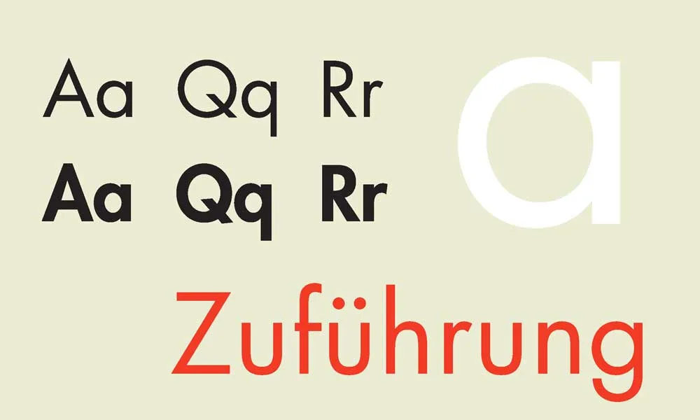
Ah, Futura. The Audrey Hepburn of fonts. Elegant, timeless, and always in style.
Created by Paul Renner in 1927, Futura is a geometric sans-serif typeface that’s stood the test of time. It’s clean, modern, and versatile as hell.
Why it’s fantastic:
- Perfect for logos, headlines, and body text
- It comes in various weights and styles
- Used by big brands like FedEx and Volkswagen
Pro tip: Pair Futura with a serif font for a classic contrast that never goes out of style.
2 – Gilroy: The Modern Maverick

If Futura is the classic beauty, Gilroy is the cool kid on the block.
This geometric sans-serif font family is perfect for contemporary designs. With its clean lines and balanced letterforms, Gilroy screams modern sophistication.
Why it’s awesome:
- 20 different weights and styles
- Great for branding, digital signage, and editorial design
- High readability across various sizes
Pro tip: Use Gilroy for your next tech startup branding project. It’ll make you look like you know what you’re doing (even if you don’t).
3 – Bodoni: The Luxurious Serif

Want to add a touch of luxury to your designs? Say hello to Bodoni.
This serif typeface, designed by Giambattista Bodoni in the late 18th century, epitomises elegance. It’s like the James Bond of fonts – suave, sophisticated, and always dressed to impress.
Why it’s fantastic:
- Perfect for fashion and luxury brands
- High contrast between thick and thin strokes
- Conveys a sense of timeless appeal
Pro tip: Use Bodoni for headers and titles in fashion magazines or high-end product packaging. It’ll make everything look more expensive.
4 – Helvetica Now: The Swiss Army Knife

I know what you’re thinking. “Helvetica? Really? How basic.”
But hear me out. Helvetica Now is not your grandma’s Helvetica. It’s a refreshed version of the classic Swiss typeface designed for the digital age.
Why it’s fantastic:
- Improved legibility at small sizes
- New weights and styles for more versatility
- Works well in both print and digital mediums
Pro tip: Use Helvetica Now for clean, minimalist designs that need to look professional without trying too hard.
5 – Aleo: The Friendly Slab Serif

Looking for a font that’s both sturdy and approachable? Meet Aleo.
This slab serif typeface is like that friend who’s always there for you. It’s reliable, easy to read, and has just enough personality to keep things interesting.
Why it’s awesome:
- Great for web content and print designs
- High legibility rate
- Balanced letters with semi-rounded details
Pro tip: Use Aleo for long-form content or educational materials. It’s easy on the eyes and keeps readers engaged.
6 – Moon: The Futuristic Display Font

Ready to take your designs to the moon? 🌙
Moon is a display font perfect for creating eye-catching headlines and logos. It’s got a futuristic vibe that’ll make your designs look like they’re straight out of a sci-fi movie.
Why it’s fantastic:
- Unique geometric shapes
- Great for logos and headlines
- Adds a touch of futurism to any design
Pro tip: Use Moon sparingly for maximum impact. It’s like hot sauce – a little goes a long way.
7 – Coves: The Minimalist’s Dream

If you’re a fan of clean, minimalist design, Coves is about to become your new best friend.
This sans-serif typeface is all about simplicity and elegance. It’s like the Marie Kondo of fonts – it sparks joy without any unnecessary clutter.
Why it’s awesome:
- Perfect for modern, minimalist designs
- It comes in light and bold weights
- Great for both headlines and body text
Pro tip: Pair Coves with bold, colourful graphics for a striking contrast.
8 – Big John / Slim Joe: The Dynamic Duo

Need help deciding between a bold or a slim font? Why not have both?
Big John and Slim Joe are font pairs that work together like Batman and Robin. Big John is your attention-grabbing headline font, while Slim Joe is perfect for subheadings and body text.
Why it’s fantastic:
- Versatile font pairing in one package
- Great for creating a visual hierarchy
- Adds interest to designs without being overwhelming
Pro tip: Use Big John for your main message and Slim Joe for supporting text to create a balanced, eye-catching design.
9 – Didot: The Fashion Icon
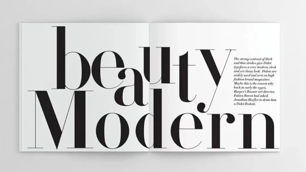
If Bodoni is James Bond, Didot is its fashionable cousin who’s always on the cover of Vogue.
This high-contrast serif font has been a favourite in the fashion industry for decades. It’s elegant, sophisticated, and always ready for its close-up.
Why it’s awesome:
- Perfect for fashion and luxury branding
- High-contrast strokes add drama to designs
- Conveys a sense of timeless elegance
Pro tip: Use Didot for fashion magazine headlines or high-end product packaging. Just be careful with small sizes – those thin strokes can get lost.
10 – Comfortaa: The Friendly Geometric

Looking for a font that’s both modern and approachable? Say hello to Comfortaa.
This rounded geometric sans-serif font is like a warm hug for your eyes. It’s friendly, legible, and adds a touch of whimsy to any design.
Why it’s fantastic:
- Great for logos and headlines
- Rounded edges add a friendly vibe
- Available for free on Google Fonts
Pro tip: Use Comfortaa for brands that want to appear modern but approachable, like tech startups or children’s products.
11 – Univers: The Versatile Workhorse

If fonts were superheroes, Univers would be the Swiss Army knife of the bunch.
Designed by Adrian Frutiger, Univers is a neo-grotesque sans-serif that’s as versatile as they come. It’s got 21 different weights and styles, making it perfect for any design challenge you throw at it.
Why it’s awesome:
- Extremely versatile with 21 weights and styles
- Highly legible in various sizes
- Works well for both print and digital designs
Pro tip: Use different weights of Univers to create a visual hierarchy within your designs without switching fonts.
12 – Lora: The Digital Serif
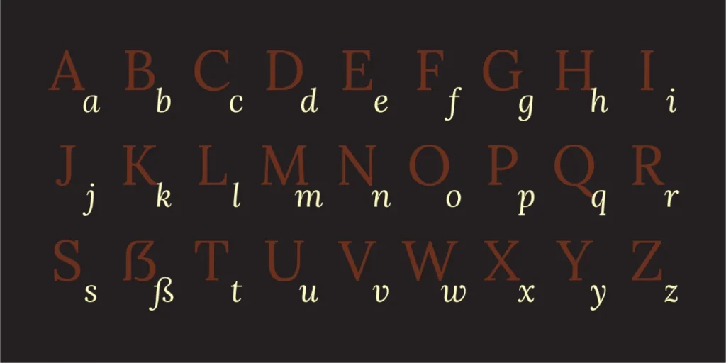
Who says serifs can’t work on screens? Lora begs to differ.
This serif typeface was designed specifically for web use, combining the elegance of serif fonts with the readability needed for digital platforms.
Why it’s awesome:
- Great for web content and digital designs
- Combines traditional serif elegance with modern readability
- Available for free on Google Fonts
Pro tip: Use Lora for long-form web content or digital publications to add a touch of sophistication to your online presence.
13 – Animosa: The Sophisticated Sans

Looking for a font that screams, “I have my life together” (even if you don’t)? Animosa is your go-to.
This modern sans-serif typeface brings a touch of sophistication to any design. With its various weights and styles, it’s like having a whole wardrobe of fonts in one package.
Why it’s fantastic:
- It comes in five weights
- Includes 93 languages and 508 glyphs
- Perfect for branding and editorial design
Pro tip: Use Animosa for corporate branding or high-end product packaging to convey a sense of professionalism and elegance.
14 – Public Sans: The Government-Approved Font

Who says government design has to be boring? Public Sans is here to prove otherwise.
Developed for U.S. government websites, Public Sans is a clean, modern typeface that’s perfect for digital platforms. It’s like the cool, tech-savvy cousin of Helvetica.
Why it’s fantastic:
- Designed for high clarity on screens
- Free and open-source
- Great for web documents and digital branding
Pro tip: Use Public Sans for projects that need to convey trust and authority, like financial services or educational platforms.
15 – Gotham: The Urban Legend
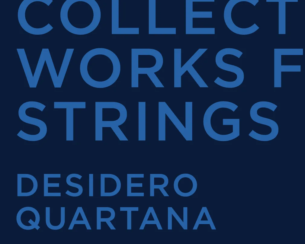
If New York City were a font, it would be Gotham.
Designed by Tobias Frere-Jones, Gotham was inspired by the architectural lettering of mid-20th century New York. It’s bold, confident, and unapologetically urban.
Why it’s fantastic:
- Versatile range of weights and styles
- Great for both headlines and body text
- Used by brands like Spotify and DC Comics
Pro tip: Use Gotham for designs that convey strength and modernity, like tech products or urban lifestyle brands.
16 – Chivo: The Confident Grotesque

Need a font that exudes confidence? Chivo’s got your back.
This grotesque typeface is bold, assertive, and ready to make a statement. It’s like the font equivalent of walking into a room like you own the place.
Why it’s fantastic:
- Great for headlines and display text
- Conveys confidence and authority
- Available for free on Google Fonts
Pro tip: Use Chivo for bold headlines in editorial designs or for branding projects that must make a strong first impression.
17 – Baron: The Vintage Revivalist

Feeling nostalgic? Baron will take you on a trip down memory lane.
This display font combines vintage charm with modern sensibilities. It’s like your cool grandpa who still rides a motorcycle and knows all the latest slang.
Why it’s fantastic:
- Perfect for vintage-inspired designs
- It comes in various styles, including inline and shadow
- Great for logos and headlines
Pro tip: Use Baron for branding projects that evoke nostalgia or timelessness, like craft breweries or artisanal food products.
18 – Infinity: The Futuristic Dreamer

Want your designs to look like they’re from the year 3000? Infinity’s got you covered.
This futuristic display font is perfect for projects that need to look cutting-edge and innovative. It’s like the font version of a Tesla Cybertruck – bold, unconventional, and impossible to ignore.
Why it’s awesome:
- Unique, futuristic design
- Great for tech-related projects
- Makes a strong visual impact
Pro tip: Use Infinity sparingly for maximum impact. It’s perfect for logos or headlines in tech or gaming-related designs.
19 – Mohave: The Desert Beauty

Like its namesake desert, Mohave is bold, striking, and full of character.
This sans-serif typeface combines geometric shapes with subtle organic touches, creating a modern and warm font.
Why it’s fantastic:
- A unique blend of geometric and organic shapes
- It comes in multiple weights
- Great for branding and display text
Pro tip: Use Mohave for brands that want to convey a sense of adventure or natural beauty, like outdoor gear companies or eco-friendly products.
20 – Accent Display: The Show-Stopper

Sometimes, you need a font that’s not afraid to steal the spotlight. Enter Accent Display.
This bold, decorative font is designed to make a statement. It’s like the Lady Gaga of typefaces – unapologetically dramatic and always memorable.
Why it’s fantastic:
- Perfect for attention-grabbing headlines
- Unique, decorative design
- Great for creating visual impact
Pro tip: Use Accent Display for short, impactful phrases in advertising or social media graphics. A little goes a long way!
21 – Simplifica: The Minimalist’s Delight
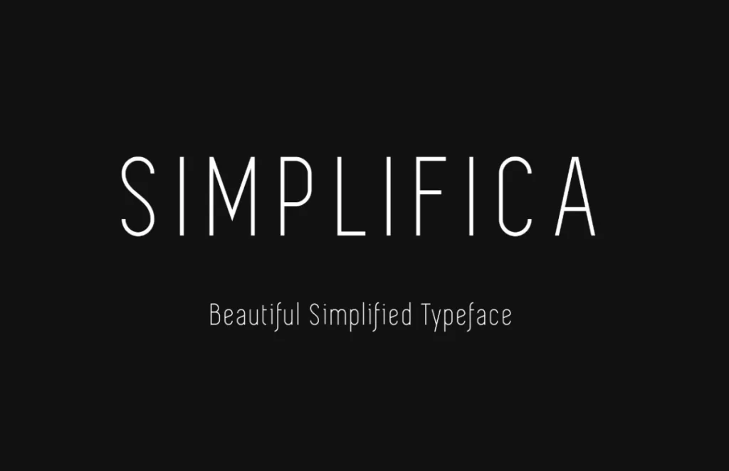
In a world of complex designs, sometimes simplicity is the ultimate sophistication. That’s where Simplifica comes in.
This clean, minimalist sans-serif font is perfect for designs that need to communicate clearly without any fuss. It’s like the Marie Kondo of fonts – it keeps only what sparks joy.
Why it’s fantastic:
- Ultra-clean and minimalist design
- Great for modern, streamlined looks
- Works well in both large and small sizes
Pro tip: Use Simplifica for brands that want to convey a sense of efficiency and modernity, like tech startups or minimalist product designs.
22 – Frontage: The Urban Explorer

Want to bring a touch of street style to your designs? Frontage has got your back.
This display font family is inspired by urban signage and street art. It’s like the typographic equivalent of a cool street mural – edgy, artistic, and impossible to ignore.
Why it’s fantastic:
- Unique, urban-inspired design
- It comes in various styles, including condensed and 3D
- Perfect for creating eye-catching headlines
Pro tip: Use Frontage for brands or projects that want to capture an urban, street-smart vibe, like streetwear brands or music festivals.
23 – Axis: The Geometric Maverick

If you’re looking for a modern and playful font, Axis is your new best friend.
This geometric sans-serif font family combines clean lines with unexpected twists, creating a functional and fun typeface. It’s like the font version of a well-designed playground – structured but with plenty of room for creativity.
Why it’s awesome:
- Unique geometric design with playful elements
- It comes in various weights and styles
- Great for both headlines and body text
Pro tip: Use Axis for brands that want to appear modern and innovative, like tech companies or creative agencies, while maintaining a sense of approachability.
24 – Coco Gothic: The Fashionista’s Choice

Looking for a font that’s as stylish as your latest Instagram post? Say hello to Coco.
This elegant, fashion-forward font is perfect for designs that need to exude sophistication and style. It’s like the typographic equivalent of a little black dress – timeless, versatile, and always chic.
Why it’s awesome:
- Elegant, fashion-inspired design
- Great for luxury and lifestyle brands
- Works well for both headlines and body text
Pro tip: Use Coco for fashion-related projects, luxury brand identities, or any design that conveys elegance and style.
25 – Dense: The Space Saver

Last, we have Dense – the font that proves good things come in small packages.
This condensed sans-serif font is perfect for designs where space is at a premium. It’s like the tiny house of fonts – compact, efficient, and surprisingly stylish.
Why it’s fantastic:
- The ultra-condensed design saves space
- It comes in various weights
- Great for headlines and information-dense designs
Pro tip: Use Dense for infographics, packaging designs with limited space, or any project where you need to fit a lot of information into a small area.
How to Choose the Right Font for Your Project

Now that we’ve gone through the crème de la crème of graphic design fonts, you might think, “Great, but how do I choose?”
Don’t worry; I’ve got you covered. Here’s a quick guide to picking the perfect font for your project:
1 – Consider Your Brand Personality
Is your brand serious and professional or fun and quirky? Your font should match your brand’s personality like a well-tailored suit.
For example:
- Serious and professional? Go for something like Helvetica Now or Univers.
- Fun and quirky? Try Comfortaa or Baron.
2 – Think About Readability
If you’re designing something people need to read (which, let’s face it, is most things), readability is key.
- For body text, stick to tried-and-true options like Futura or Lora.
- You can get more creative with fonts like Accent Display or Frontage for headlines.
3 – Consider the Medium
Are you designing for print or digital? Some fonts that look great on paper might render poorly on screens, and vice versa.
- Fonts like Public Sans or Chivo are your best bet for digital designs.
- For print, you have more flexibility. Bodoni or Didot can add a touch of elegance to printed materials.
4 – Don’t Be Afraid to Mix and Match
Using multiple fonts can add visual interest to your designs. Just remember the golden rule: contrast is key.
- Pair a serif font with a sans-serif for a classic look.
- Use different weights of the same font family for a cohesive but varied design.
5 – Test, Test, Test
Never commit to a font without testing it first. Try it in different sizes, weights, and contexts to ensure it works for your project.
Remember, choosing a font is like choosing a life partner. It needs to be compatible with your brand, reliable in different situations, and something you won’t get sick of looking at day after day.
The Future of Fonts: Trends to Watch
Now, let’s put on our futurist hats and peek at what’s coming down the typographic pipeline.
Variable Fonts: The Shape-Shifters
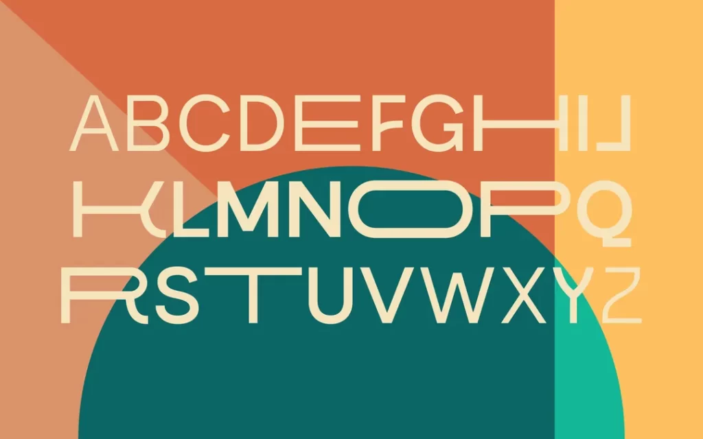
Variable fonts are the chameleons of the type world. They can adapt to different sizes, weights, and styles, all within a single file. It’s like having an entire font family in one neat package.
Why they’re awesome:
- Faster loading times for web designs
- More flexibility in responsive design
- Endless possibilities for creative typography
Pro tip: Experiment with variable fonts to stay ahead of the curve. They’re the future of web typography.
Brutalist Typography: The Rule Breakers
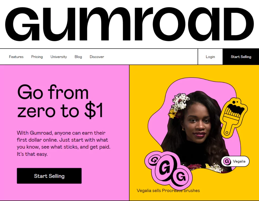
Brutalism in typography is all about breaking the rules. It’s raw, it’s edgy, and it’s not afraid to make a statement.
Why it’s fantastic:
- Creates visually striking designs
- Perfect for brands that want to stand out
- Challenges traditional notions of “good” design
Pro tip: Use brutalist typography sparingly for maximum impact. It’s like a strong spice – a little goes a long way.
Retro Revival: What’s Old is New Again
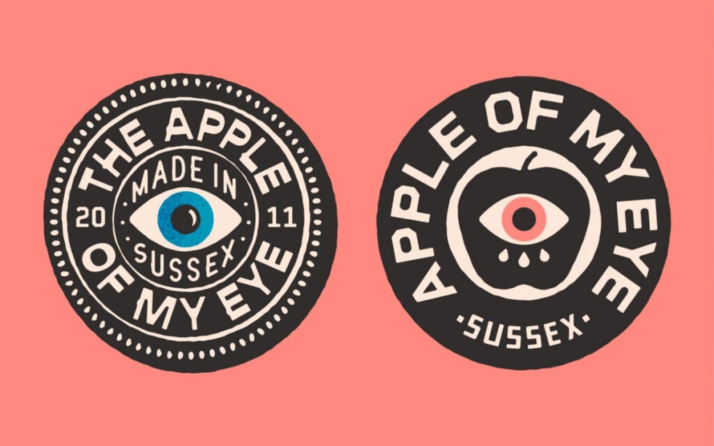
Everything old is new again, and typography is no exception. We’re seeing a resurgence of retro-inspired fonts that evoke nostalgia while still feeling fresh.
Why it’s fantastic:
- Taps into Nostalgia Marketing Trends
- Adds character and personality to designs
- Works well for brands looking to stand out in a sea of minimalism
Pro tip: Pair retro fonts with modern design elements for a fresh take on vintage style.
The Power of Typography: Real-World Examples
Let’s take a moment to appreciate some brands that are nailing their typography game:
1 – Airbnb: The Power of Custom Fonts

Airbnb’s custom font, Cereal, is a masterclass in brand typography. It’s friendly, approachable, and works seamlessly across all their platforms.
What they did right: Created a custom font that perfectly embodies their brand personality and works across all mediums.
2 – Netflix: Bold and Recognisable

Netflix’s use of bold, sans-serif typography is instantly recognisable. It’s simple, impactful, and looks great on everything from billboards to app icons.
What they did right: Choose a bold, simple font that’s easily recognisable even at a glance.
3 – The New York Times: Timeless Elegance
The New York Times’ use of their custom font, Imperial, is a perfect example of how typography can convey authority and tradition.
What they did right: Stuck with a classic, serif font that conveys trust and authority while still feeling modern.
FAQs: Your Burning Font Questions Answered
Can I use these fonts for commercial projects?
It depends on the font. Always check the licensing agreement before using a commercial font.
How many fonts should I use in one design?
As a general rule, stick to 2-3 fonts max. Any more, and your design might start looking like a ransom note.
Are there any fonts I should avoid?
Comic Sans and Papyrus are generally frowned upon in professional design. Use at your own risk!
What’s the difference between a font and a typeface?
A typeface is the design of the letters, while a font is a specific size and style of that typeface.
How do I know if a font is web-safe?
Web-safe fonts are commonly installed on most devices. Google Fonts is an excellent resource for web-safe fonts.
Can I modify a font?
This depends on the font’s license. Some allow modifications, others don’t. Always check before making changes.
What’s the best font size for body text?
For the web, 16-18px is generally optimal. For print, 10-12pt is standard.
How do I pair fonts effectively?
Look for contrasting fonts, like pairing a serif with a sans-serif. Tools like FontJoy can help.
Are there any free alternatives to popular paid fonts?
Yes! Popular paid ones inspire many free fonts. Sites like Font Squirrel offer high-quality free fonts.
How important is typography in branding?
Extremely important. Typography can convey your brand’s personality and values at a glance.
What’s the difference between OTF and TTF files?
OTF (OpenType Font) is newer and offers more features, while TTF (TrueType Font) is older but more widely supported.
How do I install new fonts on my computer?
Double-click the font file on most systems and click “Install”. Always restart your design software after installing new fonts.
Conclusion: The Write Stuff
There you have it, folks – the 25 best graphic design fonts to make your work pop in 2025 and beyond.
Remember, choosing the right font is like choosing the right outfit for a job interview. It sets the tone, makes an impression, and can differentiate between “You’re hired!” and “We’ll keep your CV on file.”
But here’s the thing:
Rules are meant to be broken.
These fonts are a great starting point, but feel free to experiment, mix things up, and find your typographic voice. After all, that’s what great design is all about.
And if you’re feeling overwhelmed by all this font talk, don’t worry. That’s what we’re here for at Inkbot Design. We eat, sleep, and breathe this stuff (sad, I know, but someone’s got to do it).
So, whether you’re a seasoned designer looking to freshen up your font game or a newbie just dipping your toes into the vast ocean of typography, remember this:
The perfect font is out there. You have to find it.
Now, go forth and create something beautiful. And please don’t use Comic Sans for the love of all that is holy. 😉

