
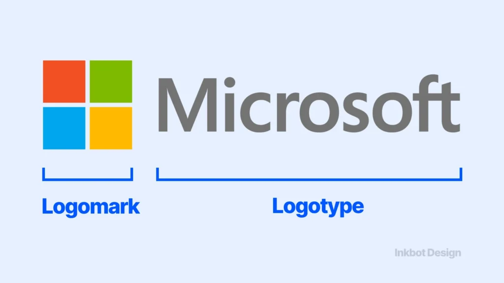
Logotype vs Logomark: Which Should Your Firm Choose?
When a 90-partner accountancy firm signs off on a rebrand ahead of a merger, the logo decision usually arrives as a mood board rather than a strategy.
Three symbol options, one wordmark, and a room full of people picking the one that “feels more premium.”
The mark that feels premium and the mark that does commercial work are rarely the same thing – and in professional services, the gap between them is wider than almost anywhere else.
This matters more than the meeting suggests.
A logomark – a standalone symbol – only earns its keep once a market has seen it paired with your name enough times to read the symbol as you.
Until then, it is a decoration with a recognition tax attached.
Most firms preparing to rebrand have not bought enough exposure to clear that tax. They should lead with the name, rendered as a strategic logo design wordmark, and earn the symbol later.
- Market awareness decides: lead with a logotype until exposure builds; recognition is earned through repetition, as the Nielsen Norman Group shows.
- Short, distinctive names suit a wordmark; long or generic names often need a monogram or combination mark for small sizes.
- A logomark requires sustained impressions to repay; referral-led professional services usually lack distribution, so a wordmark returns sooner.
- A combination mark is a sequencing tool: adopt it only with a plan to earn the logomark, not as a way to avoid deciding.
- Default to a wordmark for most professional services; add a logomark later once awareness, distribution, and legal distinctiveness (per WIPO) justify it.
Which Should Your Firm Choose: Logotype vs Logomark?
Choose a logotype when your firm lacks the market awareness to make a symbol carry meaning on its own, which describes almost every professional services firm under 200 staff.
Choose a logomark only once your name is already widely recognised, your distribution is broad, and you have media weight behind the symbol.
For most service brands, the wordmark wins first; the symbol is earned later.
- A logotype puts your most-searched, most-spoken asset – your name – in front of buyers who type and refer to it.
- A logomark asks the market to learn a new association before it returns any recognition value.
- The deciding variable is awareness, not aesthetics: symbols repay scale you may not yet have.
A logotype is a brand’s name rendered as a designed wordmark, while a logomark is a standalone symbol that represents the brand without text.
For the wider context of how these marks fit together, see our guide to the different types of logos, and for the craft fundamentals beneath any of them, see strategic logo design for B2B firms, which covers the execution details.
The Criteria That Actually Decide This – and the Ones That Don’t
Most comparison content scores logotypes and logomarks on “versatility,” “memorability,” and “scalability” as if both options start at the same level.
They don’t.
Four criteria genuinely drive the decision for a professional services firm, and two heavily marketed ones barely matter.
1: Market Awareness Is the Variable That Predicts the Outcome
A symbol carries no inherent meaning; it acquires meaning only through repeated pairing with the name.
The Nielsen Norman Group, the UX research consultancy, has long documented that recognition is built through repeated exposure rather than design quality alone.
A firm that 4% of its target market can name cannot expect a bare symbol to trigger recall – there is nothing encoded yet to recall.
The wordmark, by contrast, works on first exposure because the name is the information. Awareness is the gate that every other criterion passes through.
2: Name Length and Distinctiveness Set the Structural Path
A short, distinctive name is a gift to a logotype; a long or generic one strains it.
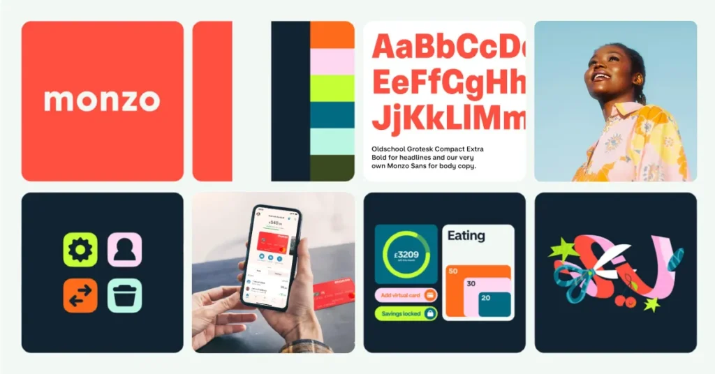
“Monzo” sets as a wordmark effortlessly; “Hartley Pemberton Associates” does not, which is precisely why long-named firms reach for a symbol or a monogram.
The World Intellectual Property Organization (WIPO) frames a mark broadly enough to include a logotype, noting a mark may be a visible, distinctive word, letter, numeral, drawing, shape, colour, logotype or label.
The legal baseline is distinctiveness – WIPO states a sign must be capable of distinguishing one business’s services from competitors’.
Your name’s length and distinctiveness, not your taste, set the realistic execution path.
3: Distribution and Media Mix: Decide Whether a Symbol Can Pay Back
A logomark is a fixed cost in attention: you must spend impressions teaching the market what it means before it returns recognition.
Consumer brands amortise that cost across enormous media budgets. A referral-led professional services firm placing its mark on proposals, LinkedIn, and email signatures has neither the frequency nor the reach to teach a symbol quickly.
The wordmark needs no teaching. Distribution breadth, not design preference, determines whether a symbol ever earns out.
4: Buyer Psychology in Low-Frequency, High-Trust Purchases
Professional services are bought rarely, at high value, on trust and reference.
A prospect who hears your name from a peer then searches for it needs to see that name confirmed at every touchpoint – the wordmark closes the loop between referral and recognition.
A symbol the prospect has never been taught adds a step instead of removing one. In 17 years of brand work, the pattern I see most often is firms adopting a symbol that their own referral sources cannot describe.
The two criteria that barely matter: “versatility across an app icon” is largely irrelevant to a firm whose primary surfaces are documents, decks, and a website – you are optimising for a context you rarely operate in. And “looking like a big brand” is not a criterion; it is the trap, addressed below.
A logomark is not a more sophisticated choice than a logotype. It is a more expensive one. The symbol bills you in market exposure up front and only repays you once your name is already known, which means the firms most tempted by a symbol are usually the least able to afford what it costs to make one work.
The Logotype: What It Is Genuinely Best For
A logotype is your firm’s name rendered as a designed wordmark, and it is the correct default for almost every professional services firm below consumer scale.
Its advantage is structural: the name is already the unit of recognition your market uses, so the mark works at first sight with no recognition debt to repay. It carries your most-searched and most-referred asset directly.
Where the logotype fails is at the extremes of name length and at very small sizes – a long firm name shrinks poorly into a favicon or a social avatar, which is where a paired monogram earns its place.
The 2026 trend coverage is unusually favourable here: multiple reports point to a return of bold custom typography and wordmark-led identities, and a rising value placed on human, authentic, handcrafted signals over generic symbols.
For a firm whose differentiation is expertise and judgement, a distinctive wordmark reads as exactly that.
The Logomark: What It Is Genuinely Best For, and Where It Fails
A logomark is a standalone symbol that represents the brand without text, and it is genuinely best once your name is already known, at which point the symbol becomes a compression tool, letting recognition fire from a glance with no name required.
That is real value. It is also a value you have to earn.
The logomark fails when deployed before that recognition exists. WIPO notes that trademark protection is territorial and generally secured through registration, with fees varying by country and by the number of goods and services classes covered – a reminder that a symbol you intend to use across markets carries registration cost on top of the awareness cost.
A symbol nobody has been taught is the most expensive form of decoration a firm can buy: it occupies the recognition slot the name should hold, and pays nothing back until the volume it may never reach arrives.
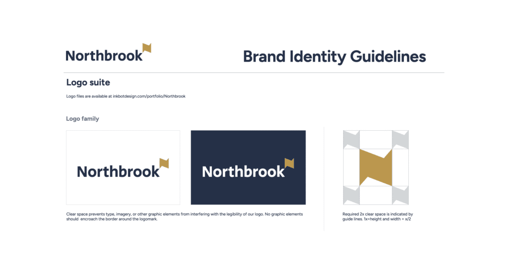
The Combination Mark: The Honest Middle, Not the Default Best
A combination mark pairs a logotype and a logomark, and it is the pragmatic choice during a transition – it lets a firm introduce a symbol. At the same time, the name still does the recognition work, then graduates to the symbol alone once awareness justifies it.
Used deliberately, it is a sequencing tool.
Used reflexively, it is a hedge.
Competing content frames the combination mark as the safe “best of both worlds,” and for a sub-scale firm, that framing quietly converts a decision into an avoidance.
You commission a symbol you are not yet ready to lead with, pay to develop and protect it, and then never use it on its own because the awareness never arrives.
The combination mark is the right answer when you have a plan to earn the symbol – and the wrong answer when it is simply a way to avoid choosing.
The Decision, by Scenario
| Your situation | Recommended choice | Why |
| Sub-200-staff firm, referral-led, modest awareness | Logotype | Name is the recognition unit; symbol has nothing to repay it yet |
| Long or generic firm name (3+ words) | Logotype + monogram lockup | Wordmark leads; monogram solves small-size and favicon use |
| Rebrand ahead of acquisition, name continuity matters | Logotype | Protects the equity buyers and referrers already hold in the name |
| Merger of two named firms into a new entity | Combination mark, with a sequencing plan | Symbol can bridge two legacies, while the new name is learned |
| Already widely recognised in your sector | Logomark or combination | Awareness exists; the symbol can now carry recognition alone |
| Short, distinctive, single-word name | Logotype | Sets effortlessly as a wordmark; no structural reason to add a symbol |
The Trap: Choosing the Symbol Because It Looks Like a Big Brand
The default mistake is reasoning backwards from Apple, Nike, and Target – concluding that because admired brands use bare symbols, a symbol signals that you have arrived.
The causation runs the other way.
Those brands removed their names after decades of paired exposure had encoded the symbol; the bare mark is a consequence of awareness, not a cause of it.
The tell that you are about to make this mistake: you find yourself excited by how the symbol looks in isolation, on a slide with no name beside it.
That is the test you will never get from a real prospect, who meets your mark cold, beside an unfamiliar name.
If the symbol only impresses when it appears on its own in a design review, it is not ready to stand on its own in the market.
The Variable You Should Actually Be Optimising For
The prevailing view – that this is a stylistic choice between two valid options – is held by intelligent people for a fair reason: at the level of a single artboard, a logotype and a logomark genuinely are two ways to solve the same brief, and a skilled designer can make either one beautiful.
Judged as craft, they are equals.
They are not equals as commercial instruments. The variable that predicts the outcome is not which mark is better designed; it is whether your market has enough exposure to your brand for a symbol to mean anything.
WIPO’s own SME guidance frames trademarks explicitly as a brand-building tool – distinctive signs that help a company create visibility and build a brand image. Visibility is the precondition.
A logotype manufactures visibility because the name is legible to a first-time viewer; a logomark consumes visibility you must already possess.
So the replacement directive is simple: stop asking “which mark looks more like a real brand,” and start asking “has my market seen my brand enough times for a symbol to carry it.” For most firms preparing to rebrand, the honest answer is not yet, which settles the question.
Lead with the wordmark; earn the symbol.
Where This Stands in 2026
The 2026 design conversation has, on the surface, moved away from fixed single marks altogether.
Trend coverage throughout the year repeatedly emphasises adaptive logos, kinetic branding, and modular identity systems rather than a single fixed piece, and several reports argue that the single static logo is becoming less relevant because brands now need marks that scale across apps, wearables, motion, and immersive interfaces.
Read carelessly, that sounds like an argument for the flexible symbol over the fixed wordmark.
It is closer to the opposite for professional services. The same body of 2026 coverage points to a clear return of bold custom typography and wordmark-led identities, and a rising premium on human, authentic, handcrafted signals over generic symbols.
A modular system does not require a symbol at its centre – a distinctive, well-built wordmark flexes across motion, social, and document surfaces perfectly well, and carries the name while it does so. For our broader read on where identity design is heading, see our analysis of current logo design trends.
The practical implication: do not let “static logos are dead” talk push you toward a symbol you have not earned. The modern requirement is a flexible identity, and a logotype meets it.
The reader’s sceptical objection here is reasonable – “surely a symbol is more flexible across digital surfaces than a block of text?” In practice, a designed wordmark with a monogram derivative gives you the small-size flexibility of a symbol while retaining the legibility of the name. You give up almost nothing.
A second fair objection – “won’t a wordmark-only identity look less established than competitors with symbols?” – assumes the symbol reads as “established” to your buyers. It reads as established only if they already know it.
To a prospect meeting you cold, an unfamiliar symbol reads as less legible than your name, not more prestigious.
The Verdict
The choice between a logotype and a logomark is decided by one question, and it is not a question of taste: has your market seen your brand enough times for a symbol to carry it?
For the overwhelming majority of professional services firms below consumer scale – referral-led, low-frequency-purchase, modest in awareness – the answer is no, and that answer settles the decision.
The logotype carries your name, which is the asset your buyers already type, speak, and remember.
The logomark asks them to learn something new before it returns anything, and it bills you for market exposure you may not have to spend.
This is why the logotype usually wins on near-term return, and the logomark usually wins later.
The wordmark works on first contact; the symbol works only after the awareness that makes it legible has been bought and banked. A combination mark bridges the two – but only as a deliberate sequence, never as a way to dodge the decision.
The firms that get this wrong are not choosing badly between equals; they are choosing a symbol before the conditions that give a symbol value exist.
Before you sign off on any new identity, get an honest read on where your brand actually stands.
Request a free Brand Equity Audit™ – a structured diagnostic that identifies exactly where your brand is losing commercial ground. Whether your market is ready for the mark you are about to commission.
FAQ
What is the difference between a logotype and a logomark?
A logotype is your brand’s name rendered as a designed wordmark, such as a styled version of the firm’s name. A logomark is a standalone symbol or icon that represents the brand without using the name. A combination mark pairs the two together in a single lockup.
Which is better for a professional services firm, a logotype or a logomark?
A logotype is usually better for professional services firms below the consumer scale. These firms are referral-led and low in market awareness, so the name carries recognition that a symbol cannot yet provide—a logomark suits firms whose names are already widely known in their sector.
Why do most service firms choose the wrong mark?
Most firms choose a logomark because admired brands use bare symbols, assuming a symbol signals arrival. The reasoning is backwards: those brands removed their names only after decades of paired exposure encoded the symbol. The symbol is a consequence of awareness, not a way to manufacture it.
When should I use a logomark instead of a logotype?
Use a logomark once your name is already widely recognised in your market, your distribution is broad, and you have enough exposure for the symbol to fire recognition on its own. Before that point, the symbol occupies the recognition slot the name should hold and returns little.
Is it true that a combination mark is the safest choice?
No – a combination mark is safe only when you have a plan to earn the symbol over time. Used reflexively, it lets a firm commission a symbol it is not ready to lead with, pays to protect it, and then never uses it on its own because the awareness never arrives.
How does name length affect the logotype vs logomark decision?
Short, distinctive names set effortlessly as logotypes, while long or generic names strain a wordmark and often justify a paired monogram for small sizes. Name length and distinctiveness, not aesthetic preference, determine the realistic path to execution for any firm’s mark.
Does a logotype work across digital and motion surfaces?
Yes – a well-built logotype flexes across motion, social, and document surfaces, and a derived monogram solves small-size uses such as favicons and avatars. The 2026 requirement for modular, adaptive identities does not require a symbol at the centre; a distinctive wordmark meets it.
What does WIPO say about whether a logotype can be a trademark?
The World Intellectual Property Organization (WIPO) defines a mark broadly enough to include a logotype, noting a mark may be a visible distinctive word, letter, numeral, drawing, shape, colour, logotype or label. The legal baseline is distinctiveness: the sign must distinguish your services from competitors’.
How much does trademark protection for a mark cost?
The World Intellectual Property Organisation (WIPO) notes that protection is territorial and generally secured through registration, with fees varying by country and by the number of goods and services classes covered, as well as possible agent and renewal fees. A symbol used across multiple markets carries this cost on top of its awareness cost.
Should a firm rebrand before an acquisition change its mark type?
A firm rebranding ahead of an acquisition should usually retain its logotype, because name continuity protects the equity that buyers, referrers, and search engines already hold in the name. A bare symbol introduced at this moment risks discarding the recognition the firm has spent years accumulating.
What kind of logo gets remembered?
The mark that aligns with your market’s existing awareness is remembered. For a firm whose name is known through referral and search, a logotype reinforces recognition at first sight. For a brand already widely recognised, a logomark compresses that recognition into a glance. Memory follows exposure, not design alone.
Can a wordmark look as established as a competitor’s symbol?
Yes – a symbol reads as established only to people who already recognise it. To a prospect meeting your brand cold, an unfamiliar symbol is less legible than your name, not more prestigious. A distinctive, well-crafted wordmark signals confidence and expertise without requiring prior exposure.
