The FedEx Logo: The Hidden Arrow is Not the Point
Everyone loves a good bit of trivia. And when it comes to logo design, the most repeated fun fact is about the FedEx logo.
“Did you see the hidden arrow?” people ask, pointing between the ‘E’ and the ‘x’.
Yes, we’ve all seen it.
And focusing on it makes you miss the entire point.
That arrow isn’t the reason the FedEx logo is a work of genius. It’s the cherry on top, the clever wink at the end of a story. But the story is a business strategy, problem-solving, and system design masterclass. It’s a lesson worth millions.
If you’re an entrepreneur or business owner, forgetting the arrow and understanding the real history of this logo will give you a far greater advantage than any hidden symbol ever could.
The real story is about solving a massive, expensive problem, not just creating a clever party trick.
- FedEx's logo features a hidden arrow symbolising speed, reliability, and efficiency, key values for the brand.
- The logo has evolved since 1971, with the current design introduced in 1994, showcasing innovation.
- Lindon Leader utilised negative space creatively, making the logo one of the most recognisable globally.
- Distinctive colours in the logo represent different company divisions, enhancing brand clarity and identity.
- The FedEx logo exemplifies successful branding, inspiring designers through its strategic design and enduring impact.
Before the Arrow: The Problem with ‘Federal Express’

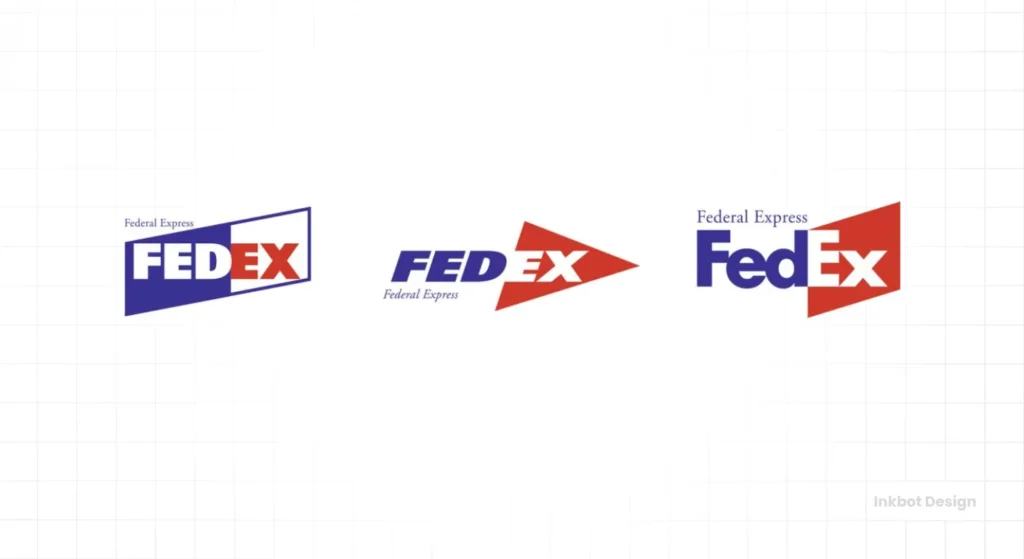
You must see what they had before to understand why the 1994 rebrand was so brilliant. The original logo, created in 1973, was for “Federal Express.”
It was a product of its time. The name was split into two colours, wrapped in a box. It was busy, hard to read from a distance, and looked clunky on the side of a van, let alone a 747.
But the aesthetic was the least of its problems.

The real issue was brand chaos. As the company grew, it launched different services. Federal Express had sub-brands for logistics, air freight, and other divisions. Each one started getting its logo variation, creating an inconsistent and confusing mess.
Think about the sheer scale of the operation. We’re talking about a global fleet of over 30,000 vehicles and countless more aircraft, drop boxes, and packaging. Every single asset needed a logo. An inconsistent, complicated brand identity wasn’t just confusing for customers; it was a logistical and financial nightmare to manage and deploy.
This was the problem CEO Fred Smith needed to solve. He didn’t need a “prettier” logo. He needed a strategic weapon.
The 1994 Rebrand: A Mandate for Simplicity
In the early 90s, the leadership team at Federal Express knew a change was necessary. They hired one of the best in the business: Landor Associates, a legendary San Francisco branding firm. Senior design director Lindon Leader led the project.
The mandate was clear: create a unified, global brand identity that was simple, powerful, and could bring the entire family of services under one visual roof.
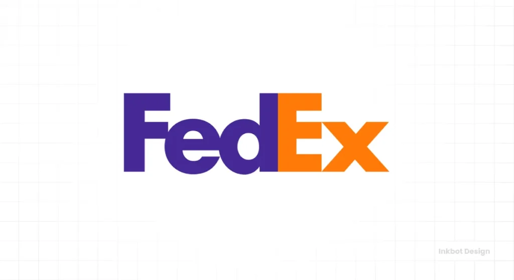
It was time to shorten the colloquial name “FedEx” into the official brand.
The Designer: Lindon Leader’s Core Philosophy
You can’t understand the logo without understanding the man behind it. Lindon Leader is a disciple of simplicity. He once summarised his entire approach in an interview, and it’s a quote every business owner should print out:
“I strive for two things in design: simplicity and clarity. Great design is born of those two things.”
This wasn’t about adding flair. It was about stripping away everything unnecessary until only the most potent, essential message remained.
The Gruelling Process: Over 200 Designs and Brutal Feedback
Great logos are not born in a flash of inspiration. They are forged in a crucible of iteration and criticism.
Leader and his team at Landor developed over 200 different designs for the FedEx logo. They explored everything—symbols, different fonts, various colour combinations. They presented these concepts to senior executives at FedEx and focus groups of employees and customers around the world.
The feedback was relentless. The process was a slow, methodical grind of elimination. It was a search for a solution that was visually appealing and could withstand the immense scrutiny of a global super-brand. This is the unglamorous reality of world-class design.
Deconstructing the Genius of the Final FedEx Logo
After months of work, they landed on the wordmark we know today. A simple, powerful logotype with two core components: the typography and the colour system. And yes, a hidden arrow.
The “Aha!” Moment: The Hidden Arrow in Negative Space
Let’s address the arrow first. During the design process, Leader was experimenting with different typefaces. He noticed that when he placed a capital ‘E’ next to a lowercase ‘x’ using a specific font, the white space between them formed a perfect arrow.
It wasn’t intentional at first. It was a happy accident born from hundreds of hours of deep typographic exploration.
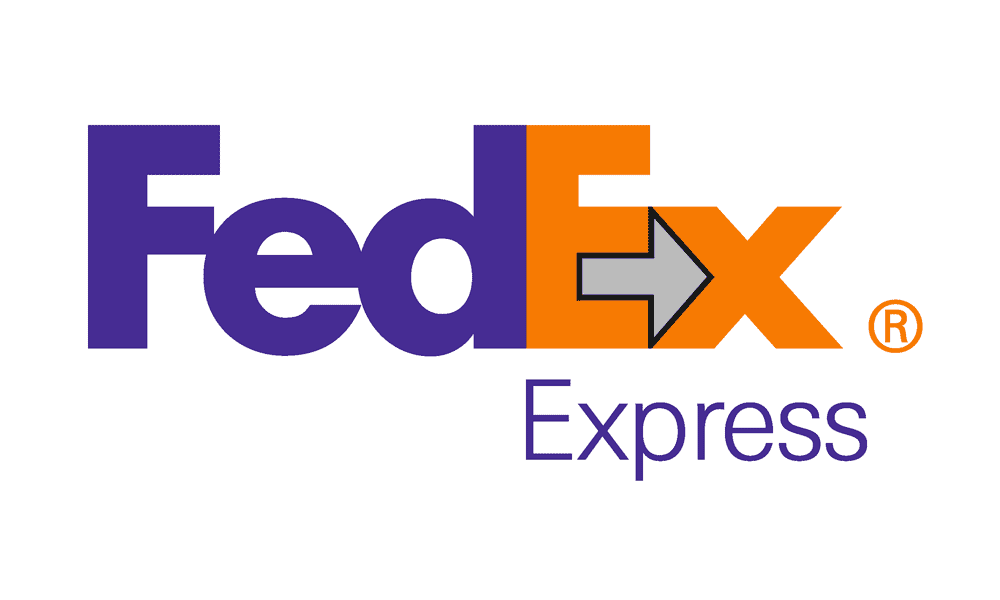
But once they saw it, they knew they had something special. The arrow perfectly encapsulated the essence of the FedEx brand. It symbolises:
- Forward direction: Moving packages and businesses ahead.
- Speed and precision: Hitting a target with accuracy.
- The A-to-B connection: The fundamental purpose of a logistics company.
The team knew most people wouldn’t see it consciously, but they felt its subliminal effect of speed and precision would register. They were right.
More Than an Arrow: The Power of Typography
The font itself is a custom creation. It combines two typefaces: Univers 67 (for its clean, modern lines) and Futura Bold (for its geometric, elegant feel).
This custom font wasn’t chosen randomly. It was engineered. The letters are set incredibly tightly, which helps form the arrow and creates a solid, stable, and compact unit. It looks sturdy and reliable. It’s legible from a thousand feet away on the tail of a plane and remains clear when shrunk down onto a small package label.
This is the workhorse element of the logo. The typography does the heavy lifting, conveying strength and modernity every time.
A System, Not Just a Logo: The Colour-Coded Genius
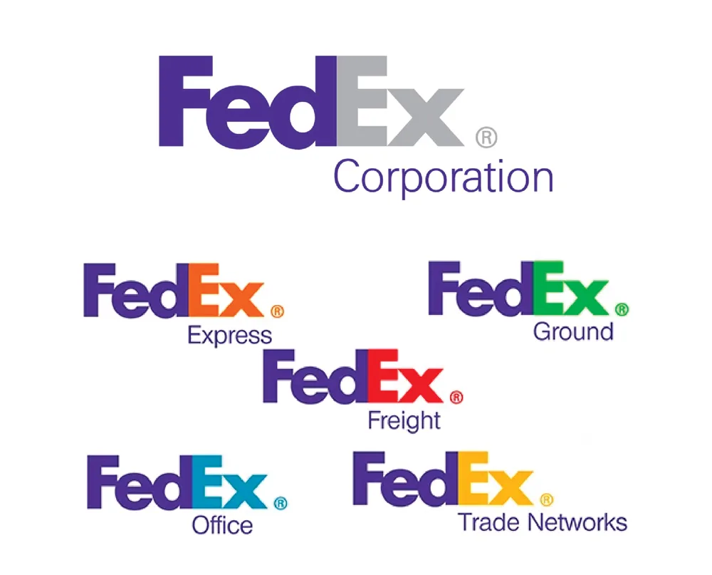
Here it is. This is the multi-million dollar lesson that most people miss while they’re busy looking for the arrow.
The true brilliance of the 1994 redesign is that Leader and his team didn’t just deliver a logo. They offered an entire brand architecture system.
The solution was devastatingly simple.
- The “Fed” would remain the same corporate purple, providing a consistent anchor for the master brand.
- The “Ex” would change colour to denote the specific operating division.
Suddenly, the brand chaos was gone, replaced by elegant order:
- Orange for FedEx Express: The original, flagship overnight service. The colour suggests speed, energy, and urgency.
- Green for FedEx Ground: A nod to the colour of money and the earth, representing the more economical, road-based delivery service.
- Red for FedEx Freight: A bold, powerful colour for heavy-duty shipping.
- Blue for FedEx Office: (The service that replaced Kinko’s) A trustworthy, corporate colour for business services.
This system allowed FedEx to acquire new companies, launch new services, and seamlessly integrate them into the brand family with a simple colour swap. It unified the company under one powerful visual identity while allowing clear differentiation. Over the decades, it saved them an astronomical amount in design and operational costs.
That is genius. The arrow is just the exclamation point.
The Lessons for Your Business (That Aren’t About a Hidden Arrow)
You may not have a fleet of 747s, but the strategic thinking behind the FedEx logo directly applies to your business.
- Lesson 1: Solve a Business Problem, Don’t Just Decorate. The FedEx rebrand wasn’t an art project. It solved a critical problem of brand confusion and operational inefficiency. Before you start thinking about colours or fonts for your logo, ask yourself: What is the most significant communication problem my brand needs to solve?
- Lesson 2: Simplicity is Strength. The old Federal Express logo was complex. The new one is two words and two colours. A simple logo is easier to remember, works better across different sizes and applications (from a website favicon to a billboard), and feels more confident and modern.
- Lesson 3: Think System, Not Symbol. Don’t just design a logo; create a brand identity system. How will your logo adapt if you launch a second product, open a new location, or start a podcast? Like the FedEx colour model, a flexible system will save you enormous headaches. Building a robust identity is the core of a professional logo design process.
- Lesson 4: Great Design is a Process, Not an Event. The FedEx logo came from reviewing over 200 options. It was a grind. Don’t expect your perfect logo to emerge on the first try. It requires research, exploration, brutal feedback, and refinement. Trust the process.
The Legacy: Why the FedEx Logo Endures
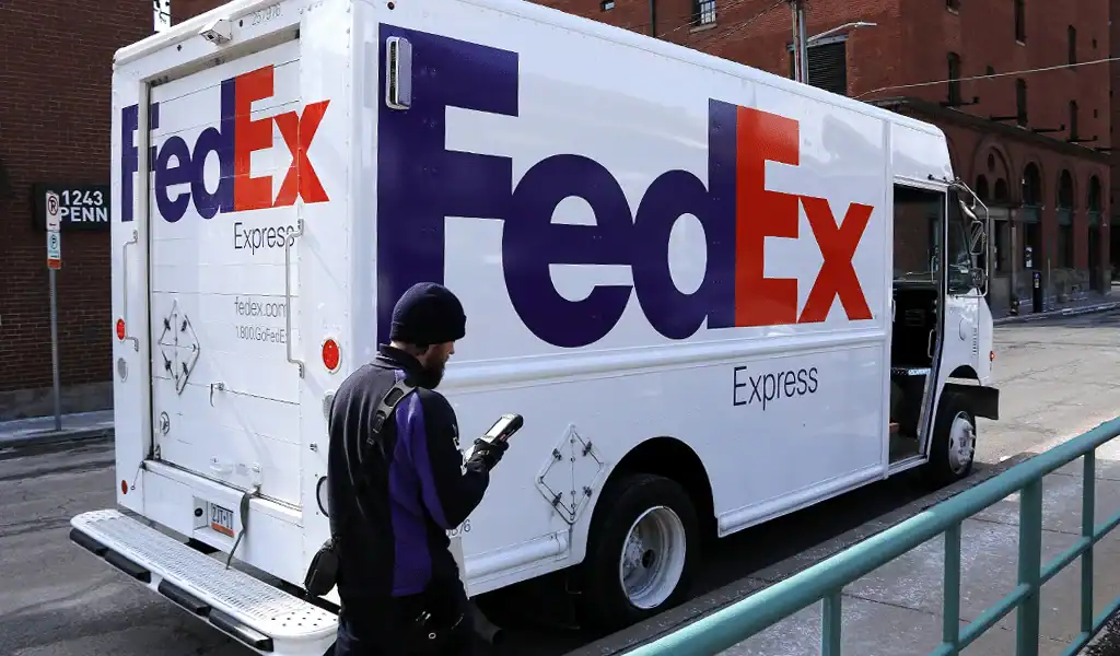
The FedEx logo has won over 40 design awards globally. It is consistently ranked as one of the best designs of all time. But its real legacy isn’t in a trophy case.
It endures because it works.
It works on a tiny screen and on the side of a building. It works in Memphis, and it works in Mumbai. It works for urgent documents and for a 500-pound pallet.
Its longevity directly results from the strategic foundation it was built upon. It’s a testament to Lindon Leader’s philosophy of simplicity and clarity. It’s proof that the most effective design is not the one that shouts the loudest but communicates its message with quiet, unshakeable confidence.
Don’t Hunt for Arrows, Hunt for Problems
The next time someone points out the arrow, you can smile and tell them the real story.
The takeaway for any entrepreneur is this: stop hunting for a clever gimmick for your logo. Stop looking for your “hidden arrow.”
Instead, look for your most significant business problem. Is it a lack of clarity? Is it an inconsistency? Do customers not understand what you stand for?
Clearly define that problem. And then, design the most straightforward, clearest possible solution. If you do that, you’ll have something far more valuable than a hidden arrow. You’ll have a brand that works.
A brand system that is robust and timeless doesn’t happen by accident. It results from a deliberate, strategic process beyond just a symbol. If you’re ready to move past simply having a logo and want to build an authentic brand identity that solves problems and creates value, the first step is a conversation.
Explore our logo design services or request a quote to begin building a brand that lasts.
Frequently Asked Questions about the FedEx Logo
Who designed the FedEx logo?
The current FedEx logo was created in 1994 by Lindon Leader, the senior design director at Landor Associates.
What is the hidden symbol in the FedEx logo?
The secret symbol is a forward-pointing arrow in the negative (white) space between the capital ‘E’ and the lowercase ‘x’. It symbolises speed, precision, and forward motion.
What was the old FedEx logo?
The original logo was for “Federal Express” and featured the name in a clunky, two-part wordmark enclosed in a box. It was used from 1973 until the 1994 rebrand.
Why did FedEx change its logo in 1994?
They changed the logo to solve a significant business problem. The old “Federal Express” brand was inconsistent across its many divisions, creating customer confusion and high operational costs. The new “FedEx” logo created a simple, unified brand architecture.
What fonts are used in the FedEx logo?
The FedEx logotype is a custom font explicitly created for the brand. It is a hybrid based on two different typefaces: Univers 67 and Futura Bold.
What do the different colours in the FedEx logo mean?
The colours denote different service divisions. The “Fed” is always purple, while the “Ex” changes:
Orange: FedEx Express (air and overnight)
Green: FedEx Ground (road-based delivery)
Red: FedEx Freight (heavy shipping)
Blue: FedEx Office (business services)
How many awards has the FedEx logo won?
The FedEx logo has won over 40 international design awards and is widely regarded as one of history’s most successful logo designs.
What is negative space in a logo?
Negative space (or white space) is the empty area around and between the elements of a design. The FedEx logo famously uses this space between letters to create a secondary image (the arrow).
Why is the FedEx logo considered so good?
It is effective because it is simple, memorable, timeless, and versatile. Most importantly, it’s the foundation of a flexible brand system that provides clarity and consistency for a massive global corporation.
What is the main lesson for businesses from the FedEx logo?
The primary lesson is that a great logo should solve a strategic business problem, not just be visually appealing. Thinking of your brand as a complete system, rather than a single symbol, is key to long-term success.
