How Abstract Logo Design Builds Real Authority
In the world of logo design, it’s easy to follow trends and end up with something that looks like everyone else.
But that’s not how you build authority.
Abstract logos have become the go-to of memorable brand identities – it’s not that they look ‘modern’, it’s that they can communicate complex ideas through simplicity.
Think about it. The most powerful brands in the world don’t use literal representations. Even Apple’s ‘apple’ is a simplified, abstract shape, with clever geometry and thoughtful symbolism that lodges itself in our brain.
- Abstract marks encode complex brand ideas simply, creating memorable identities and authority.
- They tap preattentive visual processing, connecting emotionally and being recognised faster than words.
- Geometric precision and thoughtful colour systems give balance, harmony, and reproducible authority across sizes and media.
- Effective abstraction must be conceptually grounded, distinctive and scalable, avoiding trendy or random shapes.
- Implement logos with responsive systems, precise execution, testing, animation and consistent application to build lasting recognition.
The Psychology Behind Abstract Logo Design
When you see the Nike swoosh, you don’t think of the “tick mark” – you feel movement, achievement, and that motivational “just do it” spirit. That’s the psychological power of abstraction at work.
Abstract logos tap into something primal in our brains. They bypass the logical processing centres and connect directly with our emotions. Recent visual processing studies show that humans recognise and remember shapes faster than they process words. An abstract mark can be processed in milliseconds, compared to text-based logos.
However, creating compelling abstract logos isn’t just about throwing random shapes together. There’s a science and methodology behind it that separates the iconic from the forgettable.
Preattentive Processing and Shape Recognition
Our visual system flags simple shapes and colour contrasts almost instantly. This preattentive processing helps abstract marks land a first impression before any copy is read.
Designers can exploit this by simplifying forms and amplifying figure–ground contrast. Faster recognition creates stronger recall and smoother brand attribution in cluttered environments.
The Balance of Recognition and Mystery
The best abstract logos exist in a sweet spot – they’re distinctive enough to be immediately recognisable yet mysterious enough to create intrigue. Take the Adidas trefoil. Three leaf shapes create a form that suggests a world map or a mountain, symbolising global reach and achievement, without explicitly showing either.
Gestalt principles do a lot of heavy lifting here, especially closure, continuity, and figure–ground. When elements imply a whole without drawing it, the viewer completes the form and feels rewarded.
This small cognitive step builds attachment while keeping the mark legible. Use repetition and alignment to reinforce stability without losing intrigue.
This balance creates cognitive engagement. When viewers need to make that tiny mental leap to understand your symbol, they invest in your brand identity. That investment, however small, creates a stronger memory imprint.
Core Elements of Successful Abstract Logo Design
So, what makes an abstract logo truly work? Let’s break down the essential components that transform a simple shape into a powerful brand asset.
1. Geometric Precision and Mathematical Harmony
Some of the most enduring abstract logos rely on geometric principles. The Twitter bird (now X) was famously composed of perfect circles. Apple’s iconic bite mark follows the golden ratio. These mathematical foundations give abstract logos an inherent sense of “rightness” that we perceive even if we can’t articulate why.
Twitter’s 2012 bird was built from overlapping circles to create smooth, even tension. Toyota’s 1989 logo uses three overlapping ellipses to symbolise the customer, the product, and mutual trust.
These systems create an optical balance that reads as intentional and engineered. That sense of order signals reliability, even at tiny sizes.
Look at the BBC blocks – simple squares arranged in a specific pattern create a mark that’s remained unchanged since 1997. The precision of the arrangement contributes significantly to its authority and timelessness.
2. Colour Psychology in Abstract Design
Colour plays a crucial role in abstract logo design. Colour becomes a primary communicator of brand values without literal imagery to anchor meaning.
Consider the Mastercard logo – two overlapping circles in red and yellow. The warm colours evoke optimism and energy, while the overlap creates an orange hue, suggesting creativity and enthusiasm. The simplicity of the shapes allows the colour relationship to take centre stage.
Mastercard’s 2016 refresh by Pentagram simplified the circles and typography. In 2019, the brand often used the circles alone, showing that colour and form can carry recognition without a wordmark.
This move validated the power of minimal abstract assets. When colour systems are distinctive, they consistently do heavy brand work.
Abstract logos often employ colour in ways that:
- Create visual tension or harmony
- Establish brand recognition through unique colour combinations
- Communicate brand personality before any words are read
- Support the symbolic meaning of the abstract shapes
- Remain identifiable in monochrome, duotone, and reversed applications
3. Meaningful Abstraction vs. Random Shapes
An effective abstract logo isn’t just visually appealing – it has purpose and meaning. Behind the abstraction should be a concept that ties to the brand’s core values or offerings.
The Virgin logo demonstrates this perfectly. The distinctive scrawled wordmark may appear simple, but it embodies the brand’s rebellious, unconventional approach. It’s abstract in its execution while remaining conceptually grounded.
Evolution of Abstract Logo Design: From Classic to Contemporary
Abstract logo design isn’t new – it’s been evolving for decades. Understanding this evolution helps us appreciate where we are and where we head in visual identity.
The Minimalist Revolution
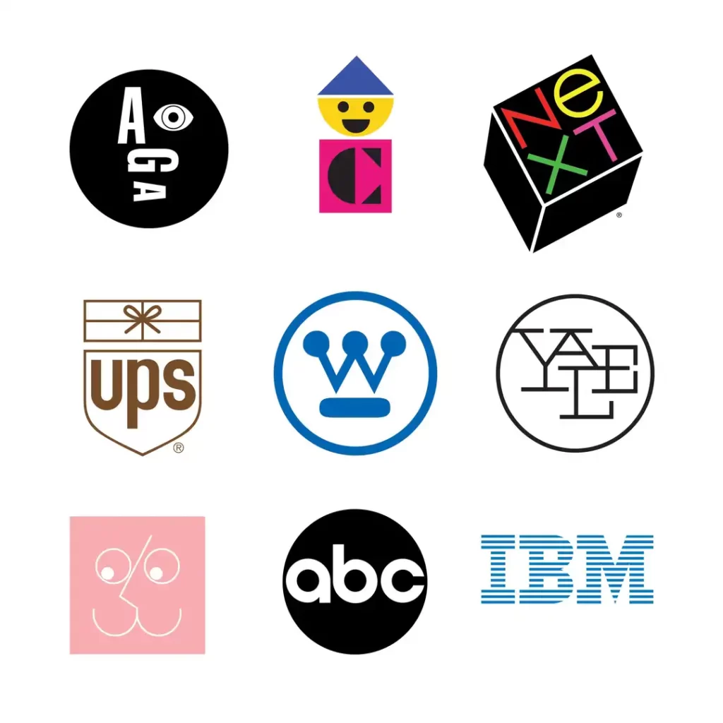
In the 1950s and 60s, designers like Paul Rand pioneered the shift toward abstract, minimalist logos. The IBM stripes, the ABC circle, and the UPS shield emerged during this era. These marks stripped away unnecessary detail to create highly functional, versatile logos that could work across multiple applications.
Key dates help frame the shift. ABC’s circle logo arrived in 1962; UPS’s shield by Paul Rand in 1961; and IBM’s stripes were introduced in 1967, then refined to eight stripes in 1972.
This timeline shows reduction as a long-term performance strategy. The marks endured because they were built on strong systems.
This approach was revolutionary, rejecting ornate illustrations and favouring bold, simple forms that communicated efficiently.
The Digital Transition
The rise of digital interfaces in the 1990s and early 2000s created new demands for logo design. Suddenly, logos needed to function beautifully at tiny sizes on screens. This prompted another wave of simplification and abstraction.
The Google Chrome logo exemplifies this era – a simple, geometric form with clear colours that works brilliantly at any size. It’s abstract yet instantly recognisable, containing subtle references to movement and dimension.
Chrome has been simplified several times to improve clarity at small sizes. Updates in 2011, 2014, and 2022 reduced shading and clarified geometry for screens.
This path shows how digital constraints pull brands towards abstraction. Cleaner vectors render consistently better across densities and platforms.
Abstract Logos in the Modern Era
Today’s abstract logos often incorporate movement and adaptability. Static logos have evolved into dynamic identity systems that shift and transform while maintaining their core visual elements.
The City of Melbourne logo demonstrates this approach beautifully – a geometric M that can be rendered in countless colour variations while remaining instantly recognisable. This adaptability reflects our multi-platform digital world, where brand identities must flex across various contexts.
MTV’s logo system has long allowed endless fills inside a fixed M and TV form. The shell remains; the content shifts, keeping equity while staying fresh.
Pentagram’s 2011 identity for MIT Media Lab generated tens of thousands of variations. A strict grid and algorithmic rules kept coherence across changes.
Case Studies: Iconic Abstract Logos That Built Authority
Let’s examine real-world examples of abstract logos that successfully build brand authority through thoughtful design.
The Unilever U
The Unilever logo comprises 25 small icons that form a U shape. Each icon represents an aspect of the business or its values – from a heart for care to a bird for freedom. It’s simply an abstract U at a glance, but closer inspection reveals incredible depth and meaning.
The current U was created by Wolff Olins and introduced in 2004. Twenty-five icons form the monogram, each representing a product area or value within the portfolio.
This provenance matters for brand governance and continuity. It anchors the abstraction in a documented corporate identity system.
This layered approach builds authority by demonstrating the brand’s multifaceted nature and attention to detail. It’s abstract at first glance but reveals its story to those who engage more deeply.
The Airbnb Bélo
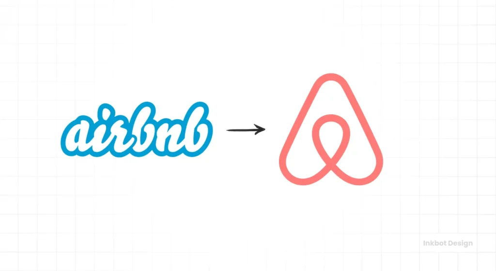
When Airbnb rebranded in 2014, they introduced an abstract symbol called the “Bélo” – a looping mark that can be interpreted as an A, a location pin, a person with arms upraised, or a heart turned upside down.
The identity, including the Bélo, was designed by DesignStudio in 2014. The team codified “belonging” as the brand idea and built a versatile symbol system around it.
Clear authorship and concept definition aid future extensions. It also helps maintain coherence across partners and campaigns.
This abstract mark brilliantly encapsulates the brand’s focus on people, places, love, and belonging. Its simplicity makes it instantly recognisable, while its multiple interpretations create conversation and engagement. The Bélo has helped transform Airbnb from a simple booking platform into a global movement around belonging.
The Shell Evolution
The Shell logo offers a fascinating study of the evolution of abstract design. Beginning as a realistic shell illustration in 1900, it has gradually become more abstract and simplified over the decades, with the current version being a bold, geometric shape that merely suggests a shell.
This evolution demonstrates how abstraction can preserve brand equity while creating a more versatile, contemporary mark. The current logo maintains the essence of the original while functioning perfectly across digital and physical environments.
Creating Your Own Abstract Logo: A Practical Approach
How do you create an abstract logo that builds genuine brand authority? Here’s a practical framework you can follow.
Step 1: Identify Core Brand Attributes
Before diving into design, identify 3-5 core attributes that define your brand. Are you innovative? Trustworthy? Disruptive? Nurturing? These attributes will guide your visual choices.
For instance, if “precision” is a core attribute, your abstract design might incorporate exact geometric forms and sharp angles. If “organic growth” matters, flowing curves and natural forms might be more appropriate.
Step 2: Research Visual Language
Every industry has visual cues and symbolic language that audiences recognise. Research competitors and adjacent industries to understand existing visual patterns.
For financial services, abstract logos often use solid, stable forms with blue tones to suggest trust and security. Tech companies frequently employ connected nodes or circuits in their abstract marks to suggest networking and intelligence.
Understanding these patterns allows you to align with them for immediate industry recognition or deliberately break them to stand out.
Step 3: Sketching Conceptual Forms
The strongest abstract logos begin with pencil and paper. Start by sketching shapes and forms that reflect your core attributes, without worrying about perfection.
Try exercises like:
- Drawing your brand values without using recognisable objects
- Creating 30 variations of a single shape in 10 minutes
- Combining two contrasting ideas into one form
- Simplifying a complex concept into its most basic elements
Step 4: Refining to the Essential
Abstract logo design is ultimately about reduction – stripping away everything unnecessary until only the essential remains. Examine your sketches and ask:
- Can any element be removed while preserving the core idea?
- Does each part of the design serve a purpose?
- Is the form immediately recognisable in various sizes?
This refinement process might take several iterations, gradually moving from complex forms to simpler, more powerful ones.
Step 5: Legal Clearance and Distinctiveness
Abstract marks work best when they are inherently distinctive rather than descriptive. Screen early with USPTO TESS, EUIPO TMview, and WIPO Global Brand Database to avoid conflicts.
Consider Nice classes and likely expansion areas before filing. Keep a record of concept, construction, and distinctiveness rationale to support registration.
Technical Execution: Creating Abstract Logos in Adobe Illustrator
The technical execution of abstract logos typically happens in vector software, with Adobe Illustrator being the industry standard. Here’s how professional designers approach the creation process:
Geometric Construction
Many abstract logos start with geometric construction – using circles, squares, and triangles as building blocks. In Illustrator, the Shape Builder tool lets designers combine these primitive shapes into more complex forms while maintaining mathematical precision.
For example, the circular elements of the Pepsi logo follow specific proportional relationships that give the design its harmonic quality. This isn’t accidental – it’s carefully constructed using precise ratios.
For screen use, export SVG and align shapes to the pixel grid. Use whole-pixel coordinates and even stroke weights to avoid blur at small sizes.
Test across device pixel ratios to catch sub-pixel artefacts. Tidy vectors beat hinting hacks when clarity is the goal.
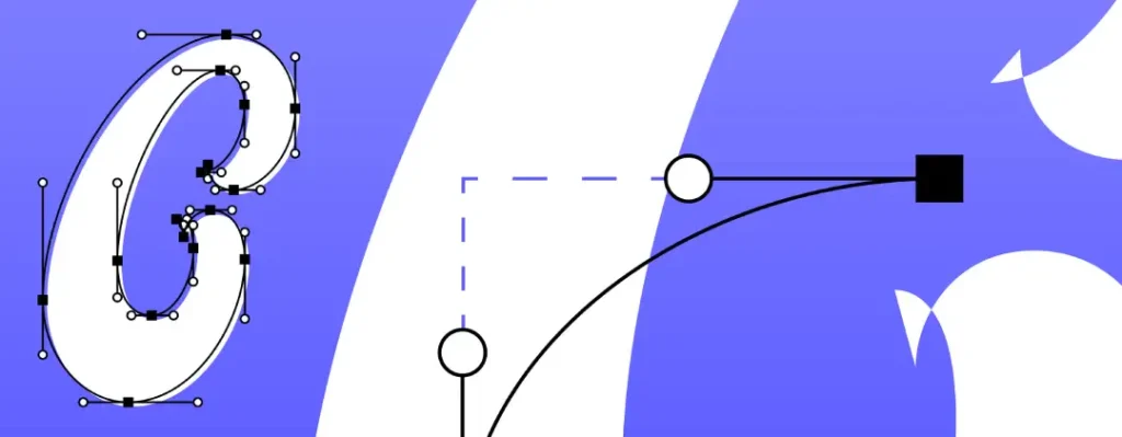
Working With Paths and Anchor Points
More organic abstract logos rely on custom paths rather than geometric primitives. Mastering the Pen tool in Illustrator allows designers to create smooth curves and precise angles, forming the backbone of abstract designs.
The key is minimising anchor points – using only what’s necessary to define the form. Fewer points generally result in cleaner, more elegant curves.
Colour Application in Vector Format
Abstract logos rely heavily on colour relationships, which are carefully managed in vector programs. Professional designers often develop colour systems that define the primary logo colours and acceptable variations.
Working in CMYK, RGB, and Pantone simultaneously ensures the abstract logo will reproduce consistently across all media – from digital screens to printed materials and physical signage.
Define HEX and sRGB for digital, CMYK and Pantone for print, with coated and uncoated variants. Highly saturated RGB neons cannot be reproduced in CMYK, so specify print-safe alternatives.
Keep a master palette with conversions and tolerances. This stops drift when vendors interpret colours differently.
The Role of Typography in Abstract Logo Systems
While the abstract mark might not contain text, typography is crucial in the whole logo system. The typeface chosen to accompany an abstract symbol should:
- Reinforce the same brand attributes
- Create visual harmony with the abstract elements
- Provide a necessary contrast to the mark
- Function well in various applications
Document primary and secondary lockups, horizontal and stacked, with clear size rules. Set minimum sizes and clear space based on a consistent module from the mark.
Record kerning and tracking adjustments for wordmarks. Small typographic decisions prevent brand wobble across channels.
Brand identity design isn’t just about the mark – it’s about creating a cohesive system where abstract elements and typography work together seamlessly.
Implementing Abstract Logos: Practical Applications
Creating an abstract logo is one thing – implementing it effectively across various touchpoints is another challenge entirely. Here’s how to ensure your abstract design builds absolute authority in the application.
Responsive Design Consideration
Modern abstract logos must function across countless digital environments. This often means creating responsive logo systems – variations of the abstract mark that adapt to different contexts while maintaining recognisability.
For instance, at tiny sizes (like a favicon), the most distinctive element of the abstract logo might be isolated. As more space becomes available, additional elements can be introduced.
Ship SVG plus raster exports at 1x, 2x, and 3x. Provide a favicon set, ICO or PNG at 16×16, 32×32, 48×48, plus SVG where supported, and platform app icons to store specs.
Test legibility on dark and light system themes. Edge cases reveal weak contrast and cluttered forms quickly.
Animation Potential
Abstract logos have tremendous potential for animation, which can bring additional layers of meaning and engagement. Simple movements can reinforce the concept of abstraction.
Lottie, created by Airbnb, enables lightweight vector animation on iOS, Android, and Web. It ships motion without heavy video assets, which suits abstract marks.
Keep motion principles simple, easing and timing that echo the mark’s geometry. Micro-movements carry meaning without distracting from content.
The Google “G” logo animates into dots that pulse, move, and transform, reinforcing the brand’s dynamic, helpful nature. This dimension wasn’t possible with static logos but adds significant value in digital environments.
WCAG 2.1’s contrast rule for text does not apply to logotypes, per Success Criterion 1.4.3 from W3C. That exemption does not excuse poor visibility, especially in cases of colour-vision deficiency.
Prioritise shape cues and high luminance contrast for recognition. Provide solid-colour versions alongside gradients to aid clarity.
Building a Visual System Around the Abstract Mark
The most authoritative brands extend their abstract logo into a comprehensive visual system. The abstract elements become building blocks for broader visual communication.
Take the Mastercard logo – the overlapping circles have become a visual motif that extends across all brand communications, creating instant recognition even when the full logo isn’t present.
Common Pitfalls in Abstract Logo Design
Creating compelling abstract logos is challenging. Here are some common mistakes to avoid:
1. Abstraction Without Meaning
The worst abstract logos are shapes for the sake of shapes. Without conceptual grounding, abstract forms become forgettable and fail to build authority.
Always start with meaning and concept, then move toward abstraction, not the other way around.
2. Following Trends Too Closely
Abstract logo design follows trends, like any creative field. The “blobs” and amorphous shapes popular in recent years will eventually look dated.
Focus on timeless principles rather than on-the-moment styles. Good geometric relationships and thoughtful symbolism outlast trends.
3. Complexity That Doesn’t Scale
Some abstract designs look brilliant at large sizes but become muddy blobs when reduced. Authority requires consistency across all applications.
Before finalisation, always test abstract logos at various sizes – from billboard to favicon.
4. Gradients and Hairlines That Fail in Production
Gradients can band in print and collapse on limited processes. Thin strokes break at small sizes or on low-resolution displays, so set minimum weights and flat-colour fallbacks.
The Future of Abstract Logo Design
Where is the abstract logo design heading? Several emerging trends suggest exciting new directions:
Generative and Parametric Systems
Some brands are moving beyond static abstract logos toward generative systems – abstract visual frameworks that can produce countless variations while maintaining core visual DNA.
These systems use algorithms and parametric design to create living, breathing identities that respond to data, user interaction, or other inputs.
3D and Dimensional Abstraction
As display technology advances, abstract logos are gaining new dimensional possibilities. What begins as a flat, abstract mark can transform into a three-dimensional object that can be explored from multiple angles.
This spatialisation of abstract logos creates new opportunities for brand expression and experience.
Animated Micro-Interactions
Abstract logos are increasingly incorporating subtle animations that respond to user actions. These micro-interactions add personality and engagement to what were once static symbols.
From loading indicators to response animations, these movements extend the language of abstract logo design into the fourth dimension – time.
Measuring the Impact of Abstract Logo Design
How do you know if your abstract logo is truly building authority? Here are some metrics and considerations:
Recognition Testing
Conduct simple tests to measure how quickly and accurately people can recognise your abstract mark. Even brief exposure (under 1 second) should be sufficient for recognition if the design is successful.
Track unaided recall, people naming the brand without prompts, and aided recall, recognition from a list. These are standard brand-tracking measures used by firms such as Kantar and Ipsos.
Rising unaided recall signals memory encoding beyond mere exposure. If aided recall climbs while unaided stalls, simplify or clarify the mark’s core cue.
Association Mapping
Ask stakeholders to identify the qualities they associate with your abstract logo. Do these align with your intended brand attributes? Successful abstract designs should evoke the correct associations even without contextual information.
Implementation Consistency
Audit how consistently your abstract logo is implemented across channels. Inconsistent application undermines authority, while consistent use reinforces it.
Social Media Engagement
Monitor how audiences interact with and share your abstract mark. Distinctive abstract logos often appear in profile pictures, become memes, or inspire creative derivatives – all signs of successful engagement.
FAQs on Abstract Logo Design
What is an abstract logo design?
An abstract logo design uses shapes, colours, and forms to represent a brand without relying on literal imagery. Instead of depicting a recognisable object, it communicates meaning through visual symbolism, making it versatile, distinctive, and easier to trademark.
What are the main types of logos?
The primary logo types include wordmarks (text-based), lettermarks (initials), brandmarks (symbols), combination marks (text + symbol), and emblems (text within a shape). Abstract logos fall under brandmarks but use non-representational forms.
What makes a logo abstract?
A logo is considered abstract when it avoids direct representation of real-world objects and instead uses geometric shapes, patterns, or conceptual forms to convey a brand’s identity.
What are the key characteristics of a successful abstract logo?
A strong abstract logo is simple, memorable, scalable, unique, and relevant to the brand’s positioning. It should evoke emotion or meaning without needing a literal explanation.
What are the 7 types of logos?
The commonly accepted seven types are wordmarks, lettermarks, brandmarks, combination marks, emblems, mascots, and abstract logos. Each serves different branding needs depending on recognition and flexibility.
What makes a logo successful?
A successful logo is distinctive, easy to recognise, adaptable across formats, and aligned with the brand’s values. It should remain effective in both small and large sizes and work in colour and monochrome.
What makes a logo timeless?
Timeless logos avoid trends and focus on simplicity, clarity, and a strong concept. They rely on balanced design principles rather than stylistic gimmicks, allowing them to remain relevant for decades.
What are the golden rules of logo design?
The core rules are simplicity, scalability, and relevance. A logo should be easy to understand, work across all sizes and platforms, and accurately reflect the brand’s identity.
Can AI create a logo?
Yes, AI can generate logos quickly using prompts and templates. However, while AI is useful for ideas and rapid prototyping, it often lacks strategic thinking, originality, and brand depth compared to professional design.
What do graphic designers use to create logos?
Designers typically use vector-based software such as Adobe Illustrator, Figma, or Affinity Designer. These tools allow precise control, scalability, and professional file outputs required for branding.
