100 Famous Logos and What They Teach About Recognition
One hundred famous logos, organised across ten industries from finance to logistics, show that recognition is not a matter of clever drawing. It is built through repeated exposure inside a distinctive-asset system. This guide breaks down what genuinely transfers to a professional-services firm weighing a rebrand — and what does not.
 By Stuart Crawford
 Reviewed by Tabitha Ayers
Updated 55 min read
On this page55 min left
A child can draw the Nike swoosh, the McDonald's arches, and the Apple silhouette from memory.
That same child has seen each mark tens of thousands of times — on screens, shopfronts, packaging, and boots — before ever forming an opinion about whether the design is good.
That gap, between recognition and quality, is the single most useful thing a Managing Partner can understand before commissioning a rebrand.
Recognition is bought with exposure, not cleverness.
A 2013 study in the Journal of Business Research argued that customers use brand logos as “summary information” — the mark becomes a shorthand for everything the brand has accumulated, rather than decoration in its own right.
The commercial stakes follow directly: a logo carries meaning only after it has been shown consistently enough times to become a retrieval cue.
Before you brief a designer, it helps to understand the different types of logos and what each is actually built to do.
What Makes a Logo Famous?
For Inkbot Design, a famous logo is a distinctive mark that audiences recognise instantly after consistent exposure across surfaces and time. The 100 famous logos below show that recognition depends less on aesthetic quality than on a mark being legible at small sizes, not easily confused with competitors, and used consistently across touchpoints.
- Survives reduction: the mark remains identifiable as a favicon, app tile or embroidered thread.
- Is ownable: the mark is distinctive enough that a competitor cannot be easily confused with it.
- Is repeated: the same mark appears consistently across decades and touchpoints.
Famous logos are recognisable because of repeated exposure across many surfaces, not because they are the best-designed marks.
This sits within the broader discipline of logo design as a commercial service, where the mark is only ever one output of a wider identity decision.
The 100 Famous Logos, Organised by Industry
Every ranking article presents famous logos as a countdown, which teaches nothing about how recognition is built.
Organised by industry, the same 100 marks reveal something a list cannot: recognition is manufactured differently in infrastructure, technology, and consumer sectors — and the professional-services lesson lives in the B2B examples, not the sugar-water ones.
Financial Services
1. JPMorgan Chase
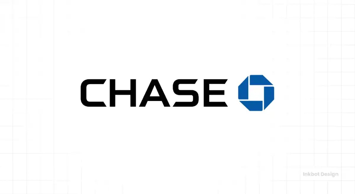
The Chase octagon is one of the oldest abstract corporate marks still in daily use, designed in 1961 by Chermayeff & Geismar for Chase Manhattan Bank — one of the first purely geometric logos adopted by a major American institution at a time when banks favoured eagles and classical seals.
The four wedges framing a central square were never officially “about” anything, which is precisely the point: it was abstraction as confidence, a bank declaring it no longer needed a literal symbol of trust.
The mark has outlived the bank it was designed for, several mergers, and sixty years of design fashion, precisely because it committed to nothing trend-dependent.
2. Visa
Visa's identity is a case study in the risk of over-simplification.
For decades, the mark carried its blue-and-gold flag device, with the gold band evoking a horizon or the colours of the Californian brand's origins. The 2006 redesign stripped that away to a plain blue wordmark, and in 2014, the gold returned only as a small underscore.
Visa essentially bet that its name alone now carried enough recognition to survive without a symbol — a bet only a brand with near-universal exposure can safely make. The current mark is deliberately unremarkable, and that is a strategic choice rather than a failure of imagination.
3. Mastercard
Mastercard’s overlapping red and yellow circles show how a famous logo can become independent of its wordmark.
The circles date to 1968; Pentagram and Michael Bierut refined the interlock in 2016, and Mastercard removed its name in 2019 after research reportedly showed that most consumers recognised the brand without it.
Research reportedly showed the majority of consumers recognised the brand without the wordmark, which is the only justification for such a move.
4. American Express
American Express deliberately went the opposite way to Visa and Mastercard, and that contrast is the interesting part.
The blue box logo, introduced in 1974 and designed by Lippincott & Margulies, was extracted from the layout of the physical charge card itself — the identity emerged from the product rather than being applied to it.
The centurion, or “the Roman” as the staff called it, adds a heritage cue that Visa and Mastercard entirely lack. Amex's strategy was never mass ubiquity; it was premium positioning, and the blue box reads as more exclusive precisely because it is less omnipresent.
5. PayPal
PayPal's mark tracks the entire arc of digital-first branding.
The original two-tone “PayPal” wordmark used overlapping P's in light and dark blue, suggesting the double-P of the name and, loosely, the two parties in a transaction.
The 2014 redesign by fuseproject tilted the letterforms into italic to imply motion and momentum — money moving — and introduced a standalone “PP” monogram for app icons, acknowledging that the brand now lived primarily as a tile on a phone screen.
That monogram is the strategically significant element: PayPal recognised early that a payments brand in the smartphone era needs an identity that functions at favicon scale, detached from its full name.
6. HSBC
HSBC's hexagon is one of the smartest translations of heritage into modern banking.
The mark derives from the Hongkong and Shanghai Banking Corporation's 1983 house flag, itself based on the Scottish St Andrew's Cross — a nod to the bank's Scottish founder, Thomas Sutherland.
Designer Henry Steiner took that flag and abstracted it into the red-and-white hexagonal device, converting colonial-era maritime heritage into a clean geometric mark that reads instantly across dozens of countries and scripts.
That cross-cultural legibility is the whole achievement: HSBC operates in markets using entirely different alphabets, so a symbol that carries meaning without language is not decoration but infrastructure.
7. Allianz
Allianz owns one of the most quietly effective marks in global finance, and almost nobody notices the design because it works so smoothly.
The three vertical bars enclosed in a rounded form — introduced in its modern version in 1999 and refined since — read as an abstracted eagle, a nod to the company's original 1923 eagle emblem, radically simplified.
That evolution from an ornate literal eagle to three clean strokes is a masterclass in how heritage marks should modernise: keep the underlying idea, discard the illustration. The Allianz blue is deeply owned across European markets.
8. AXA
AXA's identity is defined by a single strategic decision: the name itself was invented to be pronounceable in any language.
The palindromic, three-letter name works equally well across French-, English-, Mandarin-, and Arabic-speaking markets — the branding intelligence lies in the naming, and the logo simply houses it.
The current mark pairs the bold AXA wordmark with a red slash, added to inject motion and warmth into an otherwise austere set of letters. That red diagonal is the whole personality of the mark; without it, AXA would read as coldly as its insurance-industry peers.
9. Bank of China
Bank of China owns arguably the most elegant of the Chinese banking marks, designed in 1980 by the renowned Hong Kong designer Kan Tai-keung.
The red symbol depicts an ancient Chinese coin — round with a square hole — overlaid with a vertical line through the centre, forming the character 中 (zhōng, “middle” or “central,” as in the name of China itself).
In a single stroke, the mark unites currency, the country's name, and a sense of centrality and stability.
10. Santander
Santander's flame is one of European banking's most recognisable assets, and its evolution tells a clear story of modernisation.
The mark originates from an old handshake emblem — two hands meeting — that, over successive redesigns, was abstracted into the swooping red “flame” or “S” form now used globally.
The 2018 refresh by Interbrand flattened and simplified it for digital, tightening the curve so it holds up as an app icon and animates cleanly.
Santander red is among the most ownable colours in European finance, deployed with unusual discipline across every market in which the bank operates.
Energy, Oil, Gas & Utilities
11. Saudi Aramco
Saudi Aramco's identity is defined by its restraint relative to its scale — the world's most profitable company uses a mark of deliberate corporate calm.
The four-pointed star, or “energy burst,” device, paired with the wordmark in green and blue, signals a modern, diversified energy company rather than a traditional oil giant.
Green is a loaded choice for a fossil-fuel company, and its use here is a positioning statement: Aramco framing itself around energy and technology broadly rather than crude specifically.
12. Shell
The Shell pecten is one of the oldest and most valuable logos in the world, and its history is genuinely fascinating.
The company used a literal scallop shell from 1904, reportedly because an early associate of the founder's family imported shells — the name and symbol have a real, if humble, origin story rather than a designed one.
The mark's defining moment came in 1971, when Raymond Loewy, the legendary industrial designer, radically simplified the pecten into the bold red-and-yellow form still used today.
Loewy's version removed nearly all detail, anticipating the small-scale, high-speed recognition that petrol-station signage demands. That 1971 redesign has barely changed in over fifty years, which is the point: Loewy designed for durability, not fashion.
13. Chevron
Chevron's mark is one of the most literal name-symbol alignments in the energy sector: the brand is called Chevron, and its logo is a chevron — the red-and-blue V-shaped stripe device in use since the 1930s and refined over the decades.
That tight coupling between name and mark is a genuine strength, and it aligns with research showing that a strong semantic link between a brand's name and its logo improves recall and recognition.
When the word and the image reinforce each other, each mention strengthens both.
14. BP
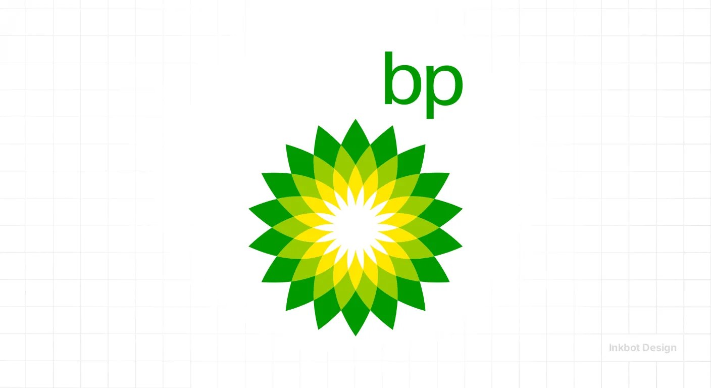
BP owns the most controversial rebrand in energy-industry history, and it is essential viewing for any firm.
In 2000, BP replaced its traditional green-and-yellow shield with the “Helios” mark — a green-and-yellow sunburst named after the Greek sun god — in a £4.6 million (reported) rebrand by Landor, repositioning the company around “Beyond Petroleum” and renewable energy.
As a piece of design, Helios is genuinely accomplished: a warm, radial, almost floral mark that deliberately looks nothing like an oil company.
As a strategic decision, it became a cautionary tale. After the 2010 Deepwater Horizon disaster, the sunny green identity was widely mocked as greenwashing, and the gap between the mark's environmental promise and the company's reality became a liability.
15. TotalEnergies
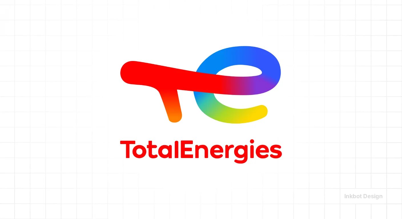
TotalEnergies executed a substantial 2021 rebrand that is worth studying as a deliberate shift in positioning.
The French energy company, renamed from “Total” to “TotalEnergies” and replaced its blue-white-red mark with a multicoloured device made of overlapping coloured strokes — red, orange, yellow, green, and blue — explicitly signalling a move from oil toward diversified energy, including renewables.
The multicoloured mark is a direct visual argument: the range of colours stands for the range of energy sources.
16. PetroChina
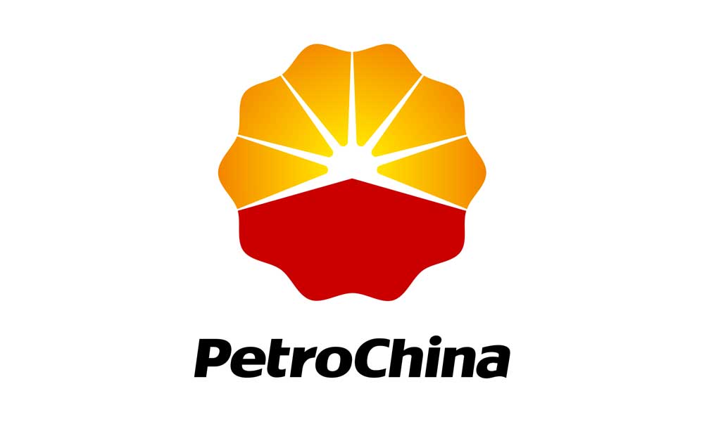
PetroChina's mark features a stylised device combining a sun and a petal or flower form in red, orange, and yellow, suggesting energy, warmth, and growth.
As one of Asia's largest oil producers, it has an identity built for institutional and governmental audiences rather than consumers, so the mark prioritises a sense of scale and national significance over personality.
The warm palette softens what is otherwise a heavy-industry brand, and the sun motif — common across energy companies as varied as BP and PetroChina — reflects a category-wide instinct to associate with light and energy rather than extraction.
17. Equinor
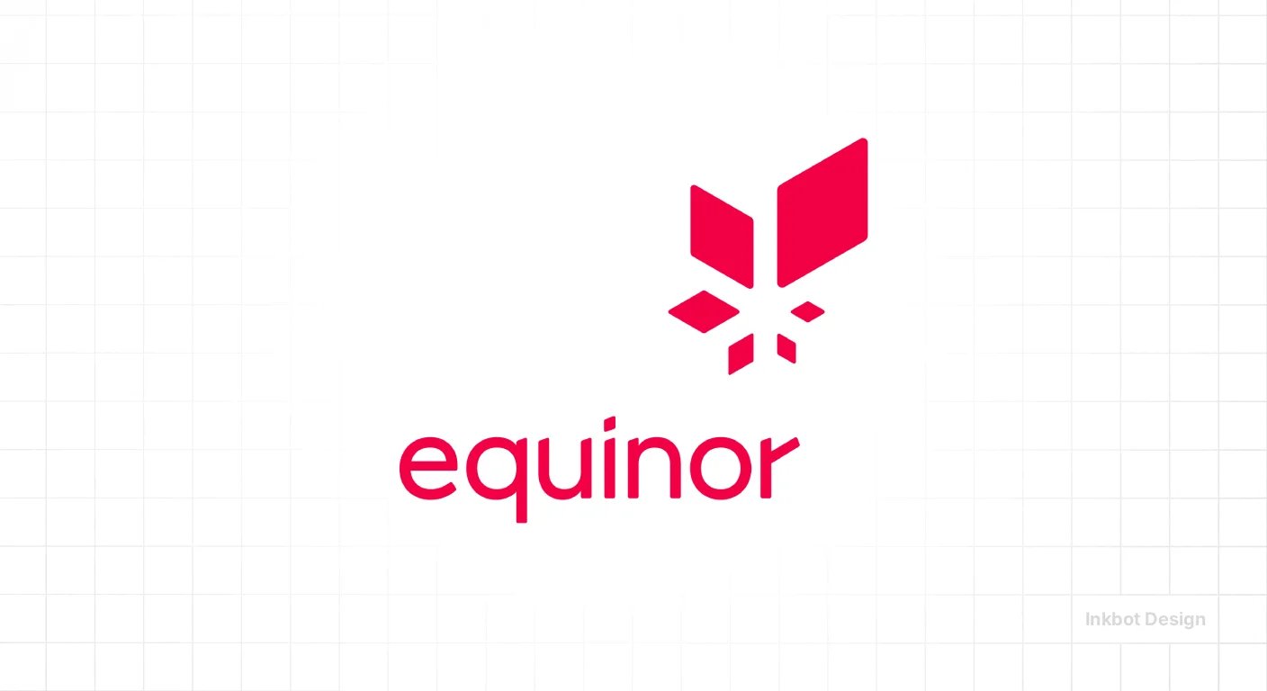
Equinor represents one of the cleanest strategic rebrands in the energy sector. In 2018, Norway's Statoil renamed to Equinor — dropping “oil” from its name entirely — to reflect its transition toward a broader energy portfolio including offshore wind.
The new name fuses “equi” (as in equilibrium, equality) with “nor” (for Norway), and the accompanying mark uses a distinctive red-to-warm gradient star device.
Removing “oil” from an oil company's name is a bold, legible signal of intent, and unlike BP's approach, Equinor changed the name itself rather than just the tagline, making the commitment harder to dismiss as spin.
The star mark conveys Nordic clarity, and the warm gradient adds a contemporary, digitally friendly quality.
18. ENI
ENI owns one of the most charming and unusual logos in global energy: the “six-legged dog,” a black canine breathing fire, originally introduced in 1952 following a design competition.
The mythological, fire-breathing hound is gloriously strange for a corporate oil company — a piece of mid-century Italian design personality that most energy giants would sand away in a modernisation.
ENI has instead kept it, refining the mark over the decades while preserving its distinctive character.
19. ADNOC
The Abu Dhabi National Oil Company uses a mark whose most interesting feature is its typographic ambition.
ADNOC's identity is built around a bespoke wordmark that works bilingually in both Latin and Arabic scripts, with the two versions designed to feel like a single coherent brand across languages.
That bilingual consistency is a serious design achievement — matching the weight, rhythm, and character of Arabic and Latin letterforms so neither feels like an afterthought is genuinely difficult, and essential for a brand operating between Gulf and international markets.
The blue palette signals corporate modernity and moves the brand away from traditional oil imagery.
20. Gazprom
Gazprom's mark features a stylised blue flame emerging from the letter “G” or a torch-like form, directly representing natural gas — the company's core product — in a literal and legible way.
The blue palette reinforces the gas association (the blue flame of burning natural gas) and gives the Russian energy giant a cool, industrial identity.
The flame device is a clear example of a mark that describes what the company does, which aids immediate comprehension at the cost of distinctiveness, since flame imagery is common across the energy sector.
Retail & E-commerce
21. Walmart
Walmart's 2008 rebrand, by Lippincott, replaced the boxy blue serif and hyphen with a warmer lowercase wordmark and the yellow “spark” — a six-pointed sunburst that vaguely echoes the star that once separated “Wal-Mart.”
The spark's job was to soften a retailer with an image problem, trading corporate coldness for approachability. It works because it is a single ownable graphic asset that detaches cleanly for app icons and signage.
Walmart ranked seventh globally in Brand Finance's 2026 study, which the mark did not cause but comfortably supports.
22. Amazon
The Amazon smile-arrow, introduced in 2000, is the most-cited “clever logo” in existence — the arrow runs from A to Z (we sell everything) and doubles as a smile.
The trivia is real, but the reason it works is exposure, not wit.
The arrow is a detachable asset appearing on boxes, vans, and app tiles worldwide, and it functions perfectly at any scale.
Amazon remains one of the world's most valuable brands across every major ranking.
23. The Home Depot
The Home Depot's orange square with its stencilled, all-caps wordmark is one of retail's most ownable colour plays.
Home Depot orange is deployed with total discipline across warehouses, aprons, signage, and trucks, and the colour alone triggers recognition before the words are read.
The stencil typeface reinforces the utilitarian, trade-focused identity — this is a store for builders, and the mark looks like it belongs on a job site.
The square container also makes it work as a modern app tile. The lesson is the power of a single relentlessly enforced colour: Home Depot owns orange in its category the way few brands own any colour anywhere.
24. Alibaba
Alibaba's mark pairs an orange wordmark with a smiling face device that suggests both a friendly figure and the letter “a.”
The smile is deliberate warmth for a B2B and B2C marketplace giant, humanising an enormous e-commerce operation.
Orange carries energy and approachability, differentiating Alibaba from the cooler palettes of Western tech.
The face motif also nods to the “open sesame” storytelling of the Alibaba name — a brand built around a recognisable narrative rather than an abstract coinage.
The interesting element is how the name's built-in story gives the identity a warmth that invented tech names lack, letting the logo lean into character rather than pure abstraction.
25. IKEA
IKEA's blue-and-yellow logo — the wordmark in a yellow oval on blue — is a direct, unmissable tribute to the Swedish flag, anchoring the brand's national identity as a core asset.
That heritage cue is strategic: “Swedish” signals affordable, well-designed, democratic furniture, and the colours carry that association before a word is read.
The mark has stayed remarkably stable for decades, and its consistency across dozens of countries is the point. IKEA is instantly recognisable in any market, despite selling to wildly different cultures.
The lesson: a genuine heritage signal, committed to completely and never diluted, becomes a durable shorthand for an entire brand promise.
26. Tesco
Tesco's wordmark with its red reflection and blue underscore stripes is one of British retail's most familiar marks.
The identity is functional and approachable rather than clever — bold, legible, and warm, designed for mass-market trust across thousands of UK stores.
The slight reflection beneath the letters adds a small, distinctive touch without complicating the mark.
For a UK professional-services audience, Tesco is a locally resonant example of how a straightforward, consistently applied wordmark builds enormous recognition through ubiquity alone.
There is no hidden meaning to find; the brand's strength is decades of presence on high streets. Familiarity, not ingenuity, is what makes Tesco's mark work.
27. Target
Target's bullseye is one of the purest examples of a logo that also serves as the brand name made visual.
The red concentric circles literally depict a target, aligning name and mark completely — every viewing reinforces both at once, exactly the semantic linkage research shows aids recall.
The bullseye is simple enough to work at any scale and distinctive enough that Target eventually dropped the wordmark from much of its branding, trusting the symbol alone. Red is owned with discipline.
The lesson: when a name can be shown as a simple, ownable image, the resulting mark compounds recognition faster than a name and symbol that must be learned separately.
28. Aldi
Aldi's mark — the stylised “A” with its arcing stripes in blue, orange, red, and the darker later versions — reads as bold, geometric, and confident, a discounter that wants to feel modern rather than cheap.
The 2017 refresh added depth and gradient to the arcs, signalling that Aldi was moving upmarket in perception without abandoning its value core.
The interesting element is this deliberate shift in perception: Aldi used a logo update to reposition itself from “budget” to “smart choice,” softening the stigma of the discounter.
29. 7-Eleven
7-Eleven's logo — the green-and-orange “7” with “ELEVEN” running vertically through it — is a wonderfully odd piece of mid-century design that persists because changing it would destroy decades of equity.
The trademarked lowercase “n” in “ELEVEn” is a famous quirk nobody has ever fully explained, and the brand simply kept it. The clashing green, orange, and red palette should not work, yet it is unmistakably 7-Eleven.
30. Nike
The Nike Swoosh proves that a simple, famous logo gains value through repeated exposure, not simplicity alone.
Carolyn Davidson designed the motion-suggesting mark in 1971 for a reported $35; decades of global use then made it recognisable enough for Nike to remove the wordmark.
A firm copying “simple like Nike” misses the point entirely. The Swoosh is not valuable because it is simple; it is valuable because it was shown relentlessly.
Technology, Software & Semiconductors
31. Apple
The Apple logo's most instructive feature is the bite.
Apple’s bitten-apple logo shows why small-size legibility is central to logo recognition.
Rob Janoff designed the bite in 1977 partly to keep the silhouette from reading as a cherry at small sizes; Apple’s 1998 shift from rainbow stripes to monochrome made the mark more versatile across products and finishes.
Apple is now so recognised that the mark needs no wordmark and no colour. It is the definitive interface-era logo: it works embossed on aluminium, glowing on a laptop lid, or as a favicon. Distinctiveness plus total exposure, refined over decades.
32. Microsoft
Microsoft's 2012 logo introduced the four-colour window grid alongside the wordmark — the company's first symbol in twenty-five years, arriving as it moved into hardware and tiles-based interfaces.
The four squares in red, green, blue, and yellow reference Windows without being literal, and they animate and tile beautifully across digital surfaces.
The mark is deliberately calm and grown-up, matching Microsoft's enterprise credibility.
What makes it interesting is timing: Microsoft added a symbol precisely when its products became interface-first and needed an app-tile-friendly asset. For a firm, it shows that identity needs follow product reality — the mark arrived when the business actually needed a scalable symbol.
33. Google
Google's 2015 rebrand replaced its serif wordmark with a custom geometric sans-serif, “Product Sans,” and introduced the four-dot “G” — all engineered for the small screen.
The serif logo looked dated and rendered poorly at tiny sizes; the new sans-serif is cleaner, loads faster, and holds up as a favicon and app icon.
The playful primary colours were retained because they are among Google's most ownable assets, with the deliberate odd green “L” breaking the pattern to signal Google doesn't follow rules.
This is the interface-first principle stated plainly: Google rebuilt its identity around how people actually encountered it, which, by 2015, was overwhelmingly on phones.
34. NVIDIA
NVIDIA’s green “eye” logo demonstrates that a B2B logo can become widely recognisable through relevance and repeated visibility rather than redesign.
In 2026, the unchanged mark accompanied NVIDIA’s brand value, which more than doubled to US$184.3 billion as the company became associated with generative AI infrastructure.
The logo did not change to earn this; exposure did. NVIDIA is the article's key contemporary proof that a B2B mark can reach mass salience without a redesign, purely by becoming culturally attached to an economic shift.
Recognition followed relevance. The mark simply appeared everywhere the AI era was being built.
35. Samsung
Samsung's wordmark — plain blue capitals, no symbol since it dropped the tilted-ellipse device from prominent use — is a study in the power of a single word consistently applied.
Samsung deliberately relies on the name alone, letting decades of product presence carry recognition rather than a graphic mark.
The blue signals corporate trust and technological competence. The interesting point is confidence: Samsung, like several giants, concluded its name is now a stronger asset than any symbol could be, so the logo gets out of the way.
For a firm, it reinforces that once a name carries enough weight, a plain, disciplined wordmark is a legitimate strategic choice, not a lack of ambition.
36. Oracle
Oracle's wordmark — bold red capitals — is one of enterprise software's most stable identities, unchanged in its essentials for decades.
There is no symbol and no cleverness, which is exactly right for a company selling databases and infrastructure to institutions that value permanence over personality.
Oracle red is ownable and confident. The mark's refusal to evolve is itself a signal: this is a company that has been mission-critical for a generation and intends to remain so.
For a B2B professional-services firm, Oracle is a clean example of how enterprise buyers are reassured by consistency and weight, and how resisting the urge to redesign can be a strength.
37. IBM
Paul Rand's 1972 IBM logo — the eight-bar striped wordmark — is one of the most revered pieces of corporate design ever made.
The horizontal stripes originally solved a practical problem, unifying the three bold letters and suggesting speed and dynamism, while also improving reproduction on the printing technology of the era. “Big Blue” owns its colour completely.
The mark has endured for over fifty years with only refinements, a testament to Rand's rigour.
The lesson is durability through principle: Rand designed a system, not a fashion, and it has outlasted every design trend since. IBM proves that great structural thinking produces marks that simply do not date.
38. Cisco
Cisco's logo cleverly encodes its origin: the vertical-bar device represents both a digital signal or soundwave and the towers of the Golden Gate Bridge, referencing the company's San Francisco birthplace (Cisco is short for San Francisco).
That double meaning — connectivity and geographic heritage — packs real narrative into a simple set of bars. The blue palette signals trust in enterprise networking. The mark reduced its bars across successive refreshes to improve digital rendering.
39. Adobe
Adobe's red “A” — a bold, angular capital in a red container — is one of software's most recognisable marks, and its 2020 refresh simplified the letterform for cleaner scaling across its now-vast product suite.
The angular “A” reads as strong and premium, aligning with research linking angular forms to perceptions of strength and quality.
Adobe red is deeply owned across Creative Cloud. The interesting challenge Adobe faces is its architecture: with dozens of products, each needing its own icon, the parent “A” must anchor the whole system.
The mark works because it is simple and distinctive enough to sit above a colourful family of app icons without competing with them.
40. Intel
Intel's 2020 rebrand modernised the famous “Intel Inside” heritage into a cleaner, contemporary wordmark, dropping the swoosh-encircled lowercase “intel” of previous eras for a bolder, more confident set of letters.
The redesign kept Intel blue while making the mark more flexible for digital and motion. The company branded a component that buyers never saw, turning an invisible chip into a consumer-trust signal via the sticker on every laptop.
That ingredient-branding strategy is one of the great B2B marketing moves. The logo modernisation reflects a company confident enough in its name to simplify around it.
Healthcare, Pharmaceuticals & Health Insurance
41. UnitedHealthcare
UnitedHealthcare ranked 24th in Brand Finance's Global 500 2026 — one of the very few healthcare brands to appear so high in a cross-industry ranking.
The mark pairs a blue wordmark with an abstract human-figure device, suggesting people and care. The design is deliberately calm and institutional, built to reassure rather than excite, because health insurance sells peace of mind to anxious buyers.
The interesting point is what its ranking reveals: healthcare brands rarely reach this altitude in cross-sector value tables, so UnitedHealthcare's position reflects the sheer scale of US health insurance more than any design distinction.
Value from market position, not from a memorable mark.
42. CVS Health
CVS Health's logo — the bold red “CVS” wordmark with “Health” appended — reflects a deliberate strategic repositioning from a pharmacy chain to a broader healthcare company.
Adding “Health” to the name signalled the shift as clearly as any visual change could.
The red heart used in some brand applications reinforces care and well-being. The mark itself is functional and legible rather than clever, built for thousands of storefronts and app tiles.
The interesting element is the name-led repositioning: CVS changed how it is perceived less through logo redesign than through the word “Health,” proving that a naming decision can carry a strategic shift more forcefully than a graphic one.
43. Cigna
Cigna's 2011 rebrand introduced the “Tree of Life” mark — a stylised tree in warm colours — replacing a cooler, more corporate identity with something intended to feel human and vital.
The tree signals growth, life, and well-being, a deliberate softening for a health-services company that wants to feel less like an insurer and more like a partner in health.
The warm orange-and-green palette breaks from the blue that dominates the category, aiding distinctiveness. In a sea of cool corporate marks, a warm tree stands out and reads as more human.
44. Pfizer
Pfizer's 2021 rebrand, its first major logo change in around 70 years, was significant precisely because of that longevity.
The old mark placed the wordmark in a blue oval “pill”; the new identity split into a two-tone blue wordmark paired with a DNA-helix-derived device, deliberately shifting the brand from “pills” toward “science.”
The redesign, arriving as Pfizer became globally prominent, repositioned the company around breakthrough science rather than pharmaceutical products.
The interesting point is the timing and intent: Pfizer used the redesign to claim a scientific, research-led identity at the exact moment the world was watching. A 70-year-old mark changed to tell a different story about what the company is.
45. Johnson & Johnson
Johnson & Johnson's flowing red script — based on the signature of one of the founding brothers — is one of the oldest logos in continuous use, dating to the 1880s.
The handwritten script signals heritage, trust, and human care, and its longevity is the entire lesson: a mark rooted in a genuine signature carries authenticity that no designed wordmark can replicate.
J&J's 2023 refresh modernised the script slightly while preserving its essential character, updating for digital without discarding 140 years of equity.
The interesting element is the durability of a signature-based mark. Because it is a real person's hand, it feels human and honest in a way that abstract corporate logos cannot.
46. Novartis
Novartis's mark features a stylised flame or torch-like device alongside the blue wordmark, symbolising light, hope, and the “new arts” or “new skills” embedded in the name's Latin roots.
The device suggests aspiration and healing, softening the pharmaceutical company's clinical nature. Novartis blue keeps it firmly in the trusted-science category.
The interesting element is the name's own meaning informing the mark — “Novartis” derives from Latin for “new skills,” and the flame device visually reinforces that idea of illuminating, forward progress.
When a coined name carries genuine meaning, the logo can amplify it, giving the identity a coherence that a purely arbitrary name paired with an unrelated symbol would never achieve.
47. Merck
Merck's identity carries one of branding's stranger complications: the company operates as “Merck” in the US and Canada but “MSD” everywhere else, following the split of the original German Merck after the First World War.
The German Merck and the American Merck are now separate companies, both claiming the name in different territories.
The current American Merck mark is a clean teal-and-green wordmark signalling modern, research-led medicine.
Merck must manage a divided brand identity across geographies, running two names for one company depending on jurisdiction — a live illustration of how heritage, trademark law, and international borders can fracture a single brand into two faces.
48. Eli Lilly
Eli Lilly's red cursive wordmark — based on the founder's signature-style script — is another heritage signature mark, like Johnson & Johnson, signalling authenticity and long-standing trust.
The flowing red letters have anchored the company for generations, and their persistence is the point: a script derived from a real founder feels personal and established in a way a designed wordmark cannot.
Lilly red is ownable within pharma's blue-dominated field. The interesting element, shared with J&J, is how signature-based marks convert a company's actual history into a durable asset.
Because the script traces back to a real person, it carries an implicit promise of accountability that resonates in a trust-dependent category.
49. AstraZeneca
AstraZeneca's mark pairs its wordmark with a stylised, ribbon-like “A” device in purple and gold tones, giving it a slightly warmer, more distinctive palette than the standard pharma blue.
The flowing device suggests movement and science, and the purple is unusually ownable for the category. AstraZeneca gained enormous global recognition in the early 2020s, and its identity had to carry that sudden visibility.
By avoiding the default clinical blue in favour of purple and gold, AstraZeneca built a more separable identity, which paid off when global attention arrived.
A distinctive colour choice made before prominence meant the brand was already visually ownable when recognition surged.
50. GSK
GSK's 2022 rebrand simplified GlaxoSmithKline to the “GSK” initialism paired with an energetic orange-to-yellow gradient device suggesting movement and vitality.
The shift to the shorter GSK acknowledged that the full name was cumbersome, while the vivid gradient signalled a modern, human, forward-looking health company. The bold colour is a deliberate break from pharma's clinical blue.
GlaxoSmithKline was the product of mergers, and reducing it to GSK made the brand faster to say, easier to render, and cleaner as an app asset.
Paired with a striking gradient, it repositioned a merger-built giant as a single, energetic, contemporary brand.
Automotive & Mobility
51. Toyota
Toyota was sixth in Interbrand's 2025 Best Global Brands ranking.
Its three-ellipse emblem, introduced in 1989, is cleverer than it appears: the two overlapping inner ovals represent the heart of the customer and the heart of the product, while the surrounding ellipse represents the world embracing Toyota — and, famously, every letter of “TOYOTA” can be found within the overlapping curves.
The mark reads instantly as a badge on a grille and scales to a favicon. The interesting element is the layered meaning executed with such geometric restraint that none of it clutters the form.
Toyota packed relationship, product, and global reach into three ovals that still work as a clean, badge-first mark.
52. Mercedes-Benz
The Mercedes three-pointed star, dating to 1909, is among the most recognised symbols on earth, representing the company's ambition to motorise land, sea, and air.
Mercedes-Benz is placed in Interbrand's 2025 top 20.
The star's genius is total reducibility: three points in a ring work as a hood ornament, a grille badge, an app icon, or a single embossed shape, at any size, in any material. It needs no wordmark.
The interesting element is how a symbol conceived over a century ago, for an ambition (sea and air travel) the company never fully pursued, became a pure abstract asset whose original meaning is irrelevant to its recognition.
Exposure long ago replaced explanation.
53. BMW
BMW's roundel, in blue and white quarters, is almost universally believed to represent a spinning aircraft propeller — a myth BMW itself encouraged, tied to its aero-engine origins.
The blue and white are, in fact, the colours of Bavaria, the company's home state, and the roundel is derived from the earlier Rapp Motorenwerke logo.
The interesting element is the durability of the propeller myth: a false origin story became so widely believed that it functions as brand folklore, adding romance the mark never intended.
The truth — Bavarian heritage colours — is prosaic, but the myth demonstrates how narratives attach themselves to famous marks regardless of accuracy.
54. Tesla
Elon Musk often explains Tesla's “T” emblem as a cross-section of an electric motor, the stem and top representing the rotor and stator poles.
Whether or not that reading is retrofitted, the stylised “T” works cleanly as a badge and a digital icon, and its sleek, minimal form matches Tesla's tech-forward positioning far better than a traditional automotive crest would.
The interesting element is how deliberately un-car-like the mark is — no wreath, no heraldry, no chrome tradition.
Tesla's identity signals “technology company that makes cars,” and the minimalist “T” reinforces that framing. The mark aligns the brand with Silicon Valley rather than Detroit, exactly as intended.
55. Volkswagen
Volkswagen's 2019 rebrand flattened its iconic VW roundel into a thinner, two-dimensional, digital-first version, part of a strategic pivot toward electric vehicles and a cleaner corporate image after the emissions scandal.
The redesign removed the chrome depth and gradients, optimising the mark for screens, animation, and app tiles.
The stacked “V over W” monogram remains one of the most efficient in automotive — two letters that interlock perfectly.
VW used the flattening not just for digital practicality but as a visible reset, a fresh, simplified face to signal a new era. A logo redesign served as a public statement of change after reputational damage.
56. Porsche
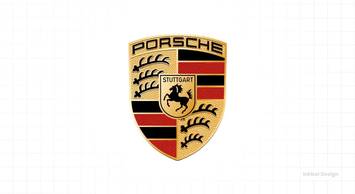
The Porsche crest is the most heraldic mark in mainstream automotive — a complex coat of arms incorporating the Stuttgart horse and the black-and-red antlers and stripes of the Württemberg-Hohenzollern region.
It is deliberately intricate, everything modern logo advice warns against, and it works precisely because of that. The crest signals heritage, craftsmanship, and pedigree, exactly what a luxury sports-car buyer wants.
While most brands simplify, Porsche's ornate crest is an asset because its intricacy signals heritage and authenticity in the luxury category. A simplified Porsche badge would forfeit the very sense of legacy that justifies the price.
57. Audi
Audi's four interlocking rings represent the 1932 merger of four car manufacturers — Audi, DKW, Horch, and Wanderer — into Auto Union.
The mark is a rare case of a logo directly depicting corporate history: four companies, four rings, linked. Audi's 2022 refresh flattened the rings into a clean, two-dimensional form for digital use.
The interesting element, noted in the brief's own competitor research, is the trademark dispute with the Olympic Committee over the interlocking-rings resemblance.
The rings work as a badge and a favicon and carry genuine historical meaning. Still, they also illustrate a risk: interlocking-circle marks are common enough that distinctiveness and legal clearance can collide. Heritage meaning does not guarantee uncontested ownership.
58. Ford
The Ford “Blue Oval” with its flowing script dates in its recognisable form to the early 20th century, the script based on the handwriting style of an early Ford engineer, Childe Harold Wills.
It is a signature heritage mark like Johnson & Johnson's, with over a century of continuity.
Ford Blue is deeply owned. The mark has been refined but never fundamentally changed, and that stability is the asset.
The interesting element is the endurance of the cursive script in an era of flat sans-serif wordmarks — Ford has resisted modernising away the handwriting because it is inseparable from the brand's identity.
The Blue Oval proves that heritage consistency can outvalue contemporary polish.
59. Honda
Honda's “H” emblem — a clean, trapezoidal capital H — is a model of restraint, a simple monogram that scales flawlessly as a grille badge and a digital icon.
There is no hidden meaning and no ornament; the mark's strength is pure legibility and consistency across an enormous range of products, from cars to motorcycles to power equipment.
The interesting element is how a plain monogram serves a diversified company better than a specific symbol would. Because Honda makes far more than cars, an abstract “H” works across all categories without implying any one in particular.
Simplicity here is strategic breadth: the mark fits everything Honda builds, precisely because it commits to nothing specific.
60. Ferrari
The Ferrari “Prancing Horse” — the black stallion on a yellow shield — carries one of automotive's most romantic origin stories: it derives from the emblem painted on the plane of Francesco Baracca, a First World War Italian flying ace, which the aviator's mother gifted to Enzo Ferrari for luck.
The yellow background is the colour of Modena, Ferrari's home city.
The Prancing Horse is among the most valuable logos per unit of exposure on earth, proof that a real, resonant origin story compounds a mark's power.
Industrial Manufacturing & Engineering
61. Siemens
Siemens uses one of the purest wordmark identities in the global industry — the name in a clean, custom sans-serif, in a distinctive teal-leaning blue, with no symbol at all.
For a 175-year-old conglomerate spanning energy, healthcare, and automation, the wordmark's job is to hold an enormous, diversified business under one confident, legible name.
The restraint is strategic: a specific symbol would imply a specific business, and Siemens does too many things for that. The interesting element is how a pure wordmark becomes the right answer for a sprawling conglomerate — with no single product to depict, the disciplined name itself, consistently applied across every division, is what unifies the whole enterprise.
62. General Electric
The GE monogram — the ornate script “GE” inside a circle, sometimes called the “GE meatball” — dates in essence to the 1890s and is one of the oldest continuously used logos in the world.
The flowing cursive letters inside the roundel signal heritage, trust, and American industrial legacy. As GE has broken itself into separate companies, the monogram's fate has become a live question of who inherits the equity.
A decorative Victorian-era script has survived over 130 years and countless design revolutions, precisely because its accumulated recognition made it too valuable to abandon. The “meatball” is heritage rendered untouchable by exposure.
63. Caterpillar
Caterpillar's identity centres on the bold “CAT” wordmark with its yellow triangle beneath the “A,” a mark engineered for rugged, high-visibility application across heavy machinery.
The black-and-yellow palette is deeply ownable and functionally chosen — yellow signals caution and equipment visibility on job sites, so the brand colour is inseparable from the product context. The triangle under the “A” adds a distinctive, stable graphic anchor.
Caterpillar's yellow is the colour of its machines, so the brand and the equipment reinforce each other on every construction site. The mark looks like where its products work — utilitarian, tough, and impossible to miss.
64. 3M
3M's logo is a masterclass in simplicity: the two bold red characters “3M,” redesigned by Siegel+Gale in 1978 into the compact, heavy form still used today.
For a company with tens of thousands of products across wildly different categories, the mark could not depict anything specific, so it depicts nothing but the name.
The red is confident and ownable.
The interesting element is how radical simplification became the only viable solution for extreme diversification — from Post-it notes to industrial adhesives to healthcare, no symbol could represent 3M's range, so a bold, abstract wordmark is the sole unifier. Simplicity here is not aesthetic preference but structural necessity.
65. Bosch
Bosch's mark pairs its red wordmark with the distinctive circular “anchor” or armature symbol — a device derived from a magneto armature, referencing the company's origins in automotive ignition technology.
The circular emblem, dating in concept to the early 20th century, gives Bosch a genuine heritage asset tied to its founding engineering.
The red-and-grey palette is industrial and trustworthy. The interesting element is the armature's origin: the abstract circular device actually depicts a real early product component, so the mark carries authentic engineering heritage rather than arbitrary geometry.
For an industrial brand, a symbol rooted in the company's founding technology reads as more credible than an invented shape, tying identity directly to competence.
66. Mitsubishi Electric
Mitsubishi Electric uses the famous “three diamonds” mark shared across the broader Mitsubishi group — three rhombuses arranged in a triangular red emblem, one of Japan's most recognisable corporate symbols, dating to the 1870s.
The three diamonds derive from combining the founder's family crest with the three-leaf crest of a feudal lord.
Like several enduring logos, it distils authentic historical family crests into a clean geometric form, and the name “Mitsubishi” itself means “three diamonds” — a perfect name-symbol alignment.
The mark carries 150 years of meaning while functioning as a simple, badge-ready geometric emblem across the group's companies.
67. Hitachi
Hitachi's wordmark — the name in a clean, bold, slightly custom sans-serif, often in red or a gradient — anchors another vast Japanese conglomerate.
The identity is deliberately simple and legible, prioritising the name across an enormous diversified business from infrastructure to electronics.
The “Inspire the Next” tagline has long accompanied it.
The interesting element, shared with Siemens and 3M, is the conglomerate wordmark pattern: companies spanning too many industries to depict any single one converge on disciplined, symbol-free name treatments.
Hitachi's strength is decades of consistent use of a straightforward wordmark, letting the name itself accumulate recognition that a specific symbol would inappropriately narrow to a single business line.
68. Komatsu
Komatsu's identity uses a bold blue wordmark, distinguishing the Japanese heavy-equipment maker from Caterpillar's dominant yellow.
The choice of blue is itself strategic — in a category where Caterpillar owns yellow so completely, Komatsu differentiates through colour, claiming a cooler, equally industrial but distinct identity.
The clean, heavy letterforms read as solid and reliable for construction and mining machinery.
The interesting element is the competitive colour positioning: when one brand owns a category's obvious colour, rivals must choose a different colour or blend.
Komatsu's blue is a deliberate counter to Caterpillar's yellow, ensuring the two industry giants are never confused on a job site where both machines operate side by side.
69. John Deere
John Deere's “leaping deer” emblem is one of the most beloved industrial logos, pairing a stylised deer with the iconic green-and-yellow palette.
The deer has evolved across versions — notably, older marks showed the deer landing, while modern versions show it leaping upward, a subtle shift toward aspiration and forward momentum. The green-and-yellow is deeply ingrained in agriculture.
The interesting element is the directional evolution: the deer's posture shifts from descending to rising, quietly encoding brand ambition, and the detail rewards those who notice, while the overall mark remains instantly recognisable.
John Deere shows how a heritage animal mark can be refined to signal progress without losing a shred of its equity.
70. Rolls-Royce
Rolls-Royce's interlocking double-“R” monogram is one of engineering's most prestigious marks, signalling craftsmanship and heritage across both the automotive marque and the separate aerospace and power business.
The overlapping Rs are elegant and restrained, and the mark famously changed from red to black lettering, commonly attributed to a desire for understated dignity.
The interesting element is the mark's association with engineering excellence at the highest tier — Rolls-Royce aerospace engines carry the same monogram prestige as the cars, so the identity signals uncompromising quality across entirely different products.
The double-R has become shorthand for the pinnacle of a category, a rare mark that elevates whatever it appears on.
Telecommunications & Communications Infrastructure
71. Verizon
Brand Finance's 2026 list placed Verizon at No. 16 across all industries.
Verizon's 2015 rebrand stripped its identity down to a plain black wordmark with a single red checkmark over the “z,” radically simplifying the previous logo's swooping red mark.
The checkmark is the sole ownable asset, functioning as a small tick of confidence and reliability.
Verizon reduced a busy legacy logo to near-nothing plus one small red gesture, betting that its name carried enough recognition to survive on simplicity.
For a firm, it demonstrates the discipline of subtraction — removing everything but the name and a single distinctive mark, which only saturation permits.
72. AT&T
Brand Finance's 2026 list placed AT&T at No. 25 across all industries.
AT&T's globe — the striped blue sphere originally designed by Saul Bass in 1983 for the reorganised company — is one of the great pieces of corporate design, evoking global connectivity through horizontal lines that wrap around a sphere.
The mark has been flattened and simplified over the decades for digital use, losing Bass's three-dimensional shading.
The globe was created by one of the 20th century's finest designers, and its underlying concept — lines of communication encircling the world — remains conceptually perfect for a telecoms company, even as later refreshes sanded away the original's depth.
73. T-Mobile
T-Mobile owns one of the most disciplined colour strategies in telecoms: magenta, so aggressively defended that T-Mobile's parent has pursued trademark action against other companies using similar shades of the colour.
The mark itself — the “T” and dots in magenta — is secondary to the colour, which does the real recognition work.
T-Mobile has effectively made magenta synonymous with the brand, to the point of treating the colour itself as intellectual property.
It is the clearest example on this list of a single-owned colour becoming more valuable and more recognisable than any logo shape the company could design.
74. Deutsche Telekom
Deutsche Telekom has been identified as the world's most valuable telecom brand.
Its identity is built around the magenta “T” flanked by grey square “digits,” a mark dating to the mid-1990s and shared with T-Mobile as part of the same corporate family.
The magenta is the group's signature colour. The interesting element is the systemic consistency: Deutsche Telekom built a flexible identity around a single letter and a single colour, then extended it across a family of “T-” brands worldwide.
The “T” plus dots works as a compact, ownable system, and its magenta anchors the world's most valuable telecom brand through relentless, disciplined application across every market.
75. BT
BT's identity, for a UK professional-services audience, is a familiar case study in repeated reinvention.
The former British Telecom has cycled through several marks — the “piper” figure, the flowing “connected world” globe of 2003, and more recent simplified versions.
Each redesign sought to modernise the image of a privatised former monopoly.
76. Orange
Orange's identity is the boldest name-colour alignment in telecoms: the company is called Orange, and its logo is a bright orange square containing the white wordmark.
Name and colour are the same concept, so every mention reinforces both — the strongest possible semantic linkage.
The simple square is endlessly reproducible across markets and surfaces.
By naming itself after a colour and then owning that colour completely, Orange created an identity where the brand name literally instructs the viewer what to see. It is almost impossible to think “Orange” without the colour, which is precisely the point.
77. China Mobile
China Mobile's mark features an interlocking, ribbon-like device suggesting connection and continuity, in a distinctive blue-green, for the world's largest mobile operator by subscribers.
The flowing linked form evokes network connectivity and seamless communication.
The interesting element is the visual metaphor of interconnection — like several telecoms marks, China Mobile reaches for imagery of linking, flow, and continuity, because the underlying product is the connection between people.
The ribbon device translates an abstract service into a graphic gesture of things joining together. For the largest carrier on earth, the mark prioritises a sense of vast, reliable, continuous network over any clever or ownable eccentricity.
78. China Telecom
China Telecom uses a mark built around a stylised blue device that suggests connectivity, wings, or Chinese character elements related to communication and networks.
As a major state telecommunications provider, its identity prioritises a sense of national scale and technological reliability—the blue signals trust and infrastructure.
The interesting element, seen across the large Chinese telecoms and banks, is the tendency toward marks that encode culturally specific meaning — character references and symbolic forms legible primarily to domestic audiences — rather than the abstract, globally oriented minimalism of Western carriers.
The mark is designed first for the market it serves, correctly prioritising domestic recognition over international design-blog approval.
79. NTT
NTT's mark — a dynamic, looping device suggesting movement and connection, in blue — represents one of the world's largest telecommunications companies.
The flowing form evokes a sense of communication flow and technological momentum. The blue palette is standard telecoms trust signalling.
NTT's identity must span data centres, mobile networks, and global IT services, so it favours an abstract, momentum-suggesting device that implies technology and progress without tying it to any specific service.
Like the industrial conglomerates, NTT needs a market broad enough to represent a business too diversified to be depicted literally.
80. Telefónica
Telefónica's identity has been notably fluid — the Spanish telecoms giant has used a distinctive mark built from dots and geometric forms that spell or suggest the “T,” in a palette leaning toward blue and green.
Telefónica has also operated consumer brands like Movistar and O2 separately.
Telefónica maintains a corporate identity while operating more consumer-facing brands beneath it, so the parent mark signals institutional scale to investors and partners, while the sub-brands convey consumer warmth.
This split, like Qualcomm's Snapdragon strategy, reflects a common structural choice — the parent projects credibility, the sub-brands do the emotional, market-facing work.
Consumer Goods, Food & Beverage
81. Coca-Cola
Coca-Cola and McDonald's remained in Interbrand's global top ten in 2025.
The Coca-Cola script — the Spencerian handwriting created in 1886 by bookkeeper Frank Robinson — is the single clearest proof of this article's thesis.
By any modern standard, it is not a well-designed logo: it is ornate, hard to reproduce cleanly at small sizes, and dated.
Yet it is among the most recognised marks on earth, because it has been shown, essentially unchanged, for nearly 140 years. Coca-Cola red is owned completely.
The lesson is unambiguous: the mark's fame is a function of relentless, consistent exposure across more than a century, not of design quality. Nobody would draw it that way today. It does not matter.
82. Pepsi
Pepsi's globe has been redesigned repeatedly, most notoriously in a 2008 refresh accompanied by a leaked agency document that used pseudo-scientific language and gravitational-field diagrams to justify the tilted white band — the design world's favourite example of overwrought rebrand rationalisation.
In 2023, Pepsi returned to a bolder, more retro globe with the wordmark restored across it. The interesting element is the contrast with Coca-Cola: where Coke's stability built unshakeable equity, Pepsi's frequent redesigns illustrate the cost of restlessness.
Each change resets some accumulated recognition. The 2023 return to a more classic look was, in effect, an admission that consistency and heritage were worth more than perpetual reinvention.
83. Nestlé
Nestlé's “bird's nest” logo — a mother bird feeding chicks in a nest — is a rare case of a logo that is a literal illustration of the founder's surname: “Nestlé” relates to the German word for a small nest, and founder Henri Nestlé used his family coat of arms.
The nest imagery signals nurturing, family, and care, perfectly suited to a food and nutrition company.
The interesting element is the name-symbol unity rooted in genuine heritage — the mark depicts the meaning of the founder's actual name, so symbol, name, and family history align completely.
Over time, the nest was simplified, but the core image endures because it is authentically, inseparably tied to who Nestlé is.
84. Unilever
Unilever's “U” logo, designed by Wolff Olins in 2004, is built from 25 smaller icons — a heart, a fish, a spoon, a hand — each representing an aspect of the company's brands and values, assembled into a single “U.”
It is one of the most conceptually dense corporate marks ever made. Like P&G, Unilever is a house of brands, so the corporate mark speaks to stakeholders rather than shoppers.
The interesting element is the density of meaning — 25 hidden symbols are far more than any viewer can decode, but the richness gives the mark texture and a story that a plain letter would lack. The “U” rewards examination while functioning as a clean whole.
85. L'Oréal
L'Oréal's wordmark — the name in clean, elegant capitals, often with “Paris” appended — trades entirely on typographic sophistication and the equity of “Paris” as a signal of beauty and luxury.
There is no symbol; the refinement lives in the letterforms and the association with the French cosmetic authority.
“L'Oréal Paris” uses the city as a borrowed credential, because Paris carries automatic associations of beauty and style that no designed symbol could manufacture.
The mark demonstrates how a place name can function as a distinctive asset in its own right, lending a brand inherited prestige simply through association with a location the audience already reveres.
86. McDonald's
McDonald's Golden Arches are so recognised that the wordmark is frequently unnecessary — the “M” alone triggers instant identification worldwide, and the mark reportedly out-recognises many religious symbols in some studies.
The arches originated as literal architectural features of early restaurants before being abstracted into the logo. McDonald's red and yellow are owned completely.
The interesting element is the reduction to a single letter shape: the arches work because they are simple enough to read at highway speed from a distance, which is exactly the context for which they were built.
The mark proves that a symbol engineered for its real viewing conditions — fast, distant, repeated — becomes unshakeably recognisable through sheer exposure.
87. Starbucks
Starbucks's siren has been progressively simplified, and in 2011 the wordmark was removed entirely, leaving only the green twin-tailed mermaid — a bold move signalling total confidence in symbol recognition.
The siren derives from a 16th-century Norse woodcut, tying the coffee brand to seafaring and the romance of distant trade. Starbucks green is deeply owned.
By 2011, Starbucks judged the siren alone sufficient, joining the small club (Apple, Nike, Mastercard, Target) confident enough to drop its own name.
That decision is only available to brands with saturation-level exposure, and Starbucks earned it through tens of thousands of consistent storefronts and cups.
88. Kraft Heinz
Kraft Heinz, formed by the 2015 merger, presents a rare case of two heritage marks maintained in parallel rather than merged into one.
The Kraft hexagon and the Heinz keystone each retain enormous individual equity, so the combined company kept both rather than forcing a single new identity that would have destroyed generations of recognition.
Unlike companies that impose a unified new brand after a merger, Kraft Heinz recognised that Kraft and Heinz were each too valuable to subsume.
The corporate entity holds two famous logos rather than one, a deliberate choice to preserve accumulated recognition over the tidiness of a single unified brand.
89. Colgate
Colgate's bold red wordmark with its clean white lettering is one of the most globally consistent marks in consumer goods, recognisable across nearly every market on earth.
The red is owned, the typography is simple and legible, and the mark has stayed remarkably stable. The interesting element is the sheer geographic consistency: Colgate looks essentially identical in dozens of countries and scripts, and that uniformity is the asset.
For a mass-market product sold everywhere, an unchanging, high-contrast wordmark ensures instant shelf recognition regardless of language.
Colgate demonstrates that for a global consumer staple, disciplined consistency across every market matters far more than local adaptation or design cleverness.
90. Kellogg's / Kellanova
Kellogg's famous red script — based on founder W.K. Kellogg's signature — is another signature-heritage mark, carrying authenticity through a real person's handwriting.
In 2023, the company split, with the snacks business renamed “Kellanova” while the cereal business retained the Kellogg's name and script.
The beloved Kellogg's script stayed with cereal, while the new Kellanova coined an entirely new corporate name for snacks.
It illustrates how a company divides its brand equity — the historic signature mark, too valuable to abandon, remained with the business most associated with it. At the same time, the other half took a fresh, unencumbered corporate identity.
Logistics, Shipping & Transportation
91. DHL
DHL's red-and-yellow identity is engineered for one thing above all: visibility.
The bold red wordmark on a yellow ground is among the most attention-grabbing colour combinations possible, chosen so DHL vans, aircraft, and packages are instantly spotted anywhere.
The 2002 identity (after Deutsche Post acquired DHL) formalised this high-contrast scheme. The interesting element is the functional colour logic: logistics is a business of physical objects moving through the world, so a livery that maximises visibility on a truck or a package is a genuine competitive asset.
DHL's yellow-and-red is not an aesthetic preference but operational design — the brand is built to be seen in motion, at a distance, everywhere.
92. UPS
UPS's shield logo, redesigned by Paul Rand in 1961, carried a bow-tied package above the shield for over four decades — one of Rand's most famous marks.
The 2003 redesign controversially removed the package and modernised the shield with a gold-and-brown gradient.
Purists lamented dropping the package, but the brown (“What can Brown do for you?”) remained UPS's most owned asset throughout. UPS brown is so distinctive that the company built entire campaigns around the colour itself.
The mark shows that even when a beloved design detail is retired, a relentlessly owned colour can carry brand recognition on its own.
93. FedEx
FedEx's wordmark, designed by Lindon Leader in 1994, contains the most celebrated hidden element in logo design: the arrow formed in the negative space between the “E” and the “x,” suggesting speed and precision.
The two-colour split (purple “Fed,” orange “Ex”) is functionally brilliant, reading instantly on the side of a moving vehicle.
The interesting element is that while the hidden arrow is the famous talking point, the mark's real strength is the bold, high-contrast, two-tone wordmark engineered for legibility in motion.
Most people never consciously see the arrow, yet everyone recognises FedEx — proof, once again, that exposure and legibility drive recognition while cleverness is a bonus few decode.
94. Emirates
Emirates' identity — the flowing red Arabic-inspired calligraphic wordmark paired with the English name — is one of aviation's most distinctive, rooting the airline firmly in its Dubai and Arabic heritage.
The calligraphic script genuinely distinguishes itself within the category of Latin-alphabet wordmarks.
The interesting element is the confident use of Arabic calligraphy as a primary brand asset: rather than minimising its regional identity for global palatability, Emirates foregrounds it, and the distinctive script has become inseparable from the airline's premium, cosmopolitan positioning.
It proves that leaning into authentic cultural heritage, rather than sanding it away for generic international appeal, can produce a more ownable and memorable identity.
95. Delta Air Lines
Delta's “widget” — the red-and-blue triangular device suggesting the Greek letter delta and, loosely, a swept wing — is a clean, ownable mark for one of the world's largest airlines.
The triangular form is simple, scales well, and reads instantly on tails and app tiles.
“Delta” is the Greek letter shaped like a triangle, and the widget is a triangle, so name and mark reinforce each other directly.
Like Chevron or Target, Delta benefits from a logo that visually echoes its name, meaning every mention and every sighting strengthens both together — an efficiency that arbitrary symbols paired with unrelated names never achieve.
96. American Airlines
American Airlines' 2013 rebrand replaced its beloved 1967 Massimo Vignelli “AA” eagle logo — a mark cherished by design purists — with the “Flight Symbol,” a stylised abstract eagle-and-flag device in red, white, and blue.
The redesign was divisive, retiring a genuine design classic.
The Vignelli identity was revered, but American Airlines judged it too dated for a digital era and needed a mark that worked in motion and on screens.
The controversy illustrates the real cost of retiring a classic — you gain digital flexibility but forfeit accumulated affection, and whether the trade is worth it remains genuinely debated.
97. United Airlines
United Airlines adopted the “tulip” — the stylised blue-and-gold U-shaped device originally designed by Saul Bass in 1974 — and, after the Continental merger, controversially switched to Continental's globe logo, before reviving the beloved Bass tulip in 2019 to widespread approval.
United retired a genuine Saul Bass classic, spent years with the globe, then brought the tulip back, acknowledging that the Bass mark carried affection and equity the globe never matched.
It is a clear real-world lesson in the value of heritage design — a company that abandoned a beloved mark ultimately reversed course, proving how much accumulated recognition a classic logo holds.
98. Lufthansa
Lufthansa's encircled crane, dating in essence to 1918 and refined over the decades, is one of aviation's oldest and most stable logos — a stylised flying crane within a ring, in the airline's blue and yellow.
The 2018 refresh darkened the blue and simplified the crane while preserving its essential form.
The interesting element is the extraordinary longevity: the crane has represented German aviation for over a century, surviving world wars, the airline's dissolution and rebirth, and every design trend.
Its endurance is the asset — a mark seen consistently for 100 years accumulates a depth of recognition and trust that no new logo, however well-designed, can manufacture quickly.
99. Singapore Airlines
Singapore Airlines' “bird” — the stylised yellow bird device on the tail, in use since 1972 — pairs with a premium identity that has made the airline synonymous with service excellence.
The bird is elegant and restrained, and the overall identity, including the famous “Singapore Girl” and batik-inspired elements, projects refined, Asian-inflected luxury.
The interesting element is the coherence between the visual identity and the service reputation: Singapore Airlines has built a brand in which the elegant mark, the crew uniforms, and the service standards all reinforce a single premium positioning.
The logo does not work alone; it is one asset in a tightly controlled system where every touchpoint signals the same disciplined excellence.
100. Uber
Uber's inclusion in Interbrand's 2025 Best Global Brands ranking reflects the shift from conventional transport branding to digitally mediated mobility platforms.
Uber's identity has been notably unstable — a 2016 rebrand introduced a cryptic “bit and atom” symbol that confused users, hastily replaced in 2018 by a clean, simple black “Uber” wordmark that wisely abandoned the abstraction.
The interesting element, closing the entire list, is Uber as the perfect modern bookend: a platform brand whose logo lives almost entirely as an app icon and in-app asset, and whose journey from over-conceptualised symbol back to a plain, legible wordmark captures the whole lesson.
Clarity and consistency beat cleverness. Recognition is built by being seen, simply and repeatedly, everywhere the audience actually is.
Where Firms Get This Wrong
The most common error a rebranding firm makes is treating a famous logo as a template to imitate rather than an outcome to understand.
A firm sees Nike's simplicity and asks for “something clean like that”, without registering that the swoosh means nothing on its own — it means something because Nike spent billions attaching meaning to it over fifty years.
A 2023 study in the Journal of Retailing and Consumer Services found that consumers perceived brands with angular logos as more premium than brands with circular logos, with perceived strength as the mechanism.
That is a genuinely useful, transferable finding — the kind of evidence a firm should act on. Copying a competitor's aesthetic is not. The mark you can defend is the one built around your own distinctive assets, not a borrowed silhouette.
The second error is treating the logo as the brand. It is one asset. A 2022 paper found that the relationship between a brand name and its logo improves memorisation — recall, recognition, and brand associations — through semantic repetition.
The logo works best when it is aligned with the name, colour, and language around it, not when it carries the identity on its own.
Where Famous Logos Stand Now
The composition of the world's famous logos is changing, and the direction matters for any firm benchmarking its own identity.
The rise of platforms and infrastructure brands — NVIDIA, YouTube, Microsoft — reflects a structural shift: visual identities must now work as favicons, app tiles, profile images, splash screens, and attribution badges.
NVIDIA's ascent to fifth globally in 2026 illustrates how a technical infrastructure company becomes a household-level brand when its technology becomes synonymous with an economic shift.
The famous logo is no longer a single drawing; it is one recognisable asset within a distinctive asset system spanning name, colour, typeface, iconography, motion, and interface conventions. The legal environment reinforces this.
With an estimated 11.7 million trademark applications filed globally in 2024, visual distinction is not a design ambition but a practical requirement for recognition, clearance, and long-term protection.
There is a clear industry movement toward motion-capable, responsive marks, though grand claims about animation's memorability should be treated with caution — much of the circulating data is unverifiable.
What can be said with confidence is that platform-heavy brands increasingly need a mark that withstands extreme reduction. This is where responsive logo design stops being optional and becomes a functional requirement.
Industry forecasters for 2026 point to a move towards clearer but more characterful identity systems — crafted lettering, heritage cues, pixel precision, seals, and illustrated mascots. The strategic issue is not whether a style is fashionable, but whether it creates an asset competitors cannot easily imitate.
After a decade of flattening, the pushback against generic minimalism is, in fact, a search for ownability.
Famous logos do not belong only to old consumer-goods companies; recognition is increasingly built by platforms, industrial specialists, and infrastructure firms whose marks appear repeatedly in digital and international contexts.
The Recognition Principle, Paid Off
The prevailing view — that famous logos are famous because they are brilliantly designed — is held by intelligent people for good reason: the marks genuinely are well-crafted, and that craft is visible. It is easy to conclude that the craft caused the fame.
The evidence points the other way. State Grid, tenth among the world's most valuable brands in Brand Finance's 2026 ranking, is unrecognisable to most consumers.
UnitedHealthcare, 24th in the same Global 500, is a mark almost nobody could sketch. NVIDIA's logo did not improve on its way to fifth place; NVIDIA's exposure did.
Across all 100 marks in this guide, the constant is not design quality — it is consistency of exposure across the surfaces where each brand's audience lives.
For a professional-services firm, that reframes the entire rebrand question. You are not competing to design the most beautiful logo in your sector.
You are competing to build the most ownable one and then to show it, unchanged, more consistently than anyone else.
Distinctiveness you can commission—consistency you must enforce. Understanding the difference between a logotype and a logomark is where that discipline starts.
The Verdict
Strip away the negative-space trivia and the ranked countdowns, and 100 famous logos deliver one principle worth acting on: recognition is manufactured through distinctive assets shown with relentless consistency, not through the cleverness of a drawing.
The child who can sketch the McDonald's arches proves it.
So does State Grid, valued at tenth in the world while remaining invisible to the public, and NVIDIA, whose market cap reached fifth place not by improving but by appearing everywhere the AI era was being built.
For a firm preparing to rebrand ahead of growth, an acquisition, or a repositioning, the practical consequence is liberating.
You do not need the branding budget of a consumer giant. You need to identify the assets you already own — your name, your colour, your sector reputation — commit to a mark that is genuinely distinct rather than borrowed, and then enforce its consistent use across every surface where clients meet you.
That last part is where most firms fail, because consistency is unglamorous and easy to abandon.
The single thing to do today: audit where your current identity is applied inconsistently — across proposals, your site, email signatures, and physical spaces — and count the versions in circulation. If you found more than one, you are diluting the recognition you have already paid for.
A free Brand Equity Audit™ identifies exactly where that dilution is costing you commercial ground, and what to correct first.
Frequently asked questions
What makes a logo famous?
A logo becomes famous through repeated, consistent exposure across many surfaces over time, not through design quality. Audiences learn to recognise the mark and use it to retrieve everything they associate with the brand. Coca-Cola's script is famous for its exposure, not for modern design merit.
Why are some valuable brand logos ones nobody recognises?
Because brand value and public recognition are different things. State Grid ranked tenth among the world's most valuable brands in Brand Finance's 2026 study, yet most consumers could not draw its mark. Its value comes from infrastructure scale and B2B exposure, not consumer familiarity.
What is the most valuable brand of 2026?
Major rankings place technology and platform brands at the top. NVIDIA reached the fifth position globally in 2026 after its brand value more than doubled to US$184.3 billion, driven by its cultural association with generative AI rather than by any redesign of its logo.
How is a famous logo different from a good logo?
A good logo is well-crafted; a famous logo is well-exposed. The two often overlap but are not the same. Many famous marks, including Coca-Cola's, would not win a design award today, yet remain instantly recognised because of decades of consistent, high-volume exposure.
Should our firm copy a famous logo style in a rebrand?
No — imitating a famous logo's aesthetic borrows a silhouette without the exposure that gave it meaning. The transferable lesson is to build a distinctive, ownable mark around your own assets and deploy it consistently, rather than replicate a competitor's or a giant's look.
Does logo design actually affect brand value?
Yes, but indirectly. A 2023 Journal of Retailing and Consumer Services study found that angular logos are perceived as more premium than circular ones, based on perceived strength. Design shapes perception, but value accrues mainly from consistent exposure, which attaches meaning to the mark over time.
What is a distinctive-asset system?
It is the full set of recognisable brand elements — name, colour, typeface, iconography, motion, sound, and interface conventions — of which the logo is one part. Treating the logo as the entire brand is a common error; it works hardest when wired to the assets around it.
Why do logos need to work at small sizes now?
Most brand exposure is now digital, where the mark appears as a favicon, app tile, or profile image. A logo that fails at 16 pixels fails where audiences most often see it. This is why responsive and reduction-tolerant marks have become a functional requirement.
When should a professional-services firm rebrand?
Typically, ahead of a growth phase, merger, acquisition, or market repositioning, the existing identity no longer aligns with the firm's ambition or is inconsistent across touchpoints. The trigger is strategic misalignment, not aesthetic boredom, and the audit should precede any design work.
Is it true that animated logos are more memorable?
Not reliably. Widely circulated figures claiming animated logos are far more memorable lack verifiable methodology and should not be trusted. What is defensible is that platform-heavy brands increasingly need marks that survive extreme reduction and function across digital contexts, a capability motion can support.
How many famous logos are there?
There is no fixed number; fame is a spectrum of recognition. This guide profiles 100 across ten industries, from financial services to logistics, chosen to show how recognition is built differently by sector rather than to rank a definitive list of the world's most famous marks.
What can a small firm learn from famous logos?
That recognition is earned through distinctiveness and consistency, not budget. A small firm cannot buy consumer-scale exposure. Still, it fully controls how consistently it applies its mark across proposals, its website, and physical spaces — which is precisely where most firms dilute the recognition they already own.