Rolex Logo Design: The Brand Breakdown
Ever stared at a Rolex watch and wondered, “How did they create such a simple yet powerful logo?”
I have.
And let me tell you, it’s not just about slapping a crown on top of some fancy text.
There’s a method to the madness—a strategy behind the simplicity.
And today, we’re going to dissect it all.
🔰 TL;DR: Crafting a timeless logo like Rolex’s doesn’t require a Swiss bank account. This guide breaks down the elements of Rolex’s iconic design, explores its history, and provides actionable steps for creating your powerful brand symbol. Whether you are a startup founder or a seasoned entrepreneur, you’ll learn how to apply Rolex’s design principles to your brand identity.
- Rolex's logo features a crown symbolising prestige, power, and exclusivity, elevating brand perception in a competitive market.
- The logo's detailed craftsmanship ensures authenticity, helping discern genuine Rolex watches from counterfeits.
- Rolex's longstanding brand recognition is rooted in iconic simplicity, evoking feelings of luxury and success.
- The timeless design principles behind the logo—simplicity, quality, and consistency—can be applied to new brands seeking impact.
- Owning a Rolex watch is often seen as a mark of achievement, reinforcing personal success and recognition.
The Power of a Crown: Rolex’s Logo Decoded
Let’s start with the obvious: Rolex’s logo is a crown.
But it’s not just any crown. It’s the crown.
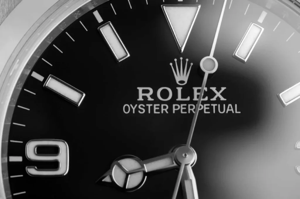
Five-pointed prongs. Perfectly symmetrical. It’s practically royalty, sitting proudly atop the Rolex name in a distinctive font.
But why a crown?
Simple. It’s about perceived value.
Crowns represent:
- Royalty
- Power
- Prestige
Sound familiar? That’s precisely what Rolex wants you to think when you see their watches.
Clever buggers, aren’t they?
How the Rolex Logo Elevates Brand Prestige and Exclusivity
The Rolex logo plays a pivotal role in cementing the watchmaker’s reputation for prestige and exclusivity. Its intricate design is symbolic and practical in ensuring authenticity—a critical factor in luxury markets.
Attention to Detail: A Symbol of Authenticity
- The detailed craftsmanship of the Rolex crown makes it one of the foremost markers of a genuine timepiece.
- Discerning buyers often scrutinise this logo to differentiate authentic watches from counterfeits.
Legacy of Excellence
- In a market teeming with exceptional Swiss watchmakers, Rolex stands unrivalled in prestige.
- The logo encapsulates decades of innovation and excellence, reinforcing the brand’s legendary status.
Successful Branding and Recognition
- The Rolex logo, synonymous with luxury, has become an emblem recognised worldwide.
- It fosters brand loyalty and establishes a connection with consumers who value unparalleled quality.
In summary, the Rolex logo is more than just a symbol; it is a cornerstone that upholds the brand’s luxury and exclusivity while assuring buyers of its authenticity and timeless appeal.
A Brief History: From Humble Beginnings to Horological Royalty
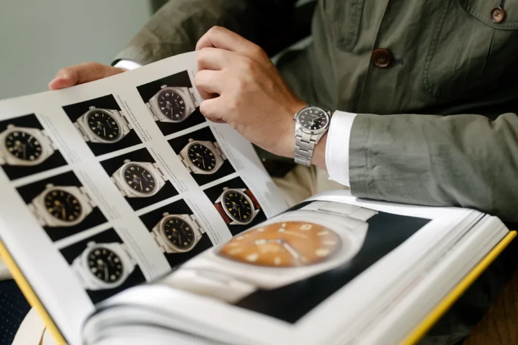
Rolex wasn’t always the king of the watch world.
The company started in 1905 as “Wilsdorf and Davis” in London. It is not a name that rolls off the tongue, is it?
It wasn’t until 1908 that the Rolex name was born. And even then, the logo we know today didn’t exist.
The crown didn’t make its debut until 1931. That’s right, Rolex operated for over two decades without its iconic symbol.
Why the change?
The Crown Jewel of Marketing
Hans Wilsdorf, Rolex’s founder, was a marketing genius. He understood something crucial:
People don’t buy watches. They buy status.
The crown was the perfect embodiment of this idea. It positioned Rolex not just as a watchmaker but as a horological royalty.
And boy, did it work.
How Does Rolex Maintain Its Status as a Luxury and High-Quality Watchmaker?
In a fiercely competitive watchmaking industry, standing out demands more than high-quality craftsmanship.
Only some brands have achieved the level of prestige and recognition that Rolex has, and this isn’t just by chance. The brand’s success is rooted in several key factors that tightly interweave quality, heritage, and powerful branding.
1. Iconic Branding and Recognition
The Rolex crown logo is more than just a symbol; it is an emblem of status and heritage. It’s instantly recognisable and evokes a sense of pride in ownership. The logo and strategic marketing efforts have built an indelible identity that resonates globally. This branding creates desire and forms a lasting connection with loyal and potential customers.
2. Emotional Resonance and Ownership Pride
Owning a Rolex is synonymous with achievement. For many, it’s a celebration of success, as a personal trophy worn on the wrist. Each glance at its iconic design reminds the owner of their accomplishments, reinforcing why they invested in such a piece.
3. Enduring Investment Value
Rolex watches are not just luxury items; they are also wise investments. Unlike many other consumer goods, these timepieces maintain and often increase in value over time. This financial reliability heightens their allure, making them a prized possession, even among those who may not traditionally be watch enthusiasts.
4. Association with Success and Wealth
Rolex has firmly established itself as a symbol of success and affluence. The brand crafts an image of excellence by adorning the wrists of influential figures and appearing at prestigious events. This association bolsters its reputation, aligning the product with the aspirational lives of its buyers.
5. Craftsmanship and Quality
Beyond branding, Rolex’s enduring status is backed by unparalleled craftsmanship and quality. Every watch is a masterpiece of precision and timeless aesthetics, ensuring owners receive a product and a legacy. This dedication to excellence is evident in every intricate detail of their creations.
In summary, Rolex combines strategic branding with superior craftsmanship to maintain its dominant position in the luxury watch market. This blend of emotional appeal and tangible quality ensures the brand remains at the pinnacle of desirability and sophistication.
Deconstructing the Design: What Makes It Tick?

Let’s break down the Rolex logo into its key components:
- The Crown
- Five points (representing the five fingers of a hand)
- Symmetrical design
- Bold, simple lines
- The Wordmark
- Custom serif font
- All caps
- Slight spacing between letters
- Colour
- Predominantly gold or green (depending on application)
What Colour Scheme Does the Rolex Logo Use, and What Do These Colours Symbolise?
The Rolex logo features a sophisticated colour scheme that combines a luxurious gold shade and a deep green hue. The logo is characterised by its golden crown, which utilises a metallic sunburst tone. This golden colour signifies prestige and luxury, reflecting the brand’s reputation for excellence.
In contrast, the name “ROLEX” in the logo is rich cadmium green. This green is often associated with wealth and financial prosperity, aligning with the brand’s image of success and affluence.
Together, these colours create a powerful visual statement: the gold communicates luxury while the green emphasises wealth, perfectly encapsulating the brand’s core values and appeal.
What can we learn from this?
Simplicity Reigns Supreme
The Rolex logo is dead simple. No fancy gradients. No complex shapes. It’s just a crown and a name.
Yet it’s instantly recognisable.
Why?
Because simplicity is memorable.
Think about it. Could you draw the Rolex logo from memory right now? You could get pretty close.
Now, try drawing the logo of that local plumbing company down the street. Not so easy, is it?
Consistency is Key
Rolex hasn’t significantly changed its logo since 1931.
Let that sink in.
For over 90 years, they’ve stuck with the same basic design.
Sure, they’ve made minor tweaks and refined the lines. Adjusted the proportions. But the core elements remain the same.
This consistency has allowed Rolex to build massive brand recognition. You see that crown; you know it’s Rolex—end of story.
The Psychology Behind the Crown: Why It Works
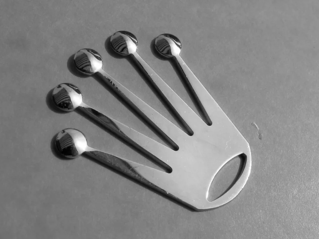
All right, it’s time for a quick psychology lesson.
Humans are hardwired to respond to certain symbols. Crowns are one of them.
Why?
Because crowns represent:
- Authority
- Success
- Luxury
When we see a crown, our brains make these associations automatically. We can’t help it.
Rolex taps into this psychological trigger masterfully. Their logo doesn’t just tell you what the brand is called. It tells you what the brand represents.
It’s bloody brilliant.
Real-World Impact: The Logo in Action
Let’s look at how this logo performs in the real world.
Case Study: Rolex at Wimbledon
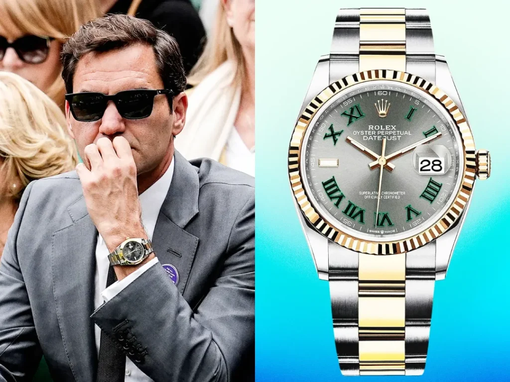
Rolex has been the official timekeeper of Wimbledon since 1978. Their logo is plastered all over the event.
But here’s the kicker:
Even with all the action on the court, people notice the Rolex logo. It stands out.
Why?
- Contrast: The green and gold of the Rolex logo pops against the predominantly white and green backdrop of Wimbledon.
- Simplicity: The simple crown design cuts through the clutter in a sea of visual noise.
- Placement: Rolex strategically places its logo in high-visibility areas, ensuring maximum exposure.
The result? Massive brand reinforcement.
Every time you watch a Wimbledon match, you’re subtly reminded of Rolex’s prestige.
Sneaky? Maybe. Effective? Absolutely.
Noteworthy Rolex Appearances in Pop Culture and Media
Rolex watches have long been synonymous with elegance and luxury, making them a staple in iconic film moments and among influential figures.
Classic Film Appearances
In cinema, few watches have as much screen presence as the Rolex. One of the most memorable on-screen appearances is in the James Bond series. The suave secret agent, portrayed by Sean Connery, sported a notably refined model in Dr. No, forever linking the watch to espionage and style. Similarly, Marlon Brando added a layer of rugged authenticity to his character in Apocalypse Now by wearing a striking Rolex, captured vividly in the film’s intense narrative.
Influence Beyond the Screen
Rolex’s appeal extends beyond its cinematic presence. It also garners admiration from leading figures in film direction. Esteemed filmmakers like James Cameron, Alejandro González Iñárritu, Martin Scorsese, and Kathryn Bigelow have associated themselves with the brand, reflecting its wide-reaching influence and status symbol in storytelling culture.
Rolexes are not merely accessories; they are symbols of precision, craftsmanship, and a certain timeless allure that continues to captivate audiences and cultural icons alike.
Creating Your Iconic Logo: Lessons from Rolex
Right, enough about Rolex. How can you apply these principles to your brand?
Here’s a step-by-step guide:
1. Define Your Brand’s Core Values
Before you even think about design, ask yourself:
- What does my brand represent?
- What emotions do I want to evoke?
- What’s my unique selling proposition?
Rolex = Luxury, precision, success. Your brand = ???
Fill in that blank before moving forward.
2. Choose a Symbolic Element
Rolex has its crown. What’s your symbol?
It doesn’t have to be literal. Apple’s logo isn’t a computer, is it?
Choose something that represents your brand’s values. Keep it simple.
3. Develop a Custom Typeface
Rolex’s font is instantly recognisable. Yours should be, too.
Don’t just pick a font from Microsoft Word. Work with a designer to create something unique.
It doesn’t have to be complex. Sometimes, slightly modifying an existing font can make all the difference.
4. Embrace Simplicity
I can’t stress this enough:
Simple logos are more versatile and memorable.
Ask yourself: Can your logo be easily reproduced in different sizes and mediums?
If not, simplify it.
5. Choose Your Colours Wisely
Colours evoke emotions. Choose wisely.
Rolex uses gold (luxury) and green (prestige).
What emotions do you want to evoke? Choose colours that align with those feelings.
6. Test for Versatility
Your logo needs to work everywhere:
- Business cards
- Websites
- Social media profiles
- Product packaging
Test it in all these contexts before finalising.
7. Commit to Consistency
Once you’ve nailed your logo, stick with it.
Consistency builds recognition. Recognition builds trust. Trust builds sales.
It’s that simple.
The Cost Conundrum: Quality vs. Budget
Now, I know what you’re thinking:
“This all sounds great, but I’m not Rolex. I can’t afford a fancy design agency.”
I hear you. But here’s the thing:
You don’t need a massive budget to create a great logo.
Yes, Rolex spent a fortune on its branding over the years. But remember, their logo started simple.
Here are some budget-friendly options:
- DIY Design Tools: Platforms like Canva offer logo templates you can customise.
- Freelance Designers: Sites like Fiverr and Upwork have talented designers at various price points.
- Design Contests: Platforms like 99designs let you run contests where multiple designers submit ideas.
- AI-Powered Tools: Some AI tools can generate logo concepts based on your input.
Remember: It’s better to have a simple, well-executed logo than a complex, poorly designed one.
Measuring Success: Is Your Logo Working?
So you’ve created your logo. How do you know if it’s effective?
Here are some metrics to consider:
- Recognition: Can people identify your brand quickly from the logo alone?
- Recall: If asked, can people describe your logo from memory?
- Emotional Response: What feelings does your logo evoke in viewers?
- Versatility: Does your logo work well across different mediums and sizes?
- Longevity: Does your logo still feel relevant after a few years?
Don’t just guess. Survey your customers. Get real feedback.
And be prepared to make adjustments if needed.
The Role of the Rolex Logo in Spotting Counterfeits
Regarding preventing counterfeit watch purchases, the Rolex logo plays a crucial role. This iconic emblem, known for its detailed craftsmanship, serves as an initial checkpoint for discerning buyers.
Key Factors
- Intricate Design: The complexity of the Rolex crown makes it challenging for counterfeiters to replicate accurately. Genuine watches boast sharp, precise details that are hard to mimic.
- Symbol of Authenticity: Buyers often scrutinize the logo to confirm authenticity. A thorough inspection of the logo helps ensure that the timepiece is genuine, offering peace of mind to potential buyers.
- Immediate Visual Check: The logo is typically one of the first features examined when authenticating a watch. Its appearance can immediately raise red flags if inconsistencies are noted.
By understanding these elements, buyers can better protect themselves from counterfeit purchases. The Rolex logo is more than just a brand mark—it safeguards against imitation.
The Evolution Game: When to Update Your Logo
Rolex has kept its logo essentially unchanged for decades. But that doesn’t mean you have to.
Sometimes, a logo update can breathe new life into a brand.
When should you consider an update?
- Your business has significantly changed or expanded.
- Your logo looks outdated compared to competitors.
- Your logo doesn’t work well in digital formats.
- You’re targeting a new audience.
But remember: Evolution, not revolution.
Drastic changes can confuse customers and erode brand recognition.
Just ask Gap. Their 2010 logo redesign was so poorly received that they reverted to the old one within a week.
Ouch.
Beyond the Logo: Building a Brand Identity

Here’s a hard truth:
A great logo alone won’t make your brand successful.
It’s a crucial piece of the puzzle, sure. But it’s just one piece.
Your brand identity includes:
- Your website design
- Your product packaging
- Your customer service
- Your marketing messages
- Your company culture
All of these elements need to work together cohesively.
Rolex doesn’t just have a great logo. Their comprehensive brand identity screams luxury and precision at every touchpoint.
Aim for that level of consistency in your brand.
Why is Owning a Rolex Watch Considered a Symbol of Achievement and Pride?
- Representation of Success: Wearing a renowned timepiece on your wrist is often seen as a definitive mark of success. The brand’s reputation for excellence and precision craftsmanship is recognised globally. This makes owning one synonymous with reaching a significant milestone or fulfilling a personal aspiration.
- Exclusivity and Craftsmanship: Each watch is a testament to meticulous craftsmanship and attention to detail. The intricate engineering and superior quality signify personal achievement, offering a tangible reward for an individual’s hard work and dedication.
- Iconic Status: These watches have become iconic over time, with an instantly recognisable design and logo. This reputation adds to the pride of ownership, as every glance at your wrist reinforces a sense of accomplishment.
- The tradition of Gifting: Receiving one as a gift often indicates significant life events – a promotion, a graduation, or a special anniversary. Such occasions highlight the watch as not just a tool to tell time but as a cherished symbol of one’s journey and milestones.
The blend of unparalleled quality, storied legacy, and its role as a cherished gift contribute to why owning this watch is a profound emblem of achievement and personal pride.
The Future of Logo Design: Trends to Watch
As we wrap up, let’s look at some emerging trends in logo design:
- Responsive Logos: Logos that adapt to different screen sizes and contexts.
- Minimalism 2.0: Even simpler designs, often using just typography.
- Animated Logos: Logos that move and interact, especially in digital contexts.
- Gradients: A resurgence of colour gradients for depth and visual interest.
- Authenticity: Logos that feel hand-crafted and unique, moving away from overly polished designs.
Keep an eye on these trends, but remember:
Timelessness trumps trendiness.
Don’t chase every new design fad. Focus on creating a logo that will stand the test of time, just like Rolex’s has.
Conclusion: Your Logo, Your Legacy
Creating a logo like Rolex’s isn’t about copying their crown or font.
It’s about understanding the principles behind their design:
- Simplicity
- Symbolism
- Consistency
- Quality
Apply these principles to your brand, and you’ll be well on your way to creating a logo that stands the test of time.
Remember:
Your logo is often the first thing people see when they encounter your brand.
Make it count.
Make it memorable.
Make it yours.
Now, go forth and create something iconic. Your brand deserves nothing less.
FAQs: Demystifying Logo Design
How much should I expect to pay for a professional logo design?
Costs vary widely, from £100 for a basic design to £10,000+ for a comprehensive brand identity package. A £500-£2,000 budget can yield excellent results for most small businesses.
How long does the logo design process typically take?
On average, 2-4 weeks. This includes research, concept development, revisions, and finalisation. Complex projects may take longer.
Should I trademark my logo?
Yes, if your budget allows. Trademarking protects your brand identity and prevents others from using a similar design.
Can I use stock images in my logo?
It’s not recommended. Anyone can use stock images, potentially leading to confusion with other brands. Custom designs are always preferable.
How often should I update my logo?
There’s no fixed rule, but most successful brands update their logos every 7-10 years, usually with subtle changes rather than complete overhauls.
Is using a symbol or just text for my logo better?
It depends on your brand. Text-only logos (like Google) can be very effective, but symbols (like Apple’s Apple) can be more versatile across different media.
How important is colour in logo design?
Extremely important. Colours evoke emotions and can significantly impact brand perception. Choose colours that align with your brand values and appeal to your target audience.
Can I design my logo without any design experience?
While possible, it’s challenging. If you’re on a tight budget, consider using a logo maker tool or hiring a junior designer rather than DIY.
How many logo concepts should I expect from a designer?
Typically, 3-5 initial concepts. From there, you’ll choose one to refine further.
Is it okay to use my logo design on merchandise?
Absolutely! It’s a great way to increase brand visibility. Just ensure you have the correct file formats for different applications.
How do I choose the right font for my logo?
Can I use my logo on social media profiles?
Definitely! Create versions of your logo optimised for different social media platforms, considering their specific size and format requirements.
