How the Adobe Logo Reflects the Evolution of Digital Creativity
The red square that dominates your screen every time Photoshop launches isn’t just a logo—it’s a silent witness to four decades of creative revolution.
While you’ve been cursing at loading bars and subscription renewals, Adobe’s iconic symbol tells a story about how we create, who gets to make, and what happens when software eats the design world.
Let me put this in perspective: In 1982, when Adobe launched, “digital creativity” meant green text on a black screen. Most designers were still cutting and pasting with actual scissors and glue.
Fast forward to today, and a teenager with a laptop has more creative firepower than entire 1980s design agencies. Adobe’s logo transformation—from that original stylised “A” to the minimalist red square—mirrors this democratisation of creative power.
Adobe didn’t just make design tools—they fundamentally rewired how human creativity functions in the digital age. And their logo evolution reflects that massive power shift, one subtle refinement at a time.
- Adobe's logo evolution reflects four decades of digital creativity, paralleling the democratisation of creative tools.
- Throughout updates, Adobe maintained a consistent red square to signify recognition and credibility in a competitive market.
- The brand's approach shows that evolution over revolution in visual identity supports business strategy and enhances brand loyalty.
The Origin Story: 1982
Adobe’s first logo wasn’t some stroke of divine inspiration—it was practical problem-solving by co-founder John Warnock. In 1982, when Adobe was just a scrappy startup founded by Warnock and Charles Geschke (ex-Xerox PARC rebels), they needed a visual identity to stand out in the emerging software market.
The original logo featured a stylised “A” formed by a unique geometric shape—a triangle with one corner smoothed into a curve. This wasn’t random. The design reflected Adobe Creek, which ran behind Warnock’s Los Altos, California house. The logo was red (PMS 485)—a deliberate choice that shouted confidence in a sea of blue corporate identities dominating tech at the time.
Context matters here: 1982 was the Wild West of personal computing. Apple had just gone public, Microsoft was still a tiny player, and graphic design software barely existed. Adobe’s first product, PostScript, was about to revolutionise digital typography and printing. Their logo needed to convey technical precision while appearing approachable to creative professionals.
Evolution Phase 1: 1990s Refinement
By the early 90s, Adobe had transformed from a font technology company into a software powerhouse with Photoshop, Illustrator, and other creative tools. Their logo evolved subtly:
Visual Changes:
- The “A” symbol remained but was refined with cleaner lines
- Typography was updated to a more modern sans-serif
- The colour palette stayed with the bold red but slightly softened
Strategic Thinking: This wasn’t just decoration—it was calculation. Adobe was positioning itself as both technically sophisticated and creatively empowering. The refined logo reflected growing confidence as they expanded beyond fonts into the broader creative software market.
During this period, competitors like Macromedia (with Flash) and Quark (with QuarkXPress) were gaining traction. Adobe’s visual identity needed to maintain authority while appealing to a growing market of creative professionals just discovering digital tools.
The Pivotal Shift: 1993-1997
The mid-90s brought Adobe’s most significant early logo transformation, coinciding with their rapid expansion:
Visual Changes:
- The single “A” symbol evolved into a stylised, geometric “A” with more substantial angles
- The wordmark became bolder and more confident
- Red remained dominant but with a more sophisticated application
Strategic Win: This update worked because it maintained brand recognition while signalling evolution. The internet was emerging, and Adobe was positioning itself as the toolmaker for this new frontier. The updated logo communicated stability (important for enterprise customers) while still appealing to creatives (their bread and butter).
When competitors were chasing flashy digital aesthetics, Adobe took the smarter route—evolutionary refinement rather than revolutionary redesign. This preserved brand equity while still appearing modern.
The Wieden+Kennedy Era: 2002-2005
In the early 2000s, Adobe enlisted renowned agency Wieden+Kennedy to refresh its brand identity as it prepared to acquire competitors and expand its software suite:
Visual Changes:
- The “A” symbol became more abstract and geometric
- Typography evolved to a cleaner, more corporate appearance
- Red remained but gained a more sophisticated tone
Business Alignment: This wasn’t coincidental—Adobe was preparing to swallow Macromedia (Flash, Dreamweaver) and needed a visual identity that could accommodate expanding product lines. The logo needed to feel less like a specific tool provider and more like a creative ecosystem.
The psychology here was subtle but effective: geometric precision in the logo communicated Adobe’s technical excellence while maintaining creative elements that resonated with its user base. This balance helped Adobe navigate the tricky waters of being perceived as innovative and reliable.
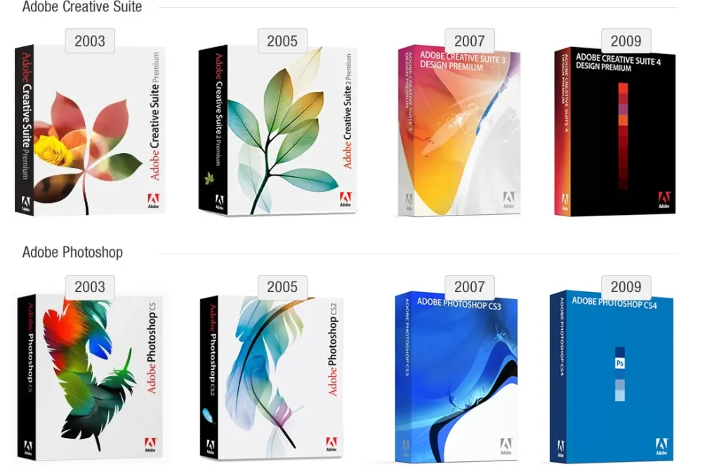
The CS Era Revolution: 2005-2013
The Creative Suite era brought another significant logo evolution:
Visual Changes:
- Introduction of the now-famous red square with “Adobe” text
- Simplification of the overall design language
- The “A” symbol became less prominent as Adobe embraced a more cohesive product family approach
Strategic Context: This change aligned perfectly with Adobe’s business strategy. They weren’t selling individual products anymore—they were selling an integrated creative ecosystem. The red square became the unifying visual element across their product line, creating instant recognition.
This was genius-level brand architecture. Each product (Photoshop, Illustrator, etc.) maintained its identity through distinctive letter abbreviations (Ps, Ai) while belonging to the Adobe family through consistent use of the red square.
Market Position: While competitors focused on specific niches, Adobe played chess, not checkers. Their visual identity communicated an entire creative universe under one roof. The simplicity of the red square allowed for incredible flexibility across digital and physical touchpoints.
The Cloud Pivot: 2013-Present
2013 Adobe made its most controversial business move: shifting from perpetual licenses to subscription-based Creative Cloud. Their logo evolved in parallel:
Visual Changes:
- The red square remained but became more dimensional
- Typography evolved to feel more digital and contemporary
- Introduction of the “CC” designation to replace “CS.”
Strategic Reasoning: Adobe needed visual signifiers that communicated “cloud” and “subscription” without alienating its existing customer base. The updated look helped bridge this gap—familiar enough to maintain trust and fresh sufficient to signal evolution.
Controversy Analysis: Let’s be honest—this logo update wasn’t the problem. The subscription model created the backlash. Adobe’s visual rebrand helped smooth the transition by maintaining key visual equities (red square, clean typography) while signalling change.
The psychology was calculated: maintain the red (passion, creativity) while evolving the form to feel more digital and “cloud-like.” This visual consistency provided stability during a tumultuous business model transformation.
The Minimalist Refinement: 2020-Present
Adobe’s most recent logo refinement embraces digital-first minimalism:
Visual Changes:
- Further simplification of the red square
- Reduction of unnecessary visual elements
- Cleaner typography optimised for digital display
Strategic Alignment: This update reflects Adobe’s maturation as a digital service provider. The simpler logo works better across platforms, especially on small screens where their products are increasingly used. It’s not a creative genius—it’s a practical adaptation to changing usage patterns.
Competitive Positioning Through Design
Throughout their logo evolution, Adobe has consistently positioned itself against key competitors:
- vs. Microsoft: Adobe maintained creative credibility through warmer colours and more dynamic geometric forms, while Microsoft leaned into corporate blues and rigid forms.
- vs. Apple: Adobe carefully balanced creative appeal with technical authority, whereas Apple went all-in on minimalist consumer-focused design.
- Vs Smaller Creative Tools: Adobe’s logo consistently communicated institutional permanence compared to newer, trendier competitors—a visual promise that they wouldn’t disappear overnight with your creative files.
Colour Psychology & Form Analysis
Adobe’s persistent use of red isn’t accidental—it’s strategic:
- Red signals creativity, passion, and energy (appealing to their core users)
- Red creates urgency and attention (valuable for a subscription business)
- Red stands out in the predominantly blue tech landscape.
The square form communicates:
- Stability and reliability (critical for tools people depend on for their livelihood)
- Precise edges reflect technical excellence and pixel-perfect design
- Simplicity allows for recognition at small sizes across platforms
The Current Logo: Strengths & Weaknesses
The current Adobe logo succeeds because:
- It’s instantly recognisable even at tiny sizes (crucial for mobile)
- It works in monochrome or colour (flexibility across contexts)
- It scales across a massive product ecosystem without confusion
However, it faces challenges:
- The red square has become somewhat generic as minimalism has dominated tech branding.
- It lacks a distinctive character compared to its original “A” symbol.
- It prioritises corporate consistency over creative inspiration (potentially alienating some core users)
Future Projection
Based on current trends and Adobe’s trajectory into AI-powered creative tools, their logo will likely evolve toward:
- More dynamic representations that can animate smoothly in digital contexts
- Variable design elements that can adapt to personalisation
- Subtle incorporation of AI-suggestive visual language while maintaining the red square heritage
Key Lessons From Adobe’s Logo Evolution
- Evolution beats revolution. Adobe never threw away its visual equity—it refined it. That’s brand management discipline at its finest.
- Logo design follows business strategy. Each major logo update aligned with fundamental business shifts. The visual identity supported the business narrative rather than existing separately.
- Simplicity enables flexibility. As Adobe expanded across more products and platforms, its logo was simplified to work everywhere.
- Colour consistency builds recognition. Despite all the changes, that red has remained Adobe’s visual anchor for 40+ years.
- Good logos solve practical problems. Adobe’s best logo decisions addressed real business challenges—recognition, product architecture, digital display—rather than chasing design trends.
The Bottom Line
Adobe’s logo evolution demonstrates why visual branding isn’t just decorative bullshit—it’s business strategy made visible. Their visual identity has successfully:
- Maintained recognition across four decades
- Supported multiple business model transformations
- Created a flexible system that spans hundreds of products
- Differentiate them in a crowded market
- Communicated complex values (creativity + technology) through simple visual elements
The most valuable lesson? Adobe never let its logo become more important than its products. The emblem evolved to support what they were building, not vice versa. That’s the difference between masturbatory design and strategic visual communication.
For any brand looking to evolve its visual identity, Adobe’s journey offers a masterclass in balancing heritage with progress. Don’t chase trends, don’t throw away equity, and never forget that your logo’s job is to solve business problems, not win design awards.
FAQs on the Adobe Logo Design
When was the first Adobe logo created, and what did it look like?
The first Adobe logo was created in 1982, featuring a stylised “A” with a unique geometric shape—a triangle with one corner smoothed into a curve. It was coloured in a bold red (PMS 485) and was inspired by Adobe Creek, which ran behind co-founder John Warnock’s house in Los Altos, California. This distinctive red mark helped Adobe stand out in a tech landscape dominated by blue corporate identities.
Why did Adobe choose red for its brand colour, and what does it signify?
Adobe’s choice of red wasn’t arbitrary—it was strategically selected to differentiate the company in the predominantly blue tech industry of the 1980s. Red signifies creativity, passion, and energy—qualities Adobe wanted to associate with their brand. It creates visual urgency and demands attention, which has served them well in maintaining brand recognition throughout their evolution from a font technology company to a creative software powerhouse and eventually a subscription service.
How did Adobe’s logo change when they introduced Creative Suite?
When Adobe introduced Creative Suite in the mid-2000s, it made a significant logo evolution. They moved to the now-famous red square with “Adobe” text, simplifying their overall design language. The original “A” symbol became less prominent as Adobe embraced a more cohesive product family approach. This change coincided with their shift from selling individual products to marketing an integrated creative ecosystem, with the red square becoming the unifying visual element across their entire product line.
Did Adobe’s logo change when they switched to the subscription model?
Yes. When Adobe pivoted to the subscription-based Creative Cloud in 2013, its logo evolved to reflect this business transformation. The red square remained but became more dimensional, the typography evolved to feel more digital and contemporary, and they introduced the “CC” designation to replace “CS” (Creative Suite). These visual changes helped signal evolution while maintaining enough familiarity to ease the controversial transition to a subscription model.
How does Adobe’s logo positioning compare to competitors like Microsoft and Apple?
Adobe has consistently positioned its logo to balance creative appeal with technical authority—differentiating itself from Microsoft’s more corporate blues and rigid forms while not going as minimalist-consumer as Apple. This middle ground visually communicates that they make professional tools for creative work, not just consumer products or business software. Their logo’s persistent use of red and geometric precision has maintained this unique position in the market.
What’s the significance of Adobe Red Square in their current brand architecture?
The red square is a powerful unifying element across Adobe’s extensive product ecosystem. Each product (Photoshop, Illustrator, etc.) maintains its identity through distinctive letter abbreviations (Ps, Ai) while belonging to the Adobe family through consistent use of the red square background. This visual system instantly recognises dozens of products and services, allowing Adobe to maintain a coherent brand identity despite its massive product portfolio.
Has Adobe ever wholly redesigned its logo or just evolved it?
Adobe has never done a complete rebrand or logo redesign—they’ve consistently chosen evolution over revolution. Each major logo update refined existing elements rather than starting from scratch, preserving their visual equity while adapting to changing business needs and design trends. This approach demonstrates exceptional brand management discipline, allowing them to maintain recognition across four decades while appearing contemporary.
What does the minimalist trend in Adobe’s recent logo updates say about digital design?
Adobe’s move toward increasing minimalism (particularly in their 2020 refinements) reflects broader digital design trends and practical considerations. More straightforward logos work better across platforms, especially on small screens where Adobe’s products are increasingly used. This shift prioritises functional considerations like legibility at small sizes, cross-platform consistency, and clean rendering on various displays—showing how digital contexts now drive brand design decisions more than print considerations.
How does Adobe’s current logo reflect its move into AI-powered tools?
Adobe’s current logo doesn’t explicitly reference AI. Still, its simplified, highly geometric form creates a flexible foundation that can adapt to emerging technologies. The clean, precise shape of the red square communicates technical excellence while maintaining creative heritage—a balance that serves them well as they integrate AI into creative workflows. The logo’s minimalism also allows it to function effectively in dynamic digital contexts where AI interfaces are increasingly important.
What can other brands learn from Adobe’s logo evolution?
Adobe’s logo journey demonstrates how visual identity should follow business strategy. Their most valuable lesson is how they never let their logo become more important than their products—the logo evolved to support what they were building, not vice versa. They maintained colour consistency for recognition, simplified for flexibility across platforms, and made each update align with fundamental business shifts. This shows how effective logos solve practical business problems rather than just chasing design trends.
Why didn’t Adobe face significant backlash for its logo changes like many other companies?
Adobe avoided significant logo backlash by taking an evolutionary approach rather than making jarring changes. They preserved key visual elements (mainly red) while gradually refining them. More importantly, they timed logo updates to coincide with genuine product evolutions, making the visual changes feel justified rather than arbitrary. When they did face controversy (during the subscription model transition), the issue was the business model change itself, not the accompanying logo refinement.
How might Adobe’s logo evolve in the future as technology continues to advance?
Based on current trends and Adobe’s trajectory into AI-powered creative tools, their logo will evolve toward more dynamic representations that can animate smoothly in digital contexts, with variable design elements that can adapt to personalised experiences. We may see a subtle incorporation of AI-suggestive visual language while maintaining the Red Square heritage. The challenge will be balancing their established visual equity with the need to represent increasingly complex and abstract creative technologies.

