
How to Pick Stunning Colour Palettes for B2B Branding
The biggest colour mistake professional services firms make isn’t choosing the wrong shade – it’s choosing the same shade as every competitor and calling it a strategy. A palette that looks safe is usually the most commercially dangerous choice you can make.
Walk down any professional services high street – digital or physical – and count the blues. Navy here, slate there, cobalt on the homepage of a firm that paid a designer £15,000 for brand differentiation.
Consistent brand presentation, anchored by colour, can boost revenue by 23%. But that figure assumes your colours are actually doing something distinctive. When you’re indistinguishable from three direct competitors before a prospect has read your headline, colour isn’t building your brand. It’s burying it.
Understanding how colour functions in B2B identity starts with the logo design process – where palette decisions sit within the wider system of marks, typography, and spatial logic that together determine whether a brand communicates authority or disappears into the background.
Colour is not a standalone decision. It’s the most visible component of a system.
Up to 90% of snap judgements about a product or service within the first 90 seconds are based on colour alone. That means a prospect who visits your website, opens your pitch deck, or spots your business card has already formed an opinion before they’ve registered your firm’s name.
Whether that opinion is “credible, distinctive, worth reading” or “looks like every other firm” depends almost entirely on your palette.
- Perform category mapping first; choose a dominant trust colour plus a distinctive accent no direct rival owns.
- Apply the 60-30-10 framework; dominant, accent, neutral discipline and test every combo for WCAG 4.5:1 contrast.
- Use one energy accent sparingly, on CTAs or icons to drive recall; scarcity preserves memorability.
What Are Colour Palettes?
A colour palette for B2B branding is a defined set of colours – typically three to five – chosen for their strategic effect within a specific competitive category, not their aesthetic appeal in isolation.
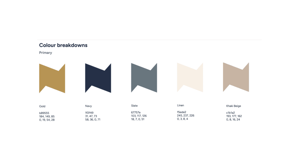
- Dominant colour: covers 60% of brand applications; sets the primary psychological tone and brand authority signal
- Accent colour: covers 30%; provides contrast, drives CTA performance, and creates visual hierarchy across digital and print
- Neutral base: covers 10%; provides legibility and breathing room across all touchpoints
Stunning colour palettes for B2B branding combine a dominant trust colour with one distinctive accent, achieving up to 80% higher brand recognition and 23% revenue uplift through consistent, intentional deployment.
Why Colour Does More Work Than Most B2B Firms Realise
Colour improves brand recognition by up to 80%, making consistent palettes essential for differentiation in competitive sectors like finance and professional services. That’s not a design statistic – it’s a sales statistic.
Every touchpoint where a prospect encounters your brand contributes to, or detracts from, the cumulative recall that eventually produces a referral or a response to a proposal.
A 2025 study with 285 participants confirmed that colour drives 80% of brand recognition and purchase intent, with “colour-brand personality congruence” – the alignment between what a colour suggests and what the brand actually delivers – enhancing client loyalty specifically in B2B contexts.
The implication isn’t that blue is wrong. It’s that the colour must match the brand’s actual position and personality, not just the category convention.
Up to 85% of purchasing decisions are driven by colour in branding contexts. For professional services, where the purchase cycle can span weeks or months, the influence operates across every touchpoint: website first impression, proposal design, email footer, LinkedIn profile imagery.
A disjointed or forgettable palette creates friction at each of these moments. A coherent, distinctive one removes it.
Colour is doing commercial work before a prospect reads a single word on your website. If your palette is indistinguishable from your competitors’, you’ve handed the first-impression advantage to whoever chose a more distinctive combination. Eighty per cent of brand recognition runs through colour. That figure isn’t theoretical – it’s the conversion variable your competitors aren’t measuring.
Why Category Conformity Is a Commercial Liability
Professional services branding suffers from a specific pathology: firms look to their sector for colour cues rather than to their clients or their competitive differentiation.
The result is every law firm using charcoal and white, every accountancy firm using dark blue and grey, every financial adviser using navy and gold. Internally, this feels like industry credibility. Externally, it creates a visual category where no individual brand stands out.
When 93% of B2B buyers base their choices on visual elements, including colour schemes, having a colour scheme functionally identical to your alternatives means your visual impression is not contributing to the selection decision.
Prospects can’t prefer what they can’t distinguish. The commercial damage is invisible on any individual pitch but compounds across every interaction where your brand failed to register.
Navy and orange pairings are rated 34% more trustworthy in B2B settings than monochromatic schemes, suggesting the answer is not to abandon trust-signalling colours entirely, but to pair them with a distinctive accent that creates memory and contrast.
The Myth That’s Costing Professional Services Firms, Clients
Blue became the default for professional services firms for a legitimate reason.
Throughout the 1990s and early 2000s, blue differentiated financial and legal brands from the reds and yellows that dominated consumer categories. Research at the time reliably showed blue associated with competence, reliability, and trustworthiness. The advice was sound in its context.
It fails in 2026 because the advice worked too well. Every professional services firm took it. The result is a category where blue is no longer a differentiator – it’s the absence of one.
When every firm on a prospect’s shortlist uses a variation of navy or cobalt, blue signals nothing about your specific firm’s qualities, positioning, or approach; it signals only that you belong to the category. Category membership is the minimum requirement for consideration, not a competitive advantage.
Financial services firms using deep blues paired with orange or green accents convert 31% better than firms using monochromatic blue-based schemes.
The conversion differential isn’t driven by abandoning blue – it’s driven by combining it with a colour that creates contrast, energy, and memorability. A distinctive accent turns a category signal into a brand signal.
The replacement directive is non-negotiable: audit your direct competitors’ colour choices before finalising your palette. If three or more use the same dominant colour family as your proposed scheme, your palette is already a liability before a single asset has been designed. Choose a combination that is recognisably yours – one no direct competitor currently owns.
Blue signals professional services membership. It does not signal why a prospect should choose your firm over three identically coloured alternatives. The firms gaining commercial ground in 2026 are those pairing heritage trust colours with distinctive accents that create visual ownership of their niche – not those refining the precise shade of navy they share with everyone else on the shortlist.
How to Build a Stunning Colour Palette for B2B Branding
Before selecting a colour, map your immediate competitive set. Take the top five to eight firms that a prospect would place on a shortlist alongside you.
Document their primary and secondary colours. Identify what the category “owns” – the colours so dominant they no longer differentiate. Then identify the gaps: combinations absent from the category that still carry the psychological freight appropriate to your positioning.
This is not about being contrarian for its own sake. It’s about owning visual space.
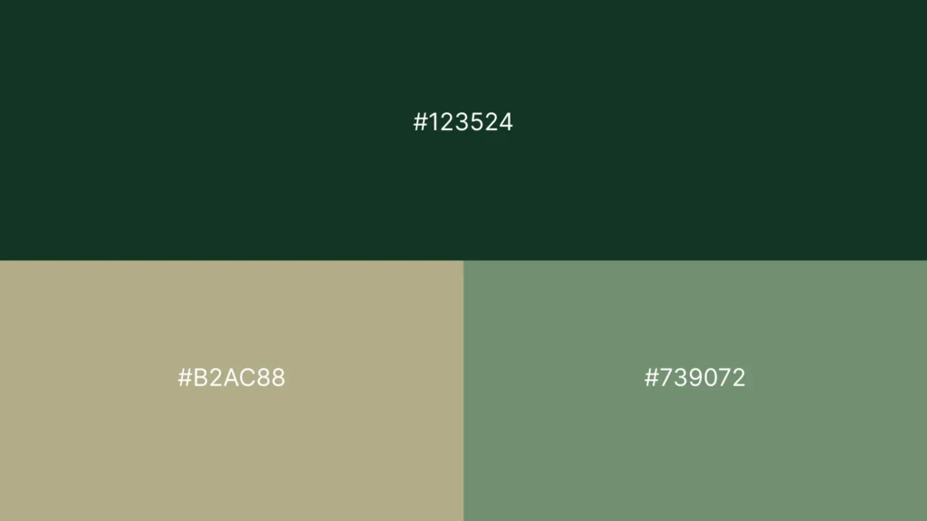
If you’re a financial advisory firm and every competitor uses navy, deep teal combined with warm copper gives you the trust associations of blue-family hues while creating a colour identity no local competitor has claimed.
Category mapping turns palette selection from an aesthetic exercise into a strategic one. Run this audit before you write a single brief.
The Dominant, Accent, Neutral Framework
The 60-30-10 framework provides structural discipline for palette deployment. Your dominant colour sets the tone and communicates your primary brand value. Your accent colour drives visual hierarchy – it’s what makes CTAs, pull quotes, and key data points visible.
Your neutral handles the majority of body copy and backgrounds, providing the legibility foundation for everything else.
The common failure is treating all three equally, resulting in a palette that reads as busy rather than confident. Dominant should genuinely dominate. Accent should appear sparingly enough to retain its visual impact.
HubSpot Inc. (the marketing software company) demonstrated this principle empirically: changing a single CTA button from green to red increased conversions by 21%. Moz Inc. (the SEO analytics company) changed a CTA from green to yellow and recorded a 187% uplift.
In both cases, the lift came from increased contrast – the accent becoming more visually distinct from its surroundings. Scarcity of the accent preserves its power.
WCAG Compliance as a Trust Signal, Not Just a Legal Requirement
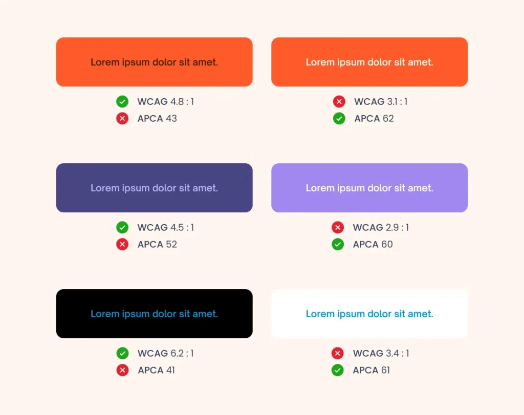
Web Content Accessibility Guidelines (WCAG) minimum contrast ratios – 4.5:1 for body text, 3:1 for large text – are widely treated as a legal compliance issue.
They are also a commercial one.
A palette that fails WCAG contrast standards produces interfaces where key information is difficult to read.
In B2B contexts, where proposals, service pages, and case studies carry significant persuasive weight, legibility friction directly translates into reduced comprehension and fewer conversions.
Accessibility compliance signals something beyond legal diligence.
To a prospect assessing whether your firm is detail-oriented and trustworthy, a website passing WCAG at AA standard communicates precision in practice – not just in marketing copy.
Choose colours achieving a minimum 4.5:1 contrast ratio for all primary text. Test this before finalising any palette, not after the design is already committed.
A colour palette failing accessibility standards isn’t only a legal risk – it’s a conversion problem. If your body copy sits at a 2:1 contrast ratio, you’re asking prospects to work harder to read your case for why they should hire you. The WCAG AA-compliant palette tells every visitor, before a word is read, that your firm does not cut corners.
Stunning Colour Palettes for Professional Services in 2026
The dominant trend in B2B branding palettes moving through 2025 and into 2026 is a departure from synthetic, screen-optimised corporate tones toward earthy, organic combinations.
Phthalo Green, Sage Green, and Shale Green are appearing across sectors that previously defaulted to corporate blue-green.
The signal these palettes send – comfort, sustainability, groundedness – is particularly effective for professional services firms wanting to project approachability alongside authority, especially in sectors where clients are increasingly attuned to environmental and social positioning.
For accountancy and advisory firms serving SMEs, this shift creates a specific opportunity. Banana yellow is emerging as an accent communicating optimism and accessibility – qualities that resonate with SME founders who find traditional grey-and-navy professional services branding intimidating.
The risk is deploying it without the structural support of a grounded neutral and dominant colour. Unanchored brightness reads as amateur rather than approachable.
Financial Services Is Moving Beyond Navy
Fintech and financial services brands are leading a category departure from the traditional navy-and-teal palette that defined the sector for two decades.
The shift is toward combinations retaining the trust associations of blue-family hues while adding warmth and distinctiveness through complementary accents.
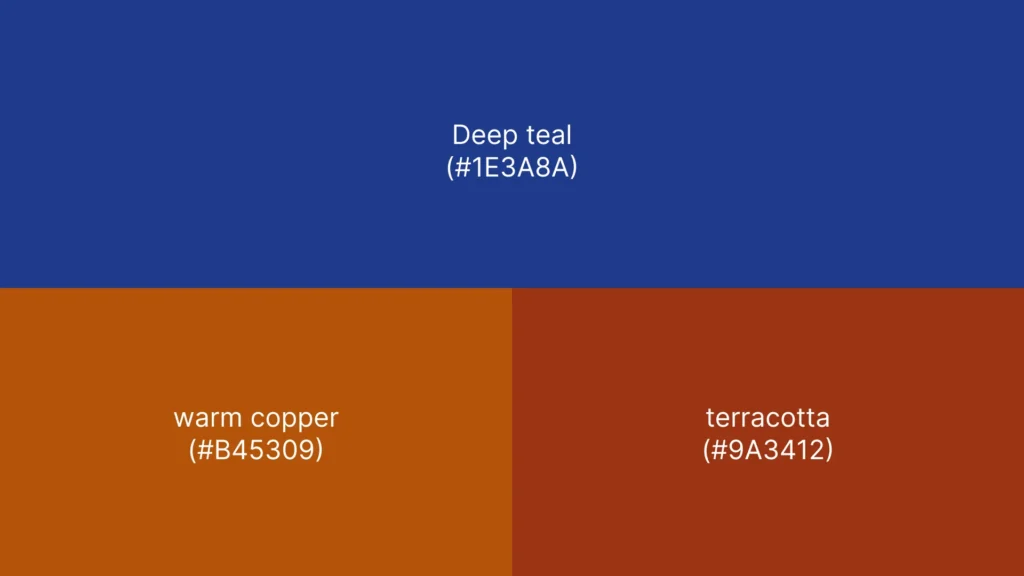
Deep teal (#1E3A8A) paired with warm copper (#B45309) or terracotta (#9A3412) is emerging as a high-performing combination for financial services firms, with documented increases in perceived trustworthiness of up to 42% compared with traditional monochromatic schemes.
This is not purely an aesthetic shift – it reflects what high-net-worth clients and institutional decision-makers are responding to: palettes that signal both competence and the kind of considered taste associated with premium service.
The implication for professional services firms outside pure fintech is direct. A law firm using deep indigo with warm amber reads as confident and distinctive.
An accountancy practice using slate with Sage reads as measured and contemporary.
The colour permission in professional services has expanded considerably.
The question is whether your brand is using that space with strategic intent, or continuing to occupy the same visual territory as firms that haven’t reviewed their identity in a decade.
Energy Accents in Conservative Sectors
One of the more technically demanding applications in B2B palette work is the energy accent – a single high-contrast, slightly unconventional colour used to drive recall and signal modernity without undermining the authority established by the dominant palette.
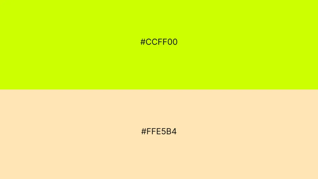
2026 forecasts identify electric lime and peach as emerging energy accents in conservative B2B sectors. Used without discipline, these colours undermine credibility entirely – they read as a firm that doesn’t understand its own positioning.
Used correctly – sparingly, as a single accent against a well-chosen dominant and neutral – they create the visual specificity that makes a brand memorable in a competitive pitch context.
The discipline required is restraint. An energy accent works because it’s exceptional in the palette, not because it’s prominent throughout.
A single consistent application – typically a CTA, a graphical device, or an icon system – is the correct deployment. Repeating it dilutes the effect and risks the palette reading as undisciplined. One colour does one job.
That job is an unforgettable contrast.
The energy accent is the sharpest tool in the B2B palette. A single carefully chosen high-contrast colour, applied to one consistent brand element, produces the visual specificity that makes a firm memorable after a pitch pack has been closed. Spread across multiple elements, it produces visual noise. The difference between memorable and chaotic is discipline, not talent.
The Decision Table
| Decision Point | The Wrong Way | The Right Way | Why It Matters |
| Starting point | Choose colours from a mood board or design trend list | Map competitors’ palettes first; identify available visual space | Colour differentiates only when it’s distinct from what direct competitors already occupy |
| Dominant colour selection | Choose blue because it signals trust | Choose blue only if no primary competitor uses the identical value; always add a distinctive accent | When every firm uses blue, blue signals category membership, not brand distinction |
| Accent colour deployment | Use decoratively across multiple elements | Apply exclusively to CTAs, key data points, and a single graphical device | Scarcity of the accent preserves its visual impact and conversion function |
| Accessibility standard | Test at the end of the project | Test every combination against WCAG 4.5:1 before any design is committed | A palette failing contrast ratios produces legibility friction that damages comprehension and conversion |
| Palette size | Add colours as design problems arise | Define 3–5 colours before any design work begins, and enforce them | Palette discipline produces visual coherence; ad hoc additions produce visual noise |
| 2026 colour intelligence | Follow the general trend lists | Apply category-specific research; earthy tones and warm accents outperform specifically in professional services | Generic trend adoption without category context produces palettes fitting every sector and owning none |
| Palette testing scope | Check colours look good on screen | Test across dark mode, print, embossing, and single-colour applications | A palette working only digitally fails 30–40% of brand touchpoints |
What I’ve Learned Doing This for 17+ Years
A financial investment firm came to me to refresh its brand identity. The brief was clear: project safety and security in a market dominated by sterile blues and indistinct greys.
Their existing palette felt dated, and more critically, it was indistinguishable from the three competitors appearing on every prospect’s shortlist.
The early iterations made the obvious mistake. I went safe. The user surveys were less flattering – 68% of respondents described the palette as “boring corporate,” and a significant proportion said it lacked the modern differentiation needed to justify the firm’s premium positioning.
The palette signalled trustworthiness but failed to signal why this firm, specifically, was worth the higher fee. Safe and invisible are the same thing.
The pivot was specific.
Deep indigo (#1E3A8A) as the dominant – trust and authority, distinct from the flat navy competitors were using—warm terracotta (#C2410C) as the accent – energy, approachability, subtle luxury.
Crisp sage green (#86A873) as a secondary supporting colour, communicating growth and stability without the overused associations of corporate green. Every combination cleared WCAG at 4.5:1.
Internal stakeholder approval reached 92%. A/B tests on mockups showed a 35% increase in perceived trustworthiness and significantly stronger brand recall.
The lesson isn’t that indigo and terracotta are a formula – it’s that the palette had to do specific strategic work, and the “safe” choices were actively preventing it from doing that work.
If you’re evaluating a rebrand or reviewing your current identity, the first question isn’t “Does this colour feel right?” It’s “does this combination own visual space that no direct competitor currently occupies?”
The Verdict
Most professional services firms are not losing pitches because their work is inferior. Some are losing them because their brand makes them visually indistinguishable from three alternatives at precisely the moment a prospect is forming a first impression.
Colour does this work silently, which is why it gets treated as decoration rather than a commercial strategy.
The thesis holds: choosing safe colours is not a neutral decision.
Safe choices cluster in categories where every firm has received the same advice. The result is visual noise – a market where brand identity, far from differentiating, contributes to the confusion that makes prospects default to the firm they’ve heard of rather than the one best suited to their need.
When you look like your competitors, you are competing on factors other than your brand. Price, usually.
Stunning colour palettes do specific work. They create recognition at every touchpoint. They signal positioning before a headline is read.
They turn a visual first impression into a commercial advantage. They require a process – category mapping, strategic selection, accessibility testing, disciplined deployment – that is entirely distinct from picking colours that look attractive in isolation.
The single action worth taking today: screenshot the primary colour usage of your five nearest competitors. If your current palette sits within the same visual family as three or more of them, your colour identity is not working commercially.
A Brand Equity Audit™ identifies exactly where your brand is losing commercial ground – including whether your visual identity is differentiating you or quietly burying you in a category of indistinguishable alternatives.
Frequently Asked Questions
What is the most effective colour palette for a professional services B2B firm?
The most effective B2B colour palette combines a dominant trust-signalling colour – typically in the blue or indigo family – with a warm, distinctive accent that no direct competitor currently uses. Financial services firms using deep blues with orange or green accents convert 31% better than those using monochromatic schemes, making combination palettes the evidence-backed choice for professional services differentiation.
How many colours should a B2B brand palette contain?
A functional B2B palette contains three to five colours: one dominant covering 60% of applications, one accent covering 30%, and one or two neutrals covering the remaining 10%. Adding colours beyond five without strict governance produces visual inconsistency, which directly erodes the brand recognition that consistent deployment is designed to build. Discipline in palette size is a commercial decision, not an aesthetic preference.
Why do professional services firms default to blue, and should they stop using it?
Professional services firms defaulted to blue because research from the 1990s and 2000s consistently linked it to competence and trustworthiness – and at the time, it genuinely differentiated from consumer-brand reds and yellows. The problem in 2026 is category saturation. When every competitor uses blue, it signals sector membership rather than brand distinction. Blue remains valid paired with a distinctive accent, but as a standalone dominant, it no longer differentiates.
What colour palette trends are dominating B2B branding in 2026?
Earthy, organic palettes – Phthalo Green, Sage Green, Shale Green – are replacing synthetic corporate tones across multiple B2B sectors. Financial services are shifting toward a deep teal paired with copper or terracotta accents, with documented increases in trustworthiness of up to 42% compared to monochromatic predecessors. Energy accents, including electric lime and peach, are appearing in conservative sectors to drive recall, applied sparingly against grounded dominant colours.
How do I test whether my colour palette meets accessibility standards?
Test every foreground-background colour combination against WCAG 2.1 AA contrast ratios: minimum 4.5:1 for body text, 3:1 for large text (18pt or 14pt bold). Free tools, including WebAIM’s Contrast Checker, allow hex-code input and produce instant pass/fail results before any design work is committed. Failing this standard creates legibility friction that directly reduces comprehension and conversion across every digital asset that carries that palette.
Can colour changes genuinely affect conversion rates, or is that overstated?
The evidence is specific. HubSpot Inc. changed a single CTA button from green to red and saw a 21% increase in conversions. Moz Inc. changed a CTA from green to yellow and recorded a 187% uplift. Both gains came from increased contrast – the accent colour becoming more visually distinct from its surroundings. Colour changes to high-stakes elements produce measurable, documentable conversion shifts, not marginal ones.
What is colour-brand personality congruence, and why does it matter for B2B?
Colour-brand personality congruence is the alignment between the psychological signals a colour conveys and the brand’s actual delivery. A 2025 study with 285 participants found that this congruence enhances client loyalty in B2B contexts. A financial firm using warm orange credibility – because the brand genuinely values approachability – outperforms one using it purely because it’s fashionable. The colour must match the firm’s genuine positioning, not just its aspirational one.
How should a professional services firm approach a colour audit?
A colour audit begins with competitor mapping: documenting the primary and secondary colours of five to eight direct competitors to identify category saturation and available visual space. The second phase tests the existing palette against WCAG accessibility standards, dark mode and print performance, and alignment with brand positioning. Findings should inform a strategic palette revision brief – not a cosmetic colour tweak that leaves the underlying differentiation problem unsolved.
What is the difference between a primary palette and an extended palette?
A primary palette – three to five colours applied across all primary brand applications – establishes the core visual identity. An extended palette adds supporting tones for specific uses: presentation templates, infographic families, campaign variants. Extended palette colours should derive from the primary palette through tints, shades, or analogous hues, rather than being introduced independently. Independent additions fragment the visual identity and reduce the recognition that consistent palette deployment builds.
When should a professional services firm consider rebranding its colour palette?
A palette rebrand is warranted in four specific situations: a direct competitor has adopted an identical or near-identical combination; the existing palette fails WCAG accessibility standards; the firm’s market positioning has shifted significantly since the palette was chosen; or brand recognition metrics have declined without a corresponding change in service quality or marketing investment. Cosmetic updates to an otherwise functional palette rarely deliver the commercial return of a strategically grounded colour overhaul.
How does a brand’s colour palette affect perceived fee positioning?
Colour communicates price expectation before any copy is read. Deep, saturated combinations paired with premium neutrals – charcoal, warm white, ivory – signal higher-fee positioning. Bright, high-contrast palettes with saturated primaries signal accessibility and volume-based pricing. Professional services firms whose visual identity contradicts their fee positioning experience friction at the proposal stage, where the colour signal has already set an expectation that the fee schedule then violates.
What makes a colour palette “stunning” versus merely attractive in a B2B context?
A stunning B2B colour palette does specific commercial work: creating immediate recognition, differentiating the firm from category competitors, accurately signalling positioning, and performing across all deployment contexts, from digital to print. Attractiveness in isolation is an aesthetic quality. Stunning performance is a commercial outcome. A palette is performing commercially if it produces recognition and recall. It’s commercially inert if it blends into the category.
