Mountain Dew Logo Evolution: From Moonshine to Mainstream
Mountain Dew started as a literal moonshine mixer with a cartoon hillbilly shooting at revenuers. Today? It’s a billion-dollar brand powering gamers and extreme athletes worldwide. That transformation didn’t happen by accident.
In the next 10 minutes, I will explain how a regional soda with backwoods branding transformed into a global powerhouse through strategic visual evolution.
Most brands get this wrong. They treat logo changes like fashion updates—surface-level adjustments with no strategic foundation. Mountain Dew did the opposite. Every pixel, every colour shift, and every typographic choice served a specific business objective.
Want to know how a drink once associated with barefoot hillbillies now commands premium shelf space and cultural relevance five decades later? Buckle up. This isn’t just a design case study—it’s a masterclass in visual brand evolution that directly impacts revenue.
- Mountain Dew evolved from a moonshine mixer to a billion-dollar brand through strategic visual changes over decades.
- Key rebranding phases reflect a shift from regional hillbilly roots to global appeal, aligning with cultural movements like extreme sports.
- Successful adaptations maintained the brand’s authenticity while evolving, demonstrating that understanding core demographics drives effective marketing.
The Origin Story: Hillbilly Roots (1940s)
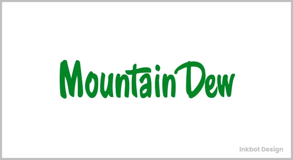
Mountain Dew began in the hills of Tennessee in 1940. The initial logo? Pure hillbilly energy.
The first Mountain Dew logo featured a gun-toting cartoon hillbilly shooting at a government revenue agent fleeing an outhouse. There is no subtlety here. The name “Mountain Dew” itself was Appalachian slang for moonshine. The original product was created as a whiskey mixer – not the extreme sports fuel it would later become.
Context: This was post-prohibition America. The country was fascinated with bootlegger culture, and the founders (Barney and Ally Hartman) leaned hard into this identity. The original Mountain Dew was a clear, lemon-lime soda – nothing like today’s product.
Strategic Intent: This wasn’t sophisticated marketing. This was an authentic regional identity. They weren’t trying to build a national brand but creating a local product with local appeal. The hillbilly character (later named “Willy the Hillbilly”) embodied the rebellious, stick-it-to-authority ethos that would remain part of the brand DNA for decades.
The Pepsi Acquisition and First Major Rebrand (1964-1969)
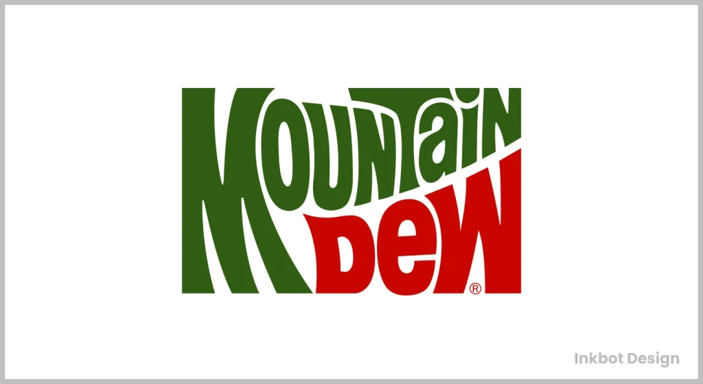
When Pepsi acquired Mountain Dew in 1964, they immediately recognised the potential beyond the regional market. But the hillbilly moonshiner image wouldn’t scale nationally.
Visual Changes:
- The hillbilly character remained but was softened
- Introduced a circular logo with “Mountain Dew” in a more standardised font
- Added the tagline “Yahoo! Mountain Dew!”
- Maintained the green and red colour scheme
Strategic Thinking: Pepsi needed to maintain the brand’s rebellious essence while making it palatable to a broader audience. They kept the hillbilly mascot as a nod to the heritage. Still, they began positioning the drink as “exhilarating” rather than explicitly connecting to moonshine.
Market Context: This was the 1960s – a time of significant cultural change. Pepsi was wise in maintaining some of the countercultural elements while making the brand more accessible.
The Outdoor Adventure Phase (1970s)
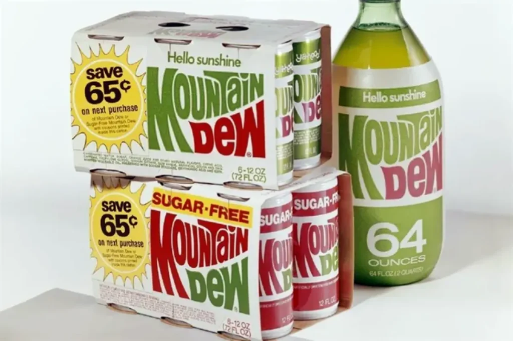
By the early 1970s, Mountain Dew underwent its most pivotal transformation yet.
Visual Evolution:
- Eliminated the hillbilly character entirely
- Introduced the iconic “mountain” logo with stylised lettering
- Shifted to a bright green colour palette
- Created a more dynamic, nature-focused visual identity
The Strategy Shift: This was calculated brilliance. Pepsi recognised that the hillbilly imagery had regional limitations and carried uncomfortable class stereotypes. Instead, they pivoted to something with universal appeal – outdoor adventure and nature.
The Bigger Picture: This aligned perfectly with the growing environmental movement and America’s fascination with the outdoors. The 1970s saw the first Earth Day, the creation of the EPA, and a broader cultural shift toward appreciating nature.
Business Impact: Sales exploded. By untethering from its regional roots, Mountain Dew could now compete nationally. The product’s high caffeine content was repositioned from “hillbilly energy” to “fuel for outdoor adventures.”
The Extreme Makeover (1990s)
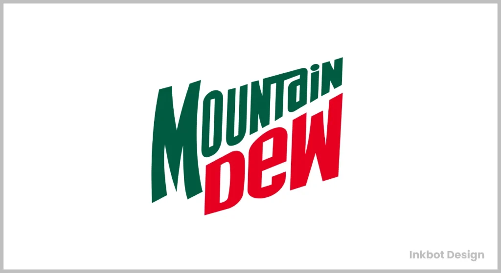
The 1990s brought the most transformative rebrand in Mountain Dew history.
Visual Revolution:
- Abbreviated the name to “MTN DEW” in many applications
- Introduced a more aggressive, angular typography
- Incorporated extreme sports imagery and neon colors
- Added the “Do the Dew” tagline
Strategic Masterclass: This wasn’t just a logo update but a complete brand personality overhaul. Mountain Dew recognised the emerging extreme sports culture and went all-in. The timing was impeccable – they caught the wave of skateboarding, snowboarding, and BMX just as these sports exploded into mainstream consciousness.
Competition Analysis: While Coca-Cola remained traditional and nostalgic with its branding, Mountain Dew positioned itself as the anti-establishment alternative. They weren’t competing with Coke but creating an entirely different category.
The Psychology: The sharp angles, electric green, and abbreviated text signalled speed, risk, and youthful rebellion. The brand deliberately used visual shorthand to appeal to teenage boys – their core demographic.
Public Reaction: The rebrand was polarising – precisely as intended. Parents were confused or concerned, increasing the appeal to young consumers seeking rebellion.
The Digital Age Evolution (2000s)
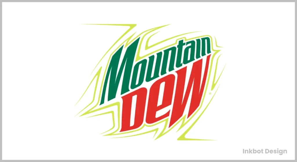
The early 2000s saw Mountain Dew facing a crucial challenge: maintaining extreme credibility in an increasingly digital world.
Visual Updates:
- Sleeker, more simplified mountain graphic
- A more minimal approach to the wordmark
- Introduction of the “lightning bolt” design element
- Greater emphasis on the abbreviated “MTN DEW” across platforms
Strategic Context: This evolution coincided with the brand’s expansion into gaming culture. As extreme sports became commercialised, Mountain Dew pivoted to a new frontier of extreme–competitive gaming.
Business Connection: This visual evolution directly supported the launch of Game Fuel variants and partnerships with major gaming franchises like Call of Duty and Halo.
Competitive Positioning: While Red Bull dominated the physical extreme sports space, Mountain Dew carved out digital extremes as their territory.
The Design Psychology: The simplified graphics and bold typography worked better in digital environments – on websites, games, and social media. The lightning bolt element conveyed energy without requiring the full extreme sports narrative.
The Modern Minimalist Turn (2009-2016)
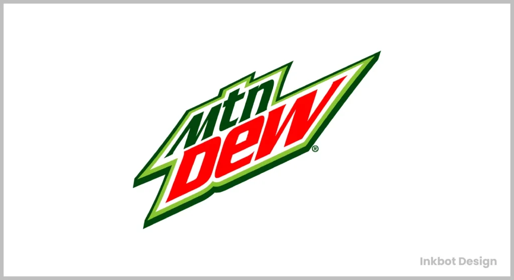
In 2009, Mountain Dew underwent a significant simplification.
Visual Transformation:
- Dramatically simplified mountain graphic
- More spacing between letters
- Cleaner, more corporate feel overall
- Maintained the “MTN DEW” abbreviation but with less aggressive styling
Strategic Failure: This was Mountain Dew’s most controversial rebrand, and frankly, it missed the mark. In attempting to look more contemporary, they sacrificed edge. The brand looked cleaner but felt watered down.
Market Context: This coincided with a broader trend toward minimalism in corporate design (think Google and Apple). Mountain Dew tried to follow this trend but failed to recognise that their brand equity lived in their maximalist approach.
Consumer Reaction: Hardcore fans hated it. The cleaner look felt corporate and inauthentic to the brand’s rebellious roots.
Business Impact: This period saw slower growth and lost market share. The lesson? Don’t chase design trends at the expense of your core identity.
The Course Correction (2017)
Recognising their misstep, Mountain Dew course-corrected in 2017.
Visual Adjustments:
- Reintroduced more dynamic, angular elements
- Returned to a higher contrast color palette
- Maintained the simplified mountain but with more energy
- Added dimensional effects and dynamic backgrounds
Strategic Recalibration: This was a balancing act – keeping the cleanliness and digital-friendliness of the minimalist approach while reinjecting the energy and attitude that fans missed.
Business Context: This rebrand coincided with Mountain Dew expanding their product line into different variants and flavours. The more flexible visual system allowed for better product differentiation while maintaining brand cohesion.
Market Position: By this point, Mountain Dew had established itself as more than a soft drink – it was a lifestyle brand with apparel, partnerships, and significant cultural cachet among its target demographic.
The Current State (2024-Present)
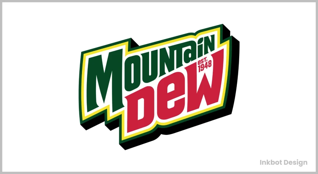
Today’s Mountain Dew logo represents an evolutionary culmination.
Visual Elements:
- Bold, condensed typography
- Simplified but dynamic mountain graphic
- Strategic use of white space
- Flexible design system that works across product variants
Strategic Success: The current identity strikes the right balance between heritage and contemporary relevance. It maintains the attitude while working effectively across digital platforms.
Psychological Impact: The current design system uses colour psychology masterfully – the core green signals energy and differentiation. In contrast, variant colours communicate flavour profiles.
Competition Comparison: While competitors like Sprite have gone ultra-minimal, Mountain Dew has maintained more character in their visual identity – an innovative differentiation play.
Lessons from Mountain Dew’s Logo Evolution
- Authenticity Trumps Trends: Mountain Dew’s most successful rebrands stayed true to their rebellious essence. When they tried to look too corporate, they failed.
- Evolution, Not Revolution: The most successful changes respected heritage while pushing forward. They never threw away equity – they repurposed it.
- Demographic Understanding: Mountain Dew has consistently designed for their core audience, not for design critics. They know who buys their product and design specifically for them.
- Cultural Alignment: Each major rebrand is connected to broader cultural shifts – outdoor appreciation, extreme sports, and gaming culture.
- Visual Flexibility: Over time, the brand has created a visual system that maintains identity while allowing for product expansion.
The Future Projection
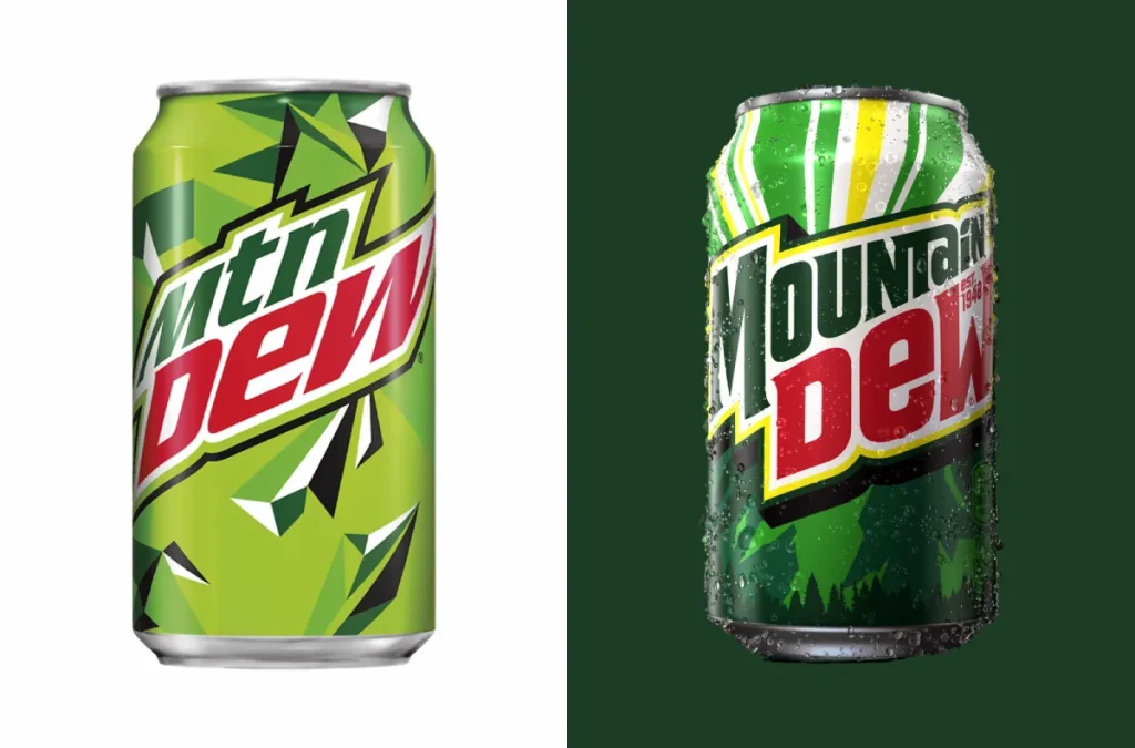
Where does Mountain Dew go from here? Based on current trends and their trajectory:
- Greater Sustainability Signaling: Expect subtle visual cues that emphasise environmental responsibility without sacrificing edge.
- Digital-First Design Elements: As the metaverse expands, look for Mountain Dew to incorporate design elements that translate into virtual environments.
- Nostalgic Callbacks: With 90s nostalgia peaking, don’t be surprised to see limited-edition returns to the extreme sports era visual identity.
- Increased Personalisation: The logo system will likely evolve to support greater personalisation across platforms and products.
The Mountain Dew logo history isn’t just a design case study – it’s a masterclass in brand evolution. They’ve maintained core DNA while repeatedly reinventing themselves for new generations. That’s not just good design – that’s good business.
FAQs
What did the original Mountain Dew logo look like, and what was its significance?
The original 1940s Mountain Dew logo featured a cartoon hillbilly character (later named “Willy the Hillbilly”) shooting at a revenue agent running from an outhouse. This imagery directly referenced the drink’s Appalachian roots and moonshine connection – “mountain dew” was slang for homemade whiskey. The logo embodied the rebellious, anti-authority spirit that would remain part of Mountain Dew’s brand DNA throughout its evolution.
Why did Pepsi remove the hillbilly character from Mountain Dew’s logo in the 1970s?
Pepsi eliminated the hillbilly character to broaden Mountain Dew’s appeal beyond regional markets. The character carried uncomfortable class stereotypes and limited the brand’s national potential. By pivoting to a nature-focused visual identity with the iconic mountain logo and bright green colour palette, Pepsi transformed Mountain Dew from a regional curiosity to a national brand with universal outdoor adventure appeal, coinciding perfectly with the growing environmental movement.
Which Mountain Dew logo redesign had the most significant impact on sales?
The 1990s “extreme” rebrand undoubtedly had the most significant impact on Mountain Dew’s commercial success. By introducing aggressive angular typography, abbreviated “MTN DEW” branding, and the “Do the Dew” tagline, Mountain Dew positioned itself at the centre of the exploding extreme sports culture. This visual transformation helped the brand capture the teenage male demographic and establish a unique market position separate from traditional colas, resulting in explosive sales growth that established Mountain Dew as a top-tier beverage brand.
Has Mountain Dew ever had a logo redesign that failed?
The 2009 minimalist redesign is widely considered Mountain Dew’s biggest branding misstep. In following broader corporate design trends toward simplification (like Google and Apple), Mountain Dew sacrificed its edgy identity for a cleaner, more corporate feel. The redesign featured dramatically simplified graphics and wider spacing that longtime fans perceived as watered-down and inauthentic. This period saw slower growth and lost market share until the company course-corrected in 2017 by reintroducing more dynamic elements.
How did Mountain Dew’s logo evolution reflect changes in its target audience?
Mountain Dew’s logo evolution perfectly mirrors its shifting target demographics:
1940s-60s: The hillbilly character targeted rural, primarily Southern consumers
1970s: The nature-focused rebrand expanded to outdoor enthusiasts nationwide
1990s: The extreme sports identity laser-targeted teenage males and young adults
The 2000s: The digital-friendly redesign embraced gaming culture and online communities
2010s-present: The balanced modern approach supports both core fans and broader consumer groups
Each visual evolution was directly tied to capturing or expanding specific audience segments.
How did Mountain Dew’s logo change compared to competitors like Coca-Cola and Sprite?
While Coca-Cola maintained consistent traditional branding with minimal changes over decades (emphasising heritage and nostalgia), and Sprite pursued increasingly minimalist design approaches, Mountain Dew took a dramatically different path. Mountain Dew embraced regular reinvention while maintaining core brand elements, allowing it to stay culturally relevant. At the same time, competitors either remained static or followed corporate minimalism trends. This strategic differentiation helped Mountain Dew discover a unique position as the anti-establishment alternative in the carbonated beverage market.
What role did colour psychology play in Mountain Dew’s logo evolution?
Colour has been crucial to Mountain Dew’s brand identity. The shift to bright, electric green in the 1970s was particularly significant, as this colour:
Signalled energy, excitement, and youthfulness
Created immediate shelf differentiation from red (Coca-Cola) and blue (Pepsi) competitors
Subconsciously connected to nature and outdoor activities.
Later, in the extreme sports era, the neon green intensity communicated the high-caffeine, high-energy product experience.
In modern variants, colour modifications signal different flavour profiles while maintaining brand recognition.
How did digital technology influence Mountain Dew’s logo design?
The digital revolution dramatically impacted Mountain Dew’s visual identity in several ways:
The early 2000s saw simplification to ensure logos rendered well on lower-resolution screens.
The abbreviated “MTN DEW” worked better in limited digital spaces.
The lightning bolt element provided a recognisable icon for small digital applications.
More recent designs emphasised platform flexibility, from mobile apps to gaming integrations.
The current system supports animation and motion graphics for dynamic digital applications.
Logo spacing and composition were optimised for social media avatars and limited digital real estate.
What business lessons can other brands learn from Mountain Dew’s logo evolution?
Key lessons include:
Evolve strategically, not reactively – each Mountain Dew change is connected to broader business goals.
Maintain core brand DNA through transitions – Mountain Dew kept its rebellious spirit across wildly different visual approaches.
Design for your audience, not design critics – Mountain Dew prioritises resonance with core customers over design trends.
Visual identity should signal product differentiation – Mountain Dew’s distinctive look reinforced its unique position.
Failed rebrands can be corrected – Mountain Dew recognised its minimalist misstep and course-corrected successfully.
Logo systems need flexibility for product expansion – Mountain Dew created a visual framework that supported dozens of variants.
How did Mountain Dew balance heritage with modernisation in its logo evolution?
Mountain Dew mastered the delicate balance between heritage and contemporary relevance by:
Retaining the mountain motif across generations while repeatedly modernising its execution
Maintaining the core green colour palette while updating specific shades for current trends
Preserving the rebellious brand essence while shifting how this rebellion was visually expressed
Creating design systems that could flex for new products while maintaining recognisable brand elements
Using limited-time retro packaging to celebrate heritage while maintaining forward-looking primary branding
Allowing the logo to evolve alongside cultural shifts while retaining key distinctive assets
What elements of Mountain Dew’s current logo design make it effective in today’s market?
The current Mountain Dew logo succeeds through:
Bold, condensed typography that commands attention in crowded retail environments
A simplified mountain graphic that works well across digital platforms while honoring brand heritage
Strategic use of white space that balances energy with clarity
A flexible design system allows for clear product variant differentiation.
Visual elements that translate effectively to merchandise and partnerships
Digital-friendly characteristics that support animation and integration into gaming environments
A balanced approach that appeals to both loyal longtime customers and new consumers
