Visual Content in Marketing: Guide to High-Performance Design
Most marketing “experts” treat visual content as an afterthought—a bit of digital wallpaper to brighten up a boring blog post. They are wrong.
If you are an entrepreneur or an SMB owner, you need to understand that every pixel on your site is either building trust or creating friction.
In my fieldwork as a Creative Director, I see the same mistake repeated: companies spend thousands on content marketing only to wrap their insights in amateurish, stock-heavy visuals that scream “unreliable.”
Visual debt is real. It is the cost of using “good enough” graphics that eventually need to be ripped out and replaced when you realise they are the reason your conversion rate is stagnant.
This guide isn’t about making things “pretty.” It is about the forensic application of visual communication to solve business problems.
We will conduct a thorough content analysis of what actually works, moving far beyond the surface-level advice commonly found on generic marketing blogs.
- Visuals are strategic, not decorative: every pixel should reduce friction and build trust to drive conversions.
- Forensic visual strategy combines intent, technical precision, and brand cohesion to align semiotics with audience values.
- Optimise assets for performance and SEO: metadata, LCP, formats, and priority hints matter for visibility and rankings.
- Authenticity wins: handcrafted, provenance-backed imagery and UGC outperform homogenous AI-generated visuals in trust and conversion.
What is Visual Content?

Visual content is the strategic use of imagery, graphics, video, and layout to communicate information, evoke specific psychological responses, and guide user behaviour.
In a commercial context, it functions as a non-verbal sales force that operates at the speed of human perception (approx. 13 milliseconds).
At a deeper level, forensic visual strategy is built on Visual Semiotics—the study of how signs and symbols create subconscious meaning.
In a high-performance brand, we do not just choose a “blue” background; we analyse the Denotation (the literal image) and the Connotation (the cultural association).
If your brand’s semiotic signals are misaligned with your market’s values, your audience will experience a “visceral rejection” of your message before they read a single word of copy.
The three core elements of effective visual content are:
- Intentionality: Every asset must serve a specific stage of the buyer’s journey.
- Technical Precision: Proper formatting, compression, and accessibility compliance.
- Brand Cohesion: Strict adherence to a visual grammar that builds long-term recognition.
Beyond the visible pixels, a forensic visual strategy includes the Metadata Layer.
Search engines crawl EXIF Data (Exchangeable Image File Format) to verify the authenticity and location of an image—a critical factor for local SEO and brand trust.
Furthermore, since your Largest Contentful Paint (LCP)—a core Google ranking factor—is usually a visual asset, you must implement Priority Hints (using fetchpriority=”high”) for your hero images.
If your visual presence isn’t optimised at the code level, it becomes a technical liability that degrades your search visibility.
The Hierarchy of Visual Assets: From Slide Decks to Satellite Images
In visual content marketing, not all assets are created equal. A robust visual strategy requires a diversified portfolio of content assets.
If you are only thinking about Instagram posts, you are missing the broader landscape of visual elements that drive B2B and high-ticket B2C conversions.
1. High-Density Assets: Digital Brochures and Slide Decks
When a lead is deep in the consideration phase, they aren’t looking for a “vibe”; they are looking for data. Digital brochures and slide decks are often the unsung heroes of the sales funnel. However, most firms treat these as text-heavy dumps.
A forensic approach treats a slide deck as a cinematic experience—minimising text and using data visualisation to make complex arguments undeniable.
The 3-Second Visual Audit
Look at your latest visual design. Does it pass the “scroll-stopper” test? Be honest and toggle “YES” for every criteria it meets.
2. The Power of Information-Rich Imagery
We often talk about “artworks” in a marketing context, but for an SMB, your imagery must be functional.
Satellite images, for instance, are increasingly used in logistics and real-world service sectors to provide literal proof of scale.
Similarly, charts and graphs shouldn’t only be exported from Excel, but also designed to minimise cognitive load, ensuring that the “aha!” moment occurs instantly.
3. Historical Visuals: From Newspaper Images to Magazine Advertisements
To understand the future, we must perform a social semiotic analysis of the past.
The way newspaper images and magazine advertisements once captured attention has evolved, but the core psychological triggers—contrast, gaze, and framing—remain the same.
We take these legacy principles and apply them to modern content creation for search engines.
Social Media and the Attention Economy
Your presence on social media platforms is often the first point of contact for your brand. If your visual branding elements are inconsistent, you are effectively introducing your business with a stutter.

Instagram Business and the Grid Strategy
On Instagram Business, your grid is your storefront. It requires more than just posting “family photos” or generic staff shots. It requires a cohesive visual storytelling toolbox.
Each post must contribute to a larger narrative that fosters brand recognition and loyalty. If a user lands on your profile and sees a disconnected mess, they won’t follow, and they certainly won’t make a purchase.
The Rise of YouTube Shorts and Explainer Videos
The shift toward short-form video content is no longer a trend; it is the standard. YouTube Shorts and explainer videos offer a way to circumvent the “Temporal Friction” associated with long-form videos.
By delivering value in 15-60 seconds, you respect the user’s time while increasing your visibility in Google’s SERPs.
User-Generated Content (UGC) as Proof
User-generated content is the digital version of a “neighbourly recommendation.”
It is raw, often unpolished, and highly effective.
When your customers create content for you, it serves as a visual testimonial that carries more weight than any high-budget video marketing campaign could ever hope to achieve.
Data Visualisation and the Science of Learning Comprehension
One of the most significant gaps in modern marketing is the failure to comprehend learning. If your visual content is too complex, the brain tends to reject it. If it’s too simple, the brain ignores it.
The Role of Content Analysis
Through rigorous content analysis, we’ve found that high-performing B2B brands use data visualisation not just to look smart, but to facilitate faster decision-making.
Researchers, such as Giuseppe Caltabiano, have noted that integrating visual and textual information is crucial for brand retention.
Interactive Research Reports
The pinnacle of visual content in 2026 is the interactive research report. Instead of a static PDF, these reports allow users to toggle data points, providing a bespoke experience that increases scroll depth and dwell time.
This is a significant signal to search engines that your content is of high quality.
The Technical Frontier: AR, VR, and Motion Design
As we move toward a more immersive web, motion design and extended reality are becoming “Root Attributes” for forward-thinking brands.
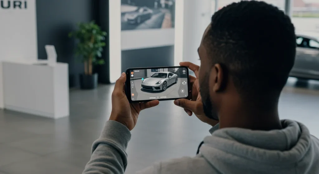
Augmented Reality (AR) and the AR Feature
The AR feature is no longer just for trying on virtual glasses. For SMBs in the furniture, real estate, or industrial sectors, Augmented Reality allows customers to project products into their own space.
This reduces the “Risk of Purchase” and dramatically lowers return rates. It is visual content that solves a logistical problem.
Virtual Reality (VR) and Immersive Training
While Virtual Reality remains a niche for many, its application in training and “behind-the-scenes” tours is unparalleled.
It offers a level of immersion that standard video content cannot match, fostering a deep sense of brand identity.
Motion Graphics vs. Static Design
Motion graphics should be used to direct the eye, not just to add “flair.” A subtle animation on a landing page can guide a user toward a CTA, while over-the-top motion creates a distraction.
In our motion design work, we focus on creating functional movement that supports a seamless user experience.
Measuring Visual Success: Heatmaps and Scroll Depth
The primary commercial benefit of a visual strategy lies in Multi-touch Attribution.
While a text-based search ad might trigger the final click, it is often a high-fidelity Explainer Video or a well-designed Slide Deck viewed days prior that establishes the “Trust Floor.”
Forensic branding treats visuals as Conversion Catalysts—assets that don’t just “inform” but significantly shorten the sales cycle by reducing the cognitive effort required to reach a purchase decision.
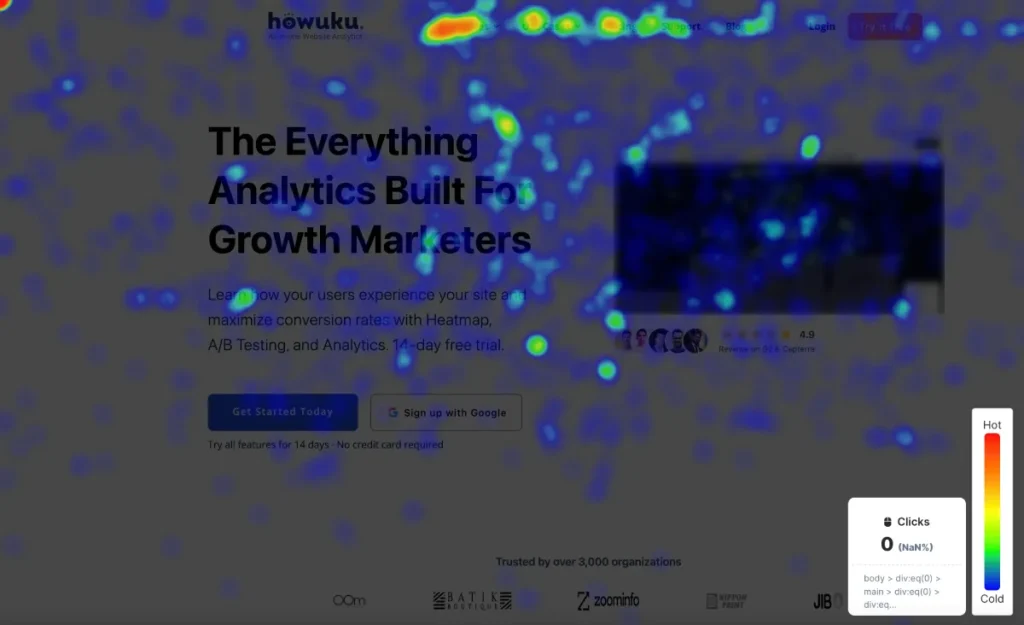
Heatmap Analysis
Heatmap analysis enables us to pinpoint exactly where users are focusing their attention. If your “Hero Image” is getting all the attention but your “Call to Action” is being ignored, you have a visual hierarchy failure.
Often, a simple change in the direction a person in a photo is looking can redirect a user’s attention back to your conversion point.
Scroll Depth and Retention
By monitoring scroll depth, we can see if our visual elements are successfully “pulling” the user down the page.
If there is a massive drop-off at a specific point, it usually indicates a “Visual Wall”—a section of text that is too dense and lacks the visual breaks provided by charts and graphs or images.
The Impact on Google’s SERPs
Visuals impact SEO indirectly through engagement metrics and directly through Google Search Image results.
By ensuring your images are indexed correctly and have descriptive metadata, you open up a secondary “Search Engine” traffic source that most competitors ignore.
AI and the Return to Human Design
We have entered the era of AI-Generated Homogeneity. Over the last 18 months, the market has been inundated with “perfect” yet soulless AI-generated imagery.
While design software has made it easy to create visuals, it has also created an “Uncanny Valley” effect.
The 2026 Shift: We are witnessing a massive resurgence of “The Handcrafted Asset.” Brands that invest in custom illustrations, real-world photography, and “imperfect” human-led design are seeing higher trust signals. Authentic, raw storytelling in marketing is now a premium differentiator.
Data Security and Visual Integrity
As deepfakes become more prevalent, data security and visual integrity are paramount. Users are becoming sceptical. Brands that can prove the “Provenance” of their visual assets—showing the real people and real processes behind the scenes—will win the trust war.
A critical problem in 2026 is Synthetic Scepticism. As users become accustomed to AI-generated “slop,” they develop a heightened sensitivity to imagery that appears “too perfect.”
The solution is Visual Provenance—incorporating “High-Friction” elements like raw behind-the-scenes footage, unedited team photos, and process-driven Motion Design.
This provides “Proof of Humanity,” a trust signal that converts at a significantly higher rate than AI-perfected imagery in high-ticket B2B sectors.
The Verdict
Visual content in marketing is a technical discipline, not a decorative one. If you are an entrepreneur who is “allergic to fluff,” you must treat your visual assets with the same forensic scrutiny you apply to your balance sheet.
Stop using visuals to “fill space.” Use them to reduce friction, explain complex ideas, and provide the “Visual Proof” that your brand is the authority it claims to be.
The era of the generic stock photo is over. The era of high-performance, semantic, and human-centric design is here.
If your current branding feels like it’s stuck in 2015, it is costing you money. Don’t let visual debt kill your growth.
Next Step: Are you ready to stop guessing and start scaling? You can request a quote for a forensic design audit, or visit our homepage at Inkbot Design to see how we turn visual strategy into business results.
Frequently Asked Questions
What is the “13-Millisecond Rule” in visual marketing?
This refers to the speed at which the human brain can process visual information, such as images. Because visual content bypasses the “rational” brain and goes straight to the emotional centres, your imagery must communicate your brand’s value proposition faster than a user can blink.
Why is Visual Content critical for SEO in 2026?
Visuals impact SEO both directly (via Google Image Search) and indirectly by increasing “Dwell Time.” High-quality charts, graphs, and videos keep users on the page longer, which signals to Google that your content is authoritative and helpful.
What is “Visual Debt”?
Visual Debt is the long-term cost of using amateur or mismatched graphics. Like technical debt in software, it accumulates over time, eroding brand trust and conversion rates until the assets eventually require a costly, forensic overhaul to fix the “sea of sameness.”
How does LCP (Largest Contentful Paint) affect my rankings?
LCP measures how fast the largest visual element on your page (usually a hero image) loads. If your image is unoptimised or lacks Priority Hints, your LCP score will be poor, directly resulting in lower rankings in Google’s mobile-first index.
Should I use AI-generated images for my branding?
In 2026, AI should be used for brainstorming, but not for final “Trust-Building” assets. Users are increasingly wary of AI-Homogeneity. To stand out, you must add human-led design elements and real-world photography to provide the “Proof of Humanity” that builds brand loyalty.
What is “Visual Semiotics”?
Visual Semiotics is the study of how visual elements—colours, shapes, and symbols—communicate meaning. A forensic designer uses semiotics to ensure that every pixel aligns with the subconscious expectations of your target audience.
How do Heatmaps improve my visual strategy?
Heatmap analysis reveals where users are looking and clicking. If your “Hero Image” is getting all the focus but your “Call to Action” is being ignored, you have a Visual Hierarchy failure that is costing you conversions.
What is the “Halo Effect” in design?
The Halo Effect is a cognitive bias where a user’s overall impression of a brand is influenced by a single trait—often its visual quality. If your website looks “premium,” users are more likely to assume your service is also premium, even before they see your results.
How do I optimise images for mobile performance?
Use next-gen formats like WebP or AVIF, implement “Lazy Loading,” and use the <picture> element to serve different image versions based on the user’s screen size. This ensures your “Visual Content” doesn’t destroy your page speed.
What is the difference between Vector and Raster images?
Vector images (SVGs) are made of mathematical paths and are infinitely scalable—perfect for logos. Raster images (JPEGs) are composed of pixels and become blurry when enlarged. Using the Inkbot Design logomark in SVG format ensures crispness at any scale.
How does AR (Augmented Reality) impact conversion?
AR reduces the “Risk of Purchase” by allowing users to see products in their own environment. For SMBs, this “Visual Proof” reduces return rates and increases conversions by addressing the physical distance issue in e-commerce.
What are “Distinctive Brand Assets”?
These are non-logo elements—like a specific colour, font, or sound—that trigger immediate brand recognition. Forensic differentiation focuses on building these assets so your brand is identifiable even without its name.
How do I fix “Visual Cognitive Dissonance”?
This occurs when your visuals tell a different story from your copy. If you sell high-end services but use cheap stock photos, the user’s brain detects a lie. You fix it by replacing generic assets with authentic, custom-made visual proof.
Why is “Accessibility” (WCAG) part of a visual strategy?
Accessible design ensures your visuals work for the 15% of the population with disabilities. This includes proper colour contrast and descriptive Alt Text, which is also a primary signal for search engine crawlers.
How does visual content reduce Customer Acquisition Cost (CAC)?
High-quality visuals establish trust more quickly, reducing the number of touchpoints needed to convert a lead. By lowering friction and increasing “Information Gain,” you make your paid advertising and organic search efforts significantly more efficient.
