The Gillette Logo: Razor-Sharp Beginnings to Smooth Modern Design
Attention business owners struggling with branding: Your logo might cost you millions of lost sales.
Did you know that most of you’ve heard about logo design is wrong? Yes, it’s true. While you’ve been chasing trendy designs and clever concepts, you’re still not seeing the results you want.
But it’s not your fault.
The secret to a powerful, enduring logo has been hiding in plain sight for over a century.
Picture this: It’s 1901. A small company launches with a logo featuring lowercase letters impaled by an arrow.
Fast forward to today, and that same company’s logo is a bold, capitalised wordmark recognised worldwide.
The company? Gillette. The transformation? Nothing short of revolutionary.
In the next few minutes, I will show you how Gillette’s logo evolution can teach you more about effective branding than any design school ever could.
You’ll learn:
- The counterintuitive reason why Gillette’s original “clever” design held them back
- The exact moment Gillette’s logo went from good to great (and how you can replicate it)
- Why simplicity trumps creativity in logo design every single time
Buckle up. By the end of this article, you’ll never look at your company’s logo the same way again.
🔰 TL;DR: Gillette’s logo has evolved from a simple arrow-pierced wordmark to a sleek, modern design subtly incorporating razor-like elements. This journey reflects the brand’s growth, technological advancements, and changing consumer preferences over 120+ years.
- Gillette's logo evolution exemplifies the power of branding, transforming from a complex design to a sleek, modern identity.
- Simplicity in logo design is crucial; it enhances recognition and aligns with changing consumer preferences.
- The enduring success of Gillette's logo illustrates the importance of adapting while maintaining core brand elements.
The Birth of a Shaving Giant (1901-1964)
A Cut Above the Rest: The Original Gillette Logo

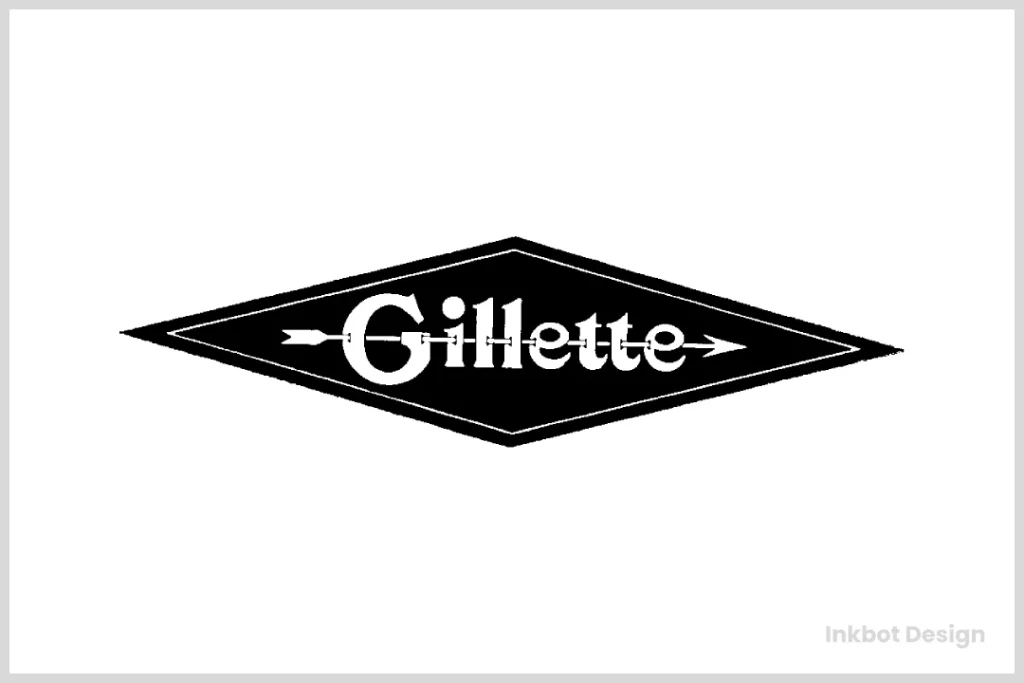
- When King C. Gillette founded his company in 1901, he needed a logo to slice through the competition. And boy, did he deliver! The original Gillette logo was a stroke of genius: Lowercase “Gillette” lettering (except for the capital “G”)
- A sharp arrow piercing through the letters
- Encased in a distinctive rhombus shape
This design wasn’t just eye-catching; it was downright revolutionary. The arrow symbolised the sharpness and precision of Gillette razors, while the unique typeface oozed sophistication.
Fun fact: Did you know King C. Gillette was a travelling salesman before inventing the safety razor? Talk about a career change!
Sharpening the Edge: Early Logo Iterations
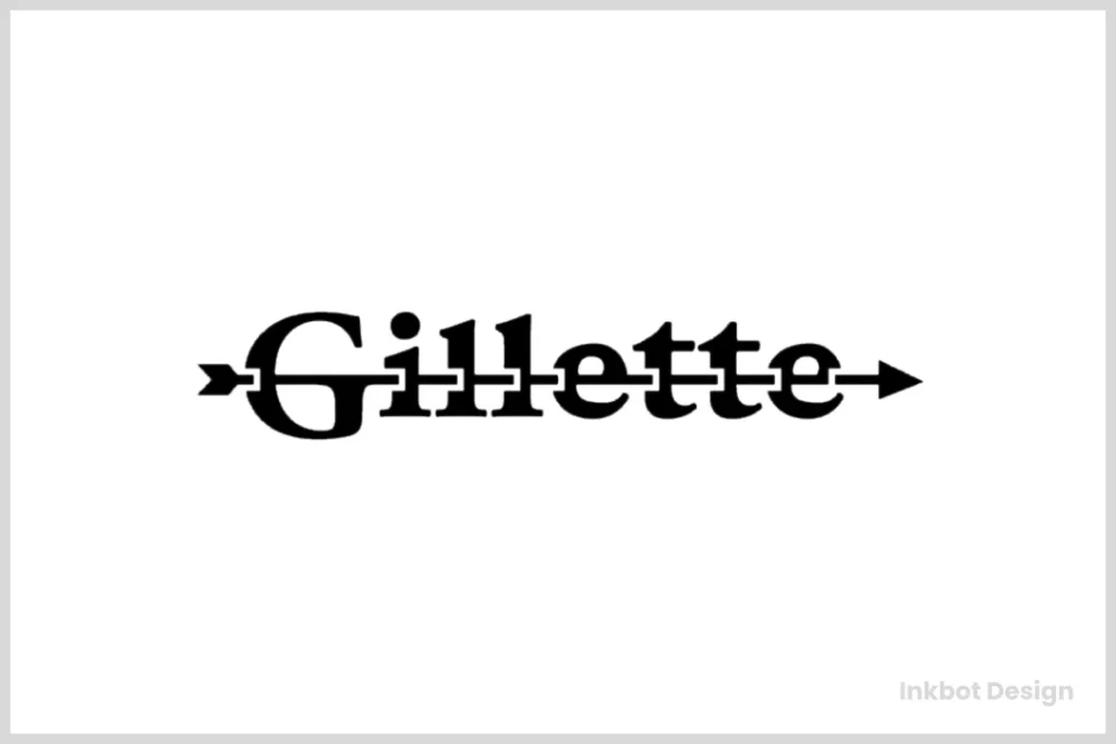
- Over the next few decades, Gillette’s logo underwent subtle refinements: The rhombus shape was occasionally dropped.
- Variations in arrow placement and thickness
- Experimentation with uppercase and lowercase lettering
But the core concept remained intact. That arrow was Gillette’s secret weapon, slicing through the competition like a hot knife through butter.
A Clean Shave: The 1964 Redesign

- By 1964, Gillette was ready for a fresh look. Enter the new logo: Solid black letters.
- A redesigned, more prominent “G”
- The arrow is still present but more integrated.
- This redesign marked a turning point. Gillette was no longer just a razor company; it was becoming a grooming empire. Around this time, Gillette also introduced a corporate roundel emblem: A thin black ring with white filling.
- Three short bars near the right side
- “The Gillette Company” text in a simple sans-serif font
This dual-logo approach allowed Gillette to maintain its iconic wordmark while presenting a more corporate image when needed.
Smoothing Out the Edges: 1974-2009
1974: A Bold New Direction

- In 1974, Gillette took a risk that would make most designers break out in a cold sweat. They ditched the arrow. I know, I know. I can hear you gasping from here. But trust me, it worked. The new logo featured Bolder, more confident lettering.
- A clever visual rhythm emphasising the double letters
- Merged horizontal bars on the “tt.”
This design was a game-changer. It screamed modernity and confidence. Gillette wasn’t just selling razors; it was selling a lifestyle.
1989: The Prototype of Today

- By 1989, Gillette was ready to take another leap forward. This redesign laid the groundwork for the logo we know today: All capital letters.
- Even bolder typeface
- Tighter letter spacing (some letters touching)
This version exuded strength and reliability. It was a logo that said, “Trust us with your face. We’ve got this.”
The Modern Era: 2009-Present
2009: A Cut Above the Rest

- In 2009, Gillette unveiled its current logo, and let me tell you, it’s sharper than a fresh razor blade. Key features: Asymmetric shape above the “i” (resembling a razor blade)
- Angled cuts on the “G” and “i”
- Sleek, modern typeface
This design is pure genius. It subtly incorporates Gillette’s core product (razors) without being obvious. It’s clean, it’s sharp, and it’s unmistakably Gillette.
The Hidden Gem
Here’s where it gets exciting. Take a closer look at that dot above the “i”. Notice how the diagonal line leads into the shape of the “G”?This isn’t just clever design; it’s a visual representation of Gillette’s precision. It mimics the action of a razor gliding across the skin, leaving a clean, smooth finish. Brilliant, right? Details like these separate good logos from great ones.
The Impact of Gillette’s Logo Evolution
Gillette’s logo journey isn’t just about pretty pictures. It’s a masterclass in brand evolution.
- Each logo iteration mirrored Gillette’s technological progress: The original arrow Symbolised the revolutionary safety razor.
- The bold 1974 design: Representing multi-blade innovations
- The current sleek look: Embodying modern, high-tech grooming solutions
Adapting to Consumer Preferences
- Gillette’s logo has also evolved with changing consumer tastes. Early 1900s: Ornate, detailed designs were in vogue
- Mid-century: Clean, bold typography gained popularity
- Modern era: Minimalist, meaningful designs reign supreme
Building Brand Recognition
Today, Gillette boasts a staggering 60% market share in the global razor market.
That’s not just because of their products but also their consistent, evolving brand identity. Their logo is instantly recognisable, whether on a product package, a sports stadium, or a Formula 1 car.
Lessons from Gillette’s Logo Evolution

So, what can we learn from Gillette’s logo journey? Plenty!
- Embrace evolution: Don’t be afraid to update your logo as your brand grows.
- Maintain core elements: Notice how Gillette always kept their name as the focal point?
- Incorporate subtle meanings: The hidden razor in the current logo is pure genius.
- Stay relevant: Each redesign reflected current design trends and consumer preferences.
- Think long-term: Gillette’s gradual logo changes allow for consistent brand recognition.
When I founded Inkbot Design, I took these lessons to heart. Our logo has evolved, but we’ve always maintained our core identity. It’s a delicate balance, but one that pays off in spades.
The Future of the Gillette Logo
So, what’s next for Gillette’s iconic emblem? While I don’t have a crystal ball (or a time-travelling razor), I can make some educated guesses:
- Increased simplification: As digital platforms become more prevalent, we might see an even more streamlined version of the logo.
- Animated versions: With the rise of digital advertising, don’t be surprised to see animated Gillette logos that showcase the “shaving” action.
- Customisable elements: As personalisation becomes more critical, Gillette might introduce logo variations for different product lines or markets.
Whatever the future holds, one thing’s for sure: Gillette’s logo will continue to be as sharp and innovative as its razors.
Conclusion: A Legacy Carved in Design
From its humble beginnings as an arrow-pierced wordmark to its current sleek and meaningful design, the Gillette logo has come a long way. It’s a testament to the power of thoughtful branding and consistent evolution.
As a designer, I’m in awe of Gillette’s logo journey. It’s inspired me in my work at Inkbot Design, reminding me that great branding is more than aesthetics. It’s about telling a story, evolving with your audience, and always staying a cut above the rest.
So, the next time you pick up a Gillette razor, take a moment to appreciate that little logo. It’s not just a design; it’s over a century of innovation captured in a few simple lines.
And who knows? In another 120 years, we’ll admire the Gillette logo on our Mars colonies. One can dream, right?🎨
Need help crafting a logo that stands the test of time? Let’s chat!
At Inkbot Design, we specialise in creating timeless, meaningful logos that grow with your brand.
Don’t let your business get lost in the shuffle. Reach out today, and let’s start carving your legacy in design.
FAQs
Who designed the original Gillette logo?
The original Gillette logo designer is unknown but was created when King C. Gillette founded the company in 1901.
How many significant redesigns has the Gillette logo undergone?
The Gillette logo has had four significant redesigns: 1964, 1974, 1989, and 2009.
What does the arrow in the original Gillette logo represent?
The arrow symbolises the sharpness and precision of Gillette razors.
When did Gillette remove the arrow from its logo?
Gillette removed the arrow from its logo in the 1974 redesign.
What’s the significance of the current Gillette logo design?
The current logo subtly incorporates razor-like elements, with the dot of the ‘i’ resembling a razor blade and the diagonal line leading into the ‘G’ mimicking a razor’s action.
Has Gillette ever used a mascot or character in its logo?
Gillette has always used a wordmark-based logo without mascots or characters.
Does Gillette use different logos for different product lines?
While Gillette uses the same core logo across its product lines, it may be adapted slightly for different products or markets.
How has Gillette’s logo evolution impacted its brand recognition?
Gillette’s consistent yet evolving logo has contributed to its strong brand recognition, helping it maintain a 60% market share in the global razor market.
Are there any hidden meanings in the current Gillette logo?
Yes, the diagonal line in the dot of the ‘i’ leading into the ‘G’ represents the precise shave of Gillette razors.
How does Gillette’s logo compare to those of its competitors?
Gillette’s logo stands out for its sleek, modern design and subtle incorporation of razor-like elements, setting it apart from competitors.
Has Gillette ever considered a complete rebranding with a new name or logo concept?
No public information suggests Gillette has ever considered a complete rebranding. The company has consistently evolved its existing logo concept.
How does Gillette’s logo adapt to different media and sizes?
Gillette’s current logo is designed to be highly versatile, working well across various media, from tiny product packaging to large billboards.

