Top 10 Famous Fast Food Logos for Design Inspiration
I’ve always been fascinated by the power of fast food logos. These small, seemingly simple designs have become some of the most recognised symbols on the planet—sometimes even more familiar than religious icons or national flags.
Truthfully, there’s something remarkable about how these colourful emblems have wormed their way into our collective consciousness.
Fast food logos aren’t just corporate identifiers but cultural landmarks that trigger immediate emotional responses.
Let’s break it down: when you see those golden arches on the horizon whilst driving down the motorway, doesn’t your brain immediately conjure up the taste of those salty chips? That’s not coincidental—that’s brilliant branding at work.
But what makes these logos so effective? How have they evolved over the decades to maintain relevance while staying true to their core identity? And what design lessons can we learn from these masterpieces of visual communication?
- Fast food logos leverage colour psychology, using red and yellow to stimulate appetite and evoke positive emotions.
- Simplicity and recognisability are key traits, ensuring logos are memorable and effective across various media.
- Successful logos evolve gradually, maintaining core elements while adapting to contemporary design trends.
The Psychology Behind Fast Food Logo Design
The colours and shapes used in fast food branding aren’t chosen at random. There’s a method to the madness, a psychology driving these design decisions that influences how we perceive and interact with these brands.
Red and yellow dominate the fast food logo colour palette for good reason. Red stimulates appetite and creates a sense of urgency, while yellow evokes happiness and optimism.
They make a powerful psychological combination by saying, “Eat here and feel good about it.” Look at McDonald’s, Burger King, and countless others who employ this colour strategy.
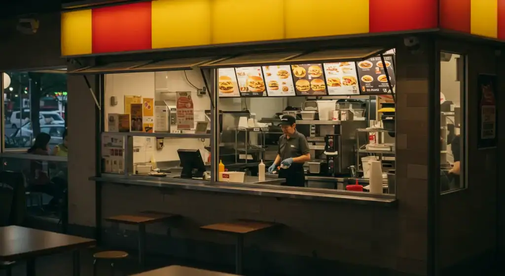
Simplicity is another trademark of successful fast-food logos. These brands understand that their logos must be instantly recognisable at 70mph from the motorway, memorable enough for children to recall, and simple enough to be reproduced consistently across thousands of locations worldwide.
The shapes themselves matter, too. Rounded elements and curves are perceived as friendly and approachable. Consider the soft, rounded edges of the Burger King logo or the perfectly circular aspects of many fast food designs. These choices aren’t accidental—they’re calculated to make consumers feel comfortable and welcome.
McDonald’s Logo: The Power of the Golden Arches
No fast food logo is more iconic than McDonald’s golden arches. The simple “M” shape has transcended mere corporate branding to become a global cultural symbol, recognised by an estimated 88% of the world’s population.
The McDonald’s logo as we know it today wasn’t always so streamlined. In the 1960s, the actual architecture of McDonald’s restaurants featured golden arches as part of their design. Eventually, these architectural elements were abstracted into the simplified “M” logo we recognise today. This evolution demonstrates how real-world brand elements can be distilled into powerful graphic symbols.
What’s particularly clever about the golden arches is their versatility. The logo works in multiple contexts—a tiny icon on a mobile app or a massive sign visible from the motorway. The distinct yellow against red create maximum visibility and contrast, ensuring the logo stands out in any environment.
The golden arches also demonstrate the power of consistency. While McDonald’s has updated its visual identity over the decades, the fundamental elements have remained remarkably stable. This consistency has allowed the brand to build incredible recognition while evolving.
For designers, the lesson is clear: sometimes, the most effective logos aren’t the most complex or trendy. The golden arches succeed because they’re simple, memorable, and have been consistently presented for decades. As Inkbot Design’s branding experts would affirm, consistency is often the secret ingredient to logo success.
Burger King Logo: Evolution and Modernisation
Burger King’s logo history offers a fascinating case study of how a brand can evolve while maintaining its core identity. The company’s recent 2021 logo redesign took a step backwards—in the best possible way—by reintroducing a modernised version of its classic 1969 logo.
This “retro-modern” approach perfectly demonstrates how brands can honour their heritage while appearing contemporary. The redesigned logo features a simplified burger icon with the brand name nestled between the buns, employing a vibrant colour palette of red, yellow, and brown that feels both nostalgic and fresh.
What makes this redesign particularly interesting is how it addresses multiple design challenges simultaneously:
- It connects with nostalgia for long-time customers
- It feels clean and modern for younger audiences
- It works seamlessly across digital platforms
- It stands out against competitors with its distinctive shape
The Burger King logo also shows us how effective stylised representations can be. The logo doesn’t try to depict a burger realistically. Instead, it creates a symbolic representation that captures the essence of the product while maintaining graphic simplicity.
For graphic designers working on rebrands, Burger King’s approach offers valuable insights about balancing heritage with contemporary needs. Sometimes, looking backwards is the most progressive step forward.
KFC Logo: The Colonel’s Lasting Legacy
The KFC logo stands apart from many fast food competitors by using a recognisable character—Colonel Sanders—as the centrepiece of its visual identity. This approach connects the brand directly to its founder and history, creating an immediate sense of authenticity and heritage.
Over the years, the Colonel’s image has been progressively simplified and stylised, demonstrating the art of reduction in logo design. The current version maintains the Colonel’s distinctive features—the glasses, goatee, and tie—while rendering them more graphic and reproducible.
KFC’s 2006 rebrand introduced the now-famous apron shape behind the Colonel, giving the logo a distinctive silhouette that enhances recognition. This evolution shows how adding a simple geometric container can strengthen a logo’s impact and versatility.
Red dominates the KFC brand, creating strong visibility and appetite appeal. However, unlike many competitors who pair red with yellow, KFC uses white as its secondary colour, creating a cleaner, more premium feel that helps differentiate it from other fast food chains.
What’s particularly interesting about the KFC logo is its balancing personality with professionalism. Using a character could easily become cartoonish, but KFC’s execution maintains respectability, which allows the brand to appeal to children and adults.
Subway Logo: Direction Through Typography
Subway’s logo demonstrates the power of typography-driven design. Unlike logos centred around symbolic icons, the Subway logo relies primarily on distinctive letterforms with the addition of directional arrows on the “S” and “Y.”
The arrows in the Subway logo are particularly clever as they suggest movement, speed, and efficiency—all qualities associated with “fast” food. They also subtly communicate the “in and out” nature of the subway transportation system, creating a visual metaphor that connects to the brand name.
The rounded, customised typography projects a friendly, approachable personality, while the bold weight ensures visibility and recognition. The green and yellow colour scheme also helps Subway stand apart from the red-dominated fast food landscape, subtly suggesting freshness and health—a key differentiator in their marketing strategy.
When Subway refreshed their logo in 2016, it maintained these core elements while simplifying the execution, making it more adaptable to digital contexts. This evolution demonstrates the importance of preserving distinctive brand elements even during modernisation.
For designers, Subway’s approach highlights how typography can be the show’s star. Not every successful logo needs an accompanying symbol or icon—sometimes, distinctive letterforms can create equally powerful brand recognition.
Check out Inkbot Design’s graphic design services to see how custom lettering can transform your brand identity.
Wendy’s Logo: The Power of Character Design
Wendy’s logo features a detailed character illustration that is increasingly rare in modern corporate identity. The pigtailed girl (based on founder Dave Thomas’s daughter) has remained the core of their visual identity since 1969. However, she’s undergone several stylistic updates.
The 2013 redesign of the Wendy’s logo demonstrates how characters can be modernised without losing their essential recognition factors. The updated illustration maintained the signature red hair and freckles while adopting a cleaner, more contemporary style. The hidden “mom” word in Wendy’s collar (look at her collar—it spells “mom”) shows how clever details can add depth to seemingly simple designs.
The framing of the character within a circular badge creates structure and enhances versatility. This container allows the detailed illustration to work across various applications and sizes, from huge signage to tiny app icons.
Wendy’s use of a script typeface alongside the character creates a warm, homestyle feel that reinforces their brand positioning as a higher-quality alternative to other fast food chains. The combination of illustration and distinctive typography creates a memorable visual signature that competitors can’t easily imitate.
For designers working with mascots or character-based logos, Wendy’s Evolution offers valuable lessons on maintaining character recognition while adapting to contemporary design standards.
Taco Bell Logo: Minimalism in Action
Taco Bell’s logo evolution represents one of the clearest examples of the minimalist design trend in corporate identity. The journey from their original detailed mission bell to today’s streamlined purple bell shape demonstrates the “reduction to essence” philosophy that has dominated logo design in recent decades.
The current Taco Bell logo, introduced in 2016, distilled its visual identity down to the simplest possible representation of a bell while maintaining brand recognition. The distinctive purple colour—unusual in the fast food industry—creates immediate differentiation from competitors.
What’s particularly clever about Taco Bell’s minimalist approach is how it created a flexible visual system. The simplified bell shape works beautifully across digital platforms, merchandise, and environmental applications. It can be used as a standalone icon or paired with a wordmark.
The logo also demonstrates the power of owning a distinctive colour in a competitive category. While most fast food chains battle in the red and yellow space, Taco Bell’s purple ownership creates instant recognition—you know precisely which brand it is even before reading the name.
For designers, Taco Bell’s evolution provides a masterclass in strategic reduction. The challenge isn’t simply removing detail but identifying which elements carry the most brand equity and preserving them while eliminating the rest.
Pizza Hut Logo: Architectural Brand Identity
Pizza Hut’s logo is a fascinating example of how architecture influences brand identity. The iconic red roof shape directly references the distinctive roof design of their original restaurants, creating a perfect synergy between physical spaces and graphic representation.
This architectural connection gives the Pizza Hut logo a concrete foundation in reality that many abstract logos lack. When customers see the logo, they’re not just seeing a random shape but a simplified version of a physical place they’ve experienced.
Over the years, Pizza Hut has modernised its logo while maintaining the essential roof element. The 2014 redesign embraced a more tomato sauce-like red colour and a hand-drawn quality that suggests artisanal pizza-making rather than mass production—a significant shift as consumer preferences moved toward more authentic food experiences.
The logo also demonstrates the effective use of a container shape. The roof element creates a distinctive silhouette that works well across applications and helps the logo maintain visibility even at small sizes or from a distance.
For designers working on brands with distinctive architectural elements, Pizza Hut shows how physical spaces can be abstracted into powerful graphic symbols that carry the essence of the customer experience.
Starbucks Logo: Beyond Fast Food
Although Starbucks positions itself as a premium alternative to fast food, its logo deserves mention for its extraordinary evolution and recognition. The Starbucks siren has undergone a fascinating simplification journey while maintaining its mythological roots.
The Starbucks logo evolution demonstrates the concept of “earned simplicity”—the idea that brands can progressively simplify their logos as they build recognition. The original detailed illustration has been gradually refined, eventually reaching a point where the company name could be removed entirely because the siren symbol alone carried sufficient brand equity.
What’s particularly instructive about the Starbucks logo is its distinctive green colour that stands apart from typical fast food palettes. This colour choice has helped position Starbucks as something different—more premium, natural, and sophisticated than traditional fast food offerings.
The circular composition of the logo creates a versatile shape that works well across applications, from coffee cups to store signage. The symmetry of the design contributes to its memorability and visual stability.
For designers, Starbucks teaches how mythological or complex imagery can be simplified over time while retaining its essential character and recognition factors.
Domino’s Logo: Symbolism and Simplicity
Domino’s logo demonstrates the power of direct symbolism in brand identity. The domino game piece instantly communicates the brand name through visual metaphor, creating immediate recognition and recall.
The three dots on the domino originally represented the first three Domino’s stores, showing how logo elements can tell brand stories. As the chain grew far beyond three locations, the symbol remained but took on a more abstract representation of the brand name itself.
The 2012 logo update removed the word “Pizza” entirely, demonstrating the confidence of a brand that knows its primary symbol has achieved sufficient recognition to stand alone. This evolution shows how logos can be simplified as brand awareness grows.
The bold use of the three-colour palette—blue, red, and white—creates a distinctive look in the pizza category, helping Domino’s stand apart from competitors who often use more traditional Italian-inspired colour schemes of red, white, and green.
For designers, the Domino’s logo illustrates how simple game pieces, shapes, or objects related to a brand name can become powerful visual assets when effectively simplified and styled.
Designing Your Iconic Logo: Lessons from Fast Food Giants
After examining these famous fast food logos, several key principles emerge that can guide your logo design process:
Simplicity Wins
Nearly every successful fast food logo has moved toward greater simplicity over time. This isn’t about following trends—it’s about creating marks that are:
- Instantly recognisable
- Reproducible across all media
- Memorable even with brief exposure
- Effective at small sizes
Strip your concept down to its essential elements. Ask yourself, “What minimum is needed to convey the core idea?”
Colour Psychology Matters
The dominance of red and yellow in fast food logos isn’t coincidental:
- Red stimulates appetite and creates urgency
- Yellow evokes happiness and optimism
- Green suggests freshness and health
- Purple creates differentiation and premium positioning
Choose colours deliberately based on the emotional response you want to trigger and the category expectations you want to meet or intentionally break.
Evolution, Not Revolution
Most successful fast food logos evolve gradually rather than making radical changes. This approach:
- Preserves brand recognition
- Respect existing brand equity
- Allows for modernisation without alienating loyal customers
When updating an established logo, consider what elements carry the most recognition value and preserve them while updating less essential components.
Versatility Is Essential
Modern logos must function across an unprecedented range of applications:
- Tiny app icons
- Social media profiles
- Traditional signage
- Merchandise
- Packaging
Design with this versatility in mind, ensuring your logo works in horizontal and square formats, various sizes, and in colour and monochrome.
If you want to create a logo with this kind of versatility and impact, consider contacting the experts at Inkbot Design for professional logo design services.
Famous Logo Redesigns: Hits and Misses
The fast food industry has seen some remarkable logo redesigns—some brilliantly successful, others notoriously problematic. Examining both can provide valuable lessons.
Successful Redesigns
McDonald’s Consistency: While McDonald’s has refined its logo over the decades, it has maintained the golden arches as its core element. This consistency has built enormous brand equity while still allowing for modernisation.
Burger King’s Return to Roots: Burger King’s 2021 reversion to a modernised version of their classic 1969 logo demonstrates how looking backwards can sometimes be the most progressive approach. The redesign connected with nostalgia while still feeling contemporary.
KFC’s Simplification: KFC’s evolution from detailed Colonel Sanders portraits to more graphic interpretations shows how character logos can be successfully modernised through strategic simplification.
Controversial Redesigns
Subway’s 2016 Update: While not a disaster, Subway’s 2016 logo update received mixed reviews. The simplification maintained the arrow elements but lost some of the distinctive character of the previous version.
Pizza Hut’s Frequent Changes: Pizza Hut has changed its logo relatively frequently compared to competitors, potentially diluting some brand recognition.
The key lesson? Successful logo redesigns honour heritage while solving contemporary needs. They don’t change for the sake of change—they evolve with purpose.
Global Adaptations: How Fast Food Logos Change Worldwide
Interestingly, fast food logos often undergo subtle adaptations when entering new markets. These modifications can reveal fascinating insights about cross-cultural branding challenges.
In some Middle Eastern countries, McDonald’s maintains the golden arches but often uses green elements (rather than red) to appeal to local colour preferences and cultural associations. KFC in Japan has developed Colonel Sanders into a much more prominent mascot than in Western markets, appearing in various seasonal costumes and promotions.
These adaptations demonstrate the balance between maintaining global recognition and respecting local sensibilities—a challenge facing any brand with international ambitions.
The Future of Fast Food Logos: Digital-First Design
As digital platforms become increasingly central to fast food ordering and marketing, logos are evolving to meet new demands. The future of fast food logos appears to be heading toward:
- App-Friendly Icons: Logos that can function as recognisable app icons at tiny sizes.
- Animated Versions: Dynamic logos that can move and transform in digital environments.
- Simplified Forms: Further reduction to work in increasingly crowded digital interfaces.
- Variable Logos: Flexible systems that adapt to different contexts whilst maintaining recognition
This digital transformation pushes brands to develop more comprehensive visual systems rather than single, static logos—creating expanded design languages that can flex across an ever-growing range of customer touchpoints.
Fast Food Logos and Cultural Impact
Beyond their marketing function, fast food logos have become genuine cultural artefacts. They appear in art, fashion, and popular media as symbols that transcend their corporate origins.
Andy Warhol’s famous Campbell’s Soup paintings demonstrated how commercial imagery could become high art, and today’s artists continue this tradition with fast food iconography. The golden arches, Colonel Sanders, and other fast food symbols appear in everything from serious artistic commentary to internet memes.
This cultural penetration speaks to the extraordinary success of these logos in embedding themselves in our collective consciousness. Few other commercial symbols have achieved this level of cultural saturation.
Frequently Asked Questions
What makes fast food logos different from other corporate logos?
Fast food logos are designed for exceptional visibility and instant recognition, often from significant distances (like motorway signs). They typically use bright, appetite-stimulating colours and simpler shapes than many corporate logos. They’re also designed to work across an extensive range of applications, from massive signage to tiny app icons.
Why do so many fast food logos use red and yellow?
Red and yellow are psychologically linked to appetite stimulation, urgency, and happiness. Red increases heart rate and creates excitement, while yellow is associated with joy and optimism. They make a powerful emotional combination that encourages quick decision-making, perfect for the fast food industry.
How often should fast food chains update their logos?
The most successful fast food logos evolve gradually rather than changing dramatically. Major redesigns typically happen every 10-20 years, with more minor refinements in between. Complete overhauls can risk losing valuable brand recognition, as evidenced by brands returning to more classic logo versions after too-radical changes.
Which fast food logo is considered the most recognisable worldwide?
The McDonald’s golden arches are generally considered the most recognised fast food logo globally, with an estimated 88% worldwide recognition rate. This exceeds the recognition rates of many religious symbols and national flags.
How have digital platforms changed fast food logo design?
Digital platforms have pushed fast food logos toward greater simplicity, focusing on how they function at small sizes (like app icons) and in motion (animated versions for digital advertising). Logos now must work across an unprecedented range of sizes and contexts, from tiny smartphone screens to massive digital billboards.
Do fast food logos need to represent food literally?
No—in fact, many of the most successful fast food logos don’t directly represent food at all. McDonald’s golden arches, Taco Bell’s bell, and Domino’s domino pieces are abstract or symbolic rather than literal food representations. What matters more is creating a distinctive, ownable visual element that builds recognition over time.
How important is colour consistency in fast food logos?
Colour consistency is crucial for fast food logos, as specific colours become strongly associated with the brand. McDonald’s golden yellow arches and Taco Bell’s purple are integral to brand recognition. Most successful chains maintain strict colour standards across all applications of their logos.
Can a small food business learn from big fast-food logos?
Absolutely. While small businesses won’t have the same marketing budgets, they can apply the same principles: psychological colour choices, simplicity, versatility, and consistency. Small companies should create distinctive, memorable logos that work across all needed applications while differentiating from competitors.
How much does a professional fast food logo design cost?
Professional logo design for restaurants can range from a few hundred pounds for basic work to tens of thousands for comprehensive brand identity systems from specialised agencies. Fast food chains typically invest significant resources in their logo development due to visual identity’s crucial role in their marketing strategy.
What software do professional designers use for logo creation?
Professional logo designers typically use Adobe Illustrator or similar vector-based software to ensure logos can be scaled to any size without losing quality. Initial concepts might be sketched by hand or in digital sketching programs before being refined in vector software.
Are there any design laws or food industry regulations affecting logo design?
While no specific design laws exist for food logos, there are regulations around making implied health claims through visual elements. Additionally, logos cannot intentionally mimic competitors in ways that might confuse consumers. Trademark protection is also essential for protecting unique logo elements from imitation.
How can I know if my restaurant logo design is effective?
Compelling restaurant logos should pass several tests: the recognition test (can people identify it quickly), the reduction test (does it work at small sizes), the application test (does it work across all needed formats), and the differentiation test (does it stand apart from competitors). Professional design firms like Inkbot Design can provide evaluation and testing of logo concepts.
Using the principles we’ve explored from these iconic fast food logos—simplicity, psychological colour choices, strategic evolution, and versatility—you can create powerful visual identities for any brand. Whether you’re designing for a multinational corporation or a local startup, these fundamental concepts remain remarkably consistent.
Remember that great logos aren’t just pretty symbols—they’re strategic business tools that build recognition, communicate values, and create emotional connections with customers. Viewing logo design through this lens elevates it from mere decoration to powerful visual communication.
And if you’re hungry for more design insights (pun intended), the creative team at Inkbot Design has you covered. Their logo design and brand identity development expertise can help your business create its iconic visual identity.

