Top 10 Brand Design Case Studies To Learn From
Have you ever walked into a party and instantly known who the cool kids were? That’s what excellent brand design does in the marketplace. It sings, dances, and sometimes even does backflips to get your attention.
However, not all brand designs are equal. Some of them are that character at the party who’s trying a little too hard, all flash and no substance. Others are wallflowers, barely making a peep. And then those few strike that perfect balance, leaving an indelible mark upon our collective psyche.
We’ll waltz through 10 different brand designs that have tried their turn around this precarious dance. Some have nailed it, becoming the life of the party. Others? They might need a few more dance lessons.
Why does that matter? Because in a world drowning in noise, clarity is king. And great brand design? That’s the crown jewel of clarity.
Buckle up because we’re about to embark on a trip into the bold, beautiful, and downright baffling world of brand design. I guarantee you’ll never look at these brands the same way again.
- Brand design is essential for standing out in a crowded market, creating a visual identity that connects and resonates with audiences.
- Effective brand design combines simplicity, consistency, and emotion, making brands more memorable and trustworthy across all touchpoints.
- A successful brand tells a story through its design elements, enhancing the user experience while reflecting its core identity and values.
Why Brand Design Matters
Before the case studies, let’s discuss why brand design is a big deal. How would you stand apart in a world facing thousands of messages daily? How do you make people remember you? That’s where brand design comes in.
Brand design is more than slapping a pretty logo on your product; it’s creating a visual identity through design that tells your story, connects you with your audience, and makes you unforgettable.
The secret sauce makes the forgettable business become the one everyone raves about.
The Anatomy of Effective Brand Design
So, what goes into making a brand design tick? Here are the key ingredients.
- Logo: the face of your brand
- Colour Palette: The emotions you evoke
- Typography: The voice of your brand
- Imagery: The world you create
- Consistency: The glue that holds it all together
Let’s roll our sleeves and dive into our top 10 brand design case studies. Each one of these brands nailed their visual identity in inspiring and different ways. Ready? Here we go!
1 – Airbnb: From Startup to Global Phenomenon

Remember when Airbnb had that quirky idea about air mattresses and breakfast? Look at them now! Going from a scrappy startup to a global hospitality giant is impressive. And its brand design? It played a massive role in this transformation.
The Bélo: More Than Just a Logo
In 2014, Airbnb let the world meet its new logo, the “Bélo”. It is an elegant, simple symbol that resembles a cross between an A, a heart, and a location pin. Brilliant, right? But here is the best part: it’s designed for anyone to draw. It’s a symbol of belonging that transcends language and culture.
Colour and Typography: Warmth and Inclusivity
A coral pink – the company dominates Airbnb’s colour palette and has even officially named the shade “Rausch“. It’s warm, inviting, and cuts through in a sea of blue tech companies. Its typography is modern and clean, and it has a custom typeface called “Cereal” – just like breakfast cereal.
Impact: A Brand That Feels Like Home
The result? A brand that’s as warm and inviting as the homes it lists. Airbnb’s design isn’t just good-looking; it embodies the purpose of making a world where anyone can belong anywhere. That is a robust brand design!
2 – Spotify: Turning Sound into Colour
Next up, let’s tune in with Spotify. This music-streaming giant changed how we consume music, and their brand design is no less revolutionary than the service itself.
The Evolution: From Green to Vibrant
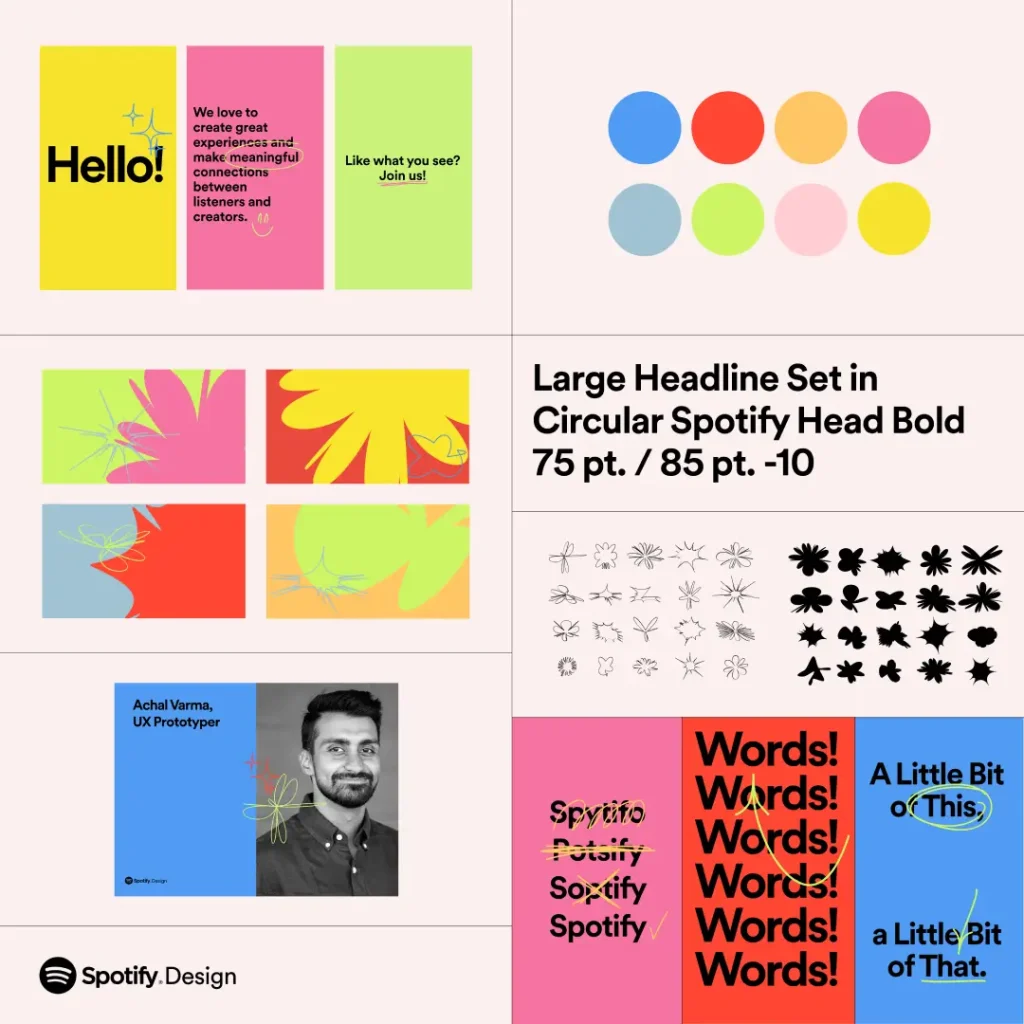
Spotify was born with a simple green and black identity. It grew a little more as it grew. In 2015, they revealed a vibrant, colourful design that captured the energy and diversity of music itself.
Duotone Magic: A Treat for the Eyes
Of all the aspects, duotone images are undeniably a masterstroke. This arresting visual effect uses two contrasting colours to render images with outstanding meanings, popping right out of the screen. This technique gained great recognition even for Spotify, differentiating it from the crowded digital world.
Typography and Layout: Calm in the Storm
Clean and modern, Spotify’s typography cuts through the noise, lending clarity to its colourful world. The grid-based layout is flexible, allowing for creative arrangements that reflect the diversity of music. Result: A brand that sounds as good as it looks.
Spotify’s brand design shines a light on exactly how a product can be mirrored through the development of a company’s visual identity. It’s a design that looks good but, moreover, feels like music. Vibrant, diverse, and in continuous motion – just like our favourite tunes.
3 – Slack: Making Work More Colourful
Who says work tools need to be bland? Certainly not Slack! This communication platform took the enterprise world by storm, and its brand design played a huge role in that process.
The Logo: A Playful Twist
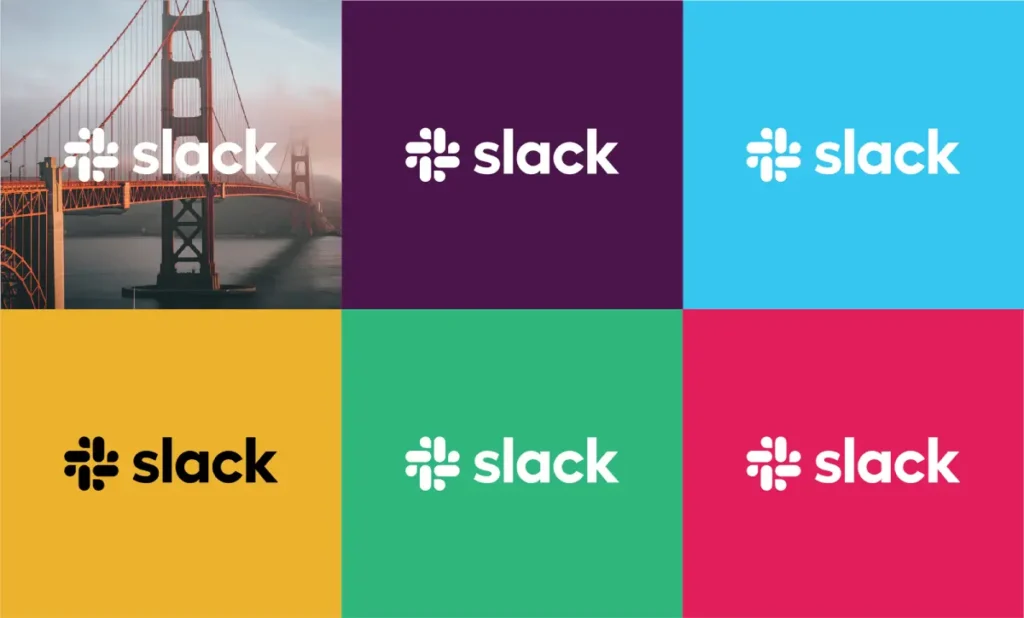
The Slack logo seems plain at first sight, but there’s more to it than meets the eye. It features 11 different colours for 11 uniquely different aspects of communication. This is like a visual representation of all the conversations happening across their platform.
Colour Palette: A Rainbow of Productivity
Slack’s colour palette is vibrant and diverse. They use all sorts of bright colours that feel fun and energetic and break the typical mindset of corporate work tools needing to be dull in presentation.
Illustrations: Bringing Personality to Work
A big standout in Slack’s designs is its use of illustrations: quirky, character-driven images that add a sense of humanity and humour to its brand, taking what was once considered a chore regarding workplace communication into something that felt creative.
Work Doesn’t Have to Be Boring.
Slack’s brand design says it clearly: work need not be dull. By infusing their visual identity with colour, creativity, and a bit of whimsey, they’ve created a brand that makes people look forward to using a work tool. Now that’s an achievement!
4 – Mastercard: Simplifying a Global Icon
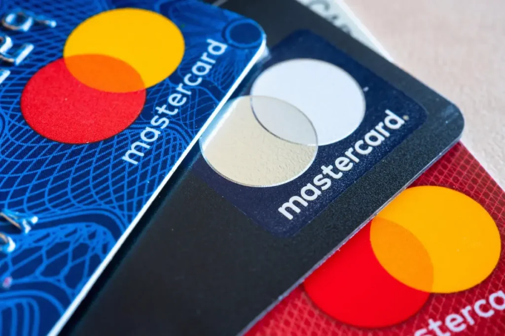
When you’re a global brand recognised by billions, how do you refresh your look without losing your identity? Mastercard’s 2016 rebrand is a masterclass in modernising a classic logo.
The Logo: Less Is More
Mastercard’s new identity stripped away everything superfluous and held on to the bare minimum: two intersecting circles in red and yellow. Simple, bold, and instantly recognisable. It’s such an icon that, in 2019, they dropped the wordmark from most uses.
Colour and Shape: Timeless Simplicity
These red and yellow circles have been part of the Mastercard identity since 1968. These core elements were retained in the redesign to preserve brand equity but propelled Mastercard to look different. The intersecting circles reflect connection and inclusiveness, essential ideals for a global financial brand.
Typography: Modern and Accessible
To that end, Mastercard revealed a new custom typeface called FFMark, which is clean, modern and highly legible across different sizes and media. Attention to typography will ensure that the brand communicates clearly in all contexts.
Result: A Brand Ready for the Digital Age
The redesign of Mastercard is the perfect case study in evolution to the digital age without losing its essence. This simplified logo works beautifully across all touchpoints, from a teeny mobile screen to gigantic billboards. It’s a timeless design positions Mastercard as a modern, forward-thinking brand.
5 – Dropbox: Evolving Beyond the Box

Remember when Dropbox was just a blue box with a name? Yeah, they’re far from that now. Their 2017 rebrand evolved them from a simple file storage service into a full-fledged creativity and collaboration platform.
Logo: Opening the Box
Dropping the new logo, Dropbox exploded that iconic box into a series of surfaces. This is cool design-wise because it shows opening possibilities and the idea of your work breaking out of traditional constraints. It’s simple yet loaded with meaning.
Colour Palette: Creative Explosion
Gone, the single blue of yesteryear Dropbox. This means bright, starkly contrasting colours that can be mixed and matched in infinite ways. Mixing and matching is a nod to the endless ways people use Dropbox to create and collaborate.
Typography and Imagery: Eclectic and Energetic
They introduced a new typeface, Sharp Grotesk, available in 259 different fonts: “expressive and dynamic communications.” The imagery runs from photography to illustration and 3D. It was essential to develop guidelines for applying the brand at every touchpoint.
The Impact: From Utility to Creativity
Dropbox’s rebrand moved them from a utilitarian storage service to a creative enablement and collaboration platform. The flexible design system lets them speak to different audiences in their tongue and positions Dropbox as a versatile tool for the modern creative professional.
6 – Burger King: Serving Up Nostalgia with a Side of Modern
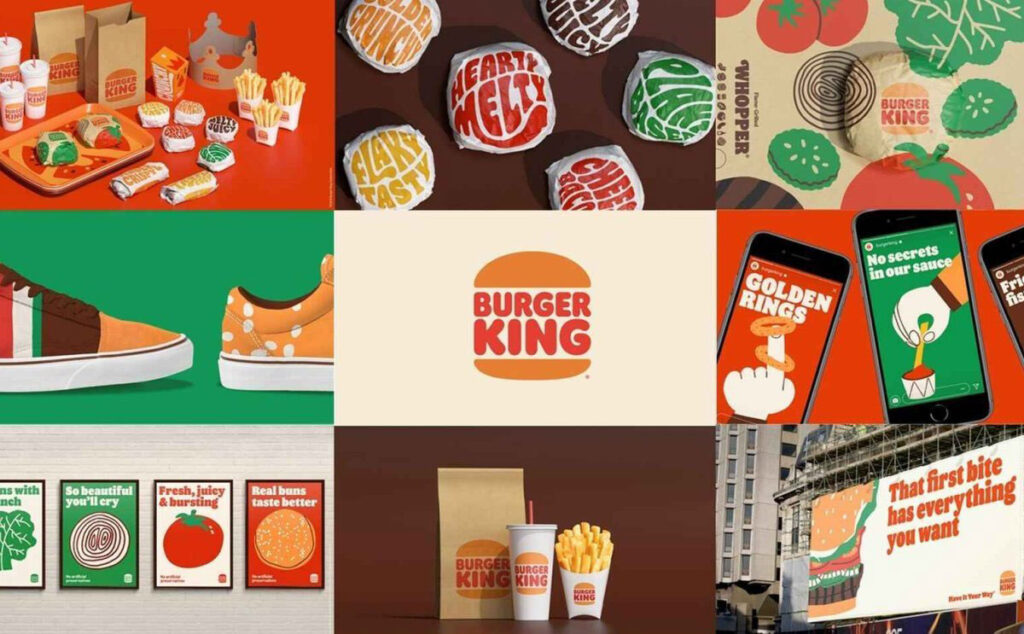
Finally, in 2021, Burger King flipped how this brand was designed. The result is a mouth-watering blend of retro charm and modern simplicity that has made everyone talk about it.
Logotype: Future to Past
Burger King returned to the basics, reviving its classic logo from the 70s and 80s. That was not all; it was far from some ‘nostalgia’ play. Out came the grease paper and rulers, and streamlined it, simplifying the design. The resulting logo feels familiar and fresh as comfort food for your eyes!
Colour Palette: Juicy and Appetising
The new palette takes its inspiration from the food at Burger King. Think flame-grilled browns, melty cheese yellows, crisp green lettuce, and juicy red tomatoes. It’s a colour palette that could make your stomach growl to look at it.
Typography: Bold and Tasty
Burger King unveiled a new bespoke typeface, “Flame Sans.” It’s rounded, bold, and a little wonky – just like their burgers. It’s designed to look good, whether on a billboard or squished onto a burger wrapper.
Imagery: Keeping It Real
In a world where everyone does food photography like art, Burger King zagged. This new imagery style puts forward their food’s messy, drippy, real nature: honest, appetising, and utterly worth Instagramming.
The Impact: A Brand That’s Flame-Grilled to Perfection
The Burger King rebrand indeed is a masterclass in readdressing a heritage brand for modernity. They have managed to tap into that nostalgic feel, feeling fresh and contemporary. One of those brand designs makes you run to the nearest Burger King to order a Whopper. Now, that is what effective design is all about.
7 – Mailchimp: From Quirky Startup to Marketing Powerhouse
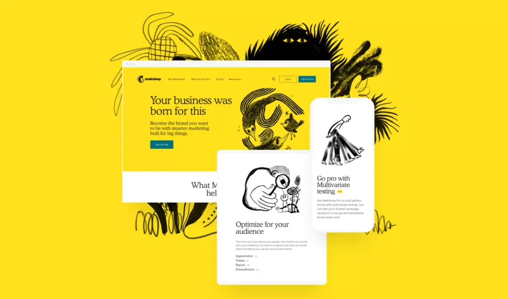
The 2018 rebranding that Mailchimp did marks the passage of this company from a niche e-newsletter provider to a full-service marketing platform. Let’s deconstruct how they keep the playful spirit while growing up.
The logo: Freddie Gets a Makeover
Mailchimp redesigned its favourite chimp mascot, Freddie, as a more refined version. The new Freddie was an icon rather than an illustration to make way for more varied media. But never mind; he still had that wink behind his eye.
Colour Palette: Cavendish Yellow Takes Centre Stage
Mailchimp doubled down on its signature Cavendish Yellow, using it more liberally across the brand. They balanced it with softer secondary colours, making the palette feel energetic yet refined.
Typography: Playful Yet Professional
Mailchimp introduced Cooper Light as its new typeface, marrying quirkiness and readability. They paired that with a sans-serif font for the body and developed a unique and functional typography system.
Illustrations: Hand-Drawn Whimsy
The most recognisable pieces of Mailchimp’s rebrand are its quirky, hand-drawn illustrations. Yes, this injects personality and warmth, setting apart Mailchimp in cold marketing technology.
The Result: Growing Up Without Growing Old
Mailchimp’s rebranding is a masterclass in evolving a brand without losing its essence. They have managed to forge a more mature, versatile visual identity that still retains so much of the playful spirit that made people fall in love with it in the first place. This is like watching your quirky friend grow into a successful businessperson – without losing their sense of humour.
8 – Guinness: Crafting a Timeless Brand
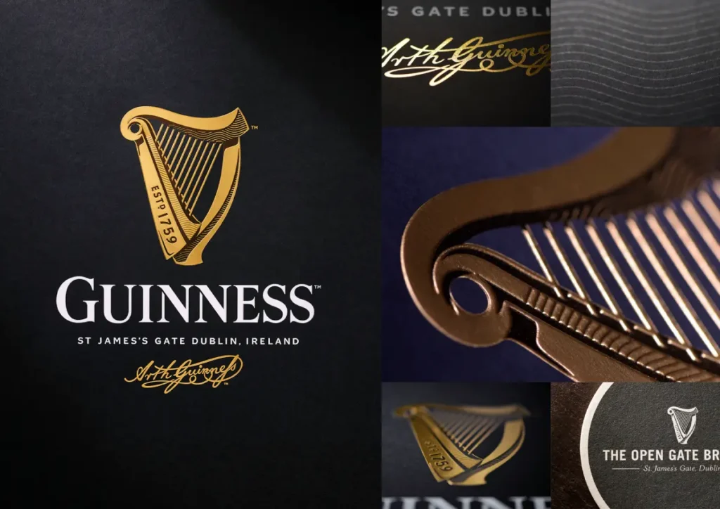
Guiness-when one thinks of iconic brands, it is at the top of the list. Its brand design has continued, changing subtly over the years but staying true to its core identity. Let us dive into this rich, creamy brand design.
The Logo: The Harp Playing a Visual Melody
The Guinness harp logo has been consistent since 1862: simple, beautiful, and unconsciously recognisable. It has been refined and fine-tuned and perpetually simplified over the years; it still retains, however, its all-important originality. It’s a testament to a well-designed logo.
Colour Palette: More Than Just Black and White
While Guinness is synonymous with the deep dark colour of its stout, the brand design is not merely black and white. Gold accents add a premium quality feel, while deep reds or blues may be used for special editions or seasonal promotions.
Typography: Strength in Simplicity
Typography for Guinness is bold and matter-of-fact, much like the drink itself. They use serif and sans fonts together in often-all-caps, confident statements. The typography states, “We know who we are and are proud of it.”
Imagery: Celebrating Heritage and Craftsmanship
More often than not, Guinness’ visual identity has elements of its rich history and the craftsmanship that goes into brewing the drink. From images of the St. James’s Gate Brewery to the perfect pour of a pint, the imagery of Guinness reflects a brand steeped in tradition yet always facing the future.
The Impact: A Brand as Timeless as Its Taste
The Guinness brand design is a masterclass in longevity – how to remain relevant for more than 250 years and never lose one’s core identity. It’s one of those genuinely classic brands that feels just as contemporary as the perfect pint of Guinness.
9 – Netflix: Streaming Success Through Design

The journey of Netflix, from rentals of DVDs to a steaming giant, is phenomenal. The brand design has accompanied this journey perfectly and has changed with time to reflect their leadership in entertainment.
The Logo: Simplicity Meets Sophistication
The Netflix logo has undergone many changes, arguably at its best in its present form. Its bold, custom-designed wordmark is as instantly recognisable on a billboard as a tiny app icon on your phone.
Colour Palette: Red Hot Branding
Netflix’s signature red is bold, energetic, and impossible to ignore. It’s often used against a black background – a high-contrast look that cuts through in the busy entertainment marketplace. It brings to mind the classic theatre of the red curtains against the dark.
Typography: Cinematic yet Clear
Designed to be expressive and functional, Netflix Sans is the company’s custom typeface. Equally adept as both show title and user interface elements, it’s saved millions in licensing fees. If that’s not a wise design investment, I don’t know what is.
The ‘N’ Icon: A Brand in Motion
However, One of Netflix’s most innovative design elements is its animated ‘N’ icon. This ribbon-like ‘N’ unfurls to mimic a film strip, infusing it with a sense of movement and energy. It’s a perfect manifestation of a brand centred on moving images.
User Interface: Design That Disappears
Netflix’s UI design is an integral part of its brand experience. It’s intuitively designed, unobtrusive, and keeps the content front and centre. The clean, image-focused layout makes browsing feel like walking through a virtual video store.
The Impact: A Brand That Entertains
It does more than look great – Netflix’s brand design elevates the entire viewing experience. From the instant you see that red ‘N’, right to the swooning ‘ta-dum’ sound at the start of a show, every element collaborates towards conjuring anticipation for watching it. This is a brand which does not stream entertainment but is entertainment itself.
10 – Lego: Building a Timeless Brand Brick by Brick
Our final case study is a brand that’s been a part of childhoods-and adult hobbies-for generations: Lego. This Danish toy company has built a brand as sturdy and versatile as its famous bricks. Let’s snap together the pieces of their brand design.
The Logo: Simplicity in Play
The Lego logo is playful simplicity at its best: instantly recognisable, from bright red bubble-like letters to kids and adults alike. It has remained the same since 1973, proving that good design can stand the test of time.
Colour Palette: A Rainbow of Possibilities
Lego’s colour palette is as diverse as the worlds you could create with their building blocks. Though its logo is stuck on red, black, and white, the product line has everything from indigo to yellow as part of its vibrant rainbow of colours. That’s a testament to the endless possibilities that Lego is built on.
Typography: Playful yet legible
Typography – clean and legible, with the slightest hint of roundness to echo the shape of their bricks – is playful but not childlike. This has made the brand youthful but also appealed to adult enthusiasts.
Lego’s visual identity consists mainly of impressive constructions made with their bricks, showing what is possible with their product. It also involves CGI characters from themed sets and movies, bridging physical play to digital entertainment.
Packaging: A Window to Wonder
Packaging design also plays a significant part in Lego’s brand experience. Many boxes feature a window, which showcases the bricks inside to build anticipation. It also doubles as inspiration, demonstrating completed models and suggesting alternative builds.
The Impact: A Brand Built to Last
The brand design from Lego – just like their product – is based on simplicity and versatility. It’s one of those few brands that have kept fresh and alive through decades, as it appeals to new generations yet can attach itself firmly with nostalgia among adults. Among high-tech toys, the timeless design of Lego reminds one of something powerful: imagination and creativity.
The Building Blocks of Successful Brand Design

Now, having passed through these outstanding ten examples of brand design, let’s piece together some key takeaways. What works for these brands? What can we be taught by their success?
Simplicity Is Key
From Mastercard’s interlocking circles to Netflix’s bold custom wordmark, simplicity is the name of the game for modern brand design. A simple design is more versatile, more memorable, and often far more timeless.
Consistency Across Touchpoints
Whether it’s Spotify’s duotone imagery or Airbnb’s Bélo symbol, successful brands ensure the same across all contact points. This creates recognition and builds trust.
Flexibility for the Digital Age
Slack and Dropbox are among the companies that have created systems that will look stunning and perform great across digital channels. In today’s multi-device world, your brand should look nice on a smartwatch or billboard.
Emotion and Personality Count
Quirky illustrations from Mailchimp and appetising colour palettes from Burger King prove that excellent brand design isn’t just a question of looking good – it’s about evoking emotions and showing personality.
Evolution, Not Revolution
Guinness and Lego show that sometimes you don’t need wholesale change. Sometimes, subtle evolution over time is all it takes to keep a brand fresh while carrying a consistent core identity.
Design That Tells a Story
The best brand designs, like Airbnb’s Bélo and Netflix’s animated ‘N’, tell a story about the brand. They aren’t just pretty pictures; they have meaning to them.
Functionality Meets Aesthetics
Particularly for digital brands, such as Spotify and Netflix, brand design is about more than just forms; it is very much a part of the user experience. Good brand design enhances functionality, but it doesn’t get in the way of it.
Conclusion: The Art and Science of Brand Design
The ten case studies shown here expose brand design as both art and science, aesthetics and strategic psychology for solving complex problems.
Excellent brand design does more than make a company look good; it tells its story, connects it with its audience, and drives its success. From Airbnb’s inviting Bélo to the ever-timeless Lego logo, each of these brands has leveraged design for a visual identity that is not about good looks per se but a potent business tool.
Whether you’re a designer, an entrepreneur, or someone who appreciates great design, these case studies have helped further illustrate the power of brand design in action. Next time you see a logo or interact with a brand, take just a moment to think about what it took to create it – your thoughts and imagination.
Robust brand design is no longer a nicety; it’s a core necessity in today’s world, where thousands of messages are thrown at you daily. It is what places you differently and will make people remember you; thus, it is ultimately about success.
So, what’s your brand’s story? How do you tell it visually? The world is waiting to see. Now, go out and design something unique!
FAQs About Brand Design
What is brand design?
Brand design is creating the look and feel of a company or product. It includes elements like logos, colour schemes, typography, and imagery that tell something about a brand’s personality and values.
How often should a company refresh its brand design?
There is no correct answer, but mainly speaking, a company should renew its brand design every 5 to 10 years. However, significant rebrandings must be cautiously approached and taken strategically.
Can a small business afford professional brand design?
Professional brand design can be a significant investment, but there is something for every budget. So many designers have scalable packages, and even some DIY tools exist, but you have to remember that professional design brings value to your business.
How big of a role does colour play in branding?
Colour is paramount when it comes to brand design. It helps create a mood, improve brand awareness, and deliver your brand’s personality. Scientists have found that colours increase brand recognition by a factor of 80 per cent.
What is the difference between a logo and a brand?
A logo is only a tiny part of a brand. While a logo identifies a business through a symbol or design, a brand speaks to all identity and personality, including values, voice, and customer perceptions.
How does brand design impact customer perception?
The brand design certainly plays a massive role in shaping customer perceptions. It communicates your company values, quality, and personality all at once glance. Consistent, professional branding will build trust and loyalty among customers.
What are the common mistakes in designing brands?
The common mistakes are that the designs tend to be over-elaborative, inconsistent through different platforms, copying trends without considering brand personality, and not considering the target audience in the design process.
How does digital media influence brand design?
The most impacting power of digital media is that versatility has become essential in brand design. Logos and other representations of a brand must work on all screen sizes and platforms, from smartwatches to billboards. This encourages a trend toward simplicity and adaptability in design.
What is the purpose of typography in brand design?
Typography does have a significant role in brand design. It can establish personality, enhance readability, and contribute to brand recognition. Most big brands have specially designed typefaces that they use exclusively.
How do I measure the success of my brand design?
Success is measured through brand recognition, customer perception surveys, social media engagement, and business performance. A/B testing is also functional when considering design changes.
Should my brand design follow current trends?
It is great to be aware of the trends, but your brand design should, more importantly, reflect your company and resonate with your target market. If you are chasing the trends, a design may feel very outdated.
How does the design of a brand vary across cultures?
The brand’s design would vary significantly because of differences in the associations of colour, interpretation of symbols, and aesthetics. Companies operating on an international scale greatly need to consider these aspects in brand design.
