How Effective Design Impacts Sales
You've seen it before. Two products, side by side. Same features. Same price. But one flies off the shelves while the other gathers dust.
What makes them different? Design.
We like to think we’re logical creatures who decide things based on numbers and facts. But here’s the truth: we love pretty things.
Effective design doesn’t just make stuff look nice. It makes them work better. It creates an experience that sticks, connects, and forces us to act.
In a world of infinite options, design is what tips scales. It’s a silent salesperson who works every day, showing potential customers why they need this, not that.
But here’s what most businesses miss: They underestimate its power. They treat design as an add-on, something to pretty up their product after refining it.
And man, are they wrong!
Today, in this market, design isn’t part of your product. Design IS your product. This sets you apart from everyone else trying to do the same thing. People remember this about you when telling their friends why they should choose YOU over THEM…
So, let’s talk about how impactful great design can be on sales numbers – theoretically and practically- for small potatoes like yourself and those big corporations with deep pockets.
At the end of it all, remember: You don’t want “the best” product… You want THEIR CHOICE PRODUCT!!! And guess what? Good ol’ DESIGN is how we get them there!!!
Are we ready to jump into this headfirst yet, or WHAT?!
- Effective design is essential for sales, creating memorable experiences that influence customer choices and actions.
- Consistent branding and thoughtful user experience foster trust and recognition, enhancing the product's appeal.
- Emotional connections through design can drive engagement and conversion, making aesthetics a critical component of sales strategy.
- The Power of First Impressions
- The Psychology of Colour
- The Art of Simplicity
- The Power of Patterns
- The Emotional Connection
- The Science of Layouts
- The Impact of Typography
- The Power of Images
- The Importance of Consistency
- The Mobile Revolution
- The Role of Animation
- The Importance of Testing
- The Future of Design
- Conclusion
- FAQs
The Power of First Impressions
We have all been told, “You can't judge a book by its cover”. However, let’s admit it: we do this continuously. And within the business realm, that first look could potentially mean millions.
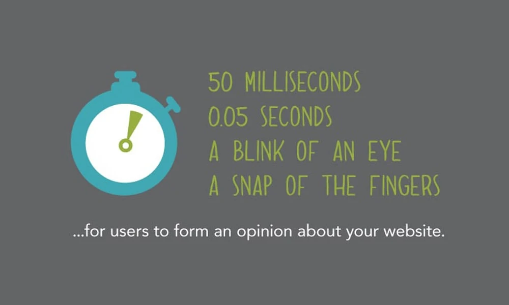
The 50-Millisecond Rule
Were you aware that users take just 50 milliseconds to form an opinion about your website?
That’s faster than blinking!
This momentary decision can decide whether a potential client stays with you or leaves. It is comparable to business speed dating.
The Halo Effect in Design
Have you ever noticed that good-looking people seem more intelligent, funnier or more likeable?
That is known as the halo effect. The same thing applies to design.
When well-designed, something creates a positive first impression, spilling over into other areas. Suddenly, your company becomes more reliable, and your product gains value.
The Psychology of Colour
Colours are not only beautiful but powerful triggers of the mind. They can make us feel hungry, relaxed, excited or trustworthy. And clever designers use this to pump up sales.
Red Alert: The Colour of Urgency
Ever wonder why so many “Sale” signs are red? It’s not just tradition. Red creates a sense of urgency and excitement – like a visual alarm clock for your wallet.
The Green Light for Go
Green, on the other hand, is associated with growth, nature, and going. That’s why you often see it used for “Buy Now” buttons; it’s giving your subconscious the green light to make a purchase.
The Trust in Blue
Banks, healthcare providers and social media giants love blue–why? Because it evokes feelings of trust, security and professionalism. It’s like a visual handshake saying, “You can count on us.”
The Art of Simplicity
In this era of too much information, simplicity is vital. However, simplicity is more complex.
The Choice Paradox
Common sense says that with more options comes more sales, yes? It turns out that studies have shown that having too many choices can lead to what’s called decision paralysis.
Imagine you’re staring at 50 different flavours of ice cream – sometimes, all you want is vanilla.
White Space: The Salesperson That Never Speaks
Designers don’t leave empty spaces in their work because they forgot to fill them – it’s a trick.
White space gives the eye somewhere to rest and allows other elements on the page to guide attention. This makes your product or service stand out like a lone tree on an otherwise featureless plain.
The Power of Patterns
Our minds are pattern recognition devices. Designers can use this innate ability to lead users and increase sales.
The F-Pattern in Web Design
Studies of eye movement while reading web pages have revealed that people usually follow an F-shaped pattern.
Good designers will, therefore, place important information along this visual path — it’s like leaving a trail of breadcrumbs for Hansel and Gretel, only instead of leading them home, it leads them to the ‘Buy Now’ button.
The Rule of Thirds
Photographers have used the rule of thirds for centuries to create visually exciting and balanced compositions.
Nowadays, many web designers adopt this concept to design attractive layouts that direct attention towards focal points. It resembles drawing a visual treasure map with an X marking the ‘Add to Cart’ location.
The Emotional Connection
Good design is not only about appearances – it’s also about how it makes people feel. Those feelings can turn into direct sales.
The Power of Nostalgia
Retro designs aren’t just a fad – they work. They tap into good memories and emotions, instantly connecting with the customer. It’s like visual comfort food.
The Joy of Interaction
Designs that let you interact with them create a sense of playfulness and involvement. Think about sliding switches or seeing animations react as you scroll – wouldn’t it be nice? These small moments make shopping fun rather than dull, and fun experiences sell things.
The Science of Layouts
How information is presented can dramatically affect how it's perceived and acted upon.
The Golden Ratio In Design
Art and architecture have used the golden ratio, about 1.618 to 1, since ancient times.
Now, it is being brought into digital design. Layouts based on this ratio are naturally balanced and attractive to the eye. It’s such visual comfort food.
The Z-Pattern of Eye Movement
When dealing with text-heavy designs, the Z-pattern is used.
Our eyes naturally move in a Z shape across the page. Innovative designers take advantage of this by guiding the eye from a critical point to an important point, finishing at the call to action.
It’s like a roadmap for your sales pitch.
The Impact of Typography
Typography is not just about making words easy to read — it’s also about giving them a personality and an effect.
The Psychological Power of Fonts
Fonts have different effects on people. For example, serif fonts such as Times New Roman appear traditional and authoritative, while sans-serif ones like Arial look modern and clean.
Script typefaces feel personal and creative. In other words, selecting a font is like dressing up your text for success.
The Legibility Factor
Even if a font looks nice, it won’t sell well if readers find it hard to read.
Thus, good typography balances ornamentation and clarity; imagine serving haute cuisine where taste and presentation matter equally.
The Power of Images
Pictures are more important than ever in a world where people have shorter attention spans.
The Increasing Significance of Visual Content
Research reveals that individuals retain 65% of visual information in their minds after three days, compared to only 10% for written text.
That is why infographics, videos, and well-shot product images are crucial; they not only please the eye but also serve as memory triggers.
The Human Element
Nothing grabs our attention like photos of faces or people.
We are biologically wired to react to human faces.
This is why many landing pages have happy-looking individuals staring straight into the camera—or better yet, towards the call-to-action button; it’s like saying, “Hey you! Click here!” visually.
The Importance of Consistency
Design consistency does not only make things look professional; it creates trust and recognition.
Recognition of a Brand
When colours, fonts, and design elements are used consistently in all touchpoints, they create brand recognition. It is like having a visual signature that customers can identify and trust quickly.
The Mere Exposure Effect
The more often we see something, the more we like it.
This is known as the mere exposure effect psychologically, which explains why branding should be consistent. Design works as if it allows for making friends with consumers over time.
The Mobile Revolution
Do you remember when websites were rare and having an online presence meant being innovative?
Those days are long gone. If your website is not mobile-friendly, it does not exist.
For most individuals, their phone is their primary internet connection, making it a part of them and not just a device.
However, becoming mobile-friendly doesn’t mean simply shrinking your desktop site. It requires you to look at things from a different perspective.
This is where responsive design comes in; it’s more than a buzzword – it’s an ethos.
Your website should be designed to change its appearance seamlessly depending on whatever gadget accesses it.
Whether someone uses their desktop computer, tablet, or phone doesn’t matter because each experience must feel perfect every single time.
But let us dig deeper. Have you ever heard about the “thumb zone”? It refers to the easily reachable area with your thumb on any mobile screen.
Clever designers place essential elements such as the “Buy Now” button within this convenience region.
Why would they do that? Well, design is not only about aesthetics; it also has much to do with emotions. People want everything around them so natural that they don’t even recognise anything like a graphical user interface (GUI) but proceed directly towards fulfilling their goals or desires effortlessly.
Convenience alone is not enough – respect counts, too!
Respect for users’ time; respect for users’ attention; respect for users’ intentions…
When designing with humanity in mind (considering human behaviour patterns/limitations/wants), one does more than create another website – one establishes relationships!
And given that attention happens to be the most scarce resource worldwide nowadays – please bear this phrase forever: “Relationships Matter Most”.
So, reflect upon these questions: Is my mobile site an afterthought? Or is my digital strategy built around a mobile-first approach?
By 2024, you shall be seen or ignored; either make a sale or lose customers forever.
The Role of Animation
Quiet animations can direct attention while giving interfaces a more dynamic and responsive feel.
Micro-interactions
These small functional animations, sometimes called micro-animations, provide feedback and help users interact with an interface. It’s like hovering over a button, and it changes colour.
Loading Animations
No one likes waiting, but a good loading animation makes wait times faster because they take up our attention. They’re the digital equivalent of watching a street performer while sitting in traffic.
The Importance of Testing
Great design does not happen in isolation; instead, it is perfected through trying out and receiving responses.
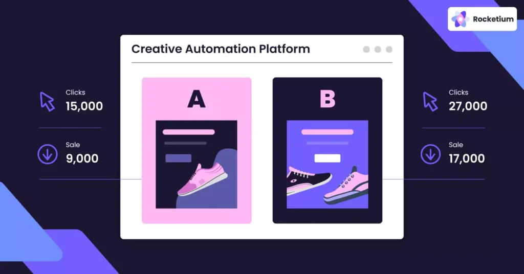
A/B Testing
To compare two or more versions of a design to determine which one performs the best is referred to as A/B testing. It’s like pitting designs against each other in a battle arena until only the strongest survives.
Heat Maps
Heat maps indicate where users click and look at your website most frequently. Think of them as X-ray vision for user behaviour.
The Future of Design
Technology is constantly changing, and so is the design field. Keeping up with these developments can put you ahead of the game.
Design by AI
AI has also started helping out in design; it can come up with colour schemes or propose layouts for you. Imagine having a super dedicated assistant that never sleeps.
E-commerce and Augmented Reality
Augmented reality enables customers to see what products look like in their surroundings before making purchases. Try things out before buying through your phone's camera.
Conclusion
Creating experiences that connect with people on a deep level is effective design—it’s not just about making things look pleasing.
It evokes emotions, guides attention and builds trust, often without the audience knowing it. Sometimes, the choice between a sale and lost customer comes down to this.
Don’t forget that design is subjective.
What may work for one brand will not necessarily work for another. So, know your audience by testing many different designs until finding what resonates best with them because every business has unique goals they wants to achieve.
Take a moment to consider what you’re looking at right now – whether it be your website, product or marketing materials – does this design work as hard as possible? Does it give off the correct first impression while leading users in the right direction? Is it evoking any emotion(s) necessary for purchase decisions or sales?
If not, consider updating everything visually. After all, good design isn’t cheap, but when done correctly, it pays off both financially and reputation-wise too!
FAQs
How much should I spend on design?
The amount of money you should put into design will depend on your business size, industry, and what you want to achieve. However, since design can significantly affect sales figures, it is often recommended that a large portion of your budget be allocated to it. Consider this as an investment rather than an expense.
Can a good design compensate for a lousy product?
Good design can boost the sales of a decent product, but it cannot solve fundamental problems with the product itself. The best approach has excellent products and designs; thinking about them is like icing on cakes – they make good products better but cannot make bad cakes taste good.
How frequently should I update my website's look?
There is no one-size-fits-all answer, but typically, businesses do major overhauls every 2-3 years to stay caught up with current styles or technological advancements. Nevertheless, more minor alterations and updates based on user feedback and analytics should continuously be made.
Is hiring a designer worth it, or can I use templates?
Although templates may be applicable starting points, especially for small businesses or startups, professional designers can create individualised appearances that differentiate firms from rivals and are more suited for specific targets/requirements. It’s like wearing off-the-rack suits versus bespoke ones.
How do I know if my current design is successful?
Look at your metrics! Are people staying on your site? Are they doing what you want them to do (e.g., signing up for newsletters)? Do you have reasonable conversion rates? Use heat maps or conduct user testing if you need deeper insights – think about this being similar to health checks for designs.
Can B2B sales benefit from effective design like B2C does?
Absolutely! Although B2B decisions may be more logical, they are made by people who can be swayed by aesthetics and ease of use. Good designs will make your B2B offering more visible in crowded markets while also ensuring that complex information is presented clearly for action.
How important is mobile design?
Mobile design is crucial because over half of all web traffic comes from mobile devices. If a website looks great on a desktop but doesn't work well on mobile, it could lose many potential sales. It’s not just about shrinking things down – consider the user experience when re-designing for mobile users.
Can practical design help reduce customer support issues?
Yes! Clear, intuitive designs make products or websites more straightforward to use, thus lowering support requests. Additionally, good designs can improve the accessibility and user-friendliness of help sections or FAQs. Consider this like having a silent 24/7 customer service rep.
What impact does culture have on effective design?
Different cultures have different ideas about what makes something a practical piece of design work. Colours, symbols, and layout preferences may vary across cultures, so global brands should consider these and potentially adapt their designs for different markets – think being a chameleon with designs depending on where you are!
Is over-designing a thing?
Yes, indeed. Occasionally, designers over-complicate stuff when trying to make them one-of-a-kind or striking. This can result in bewilderment and annoyance on the part of users. The trick lies in striking a balance between beauty and usefulness. Many times, remember that less is more with design.
