
Typography Basics: The Guide to Rules, Terms & Hierarchy
Most business owners treat typography as an afterthought. You spend weeks agonising over the logo mark or the copy, then slap it into a generic typeface and wonder why the final result looks “off.
Here is the truth: Typography is 90% of design. On the web, it is 95%.
If you get the typography wrong, your brand not only looks unappealing, but it also appears incompetent.
We are not talking about personal taste here. Typography is not art; it is a form of engineering. It is a system of rules, mathematical ratios, and optical adjustments designed to transfer information from a screen or page into a human brain with the least amount of friction possible.
When you ignore typography basics, you increase cognitive load. You make your customers work harder to understand you. And in an attention economy, if you make them work too hard, they leave.
This is not a fluff piece about “expressing your feelings through fonts.” This is a technical breakdown of the mechanics of type, written for entrepreneurs who want their brand to be taken seriously.
- Typography is engineering: legibility, readability, and hierarchy are non-negotiable for clear brand communication.
- Use correct terminology: typeface = design; font = specific file (weight/style).
- Micro-typography matters: kerning, tracking and leading dramatically affect readability and perceived quality.
- Web rules: use rem units, ensure 4.5:1 contrast, scalable text, and limit line length to 45–75 characters.
- Choose typefaces purposefully: pair complementary fonts, prefer high x-height for screens, and avoid scripts for body text.
What are the Typography Basics?
Typography is the art and technique of arranging type to make written language legible, readable, and appealing when displayed. It involves selecting typefaces, point sizes, line lengths, line spacing (leading), and letter spacing (tracking), and adjusting the space between pairs of letters (kerning).
At its core, professional typography relies on three non-negotiable pillars:
- Legibility: Can the character be distinguished from others? (A function of the typeface design).
- Readability: How easy is it to read words and blocks of text? (A function of how you arrange the type).
- Hierarchy: Does the viewer instantly know what is most important? (A function of scale, weight, and position).
If you fail at any one of these, you fail at communication.
The Anatomy of Type (Stop Calling it a Font)
Before we fix your documents, we need to agree on terminology. Using the wrong words can make you appear like a novice when briefing a designer.
Typeface vs. Font
These words are often used interchangeably, but they refer to different things.
- Typeface: The design itself. The creative concept. (e.g., Helvetica, Garamond, Roboto).
- Font: The physical or digital file that contains the typeface at a specific weight and font style. (e.g., Helvetica Bold, 12pt).
Think of it this way: The Typeface is the song; the Font is the MP3 file. You “choose” a typeface, but you “install” a font.
The Skeleton of a Letter
To understand why some typographic design looks “trustworthy” and others look “childish,” you have to look at the anatomy.
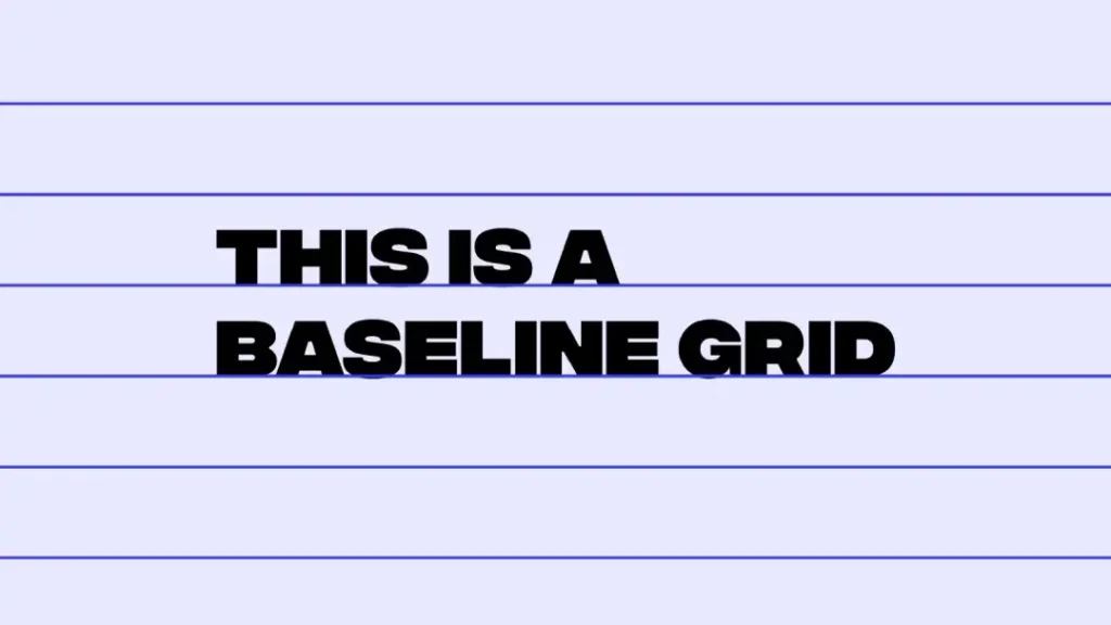
1. The Baseline
This is the invisible line upon which all letters sit. In web design and branding, establishing a consistent baseline grid (vertical rhythm) is what separates professional layouts from chaotic ones. If your text floats around without anchoring to a baseline, the page feels unstable.
2. X-Height
This is the height of the lowercase ‘x’. It determines how readable a typeface is at small sizes.

- High X-Height: The lowercase letters are tall compared to the capital letters (e.g., Helvetica). These are generally more legible on screens and at small sizes.
- Low X-Height: The lowercase letters are short and stubby (e.g., Futura). These look elegant but become illegible quickly when scaled down.
Consultant’s Note: When selecting a typeface for a mobile app or dashboard, opt for a high x-height. If you pick a low x-height font for body copy on a mobile device, your users will squint.
3. Ascenders and Descenders
- Ascenders: The parts of lowercase letters that extend above the x-height (b, d, f, h, k, l).
- Descenders: The parts that extend below the baseline (g, j, p, q, y).
Why does this matter? If your Leading (line spacing) is too tight, the descenders from the top line will crash into the ascenders of the bottom line. This is called a “crash,” and it destroys readability.

4. Counters
The open space inside a letter (like the inside of an ‘o’, ‘e’, or ‘a’).
- Open Counters: Create a font that feels airy, modern, and legible (e.g., Open Sans).
- Closed Counters: Feel tighter and more traditional, but can appear slightly blurred when printed on poor-quality paper or rendered on low-resolution screens.
Classification (The Trust Signals)
Typefaces are tools. You do not use a hammer to drive a screw. Similarly, you do not use a playful Script font for a legal contract. The typeface you choose signals your intent before the user reads a single word.
This is a core component of typography in branding. Your choice here anchors your brand identity.
1. Serif (The Authority)
Serifs are the little “feet” or strokes at the ends of the letterforms.
- Sub-categories: Old Style (Garamond), Transitional (Baskerville), Didone (Didot), Slab Serif (Rockwell).
- The Signal: Tradition, authority, reliability, establishment. Banks, law firms, and luxury fashion houses use Serifs.
- The Science: Historically, it was believed that serifs helped guide the eye along the line in print. On modern high-resolution screens, this distinction is less relevant, but the cultural association remains.

2. Sans-Serif (The Modernist)
“Sans” means “without.” These fonts lack the feet. They are cleaner, simpler, and often more legible on screens.
- Sub-categories:
- Geometric: Based on circles and squares (Futura, Avant Garde). They look modern and clean, but are harder to read in long paragraphs because the letters look too similar.
- Humanist: Based on the proportions of handwriting (Gill Sans, Verdana). These are the most readable sans serifs for body text.
- Neo-Grotesque: Neutral and objective (Helvetica, Arial). The corporate standard.
- The Signal: Innovation, clarity, approachability, tech-forward.
3. Script and Display (The Dangerous Ones)
These mimic handwriting or are designed for billboards.
- The Rule: Never, under any circumstances, use these for body copy. They are for headlines or logos only. If you write a paragraph in a Script font, you are actively preventing people from reading your content.
The “Comic Sans” Warning: We all know the joke, but the principle applies to any inappropriate font. In 2012, researchers at CERN presented the discovery of the Higgs Boson—one of the most significant scientific breakthroughs of the century—using Comic Sans in their slides. Instead of focusing on the physics, the global design community mocked the presentation. Typography determines your credibility.
3 Foolproof Font Pairings (Steal These)
Don’t know where to start? These Google Font combinations work for 90% of business use cases.
- The “Modern Tech” Duo:
- Header: Montserrat (Geometric Sans, Bold)
- Body: Open Sans (Humanist Sans, Regular)
- Why: Clean, legible, and friendly.
- The “Classic Professional” Duo:
- Header: Playfair Display (Serif, High Contrast)
- Body: Lato (Sans-Serif, Neutral)
- Why: Combines the authority of a serif with the utility of a sans.
- The “Editorial” Duo:
- Header: Oswald (Condensed Sans)
- Body: Merriweather (Serif, High Readability)
- Why: Merriweather is designed specifically for reading on screens.
Micro-Typography (Spacing is Everything)
This is where the amateurs reveal themselves. Anyone can pick a font. Only a professional knows how to space it.
1. Kerning (The Space Between Pairs)
Kerning is the adjustment of the space between two specific characters.

Digital fonts come with a “kerning table” built in, but it is rarely perfect. Certain letter combinations, like AV, Wa, To, or Ty, often leave awkward gaps because of the diagonal strokes.
- The Mistake: Relying on “Metric” kerning (the mathematical space in the file).
- The Fix: Use “Optical” kerning in your design software (Adobe Illustrator/InDesign), or manually adjust the space until the volume of space between letters feels equal.
- Why it matters: Bad kerning is distracting. If the letters T and o in “Tools” are too far apart, the brain pauses slightly to process if they belong together. These micro-pauses accumulate, causing reading fatigue.
2. Tracking (The Group Space)
Tracking is the spacing applied to a range of characters (an entire word or paragraph).
- The Rule:
- ALL CAPS: Always add tracking (letter-spacing) to uppercase text. Uppercase letters are blocky; they need breathing room to look elegant. 50–100 units of tracking transforms a headline from “shouting” to “sophisticated.”
- Body Copy: Never track out lowercase body copy significantly. It breaks the flow of reading.
- White Text on Black Background: Increase tracking slightly. Light spills over into darkness (irradiation), making the letters look fatter. Extra space counteracts this.
3. Leading (Line Height)
Leading (pronounced ‘led-ding’) is the vertical space between lines of text.
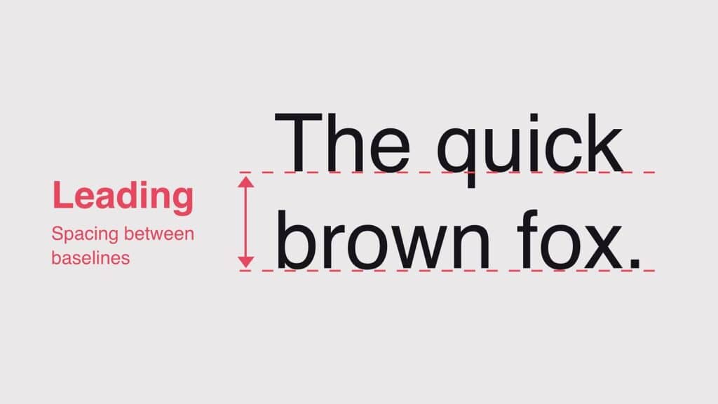
- The Standard: A standard ratio is 1.2 to 1.5 times the font size.
- If your font is 16px, your line height should be roughly 24px (1.5x).
- The Business Impact: If your leading is too tight, users lose their place when scanning from the end of one line to the start of the next. If it is too loose, the lines don’t feel like a cohesive paragraph.
- Web Reality: On the web, generous line height (1.5 to 1.6) improves accessibility and reduces bounce rates on text-heavy pages.
4. Line Length ( The Measure)
This is the width of your text block.
- The Golden Number: 45 to 75 characters per line (including spaces). 66 is widely considered the ideal.
- The Failure: Full-width text on a desktop monitor. If a line of text spans 1920 pixels, the eye cannot accurately track back to the start of the next line. This causes “reading stutter.”
- The Fix: Limit the max-width of your text containers. This is why well-designed blogs have generous white space on the sides.
Amateur vs. Professional Typesetting
| Feature | The Wrong Way (Amateur) | The Right Way (Professional) |
| Kerning | Auto/Metric (ignored). Gaps in headlines. | Optical or manually adjusted for headlines. |
| Leading | Default (usually 1.2). Text looks cramped. | 1.4 – 1.6 for body copy. Breathing room. |
| Line Length | Edge-to-edge screen width (100+ chars). | Controlled width (45–75 chars). |
| Alignment | Centre-aligned paragraphs. Hard to read. | Left-aligned (ragged right). Easy to scan. |
| Contrast | Light grey on white. Inaccessible. | High contrast (WCAG AA/AAA compliant). |
| Hyphens | Default hyphenation breaks words badly. | Controlled hyphenation or manually ragged. |
Hierarchy and The Grid
Hierarchy is how you tell the reader’s eye where to look first, second, and third. Without hierarchy, a page is just a wall of grey noise.
The Levels of Hierarchy
- Primary (H1): The Headline. This should be the largest, boldest, or most distinct element. It hooks the reader.
- Secondary (H2/H3): Subheads. These break up the text and allow for scanning.
- Tertiary (Body): The main content. It should be comfortable and consistent.
- Meta/Caption: Small details, dates, authors.

Contrast is Key
Hierarchy is established through contrast. You can create contrast using:
- Size: Big vs. Small. (The most obvious).
- Weight: Bold vs. Light.
- Colour: Black vs. Red.
- Structure: Serif Headline vs. Sans-Serif Body.
- Space: Isolated elements attract more attention.
The Grid System
Professional typography is never placed randomly. It is hung on a Grid.
A grid is a structure of columns and rows that organises content. Whether it is a 12-column bootstrap grid for the web or a 3-column grid for a brochure, the grid ensures alignment.
- The Rule of Alignment: Everything on your page should align with something else. Nothing should float arbitrarily. If you align your headline to the left, but your subhead is indented by 20px for no reason, the design feels “messy.”
Web Typography & Accessibility (The Legal Stuff)
In 2026, typography is not just about print; it is predominantly digital. And digital typography carries legal responsibilities.
Accessibility (WCAG Compliance)
The Web Content Accessibility Guidelines (WCAG) are not suggestions; for many businesses, they are legal requirements.
- Contrast: Text must have a contrast ratio of at least 4.5:1 against its background. Light grey text on a white background is an accessibility violation.
- Scalability: Users must be able to resize text up to 200% without breaking the layout. This means using relative units.
Pixels (px) vs. REM
Stop using Pixels (px) for font sizes on the web.
- Px: A fixed unit. If a user sets their browser default to “Large” because they have poor vision, 16px overrides their preference and stays small.
- Rem: A relative unit. 1rem equals the root font size (usually 16px). If the user changes their default to 24px, your 1rem text scales up automatically.
- The Verdict: Using rem respects the user. Using px is arrogant.
Variable Fonts: The State of Typography in 2026

A major shift has occurred in the last 18 months regarding Variable Fonts (OpenType Font Variations).
Previously, if you wanted a Light, Regular, Bold, and Extra Bold version of a font on your website, you had to load four separate files. This slowed down the site speed (Core Web Vitals).
Variable Fonts allow a single file to behave like multiple fonts. You can programmatically adjust the weight, width, and slant on a sliding scale.
- Benefit: Faster load times and infinite design flexibility.
- Adoption: By 2026, all modern branding projects should be utilising variable fonts for web performance.
The Mathematical Scale (The Major Third)
Don’t guess your sizes. Use a “Type Scale” to ensure mathematical harmony. A popular ratio for the web is the “Major Third” (1.250).
- H1 (Headline): 3.052rem (approx 48px)
- H2 (Subhead): 2.441rem (approx 39px)
- H3 (Section): 1.953rem (approx 31px)
- Body Text: 1rem (16px) – The Base
- Caption: 0.8rem (12px)
Tip: Set your base to 16px and use a tool like type-scale.com to calculate the rest.
A Reality Check
I once audited a mid-sized financial firm in London. They had spent £20,000 on a website refresh but hadn’t updated their typography guidelines.
They were using a free font from Google Fonts that looked “clean.” However, they hadn’t checked the Glyph Set . When they expanded into the European market, they realised the font didn’t support certain diacritics (accents) or the proper Euro symbol (€). Their contracts and invoices were printed with “□” boxes where the currency symbol should be.
They had to re-engineer their entire document stack—invoices, website, app, letterheads—because they didn’t check the character set of a “free” font.
The Lesson: Professional typography is about robust systems, not just pretty shapes. Always check:
- Licensing: Do you have the right to use this on a web server? (Desktop licenses do not cover web use.)
- Language Support: Does it cover all the territories you might expand into?
- Weights: Does it have enough weights (Bold, Italic, Light) to build a hierarchy?
If you are unsure whether your current brand identity is robust enough, consider reviewing our brand identity services. It is cheaper to do it right the first time than to fix it later.
Optical vs. Metric Alignment (The “Invisible” Skill)

This is a rare attribute that separates the pros from the amateurs.
Computer software aligns text mathematically (Metric). But the human eye is flawed. We see round shapes as smaller than square shapes of the same height.
- Overshoot: The letter ‘O’ and the letter ‘A’ (at the point) must actually be slightly taller than a flat letter like ‘H’ or ‘E’ to appear the same size visually. Good typefaces have this built in.
- Hanging Punctuation: If you have a bulleted list or a quote, the bullet point or the quotation mark should hang outside the alignment line. If you align the quote mark with the text, the text block appears visually indented.
- The “Play” Button Effect: A triangle inside a circle (like a play button) is mathematically centred when the distances are equal. However, visually, it appears too far to the left due to the visual weight of the triangle’s base. You have to nudge it to the right to make it look centred.
Rule: Trust your eye, not the software. If it looks wrong, it is wrong, even if the numbers say it is right.
3 Crimes Against Typography
If you spot these in your document, fix them immediately.
- Widows: A single word left dangling on its own line at the end of a paragraph. It creates a visual hole.
- Fix: Adjust the tracking slightly or rewrite the sentence to pull it back up.
- Orphans: A single word or short line at the start of a new column or page.
- Fix: Push more text to the next page to give it company.
- Rivers: Ugly vertical gaps of white space that run down through “Justified” text paragraphs.
- Fix: Switch to “Left Aligned” text.
The Verdict
Typography basics are the bedrock of brand communication. It is not about knowing the difference between Arial and Helvetica; it is about understanding how spacing, scale, and hierarchy influence human behaviour.
Bad typography creates friction. It tires the eye, lowers reading comprehension, and signals a lack of attention to detail. In a B2B context, that lack of detail translates to a lack of trust.
Your Next Steps:
- Audit your line lengths: Are your blog posts spanning the full width of the monitor? Limit them to a maximum of 75 characters.
- Check your contrast: Use a tool like the WebAIM Contrast Checker to ensure you are compliant with the WCAG.
- Stop using default spacing: Add breathing room to your body copy (1.5 line height) and tighten the tracking on your large headlines.
If you are ready to stop guessing and start engineering a brand that commands authority, you can request a quote for a comprehensive design audit.
Frequently Asked Questions (FAQ)
What is the difference between a typeface and a font?
A typeface is the design of the lettering (e.g., Helvetica). A font is the specific file that contains that design (e.g., Helvetica Bold.otf). In modern terms, the typeface is the creative work, and the font is the software you install.
Why is line height important for readability?
Line height (also known as leading) creates white space between lines of text. If it is too tight, the eye struggles to track from the end of one line to the start of the next. Standard web readability suggests a line height of 1.5 to 1.6 times the font size.
What is the ideal line length for reading?
The ideal line length is between 45 and 75 characters per line, including spaces. Lines longer than this cause eye fatigue and “tracking” errors, where the reader skips lines or re-reads the same line.
When should I use a Serif vs. a Sans-Serif font?
Use Serif fonts (e.g., Times New Roman, Garamond) to convey tradition, authority, and reliability. Use Sans-Serif fonts (e.g., Arial, Helvetica) for a modern, clean, and accessible look. Sans-serif fonts are generally preferred for digital interfaces.
What is kerning, and why does it matter?
Kerning is the adjustment of the space between two specific characters. It matters because inconsistent spacing creates visual “holes” in words, distracting the reader. It is most critical in large headlines and logos.
What are the rules for mixing fonts?
Limit your design to two (or a maximum of three) typefaces. Choose fonts with contrasting styles (e.g., a Geometric Sans header with a Serif body). Avoid using two fonts that are too similar, as it appears to be a mistake rather than a deliberate design choice.
How does typography affect website accessibility?
Typography affects accessibility through the use of contrast, size, and scalability. The text must have a contrast ratio of 4.5:1 against the background. Fonts should use relative units (rem) so they can be resized by users with visual impairments without breaking the layout.
What is the difference between tracking and kerning?
Kerning adjusts the space between two specific letters. Tracking adjusts the spacing across an entire block of text (words, sentences, or paragraphs). You track a whole word; you kern a pair of letters.
Why should I avoid using “Justified” text on the web?
Justified text creates straight edges on both sides but often results in uneven gaps between words (called “rivers”) in the middle of the paragraph. This disrupts reading flow and is particularly difficult for dyslexic readers to process.
What are Variable Fonts?
Variable fonts are a modern font technology that allows a single file to contain multiple variations of a typeface (weight, width, slant). They improve website performance by reducing the number of files the browser needs to download.
