Design Psychology: How Brands Win Before a Word Is Read
The decisions you make about colour, shape, typography, and visual hierarchy are not aesthetic preferences. They are psychological instructions.
Every element of your brand identity triggers automatic cognitive responses in your audience before a single word is read.
That process — the systematic study of how visual decisions shape perception, trust, and behaviour — is what design psychology covers. Ignore it, and you’re not just leaving money on the table. You’re actively handing control of your brand’s first impression to chance.
The stakes are measurable.
Brands that make visual decisions based on trend or personal preference rather than psychological evidence consistently underperform those that don’t.
The Ehrenberg-Bass Institute for Marketing Science at the University of South Australia has shown that brand recognition isn’t about beauty — it’s about the consistency of the psychological signals your distinctive assets send over time.
- Every visual choice is a psychological instruction shaping trust and behaviour within milliseconds, before any text is read.
- Distinctiveness plus sustained consistency build recognition; consistency is the mechanism, distinctiveness the outcome.
- Colour dominates early appraisal: in the first 90 seconds colour drives most emotional assessment; choose palettes by category context, not taste.
- Shape, form and typography signal warmth, precision and credibility preattentively; optimise legibility-distinctiveness trade-offs and visual hierarchy for processing fluency.
- AI has commoditised competence; governance, testing and protected, distinctive assets now create the asymmetric advantage in noisy markets.
What Is Design Psychology?

Design psychology is the discipline of applying cognitive, behavioural, and perceptual sciences to visual communication decisions — including colour, typography, shape, spatial layout, and imagery — to predict and influence how audiences perceive, remember, and respond to a brand.
Key Components:
- Cognitive processing — how the brain filters, categorises, and stores visual information based on pattern recognition and memory structures
- Emotional priming — how visual cues trigger automatic emotional responses that precede conscious evaluation
- Perceptual anchoring — how the relative arrangement of visual elements shapes the meaning audiences assign to each element independently
Design psychology is the reason your audience trusts or dismisses a brand within 50 milliseconds of exposure — before they’ve read a word, clicked a button, or engaged with any content.
The Cognitive Shortcut Problem No One Talks About
Your customers are not reading your brand. They’re pattern-matching it.
The human brain processes roughly 11 million bits of sensory information per second, yet conscious attention can handle only around 40 to 50 bits at a time.
The massive gap between what the brain receives and what it consciously evaluates means the vast majority of brand perception is automatic, associative, and pre-rational. That’s not a theory — it’s the operating reality of every purchasing decision your customer makes.
This has a direct consequence for branding.
When a customer sees your logo, packaging, or website for the first time, their brain runs a rapid categorisation process: Is this familiar or novel? Trustworthy or suspect? Relevant or ignorable?
That categorisation draws on stored mental schemas — what psychologists call prototypes — built from every brand experience they’ve had in your category before yours.
Suppose your design aligns with a trusted prototype, the brain flags you as credible. If it deviates without giving the brain a sufficiently compelling new signal, you register as ambiguous. Ambiguity in commercial contexts gets resolved by the path of least resistance: the known alternative.
This is why differentiation without psychological grounding backfires so consistently. Being ‘different’ is not a strategy. Being different in the right cognitive dimension — the one your audience is actually using to make purchase decisions — is.
How Pattern Recognition Shapes Brand Trust

Brand trust is not built solely through repeated exposure.
It’s built through repeated consistent exposure to the same visual signals. The Ehrenberg-Bass Institute for Marketing Science identifies two non-negotiable properties of a successful brand asset: it must be famous (easily associated with your brand) and unique (not shared with competitors).
Both conditions require sustained visual consistency over time — not reinvention cycles designed to keep the brand feeling fresh.
Research published jointly by Ipsos and Jones Knowles Ritchie (JKR) in 2023 analysed over 5,000 brand assets and surveyed more than 26,000 global consumers—the finding: fewer than 15% of tested assets achieved true distinctiveness.
Just 4% of brand colour palettes and 6% of brand slogans met the gold threshold. Most brands are investing in design without ever achieving the psychological conditions necessary for recognition to compound.
The takeaway isn’t to play it safe. It’s to understand which signal you’re trying to build, and then reinforce it with discipline.
The 90-Second Window
Consumers form visual judgements about products and brands within 90 seconds of initial exposure — and between 62% and 90% of that assessment is based on colour alone, according to a 2025 study in the International Journal of Research Publication and Reviews by Sawarkar, Dhagamwar, and Kumari.
That is not a window for storytelling. It’s a window for signal delivery.
This means the psychological work your design does in the first 90 seconds of contact is disproportionately more important than everything that follows. A well-written About page doesn’t fix a visual identity that signals the wrong category.
A strong testimonial doesn’t override a colour palette that triggers the wrong emotion. Get the design psychology right upfront, and everything downstream compounds. Get it wrong, and you’re fighting the first impression for as long as the brand exists.
Design psychology is not a creative consideration — it’s an operational one. The visual signals your brand sends in the first 90 seconds of contact account for between 62% and 90% of the emotional assessment your customer forms of you. No amount of copywriting, social proof, or advertising spend rewrites that initial signal. You deliberately build it into the design, or you don’t have it at all.
Colour Psychology: The Most Misunderstood Tool in Brand Design
Colour psychology works. But not in the way most people think it does.
The common explanation — red means urgency, blue means trust, green means growth — is an oversimplification that causes founders and amateur brand builders to make decisions that are technically correct but contextually useless.
Colour associations are real. They are also highly contingent on context, industry convention, cultural background, and contrast with competing brands in the same visual environment.
Why ‘Owning a Colour’ Is the Wrong Goal
The prevailing advice in branding guides is to “own a colour.” The problem is that colour ownership is not a design decision. It’s an outcome of sustained, distinctive deployment over time. Coca-Cola doesn’t own red because they chose it.
They own it because they’ve reinforced it consistently across every touchpoint for over a century, backed by an advertising budget most brands will never approach.
For an SMB entering a market, the relevant question isn’t “which colour do I want to own?” but “which colour combination creates the most useful psychological differentiation within my category?” Category context determines meaning.
Blue signals trust in financial services. The same blue in an energy drink brand signals boredom, because the category norm runs towards red, orange, and high-contrast palettes.
Research in the International Journal of Research Publication and Reviews (2025) confirmed that 93% of buyers focus on visual appearance when making purchase decisions, and that colour accounts for up to 80% of brand recognition.
But that recognition only accrues when the colour use is distinctive — not merely present.
For the practical implications of colour choice in brand strategy, the detailed breakdown of colour psychology in branding covers the evidence and application directly.
The Primary Colour Trap
New businesses default disproportionately to primary colours — red, blue, and yellow — because they feel safe, recognisable, and category-neutral. They’re not category-neutral. They are category-saturated.
In most B2B sectors, blue accounts for the logos of between 33% and 45% of brands, depending on the study. In financial services, the figure is higher still. A blue logo in banking isn’t distinctive. It’s invisible in the category — precisely where you need it to stand out.
The psychological case for secondary and tertiary palettes isn’t aesthetic sophistication. It’s that they’re rarer, which means the distinctiveness threshold is lower.
A teal or burgundy brand in a blue-dominated category starts with a built-in pattern interruption — and pattern interruption is the precondition for memory formation.
Colour psychology in branding is not about picking the emotion you want to convey and finding the corresponding colour on a chart. It’s about understanding which colours your direct competitors already occupy, identifying the psychological gaps in the category, and deploying a palette that creates automatic differentiation in the mental categorisation your customer is already performing — consciously or unconsciously — when they scan a shelf, a search results page, or a social feed.
Shape, Form, and the Hidden Language of Geometry
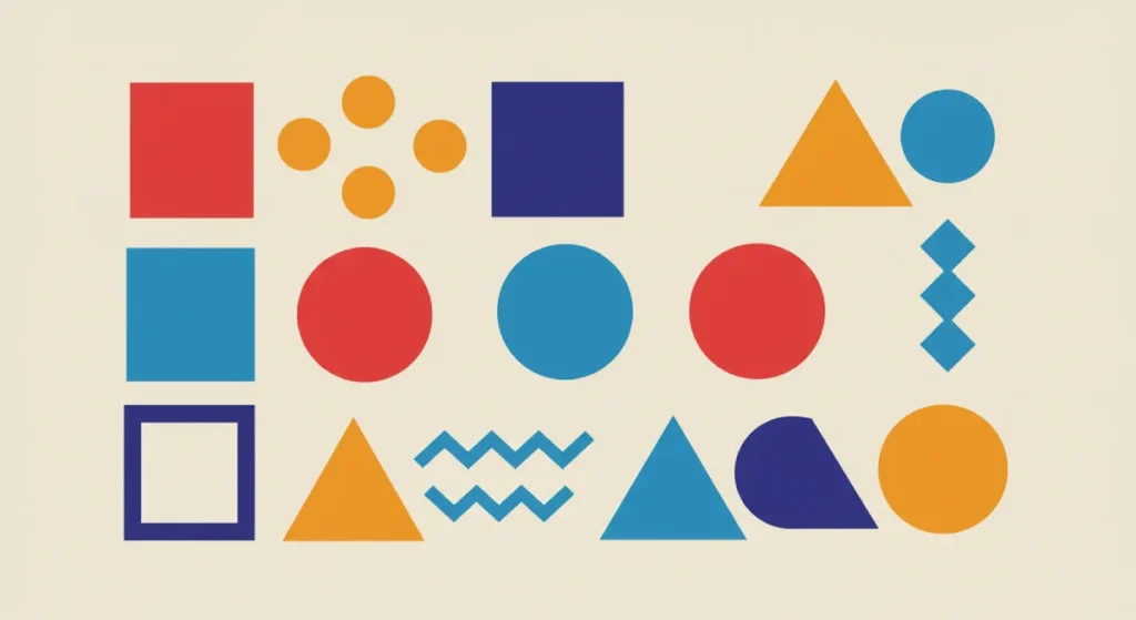
Every shape your brand uses communicates before your audience consciously processes what they’re looking at.
Rounded shapes — circles, ovals, soft curves — consistently trigger associations with warmth, approachability, safety, and community in cross-cultural studies. Sharp angular forms — triangles, pointed edges, hard lines — register as dynamic, fast, precise, and occasionally aggressive.
This is not metaphorical. It’s measurable at the neurological level. The brain’s amygdala — the threat-detection system — responds differently to pointed versus curved objects at a pre-attentive processing stage.
Brands targeting categories where perceived safety and approachability are competitive advantages (healthcare, financial planning, children’s products) deliberately use rounded forms.
Brands where precision, performance, and speed are the purchase drivers (automotive, performance technology, sports) use angular geometry for exactly the same reason. The choice isn’t aesthetic. It’s a signal to a predictable cognitive architecture.
The Logomark Shape Audit that Most Brands Skip
Most founders receive a logo, approve it based on personal preference, and move on. Very few conduct what should be a mandatory psychological audit: does the shape language of this mark reinforce the perceptual positioning we’re trying to build in our category?
This matters more in digital-first environments, where the logomark often appears at 32 pixels or smaller in favicons, app icons, and mobile navigation bars.
At that scale, complex forms collapse, and the shape signature — the silhouette — becomes the only operative psychological signal.
A logo that reads beautifully at A4 print size but becomes an unrecognisable smudge at 32px isn’t a brand asset. It’s a brand liability.
Symmetry, Asymmetry, and Perceived Stability
Symmetrical layouts read as stable, traditional, and authoritative.
They’re used by institutional brands precisely because they trigger a psychological association with permanence. Asymmetrical compositions read as dynamic, modern, and confident — they suggest movement and forward momentum.
Neither is superior. Both are useful in the right context.
The mistake is applying symmetry by default because it feels safe, without asking what the psychological instruction actually is.
Typography as Psychological Positioning
The typeface you choose is doing more psychological work than most brand owners realise.
Typography communicates personality before content. A serif typeface triggers associations with tradition, credibility, and authority — which is why established newspapers, legal institutions, and luxury brands favour them.
Sans-serif faces read as modern, clean, and accessible. Script and display fonts convey personality, craft, and distinctiveness — but at the cost of legibility at small sizes and in extended reading contexts.
The relevant question isn’t which typeface is aesthetically pleasing. It’s which typographic personality is psychologically aligned with the trust signals your audience is looking for in your category?
The Legibility-Distinctiveness Trade-off
One of the most common mistakes in SMB brand design is choosing a highly distinctive display typeface and using it across all applications — including small body copy, digital interfaces, and mobile environments.
Distinctiveness and legibility exist in a trade-off relationship. The more distinctive a typeface, the higher the cognitive load it places on the reader. High cognitive load in a purchasing context reduces conversion.
The practical solution is typographic hierarchy: use the distinctive display face for high-impact brand moments (logos, headlines, hero sections) and pair it with a highly legible body typeface for all extended reading.
The distinctive face carries the psychological identity. The legible face reduces friction during the decision process.
For how typographic and visual choices intersect with personality positioning, the guide to brand archetypes directly covers the relationship between visual language and archetype expression.
Typography is not decoration applied after positioning. It is a primary psychological signal that shapes how audiences categorise your brand in memory — before they’ve read a single word you’ve written. Choose a typeface that reflects the emotional register of your category, deploy it with sufficient consistency that recognition compounds, and resist the temptation to ‘refresh’ it every two years. Every reset is a tax on the psychological investment you’ve already made.
Why Cohesion Alone Doesn’t Create Recognition
Here’s the piece of advice you’ll find in every branding guide published in the last decade: be consistent. Consistency is king. Build a coherent visual system and never deviate from it.
The advice isn’t wrong. But it is drastically incomplete — and in practice, it causes brands to confuse visual consistency with psychological distinctiveness, which are not the same thing.
A brand can be perfectly consistent — same colour, same font, same grid system across every touchpoint — and still be psychologically invisible if those consistent elements don’t function as distinctive assets in the minds of category buyers.
Consistency is the mechanism. Distinctiveness is the outcome. Confusing them is how brands end up with impeccably consistent systems that no one actually remembers.
The Ehrenberg-Bass Institute for Marketing Science makes this distinction explicit. Their framework identifies that brand assets need to achieve both fame (broad consumer association with the brand) and uniqueness (exclusive association, not shared with competitors).
The Ipsos and JKR study (2023), testing over 5,000 assets against 26,000+ consumers, found that only 19% of brand logos and just 4% of colour palettes achieved gold-standard distinctiveness. Consistency without testing produces an unknown quantity of actual psychological impact.
The more uncomfortable truth: many brands are consistently reinforcing the wrong signals.
What Mastercard Did Right (and Why Most Brands Miss the Point)
In 2019, Mastercard dropped its brand name from its logo entirely. The brand felt confident removing text from its most prominent asset because, as marketing analyst Mark Ritson noted in Marketing Week, Mastercard had “50 years of applying and reapplying its codes across everything it does.”
The overlapping red and yellow circles became sufficient to trigger brand identification without the name present.
That’s not boldness. That’s the psychological dividend of sustained, disciplined asset management. The lesson for SMBs isn’t to remove their brand name.
It’s to understand that recognisability is a compounding asset that requires consistent inputs over an extended time — not reinvention cycles designed to feel fresh.
Consistency in branding is the mechanism, not the outcome. A perfectly consistent visual system built around elements that fail to achieve fame and uniqueness in the minds of category buyers produces impeccable invisibility. The brands that win psychologically identify which specific signals their audience actually uses to recognise and recall them — and reinforce those signals relentlessly, not everything in equal measure.
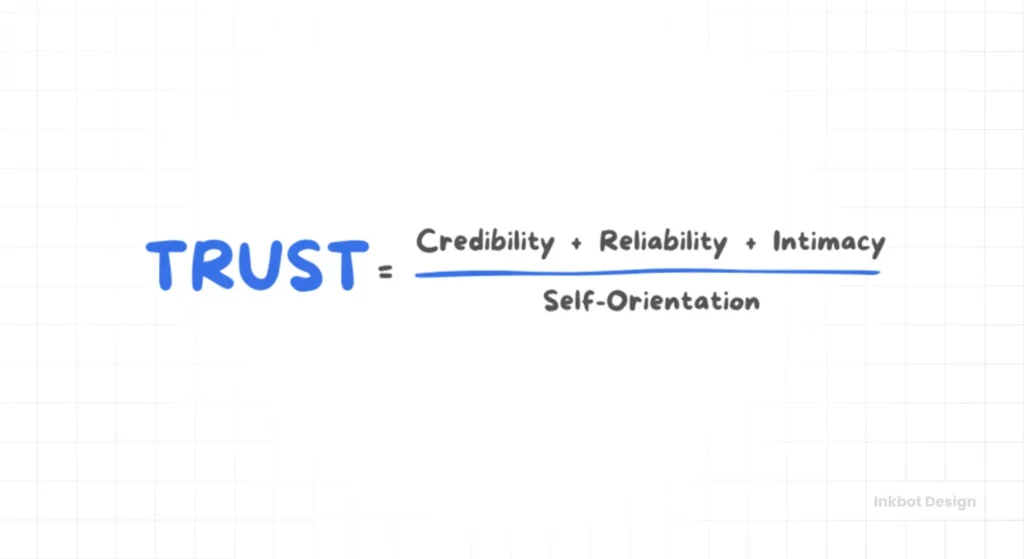
Trust Signals and the Psychology of Credibility in Visual Design
Trust is not a feeling. In commercial contexts, it is a predictable cognitive response to specific visual signals — and those signals can be designed deliberately.
Visual trust signals in brand design go far beyond the obvious credibility markers (professional photography, clean layouts, certification badges).
They include the cognitive mechanisms behind those markers. Understanding those mechanisms lets you apply them with precision rather than by imitation.
The Processing Fluency Effect
Processing fluency — the ease with which the brain processes a visual stimulus — is one of the most robust findings in cognitive psychology.
High fluency (easy to process) produces positive affect: the brain interprets ease of processing as a signal of familiarity, safety, and quality. Low fluency (visually complex, inconsistent, or poorly organised material) triggers mild cognitive strain, which the brain associates with risk or effort.
This is why professional design consistently outperforms amateur design in conversion contexts, even when the underlying product or offer is identical. The difference isn’t aesthetic preference. It’s cognitive friction.
Professional design is cognitively fluent — with a correct visual hierarchy, appropriate whitespace, consistent typographic scale, and coherent colour use. The brain processes it easily, and easy processing registers as trustworthy.
For a full breakdown of how trust manifests in specific design elements — from typography to layout to social proof placement — see the guide to trust signals in brand design.
The Visual Hierarchy Audit
The most common trust signal failure in SMB brand design is broken visual hierarchy — a layout where the visual weight of elements doesn’t correspond to their informational importance.
When the brain scans a page and can’t quickly identify which information is primary, it registers the layout as poorly organised and the brand as unprofessional. That’s not a subjective judgement. It’s a predictable cognitive response.
The practical test: convert your key brand materials to greyscale and look at the tonal contrast map. Does the heaviest visual weight fall on the most important information? If not, the hierarchy is broken — regardless of how beautiful the full-colour version looks.
Trust in brand design is generated by processing fluency: the ease with which the brain extracts meaning from a visual stimulus. Brands that create visually coherent, well-organised, and cognitively accessible materials are not just aesthetically pleasing — they are triggering an automatic association between smooth processing and credibility. No amount of copy compensates for a design that creates cognitive friction.
The State of Brand Design Psychology in 2026
The discipline has shifted significantly in the past eighteen months — and not in the directions most brand guides are tracking.
AI Has Raised the Psychological Differentiation Bar
Canva’s Magic Studio, which now serves over 220 million monthly active users globally, and Adobe Firefly, which had generated more than 16 billion image assets by late 2024 according to Adobe’s own reporting, have created a situation without historical precedent: the tools required to produce technically competent visual design are now accessible to anyone with a subscription.
The problem is the psychological consequence at scale.
When the barrier to producing competent design drops to near-zero, the threshold for perceptual differentiation rises correspondingly. According to Figma’s 2025 AI Report, 61% of design professionals now actively use AI tools in their workflows — and that figure is growing.
If every SMB in a category can produce a clean, modern, professional-looking visual identity in an afternoon, “clean, modern, and professional” ceases to function as a trust signal. It becomes the baseline.
The brand that invests in genuine psychological differentiation — unusual colour positioning, distinctive typography that’s actually been tested, shapes chosen for their specific cognitive associations — now captures an asymmetric advantage.
The AI commoditisation of visual competence has made psychological depth more valuable, not less.
The Post-AI Brand Authenticity Problem
Research from Clutch (2025) found that 59% of consumers say AI-generated content hurts trust in branding.
This isn’t a temporary sentiment. It reflects a meaningful shift in how audiences are using authenticity signals as a brand discriminator — particularly in categories where trust is a primary purchase driver.
The implication for design psychology is direct: brands that can demonstrate genuine craft, considered distinctiveness, and human creative intent in their visual communication are now operating in a differentiated tier.
Generic AI-generated visual assets are increasingly legible as such, and legibility as generic is the worst possible outcome in a competitive visual environment.
The Mental Availability Gap
McKinsey & Company’s research on AI-driven personalisation (2025) found that 71% of consumers now expect personalised brand interactions.
But the personalisation conversation has an under-discussed design psychology dimension: brands that achieve high mental availability — the property of being easily thought of in buying situations, as defined by the Ehrenberg-Bass Institute — benefit disproportionately from personalisation because the brand signal is already strong enough to be reinforced rather than built from scratch.
For SMBs, mental availability is built through one mechanism above all others: the sustained, consistent, and distinctive deployment of visual assets over time.
In 2026, the brands doing that systematically in an environment full of AI-generated visual noise are the ones compounding their psychological equity.
The Consultant’s Reality Check
I’ve audited branding work from founders across sectors for over a decade at Inkbot Design, and the most consistently expensive mistake I see is the same one: a founder who has invested in a genuinely distinctive visual identity and then spent three years systematically eroding it.
The pattern is recognisable. A new logo is commissioned. It’s well-considered, psychologically grounded, and different from the category norm in a meaningful way. Six months later, a junior team member produces some social content using a slightly different shade because they couldn’t find the hex code.
A year later, someone redesigns the website using a new typeface because the original “feels dated.” By the time we audit the brand, there are four distinct visual identities running simultaneously across different touchpoints, none of them sufficiently consistent to have built recognisable equity, and the founder is wondering why their marketing spend isn’t compounding.
The psychological investment required to build genuine brand distinctiveness is front-loaded and requires consistent maintenance.
The brand guidelines you receive after a good branding process are not a creative constraint. They are the instruction manual for protecting a psychological asset.
What should you do instead? Treat your brand system as infrastructure, not décor. Establish governance around brand asset use before you scale your team.
Audit your touchpoints quarterly against the original guidelines — not for aesthetic preference, but for signal consistency. And before you approve any redesign, ask one question: are we doing this because the psychological signal is genuinely broken, or because we’re bored with looking at it?
Boredom is not a valid brief.
Design Psychology in Practice
| Technical Decision | The Wrong Way | The Right Way | Why It Matters |
| Colour selection | Choose a favourite colour or copy what competitors use | Audit category colour distribution, identify gaps, test palette for psychological connotation in context | Colour in a saturated category is invisible; contrast creates pattern interruption |
| Logo shape | Use whatever the designer presents without a brief | Brief on the cognitive associations required (warmth, precision, authority) before design begins | Shape language communicates pre-attentively and must match the category and positioning |
| Typography | One distinctive display font across all applications | Distinctive display face for hero moments; highly legible body typeface for extended reading | Cognitive load in a purchasing context reduces conversion |
| Brand asset testing | Use internal preference as the test | Test assets for fame and uniqueness among category buyers, not employees | Marketer intuition about asset strength is reliably inaccurate, per Ehrenberg-Bass Institute research |
| Visual hierarchy | Design for aesthetic balance | Design for cognitive priority — heaviest weight on the most important information | Broken hierarchy registers as untrustworthy before any copy is read |
| Consistency management | Refresh visuals regularly to stay current | Maintain core assets relentlessly; evolve gradually with documented rationale | Every reset taxes the psychological equity already built |
| Redesign decisions | Redesign when stakeholders feel bored | Redesign only when the psychological signal is measurably broken, or the category has fundamentally shifted | Tropicana’s 2009 redesign — a $35M investment, a $30M loss — was driven by the desire to modernise, not by broken brand signal |
The Verdict
Design psychology isn’t a niche specialism for large brands with behavioural science departments. It’s the framework through which every visual decision your business makes either builds or erodes perceived value, trust, and recognisability.
The contrarian position laid out at the start of this article holds: most founders treat brand design as decoration, and that treatment is a commercial liability.
The 90-second window, the processing fluency effect, and the distinctiveness requirements identified by the Ehrenberg-Bass Institute for Marketing Science — none of these are negotiable realities. They’re operating conditions.
Working with them deliberately produces compounding returns. Working against them, or ignoring them entirely, produces the Tropicana outcome: a lot of money spent changing something that worked, in favour of something that looked modern but meant nothing to the people buying the product.
The single most important directive this article can offer: before any visual design decision, identify the specific psychological signal you’re trying to send, verify that it differentiates you meaningfully from your category competition, and commit to deploying it with enough consistency that recognition can accumulate. Then protect it.
If you’re ready to approach your visual identity with that level of strategic rigour, Inkbot Design’s brand identity work is built on exactly these principles.
You can also explore the interconnected guides on colour psychology, brand archetypes, and trust signals for the applied evidence behind each dimension of design psychology in practice.
Frequently Asked Questions
What is design psychology in branding?
Design psychology in branding is the application of cognitive and perceptual science to visual decisions — colour, shape, typography, spatial layout — in order to predict and influence how audiences perceive and respond to a brand. It operates primarily at a pre-conscious level: the brain categorises and forms emotional responses to visual stimuli before conscious evaluation begins.
Why does colour matter so much in brand design?
Colour accounts for between 62% and 90% of the initial visual assessment consumers make of a product or brand, according to research published in the International Journal of Research Publication and Reviews (2025). That assessment is formed within 90 seconds and is largely pre-conscious. Colour also functions as the most direct route to categorical positioning — brands that identify the colour gap in their market and exploit it create automatic differentiation.
How long does it take to build brand recognition?
Brand recognition is not built through a single campaign or even a single year of activity. The Ehrenberg-Bass Institute for Marketing Science’s framework shows that distinctive brand assets must achieve both fame and uniqueness before they can function as reliable memory triggers for category buyers. That level of recognition typically requires sustained, consistent deployment across multiple years of touchpoints and advertising — the exact timeframe depending on category, spend levels, and how genuinely distinctive the assets are.
What is the difference between brand consistency and brand distinctiveness?
Consistency is the operational practice of deploying the same visual signals across touchpoints over time. Distinctiveness is the psychological outcome — the degree to which those signals trigger exclusive brand association in the minds of category buyers. A brand can be perfectly consistent and still be invisible if the signals it’s consistently deploying aren’t distinctive enough. Research by Ipsos and JKR (2023) found that only 15% of tested brand assets meet the threshold of true distinctiveness.
Is it true that 95% of purchasing decisions are subconscious?
This figure is frequently attributed to Harvard Business School professor Gerald Zaltman, who argued in his research that the vast majority of consumer decision-making happens below the level of conscious awareness. The specific percentage varies across sources, but the directional conclusion — that automatic, emotional, and associative processes dominate purchase decisions — is well-supported by cognitive science and consistently replicated across consumer research contexts.
Why do professional logos outperform DIY logos even when they look similar?
Processing fluency. Professional design is visually coherent — correct hierarchy, appropriate spacing, consistent colour relationships — which the brain processes easily. Easy processing triggers positive affect and an automatic association with quality and credibility. DIY design frequently has subtle inconsistencies (uneven spacing, misaligned hierarchy, competing visual weights) that create friction. That friction registers as unprofessional before any conscious judgement is formed.
When is the right time to rebrand?
Rebranding is justified when the psychological signal your brand is currently sending is measurably broken or misaligned with your current audience and market position — not when the brand feels dated to internal stakeholders. The Tropicana 2009 case is the canonical example of a brand redesigned for internally motivated aesthetic reasons rather than a broken external signal. The result was a $30 million sales loss in under two months. Before initiating a rebrand, test whether your existing distinctive assets actually have weak fame or uniqueness scores among category buyers.
What are distinctive brand assets?
Distinctive brand assets are the non-name elements of your brand — colour, logo shape, typography, characters, sounds, slogans — that can trigger brand recognition independently. The concept was codified by Professor Jenni Romaniuk of the Ehrenberg-Bass Institute in Building Distinctive Brand Assets (Oxford University Press, 2018). To function as a genuine asset, an element must be both famous (broadly associated with your brand) and unique (exclusively associated with your brand, not shared with competitors).
Does typography really affect how customers perceive a brand?
Typography shapes categorical and emotional perception before content is processed. Serif typefaces trigger associations with tradition, authority, and credibility — which is why established newspapers, law firms, and luxury brands favour them. Sans-serif faces read as modern and accessible. The choice is not aesthetic; it’s a signal that either reinforces or contradicts the position you’re trying to hold in your category.
How has AI changed brand design psychology?
AI design tools like Canva’s Magic Studio (220 million monthly active users) and Adobe Firefly (16 billion+ assets generated by late 2024) have lowered the barrier to technically competent design to near-zero. The psychological consequence is that visual competence alone no longer serves as a trust signal—it’s now the baseline. Brands that achieve genuine psychological differentiation through distinctive assets, considered colour positioning, and coherent emotional priming now hold an asymmetric advantage over brands relying on template-driven competence.
What is processing fluency, and why does it matter for branding?
Processing fluency is the cognitive ease with which the brain extracts meaning from a visual stimulus. High fluency — achieved through clear hierarchy, consistent visual language, appropriate whitespace, and coherent colour use — produces automatic positive affect. The brain interprets easy processing as a signal of quality, familiarity, and trustworthiness. Low fluency creates mild cognitive strain, which maps onto associations of risk and poor quality. This is the primary psychological mechanism behind why professional design builds trust even with new audiences who have no prior brand relationship.
