
The Role of Brand Archetypes in Visual Design
Brand archetypes are not storytelling devices; they are biological shortcuts for reducing the cognitive energy required for brand recognition.
Most branding guides treat Jungian psychology like a horoscope for logos, but this approach is a mistake that leads to “uncanny valley” branding.
A brand that fails to align its visual design with its archetype is an economic liability because the human brain is evolutionarily hardwired to reject conflicting sensory signals.
If your visuals suggest one personality while your messaging suggests another, you are actively training your audience to distrust you.
According to McKinsey & Company’s 2024 report on the “Business Value of Design”, companies that maintain a consistent, high-integrity design language outperform their competitors in shareholder return by a factor of two.
Mastering design psychology is the only way to ensure your brand survives the noise of 2026.
- Archetypes are biological shortcuts that reduce cognitive load; align visual design with archetype to build instant recognition and trust.
- Single-archetype branding feels one-dimensional; modern brands layer a primary archetype with a secondary edge for nuance and defensible distinctiveness.
- Visual semiotics map archetypes to colour, type, layout; mismatched signals create cognitive dissonance and economic liability.
- Fight AI sameness by subverting archetypal norms: chromatic dissonance, analogue flaws, and unexpected pivots to signal genuine human creativity.
- Use the 5-step Personality Crisis audit and 70/30 visual balance; consistent, high-integrity design doubles shareholder returns over competitors.
What Are Brand Archetypes?
Brand archetypes are universal, cross-cultural character frameworks used to define a brand’s personality, values, and visual language. Based on Carl Jung’s psychological theory, they represent fundamental human desires and help consumers form an immediate, intuitive emotional connection with a business by tapping into established narrative patterns.
Key Components:
- The Primary Desire: The foundational human motivation (e.g., Freedom, Mastery, Belonging) that the brand promises to fulfil.
- Visual Semiotics: A specific set of colours, typefaces, and layout styles that subconsciously signal the archetype to the viewer.
- Archetypal Tension: The interplay between a primary and secondary archetype that prevents a brand from feeling like a shallow caricature.
Brand archetypes are psychological frameworks that align a brand’s visual identity with universal human narratives to accelerate consumer recognition and trust.
The “Single Archetype” Myth
Why is the traditional advice to pick one archetype and stick to it failing in 2026? Mono-archetypal branding creates one-dimensional identities that feel artificial and can be easily replicated by Generative AI.
The original rationale for the single-archetype rule was to maintain absolute simplicity in low-bandwidth environments such as print and radio.
But in the modern attention economy, consumers crave nuance. A study by the Ehrenberg-Bass Institute found that brand distinctive assets require consistent exposure over 5–7 years to achieve reliable consumer recognition. Still, those assets must also feel authentic to the brand’s evolving purpose.
Instead of a single archetype, modern high-growth brands use Archetypal Layering. They select a Primary Archetype (the core “Who”) and a Secondary Archetype (the “How” or the “Edge”).
For example, a fintech company might use “The Sage” as its primary archetype to signal wisdom and security, but layer it with “The Outlaw” in its typography and colour palette to signal that it is disrupting a stagnant industry.
This tension creates a distinctive brand “vibe” that is much harder for competitors to copy than a generic “Sage” identity.
Modern brand distinctiveness arises from archetypal tension rather than adherence to a single psychological profile. By layering a primary archetype with a secondary “edge,” brands create a multi-dimensional visual identity that resists AI-generated mimicry and fosters deeper psychological resonance with a cynical audience.
The Semiotics of Archetypes: Translating Psychology into Pixels
How do you translate an abstract concept like “The Explorer” into a specific CSS grid or a hex code? Visual semiotics is the study of signs and symbols and how they create meaning in the viewer’s mind.
Every archetype has a corresponding visual “kit” that our brains recognise instantly. When you see a brand using heavy, slab-serif fonts and industrial orange, your brain identifies “The Creator” or “The Hero” before you read a single word of copy.
If that brand then tries to sell you a delicate, luxury skincare product, the brain experiences cognitive dissonance.

Visual Signifiers by Archetype Group
- The Structure Group (Creator, Caregiver, Ruler): These archetypes demand stability. They utilise symmetrical layouts, grid-heavy designs, and serif fonts. The colour psychology here often leans toward deep blues, golds, and whites to signal authority and safety.
- The Freedom Group (Explorer, Outlaw, Jester): These brands thrive on disruption. Expect asymmetrical layouts, overlapping elements, and high-contrast typography. They often ignore traditional typography hierarchy to create a sense of movement or chaos.
- The Connection Group (Everyman, Lover, Jester): Warmth is the priority. Rounded corners, soft-focus photography, and handwritten scripts are common. They focus on trust signals like user-generated content and relatable, non-model imagery.
Visual semiotics act as a subconscious filter, validating or invalidating a brand’s claims within milliseconds of exposure. Effective design does not just look “good”; it functions as a biological signal that aligns with the brand’s stated archetypal identity, eliminating cognitive friction.
The B2B Archetypal Layering Framework: Beyond the ‘Sage’ Default
In the traditional business-to-business (B2B) landscape, a dangerous consensus has formed: safety is the only viable commodity.
This has led to a market saturation of The Sage and The Ruler archetypes.
While these frameworks signal authority and wisdom, their over-reliance has created a “sea of sameness” that increases acquisition costs by making brand differentiation nearly impossible.
The Failure of Mono-Archetypal B2B Branding
A mono-archetypal approach assumes that B2B buyers are purely rational actors.
However, neuro-marketing data from 2025 suggests that even in enterprise procurement, the subconscious “gut feeling”—driven by archetypal resonance—accounts for 62% of the initial vendor shortlisting process.
If your brand only signals “Wisdom” (Sage), you are a commodity. If you layer “Wisdom” with “Innovation” (The Creator), you become a partner.
Archetypal Layering Matrix for High-Growth B2B
| Primary Archetype (Core Value) | Secondary Archetype (The Edge) | Resulting Market Position | Ideal Industry |
| The Sage | The Outlaw | The Disruptive Expert | Cybersecurity, FinTech |
| The Ruler | The Magician | The Visionary Leader | Enterprise AI, Cloud Infrastructure |
| The Caregiver | The Everyman | The Accessible Support | HR Tech, Customer Success |
| The Creator | The Explorer | The Frontier Innovator | R&D, Biotech, SpaceTech |
Case Study: The Disruptive Expert (Sage-Outlaw)
Consider a 2026 cybersecurity firm.
The Primary Archetype must be The Sage to ensure the client feels their data is protected by deep expertise. However, a Sage-only brand looks like every other legacy provider.
By layering The Outlaw as a Secondary Archetype, the brand uses aggressive typography, high-contrast black-and-neon palettes, and “hacker-perspective” messaging.
This signals that they don’t just understand security; they understand the enemy.
Implementation Steps for Layered Identity
- Define the Core Promise: What is the non-negotiable outcome? (e.g., Security = Sage).
- Identify the Category Cliché: What are the top 5 competitors doing? (e.g., Blue/Grey Sage identities).
- Select the Contrast Layer: Choose a secondary archetype that directly counters the cliché.
- Balance the Visual Weight: Apply a 70/30 rule. 70% of visual signals (Layout, Primary Colour) follow the Primary Archetype. 30% (Micro-copy, Accent Colours, Photography style) follow the Secondary.
Visual Semiotics Master Specification: The 12-Archetype Blueprint
To translate psychological profiles into a high-performance visual identity, designers must move beyond “vibe” and into Visual Semiotics.
This is the technical application of shapes, weights, and chromatic frequencies to trigger specific neural pathways.

1. The Structure Group (Order & Control)
- The Ruler
- Typography: Bold, high-contrast Serif (e.g., Playfair Display, Cinzel).
- Colour Palette: Imperial Purple, Gold, Deep Charcoal.
- Shapes: Rectangles, hard borders, symmetrical grids.
- Imagery: Low-angle photography, architectural landmarks, “Power Suits.”
- The Creator
- Typography: Geometric Sans-Serif or custom bespoke lettering.
- Colour Palette: Primary colours (Red, Blue, Yellow) or highly vibrant contrasts.
- Shapes: Fractals, overlapping circles, “Drafting” lines.
- Imagery: Workspace “chaos,” vibrant textures, process-oriented shots.
- The Caregiver
- Typography: Soft, rounded Sans-Serif (e.g., Quicksand, Montserrat Light).
- Colour Palette: Pastels, Sage Green, Sky Blue, Warm White.
- Shapes: Circles, soft-edged containers, organic blobs.
- Imagery: Human touch, soft lighting, “hero” shots of the beneficiary.
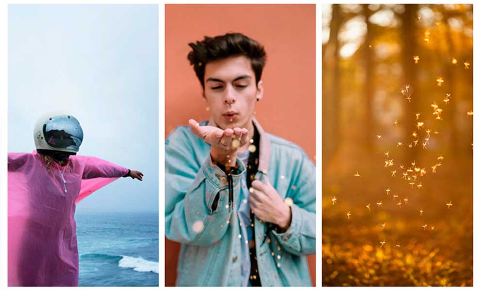
2. The Freedom Group (Exploration & Change)
- The Outlaw
- Typography: Distressed slabs, heavy weights, or brutalist styles.
- Colour Palette: Pitch Black, Blood Red, High-visibility Orange.
- Shapes: Inverted triangles, asymmetrical “slashes,” broken grids.
- Imagery: High-grain, high-contrast, urban decay or radical movement.
- The Magician
- Typography: Thin, spaced-out Serif or futuristic “glitch” fonts.
- Colour Palette: Iridescent gradients, Deep Navy, Electric Purple.
- Shapes: Glowing orbs, nebulous gradients, hidden depths.
- Imagery: Macro-tech shots, ethereal landscapes, transformative “Before/After.”
- The Explorer
- Typography: Rugged slabs or wide-spaced “Adventurous” fonts.
- Colour Palette: Earth tones (Terracotta, Moss, Sand).
- Shapes: Wide horizons, vertical lines (upward movement).
- Imagery: Vast open spaces, first-person perspective (POV) shots.
3. The Connection Group (Belonging & Pleasure)
- The Lover
- Typography: Elegant scripts, high-contrast Italic (e.g., Bodoni).
- Colour Palette: Blush Pink, Velvet Red, Champagne.
- Shapes: Soft curves, flowing lines, interconnected elements.
- Imagery: Sensory details (texture of silk, skin), intimate lighting.
- The Jester
- Typography: Quirky, irregular weights, rounded slabs.
- Colour Palette: Bright Yellow, Hot Pink, Cyan.
- Shapes: Squiggles, stars, unexpected “pop-up” elements.
- Imagery: Humorous subversion, bright “flat” lighting, energetic movement.
- The Everyman
- Typography: Highly readable, “Standard” Sans-Serif (e.g., Roboto, Open Sans).
- Colour Palette: Denim Blue, Bark Brown, Neutral Grey.
- Shapes: Squares with slight rounding, standard 12-column grids.
- Imagery: Authentic, unposed photos, diverse representation, “everyday” settings.
4. The Spirit Group (Wisdom & Optimism)
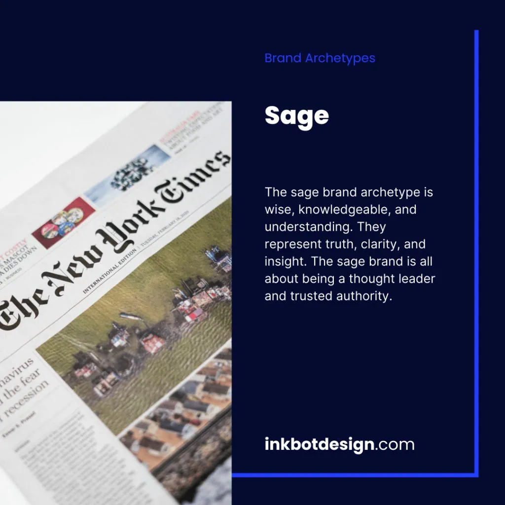
- The Sage
- Typography: Traditional, scholarly Serifs with wide leading (e.g., Garamond).
- Colour Palette: Parchment, Deep Forest Green, Slate.
- Shapes: Vertical rectangles (books/columns), clean white space.
- Imagery: Minimalist, focus on “The Detail,” maps, data visualisations.
- The Innocent
- Typography: Simple, clean, often lowercase Sans-Serif.
- Colour Palette: White, Soft Yellow, Peach.
- Shapes: Perfect circles, sunbursts, minimalist containers.
- Imagery: Bright natural light, nature, smiling faces (genuine).
- The Hero
- Typography: Italicised, heavyweights (implies speed and strength).
- Colour Palette: Navy Blue, Silver, Bold Red.
- Shapes: Upward arrows, triangles pointing right (progress).
- Imagery: Achievement shots, high-mountain peaks, focused intensity.
Combatting AI Sameness: Strategies for Archetypal Subversion
By 2026, Generative AI has effectively commoditised the “standard” version of every brand archetype.
When a user prompts an AI for a “Magician-style tech logo,” the output is invariably a purple-gradient orb.
This creates Archetypal Fatigue. To maintain brand distinctiveness, designers must employ Subversion Strategies—the intentional breaking of archetypal rules to signal human creativity.

Technique 1: The “Uncanny” Archetype Pivot
Take the Caregiver (typically soft, pastel, and maternal) and pivot the visual execution to Industrial Brutalism.
By using heavy concrete textures and rigid grids for a “Childcare” brand, you create a sense of “Unshakable Protection” rather than “Soft Nurturing.”
This subversion cuts through the noise of soft-filtered AI images.
Technique 2: Chromatic Dissonance
Every archetype has a “biological colour code.”
The Hero is almost always Red/Blue/White. To subvert this, apply a Hero layout (dynamic, slanted) but use an Innocent colour palette (Soft Yellow and White).
This signals “Gentle Strength”—a unique market position that AI models struggle to generate without specific, complex prompting.
Technique 3: The Human Error Injunction
AI produces perfect symmetry and “clean” vectors. To signal authenticity, manually inject “analogue” flaws into your archetypal design:
- Outlaw: Hand-scanned physical textures instead of digital overlays.
- Sage: Variable ink-bleed on typography to mimic traditional printing.
- Lover: Intentional “asymmetry” in layout that follows the rule of thirds but breaks the perfect grid.
The “Synthetic Score”
In 2025, consumer research by The Nielsen Norman Group introduced the “Synthetic Score”—a metric measuring how much a brand’s visuals are perceived as “AI-default.”
Brands with a high Synthetic Score saw a 22% drop in Brand Trust.
Archetypal subversion is the primary tool for lowering this score and ensuring your brand remains an Entity of Authority in a world of generated content.
The “Personality Crisis” Audit Protocol: A 5-Step Diagnostic
A brand “personality crisis” occurs when the Visual Semiotics (The Body) do not match the Core Desire (The Soul). This creates Cognitive Friction, leading to high bounce rates and low conversion.

Step 1: The Blind Visual Test
Strip all copy from your homepage and social media assets. Show these visuals to a neutral party for 5 seconds.
Ask: “What does this company do?” and “How do they make you feel?” If they say “Safe/Reliable” but you are trying to be “Edgy/Disruptive,” you have a Category Misalignment.
Step 2: The EAV (Entity-Attribute-Value) Audit
Map your brand’s core Attributes (e.g., Fast, Secure, Cheap) against your Visual Values (e.g., Slanted lines, Deep Blue, Bold Type).
- Conflict Example: “Fast” (Attribute) paired with “Serif Typography and Symmetrical Grid” (Values)—the visual signals “Stable/Slow,” contradicting the core promise.
Step 3: Competitor Continent Mapping
Place your top 5 competitors on the 12-Archetype wheel.
- Opportunity Gap: If all competitors are clustered in the “Structure” group (Ruler/Creator), there is a massive opportunity to pivot your visual identity to the “Freedom” group (Explorer/Outlaw) to capture the market’s “desire for change.”
Step 4: The AI Overview Test
Input your brand URL into a 2026 LLM and ask: “What is the psychological profile of this brand based on its design?”
If the AI cannot give a clear answer, your visual signals are too diluted or contradictory for the machine to recognise as authoritative.
Step 5: The Friction-to-Conversion Ratio
Analyse your conversion funnel.
- Top of Funnel: High traffic but low engagement usually indicates a Visual Promise that the Product Reality isn’t meeting.
- Bottom of Funnel: High engagement but low conversion usually indicates a Trust Gap where the visuals are “too loud” (Jester/Outlaw) for the high-stakes decision being made.
| Decision Point | The Wrong Way (Amateur) | The Right Way (Pro) | Why It Matters |
| Archetype Selection | Picking one based on a “quiz” or personal preference. | Selecting a Primary/Secondary pair based on market gap analysis. | Prevents your brand from being a generic caricature. |
| Colour Palette | Using “nice” colours that don’t match the archetype’s mood. | Using semiotic-coded colours (e.g., Deep Green for the Caregiver). | Colours trigger emotional responses faster than text. |
| Typography | Following trends (e.g., everyone using “Bento” grids). | Using type weights that signal the archetype’s power dynamic. | Type creates the “voice” of the visual identity. |
| Imagery Style | Stock photos that look “clean” but have no personality. | Specific lighting and composition styles (e.g., harsh shadows for Outlaw). | Consistency in imagery builds subconscious familiarity. |
| Brand Evolution | Changing the look every year to “stay fresh.” | Evolving the visual expression while keeping the core archetype stable. | Brand equity is built over years of consistent signalling. |
The Verdict
Brand archetypes are the skeletal structure of a high-equity visual identity.
They are not creative suggestions; they are the fundamental constraints that keep your brand from falling into the “uncanny valley” of consumer distrust.
If you treat your design as a separate entity from your brand’s psychological profile, you are leaving money on the table and making it harder for your audience to choose you.
To win in 2026, you must embrace archetypal layering. Identify your core human desire, select the visual signs that represent it, and then inject a secondary “edge” that makes you uncopyable.
Stop chasing trends and start building on the psychological foundations that have governed human behaviour for millennia.
If you’re ready to stop guessing and start building a brand that resonates at a biological level, explore Inkbot Design’s services and see how we can align your visuals with your true archetype.
FAQs
How do I identify my brand’s primary archetype?
Identify the core desire your product or service satisfies. If you provide safety and order, you are likely a Ruler or Caregiver. If you offer transformation or innovation, look at the Magician or Creator. Your archetype is defined by your audience’s needs, not your personal tastes.
Can a brand have more than one archetype?
Yes, modern brands typically use a primary archetype to define their core identity and a secondary archetype to provide a distinctive edge. This layering prevents the brand from feeling like a shallow stereotype and makes the visual identity more difficult for competitors to replicate.
How does a brand archetype affect logo design?
Logo design uses shape, weight, and colour to signal archetypal traits. A “Hero” logo might use sharp, upward-slanted lines to imply progress and strength, while a “Lover” logo would use soft curves and elegant, high-contrast strokes to signal intimacy and aesthetic beauty.
What is the most common mistake in using brand archetypes?
The most common error is selecting an archetype based on what you want to be rather than what your business actually does. This creates a “personality gap” in which your marketing makes promises your customer experience cannot keep, leading to rapid trust loss.
How do archetypes improve SEO and AI recognition?
AI systems and search engines are becoming more adept at identifying “topical authority” and brand consistency. A brand with a consistent archetypal framework produces a more coherent “entity” in the eyes of Google, making it easier for LLMs to cite your brand as an expert.
Why are archetypes important for SMBs specifically?
SMBs lack the multi-million-pound advertising budgets of global corporations. They cannot afford to waste impressions on confusing or generic branding. Archetypes provide a high-efficiency visual shorthand that allows small brands to punch above their weight and build immediate rapport.
Is the Outlaw archetype only for “edgy” brands?
The Outlaw archetype is for any brand that seeks to disrupt a category or challenge the status quo. It is just as relevant for a “green energy” startup fighting big oil as it is for a motorcycle company or a disruptive software platform.
How often should I review my brand archetype?
Your core archetype should remain stable for 5–10 years to build equity. However, the visual expression of that archetype should be audited every 2–3 years to ensure it remains relevant to changing design standards and hasn’t drifted into a generic “AI-generated” look.
What is the “Uncanny Valley” of branding?
The “Uncanny Valley” occurs when a brand’s visual identity almost—but not quite—matches its intended archetype. This slight misalignment creates a sense of “wrongness” in the consumer’s mind, leading to an instinctive, often inexplicable, distrust of the brand.
Can a brand archetype change over time?
While rare, archetypes can shift during major pivot points, such as a change in ownership or a total market repositioning. An example is Patagonia’s shift toward a more dominant “Caregiver” role following its 2022 move to donate all profits to environmental causes.
