The Guinness Logo: A Timeless Icon of Irish Heritage
You walk into a pub anywhere in the world. The hum of voices surrounds you, but something draws your attention. It is not the glint of glasses nor the smile of the bartender. It's a symbol-smooth yet simple-sitting atop the taps.
The Guinness harp.
You are not only looking at a logo but staring at a piece of history, at a slice of culture, at a testimony to how to get branding right.
This is no ordinary corporate symbol but a bridge across centuries, a silent ambassador for an entire nation. It talks about craftsmanship, tradition, and nights filled with laughter and song.
But the best part is that it's a stylised harp. So, how did a few curved lines and strings become so much more? How does it transcend its role from a mere trademark to a cultural touchstone?
That's the magic of the Guinness logo: It's not selling beer; it's selling a story, Ireland's story, every person who has ever raised a pint and felt part of something bigger.
The Guinness harp stands firm in an ever-changing world of disposable trends and disposables by design. It's a reminder that some good things stick around. They matter. So, the next time you see that harp, take a moment. Take it in. Because you aren't just looking at a logo—you're looking at a legend.
But what makes symbols like the harp so mighty in logo design? It's not just about aesthetics; it's about resonance. Utilising symbols linked to local legends or mythology can infuse a logo with depth and storytelling. These symbols carry the weight of history and cultural significance, making them memorable and meaningful.
Consider this: the Nike logo, inspired by the Greek goddess of victory, transcends mere design. It taps into a narrative of triumph and excellence. Similarly, the legends and mythology of your region might offer untapped potential for your brand's identity. By incorporating these elements, you create a logo that doesn't just represent your brand—it embodies its essence and connects with an audience on a cultural level.
Incorporating local symbols isn't just a nod to tradition; it's a strategic move. It roots your brand in a story that can captivate and endure, much like the harp has for Guinness. So, delve into the myths and legends of your backyard. Who knows? You might find the perfect emblem that tells your story and stands the test of time.
Now, let's delve into the story behind this icon, shall we?
- The Guinness harp is more than a logo; it represents Irish heritage and timeless branding that transcends mere product.
- The logo's design reflects quality and tradition, making it a cultural icon associated with craftsmanship and celebration.
- Guinness consistently uses local symbols to create a narrative that resonates globally, enhancing its brand identity.
- Today, the logo adapts to digital platforms while maintaining its historical significance, securing its place in popular culture.
- The Birth of a Legend
- The Evolution of an Icon
- The Harp's Design Elements
- The Psychology Behind the Logo
- The Logo in Pop Culture
- The Logo's Global Reach
- The Technical Side of Things
- The Logo's Impact on Brand Value
- The Future of the Guinness Logo
- The Role of the Logo in Marketing Campaigns
- The Legal Side of the Guinness Logo
- The Logo's Influence on Irish Culture
- Conclusion: More Than Just a Logo
- FAQs
The Birth of a Legend
A Humble Beginning
Location: 1759. A young Arthur Guinness signs a 9,000-year lease on a dilapidated brewery at St. James's Gate. Little did he know that this bold move would lay the foundation for one of the world's most recognisable brands. But the harp wasn't there from the start – oh no, that came later.
The year the company was founded, 1759, became more than just a date; it became a symbol of heritage and tradition that the company proudly displays. Even as logos evolve, the founding year often remains steadfast, anchoring the brand to its storied past.
Incorporating the founding year into a logo serves a dual purpose: it reassures consumers of the company's established roots and highlights its longevity in a competitive industry. For Guinness, this tradition reinforces the brand's legacy, ensuring that every pint poured is a reminder of its rich history.
The Harp's Debut
It wasn't until 1862 that the harp appeared on Guinness bottles. Why a harp, you ask? Well, it's a nod to the official emblem of Ireland. Clever, eh? The Guinness family wasn't mucking about – they wanted their brew to be as Irish as a leprechaun riding a shamrock.
The Evolution of an Icon
Early Designs: A Bit of a Mess
The early versions of the Guinness harp were all over the shop. They varied wildly, looking more like a child's doodle than a cohesive brand identity. You've got to start somewhere, right?
The Brian Boru Harp: Getting Serious
In 1876, Guinness decided to pull up their socks and get serious about their logo. They registered a trademark based on the Brian Boru harp, an ancient Irish instrument. This was a game-changer, folks.
In 1955, the Guinness logo underwent significant changes nearly a century after its creation. The design updates included removing the word ‘trademark' for additional design elements. Additionally, the colour scheme experienced a reversal: what was previously white now served as accents, and black became the background.
The Downward-Facing Harp: A Stroke of Genius
Here's a fun fact: the Guinness harp faces right, while the Irish government's harp faces left. Why? To avoid any confusion, of course! It's like they're playing a centuries-old game of “Spot the Difference”.
Evolution of the Guinness Logo in 1968 and 1995
In 1968, the Guinness logo underwent a significant transformation. This iteration was notably streamlined. The intricate details initially present on the iconic harp were stripped away, leaving a more minimalistic design. The number of strings on the harp was reduced to just nine, enhancing the simplicity and modern appeal of the logo.
Fast forward to 1995, another redesign took place. This revision aimed to merge elements from previous versions. Some of the details removed in 1968 were reintroduced, albeit in a more simplified form. However, this version was quickly replaced within the same year.
The brand opted for an even more minimalistic approach, discarding intricate details altogether and embracing a cleaner, straightforward aesthetic.
These changes reflect the brand's ongoing effort to modernise and adapt its visual identity to suit contemporary tastes.
The Harp's Design Elements
Strings That Sing
The strings of the Guinness harp aren't just for show. They're meticulously crafted to represent the quality and precision that goes into every pint. Each string is singing a little ditty about the perfect pour.
The Frame: Solid as a Rock
The harp's frame is robust and well-defined, much like the taste of Guinness itself. It's not going anywhere like that dark, creamy head on your pint.
Colour Palette: Less is More
The Guinness logo typically sticks to a simple black and gold colour scheme. It's elegant, timeless, and doesn't fuss about—just like the stout – no-nonsense, all flavour.
Evolution of the Guinness Logo Font
Early Years:
The journey of the Guinness logo font is a tale of transformation. In its early days, the font featured a traditional design reflective of the era, providing a sense of history and authenticity.
Mid-20th Century Changes:
As the years went by, subtle changes emerged. The company experimented with serif fonts to maintain a classic aesthetic aligned with its brand heritage.
Recent Updates:
In its latest iteration, the font underwent a significant redesign. The current version is a lighter serif font, distinguished by delicate embellishments at the ends of each letter. This design choice was custom-created in-house to ensure a unique and timeless representation of this globally recognised brewery.
Throughout these changes, Guinness has balanced modernity with its storied past, ensuring that each font iteration aligns with the brand's evolving identity.
The Psychology Behind the Logo
Trust and Tradition
The harp isn't just a pretty face – it's a symbol of trust and tradition. When you see that harp, you know you're getting a piece of Irish history in a glass. It's like a little pat on the back from Arthur Guinness himself.
Musical Connotations
Think about it – a harp is an instrument. It makes music. And what does music do? It brings people together. Just like a good pint of Guinness. Clever, eh?
National Pride
For many, the Guinness harp is as much a symbol of Ireland as the shamrock or the colour green. It's a source of national pride, worn on the chest of rugby players and plastered on pub walls worldwide.
The Logo in Pop Culture
Guinness Advertisements: A Class Act
Guinness adverts are legendary, and the harp is always front and centre. The harp is the show's star, from the iconic “My Goodness, My Guinness” posters to the heartwarming modern-day TV spots.
Merchandise Madness
You can slap that harp on almost anything, and people will buy it. T-shirts, pint glasses, keychains – you name it. It's like a badge of honour for stout lovers everywhere.
The Storehouse Experience
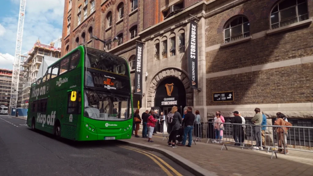
If you've ever been to the Guinness Storehouse in Dublin (and if you haven't, why not?), you'll know that the harp is everywhere. It's like a game of “Where's Wally?” but with a much cooler prize at the end – a perfectly poured pint.
If you've ever visited the Guinness Brewery in Dublin, you might have noticed a toucan featured in some vintage advertisements. But why choose a toucan as a mascot? The decision is steeped in the brand's clever marketing strategy.
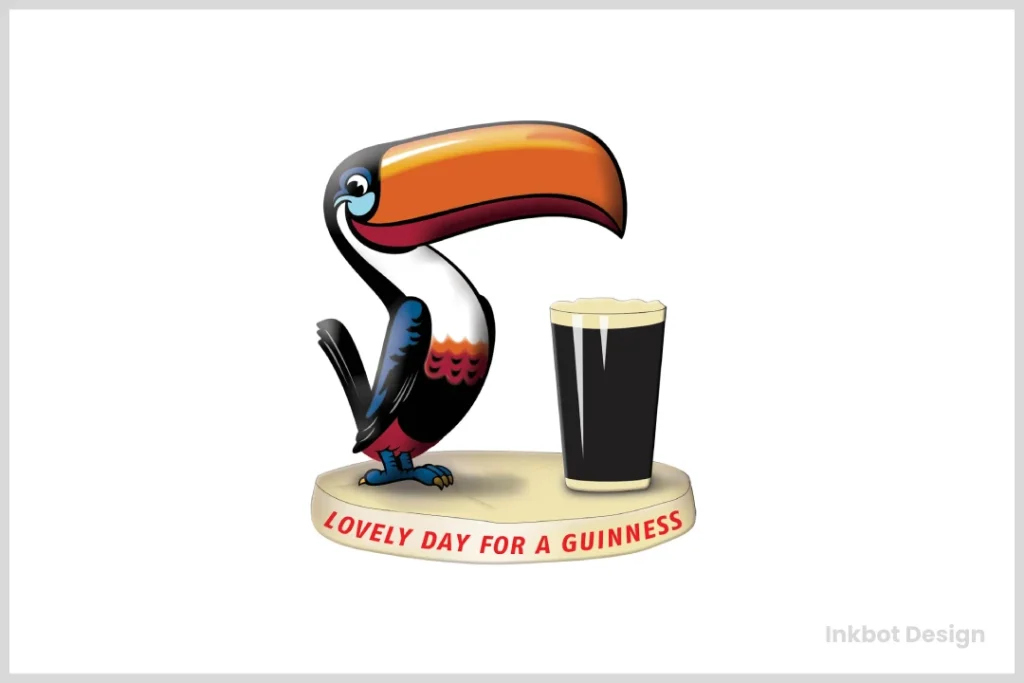
A Symbol of Exoticism
The toucan was selected to embody the beer's exotic and adventurous spirit. By associating the brand with a tropical bird, it conveyed a sense of the extraordinary, suggesting that enjoying the beer was a unique experience.
Visually Striking
Toucans are known for their vibrant and conspicuous appearance, which makes them perfect for eye-catching ads. Their colourful beaks and playful demeanour helped create memorable imagery, making the advertisements stand out from other Irish beer offerings.
In summary, opting for a toucan wasn't just about the bird itself but what it represented. It was a strategic move to differentiate the brand in a crowded market while making a lasting impression on consumers.
The Logo's Global Reach
International Recognition
Walk into any pub from Tokyo to Toronto, and you'll likely spot that familiar harp. It's a universal symbol of good times and great beer.
Cultural Crossover
The Guinness harp has transcended its roots as a mere logo. It's become a cultural icon, representing a brand and a way of life. It's not bad for a bit of bent wood and some strings.
The Technical Side of Things
Typography: Keeping it Classy
The Guinness wordmark is as vital as the harp itself. It's bold, clear, and has enough flair to be interesting without being showy. It's like the handwriting of a very posh, very confident person.
Proportions and Balance
The ratio of the harp to the wordmark is no accident. It's been carefully calibrated over the years to create a harmonious balance. It's like a perfectly poured pint – everything in its proper place.
Versatility in Application
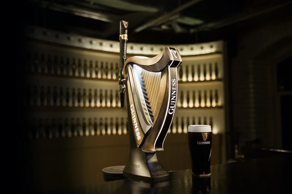
The Guinness logo maintains its integrity, whether embossed on a glass, printed on a coaster, or glowing on a neon sign. It's like a chameleon, but instead of changing colours, it changes mediums.
The Logo's Impact on Brand Value

Brand Recognition: Through the Roof
Studies have shown that the Guinness logo is one of the most recognisable worldwide. It's up there with the golden arches and the swoosh. Not too shabby for a brewery that's been around since before the United States was even a twinkle in George Washington's eye.
But how did this happen?
The secret lies in the original logo's power to capture attention and make the Dublin-based company stand out wherever it was exported. This emblem not only represented the brand but also became a beacon for beer lovers around the globe, paving the way for Guinness to gain international recognition.
By creating a visual identity that resonated across cultures, the logo helped Guinness carve out a space in the global market. This combination of historical depth and striking design made the logo an enduring symbol of quality and tradition, securing its place in the pantheon of iconic brand imagery.
Premium Positioning
The elegance of the harp helps position Guinness as a premium product. It's not just any old beer – it's a craft, a tradition, an experience. And the logo reflects that in spades.
Brand Loyalty: Stronger than Steel
Guinness drinkers are loyal, and the logo plays a big part. It's like a secret handshake – when you see someone order a Guinness, you know they're part of the club.
What Factors Contributed to Guinness Becoming a Famous Stout Globally?
For decades, the journey of Guinness evolving into a world-renowned stout can be attributed to several key factors:
- Consistently High Product Quality: The stout's enduring reputation stems from its consistent commitment to quality. This reliable taste and texture have earned it a loyal following worldwide.
- Effective Branding: The brand has carved out a strong identity that's instantly recognisable. With its deep roots in tradition and authenticity, it presents an image that resonates with beer enthusiasts globally.
- Savvy Advertising Strategies: Guinness's innovative advertising campaigns have played a pivotal role in its global fame. Particularly memorable is the use of the iconic toucan bird in its ads, which has captivated audiences since the 1940s.
- Global Expansion: Initially circulating throughout the British Empire, the stout's strategic exportation efforts eventually reached all corners of the globe, further establishing its presence in international markets.
These combined components have elevated Guinness to global fame and solidified its position as an iconic stout in the beer industry.
The Future of the Guinness Logo
Digital Adaptations
In this age of apps and social media, the Guinness logo has had to adapt. But like a true classic, it's kept its essence while moving with the times. You'll find that harp proudly displayed on Twitter feeds and Instagram stories, looking as good as it does on a pint glass.
Sustainability Initiatives
Guinness has been making strides in sustainability, and the logo is part of that story. You might start seeing it with messages about responsible sourcing and environmental initiatives. The harp is playing a new tune about caring for our planet.
Potential Redesigns: Treading Carefully
Will we ever see a significant redesign of the Guinness logo? It's about as likely as finding a four-leaf clover in your pint. But never say never – if it does happen, you can bet your bottom dollar it'll be subtle and respectful of the logo's heritage.
The Role of the Logo in Marketing Campaigns
Consistency Across Platforms
Whether you're watching a Guinness ad on telly, scrolling past one on your phone, or seeing a billboard on your commute, that harp is there. It's like a familiar face in a crowd – instantly comforting.
Seasonal Variations: A Bit of Fun
Guinness is fearless in having a bit of craic with their logo during special events or holidays. St. Patrick's Day might see the harp turn green, or Christmas could bring a snowy version. But the core design? That's sacred.
Collaborations and Limited Editions
When Guinness teams up with other brands or creates limited edition brews, the harp is always there, but maybe with a twist. It's like seeing your mate dressed up for a fancy do – still recognisable, but with some extra pizzazz.
The Legal Side of the Guinness Logo
Trademark Battles: Defending the Harp
Guinness has had to fight tooth and nail to protect their logo over the years. It's not just a pretty picture – it's a valuable asset. They guard that harp like it's the crown jewels.
Licensing and Usage Rights
Want to use the Guinness logo for something? You'd better ask nicely. The company has strict guidelines about how their logo can be used. It's like lending your favourite jumper to a friend – you want to ensure they treat it right.
The Logo's Influence on Irish Culture
A Symbol of National Identity
For many, the Guinness harp is as much a part of Irish identity as the flag itself. It's a source of pride, a reminder of home for those abroad, and a symbol of Irish hospitality. However, the significance of the harp extends far beyond its association with a popular beverage.
Historical Roots and Cultural Significance
The harp has deep roots in Irish history as a Gaelic musical instrument, famously linked to King Brian Boru. According to legend, his harp is the only one still in existence from that era, representing Ireland's rich musical heritage. This instrument is not just a relic; it embodies the country's struggle and triumphs.
A Political Emblem
The harp also played a pivotal role in Ireland's political landscape. It became a powerful symbol during the 1916 revolt when the country fought for independence. When the Irish state was established in 1922, the new government adopted the harp as the official emblem, even though Guinness had used the symbol for over 50 years. The government cleverly reversed the harp's direction for its national emblem to avoid trademark conflicts.
Widespread Influence
Beyond government use, the harp's symbolic power has inspired various Irish companies, including an airline, to incorporate its likeness into their branding. This widespread adoption underscores its enduring impact, symbolising unity and resilience throughout Irish culture.
By understanding the harp's multifaceted role in history, we can appreciate its place as a brand icon and a cornerstone of Irish identity.
Tourism and the Guinness Brand
Visit Dublin, and you'll see that harp everywhere. It's become a tourist attraction in its own right. People queue up to take photos with it, for heaven's sake. It's like the Eiffel Tower of the beer world.
Conclusion: More Than Just a Logo
Ultimately, the Guinness logo is so much more than just a fancy drawing of a harp. It's a piece of history, a symbol of quality, and a badge of belonging for millions worldwide. It's weathered centuries of change, adapted to new technologies, and still looks as fresh and relevant as ever.
From its humble beginnings in a Dublin brewery to its current status as a global icon, the Guinness harp has played a tune that resonates with beer lovers everywhere. It's a testament to the power of great design, innovative branding, and a product that lives up to its logo's promise.
Consider drawing inspiration from the Guinness approach when creating or redesigning your logo. Here's how you can harness similar creativity:
- Cultural Symbols: Just as Guinness embraced the harp, a symbol rich with Irish heritage, you can explore symbols unique to your region or industry. Is there a local emblem or myth that captures the essence of your brand?
- Mythology and Legends: Delve into the stories and legends of your culture for inspiration. Much like the Nike logo, inspired by the Greek goddess of victory, your brand can find its muse in mythology that echoes your values.
- Uniqueness and Storytelling: Consider what makes your brand story unique. A compelling narrative can elevate a logo from a simple image to an iconic symbol of your brand's promise and identity.
By integrating these elements, your logo can become more than just a visual mark—it can resonate with your audience and stand the test of time, just like the enduring tune of the Guinness harp.
So, the next time you're sipping on a pint of the black stuff, take a moment to appreciate that little harp on the glass. It's not just there to look pretty – it's telling a story. A story of tradition, innovation, and damn good beer. Sláinte!
FAQs
When was the Guinness harp logo first used?
The harp first appeared on Guinness bottles in 1862, making it one of the oldest commercial logos in continuous use.
Why does the Guinness harp face right while the Irish government's harp faces left?
This was a deliberate choice to differentiate the Guinness trademark from the official state emblem of Ireland. In 1922, the new Irish government faced a significant challenge: the harp, a symbol deeply ingrained in Irish identity, had already been used by Guinness for 50 years as their trademark.
Recognising the harp's importance as a symbol of unity across Ireland, the government was determined to incorporate it into the national emblem. They strategically used the reverse harp image to address the trademark issue. This clever adjustment allowed them to honour its cultural significance while respecting existing trademarks.
By reversing the harp, the government established a distinct identity celebrating Ireland's heritage, ensuring the national emblem and the well-known brand could coexist without conflict.
Has the Guinness logo ever undergone significant changes?
While there have been subtle refinements over the years, the core design of the harp has remained remarkably consistent since the late 19th century.
Is the Guinness harp based on a real instrument?
The design was initially based on the Brian Boru harp, now preserved in Trinity College, Dublin.
Can anyone use the Guinness logo?
No, the Guinness logo is a registered trademark, and its use is strictly controlled by Diageo, which owns Guinness.
What does the Guinness logo symbolise?
The harp symbolises Irish heritage, quality, and tradition. It's also associated with music and celebration.
How has digital media affected the use of the Guinness logo?
The logo has been adapted for various digital platforms while maintaining its core design, ensuring it remains recognisable across all media.
Are there any hidden meanings in the Guinness logo?
While there are no confirmed hidden meanings, some people believe the number of strings on the harp (usually 9) has significance, though this varies in different versions of the logo.
Has Guinness ever considered changing their logo?
There is no public record of Guinness seriously considering a complete logo change, likely due to its strong brand recognition and historical significance.
How does the Guinness logo compare to other beer logos regarding recognition?
The Guinness harp is consistently ranked as one of the most recognisable beer logos globally, often outperforming many other major brands in recognition tests.
Does Guinness use different versions of the logo in other countries?
While the core design remains the same globally, there may be slight variations in how it's presented or used in marketing materials to suit local markets.
How has the Guinness logo influenced other Irish brands?
The success of the Guinness logo has inspired many other Irish brands to incorporate traditional Irish symbols or instruments into their logos. However, none have achieved the same level of global recognition.
