Logo Design Trends 2026: Human Signal and System Design
A logo trend list will not tell you whether your rebrand survives contact with a phone screen.
That is the part the 2026 roundups skip, and it is the only part a managing partner signing off on a six-figure identity project should care about.
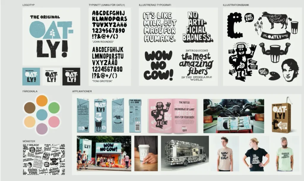
Here is the thing the listicles bury. The LogoLounge 2026 Trend Report, built by Bill Gardner from a review of more than 30,000 logos and identity systems worldwide, does not describe a year of new shapes. It describes a behaviour change.
Gardner’s word for it is that designers are becoming “architects of possibility,” and that identity is shifting “from a static artefact into something more expressive, more reactive.”
Marks now flex, pulse, rotate and adapt. That is not a style. That is a structural shift in what a logo is meant to do.
For a 60-partner accountancy firm or a mid-market litigation practice planning a rebrand before a growth phase, that distinction is the whole game.
Choose a mark for how it looks in a PDF deck, and you will discover its limits the first time it has to sit inside a 32-pixel app icon, invert cleanly for dark mode, or hold its shape in a motion sting on LinkedIn. The cost of getting this wrong is not aesthetic.
It is a brand asset that needs to be redone within two years, and a finance director who remembers signing off on the first one.
Before you assess a single trend, it helps to know what you are actually choosing between. The starting point is understanding the different types of logos – wordmark, lettermark, pictorial, abstract, combination – because the 2026 trends do not apply equally to all of them.
A trend that flatters an abstract mark can wreck a wordmark.
- Design logos as adaptive, motion-ready systems rather than fixed marks, so they function across screens, motion, app icons and AI discovery.
- Balance system logic (pixel precision, modularity, motion) with human signal (texture, heritage, imperfection) to be both legible and memorable.
- Decide how much machine clarity versus human character your brand needs; avoid defaulting to "modern and minimal".
- For professional services prioritise a sharpened, responsive wordmark with restrained motion and one deliberate human cue for trust and distinctiveness.
What Are the Logo Design Trends in 2026?
Logo design trends in 2026 are defined by one shift: logos are being designed as adaptive identity systems rather than fixed marks. The strongest trends – motion-ready behaviour, modular construction, sharper wordmarks, and deliberate human texture – are all responses to a logo now having to perform across screens, motion, app icons, and AI-driven discovery.
Three things follow from that:
- System logic dominates the technical trends. Pixel-sharp precision, responsive variants, kinetic typography, and modular marks all exist to keep an identity legible as it is shrunk, inverted, and animated.
- Human signal dominates the emotional trends. Hand-drawn texture, heritage cues, micro-imperfections, and mascot warmth all exist to make a brand feel human in feeds increasingly full of machine-generated sameness.
- The choice is contextual, not fashionable. The right direction depends on your category, channel mix, and trust needs – not on which trend looks freshest.
Logo design trends in 2026 split into two forces: system logic (adaptive, motion-ready, modular marks) and human signal (texture, heritage, hand-drawn warmth).
Why This Matters for a Firm Mid-Rebrand
A logo is not where a professional services rebrand succeeds or fails – positioning is. But the logo is where the decision becomes irreversible and public, so the pressure from the trend lands hardest there.
The pressure is measurable. Deloitte’s UK Digital Consumer Trends 2026 research found that 63% of UK consumers had used a generative AI application by May 2026.
Your buyers are increasingly discovering, shortlisting and validating firms through interfaces you do not control. Kantar’s Marketing Trends 2026 report puts it more bluntly for brands: “if the model doesn’t know you, it won’t choose you.”
A logo now has to survive not just human eyes on a website but machine interpretation in an AI answer, a creator’s reel, and a 40-pixel favicon.
That is why “does it look modern” is the wrong test. The right test is “does it stay recognisable under pressure.” Pressure means small sizes, dark mode, motion, app icons, merchandise, and AI-saturated feeds.
Every serious 2026 trend is an answer to one of those constraints.
The Anatomy: System Logic
System logic is the set of trends that keep an identity functioning as a mechanism.
These are the trends a SaaS, fintech, or technical professional services brand should weigh first.
Adaptive and responsive logo systems are now the baseline, not the upgrade
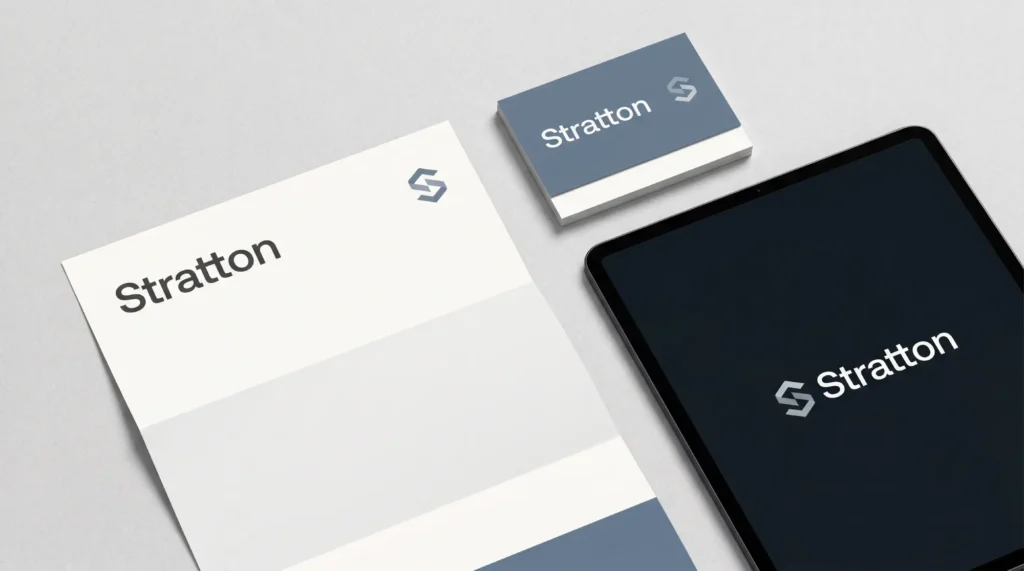
A responsive logo system gives you one identity expressed at several levels of detail – full mark, simplified mark, icon, monogram – each tuned to its context. In 2026, this stopped being a premium add-on.
The LogoLounge 2026 report describes identities that “flex, they pulse, they reveal layers, they adapt,” which only works if the mark is built as a system from the start.
For a firm whose logo will appear on a building sign, a 16-pixel browser tab, a LinkedIn avatar, and a sponsored event banner in the same week, a single fixed artwork cannot hold.
The deliverable to specify is a logo system, not a logo file.
Motion-readiness is a design constraint, not a post-production extra
A motion-ready logo is one designed so that its construction implies how it moves. The LogoLounge 2026 report names motion as its overarching theme – marks that rotate, fade, roll, and behave rather than sit.
This matters commercially because animated identity now appears in places professional services firms cannot avoid: video intros, app loading states, social stings. A logo retrofitted with motion afterwards usually looks bolted on.
One whose geometry was built with movement in mind reads as intentional. If your firm will ever appear in a video, motion-readiness belongs in the brief, not the second invoice.
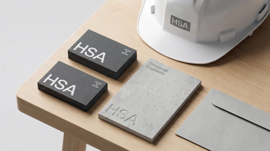
Sharper wordmarks and modular construction answer the legibility problem
Bold, high-contrast wordmarks and modular marks built from repeatable parts are on the rise because they hold up when shrunk and inverted.
A modular mark – one assembled from a small set of consistent components – can be reconfigured for different formats without losing identity.
For professional services firms, where the name is often the brand, a sharpened wordmark is frequently the highest-return move on the board.
It does not chase a visual fad. It makes the firm’s name unmistakable at every size a buyer will ever see it.
The Anatomy: Human Signal
Human signal is the set of trends that make a brand feel human-made. As AI-generated visuals saturate feeds, the marks that feel handmade carry a trust premium.
Hand-drawn texture and micro-imperfection signal authenticity
Deliberate imperfection – visible linework, hand-drawn elements, organic forms – reads as human in a feed full of machine-smooth output.
Deloitte Digital’s 2026 marketing analysis ties the rising premium on authenticity directly to the proliferation of AI-generated and synthetic content; when everything looks generated, the handmade stands out.
For a heritage firm, a craft-led practice, or any brand whose value rests on personal relationships, texture is not decoration. It is a trust signal for commercial work.
Heritage cues and warmth differentiate in trust-led categories
Heritage typography, reinterpreted crests, and warmer palettes are on the rise for brands whose buyers are seeking reassurance.
A law firm or wealth manager is selling judgment and continuity, and a mark signalling permanence can be worth more than one signalling novelty.
The mistake is treating “modern” and “trustworthy” as the same target. They are not.
A 40-year-old advisory practice repositioning for growth often needs to look established and current, which is a harder, more deliberate brief than “make it look new.”
The 2026 logo question is not “minimalist or detailed?” It is “Does this identity need more machine clarity or more human character?” A fintech needs system logic. A craft brand needs a human signal. Most professional services firms need a precise, deliberate blend – and naming that blend is the strategic act.
Where People Get It Wrong
The common misunderstanding is that minimalism is the safe, timeless default – that a clean, simple mark cannot date. This is the most repeated claim across the ranking content, and it is half-true in a way that costs money.
Minimalism is not a trend; it is a tactic. It works brilliantly for some briefs and strips away exactly the distinctiveness others need.
The LogoLounge 2026 evidence – motion, dimensionality, modularity, texture – points away from flat sameness, not toward it.
The real risk in 2026 is not that your logo is too detailed. It is too generic to be remembered or, worse, too static to function.
A minimal mark that cannot flex, cannot animate, and looks like four competitors is not safe. It is invisible.
The correction is to replace “is it simple enough?” with two better questions: does this hold up under pressure, and is it distinctive enough to build memory? Simplicity serves both sometimes. It guarantees neither.
A Worked Example: Choosing a Direction for a 90-Person Advisory Firm
Take a realistic case. A 90-person management consultancy, strong regional reputation, repositioning to win larger national clients ahead of a planned acquisition.
The partners arrive wanting “something modern and minimal, like the big firms.”
I have watched this exact instinct cost firms their distinctiveness. A professional services firm I worked with had a genuinely strong offline reputation, but online, they looked generic – qualified prospects could not see why they were different from three other firms on the shortlist.
Their instinct was to chase “modern.” The actual problem was that the brand never said what made them the right choice.
We first fixed the positioning, restructured the messaging, and then aligned the visual identity with the firm’s real expertise. Credibility and conversion quality both improved – not because the logo got prettier, but because the identity finally matched the substance behind it.
The lesson I take into every rebrand: a logo cannot rescue a brand that has not decided what it stands for.
Stuart Crawford has led brand identity projects for professional services firms across 21 countries for more than 17 years, and the pattern is predictable.
So for the 90-person consultancy, the direction is not “minimal.”
It is: a sharpened wordmark (their name is their equity), built as a responsive system (it will live in pitch decks, app icons, and event branding), with restrained motion-readiness (they will appear in video) and a single deliberate human cue – a typographic detail or warmth in the palette – so they read as established and ambitious rather than another blue sans-serif.
System logic for a function, one note of human signal for memory. That is a brief a partner can defend to a board.
The Sharper Way to See It: Recognisable Under Pressure
The competing articles list trends. The more useful frame is this: in 2026, the best logos are not trying to be more decorative – they are trying to be more recognisable under pressure.
That single idea explains why the trends cluster the way they do.
Sharper contrast, bolder wordmarks, responsive systems, modular construction – these are answers to machine pressure: tiny sizes, dark mode, app icons, AI-mediated discovery.
Texture, heritage, imperfection, mascot warmth – these are answers to human pressure: the need to feel real and be remembered in feeds full of generated sameness.
Deloitte Digital frames the underlying shift precisely: brands are “moving away from optimising for clicks and toward optimising for understanding.” A logo is now part of how a brand gets understood – by people and by models.
The intelligent version of the consensus view deserves its due. Practitioners favour minimalism because it travels well across sizes and it ages slowly – that is a real, defensible advantage. For a brand that competes on clarity, it may be exactly right.
But favouring it by default, without asking whether the brief needs system clarity, human character, or a specific blend of both, is how firms end up indistinguishable from one another.
The replacement directive is simple. Stop asking which trend looks best. Decide how much machine clarity and how much human character your specific brand needs, then choose the trends that serve that ratio.
| Brand context | Lean toward | Why |
| Fintech / SaaS / technical advisory | System logic | Buyers expect digital fluency; identity lives in product and app contexts |
| Law/wealth/accountancy (trust-led) | System logic + heritage warmth | Needs to read established and current; the name is usually the equity |
| Craft, hospitality, food, artisan | Human signal | Value rests on being made by people; texture earns a trust premium |
| Firm appearing regularly in video/social | Motion-ready system | Static marks look bolted-on once animated |
| Multi-touchpoint firm (sign to favicon) | Responsive system | One fixed artwork cannot hold across all sizes |
| Repositioning for acquisition/growth | Sharpened wordmark + one human cue | Distinctiveness and credibility matter more than novelty |
The Verdict
The 2026 logo trend story is not a list of looks. It is a single decision wearing ten costumes: how much should this identity behave like a system, and how much should it feel like a human made it?
Every trend in the LogoLounge 2026 report, every pressure named by Kantar and Deloitte, resolves to that question.
The firms that rebrand well this year are not the ones that picked the freshest style. They are the ones who knew their ratio before they briefed a designer.
That is why “make it modern and minimal” is the most expensive instruction a partner can give. It outsources the strategic decision to a default, and that default does not know your category, channels, or buyers.
A mark chosen that way looks fine in the boardroom and disappears everywhere your buyers actually meet you – the app icon, the dark-mode site, the AI answer, the crowded feed.
The one thing to do before you approve any direction: get a clear, outside read on where your brand is losing commercial ground – distinctiveness, credibility, or function – before you let anyone show you logos. Decide the ratio first; choose the trend second.
If you want that diagnosis done properly, Inkbot Design’s free Brand Equity Audit™ identifies exactly where your brand is losing ground and what to do about it. So your next logo is a strategic decision, not a fashion one.
FAQs
What are the main logo design trends in 2026?
The main 2026 logo design trends are adaptive and responsive systems, motion-ready marks, sharper wordmarks, modular construction, hand-drawn texture, and heritage warmth. The LogoLounge 2026 report, built from over 30,000 logos, frames the overarching shift as identity becoming fluid and behaving rather than static.
Is minimalism still a logo trend in 2026?
No – minimalism is a tactic, not the defining 2026 trend. The defining shift is adaptability. A minimal mark that cannot flex across motion, app icons, and dark mode, or that looks like its competitors, is a commercial risk rather than a safe default in 2026.
Why are logos becoming animated or “motion-ready”?
Logos are becoming motion-ready because identity now appears in video intros, app loading states, and social content where movement is expected. The LogoLounge 2026 report names motion as its central theme. A logo built with movement in mind reads as intentional; one animated afterwards usually looks bolted on.
How is AI influencing logo design in 2026?
AI influences the 2026 logo design in two directions. It pushes brands toward machine-legible, system-built marks. Hence, they surface correctly in AI-driven discovery, and it raises the value of human-made texture as a way to stand out from AI-generated visual sameness. Kantar warns that brands the model does not “know” will not be chosen.
What is a responsive logo system?
A responsive logo system is one identity expressed at several levels of detail – full mark, simplified mark, icon, monogram – each tuned to a context such as signage, favicons, or avatars. In 2026, it is a baseline expectation rather than a premium add-on, because a single fixed artwork cannot hold across every size a brand appears in.
Which logo trend is right for a professional services firm?
For most professional services firms, a sharpened wordmark built as a responsive system, with one deliberate human cue, fits best. The name is usually the firm’s equity, so making it unmistakable at every size returns more than chasing a visual fad. Trust-led firms add heritage warmth to read as established and current.
What’s the difference between system logic and human signal in logo design?
System logic covers trends that keep a mark functional: responsive variants, motion readiness, modular construction, and sharp contrast. Human signal covers trends that make a brand feel made by people – texture, imperfection, heritage cues, mascot warmth. The 2026 decision is choosing the right ratio of the two for your category and channels.
Will a logo designed in 2026 date quickly?
A 2026 logo dates quickly if it chases a surface style rather than solving for function and distinctiveness. Marks built as adaptable systems and grounded in a clear brand position age slowly. Marks chosen because they “look modern” tend to date fastest, since “modern” is a moving target.
How much should a professional services firm rebrand prioritise the logo?
The logo should follow positioning, not lead it. A logo cannot rescue a brand that has not decided what it stands for. Fix the positioning and messaging first, then choose a logo direction that matches the firm’s real expertise – the order matters more than the mark itself.
Is it true that bold typography is replacing symbols in logos?
Partly – bold, high-contrast wordmarks are rising because the name holds up better than a symbol at small sizes and in AI-mediated discovery. Symbols still matter, but for name-led businesses such as most professional services firms, a sharpened wordmark is often the higher-return decision in 2026.
When should a firm rebrand to follow these trends?
A firm should rebrand around a strategic trigger – a growth phase, acquisition, or repositioning – not to chase a trend. Trends inform how you execute a rebrand, never whether to do one. Rebranding purely to look current usually signals an underlying positioning problem.
