10 Logo Designers Who Shaped the World’s Most Iconic Brands
Have you ever wondered who’s behind those unforgettable logos you see daily?
You know, the ones that make you go, “Blimey, that’s clever!”
Well, buckle up because we’re about to dive into the world of logo design royalty.
These aren’t just your run-of-the-mill doodlers. Oh no.
These are the crème de la crème, the big cheeses, the… well, you get the idea.
I remember when I first started Inkbot Design. I was a wide-eyed newbie, dreaming of creating logos that would stand the test of time.
Little did I know, I was following in the footsteps of giants.
So, without further ado, let’s meet the maestros who’ve been painting the corporate world in vivid hues for decades.
🔰 TL;DR: Discover the top 10 logo designers who’ve left an indelible mark on branding history. From Paul Rand’s IBM masterpiece to Paula Scher’s Citibank revolution, these creative geniuses have shaped the visual identities of the world’s biggest brands. Learn about their best works, design philosophies, and how their innovations influence modern logo design.
- Explore ten influential logo designers who transformed branding and visual identity, shaping corporate imagery and emotional connections in the market.
- Paul Rand, Milton Glaser, and Saul Bass exemplify innovative design philosophies that prioritise simplicity, emotion, and storytelling in logos.
- These design legends continue to inspire modern branding, emphasizing timelessness, creativity, and audience connection in visual communication.
1. Paul Rand: The Godfather of Logo Design

If logo design were a mafia, Paul Rand wouldn’t just be in the game—he’d run it. Picture Don Corleone with a sketchpad instead of a Tommy gun, crafting visual identities with the same precision the mob plans a heist. No horse heads here—just the undeniable influence of a man who transformed corporate branding into an art form.
Paul Rand’s Greatest Hits:
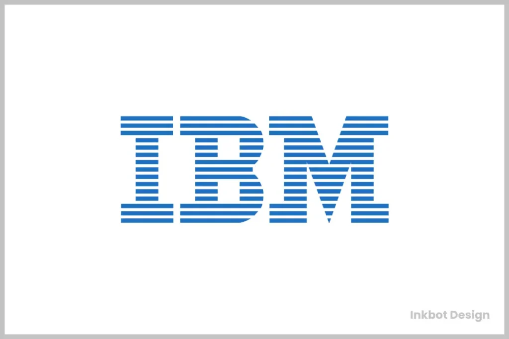
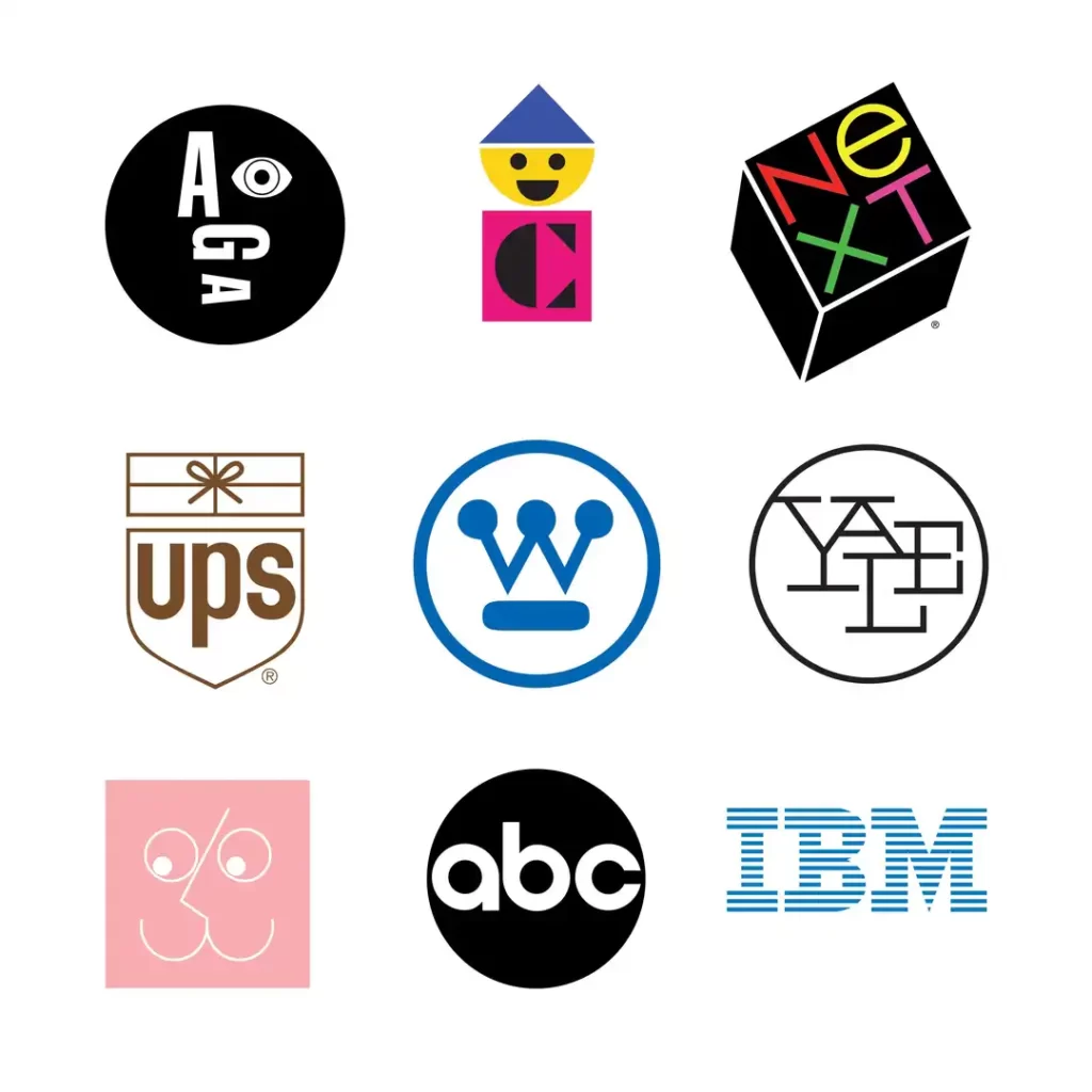
- IBM – The eight-bar logo that’s so timeless it could outlast civilisation itself. If aliens ever find Earth’s ruins, they’ll probably think IBM was our king.
- UPS – The shield that still feels sturdy enough to protect your most precious cargo.
- ABC – A minimalist masterpiece, proving simplicity isn’t boring—it means unforgettable.
But Paul Rand didn’t just design logos; he redefined the game’s rules. He made us realise that a logo isn’t just a pretty picture—it’s the face of a company. This visual handshake builds trust, recognition, and loyalty.
The Philosophy:
Rand lived by one golden rule: “Keep it simple, stupid.” He didn’t call anyone stupid (at least not to their face), but his work speaks louder than words. A logo, he believed, should be:
- Distinctive: Stand out or don’t bother.
- Memorable: It’s not about what people see but what sticks.
- Timeless: Trends fade, but great design? That’s forever.
Rand wasn’t just a designer; he was a problem-solver. Case in point: When Steve Jobs needed a logo for NeXT, Rand charged $100,000—an eye-watering amount for the time. Jobs thought he’d get a handful of concepts to choose from. Rand’s response?
I asked him if he would come up with some options.
And he said, no.
I will solve your problem for you.
And you will pay me.
You don’t have to use the solution.
If you want options, go talk to other people.
But I will solve your problem for you, the best way I know how.
Use it or not, that’s up to you. You’re the client.
But you pay me.
That’s not arrogance; that’s expertise backed by decades of delivering greatness. This kind of confidence comes from knowing your worth and your work. And spoiler: Jobs used the logo. Of course, he did.
The Legacy:
Paul Rand’s designs didn’t just help companies—they shaped them. His logos are like the Beatles of branding: you recognise the genius even if you don’t know who made them.
So, what’s the lesson for us? Whether crafting a logo, building a brand, or pitching your next big idea, channel your inner Paul Rand. Solve the problem. Keep it simple. And know your worth—because when you do, the world doesn’t just notice; it remembers.
2. Milton Glaser: The Heart of Design
Ever been to New York?
Of course, you have. You’ve been there in spirit even if you haven’t set foot in the Big Apple. And I’d wager you’ve seen (or owned) an “I ❤️ NY” t-shirt. You can thank Milton Glaser for that—though he’d probably smile and shrug it off.
Milton Glaser’s Hall of Fame:
- I ❤️ NY Logo – A cultural icon, not just a design. It’s a logo that doesn’t just represent a city; it makes you feel something for it.
- Bob Dylan Poster – A kaleidoscope of colour and coolness, perfectly capturing the groovy, rebellious spirit of the ’60s.
- Brooklyn Brewery Logo – A badge of honour for craft beer lovers everywhere, with just the right amount of hipster flair.
Glaser didn’t design logos; he designed emotions. His work isn’t just visually appealing—it’s approachable, warm, and deeply human. It’s the art that gives your eyeballs a warm hug and says, “Hey, relax. You’re going to like this.”
The Philosophy:
Milton Glaser didn’t believe in design for design’s sake. His approach was simple but revolutionary: “Make it human. Make it relatable. And, for heaven’s sake, make it enjoyable.”
Take the “I ❤️ NY” logo. It wasn’t born in a fancy design lab. It came to life in the back of a cab, sketched on a scrap of paper. That’s Glaser in a nutshell—no pretence, just brilliance. He distilled the city’s grit, charm, and chaos into three letters and a heart.
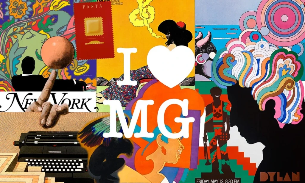
And then there’s the Bob Dylan poster. With its vivid, flowing colours and minimalist silhouette, it doesn’t just depict Dylan; it is Dylan—bold, enigmatic, and unforgettable.
The Brooklyn Brewery logo? It’s not just branding; it’s a love letter to Brooklyn’s creative spirit. One glance, and you’re transported to a neighbourhood where every corner is buzzing with stories and artisanal energy.
Why It Matters:
Glaser knew that design isn’t about what’s trendy; it’s about what resonates. His work doesn’t try too hard, leaving an indelible mark. It’s friendly, approachable, and invites you into the experience.
The Takeaway:
So, what can you learn from Milton Glaser? Simple:
- Speak to people, not at them.
- Create designs that evoke emotion, not just admiration.
- And remember, great work doesn’t have to shout. It just has to connect.
Whether you’re crafting a brand, a campaign, or just trying to make something people will remember, take a page from Glaser’s book: make it human, make it warm, and make it last.
3. Saul Bass: The Motion Picture Maestro

If Paul Rand were the godfather, Saul Bass would be the Alfred Hitchcock of logo design—a master of suspense who turned branding into high art. His work doesn’t just sit quietly on the page; it builds anticipation, sets a mood, and practically demands its dramatic soundtrack.
Saul Bass’ Greatest Hits:
- AT&T Logo – The globe that became the symbol of global communication before “going viral” was even a thing.
- United Airlines Logo – A sleek, modern design that could take flight independently.
- Bell System Logo – The ringing embodiment of connectivity in an age when the telephone was king.
But Saul Bass wasn’t just a logo maker but a storyteller. His creations weren’t just about making a mark but about making meaning.
The Genius of Bass:
Take his work for AT&T. The design wasn’t just a pretty sphere but a visual shorthand for connectivity and innovation. People didn’t just see the logo—they felt the message: “We’re bringing the world closer together.”
And when Bass got his hands on the Bell System, he didn’t just rebrand it. He gave it a new identity, crafting a logo that communicated trust, clarity, and technological progress in a single, elegant mark.
But where Saul Bass truly changed, the game was in motion. His film title sequences weren’t just intros; they were cinematic events. From the swirling graphics of Vertigo to the frantic energy of Psycho, Bass proved that design isn’t confined to the static—it can move, breathe, and immerse.
The Philosophy:
Bass had one core belief: “A logo should tell a story.” It should intrigue. It should captivate. And it should leave people wanting more. His work wasn’t about piling on details; it was about stripping away the unnecessary until all that was left was the essence.
He didn’t design logos to decorate; he created them to communicate. Every line, every curve, every colour choice was deliberate, purposeful, and steeped in meaning.
What We Can Learn:
Saul Bass teaches us that design isn’t just about looking good; it’s about feeling right. It’s about creating something so intuitive and natural that it’s always been there.
- A great logo doesn’t explain; it evokes.
- A great logo doesn’t follow trends; it creates timelessness.
- And a great logo doesn’t just represent a brand; it tells its story.
So, the next time you’re staring at a blank canvas, wondering how to encapsulate a brand in a single image, ask yourself: What’s the story? How can you intrigue, captivate, and leave your audience wanting more?
If Saul Bass taught us anything, it’s this: A logo isn’t just an emblem. It’s an experience.
4. Alan Fletcher: The British Design Maverick

Alan Fletcher proves that not all British designers are stuck sipping tea and nibbling on crumpets. Some are busy redefining what it means to be brilliant. Fletcher wasn’t just a designer; he was a thinker, a visual problem-solver who approached logos like puzzles begging to be solved. And when he solved them, the results weren’t just good—they were iconic.
Alan Fletcher’s Greatest Hits:
- V&A Logo (Victoria and Albert Museum) – A typographic masterpiece that’s as much art as it is design.
- Reuters Logo – A dynamic visual rhythm that practically reports the news.
- Pirelli Brand Identity – Stretching the boundaries of branding—literally and figuratively.
Like a Savile Row suit, Fletcher’s work is tailored, refined, and stylish. It doesn’t scream for attention because it doesn’t need to. It’s confident, elegant, and always a cut above the rest.
The Genius Behind the V&A Logo:
The V&A logo isn’t just a clever use of typography—it’s a masterstroke of lateral thinking. Fletcher took the ampersand, a symbol most of us overlook, and turned it into a bridge between two letters, seamlessly tying together history and modernity. It’s so clever that it makes even the most challenging crossword puzzle seem pedestrian.
But Fletcher’s brilliance wasn’t confined to museums. His Reuters logo transformed the flow of information into a visual language. It’s a cascade of dots, suggesting speed, movement, and connectivity—a perfect metaphor for the relentless pace of news.
And let’s talk about Pirelli. Fletcher’s work with the brand didn’t just stretch the iconic “P”; it stretched the imagination of what a logo could represent. It’s bold, dynamic, and unapologetically daring—much like Fletcher himself.
The Philosophy:
Alan Fletcher’s approach to design can be summed up in three words: “Think. Look. Solve.”
He wasn’t satisfied with the obvious. He looked at problems from every angle, flipped them upside down, and poked at them until something clicked. His work wasn’t just about aesthetics; it was about big, bold, unforgettable ideas.
Fletcher believed that design was a dialogue, not a monologue. He didn’t just want his logos to be seen; he wanted them to be understood. They weren’t decorations; they were solutions.
Lessons from Fletcher:
- Look beyond the surface. The obvious solution is rarely the best one.
- Design is thinking made visual. If your work doesn’t solve a problem, it’s just art.
- Simplicity is sophistication. Strip away the unnecessary until only the essential remains.

Why Fletcher’s Work Still Resonates:
In a world where trends come and go faster than you can say “Helvetica,” Fletcher’s work remains timeless. It’s not because he followed the rules but because he rewrote them. He understood that great design isn’t about being flashy—it’s about being unforgettable.
So, channel a little Fletcher the next time you’re staring at a brief. Think laterally. Look at the problem from every angle. And when you’ve run out of ideas? Look again. Because brilliance, as Fletcher showed us, isn’t just about talent—it’s about tenacity.
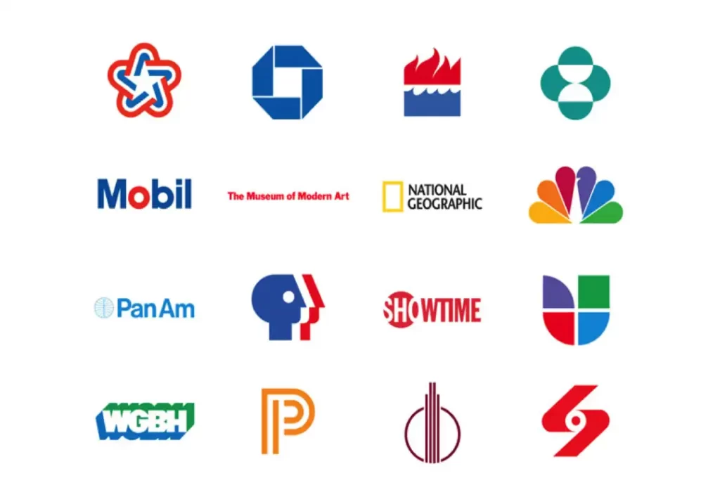
5. Ivan Chermayeff: The Abstract Artist

Ivan Chermayeff’s work is like modern art that finally got its act together. It’s bold, functional, and valuable. (Apologies to the banana-taped-to-wall crowd—you’ll have to deal.)
Ivan Chermayeff’s Hall of Fame:
- Mobil Logo – That cheeky red “o” doesn’t just catch your eye—it leaves a lasting impression.
- Chase Manhattan Bank Logo – A geometric wonder that screams stability and trust.
- Smithsonian Institution’s Yellow Sun Logo – A warm, glowing beacon of knowledge and discovery.
Chermayeff wasn’t just a designer; he was a visual poet. His work was deceptively simple, like a riddle hiding in plain sight. At first glance, you see a clean, elegant design. But the more you look, the more layers of meaning you uncover.
The Genius of the Mobil Logo:
Take the Mobil logo, for instance. Two colours, five letters, and one bold red “o.” It seems straightforward, but that single design choice injects movement, energy, and a sense of innovation. It’s the kind of logo that makes you think, “Why didn’t I come up with that?”—the hallmark of great design.
Then there’s the Chase Manhattan Bank logo. At first glance, it’s just a series of interlocking shapes. But look closer, and you see a symbol of security, trust, and perpetual motion—a perfect encapsulation of what a financial institution should represent.
And let’s not overlook the Smithsonian sun. Bright, warm, and instantly recognisable, it doesn’t just represent a brand; it radiates the institution’s mission to illuminate the world with knowledge and culture.
The Philosophy:
Ivan Chermayeff’s approach can be boiled down to one simple idea: “Less is more—but only if less is everything.” He understood that minimalism isn’t about doing less; it’s about doing more with less. Every line, every colour, and every shape in his designs had a purpose. Nothing was arbitrary.
For Chermayeff, design wasn’t about showing off but about showing what matters. He stripped away the noise and left only the essence, creating logos that weren’t just beautiful and brilliant.
What We Can Learn:
- Simplicity isn’t simple. It’s easy to clutter a design, but it takes real skill to pare it down to its core.
- Design is a riddle. The best logos don’t just look good—they make people think.
- Every detail matters. When you only have a few elements, each has to pull its weight.
Why Chermayeff’s Work Stands the Test of Time:
Chermayeff’s designs aren’t tied to trends or fleeting aesthetics. They’re timeless because they’re rooted in clarity and purpose. He didn’t just create logos; he created symbols. Symbols that endure because they’re as functional as they are beautiful.
So, the next time you’re tempted to overthink a design, ask yourself: What would Chermayeff do? He’d probably say, “Cut the fluff. Focus on what matters. And make your ‘less’ mean everything.”
6. Herb Lubalin: The Typographic Titan
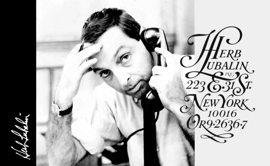
If letters could throw a party, Herb Lubalin would be the guest of honour. He didn’t just design type; he made it perform. He took the humble alphabet and turned it into a stage for creativity, emotion, and storytelling.
Herb Lubalin’s Greatest Hits:
- Mother & Child Logo – A masterclass in minimalism and metaphor, this logo says more with negative space than most can with an entire paragraph.
- Avant Garde Logo – Bold, innovative, and, dare I say, downright futuristic. It’s the logo equivalent of a time machine.
- PBS Logo – So smart and versatile, it’s the visual shorthand for “quality programming.”
The Genius of Herb Lubalin:
Let’s start with the Mother & Child logo. At first glance, it’s just two words. But then you see the baby nestled within the “o” of “Mother.” It’s so simple yet profound that it makes you want to slap your forehead and shout, “Of course!” That’s Lubalin’s genius—he made the complex look effortless.
Then there’s Avant Garde, which isn’t just a logo; it’s a revolution in typography. The custom typeface he created for the magazine went on to redefine modern design, pushing boundaries and challenging conventions. It’s not just ahead of its time; it’s practically in a league of its own.
And let’s not forget PBS—the three simple letters that come together with such elegance and precision that you can almost hear the soothing narrator’s voice as you look at it. Lubalin understood that even in simplicity, there’s room for personality.
Lubalin’s Philosophy:
Herb Lubalin didn’t see typography as a passive element in design. To him, it was the star of the show. His mantra? “Typography is a voice—let it speak.” And speak it did. Whether whispering a subtle message or shouting an audacious idea, Lubalin’s type was always saying something meaningful.
But it wasn’t just about aesthetics. Lubalin believed typography should evoke emotion. He pushed letters to their limits—stretching, twisting, and merging them—until they became something more than letters. They became art.

Lessons from the Master:
- Typography is a storyteller. Don’t just use it to say something; use it to mean something.
- Negative space is your best friend. Lubalin’s work proves that what you leave out is just as important as what you put in.
- Break the rules—carefully. Lubalin didn’t follow conventions; he rewrote them. But he did so with precision and purpose.
Why Lubalin’s Work Endures:
Lubalin’s designs aren’t just visually stunning—they’re emotionally resonant. They tap into something deeper, something human. That’s why his work still feels fresh decades later.
So, the next time you’re staring at a blank screen, trying to figure out what to do with your typography, remember this: Herb Lubalin didn’t just design with letters. He collaborated with them. He gave them a voice, a purpose, and, most importantly, a soul.
What’s stopping you from doing the same?
7. Raymond Loewy: The Renaissance Man of Design
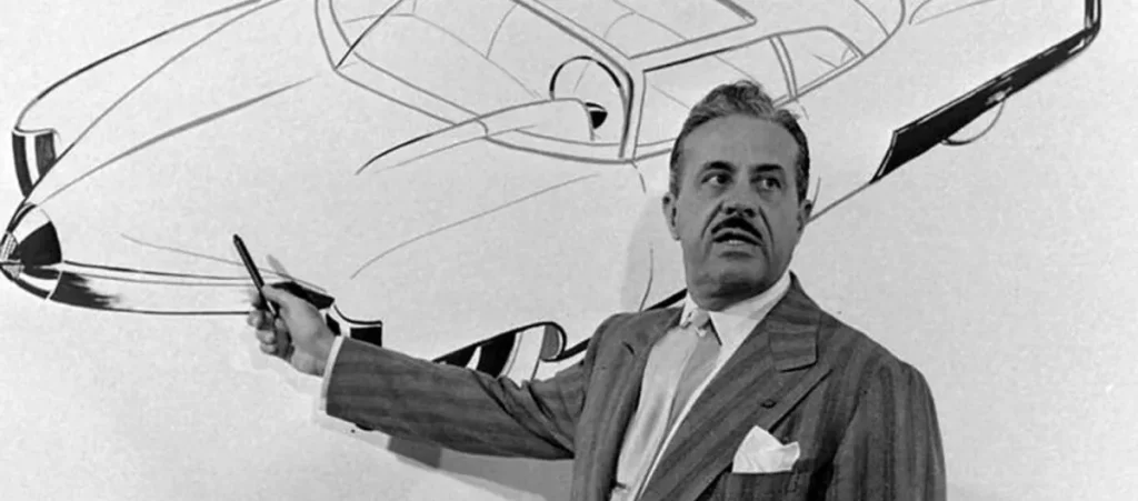
Raymond Loewy wasn’t just a logo designer; he was the Swiss Army knife of design. Whether it was logos, cars, trains, or entire corporate identities, Loewy didn’t just dabble—he dominated. His portfolio reads like a greatest hits album of 20th-century design.
Raymond Loewy’s Greatest Hits:
- Shell Logo – This branding is so iconic that it feels like seashells exist because of Loewy, not vice versa.
- Lucky Strike Packaging – Loewy didn’t just redesign the pack; he redefined how a product could influence culture.
- Coca-Cola Bottle Redesign – He didn’t invent it, but his refinement made it the global icon it is today.
The Time-Travelling Aesthetic of Raymond Loewy:
Loewy’s designs were like a snapshot of mid-century optimism fused with a futuristic flair. His work wasn’t just functional—it was aspirational. Take the Shell logo, for instance. It’s so enduringly brilliant that you could slap it on a building 100 years from now, and it would still feel fresh. It’s clean, recognisable, and utterly timeless.
Then there’s his work on Lucky Strike packaging. Before Loewy, it was just another cigarette pack. After Loewy? It became a cultural symbol, immortalised in everything from “Mad Men” to modern design textbooks. He understood that design wasn’t just about aesthetics but about how a product felt in your hand and what it represented.
And let’s talk about Coca-Cola. While the original contour bottle existed before Loewy, he streamlined it, making it even more iconic. He didn’t just design a bottle; he crafted a tactile experience. When you held that bottle, you weren’t just drinking soda—you were having a piece of history.

Loewy’s Philosophy:
Loewy lived by the mantra “Most Advanced, Yet Acceptable” (MAYA). Translation? Push the envelope, but don’t make it so unfamiliar that people reject it. He was a master at walking that fine line between innovation and comfort.
He also believed that form follows function—but he never let function get in the way of beauty. To Loewy, a design had to work, but it also had to wow. He didn’t see beauty and practicality as opposing forces; he saw them as partners.
Why Loewy Was Different:
Most designers specialise. Loewy? He was a polymath. Logos, products, interiors, vehicles—he couldn’t improve anything. His redesign of the Pennsylvania Railroad’s S1 locomotive wasn’t just about efficiency and creating a visual representation of speed and power.
Loewy’s genius wasn’t just his talent; it was his vision. He could look at something ordinary and see what it could become. He didn’t just design products; he designed aspirations.
Lessons from Loewy:
- Timelessness is king. Loewy’s work proves that good design doesn’t age; it evolves.
- Know your audience. His MAYA principle shows that understanding your market is as important as your creative vision.
- Design everything. Don’t limit yourself. Whether it’s a logo or a locomotive, approach every project with the same care and ambition.
Why Loewy’s Legacy Endures:
Loewy didn’t just make things look good; he made them matter. His designs were more than just functional; they were emotional. They told stories, created connections, and stood the test of time.
So, the next time you see the Shell logo, hold a Coke bottle, or glance at a Lucky Strike pack, take a moment. You’re not just looking at a design; you’re looking at the legacy of a man who redefined what design could be.
8. Carolyn Davidson: The Swoosh Saviour
Carolyn Davidson’s story is a masterclass in how monumental impact can come from unexpected sources. She’s living proof that you don’t need a long résumé to leave a lasting legacy—sometimes, all it takes is one moment of brilliance.
Best Work:
1. Nike Swoosh
That’s it—just one entry. But when your one contribution to the design world is the Nike Swoosh, you don’t need anything else. It’s the design that transcends trends and becomes a universal symbol of excellence, ambition, and “Just Do It” energy.
Here’s the kicker: Carolyn Davidson created the Swoosh while still a graphic design student. Think about that. Most students are juggling deadlines and dreaming about getting their first paying client. Carolyn? She casually whipped up one of the most recognisable logos in human history. That’s overachieving on a level most of us can only aspire to.
Now, let’s talk about the deal she got: $35. Yep, that’s all she was paid for designing the Swoosh. It’s the kind of story that makes every creative professional wince. But here’s the redemption arc—Nike made things right years later. They gave her stock in the company and a diamond Swoosh ring, a fitting reward for a design that helped them become a global powerhouse.
What Can We Learn From Carolyn Davidson?
Her story isn’t just a trivia nugget—it’s a blueprint for thinking about creativity, value, and simplicity:
- Simplicity Wins The Nike Swoosh isn’t flashy. It’s not trying too hard. It’s a clean, simple stroke that symbolises motion and speed. Davidson understood something many designers miss: a design doesn’t have to scream to be heard.
- Opportunities Can Come From Anywhere. Carolyn didn’t walk into Nike with decades of experience or a portfolio filled with high-profile projects. She was a student hired by Nike co-founder Phil Knight for a small project. That’s it. No fancy title, no massive budget. Just raw talent and a knack for solving problems visually.
- Know Your Worth (Even If It Takes Time) Sure, $35 wasn’t a fair price for a design that would eventually be worth billions. But Davidson’s story is a reminder that value doesn’t always show up immediately. What matters is the legacy you leave behind—and her legacy is untouchable.
Why It Matters
The Nike Swoosh isn’t just a logo—it’s a lesson. It teaches us that sometimes, less is more. That a single stroke can convey a universe of meaning. And that brilliance doesn’t always come from boardrooms or design agencies. Sometimes, it comes from a college student with a sharp mind, a creative spark, and a willingness to seize an opportunity.
So the next time you’re overthinking a project or doubting whether you have what it takes, remember Carolyn Davidson. One student. One design. One legacy.
9. Paula Scher: The Map-Maker of Modern Design
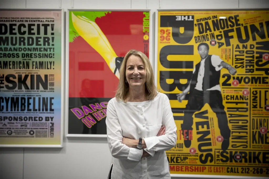
Paula Scher doesn’t just create designs—she crafts legends. Her portfolio isn’t just a collection of logos and graphics; it’s a design world map. A world where boldness, creativity, and fearless experimentation aren’t just encouraged—they’re the rule.
Best Works:
1. Citibank Logo
Scher’s redesign of the Citibank logo isn’t just a logo. It’s an icon. She infused an old, corporate symbol with life, turning it into something dynamic people remember. The bold use of colour and the minimal, sleek design are a masterclass in making something simple unforgettable.
2. The Public Theater Logo
This one is alive. It’s not just a logo; it’s a performance. The Public Theater’s logo could step off the page and into the spotlight. Scher captured the energy, the urgency, and the vibrancy of theatre itself. Every time you look at it, the logo is about to burst into a soliloquy and captivate an audience. This is branding at its most theatrical.
3. Tiffany & Co. Logo
Rebranding Tiffany & Co. was no small feat. But Scher didn’t back down. She didn’t just redesign the Tiffany brand; she redefined it. What was once a symbol of luxury and tradition was transformed into a modern, sleek, and iconic design. Scher’s approach? She took a timeless classic and made it feel fresh and exciting. It’s like turning a beloved classic novel into a page-turning thriller—still elegant, still powerful, but now with a spark that keeps you hooked.
What Sets Paula Scher Apart?
Paula Scher doesn’t just design for the sake of design. She designs with intention, purpose, and a robust understanding of how visual identity can shape the world. She knows that great design is never passive. It’s about making a statement—a bold one.
- Boldness is Non-Negotiable. If you look at Scher’s work, you’ll first notice its sheer audacity. From the heavy fonts to the bold colours, nothing is subtle. She doesn’t do quiet. Her designs are loud, demand attention, and make people notice. Boldness in design isn’t optional—it’s the whole point.
- Bravery in Design Her approach is fearless. She doesn’t worry about what’s “safe” or “expected” in the design world. Instead, Scher asks, “What can I do to push the envelope? To challenge conventions and turn them on their head?” That kind of thinking resulted in the Tiffany & Co. rebrand—challenging everything we knew about the brand while preserving its core identity.
- Never, Ever Boring Boring is a swear word in Scher’s design vocabulary. Her work is far from “safe” or “generic”—it’s designed to stand out, to make a statement, and to breathe new life into any space it inhabits. Every piece she touches becomes something unforgettable. You don’t look at her work and think, “Meh.” You look at it and think, “Wow, I need to know more.”
The Takeaway
Paula Scher’s work is a testament to what happens when you push past the limits of conventional design and embrace boldness, energy, and creativity. It’s a lesson that transcends logos. It’s about approaching every project, no matter how big or small, with the belief that design should never settle for average. Design is your chance to dare—and Scher dares every single time.
So the next time you’re sitting in front of your computer, wondering whether your design is bold enough, take a page from Paula Scher’s playbook. Don’t hold back. Be brave, be bold, and—above all—never be boring.
10. David Ogilvy: The Original Mad Man
David Ogilvy might not have technically been a logo designer. Still, his influence on branding and advertising is so colossal that leaving him off this list would be like forgetting to put the kettle on before you make your cup of tea. That’s how essential he is.
Best Works:
1. Rolls-Royce Campaigns
When David Ogilvy worked his magic on Rolls-Royce, he didn’t just create an advertisement. He shaped the narrative of what luxury truly meant. The famous ad he penned, with the line “At 60 miles an hour, the loudest noise in this Rolls-Royce comes from the electric clock,” became an instant classic. It wasn’t just about selling a car—it was about selling a lifestyle, a level of sophistication that’s now synonymous with the Rolls-Royce name. It’s not just an ad; it’s practically shorthand for luxury.
2. Dove Campaigns
Dove wasn’t always the household name it is today. But Ogilvy took the brand and flipped the script on beauty advertising. He didn’t push the typical, unattainable beauty standards that dominated the industry. Instead, he helped position Dove as the real beauty brand—showing real women, embracing the diversity and authenticity that every other brand was too scared to touch. And guess what? It worked. Dove became a cultural movement, not just a soap. Ogilvy didn’t just sell products—he sold an idea, a new approach to beauty that the world was ready for.
3. Hathaway Shirts Campaign
Hathaway shirts? Never heard of them. That is until David Ogilvy showed up. With his genius stroke of marketing, he turned an obscure shirt brand into a cultural phenomenon. How? By making the brand stand out through a story. The Hathaway shirt ads introduced a suave man wearing an eye patch, symbolising sophistication, mystery, and intrigue. That eye patch wasn’t just a quirky accessory; it became the brand’s hallmark. Ogilvy understood the power of stories and used them to turn Hathaway shirts from an afterthought into a household name.
What Made Ogilvy So Different?
David Ogilvy didn’t just make ads. He crafted identities. He knew branding wasn’t just about slapping a logo on something and hoping people noticed. It was about weaving a story that people could connect with emotionally. Every campaign he touched became more than just an ad—it reflected the brand’s soul. Here’s how he did it:
- Know Your Product Inside and Out Ogilvy didn’t just create ads based on assumptions. He studied his products. He understood them. He knew exactly what they offered and ensured that it came through clearly in every campaign. The lesson here? You’re already behind if you don’t know your product better than anyone else in the room. Don’t just advertise—understand what you’re selling.
- Know Your Audience: You can’t just guess what your customers want. Ogilvy’s genius was in his deep understanding of his audience. He knew their desires, fears, dreams, and pain points. He knew how to speak their language, address their concerns, and show them why his product was the solution. This wasn’t just guesswork—it was strategy. Ogilvy’s campaigns felt like they spoke directly to you because they did. He took the time to understand the customer at a deep, personal level.
- Don’t Be Afraid to Be Different What made Ogilvy stand out was his willingness to break the rules. He wasn’t about doing what was safe or what everyone else was doing. His campaigns didn’t follow trends—they created them. Look at the Hathaway shirt campaign. He didn’t follow the typical “buy my shirt” formula. He introduced a character, a narrative, a mystery—which became the campaign’s hallmark. If you want to stand out in a crowded market, you must do something different. Be bold. Be unique. And don’t be afraid to challenge the status quo.
The Takeaway
David Ogilvy’s legacy isn’t just in the ads he created—it’s in how he reshaped the entire marketing and branding landscape. His work proved that ads should never be mundane; they should tell a story, connect with the audience, and create an identity that lasts. He taught us that branding isn’t about following the rules but rewriting them.
So the next time you face a marketing challenge, channel Ogilvy’s principles: Know your product. Know your audience. And don’t be afraid to stand out. That’s how you create something legendary.
The Legacy Lives On
These designers didn’t just create logos; they shaped how we think about branding and visual identity.
Their work continues to influence designers today, including yours truly at Inkbot Design.
Every time we sit down to create a new logo, we’re standing on the shoulders of these giants.
So, the next time you see a logo that makes you stop and think, “Cor blimey, that’s clever!” remember the legends who paved the way.
And if you’re thinking about getting a logo that could stand alongside these greats, well… cough Inkbot Design cough… just saying.
FAQs on Logo Designers
Who is considered the father of modern logo design?
Paul Rand is often called the father of modern logo design due to his pioneering work in corporate identity design.
How much did Nike pay for their iconic Swoosh logo?
Carolyn Davidson was initially paid just $35 for the Nike Swoosh in 1971. However, Nike later compensated her with stock and a diamond ring.
What’s the most expensive logo ever designed?
The most expensive logo ever designed is believed to be the BP logo redesign in 2008, which reportedly cost 1 million, including implementation.
How often should a company redesign its logo?
There’s no hard and fast rule, but many experts suggest reviewing your logo every 5-10 years to ensure it remains relevant and aligned with your brand.
What makes a logo timeless?
Simplicity, versatility, and a strong connection to the brand’s core values are key factors in creating a timeless logo.
Can AI design logos as well as human designers?
While AI can generate logo concepts, it currently lacks the human touch, creativity, and deep understanding of brand values that professional designers bring.
What’s the difference between a logo and a brand identity?
A logo is a visual symbol representing a brand. In contrast, brand identity encompasses the entire visual language of a brand, including colours, typography, and imagery.
How long does it typically take to design a professional logo?
The logo design process can take anywhere from a few weeks to several months, depending on the complexity of the project and the number of revisions required.
What’s the most critical factor when designing a logo?
The most crucial factor is ensuring the logo accurately represents the brand’s values and resonates with its target audience.
Can a good logo save a bad product?
While a great logo can enhance brand perception, it can’t compensate for a subpar product or service. The best logos are part of a holistic brand strategy.
How has logo design changed in the digital age?
Modern logos must be more versatile, working across various digital platforms and scaling from tiny app icons to large billboards.
What’s the future of logo design?
The future of logo design will likely involve more animated and interactive elements and increased personalisation and adaptability across different contexts and platforms.
