
Landing Page Design: Top 10 High-Converting Layouts
Most landing pages I audit are expensive accidents. They are the result of a business owner hiring a “designer” who understands Photoshop but has never read a balance sheet.
You end up with a page that looks like a tech startup’s fever dream—all gradients and “bento box” grids—but it fails the most basic test: it doesn’t convert.
If you are spending money on traffic and sending it to a page that hasn’t been architected for conversion, you aren’t marketing; you’re donating to Google and Meta.
The stakes are higher in 2026. With the rise of agentic web design, your page needs to be readable by both human eyes and AI scrapers.
If your layout is a mess of non-semantic code and hidden text, you’re invisible.
- Design for a single CTA: remove navigation and distractions to focus user action.
- Use semantic HTML and structured data so humans and AI agents can parse your offer.
- Prioritise performance: optimise images (WebP/AVIF) and reduce LCP to under 1.5s.
- Match layout to intent: product-as-hero for SaaS, long-form for complex B2B, squeeze for leads.
- Reduce friction: fewer form fields, clear hierarchy, and cognitive fluency to boost conversions.
What is Landing Page Design?
Landing page design is the strategic arrangement of visual and textual elements on a standalone web page, created specifically for a marketing or advertising campaign.
Unlike a homepage, which encourages exploration, a landing page is built with a single focus: a Call to Action (CTA).
The three core elements of a high-performing landing page are:
- Relevance: Immediate alignment between the ad and the page.
- Clarity: A layout that directs the eye toward the goal without distraction.
- Friction Reduction: Minimising the mental and physical effort required to complete the task.
1. The Classic Hero (Z-Pattern)
The Z-Pattern layout follows the natural scanning habits of Western readers. The eye starts at the top left (Logo), moves to the top right (Navigation/Contact), drops down to the left (Headline), and finishes at the right (CTA).
This layout works because it respects visual hierarchy. It doesn’t force the user to “learn” how to use your site.

Real-World Example:
Slack famously utilised this layout during its hyper-growth phase. By placing the “Try for Free” button at the terminal point of the Z-scan, they ensured the CTA was the logical conclusion of the user’s initial visual journey.
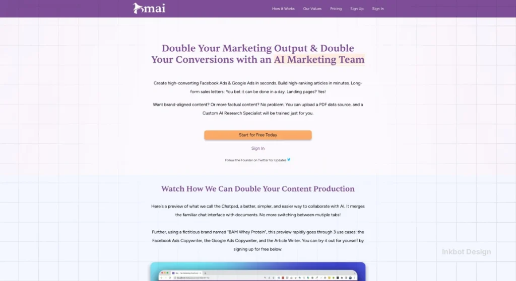
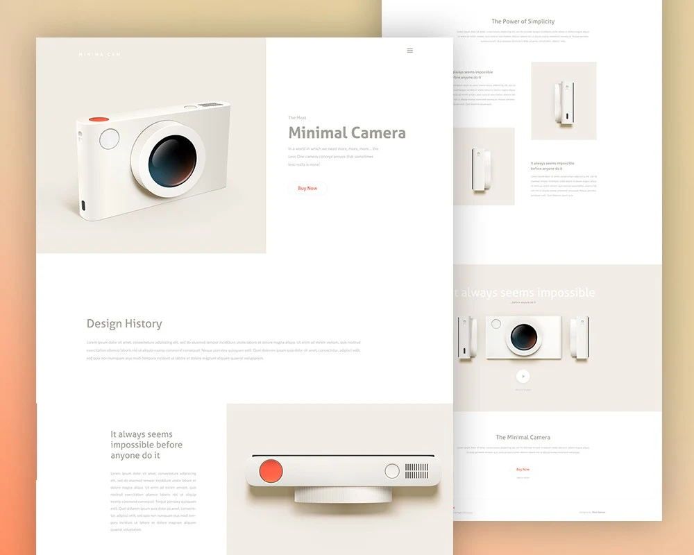
2. The Product-as-Hero (SaaS Focus)
For software or digital tools, the “Product-as-Hero” layout skips the metaphors and shows the interface. In 2026, transparency is a currency. Users are tired of “stock photo people smiling at laptops.” They want to see the UI.
This layout usually features a centralised headline with a large, high-resolution screenshot or a short, looping video directly beneath it. This is where optimisation becomes vital. If that hero image isn’t lazy-loaded or served in a modern format like WebP, your LCP will tank.

Technical Insight:
A McKinsey study on design value found that companies that excel at “showing, not just telling” outperform their peers by 2:1 in revenue growth.
3. The Long-Form Sales Letter (Trust-Heavy)
“People don’t read.” That is a lie. People don’t read boring content. For high-ticket services or complex B2B offerings, the long-form layout is king.
This layout uses a single-column layout that removes all sidebars. It focuses on website credibility through exhaustive depth. You address every objection, present every case study, and list every FAQ.
Performance Benchmarks: Is Your Design Actually Working?
Success in landing page design depends on your industry. Sending a user to a complex B2B SaaS page and expecting the same 15% conversion rate you’d see on a simple PDF download is a recipe for frustration.
Based on 2025-2026 industry data, here is where your “effective” conversion rate should sit:
| Industry | Average CVR (2026) | High Performer (Top 10%) | Primary Layout Strategy |
| SaaS & Software | 3.2% | 9.8% | Product-as-Hero |
| Professional Services | 4.8% | 12.1% | The Storyteller |
| Legal & Finance | 6.5% | 15.4% | Long-Form Sales Letter |
| E-commerce (Direct) | 2.1% | 5.5% | Directory / Minimalist |
| Healthcare | 3.9% | 8.2% | Step-by-Step |
Why the Gap?
The difference between an average page and a top performer is rarely the button colour. It is Cognitive Fluency. This is a psychological principle where the brain prefers information that is easy to process.
If your design uses Hick’s Law (reducing the number of choices), your conversion rate naturally climbs because you’ve removed the “paradox of choice” that leads to abandonment.
The 2026 Layout Finder
Select your primary offer type to reveal the highest-converting strategy.
Product-as-Hero
Why It Works
In 2026, transparency is currency. Users are tired of vague metaphors. This layout skips the fluff and features a high-fidelity interface screenshot or looping video as the primary visual. It proves the product exists immediately.
Long-Form Sales Letter
Why It Works
For expensive or complex offers, brevity kills sales. This layout removes navigation distractions and addresses every possible objection through exhaustive depth. It uses trust signals and detailed FAQs to build authority.
The Lead Gen Squeeze
Why It Works
This layout is brutal in its simplicity. One headline, three bullet points, and an email field. It leverages cognitive fluency by removing all choices except one.
The Comparison Grid
Why It Works
Perfect for bottom-of-funnel traffic where users are already shopping around. By placing your features side-by-side with “The Others,” you control the narrative and handle the evaluation phase directly on your page.
The Storyteller
Why It Works
Service businesses rely on human connection. This layout follows a narrative arc: The Problem (Villain) → Your Service (Guide) → The Solution (Hero). It uses high-quality imagery to let the content breathe.
4. The Lead Gen Squeeze (Frictionless)
The Squeeze page has one goal: get the email. This layout is brutal in its simplicity. Usually, it consists of a headline, a bulleted list of benefits, and a form.

To make this work, you must apply UX design A/B testing. Often, reducing the number of form fields from five to three can increase conversions by over 25%.
According to the Baymard Institute, “too long/complicated checkout processes” (which applies to lead forms) are a top reason for abandonment.
5. The Comparison Grid (The Competitor Killer)
If you are in a crowded market, use the Comparison Grid layout. This layout places your service side-by-side with “The Others.”
It works because it handles the “evaluation” phase of the customer journey right on the page. You control the narrative.
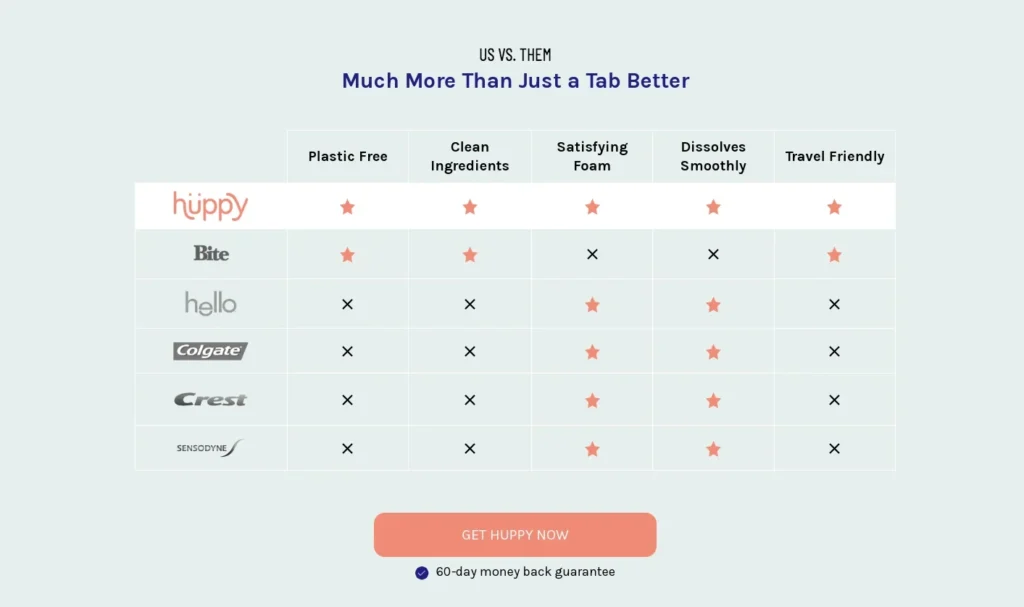
By highlighting features your competitors lack, you frame your brand as the only logical choice. This is highly effective for landing page design aimed at bottom-of-funnel traffic.
The Technical Blueprint: Designing for Humans and AI Agents
In 2026, your landing page design is no longer just a visual experience; it is a data structure.
With the rise of AI Overviews and agentic web browsers, your site must be as legible to an LLM (Large Language Model) scraper as it is to a human lead.
If an AI agent cannot “understand” your offer, it will never recommend you in a zero-click search result.
To ensure your layout is “agent-ready,” you must move beyond generic <div> soup. Using Semantic HTML5 is the baseline. This means wrapping your hero section in a <header>, your main conversion arguments in <section> blocks, and your legal or trust signals in a <footer>.
The “Answer-First” Framework: AI systems reward “Answer-First” structures. When you design a section—for example, a pricing block—ensure the most critical facts (the price, the primary feature, and the user persona) are present in the raw HTML, not hidden inside a JavaScript-heavy accordion or a flattened image.
- Standard: Use Schema.org markup, specifically SoftwareApplication or Product schemas, to tell the web exactly what you are selling.
- Performance: Use Next.js or Remix for server-side rendering. If your content only appears after a client-side script runs, the AI agent might miss your primary value proposition entirely.
Pro Tip: Run your landing page through a “text-only” browser. If you can’t understand the offer without the images, neither can the AI that controls 40% of your potential traffic in 2026.
The State of Landing Page Design in 2026
We have moved past the era of “static” layouts. In early 2026, the trend is Hyper-Personalisation. Using edge computing, landing pages now swap headlines and images in real time based on the user’s specific search intent or geographic location.
Furthermore, responsive web design has evolved. It’s no longer just about fitting a screen; it’s about “Contextual Design.”
A user arriving from a LinkedIn ad on a desktop has a different “mental model” than a user arriving from a TikTok ad on a mobile device. Your layout must adapt to these different intent signals.
6. The Storyteller (Emotional Connection)
The Storyteller layout uses a narrative arc to guide the user. It starts with a “Problem” (The Villain), introduces your service (The Guide), and ends with the “Solution” (The Hero).

This layout is perfect for brands that need to build an emotional connection. It often uses large, high-quality photography and plenty of white space to allow the story to “breathe.”
Ensure you are following web accessibility guidelines here; don’t hide your story inside images that screen readers can’t parse.
7. The Step-by-Step (Onboarding)
Complexity is the enemy of conversion. The Step-by-Step layout breaks your process down into three or four simple chunks (e.g., “1. Book a Call, 2. Get a Plan, 3. Grow your Business”).
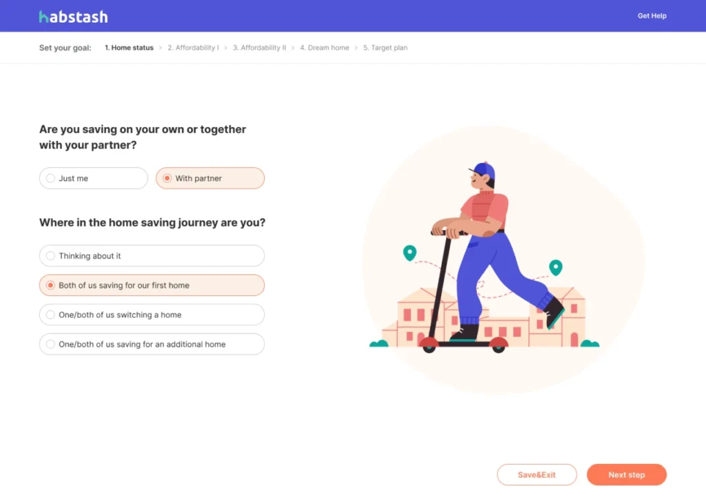
This layout reduces the “perceived effort” of working with you. Nielsen Norman Group research suggests that showing the “visibility of system status”—or in this case, the progress of a service—increases user trust and reduces anxiety.
8. The Video-Centric Layout
Video is no longer optional. However, sticking a YouTube embed at the top of a page is lazy. A video-centric layout uses the video as the primary driver of the value proposition, often with a “sticky” CTA that appears only after a certain percentage of the video has been watched.
A Consultant’s Reality Check:
I once audited a client’s landing page that featured a 4-minute auto-play video with sound. Their bounce rate was 92%. We swapped it for a 30-second silent “explainer” with captions and a clear CTA. The conversion rate jumped by 300% overnight. Don’t be “clever”; be useful.
9. The Directory/Marketplace Layout
If you offer a range of services or products (such as an e-commerce brand or a large agency), the Directory layout is your best bet. It focuses on “Search and Filter” as the primary hero element.

Think of Airbnb or Booking.com. They don’t try to sell you one specific house; they sell you the ability to find the right house. This requires a deep understanding of UX vs UI design to ensure the filtering system isn’t a technical nightmare on mobile.
10. The Minimalist (Brand-Led)
The Minimalist layout is for established brands where the logo does the heavy lifting. It uses a single, powerful image and a very short headline.
This layout is risky for SMBs. If people don’t know who you are, being “mysterious” just looks like you’ve run out of things to say.
However, if you have a strong brand identity, this layout screams “Premium.” It requires a flawless website redesign strategy to ensure that “minimal” doesn’t mean “uninformative.”
Debunking the “Fold” Myth: Why Scrolling is Your Friend
For years, designers have obsessed over “The Fold.” The belief was that if a user didn’t see the CTA within the first 600 pixels, they were gone.
In 2026, this is objectively false. Nielsen’s 2024 eye-tracking studies show that while the top of the page still gets the most attention, users are more likely to convert after being primed with information.
A “premature CTA”—one that asks for a sale before explaining the value—actually increases friction.
The goal isn’t to keep everything at the top; it’s to create a “visual narrative” that pulls the user down the page. Use directional cues, such as arrows or images of people looking downwards, to guide the scroll.
Technical Performance and GEO
In the era of Generative Engine Optimisation (GEO), the structure of your landing page design is as important as the pixels it uses.
Search engines and AI agents look for semantic HTML5 tags (<header>, <main>, <section>, <article>) to understand the relationship between your entities.
If your “10 High-Converting Layouts” are just a series of <div> tags with no semantic meaning, an AI agent will struggle to recommend your page as a “trusted source.” For more on the future of this, read our piece on web design trends for businesses.
The 2026 Toolset: Where to Build for Speed and Scale

Building a high-converting page requires more than just a template; it requires a stack that supports LCP (Largest Contentful Paint) requirements and dynamic personalisation.
- Unbounce (with Smart Traffic): Best for mid-market teams. Their AI-driven “Smart Traffic” automatically routes visitors to the layout variant most likely to convert, based on their historical data.
- HubSpot Content Hub: The gold standard for B2B. It integrates your landing page design directly with your CRM, allowing you to swap out testimonials based on the visitor’s industry (Vertical Personalisation).
- Framer: For those who prioritise “The Minimalist” or “Product-as-Hero” layouts. Its performance is best-in-class for high-fidelity animations that don’t tank your Core Web Vitals.
- Vercel & Next.js: For enterprise-level custom builds. This is where you implement Edge Computing to ensure a user in London sees a different “local” hero image than a user in Dallas, with zero latency.
The Verdict: ROI Over Art
A landing page is a business tool, not a gallery piece.
The “perfect” layout doesn’t exist in a vacuum; it exists where your audience’s intent meets your business goals.
Whether you choose a Z-pattern for a quick lead or a long-form letter for a complex sale, every pixel must justify its existence. If it doesn’t contribute to the conversion, it’s noise. And in 2026, noise is the fastest way to go broke.
Stop guessing and start converting.
If your current landing page feels more like a hobby than a lead-generation machine, it’s time for a professional audit.
Frequently Asked Questions (FAQ)
What is the best landing page layout for a small business?
The “Classic Hero (Z-Pattern)” or “Step-by-Step” layouts are generally best for SMBs. They provide a clear, familiar structure that builds trust quickly without the massive brand recognition required by minimalist designs.
How long should a landing page be in 2026?
The length should match the “complexity of the ask.” A simple newsletter sign-up can be short. A £5,000 consulting package requires a long-form layout to address objections and build necessary authority.
Does page speed affect landing page conversions?
Absolutely. Google Developers documentation states that as page load time increases from 1s to 3s, the bounce rate increases by 32%. A beautiful layout is worthless if nobody waits for it to load.
Should I remove the navigation menu on a landing page?
Yes. Traditional navigation provides “leaks.” A landing page should have one goal; giving users five other places to click (About, Blog, Team) reduces the likelihood they will complete the primary CTA.
What is the difference between a homepage and a landing page?
A homepage is a multi-purpose gateway designed for exploration and brand overview. A landing page is a single-purpose destination designed for a specific campaign with a solitary Call to Action.
How many CTAs should a landing page have?
One type of CTA, but it can appear multiple times. You might have a “Book a Call” button at the top, middle, and bottom, but don’t mix it with “Download our Ebook” or “Follow us on X.”
Is mobile-first design still important for landing pages?
It is mandatory. Over 60% of web traffic is mobile. If your landing page layout “breaks” on a smartphone or requires “pinch-to-zoom” to read the form, your campaign will fail.
What are the most important trust signals for a landing page?
Verified reviews, client logos, case study data, and professional certifications. Avoid generic “satisfaction guaranteed” badges, which carry zero weight in 2026.
How does AI affect landing page design in 2026?
AI is now a primary “visitor.” You must use Semantic HTML and structured data so AI agents can parse your offer for users. Additionally, tools like ChatGPT and Gemini are now used to audit layouts for “friction points” before they go live.
Is “The Fold” still relevant for mobile users?
While the “top-of-page” is still premium real estate, modern users are “scrollers.” The goal of your hero section is no longer to close the sale, but to earn the next scroll. Use Lottie animations or visual cues to pull the reader downward.
What is the most common conversion killer in 2026?
Performance lag. Even a beautiful layout will fail if it takes more than 1.5 seconds to become interactive. Large, unoptimised images are the most frequent culprit. Always serve assets in WebP or AVIF formats.
How many fields should my lead-gen form have?
Aim for 3 or fewer. If you need more data, use a Multi-Step Form (The Step-by-Step layout). This reduces initial “form scare” and leverages the “Sunk Cost Fallacy”—once a user starts the first step, they are 60% more likely to finish the third.
