10 Companies That Rebranded: 5 That Worked, 5 That Failed
Ten well-known companies rebranded, with sharply different results. Apple, Airbnb, and Dunkin’ clarified strategy while keeping recognition. Gap, Tropicana, and Consignia discarded the assets customers relied on. The separating variable is not design quality but retained recognition — a distinction that matters more, not less, for trust-dependent professional services firms considering change.
 By Stuart Crawford
 Reviewed by Tabitha Ayers
Updated 12 min read
On this page12 min left
A rebrand is one of the few decisions in which a firm can spend six figures and end up commercially worse off than before.
Gap did exactly that in 2010 – a competent, professionally executed logo that the company withdrew within six days. The design wasn't the problem.
What Gap threw away was recognition, and recognition, for most established businesses, is the single most valuable thing a rebrand can either sharpen or destroy.
That distinction – between clarifying what a business is and discarding what people already recognise about it – is what separates every successful rebrand below from every failed one.
It matters more, not less, when the brand in question depends on trust: a law firm, an accountancy, a consultancy.
Before committing to any of this, it's worth understanding the rebranding process as a sequence of commercial decisions rather than a design project.
What Does It Mean When a Company Has Rebranded?
A company has rebranded when it deliberately changes elements of its brand identity – name, logo, visual system, positioning, or voice – to reflect a new strategy, market role, or audience. A successful rebrand clarifies what the business is while keeping enough familiar equity to bring existing customers along—a failed one discards recognition in pursuit of novelty.
- Rebranding operates on a spectrum, from a light visual refresh to a full name-and-strategy change.
- The commercial risk rises with the extent to which recognisable equity is changed, not with how much money is spent.
- Kantar estimates that a brand represents roughly 30% of business value on average and more than 50% for the highest-performing brands, making a rebrand a material financial decision rather than a cosmetic one.
A rebrand succeeds when it clarifies strategy while retaining distinctive assets, and fails when it discards recognition customers rely on to find and choose the brand.
Five Rebrands That Worked – And Why
The strongest rebrands share one trait: each changed the brand's meaning while protecting the assets people used to recognise it. None of them started with a logo.
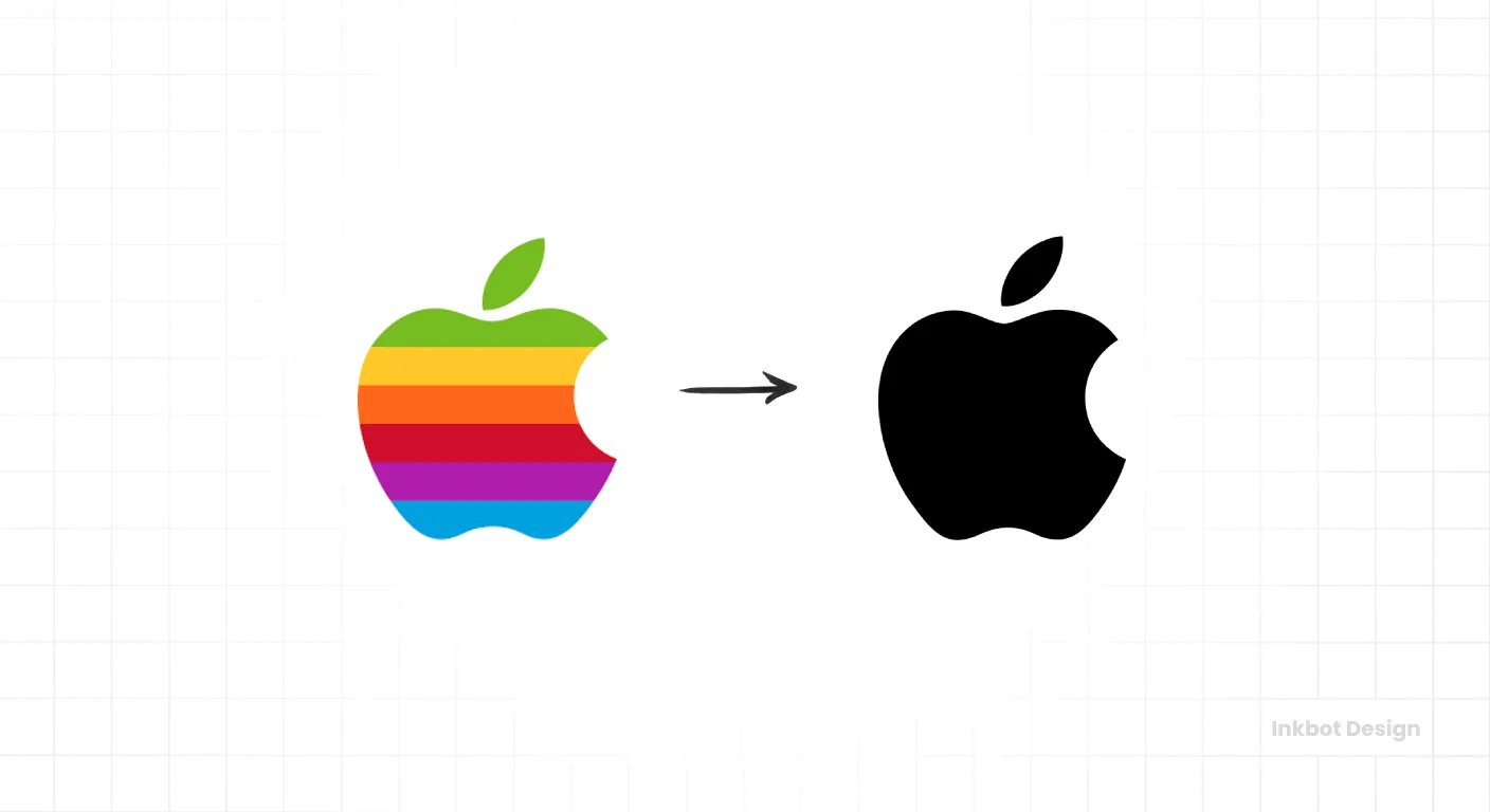
Apple rebuilt around a clear belief system – creative empowerment and simplicity – then made that belief visible in product design, retail, and communication. The 2007 drop of “Computers” from the name followed an existing strategy; it ratified a shift rather than inventing one. The lesson for a firm mid-pivot: the brand promise has to show up in the client experience, not sit in a positioning document nobody outside the marketing team reads.
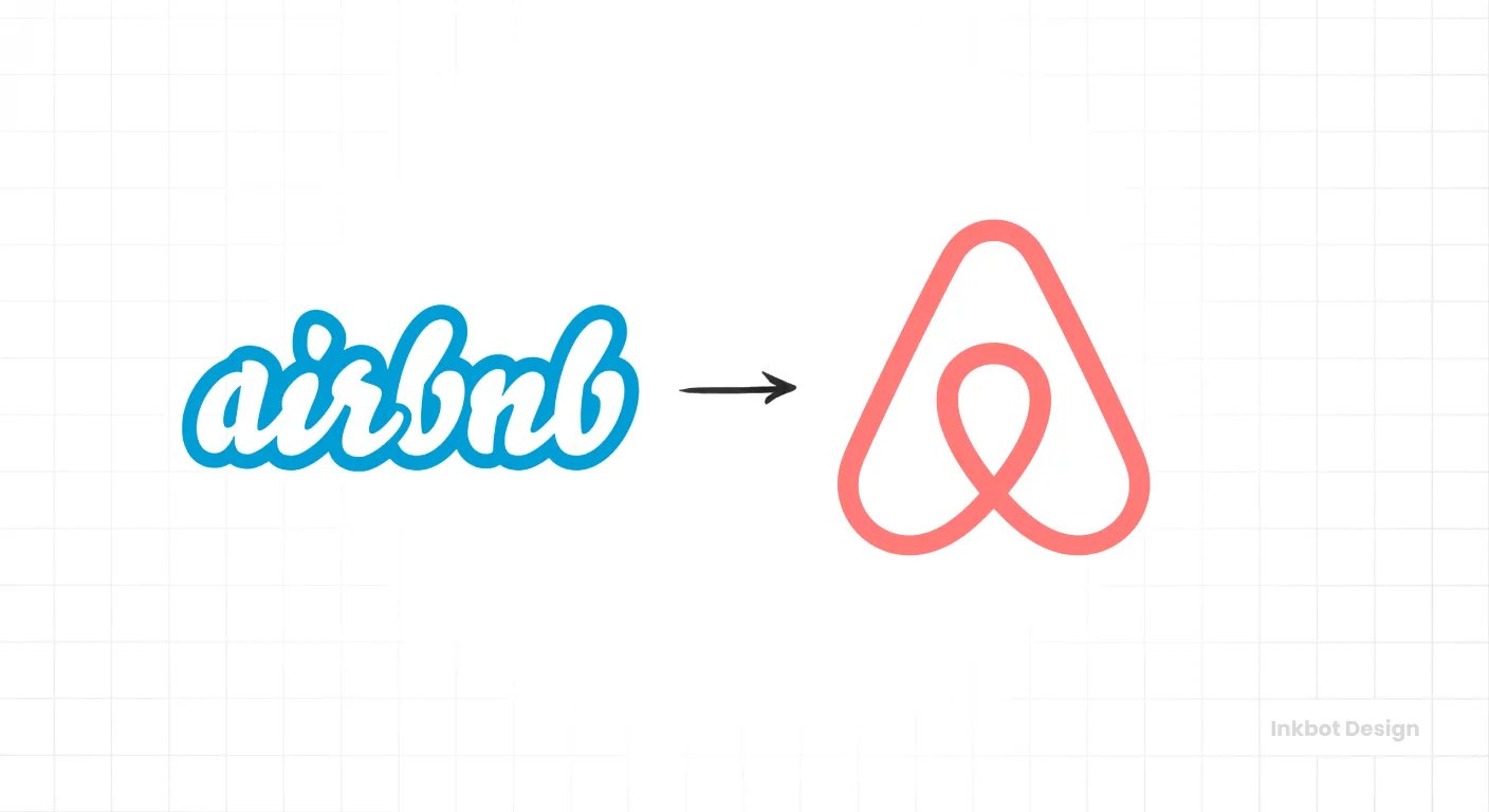
Airbnb‘s 2014 rebrand turned a room-rental platform into a belonging-led hospitality brand. The new identity, the language, and the community model all pushed the same idea. That coherence is the point – when a business expands its role, a single unifying idea has to connect the model, the experience, and the visuals, or the rebrand reads as three unrelated projects.
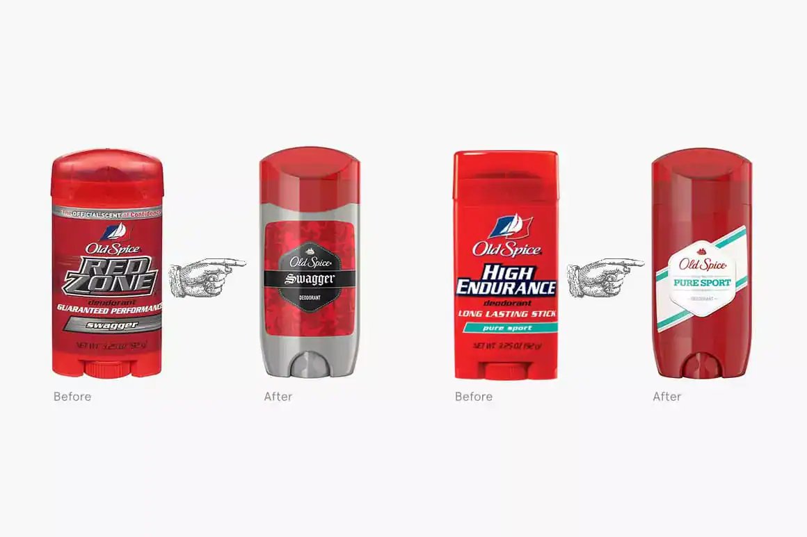
Old Spice was a brand your father used, and by the late 2000s, that was the problem. The 2010 “The Man Your Man Could Smell Like” work didn't soften the heritage or apologise for it – it picked a clear audience (the woman buying the product for a man) and committed to one unmistakable voice. Relevance came back not from looking new, but from knowing precisely who it was talking to and sounding like nothing else on the shelf.
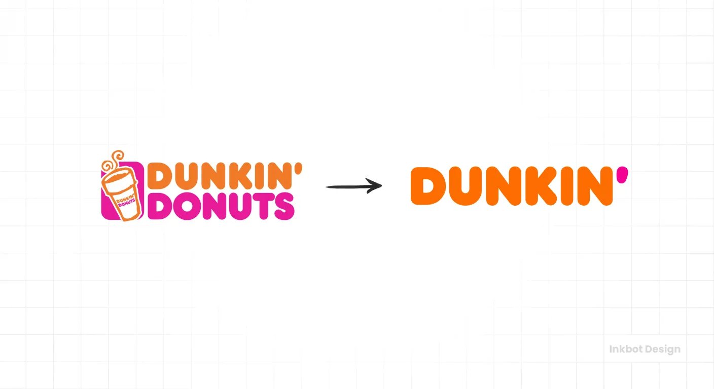
Dunkin' dropped “Donuts” in 2019 to align with a beverage- and convenience-led growth strategy, after coffee had grown to dominate sales. What matters is what it kept: the colours, the typography, the core name. The proposition evolved; the recognition survived intact.
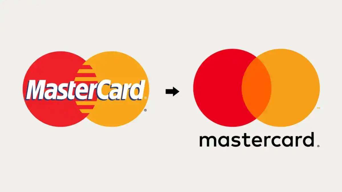
Mastercard removed its wordmark in select contexts in 2019, using its interlocking circles alone. That worked only because the circles were already among the most recognised symbols in payments. Mastercard didn't create recognition by simplifying – it spent recognition it had already banked.
The pattern across all five: strategy first, distinctive assets protected, novelty subordinate to clarity.
Five Rebrands That Failed – And What They Cost
Failed rebrands are rarely failures of design skill. They are failures of judgement about what could be changed safely. Each of the following discarded an asset that customers depended on.
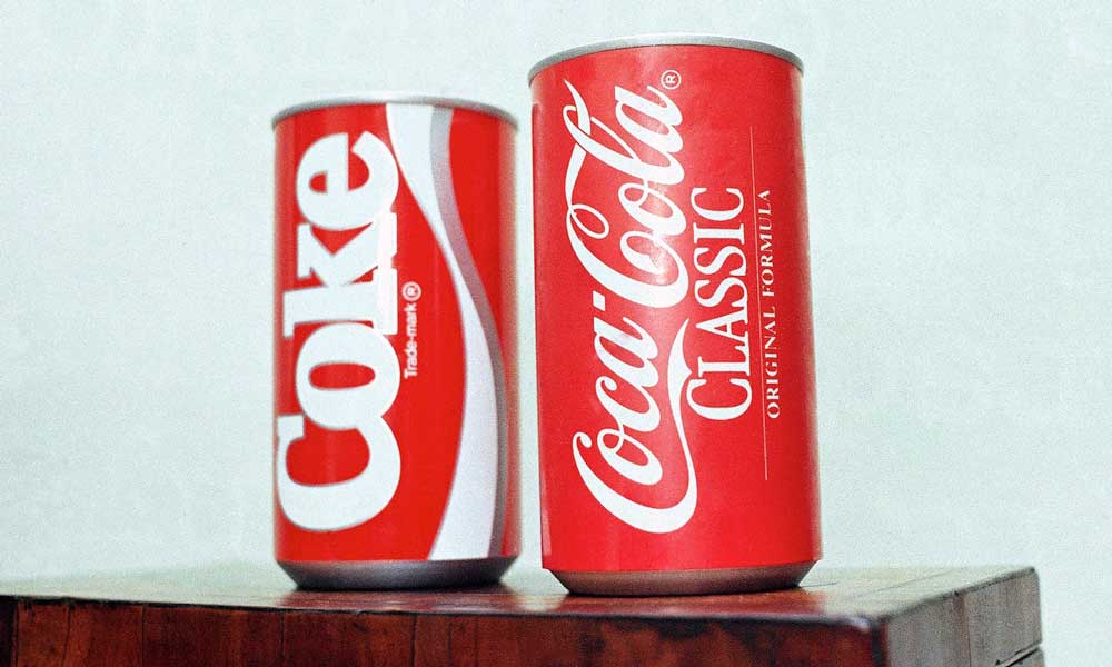
New Coke remains the classic example of confusing research with meaning. Coca-Cola changed a product people treated as a cultural institution, over-relying on taste-test data and undervaluing emotional loyalty. The taste tests were real; they simply didn't measure what mattered.
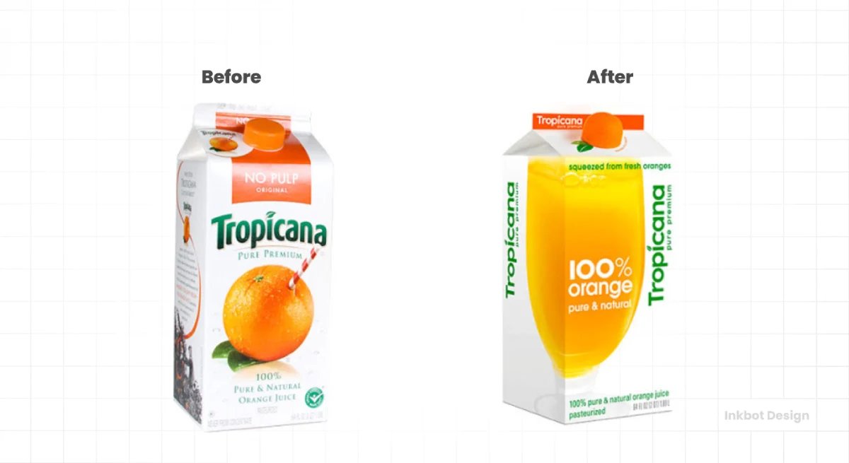
Tropicana‘s 2009 packaging redesign stripped out the high-recognition shelf assets – the orange with the straw – and made the product harder to spot. Retrospective reporting attributes roughly a 20% sales decline, about $30 million, to the redesign before Tropicana restored the prior packaging. The design was modern and clean. It was also invisible to the shopper scanning a shelf for something familiar.
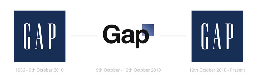
Gap unveiled a generic replacement logo in 2010, abandoning its distinctive blue box with no strategic explanation. Public backlash forced a reversal within six days. A rapid rollback is itself a metric of failure – six days is the market telling you the change carried no argument.
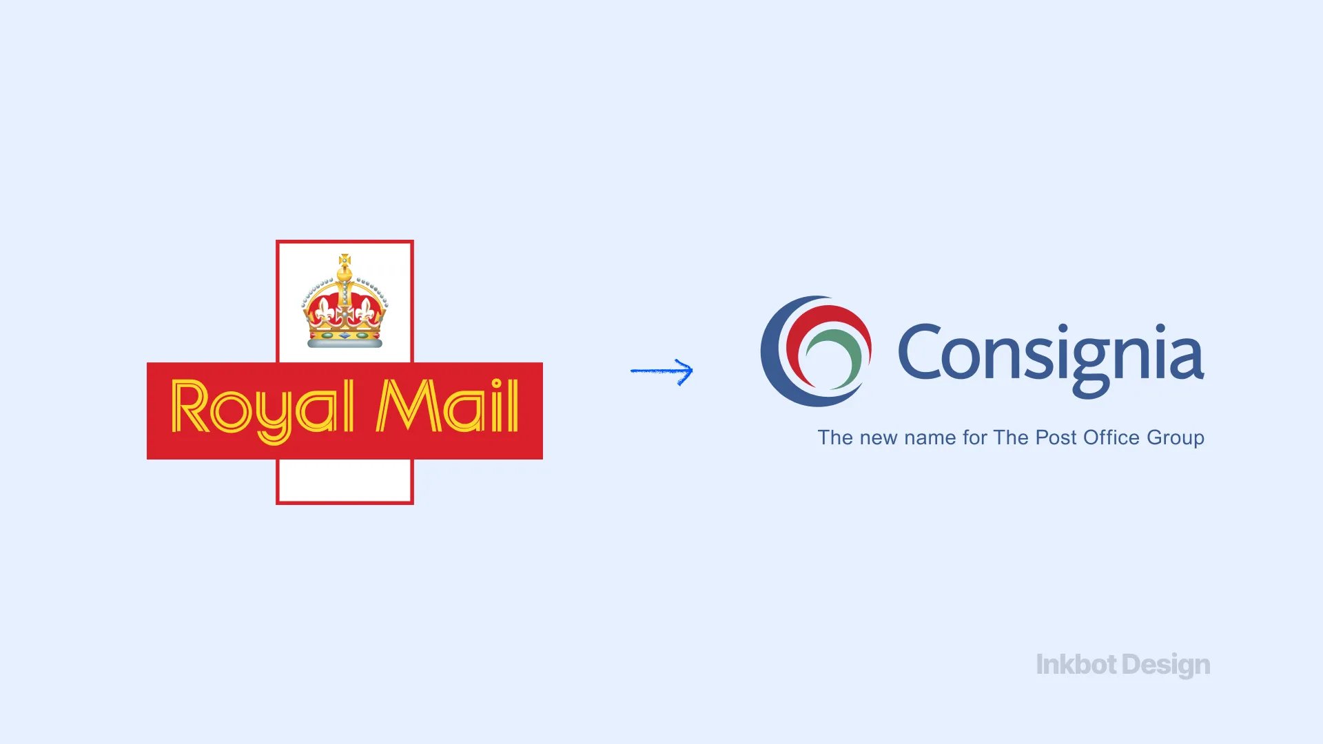
Royal Mail replaced a trusted, descriptive institutional name with “Consignia” in 2001, severing a connection to public familiarity built over generations. An invented name sacrificed clarity and accumulated reputation at once. For a trust-dependent institution, that is close to the worst possible trade.
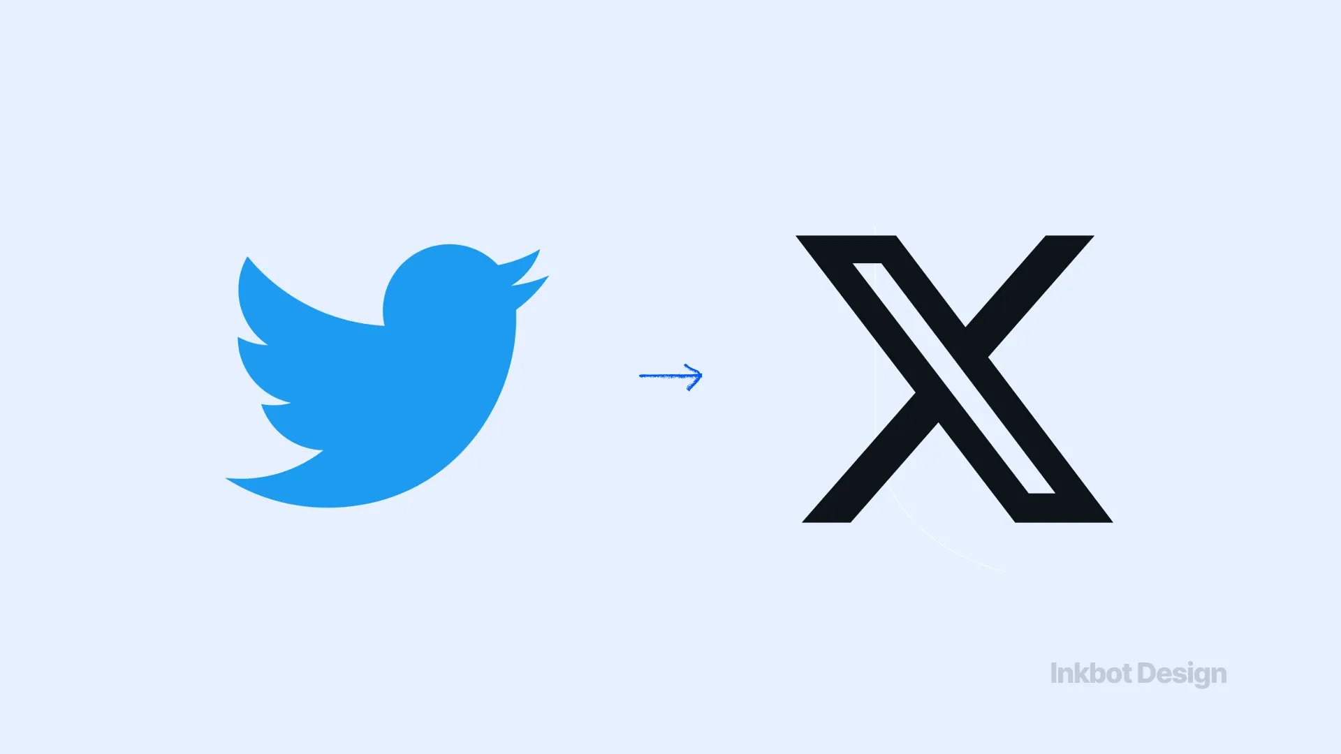
Twitter‘s 2023 change to “X” discarded a globally recognised name and symbol without a stable new meaning to replace them. Brand Finance valued X at $673.3 million in 2024 and reported it dropped out of that year's rankings. Product, advertiser, and platform decisions all fed the decline – but the erasure of a verb people used daily (“tweet”) removed a shortcut the brand had spent seventeen years building.
“The recognisable asset a rebrand feels most tempting to modernise is usually the one carrying the most commercial weight. Tropicana's straw, Gap's blue box, Twitter's bird – each looked like a decoration and functioned as infrastructure. Remove the infrastructure, and customers stop finding you, regardless of how good the replacement looks.”
Retained Recognition, Not Better Design
The intuitive theory of rebrand failure is that failed rebrands had bad design and successful ones had good design. The evidence contradicts this directly.
Gap's 2010 logo was competently produced. Tropicana's 2009 packaging was clean, modern, and professionally executed. Both failed.
The variable that separates the winners from the losers is not craft quality – it is whether distinctive, recognisable assets were retained through the change.
It's easy to see why the design-quality theory holds. Most people encounter rebrands as visuals, so the visual is the thing being judged.
Design critics reinforce it, and agencies selling design work have little incentive to argue otherwise. The theory feels obviously true.
It's wrong because it mistakes what customers actually use a brand for. Kantar's BrandZ research finds that meaningful difference accounts for 94% of the average brand's capacity to command pricing power through equity.
Recognition is not aesthetic preference – it's the mechanism by which a customer locates you, trusts you enough to choose you, and pays a premium for the reduced risk of a known quantity. When a rebrand removes the cues that trigger recognition, it raises perceived risk at the exact moment it hoped to signal progress.
Dunkin' kept its colours and ended up with a cleaner proposition. Tropicana removed its straws and got a $30 million hole—same category of decision, opposite handling of recognition.
The replacement rule is straightforward: change the strategy and the meaning as much as the business genuinely requires, but protect the specific assets – name, colour, symbol, verbal shorthand – that customers use to find and identify you, unless you have strong evidence that those assets no longer serve you.
What This Means for a Professional Services Firm
A managing partner at a 90-person law firm reading about Instagram's logo gradient is entitled to ask what any of it has to do with her practice. Fair question.
The visual specifics don't transfer – but the recognition principle transfers with greater force, because professional services trade on trust, and trust is slower to build and quicker to break than a shopper's preference between two orange juices.
When a solicitor recommends your firm to a client, or a finance director types your name into an email, or a prospect searches for the practice a colleague mentioned last month, they are reaching for a name they already hold in memory.
Change that name and every one of those moments misfires – the referral lands on a firm the recipient can't find, the search returns nothing, the recommendation quietly dies between the mention and the enquiry.
You never see the lost instruction, which is exactly why it's dangerous. Consignia is that failure made literal.
The commercial stakes are not abstract. Kantar estimates that a brand represents roughly 30% of business value on average and more than 50% for the strongest performers.
For a firm whose entire proposition is credibility, the referral and recognition equity built over a decade is not a marketing asset to be refreshed lightly – it is a substantial share of enterprise value.
In 17 years of brand work, the pattern I see most often is a firm treating a rebrand as permission to discard everything at once, when the commercial win was in changing the positioning and keeping the recognition.
That work consistently protects the equity that a rebrand must carry forward rather than resetting it.
A sceptical reader raises two fair objections here.
First: “Isn't this just an argument for never changing anything?” No – Apple, Airbnb, and Dunkin' all changed substantially and won. The argument is for changing strategy freely and recognising assets only with evidence.
Second: “Our name is holding us back – surely that justifies a change?” Sometimes it does. Subway was renamed from “Pete's Super Submarines” because the original was genuinely unusable. The test is whether the existing asset is a liability or merely unfashionable. Consignia replaced a working asset; Subway replaced a broken one.
How to Tell Which Side Your Rebrand Is On
The difference between a rebrand that clarifies and one that discards can be assessed before you commit to the budget. The following table maps real firm scenarios to the decision that the evidence supports.
Your situation | The tempting move | What the evidence supports | Why |
|---|---|---|---|
Merging two firms with equal recognition | Invent a neutral new name | Retain the stronger name, or endorse-and-transition | Consignia proved invented names sever familiarity; e& shows staged transition works |
Name genuinely confuses or misdescribes you | Keep it to preserve equity | Change it – a broken asset is a liability | Subway's original name was unusable; keeping it cost more than changing it |
Positioning feels dated, but the name is known | Rename to signal a fresh start | Reposition, keep the name and core assets | Dunkin' evolved the proposition and kept the recognition |
A distinctive symbol or colour feels old-fashioned | Modernise it away | Refine it, don't remove it | Tropicana removed its straw and lost $30m; Mastercard refined its circles and gained flexibility |
You want to look bigger or more premium | Adopt a generic, “corporate” look | Sharpen distinctiveness instead | Gap's generic logo failed in six days; distinctiveness drives 94% of pricing power (Kantar) |
The single question underneath every row: Is the asset I want to change a liability, or is it simply unfamiliar to me because I see it every day?
Firms consistently overvalue novelty because they are bored with their own brand assets long before their market is. The market's recognition lags your fatigue by years.
Where Rebranding Stands in 2026
Rebranding in 2026 sits in a market where brand value is moving faster than ever at the top and standing still in the middle. The lesson for an established firm is that a rebrand can accelerate an already-viable strategy, but it cannot manufacture one.
Kantar placed NVIDIA at $509.4 billion in brand value in 2025, up 152% year on year – brand growth that followed the company becoming central to a major market shift and communicating that role clearly.
Brand Finance included OpenAI in its Global 500 for the first time in 2026, showing category leadership can build equity unusually quickly, though emerging brands must establish trust as fast as awareness. These are cases where the brand kept pace with a genuine strategic position.
The staged-transition model is worth studying for any firm facing a merger or corporate restructure.
Brand Finance reported that e& reached a $15.3 billion brand value in 2025 – an eightfold rise, with 13% like-for-like growth against the prior combined value of its predecessor brands – by managing its corporate architecture, communications, and stakeholder understanding as a single coordinated transition rather than a single reveal. That is the opposite of the Gap approach.
The cautionary side of 2026 remains X. Brand Finance valued X at $673.3 million in 2024 and confirmed it dropped from the rankings that year.
A radical name and identity change destroyed familiar verbal and visual shortcuts; other factors contributed, but the erased recognition is the part directly relevant to any firm considering a name change.
One constraint applies to all of it. Kantar reported 2025 retail value growth of 48%, but flat apparel value, with food and beverages down 1% and personal care down 5%.
A rebrand cannot substitute for product relevance, channel strength, or category momentum. It has to be wired to a viable commercial strategy, or it is an expensive decoration on a weak position.
The Verdict
The ten cases reduce to one usable rule: rebrand the strategy as much as the business needs, and recognise only as much as the evidence allows.
Apple, Airbnb, Old Spice, Dunkin', and Mastercard changed what they meant while protecting what people recognised.
New Coke, Tropicana, Gap, Consignia, and X discarded recognition and paid for it in sales, in reversals, and in equity that took years to rebuild.
Design quality never separated the two groups. Retained recognition did.
For a professional services firm, the burden of proof for changing a known name is higher than for any consumer brand, because your recognition lives in referrals and search behaviour you cannot see – and cannot easily rebuild.
Change your positioning with confidence.
Change your name and core assets only when you can prove they are a liability, not merely a familiarity you've grown tired of.
Before you commit to any of it, find out exactly where your brand is currently winning and losing commercial ground.
Request a free Brand Equity Audit™ – a structured diagnostic that identifies where your brand is leaking value and what to protect before you change anything.
Frequently asked questions
What does it mean when a company has rebranded?
It means the company has deliberately changed elements of its brand identity – name, logo, visual system, positioning, or voice – to reflect a new strategy or market role. A strong rebrand clarifies what the business is while keeping the familiar assets customers use to recognise it.
Why do most rebrands fail?
Most failed rebrands discard a distinctive asset customers rely on – a name, colour, or symbol – rather than suffering from poor design. Gap's 2010 logo and Tropicana's 2009 packaging were both competently produced yet failed, because each removed recognition the market depended on.
How much can a rebrand cost a company if it goes wrong?
It can cost a substantial share of sales. Retrospective reporting attributes a roughly 20% sales fall – about $30 million – to Tropicana's 2009 packaging redesign before the company restored its prior packaging. The cost is measured in lost recognition, not design fees.
Should a professional services firm rebrand?
Only when the change is strategic, not cosmetic, should a firm reposition freely, but change its name and core recognition assets only with strong evidence, because professional services trade on referral and search equity that breaks silently and rebuilds slowly.
How do I rebrand without losing brand recognition?
Change the strategy and meaning as much as the business genuinely requires, but protect the specific assets – name, colour, symbol, verbal shorthand – customers use to find you. Dunkin' evolved its proposition while keeping its colours, typography, and core name intact.
What's the difference between a rebrand and a brand refresh?
A refresh updates surface elements while keeping the strategy and core assets; a rebrand changes deeper elements such as name, positioning, or market role. The commercial risk rises with the extent to which recognisable equity changes, not with how much is spent.
Is rebranding still worth the risk in 2026?
Yes – when it accelerates an already-viable strategy. Brand Finance's data on staged transitions, such as e, shows that coordinated rebrands can multiply value. Still, Kantar's flat 2025 figures across several categories confirm that a rebrand cannot substitute for genuine commercial relevance.