Top 10 Companies that Rebranded: Lessons in Transformation
Ever stared at your company logo and thought, “Blimey, that looks dated”?
You're not alone.
I remember when I first started Inkbot Design. Our original branding was… it looked like a sleep-deprived uni student designed it after one too many Red Bulls. (Spoiler: it was.)
Fast forward a few years, and I realised we needed a change. But here's the kicker – rebranding is like performing open-heart surgery on your business. If you make one wrong move, you could flatline.
That's why I've spent countless hours studying the rebranding efforts of major companies. Some nailed it, and others just provided valuable lessons on what not to do.
So, buckle up. We're about to dive into the wild world of corporate makeovers. By the end of this post, you'll have a roadmap for transforming your brand without losing your soul (or your customers).
🔰 TL;DR: Rebranding isn't just slapping on a new logo and calling it a day. It's about evolving your company's identity to stay relevant and competitive. This post dives into ten major rebrands, dissecting what worked, what flopped, and how you can apply these lessons to your own business. Spoiler alert: It's not always pretty, but can be a game-changer.
- Rebranding requires deep understanding, no mere logo change.
- Apple shifted from whimsy to minimalism, reflecting its premium tech stance.
- Burberry reinvented by focusing on heritage and exclusivity.
- Old Spice embraced humour, transforming its image for younger consumers.
- Airbnb's Bélo logo embodies its core value of belonging.
- 1. Apple: From Rainbow to Minimalism
- 2. Burberry: From Chavvy to Chic
- 3. Old Spice: From Grandpa's Cologne to Man Your Man Could Smell Like
- 4. Airbnb: From Clipart to Community
- 5. Dunkin' Donuts: Dropping the Donuts
- 6. Mastercard: Simplifying the Circles
- 7. Uber: From U to... Something Else
- 8. Instagram: From Retro Camera to Gradient Icon
- 9. Slack: From Hashtag Hodgepodge to Sleek Speech Bubble
- 10. Weight Watchers to WW: A Weighty Decision
- Wrapping Up: The Art of the Rebrand
- FAQs on Companies that Rebranded
1. Apple: From Rainbow to Minimalism
Remember when Apple's logo looked like a pack of highlighters had attacked it? Yeah, me too.
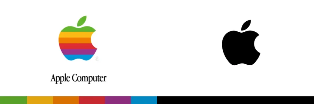
The Old Look: Technicolour Dream Logo
- Rainbow-striped apple
- Screamed, “We're fun and quirky!”
- It is about as subtle as a disco ball in a library
The New Look: Sleek and Chic
- Monochrome apple
- Whispers, “We're sophisticated and cutting-edge.”
- As minimalist as a Zen garden
Why It Worked
Apple's rebrand wasn't just about aesthetics. It was a strategic move aligned with their shift from quirky underdog to premium tech leader.
🔑 Key Takeaway: Your brand should evolve with your company's position in the market. Don't be afraid to grow up.
2. Burberry: From Chavvy to Chic
Ah, Burberry. The brand went from being the unofficial uniform of football hooligans to gracing the backs of A-list celebrities.
The Old Look: Checkered Past
- Iconic check pattern… everywhere
- Associated with “lad culture” and counterfeit goods
- About as exclusive as a bus pass
The New Look: Luxe Reinvention
- Streamlined logo and subtle use of check
- Focus on heritage and craftsmanship
- More exclusive than a secret handshake at a millionaires' club
Why It Worked
Burberry didn't just change its logo; it overhauled its entire brand strategy. They limited the use of their famous check pattern, focused on their British heritage, and positioned themselves as a luxury fashion house.
🔑 Key Takeaway: Sometimes, less is more. Don't be afraid to dial back your most recognisable elements if they hold you back.
3. Old Spice: From Grandpa's Cologne to Man Your Man Could Smell Like
Old Spice is the Benjamin Button of brands. It somehow managed to age backwards.
The Old Look: Retirement Home Chic
- Nautical themes and old-timey fonts
- It smelled like your granddad's sock drawer
- It is about as appealing to young people as a game of bingo
The New Look: Ironic Machismo
- Bold, modern typography
- Quirky, self-aware advertising
- Suddenly, smelling like your granddad was… cool?
Why It Worked
Old Spice didn't just change their look; they completely flipped their brand personality. They embraced humour and absurdity, creating viral campaigns that resonated with a younger audience.
🔑 Key Takeaway: Don't be afraid to poke fun at yourself. Self-awareness can be your secret weapon in rebranding.
4. Airbnb: From Clipart to Community
Airbnb's original logo looked like it was designed in Microsoft Paint. By a toddler. With their eyes closed.
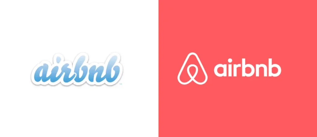
The Old Look: Budget Hostel Vibes
- Bubbly blue text
- Clipart-style cloud
- Screamed, “We can't afford a real designer!”
The New Look: The “Bélo”
- Streamlined symbol combining A, heart, and location pin
- Soft, coral-pink colour
- Whispers, “We're all about belonging”
Why It Worked
Airbnb's rebrand wasn't just about creating a pretty logo. It was about embodying their core value of belonging. The new logo, dubbed the “Bélo,” became a symbol hosts could proudly display.
🔑 Key Takeaway: Your brand should be more than skin deep. It should reflect your core values and mission.
5. Dunkin' Donuts: Dropping the Donuts
Dunkin' Donuts decided to ghost half its name. That was a bold move, Cotton.
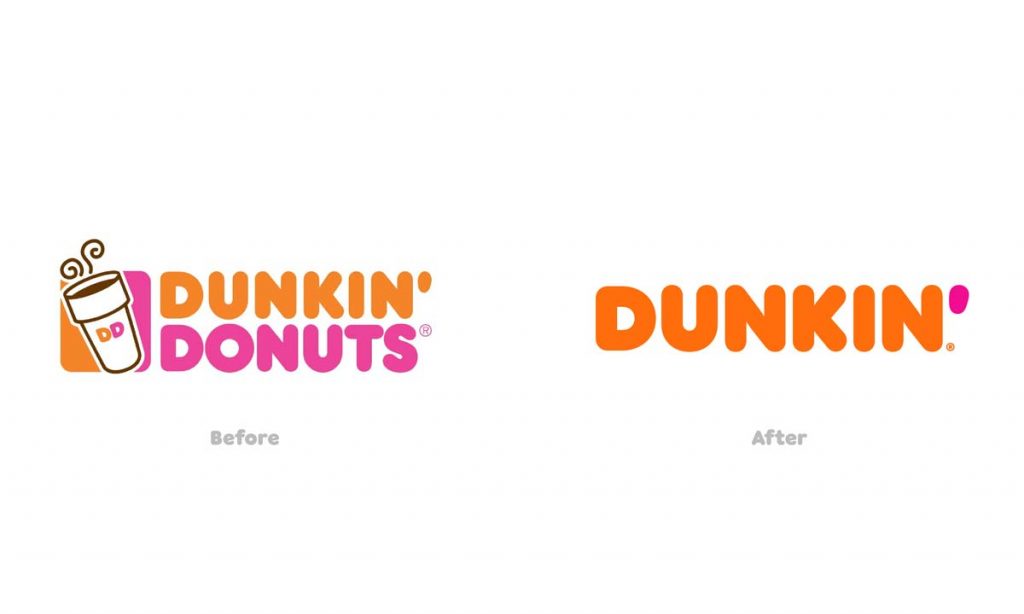
The Old Look: Donut Overload
- Pink and orange colour scheme
- Coffee cup with “DD” initials
- Name that screamed, “We sell donuts!”
The New Look: Just Dunkin'
- Same colour scheme (smart move)
- Simplified cup logo
- Name that says, “We sell… stuff.”
Why It Worked
By dropping “Donuts” from its name, Dunkin' positioned itself as more than just a doughnut shop. They acknowledged that beverages, particularly coffee, were driving their business.
🔑 Key Takeaway: Don't let your name box you in. If you've outgrown your original offering, your brand should reflect that.
6. Mastercard: Simplifying the Circles
Mastercard's rebrand was like a game of logo Jenga – how much could they remove without the whole thing falling apart?
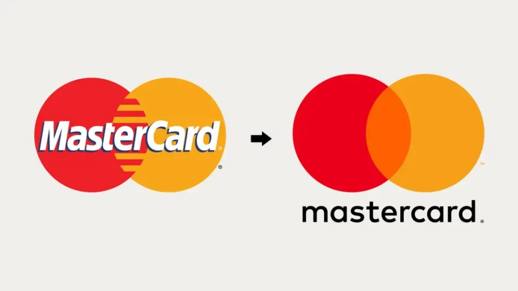
The Old Look: Cluttered Circles
- Interlocking red and yellow circles
- Name prominently displayed across the logo
- Busy design that screamed, “Look at me!”
The New Look: Minimalist Marvel
- Same interlocking circles, now without shading
- Name removed from logo in many applications
- Clean design that whispers, “You know who we are.”
Why It Worked
Mastercard's rebrand wasn't about reinvention; it was about refinement. They recognised the strength of their iconic circles and had the confidence to let them stand alone.
🔑 Key Takeaway: Sometimes, the boldest move is to simplify. If you have a solid visual element, don't be afraid to let it shine.
7. Uber: From U to… Something Else
Uber's rebrand was like watching a teenager go through an identity crisis. In public. On a global scale.
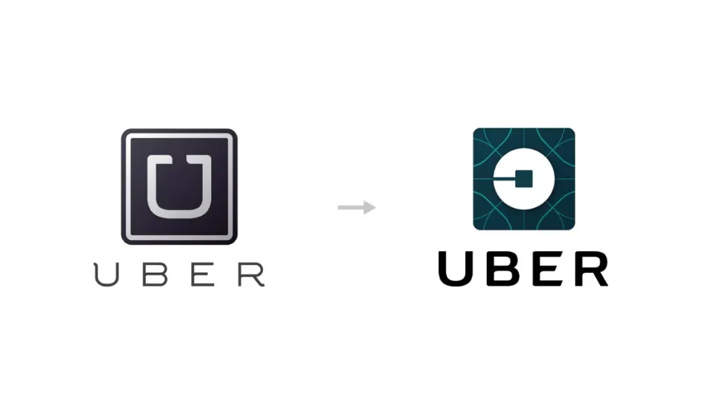
The Old Look: Simple and Sleek
- Black and white colour scheme
- Simple “U” logo
- Screamed, “We're too cool for school.”
The New Look: Abstract and… Confusing?
- Geometric patterns and shapes
- Region-specific colour schemes
- Whispered, “We're trying hard to be meaningful.”
Why It Didn't Quite Work
Uber's 2016 rebrand was met with confusion and criticism. The new look was seen as too abstract and disconnected from the brand's identity. They've since rebranded… again.
🔑 Key Takeaway: Don't overcomplicate things. Your brand should be recognisable and relatable, not a puzzle for your customers to solve.
8. Instagram: From Retro Camera to Gradient Icon
Instagram's rebrand was like watching your hipster friend admit they like mainstream music.

The Old Look: Nostalgic Nod
- Retro camera icon
- Brown and beige colour scheme
- Screamed, “We make your photos look old!”
The New Look: Modern Minimalism
- Simplified camera outline
- Vibrant gradient background
- Whispers, “We're more than just filters.”
Why It Worked
Instagram's rebrand aligned with its evolution from a photo-filtering app to a diverse social media platform. The new look felt more modern and versatile.
🔑 Key Takeaway: As your product evolves, your brand should, too. Don't let nostalgia hold you back from progress.
9. Slack: From Hashtag Hodgepodge to Sleek Speech Bubble
Slack's original logo looked like the result of a drunken game of Scrabble with only punctuation marks.
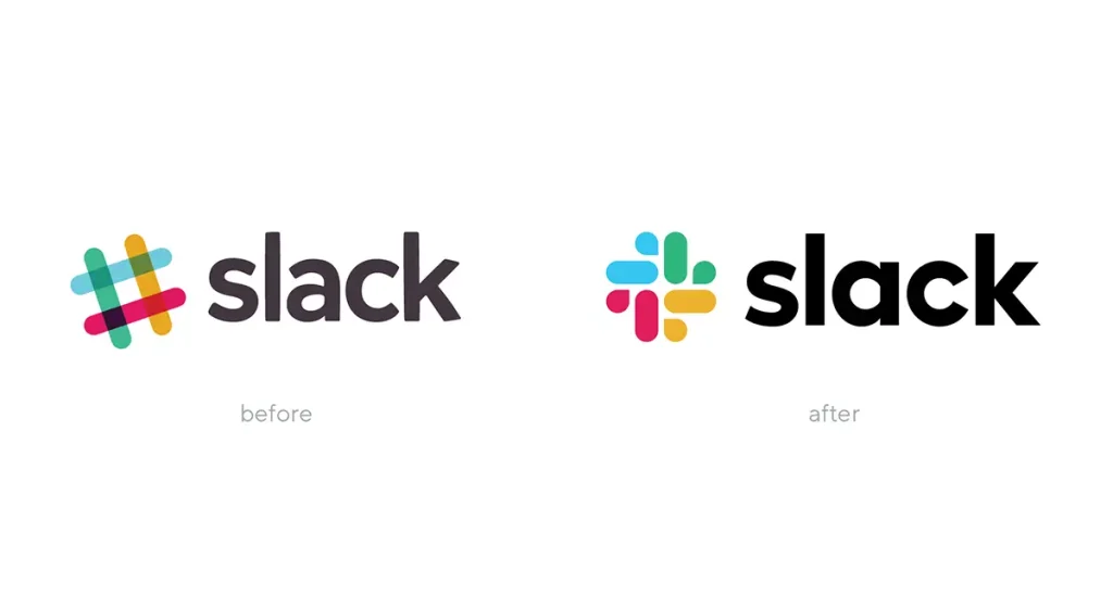
The Old Look: Colourful Chaos
- Multi-coloured hashtag/octothorpe
- Different angle for each colour
- Screamed, “We're fun and quirky… and maybe a bit confused.”
The New Look: Streamlined Speech
- Pinwheel-like speech bubble
- Consistent colour palette
- Whispers, “We're here to help you communicate better.”
Why It Worked
Slack's rebrand addressed practical issues with its old logo (it was a nightmare to reproduce consistently) while creating a more cohesive visual identity.
🔑 Key Takeaway: Your brand must work in the real world, not just look good on a mood board. Consider practical applications in your rebrand.
10. Weight Watchers to WW: A Weighty Decision
Weight Watchers rebrand was like trying to squeeze into your old jeans after Christmas dinner – ambitious but potentially uncomfortable.
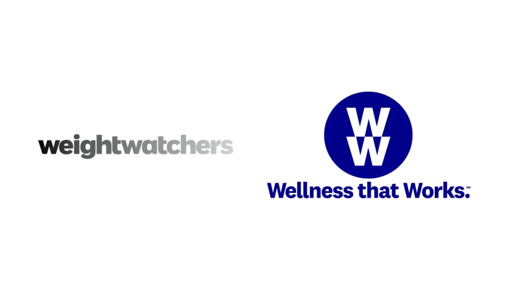
The Old Look: On-the-Nose Naming
- Full “Weight Watchers” name
- Blue and white colour scheme
- Screamed, “We're all about weight loss!”
The New Look: Wellness Whispers
- Abbreviated to “WW”
- Tagline: “Wellness that Works”
- Whispers, “We're about health… and maybe weight loss if you squint.”
Why It's Still TBD
The jury's still out on this one. While the rebrand aims to position WW as a wellness company rather than just a diet program, some argue it's created confusion among their core audience.
🔑 Key Takeaway: Ensure your rebrand doesn't alienate your core customers. Evolution is good, but revolution can be risky.
Wrapping Up: The Art of the Rebrand
Rebranding is like walking a tightrope while juggling chainsaws. It's risky, it's exciting, and if done right, it can be transformative.
Here's the thing: your brand is more than just a logo or a colour scheme. It's the personality of your business, the promise you make to your customers and how you make people feel.
When I rebranded Inkbot Design, I didn't just slap on a new coat of paint. I dug deep into what we stood for, what our clients needed, and where we wanted to go as a company.
And you know what? It was terrifying. But it was also exhilarating.
So, if you're standing on the precipice of a rebrand, take a deep breath. Remember these lessons:
- Stay true to your core values
- Evolve with purpose
- Don't overcomplicate things
- Consider practical applications
- Don't alienate your existing customers
And most importantly, don't be afraid to take that leap. Your brand is a living, breathing thing. Let it grow. Let it change. Let it surprise you.
Ready to embark on your rebranding journey? Need a steady hand to guide you through the process? That's where we come in. At Inkbot Design, we've helped countless businesses reinvent themselves without losing their soul.
Drop us a line. Let's create something amazing together.
Because your brand is your story, make it a page-turner.
FAQs on Companies that Rebranded
How often should a company rebrand?
There's no one-size-fits-all answer, but generally, consider a rebrand every 7-10 years or when your business undergoes significant changes.
Is rebranding just about changing the logo?
No! A proper rebrand often involves reassessing your company's mission, values, and positioning in the market.
How much does a professional rebrand cost?
Costs vary widely, from a few thousand pounds for small businesses to millions for global corporations.
Can a rebrand hurt my business?
If not executed properly, yes. That's why working with experienced professionals and thoroughly researching your market and audience is crucial.
How long does a rebranding process typically take?
For small to medium businesses, expect 3-6 months. Larger corporations might take a year or more.
Should I involve my customers in the rebranding process?
Absolutely! Customer feedback can provide valuable insights and help ensure your new brand resonates with your audience.
What's the difference between a brand refresh and a complete rebrand?
A brand refresh typically involves updating visual elements, while a complete rebrand can include changes to your company's core identity and positioning.
How do I know if my company needs a rebrand?
Signs include outdated visuals, shifts in your target market, new product offerings, or if your current brand no longer reflects your company's values or mission.
What should I do if my rebrand receives negative feedback?
Listen to the feedback, understand the concerns, and be prepared to make adjustments. Sometimes, it takes time for a new brand to grow on people.
Can a small business handle a rebrand in-house?
While possible, working with professionals who can provide objective insights and expertise in brand strategy and design is often beneficial.
How do I maintain brand consistency after a rebrand?
Develop comprehensive brand guidelines and ensure all team members are trained to use them consistently across all touchpoints.
What's the biggest mistake companies make when rebranding?
Forgetting their core audience. A successful rebrand should resonate with existing customers while attracting new ones.
