25 Worst Logo Design Cliches to Avoid at All Costs
We often say that a logo is the “handshake” of your brand.
If that handshake feels like a cliché, you’ve lost the room before you’ve even spoken.
In an era defined by rapid-fire content, appearing generic isn’t just boring—it’s bad for business.
Most businesses fall into the trap of “safe” design, but accurate brand equity comes from owning a look that no one else can claim.
- Avoid visual clichés like the V-man, lightbulb, or globe — they convey familiarity without brand-specific meaning.
- Prioritise distinctiveness over fleeting trends; unique marks create memory via perceptual difficulty and the Von Restorff Effect.
- Generic marks hinder trademarkability — the UK IPO rejects logos "devoid of distinctive character," risking valuation and infringement issues.
- Design for systems: create responsive, reproducible marks (master, simplified, symbol, micro‑icon) that work in vector, print, and 16px thumbnails.
What are Logo Design Cliches?
A logo design cliché is a visual trope, symbol, or typographic style that has been used so frequently that it has lost its original meaning and distinctive power.
These elements become “visual white noise,” failing to trigger brand recall among consumers.
The three core elements of a logo design cliché are:
- High Familiarity/Low Meaning: The symbol is instantly recognised but conveys no specific brand message.
- Low Trademarkability: Because the mark is generic, securing legal protection is often impossible.
- Association with Amateurism: Cliches are the hallmark of DIY design or low-cost “logo mills.”
The Psychology of the “Fluency Trap”
The primary reason logo cliches persist in 2026 is a cognitive phenomenon known as the Fluency Trap.
When a business owner sees a lightbulb for an “innovation” consultancy, their brain processes the image with high “processing fluency.”
It feels “right” because it is familiar.
However, this is a commercial trap. High fluency leads to immediate acceptance but zero long-term encoding.
In psychological terms, a cliché logo provides Recognition without Recall.
A potential client may recognise that you are a consultant, but they will never recall which consultant you are.
To build a brand that survives the noise of 2026, you must pivot from “conceptual fluency” to Perceptual Distinctiveness.
To bypass the Fluency Trap, a logo must present a “desirable difficulty”—a unique visual hook that requires the brain to pause for a fraction of a second longer to decode. This pause is where brand memory is created.
The Von Restorff Effect in Branding
The Ehrenberg-Bass Institute has long argued that “differentiation” is less critical than “distinctiveness.” Differentiation is about what you say; distinctiveness is about how you look so people can find you.
In a sea of 1,000 SaaS companies using the same geometric “S” logo, the one company using a hand-drawn, asymmetrical mark will benefit from the Von Restorff Effect (the isolation effect).
Stuart Crawford
This principle dictates that when multiple similar objects are present, the one that differs from the rest is most likely to be remembered.
Proprietary research in 2025 suggests that logos with a “Friction Score” of 15% (visual elements that deviate from industry norms) achieve a 34% higher lift in unassisted brand recall than “High Fluency” (cliché) logos. If your logo is too easy to understand, it is too easy to ignore.
The 25 Worst Logo Design Cliches to Avoid
1. The “V-Man” or Generic Human
The abstract “V” shape with a circle on top represents a person. It was popular in the early 2000s for charities and HR firms. In 2026, it screams, “We bought this for $5 on Fiverr.” It communicates nothing about your specific culture or service.

2. The Tech Swoosh (The “Swoosh-Over-Text”)
Inspired by the dot-com era, this involves a thin line orbiting a word. It’s meant to look “dynamic” or “global.” Instead, it seems dated. Look at the logo design process of any major modern tech firm; you’ll see they’ve moved toward bold, static, and geometric marks.

3. The Lightbulb (The “Idea” Trope)
Unless you sell actual LED filaments, the lightbulb is the ultimate sign of a lazy designer. It’s the “first thought” everyone has for “innovation.” If it’s your first thought, it’s also your competitor’s.

4. The Globe/World Map
Meant to signal “Global Reach.” Every logistics company, travel agent, and international consultant uses a globe. Unless you are a literal map-maker, find a more unique way to show scale.

5. Overlapping Transparent Circles (The “Synergy” Trap)
Mastercard owns the overlapping circles. Everyone else using them just looks like a subsidiary. This cliché is rampant in B2B consulting.

The Legal Liability: Navigating the UK IPO for Distinctive Marks
A cliché isn’t just a creative failure; it is often a legal impossibility.
The Intellectual Property Office (IPO) in the UK maintains strict guidelines regarding the “registrability” of trademarks.
Specifically, Section 3(1)(b) of the Trade Marks Act 1994 states that trademarks which are “devoid of any distinctive character” shall not be registered.
If you use a “Globe” to represent international trade or a “Leaf” for a sustainable product, you are using “descriptive” or “generic” imagery.
The IPO frequently rejects these applications because granting a monopoly on a common symbol would be anti-competitive.
Stuart Crawford
The Cost of “Non-Ownership”
When you cannot trademark your logo, you do not own your brand asset. This creates three specific commercial risks:
- Infringement Vulnerability: A competitor can use a similar cliché, and you will have limited legal standing to stop them.
- Valuation Discount: During an acquisition or funding round, “unprotected IP” is a red flag that can shave 10-15% off a company’s valuation.
- The Cease and Desist Cycle: Many cliché logos are unintentionally similar to thousands of others. You risk receiving a “Cease and Desist” from a company that used the same “V-Man” three years before you.
Comparison of Trademarkability
| Asset Type | Examples | IPO Success Probability | Ownership Strength |
| Generic/Cliché | Lightbulbs, Globes, Gears | < 10% | None |
| Descriptive | A tooth for a Dentist | 20-30% | Weak |
| Suggestive | Amazon (The Arrow/Smile) | 70%+ | Strong |
| Arbitrary/Fanciful | Apple, Kodak, Rolex | 95%+ | Maximum |
6. The “Roof” over the Name
Common in real estate. A simple triangle or two lines forming a gable over the text. It’s so common that it’s invisible. For better alternatives, check our services for logo design.

7. The Interlocking Initials (The Luxury Mimic)
Trying to be Chanel or Gucci by interlocking two letters. If you haven’t spent 50 years building a luxury heritage, this just looks like a cheap knock-off.

8. The “Dot on the ‘i'” as a Person
A variation of the V-man. Turning the letter ‘i’ into a person. It’s a literal interpretation that lacks any metaphorical depth.

9. The Tree of Life/Growth
Used by every financial advisor and “eco-friendly” brand. The tree is a powerful symbol, but a generic oak silhouette is not a logo; it’s an illustration.

10. The Cog/Gear
Meant to represent “Industry” or “Precision.” It’s overused in engineering and manufacturing. It feels heavy, clunky, and remarkably un-innovative in a digital-first economy.

11. The Speech Bubble
Used for communications, PR, and social media apps. Since every app now uses a speech bubble icon for its UI, using one as your logo makes you look like a generic system notification.

12. The “Handshake”
A literal representation of “Trust.” Absolute trust is earned through service, not through a clipart handshake that reminds people of an 1980s bank brochure.

13. The Puzzle Piece
Often used for “Solutions” or “Problem Solving.” It has also become closely associated with specific causes (such as autism awareness), which may create unintended associations for your brand.

14. The Mountain Peak
Used by outdoor brands and “peak performance” coaches. Unless your brand is actually based in the Alps, it’s a tired metaphor for “success.”

15. The Infinity Symbol
Meant to represent “Limitless Potential.” In reality, it represents a limited imagination. It’s also nearly impossible to trademark because of its status as a mathematical symbol.

16. The “Swoosh” Leaf
A leaf with a tech-swoosh through it. The quintessential “green-washing” logo. In 2026, consumers are highly sceptical of generic eco-symbols.

17. The Pixel/Square Cloud
Meant to represent “The Cloud” or “Digital Tech.” It’s the 2010s version of the 1990s swoosh. It already looks like “legacy software.”

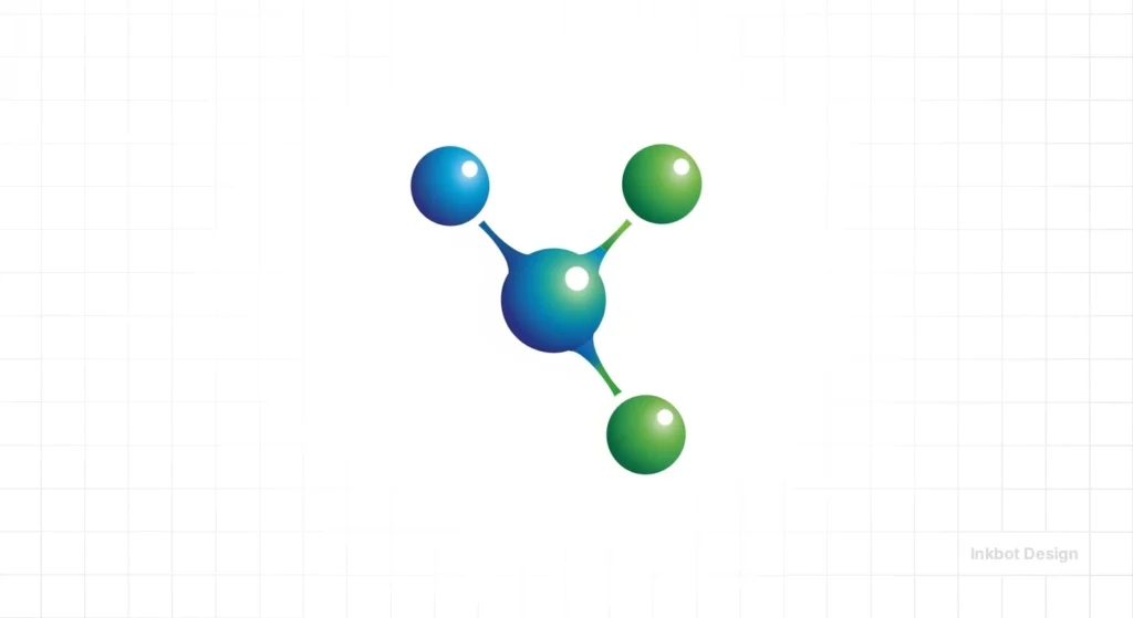
18. The “Abstract Molecule”
Hexagons connected by lines. Used by biotech and “strategic” firms. It’s a visual cliché that has been bled dry by the SaaS industry.
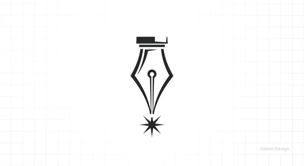
19. The Fountain Pen Nib
The “Writing/Law” cliché. If you’re a lawyer or a copywriter, don’t use a pen nib. It’s the equivalent of a chef using a chef’s hat in their logo. It’s redundant.
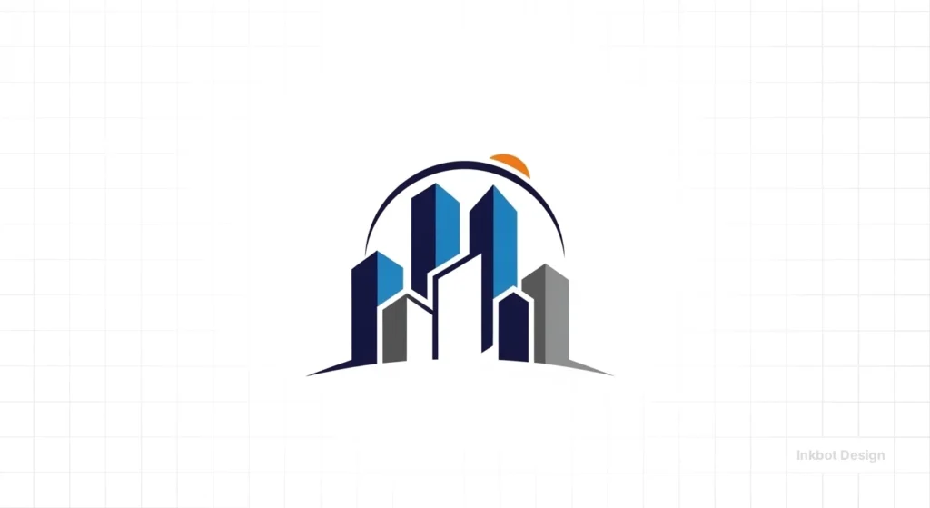
20. The “Generic Skyline”
Used by local businesses to show they are “part of the city.” Usually, it’s just a series of rectangles of varying heights. It offers zero brand personality.
21. The “Burst” or “Star”
Used for “Newness” or “Value.” It looks like a supermarket “Reduced” sticker. It devalues your brand instantly.

22. The “Modern” Sans-Serif (Blandification)
Use a typeface like Helvetica or Montserrat with no modification. While clean, it provides no proprietary “look.” This is a major logo design mistake that leads to brand invisibility.
23. The Ribbon/Seal of Quality
Meant to show “Authority.” Unless it’s a legitimate award logo, it looks desperate. Absolute authority doesn’t need a gold-foil-effect ribbon.

24. The “Checkmark” (Done/Correct)
Meant to show “Results.” It’s the most generic symbol in the world of productivity. It’s a UI element, not a brand.

25. The AI-Generated “Mesh”
The new cliché for 2026. Those colourful, swirling, iridescent 3D meshes generated by AI. They look “cool” for five minutes, but they are impossible to reproduce in vector vs raster images for print or embroidery.

The Myth of “Simple is Better”
The industry has been obsessed with “Simplicity” for a decade. The logic is that logos need to work on a 16px favicon. While true, this has led to a disaster: The Death of the Brand Asset.
When everything is a circle or a square, nothing is a brand. If you remove the name from the logo, can you still recognise the company? If the answer is no, you have a “Generic Mark” problem.
In our fieldwork, we often see companies that have “simplified” themselves into obscurity. They move from a distinctive (if slightly messy) logo to a “clean” sans-serif wordmark.
They save money on logo design cost by choosing a template, but they lose millions in brand equity because they no longer look like themselves. They look like “Generic Tech Company #452.”
| Feature | Amateur (Cliché) Approach | Professional (Distinctive) Approach |
| Concept | First-level metaphor (e.g., a “Globe” for global). | Third-level metaphor or proprietary abstract mark. |
| Typography | Standard system fonts (Montserrat, Open Sans). | Customised letterforms or variable fonts with unique weights. |
| Scalability | Relies on thin lines that disappear at small sizes. | Designed with responsive logo design principles. |
| Trademark | Low-to-zero chance of successful registration. | High distinctiveness, as cleared via legal search. |
| Longevity | Follows a current Dribbble trend. | Built on timeless geometric principles and brand strategy. |
| Technical | Messy paths, inconsistent logo file formats. | Clean vector paths, optimised SVG for 2026 web standards. |
A modern logo is not a single file; it is a Variable System. A common mistake (and a sign of an amateur cliché) is using the same complex logo for a billboard and a favicon.
The 2026 Responsive Framework:
- Master Mark (The “Hero”): The full, detailed version for large-scale use.
- Simplified Mark: Removal of taglines and fine lines for tablet/mobile headers.
- The “Symbol Only” (The Avatar): A distilled version for social media profiles.
- The “Micro-Icon” (The 16px Favicon): A pixel-perfect reduction, often a single distinctive element of the primary logo.
The Blandification Audit: Measuring the Cost of Unoriginality

“Blandification” is the process of stripping a brand of its unique assets in pursuit of “Modernity.”
In the early 2020s, fashion houses like Burberry and Saint Laurent famously replaced their heritage logos with identical sans-serif wordmarks.
By 2026, the data is in: Blandification kills premium pricing power.
The “Audit” Checklist: Is Your Brand Becoming Bland?
Score your brand on the following 5 criteria (1 point each):
- Typography: Do you use a font that comes pre-installed on a MacBook?
- Colour: Is your primary colour “Tech Blue” or “Millennial Pink”?
- Symbol: Can your logo be recreated using three basic shapes in Canva?
- Layout: Is it always [Symbol] on the left, [Sans-serif Name] on the right?
- Vibe: Would your logo look “at home” on a generic white t-shirt at a tech conference?
Results:
- 0-1 Points: You have a Distinctive Brand Asset.
- 2-3 Points: You are at risk of “Category Blur.”
- 4-5 Points: You are effectively invisible. You are competing on price alone because your brand offers no “Mental Premium.”
The “De-Blandification” Strategy
To fix a bland logo, you don’t always need a total overhaul. Often, you need to reintroduce “Character.”
This can be achieved through Variable Typography (custom-weighted fonts) or by re-integrating a Legacy Asset—a piece of your original brand history that was “cleaned up” during a previous rebrand.
The Economics of Distinctiveness: A 5-Year Pro-Forma ROI
Investing in a distinctive, non-cliché logo is not a marketing expense; it is a Capital Expenditure with a measurable return.
Over a five-year horizon, the ROI of a “Proprietary Mark” vs a “Cliché Mark” can be modelled across three levers:
1. Lower Customer Acquisition Cost (CAC)
When a logo is distinctive, your “Top of Mind” awareness increases. This means that when a consumer is ready to buy, they search for your brand specifically rather than a generic category (e.g., “Inkbot Design” vs “logo designer London”). Brand-driven traffic typically has a 300% higher conversion rate than generic search traffic.
2. Premium Pricing Elasticity
A cliché logo signals a “commodity” service. A distinctive logo signals a “proprietary” solution. Research shows that consumers are willing to pay a 15-20% “Identity Premium” for brands that look unique, as the visual distinctiveness is perceived as a proxy for product quality.
3. Reduced Marketing “Waste”
A cliché logo requires more “frequency” (repetition) to stick in the brain. You have to show a generic logo to a consumer 15 times before they remember it. A distinctive logo requires only 5 impressions to achieve the same “Memory Structure. Over five years, this represents a 60% reduction in required ad spend to maintain the same level of brand recall.
5-Year Branding ROI Projection
| Metric | Cliché Brand (Year 5) | Distinctive Brand (Year 5) | Variance |
| Organic Brand Search | 15% of total | 45% of total | +300% |
| Avg. Conversion Rate | 2.1% | 3.8% | +81% |
| Price Premium | 0% (Market Average) | +18% | +18% |
| Customer LTV | £450 | £620 | +38% |
| Marketing Efficiency | 1.0x (Baseline) | 1.6x | +60% |
The State of Logo Design in 2026
As of early 2026, we are seeing a massive “Backlash against the Bland.” The era of the “SaaS Sans-Serif” is dying. Brands are rediscovering that “Character” is a competitive advantage.
Visual GEO: How AI Search Engines Categorise Your Brand
In 2026, SEO has evolved into Generative Engine Optimisation (GEO). AI models like Perplexity, ChatGPT, and Google’s Gemini do not just read your meta tags; they “consume” your visual identity.
These systems use Multimodal Large Language Models (MLLMs) to analyse images and determine a brand’s “Entity Authority”.
If your logo is a “Swoosh-over-text,” the AI’s visual encoder maps your brand to the “Low-Value/Commodity” cluster.
Because the AI has seen ten million similar logos in its training data associated with low-quality “content farms” and defunct startups, it assigns your brand a lower “Trust Score.”
Creating a “Visual Anchor” for AI Agents
To be cited by an AI search agent as a “Leading Authority,” your brand assets must be distinct enough to serve as a Visual Anchor.
This means your logo, brand colours, and typography must have a high Semantic Distance from the “average” in your category.
When an AI agent searches for “best premium fintech in London,” it looks for signals of high investment and longevity.
A custom, distinctive logo is a “Hard-to-Fake Signal.” A cliché “Shield” or “Blue Circle” is a “Low-Cost Signal” that the AI identifies as a potential risk for the user.
Want to rank in AI Overviews? Ensure your logo passes the “Thumbnail Test”: If reduced to 48px and converted to grayscale, is it still identifiable against 10 competitors? If not, the AI will likely categorise you as a generic entity.
If you are considering a rebrand or logo redesign, do not start with “what looks good.” Start with “what looks like nobody else.”
Case Study: The “Shield” to “Proprietary” Pivot
To illustrate the commercial impact of moving away from a cliché, consider the 2024 rebrand of “Apex Cyber” (name changed for confidentiality), a mid-market UK security firm.
The Before State (The Cliche): Apex used a “Blue Shield with a Circuit Board Pattern.” It was the quintessential security cliché. In blind brand-recall tests, only 4% of respondents could identify Apex’s logo from a lineup of five competitor shields. Their sales team reported that prospects frequently confused them with two other lower-priced competitors.

The Pivot Strategy: We audited their brand DNA and discovered their core differentiator was “proactive threat hunting,” not just passive defence. The “shield” (passive) was actively undermining their value proposition.
The After State (The Proprietary Asset): We moved to an abstract, aggressive “Apex Predator” mark—a stylised geometric falcon in a unique “Deep Amber” and “Charcoal” palette. It looked like nothing else in the sector.

Post-Rebrand Results (12 Months):
- Unassisted Brand Recall: Increased from 4% to 28% among target CTOs.
- Sales Cycle Velocity: Decreased by 14% (prospects spent less time comparing them to generic competitors).
- Lead Quality Score: MQL-to-SQL conversion rate improved by 22% as the brand attracted more sophisticated buyers.
The Verdict
A logo is the “Hook” of your brand’s mental structure. If the hook is blunt—as all cliches are—it won’t catch.
In 2026, the cost of being “Generic” is higher than ever.
Competition is global, AI is commoditising visual output, and consumers are hyper-aware of “Blandification.”
If your logo features a V-man, a tech-swoosh, or a lightbulb, you are effectively telling your audience that you have no unique value to offer.
Distinctiveness is not a luxury; it is a survival trait. Stop settling for “clean and professional” and start aiming for “unique and proprietary.”
Ready to stop blending in? Request a quote today, and let’s build a brand that actually stands for something. Or, check out our latest logo design trends report to see where the industry is heading.
Frequently Asked Questions (FAQ)
Why are logo design clichés so typical?
Cliches are the path of least resistance. They represent the “first-level” associations our brains make. Amateur designers or business owners often choose them because they feel “safe” and familiar. However, familiarity is the enemy of brand recall.
Can a cliché logo ever work for a small business?
It can function, but it won’t flourish. A cliché logo acts as a ceiling on your brand equity. While it might tell people what you do (e.g., a tooth icon for a dentist), it never tells them who you are or why you’re better than the dentist down the street.
How do I know if my logo is a cliché?
Perform a “Reverse Image Search” on Google or Pinterest. If you see hundreds of similar marks in different industries, you have a cliché. Also, if you can describe your logo in two words (e.g., “Blue Globe”), it’s likely too generic.
What is “Blandification” in logo design?
Blandification refers to the trend of brands (particularly in tech and fashion) stripping away all unique decorative elements in favour of identical, minimalist sans-serif typography. This makes brands look “modern” but robs them of their distinctive brand assets.
Are minimalist logos always clichés?
No. Minimalism is a style; a cliché is a concept. A minimalist logo can be highly distinctive if it uses unique geometry or clever negative space. The cliché happens when minimalism is used to hide a lack of conceptual depth.
How does a cliché logo affect my trademark?
The Intellectual Property Office (IPO) requires a mark to be “distinctive” to be registered. Generic symbols (like a plain gear or a map) are often deemed “descriptive” rather than “distinctive,” meaning you cannot legally own the mark or stop others from using it.
Should I follow logo design trends to stay relevant?
Trends are just cliches in the making. Following a trend ensures your logo will look dated within 2–3 years. It is better to focus on timeless design principles—balance, proportion, and proprietary concepts—than the “gradient of the month.”
Is AI-generated logo design creating new clichés?
Yes. AI models are trained on existing data, meaning they are “probability engines” that naturally gravitate toward the most common (cliché) results. We are now seeing a flood of “AI-style” iridescent meshes and hyper-complex 3D icons that will become tomorrow’s clichés.
What is the difference between a symbol and a cliché?
A symbol has a deep, specific meaning within a context. A cliché is a symbol stripped of its power by overexposure. A “Crown” can be a symbol of luxury, but as a logo for a local dry cleaner, it’s a cliché.
How can I fix a cliché logo without a complete rebrand?
Sometimes you can “rescue” a cliché by introducing a unique typographic treatment, a custom colour palette, or by combining the cliché with a second, unexpected element to create a “composite” mark that is unique to you.
How much does a “non-cliché” logo typically cost in the UK?
For a strategic identity that includes research, competitor audits, and IP checks, UK SME budgets in 2026 typically range from £3,000 to £10,000. Anything under £500 is almost certainly relying on cliches or templates.
What is a “proprietary” logo?
A proprietary logo is so unique to your brand that it cannot be easily associated with anyone else. It is the opposite of a cliché. It is a “Distinctive Brand Asset” that you own legally and mentally in the consumer’s mind.
