Top 10 Brewery Logos: Artistic Craftsmanship and Brewtiful Designs
Welcome to the fascinating world of brewery logos, where artistry and design combine to create iconic emblems representing almost 10,000 breweries across the United States. As the beer industry has exploded recently, breweries have increasingly focused on crafting eye-catching logos that encapsulate their brand identities. 93% of craft brewery owners say their logo is “crucial” to their overall branding and marketing efforts.
In this article, we'll explore 10 of the most creative and memorable brewery logos, analysing the symbolic elements, colour schemes, typography and more that make them stand out. From established players like Guinness and Samuel Adams to upstart local breweries putting their unique stamp on the industry, these logos showcase the incredible diversity and innovation happening in modern beer branding.
So grab a perfectly poured pint, settle in, and embark on a tour through some of the best and boldest brewery logo designs! We'll look at how these logos evoke fundamental brand values, create visual intrigue, and ultimately leave a lasting impression on beer lovers nationwide. Cheers to great beer and even better branding!
The Brewery Logo Evolution: A Visual Journey
Brewery logos have undergone an intriguing evolution over time, adapting to reflect changing design trends and appeal to evolving consumer preferences. In the early days of commercial brewing, logos tended to be straightforward – often just the brewery's name rendered in basic typography without much creative embellishment. This direct approach made sense in a relatively small and localised beer industry.
However, as beer production scaled up and national distribution increased competition in the late 1800s, breweries recognised the growing importance of branding and visual identity. Logos became more artistic, incorporating elaborate fonts, illustrations, and symbolic images to capture consumer interest. Many iconic breweries still popular today trace their logos back to this creative renaissance in brewery advertising.
By the 1950s, a new minimalist aesthetic emerged as the favoured logo style for modern brands. Major breweries opted for sleek, pared-down designs built around an abstract icon or signature initials. This allowed brands to retain some personality and heritage while presenting a contemporary, commercial sensibility. Some notable logos that arose during the mid-century brewing boom, like the eagle icon for Anheuser-Busch, still maintain their strong brand recognition today.
Craft brewing's surge in popularity from the 1980s onward brought a renewed focus on branding and logo design in the beer world. Smaller breweries sought logos that felt nostalgic, familiar, and conveyed a sense of craftsmanship. Many featured throwback typography, hand-drawn illustrations of brewing ingredients or equipment, local landmarks, or quirky anthropomorphic characters. By distinguishing themselves from corporate megabrands, these logos fueled craft beer's rise as an anti-establishment alternative for beer drinkers seeking more flavorful options with personality.
According to recent market research, visual branding plays a significant role in consumer choice today. In surveys, 66% of beer drinkers say they are likelier to purchase a beer from a brewery with an attractive, memorable brand. As customer demographics and tastes shift, brewery logo design will evolve. The rich heritage and expanding diversity of beer branding sets the stage for innovative new logos that capture the imagination of 21st-century drinkers.
Fundamental Elements of Brewery Logos
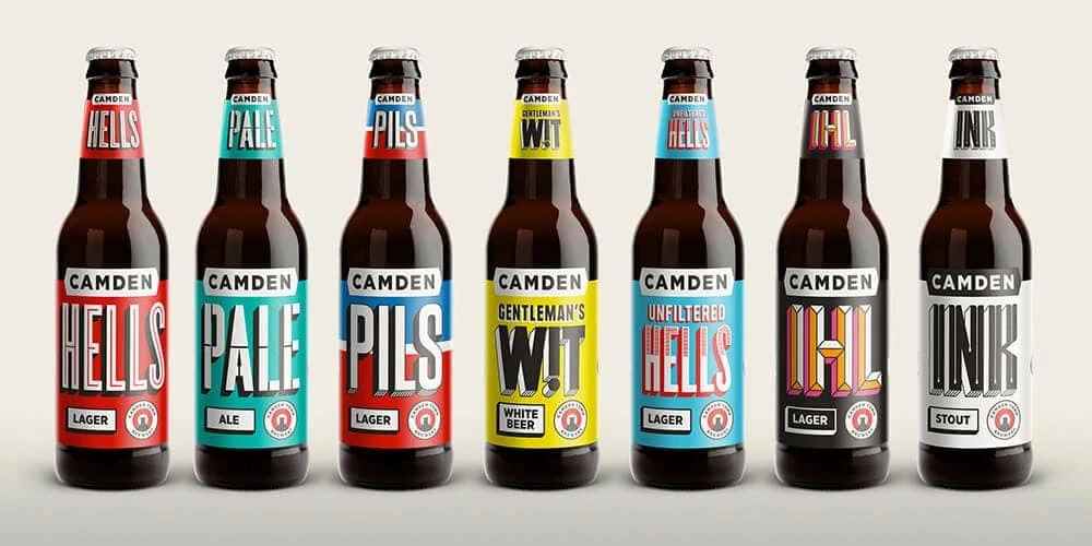
Behind every excellent brewery logo lies a thoughtfully crafted design that communicates the brand's essence. Let's explore the key elements that make these logos so captivating:
Colours that Quench the Thirst
The choice of colours in brewery logos is an important strategic decision that helps convey the desired emotions and brand image. Craft breweries, in particular, put a lot of thought into selecting logo colours that align with their values, style, and personality.
Rich earthy tones like deep greens, browns, and burnt oranges often evoke a sense of tradition, authenticity, and connection to nature. These natural colours reflect the care and craftsmanship of artisan brewing, hearkening back to beermaking's old-world roots. For example, the renowned Sierra Nevada Brewing Company uses hunter green and black in their logo, representing their commitment to environmental sustainability and the great outdoors.
On the other end of the spectrum, vibrant, energetic colours like red, yellow, and neon shades add a modern, fun vibe to a brewery's brand image. Poppy reds and bright citrus colours reflect new takes on classic styles, big, bold flavours, and excitement about experimenting with beer. Many trendy new craft breweries employ these lively hues to position themselves as innovative and refreshing.
In between these extremes, rich blues and deep purples balance tradition and modernity. These regal colours convey craftsmanship and sophistication for discerning beer drinkers. Belgian breweries like Chimay are known for their deep blue labels, evoking a monastery-brewed complexity.
No matter where they fall on the colour spectrum, thoughtful brewery logo designs use colour strategically to reflect the beer and ethos they want to project. So next time you crack open a cold one, take a moment to appreciate how the art of colour on its label brings the beer to life!
Fun Fact: Red is among the most popular colours in brewery logo design. It conveys passion, boldness, and vibrant energy – perfect for capturing the enthusiasm around craft beer. The colour red is also symbolic of the rich, amber hue of many brews like IPAs, amber ales, and Irish reds.
Typography that Pours Character
Typography is critical in brewery logo design, just as it does for any company or brand. The fonts and lettering styles selected for a brewery's logo convey distinct messages and set specific tones about the beer being offered. Bold, chunky fonts with thick lines and weight give ruggedness, strength and dependability – essential attributes for a quality craft brew. They speak to the robustness and alcohol content of the beer while reflecting the brewery's confidence in their recipes. Consider the bold, vintage-inspired fonts in Brooklyn Brewery's logo or the thick, sans-serif letters of Rogue Ales.
On the other end of the spectrum, scripts and more elegant serif fonts evoke notes of sophistication, prestige and tradition for a brewery. Flowing, fine lines in a logo impart a sense of refinement and upscale appeal, perfect for a brewery looking to be seen as premium, discerning or exclusive. Belgian brewer Duvel and its flowing, calligraphic logo script exude class and pedigree. The same goes for Heineken's elaborate signature logo font, which connotes imported prestige. Even the ornate script of Samuel Adams' logo speaks to the history and meticulous craft.
Some breweries also utilise classic, familiar fonts that customers easily recognise. Guinness draught's traditional Gaelic font has graced its logo for generations, making it synonymous with timelessness and heritage. Similarly, the German blackletter font in Beck's logo signals its German roots and age-old brewing practices. Whether bold or elegant, funky or familiar, a brewery's logo font plays a leading role in consumer perceptions of beer brands and brewers.
Mascots and Symbols on Tap
Brewery logos often incorporate creative symbols and mascots that capture the essence of the brand's identity and values. These visual elements serve as memorable icons that connect with customers emotionally, going beyond just representing the company's name.
One great example is the Flying Dog Brewery based in Frederick, Maryland. Their logo features a wildly exaggerated and artistic rendering of a dog in mid-flight, with wings stretched out and tongue hanging loose. This striking canine perfectly encapsulates the brewery's bold, free-spirited vibe. The unconventional style of the logo matches the adventurous nature of Flying Dog's beer recipes, which frequently feature experimental ingredients and flavours.
In a similar spirit, the Magic Hat Brewing Company in Vermont uses a colourful top hat as its central icon. The theme draws inspiration from the company's roots as a circusy, fun-loving craft brewery. The top hat evokes a sense of quirkiness and playfulness, much like the whimsical names of Magic Hat's beers, such as Circus Boy and Dream Machine.
Other breweries choose to incorporate local wildlife into their logos as a way to connect with their regional communities. Moosehead Breweries in Canada features the iconic antlered moose, an animal synonymous with the country's wilderness. Tampa Bay's Cigar City Brewing nods to Florida's culture with a logo depicting a cigar-smoking alligator. These types of symbols tap into local pride and a sense of place.
No matter what image or mascot a brewery chooses, the goal is to find a memorable symbol that encapsulates the company's ethos. The logo is a distinctive stamp that builds brand recognition and delights beer drinkers. Finding the perfect symbolic representation is vital to crafting a compelling visual identity.
Top 10 Brewery Logos: A Visual Feast
Now that we've explored the elements that contribute to a compelling brewery logo, let's dive into the top 10 brewery logos that have captured the hearts of beer enthusiasts worldwide. Each logo boasts a unique story and design, making them stand out in a crowded market.
1 – Guinness – The Iconic Harp
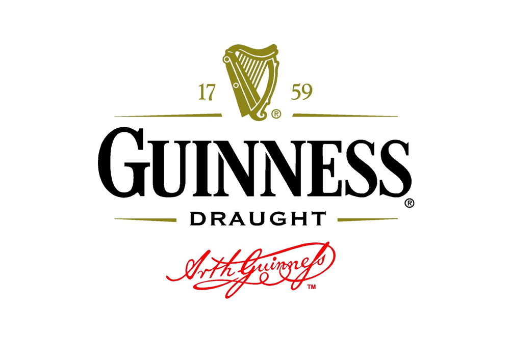
The iconic Guinness logo featuring a detailed harp is one of the world's most instantly recognisable brewery symbols. The elegant gold harp on a black background pays tribute to Guinness' origins in Ireland. The harp has been a national symbol of Ireland for centuries, used on coins and coat of arms to represent the country. Guinness' use of the harp connects the brand to Ireland's rich culture and heritage.
The logo's intricate harp illustration first appeared in 1862, created by the artist Michael Columb. Over the years, the harp design has been updated and perfected, but it retains its ornate style. The current version was developed in 1955 by graphic designer John Gilroy, who aimed to make the harp look three-dimensional and lifelike. Gilroy's harp conveys a sense of forward movement, with the strings mid-strum, bringing a dynamic energy to the logo.
The gold and black colour scheme chosen for the logo exudes sophistication and elegance. The bold black background allows the brilliant golden harp to stand out. The colour combination also provides continuity with Guinness' famously dark, opaque beer. This touch connects the visual identity with the product itself.
The Guinness harp is deeply woven into the brand's history. As one of the oldest trademarks in the world, the logo has gained recognition and meaning over its 150+ years of use. While the design has evolved, the harp symbolises quality, heritage and Irish tradition for Guinness. Its graceful form imparts a timeless, classic feel that persists amid changing trends. For Guinness drinkers globally, the sight of the brilliant golden harp is a distinctive sign of the treasured black beer to come.
2 – Goose Island Beer Co. – Avian Elegance
Goose Island Beer Company, founded in Chicago in 1988, has become one of America's most respected craft breweries. Their logo, featuring an illustrated goose in flight, perfectly encapsulates the spirit of sophistication and refinement that Goose Island aims to embody.
The illustration style gives the goose an artistic, hand-drawn look that comes across as elegant and graceful rather than cartoonish. The goose symbolises the brewery's Chicago origins, as geese migrate along the city's iconic Lake Michigan each year.
Muted earthy tones of brown and tan fill the goose illustration, complementing the vintage vibe. Unlike the loud neon colours many beer companies use, these natural hues convey a sense of purity and quality. The text is understated, too, with “Goose Island” in a slim serif font placed below the goose. This simplicity focuses on the beautiful illustration encapsulating everything Goose Island wants to communicate.
Overall, Goose Island's logo channels the craftsmanship and passion that goes into their award-winning beers. The artistic goose in flight and vintage colour palette gives off an air of refined, sophisticated quality. This memorable and appealing logo visualises the premium spirit that sets Goose Island apart as an industry leader in independent craft brewing. Its elegance and grace reflect the care and skill dedicated to each batch, cementing Goose Island's well-deserved reputation at the forefront of Chicago's thriving beer scene.
3 – Samuel Adams: An Iconic Type
The Samuel Adams logo brilliantly encapsulates the heritage and craftsmanship that defines the iconic American beer brand. The logo immediately evokes a sense of tradition and premium quality, featuring bold, distinguished lettering spelt out in a flowing script font.
The commanding presence of the brand name takes centre stage, pronouncedly spelt out in a deep reddish-brown hue reminiscent of the rich malts used in Samuel Adams brews. The script almost appears handwritten, speaking to the brand's commitment to small-batch craftsmanship. It exudes an air of sophistication and refinement, perfectly befitting Samuel Adams' status as one of the original American craft beers.
Complementing the scripted branding is a rectangular banner that crosses behind, edged in a thin golden trim and bearing patriotic symbols that pay tribute to the revolutionary spirit of Samuel Adams. On the left sits a proud American eagle with its wings outstretched, clutching an American flag in its talons. This iconography ties directly to Founding Father Samuel Adams and his instrumental role galvanising the American Revolution.
On the right side of the banner sits a hop cone, representing Samuel Adams' use of only the finest American hops to flavour its beers. The hop stands as a symbol of the honest, quality ingredients sourced by the brewery. These patriotic motifs encircling the Samuel Adams name reinforce the brand's American heritage and ingenuity while underscoring its commitment to independence and authenticity.
4 – Stone Brewing – Gargoyle Guardian
The iconic Stone Brewing logo features a gritty, stone-carved gargoyle with a menacing grimace and intense stare. The mythical creature's wings are outstretched in a protective stance, representing the brewery's steadfast commitment to safeguarding the integrity of its craft beers.
The gargoyle's chiselled features and muscular physique depict the raw power and unrelenting intensity that Stone Brewing strives for in its boldly hopped beers. Its stony complexion symbolises the unyielding principles that Stone Brewing refuses to compromise on, like using only the finest ingredients and no artificial preservatives.
The logo's distressed font in a deep charcoal hue further emphasises the brand's emphasis on darker, fuller-bodied beers. The distressed lettering paired with the worn stone texture of the gargoyle gives off an aged, timeworn vibe, nodding to the traditional brewing methods used to create these beers bursting with flavour and character.
Overall, the Stone Brewing logo masterfully encapsulates the brewery's self-proclaimed reputation for being “Arrogant” in crafting iconic West Coast-style IPAs and other hop-forward beers that shun modern shortcuts. The formidable gargoyle is a fitting representation of the palate-wrecking boldness and integrity that Stone Brewing is known for across its offerings. With this impactful branding, Stone Brewing has crafted as much of an unforgettable visual identity as its critically acclaimed beers.
5 – Lagunitas Brewing Company – An Eclectic Vibe

Lagunitas Brewing Company's whimsical logo perfectly encapsulates the brewery's funky, eclectic spirit. The illustration features a relaxed, shaggy dog lounging lazily with its tongue hanging out. Rendered in sketchy, hand-drawn lines, the dog exudes a carefree attitude that aligns with Lagunitas' commitment to not taking itself too seriously.
The logo's playful typography also speaks to Lagunitas' fun-loving personality. Each letterform has its unique style, with varying heights, widths and angles that give the text a lively, animated quality. Some letters have small doodles incorporated into their forms, like the bunny ears sprouting from the ‘A' and the flower growing off the ‘T.' These small details add unexpected delight and reinforce the brewery's quirky identity.
By combining this irreverent illustration and typography, Lagunitas has created a memorable logo that perfectly encapsulates its laid-back California vibe. The logo emanates the brewery's commitment to creativity, individuality, and not following conventions. With its relaxed dog and funky lettering, Lagunitas signals that it marches to the beat of its drummer and isn't afraid to have fun along the way. The logo succinctly communicates Lagunitas' unconventional attitude in a single creative mark.
6 – Anchor Brewing Company – Nautical Nostalgia

The iconic logo of Anchor Brewing Company hearkens back to San Francisco's origins as a bustling seaport and a gateway to the Pacific. The logo recalls the harbour's sailing vessels, featuring a sturdy anchor wrapped in a ship's wheel against a backdrop of deep blue. It evokes the adventurous, seafaring spirit of the city's earliest residents.
The bold navy and gold palette speak to Anchor Brewing's proud heritage and commitment to timeless quality. While many brewers have updated their visual branding over the years, Anchor's logo has remained unchanged since its founding in 1896. The striking nautical motif pays homage to the brand's longevity and integrity. Just as an anchor holds fast even in choppy waters, Anchor has steadfastly weathered the ever-changing tides of consumer taste while staying true to its core values.
The wheel's spokes point in four directions, representing Anchor's reach to the world's far corners. The ocean-bound ships of old expanded trade and connected distant cultures, just as Anchor's internationally-inspired craft beers continue to push boundaries and bring people together through the universal language of beer. The emblem serves as a reminder of San Francisco's history as a bustling port of call, where merchants and immigrants alike passed through on journeys to new frontiers.
With its blend of heritage and progressiveness, Anchor Brewing's iconic logo aptly captures the ethos of San Francisco itself. The striking nautical visuals recall the city's maritime beginnings, even as Anchor moves boldly into the future of craft brewing. The anchor and wheel logo is a fitting symbol for a brewery – and a city – founded on big dreams and the open seas.
7 – New Belgium Brewing Company – The Bike Ride to Success
The iconic logo of New Belgium Brewing Company features a brightly-coloured bicycle, encapsulating the Colorado-based craft brewery's core values of environmental stewardship, community, and fun. The bike represents New Belgium's commitment to sustainable business practices and eco-friendly operations. As the first wind-powered national craft brewery in the United States, New Belgium has long prioritised reducing its environmental footprint through renewable energy, recycling, and conservation initiatives.
The logo's vibrant red and yellow hues evoke a playful, lively spirit, reflecting New Belgium's focus on building community and cultivating connectedness through the shared enjoyment of beer. The brewery emphasises building relationships through its engagement with non-profit partners, its employee-ownership business model, and its welcoming taprooms. From its start in 1991 in the basement of co-founder Jeff Lebesch, New Belgium has grown into one of the largest craft breweries in the U.S. Still; it has retained its dedication to environmental values and building a collaborative, inclusive beer culture.
With its rolling bicycle logo beckoning fun times and responsible drinking, New Belgium demonstrates its commitment to delivering quality craft beers that taste great and represent shared passions for community and sustainability. As the brewery enters its third decade, the iconic bicycle accurately encapsulates New Belgium's identity and mission to produce world-class beers while promoting environmental stewardship and building connected communities.
8 – Brooklyn Brewery – An Iconic Bridge
The iconic logo of the Brooklyn Brewery features a bold black and white illustration of the famous Brooklyn Bridge, representing the brewery's proud heritage and long-standing bond with its home borough of Brooklyn, New York. Using the landmark bridge in the logo speaks to Brooklyn Brewery's sense of place and neighbourhood pride.
More than just a bridge, the Brooklyn Bridge is a symbol of the immigrant spirit, architectural ingenuity, and the connective tissue linking Brooklyn to Manhattan. By featuring this iconic piece of New York architecture in its branding, Brooklyn Brewery taps into the bridge's symbolic meaning, communicating its craftsmanship, quality, and community values.
The logo's striking black-and-white palette also references the brewery's classic, old-world style. The balanced and visually appealing high-contrast scheme evokes a sense of refined taste and timelessness, much like the brewery's meticulously crafted beers. The logo's vintage vibe gives a nod to brewing tradition and expertise.
Yet, while it tips its hat to the past, the bold and graphic logo also has a contemporary sensibility suited to modern tastes. This blend of old and new is at the heart of Brooklyn Brewery's ethos. The logo expresses the brewery's commitment to keeping craft beer culture alive and growing in Brooklyn and beyond while evolving its offerings to appeal to present-day palates. Its balance of tradition and innovation makes the Brooklyn Brewery logo an exemplary brand image.
9 – Deschutes Brewery – The Pacific Wonderland
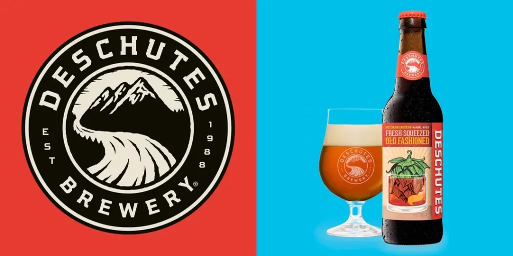
The iconic logo of Deschutes Brewery captures the spirit of outdoor adventure and connection to nature that defines the Pacific Northwest. A silhouette of majestic snow-capped mountains towers over a winding river, rendered in earthy shades of brown, tan, and white. The use of colour brings to life the region's diverse beauty, from rugged mountain peaks to meandering waterways.
Yet the logo transcends mere landscape. The river flowing from the mountains symbolises the craftsmanship and care that goes into each pour of Deschutes beer. Just as pristine snowmelt nourishes the river below, the brewmasters at Deschutes draw on the finest ingredients to produce their acclaimed ales and lagers. Flowing through the logo, the river represents how the brewery channels the essence of the Pacific Northwest into every pint.
The river also beckons adventure. Its sinuous path invites you to embark on an expedition into wild places, from remote forests to winding canyons. The mountains call you to scale their summits and take the sweeping vistas. Deschutes aims to be your companion on these journeys, capturing the free spirit of roaming off the beaten path.
So while showcasing the singular beauty of the Pacific Northwest, the Deschutes logo ultimately reflects the brewery's commitment to community, sustainability, and celebrating life's moments, both big and small. It's a window into how Deschutes draws inspiration from nature while crafting quality beers to enhance times spent outdoors. One look at the logo, and you're ready to live life to the fullest with a Deschutes beer.
10 – Heineken: The Timeless Emblem

Heineken's iconic red star logo has become one of the most recognisable symbols in the beer industry worldwide. First introduced in 1907, the Heineken logo has undergone minor changes over the decades but retains its classic and timeless design.
At the heart of the logo is the bold red star. The crimson colour represents the passion and craftsmanship of brewing Heineken beer. The five-pointed star conveys excellence, high quality, and ambition. It reflects Heineken's commitment to brewing the perfect pint using only premium ingredients. The star shape also symbolises the brand's global reach, which is available and enjoyed in over 192 countries today.
Enclosing the red star is a green border, representing Heineken's long-standing connection to sustainability and the environment. As early as the 1950s, Heineken began initiatives to reduce waste and energy consumption at its breweries. Today, Heineken aims for 100% renewable energy in production and eco-friendly cooling technologies in bars that serve its beers. The green border reinforces the brand's continuing efforts for sustainable practices.
The red star and green border make for an eye-catching and memorable logo. The bold colours pop and create high visibility on neon signs, billboards, or Heineken bottles and cans. The logo is a proud symbol of quality and responsibility, reflecting the brand's passion for brewing and commitment to global leadership in the beer industry. Over a century old, the Heineken logo represents a premium beer experience consumers enjoy worldwide.
Conclusion
The world of brewery logos is a fascinating realm where art, symbolism, and craftsmanship converge to create compelling emblems. As we have seen, each of the top 10 brewery logos explored has a unique story, capturing the spirit and essence of the breweries they represent.
For example, the iconic Guinness harp logo dates back over 250 years and evokes Ireland's national symbol and musical tradition. Its graceful curvature and bold colour scheme create an instantly recognisable brand image. Similarly, the Dogfish Head logo creatively incorporates nautical themes and canine imagery to reflect the brewery's coastal location and eccentric personality.
Other logos, like those of Brooklyn Brewery and New Belgium Brewing, use visual puns and homages to local culture to connect with consumers. The innovative Flying Dog Brewery logo combines Ralph Steadman's gonzo art style with themes of aeronautics and adventure. And the Hoegaarden logo neatly encapsulates the brewery's origins and legacy by incorporating the town's towers and historic design cues.
These brewery logos significantly shape consumer perceptions and foster an emotional connection with beer enthusiasts worldwide. As the beer industry evolves, so will the design trends and innovations in brewery logo creation. Breweries will continue to find new ways to differentiate themselves and create logos that leave a lasting impression.
The stories, symbols, and personalities that brewery logos encapsulate make them authentic artistic creations. So next time you raise a glass, take a moment to appreciate the artistry behind the logo and the story it tells about the brewery and its fantastic beer. The convergence of art, craft, and commerce in brewery logo design will be celebrated as we cheer with beers from creative brewers!


I love the brewery logos on this site! They’re so cool and creative. Each design has its very own style, and it’s awesome to see how they capture the vibe of different breweries. This is a great proposal for anyone looking to create a special logo for their brewery. Thumbs up.
Love the creativity in these brewery logos! Each sketch tells a special story about the brand. Great idea for every person searching to make their mark in the craft beer scene. Cheers!