
What is a Corporate Identity System (CIS)?: Agency Guide
Most companies build their corporate identity system entirely the wrong order — they design the assets first and write the rules afterwards. That’s not a system. That’s a style guide with delusions of grandeur.
A genuine Corporate Identity System (CIS) is an operational infrastructure decision disguised as a design brief, and the distinction costs businesses real money when they get it wrong.
A McKinsey & Company analysis of design-led companies found that they outperform industry peers by more than 2:1 in total shareholder returns over 10 years.
Prettier logos don’t explain that gap. It’s explained by companies that treat visual identity as a functional system rather than a branding exercise.
Before you commission a logo, before you pick a typeface, before you brief an agency — read this. Your brand identity is only as strong as the system that governs it.
- Corporate Identity System (CIS) is infrastructure, not a style guide; embed identity rules in tools and processes with a named governance framework.
- Build infrastructure first: tokenised colour and typographic systems, component libraries (Figma/Storybook), then living documentation.
- A logo is an entry point only; without system governance assets like Tropicana's orange can be erased, destroying recognition equity.
What Is a Corporate Identity System (CIS)?
A Corporate Identity System is the complete, codified set of visual and verbal rules, assets, and governance structures that controls how an organisation presents itself across every medium, market, and context — from business cards to billboard campaigns to digital product interfaces.
Key Components:
- The mark system — the primary logo, secondary marks, icon variants, and the rules governing their use in relation to each other
- The design language — colour, architecture, typographic hierarchy, spatial logic, and motion principles
- The governance framework — who controls identity decisions, how deviations are approved, and how the system scales under pressure (acquisitions, new markets, sub-brands)
A Corporate Identity System is the infrastructure that makes a brand reproducible without the original designer present. Without it, every touchpoint becomes an improvisation.
Why Your Logo Is Not Your Corporate Identity
A logo is a single component of a CIS. Treating it as the whole thing is the most expensive category error in branding.
Tropicana proved this in 2009 when PepsiCo authorised a packaging redesign by Arnell Group that replaced the brand’s iconic orange-and-straw visual — a distinctive asset worth decades of consumer recognition — with a generic glass of juice.
The redesign didn’t fail because the new design was ugly. It failed because the decision was made outside any coherent identity governance system.
Within two months, Tropicana had lost an estimated $30 million in sales before reverting to the original, according to reporting by AdAge. The orange and straw were a system asset, not just a picture. Nobody in the approval chain was operating from that understanding.
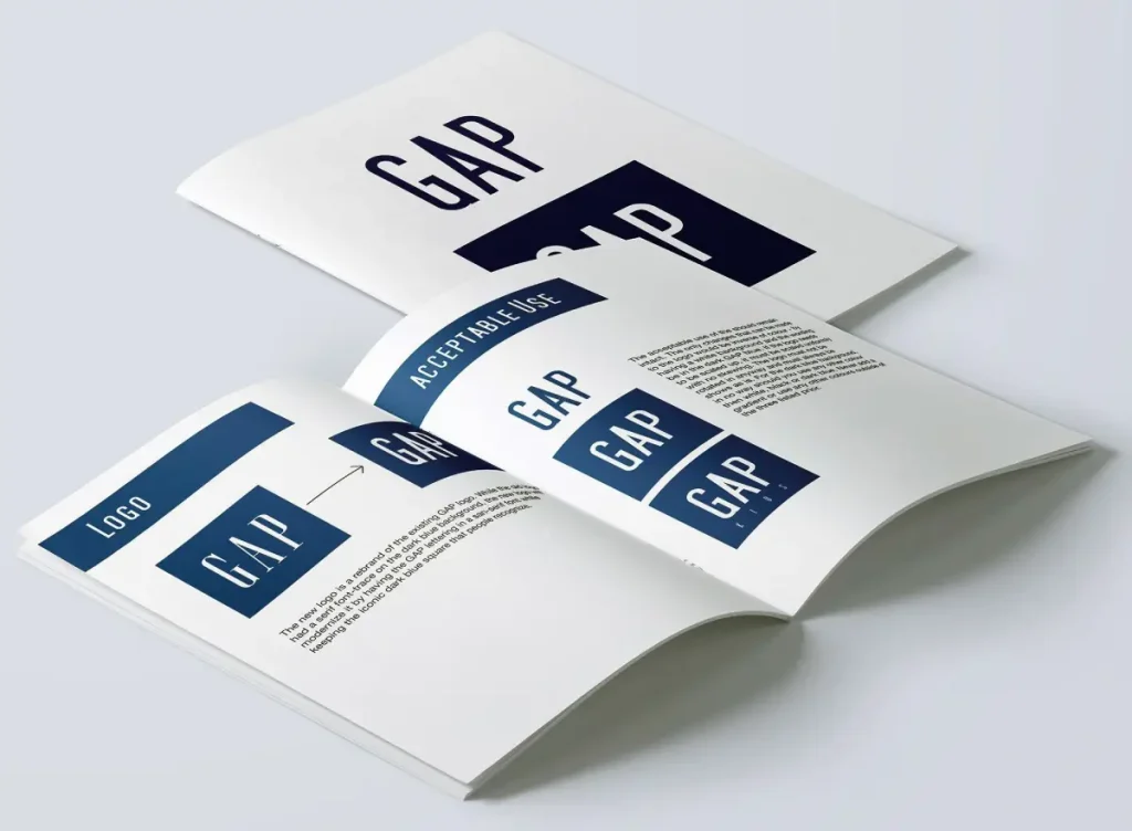
Gap made the same category error in 2010, swapping its iconic blue square logo for a generic Helvetica wordmark with a small gradient square. The decision was reversed within 6 days following coordinated public backlash.
Neither the designers nor the executives involved appeared to understand what made the original mark a system asset versus a stylistic preference.
The lesson in both cases is the same. When you treat individual identity components as design choices rather than system components, you lose the ability to make rational decisions about them.
A logo is the entry point to an identity system, not the system itself. Every visual decision a company makes — from email signature fonts to Instagram grid spacing — either reinforces that system or quietly dismantles it. The organisations that dominate their category visually are almost always the ones that resolved this distinction early and enforced it operationally, not aesthetically.
The Five Structural Layers of a Corporate Identity System
A fully functional CIS operates across five distinct layers. Most businesses only build the first two and wonder why their brand looks inconsistent three years later.
Layer 1: The Mark Architecture
The mark architecture defines not just what your logo looks like, but how it behaves. A well-constructed mark architecture includes:
- Primary lockup — the full logo configuration used at flagship scale
- Secondary lockup — a horizontal or stacked variant for constrained layouts
- Icon/symbol — the isolatable element that functions without the wordmark
- Favicon/app icon — the sub-32px optimised variant (not simply the logo at a small size)
- Clear space rules — minimum isolation zones expressed in units relative to the mark itself, not in fixed pixel values
Logos rendered at 32 pixels or fewer lose an average of 60% of their visual complexity, making multi-element marks effectively unidentifiable at favicon scale. This is why the icon variant exists — not as a shortcut, but as a purpose-built asset for a specific context.
Layer 2: The Colour Architecture
Amateur colour systems pick three or four hex codes and call it a palette. Professional colour architecture defines:
- Primary brand colours — the dominant set that carries the majority of brand presence
- Secondary/supporting palette — for hierarchy, supporting content, and visual breathing room
- Functional colours — UI states (success, warning, error, disabled) for digital applications
- Colour space specifications — Pantone references for physical print, CMYK for offset, RGB/HEX for screen, and HSL values for CSS variable systems
The Ehrenberg-Bass Institute, the consumer psychology research body at the University of South Australia, has documented that distinctive brand assets — including colour — require consistent exposure across five to seven years before achieving reliable consumer recognition. Changing your primary brand colour after two years doesn’t refresh your identity. It resets a recognition clock you’ve already been paying to run.
Layer 3: The Typographic System
Typography is the identity component most often treated as decoration and least often treated as a system. A coherent typographic system defines:
- Primary display typeface — for headlines, campaign materials, and brand-led communication
- Body/editorial typeface — for long-form content, reports, and functional communication
- UI typeface — for interface environments (often different from editorial choices for legibility reasons)
- Scale and hierarchy — defined size ratios, not arbitrary decisions made by whoever is building a particular document
- Licensing scope — desktop, web, app, and broadcast licensing requirements are explicitly covered
Failing to address licensing scope is a compliance risk, not just a design gap. A typeface licensed for desktop use cannot legally be embedded in a web font stack without a separate web licence. Many businesses discover this during legal audits, not during the design phase.
Layer 4: The Application System
This is where most identity guidelines stop — and where most brand drift begins. The application system documents how the identity components combine in real-world contexts:
- Stationery suite (business card, letterhead, email signature, envelope)
- Digital templates (presentation decks, social media formats, email newsletter headers)
- Environmental applications (signage, exhibition, vehicle livery)
- Merchandise and uniform guidelines
Each application should be documented with a live example, not just a rule. Designers and non-designers alike follow examples far more reliably than they follow specifications.
Layer 5: The Governance Framework
This is the layer almost no agency delivers, and almost every client eventually needs. The governance framework answers the operational questions:
- Who has the authority to approve deviations from the identity system?
- What is the process for reviewing new sub-brand or product identity requests?
- How is the system version-controlled and distributed to internal and external teams?
- What happens to legacy materials when the system is updated?
Without a governance framework, a CIS degrades in proportion to the number of users. Every unauthorised variation — a slightly different blue on an internal presentation, a freelancer who used the wrong font weight — is a tax on recognition equity. Individually invisible. Cumulatively destructive.
A Corporate Identity System without a governance framework is like a building without a facilities management team. It looks fine on opening day. By year three, someone has installed a drop ceiling in the atrium and painted the boardroom the wrong shade of white. Design systems decay at the speed of the least engaged person authorised to use them.
The Brand Guidelines Myth: Your Manual Is Not Your System
The most damaging misconception in corporate identity is that producing a brand guidelines document constitutes building a CIS. It does not.
Brand guidelines — the PDF handed over at project completion — document a system, not the system itself. This distinction matters because documentation can be ignored, lost, or simply not consulted when a decision needs to be made quickly. A functional CIS is embedded in the tools, templates, and processes that people actually use.
This misconception was considered best practice because, until the mid-2010s, distributing a printed brand manual to key stakeholders was genuinely the best available method for communicating identity rules. The manual was the system in a pre-digital production environment.
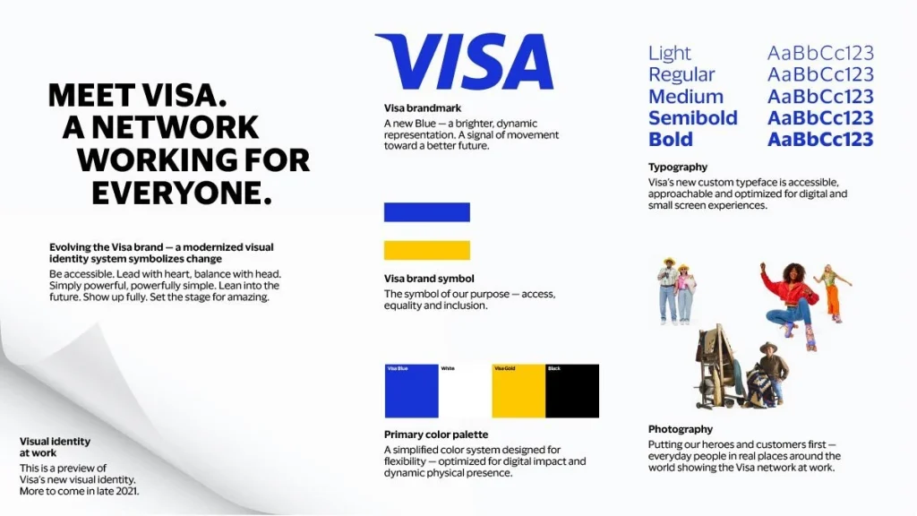
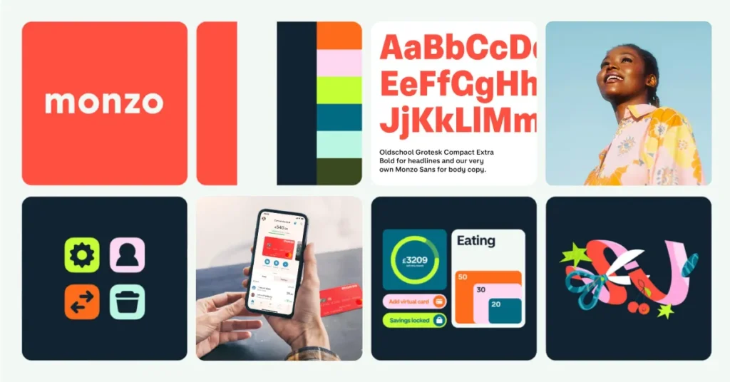
In 2026, that rationale no longer holds. The companies operating the strongest identity systems — Airbnb, Stripe, Figma, Monzo — don’t rely on PDFs. They have design systems embedded in component libraries (Figma, Storybook), token-based colour and typography systems that propagate updates automatically across digital products, and identity governance processes that sit inside their product and marketing workflows rather than beside them.
Airbnb’s 2014 identity overhaul, led by DesignStudio, introduced the Bélo mark—a single, scalable symbol built from four shapes (head, location pin, heart, and the letter A) — that functions at any scale without a secondary icon variant. More importantly, Airbnb rebuilt its entire design infrastructure. The mark was a byproduct of a systems-level decision, not a starting point.
The alternative directive: don’t start your CIS with a guidelines document. Start with the tools your team actually uses and embed the identity rules into them. The PDF comes last, as a reference — not first, as a strategy.
Brand guidelines are the receipt, not the purchase. Every business that hands over a 60-page PDF and calls it an identity system has confused the documentation with the thing being documented. The system is what your team does by default, without consulting the guidelines — because the guidelines are already baked into every template, component, and approval workflow they touch.
Corporate Identity Systems in 2026
The CIS landscape has shifted more in the past 18 months than in the previous decade. Three developments are driving the change — and each has direct implications for how businesses should approach identity system builds in 2026.
AI-Generated Identity: The Commoditisation Problem
Canva’s Magic Design, Adobe Firefly 3’s brand kit generator, and Looka’s AI logo platform have collectively made it possible to generate a complete visual identity — logo, colour palette, typeface pairing, and social media templates — in under ten minutes for less than £50. The result is a glut of visually competent but systemically hollow identity sets that are functionally indistinguishable from each other.
The Forrester Research 2024 Design Technology Survey found that 43% of SMBs had used an AI tool to generate at least one brand asset in the previous 12 months. The majority of those assets were never integrated into any coherent identity system. They were downloaded, used once, and abandoned — which is what happens when you treat identity as a visual output rather than an operational infrastructure.
The implication for businesses choosing between AI generation and professional identity development is not aesthetic. It’s systemic. An AI tool can produce a logo. It cannot produce a governance framework, a scalable colour token system, or an application library that your marketing team can actually use without reinventing rules every time a new format arises.
Design Token Systems: The New Standard for Digital-First Brands
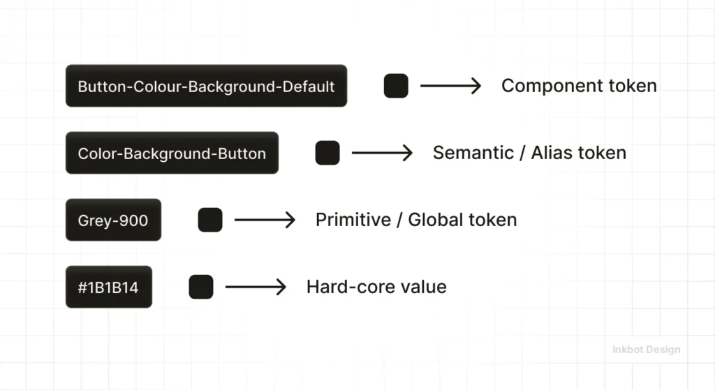
Design tokens — the practice of storing colour, typography, spacing, and motion values as named variables in a shared system (typically JSON or CSS custom properties) that propagate automatically across all digital products — have moved from enterprise practice to SMB expectation.
Brands that built their digital identity without token systems are now managing maintenance debt: every colour or font change requires manual updates across dozens of templates, code repositories, and design files. Brands that are built with tokens make a single change that propagates automatically.
Figma’s 2024 Variables system (a native implementation of design tokens) and the W3C Design Tokens Community Group’s published specification have standardised the practice. Any agency delivering a corporate identity system in 2026 that doesn’t include documentation for the token system for digital applications is delivering an incomplete product.
The LLM Brand Signal Problem
This is the least-discussed development and potentially the most consequential over the next five years. Large language models — including Google’s Gemini, OpenAI’s GPT-4o, and Anthropic’s Claude — are being trained on web content in which brand signals (consistent naming, consistent description, consistent category positioning) influence how AI systems represent a brand in generated responses.
A brand with a coherent CIS that includes consistent verbal identity rules (how the company describes itself, what category terms it consistently uses) is more likely to be accurately represented in AI-generated responses than a brand with inconsistent, contested, or absent verbal identity standards.
The Nielsen Norman Group, the UX and digital design research organisation, published research in late 2024 indicating that brand entity clarity — the consistency with which a brand’s name, category, and differentiators appear across its digital properties — directly influences how AI systems resolve ambiguous queries about that brand. This is a new pressure on corporate identity that didn’t exist five years ago, and most identity systems are not built to address it.
Brand System Audits: The Emerging Service Category

The combination of AI tool proliferation, design token standardisation, and LLM brand signal requirements has created demand for a service category that didn’t exist three years ago: the brand system audit.
Rather than a full rebrand, this is a structural review of whether an existing CIS is performing its function — delivering consistent identity signals across all touchpoints — or quietly degrading under the pressure of scale, distributed teams, and tool fragmentation.
At Inkbot Design, we’ve built a structured diagnostic for exactly this — the Brand Equity Audit — because the question we’re most frequently asked by established businesses isn’t ‘can you design us a new logo?’ It’s ‘Can you tell us why our brand looks different everywhere?’
Corporate identity in 2026 is no longer a static design deliverable. It is a living system that must be maintained, version-controlled, and protected against the entropy introduced by distributed teams, AI-generated assets, and the growing expectation that brand signals remain consistent across AI-generated and human-generated content. The businesses that treat their CIS as infrastructure — rather than as a creative output — will compound their recognition equity. The rest are silently draining it, one off-brand slide deck at a time.
Corporate Identity System Decisions
| Decision Point | The Wrong Way | The Right Way | Why It Matters |
| Logo file delivery | Single PNG file on a white background | Full vector suite: SVG, EPS, PDF + PNG exports at multiple scales with transparent backgrounds | PNG degrades at scale; single-background files can’t be placed on coloured or photographic surfaces |
| Colour specification | “It’s kind of a dark blue” or a screen-grabbed hex | Pantone PMS reference + CMYK + RGB + HEX + HSL for each colour, documented in the brand manual | Pantone-to-CMYK conversion without a reference produces visible colour drift across print suppliers |
| Typography licensing | Buy one desktop licence, use it everywhere | Audit every use context (desktop, web, app, broadcast) and purchase appropriate licences for each | Using a desktop-only licence for web embedding is a licensing violation, not a design oversight |
| Brand guidelines format | Static 60-page PDF emailed to the team | Living document in Notion, Confluence, or Figma with embedded assets and version control | PDFs go out of date and get ignored; living documents get consulted and updated |
| Governance process | Anyone can use the logo as they see fit | Named identity owner + deviation approval process + quarterly asset library review | Without governance, brand drift is guaranteed; with it, consistency compounds over time |
| Icon/favicon | Logo scaled down to 16×16 | Purpose-built favicon variant, optimised at 16px, 32px, and 180px (Apple Touch Icon) | Complex marks at 16px are unreadable; an unreadable favicon undermines digital brand presence |
| Sub-brand management | New sub-brand gets its own unrelated identity | Sub-brand identity built within the master brand architecture with defined relationship rules | Unrelated sub-brand identities cannibalise parent brand recognition equity. |
The Verdict
Building a Corporate Identity System in the right order — infrastructure first, assets second, documentation last — is not how most agencies sell it and not how most clients buy it. The industry has spent decades selling the logo as the product.
The real product is the system that makes the logo reproducible, scalable, and defensible at every touchpoint, in every market, by every person who touches it.
The businesses with the strongest brands are not the ones with the best logos. They are the ones with the best-governed identity systems. Airbnb’s Bélo is a nice mark. Airbnb’s design system infrastructure is what makes it work across 220 countries.
Tropicana’s orange and straw was a world-class, distinctive asset. The absence of governance infrastructure is what allowed a single project to erase three decades of recognition equity in a single season.
Your corporate identity is not what you show people; it’s what you are.
It is what you can consistently reproduce across every person, platform, and market that your business touches. If you can’t reproduce it consistently without the original designer in the room, you don’t have a system. You have a reference document and a prayer.
If your brand looks different everywhere and you’re not sure why, start with a logo design and identity audit before commissioning new assets. The problem is rarely the logo. It’s the absence of the system around it. Talk to us about building one that lasts.
Frequently Asked Questions
What is the difference between a corporate identity system and a brand identity?
Corporate identity is the visual and structural system that governs how an organisation presents itself externally — logos, colours, typography, and application rules. Brand identity is the broader concept that includes personality, tone of voice, and emotional associations. A CIS is the operational subset of brand identity that can be codified and governed.
How much does a corporate identity system cost to develop professionally?
A professionally developed CIS for an SMB typically ranges from £8,000 to £35,000, depending on scope, the number of applications required, whether design token systems are included for digital products, and the complexity of governance documentation. Costs below £5,000 generally deliver logo design with minimal system infrastructure.
How long does it take to build a corporate identity system?
A full CIS build for an SMB typically takes 8 to 16 weeks, covering discovery, mark development, colour and typography architecture, application design, guidelines production, and governance framework setup. Rushing the governance layer — the most commonly cut element — produces systems that degrade within 12 months.
What is a design token, and do I need one in my CIS?
A design token is a named variable (for example, –brand-primary: #1A2B3C) that stores a design value — colour, spacing, or typography — in a format that can be used consistently across all digital platforms. Any business with a website and a digital product (app, SaaS dashboard, email marketing) needs design tokens to maintain visual consistency without manual updates across multiple tools.
Is it true that your logo must work in black and white?
This advice was valid when the primary identity concern was single-colour print (forms, fax documents, and newspaper advertising). For the majority of SMBs operating primarily in digital environments in 2026, prioritising monochrome reproduction at the expense of colour distinctiveness is an outdated approach. Colour is a primary distinctive brand asset — weakening it to satisfy a use case that affects less than 10% of touchpoints is a poor trade-off for most businesses.
What should be included in a corporate identity system for a startup?
A minimum viable CIS for a startup includes: a primary logo with at least one lockup variant, an icon/symbol for small-scale applications, a defined two- to three-colour palette with all technical specifications, a primary and secondary typeface with usage rules, a business card and email signature template, a social media profile and cover image template, a basic brand guidelines document, and a named identity owner with a clear approval process for deviations.
When should a business consider a CIS review rather than a full rebrand?
A CIS review is appropriate when the underlying brand direction remains sound. Still, execution has become inconsistent — visible as mismatched colours across touchpoints, multiple logo versions in circulation, typography that varies by team or department, or a brand that looks significantly different in digital versus print contexts. A full rebrand is appropriate when the positioning, audience, or category has fundamentally changed.
How do I maintain brand consistency when using freelancers and external agencies?
Consistency with external partners requires three things: a shared asset library accessible via a permanent URL (not an emailed ZIP file), a clear brief document specifying which assets to use and which to avoid, and a review checkpoint before any externally produced materials go live. Relying on freelancers to self-police against a PDF guidelines document they may not have read is not a governance process.
What is the difference between a corporate identity system and a design system?
A design system is a digital-product-specific extension of a CIS — it includes UI component libraries (buttons, forms, navigation patterns), interaction design specifications, and accessibility standards, typically maintained in a tool like Figma or Storybook. A CIS governs all brand expression, including print, environmental, and physical applications. Every design system exists within a CIS; not every CIS requires one.
How does a corporate identity system affect SEO and AI discoverability?
A consistent CIS — particularly consistent verbal identity elements such as brand name usage, category descriptors, and positioning language — improves the accuracy with which AI language models represent a brand in generated responses. Search engines also use brand consistency signals during entity disambiguation, which affects how reliably a brand appears in knowledge panels and AI-generated overviews. Inconsistent brand naming and category terminology across a website actively damages AI brand representation.
What happens to a corporate identity system during a merger or acquisition?
M&A situations are the highest-pressure test of a CIS. Businesses with a governance framework and documented mark architecture can make rational, evidence-based decisions about identity integration, sunsetting, or co-branding. Businesses without one default to political decisions — whoever has the stronger negotiating position keeps their logo, which usually results in an incoherent outcome. Identity integration planning should begin during due diligence, not after the deal closes.
Can I build a corporate identity system using AI tools?
AI tools can generate individual identity assets (logo concepts, colour palettes, typeface pairings) at low cost. They cannot build the governance framework, application system, token architecture, or organisational process that constitute a functioning CIS. Using AI tools for asset generation while investing professionally in system design and governance is a reasonable cost management strategy. Using AI tools as a substitute for the entire CIS build produces assets without infrastructure.
