Starbucks Logo Design: History, Meaning & Lessons
You see that green circle, and you instantly know what it is. It’s as ubiquitous as a morning commute, a familiar comfort, or perhaps, for some, a daily addiction.
The Starbucks logo is a global icon. But the familiar story about its design—often presented as a tale of unwavering consistency—is fundamentally wrong. It isn’t a story of consistency; it’s a masterclass in brutal, strategic change.
Far too many business owners are told that their logo is sacred, an unchangeable brand bible. This dogma traps them with a visual identity that no longer fits their business model, actively hindering growth.
This article isn’t about design trends or pretty pictures. This is a teardown of the Starbucks logo’s history.
We’re here to extract the real-world, unsentimental business decisions that you can directly apply to your brand, to make it work harder for you.
- Your logo must evolve with your business model; don’t stay attached to an identity that restricts growth.
- Simplification over time creates iconic, versatile marks—but you must earn the right to be wordless.
- Treat a logo as a system (colour, shape, typography) and iteratively refine it to serve strategic goals.
The Original 1971 Logo: It Was a Problem
Every brand starts somewhere, often small, often quirky. Starbucks was no different.
The “Coffee, Tea, and Spices” Era
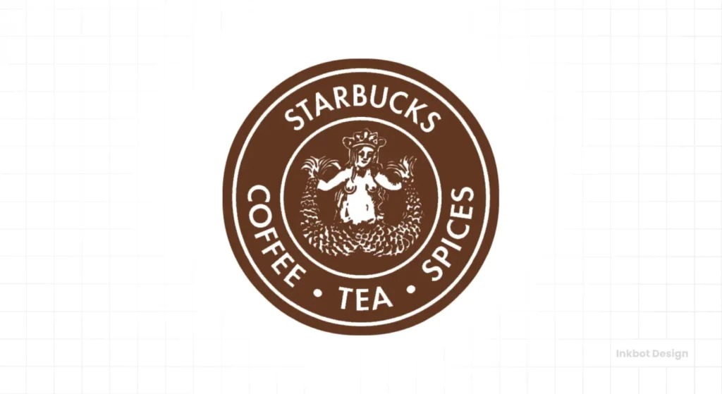
The very first Starbucks wasn’t a global coffee giant. It was a single, modest shop in Seattle’s Pike Place Market. They sold whole roasted coffee beans, loose-leaf tea, and spices.
Think artisanal, niche, and a bit bohemian. The logo, designed by Terry Heckler, reflected this specific, “old world” trader identity.
It was a circular brown logo, featuring a twin-tailed siren, inspired by a 16th-century Norse woodcut. This mythological creature certainly stood out with her long, flowing hair and exposed chest. It evoked a maritime history, fitting for a port city and a company dealing in exotic imports.
Deconstructing the Siren (and Her Controversial Anatomy)
Let’s address the elephant in the room: the original siren was, by modern standards, explicitly provocative. She had a bare chest and splayed twin tails. For a niche business in 1971, it was memorable, perhaps even charmingly audacious.
However, the key takeaway isn’t about sea nymphs or mythological allure. The design, while distinctive, had a built-in expiration date. It was unscalable.
An image like that was destined to become a significant problem the moment Starbucks considered mainstream appeal or family-friendly expansion. You couldn’t put that siren on a billboard in a conservative market without causing a stir.
Key Lesson: Your first logo serves your first business model. It’s perfectly acceptable—and often necessary—to outgrow it. Don’t fall in love with a logo that limits your future growth.
The 1987 Redesign: The Real Birth of the Brand We Know
The first significant shift wasn’t a creative whim but a consequence of an aggressive business strategy.
Enter Howard Schultz and Il Giornale
In the mid-1980s, Howard Schultz, then Director of Retail Operations and Marketing for Starbucks, had a vision. He wanted to sell brewed coffee and espresso drinks, inspired by Italy’s coffee bar culture.
After initial resistance from the original owners, he left to start his coffee bar, Il Giornale. Just two years later, he bought Starbucks itself.
This wasn’t just a merger; it was a consolidation.
Two brands, two distinct logos, one future. A redesign wasn’t optional; it was a commercial necessity to unify the newly expanded company under a single banner.
The Strategic Shift: From Brown to Green, From Niche to Mainstream
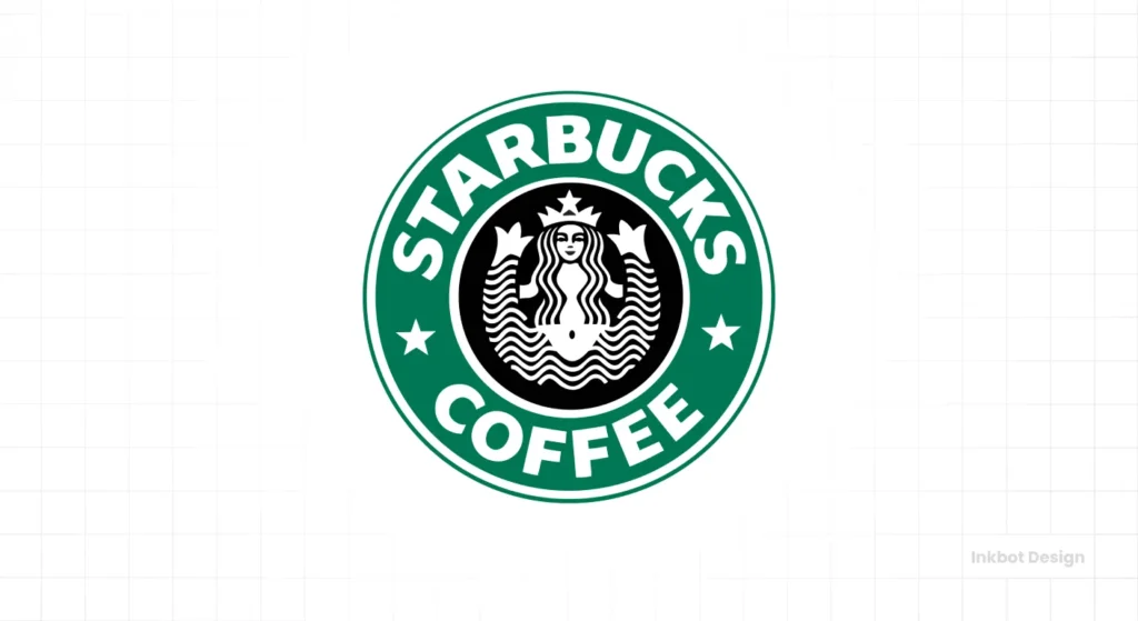
The 1987 logo marked the strategic shift from a coffee bean retailer to an espresso bar chain. Here’s what changed:
- Colour: The original brown was replaced with a vibrant green. This wasn’t just aesthetic; green signals freshness, growth, and nature—an influential food and beverage brand association.
- Typography: The wordmark “STARBUCKS COFFEE” was explicitly added, defining the new business focus. This wasn’t a time for ambiguity; they needed to tell customers precisely what they offered.
- Siren’s Modesty: The siren’s hair was strategically restyled to cover her bare chest, making the logo far more palatable for a broader, mainstream audience. The immediate commercial need for family-friendly appeal drove this.
Key Lesson: A central business pivot—a merger, an acquisition, or a fundamental change in your core service offering—must be reflected in your brand identity. Your logo isn’t just decoration; it’s a compass pointing to where your business is going.
The Minor Tweak, Major Impact: The 1992 Refinement
After the significant overhaul in 1987, Starbucks made another, seemingly minor, adjustment in 1992. But even small changes can have substantial implications.
Why Bother With Such a Small Change?
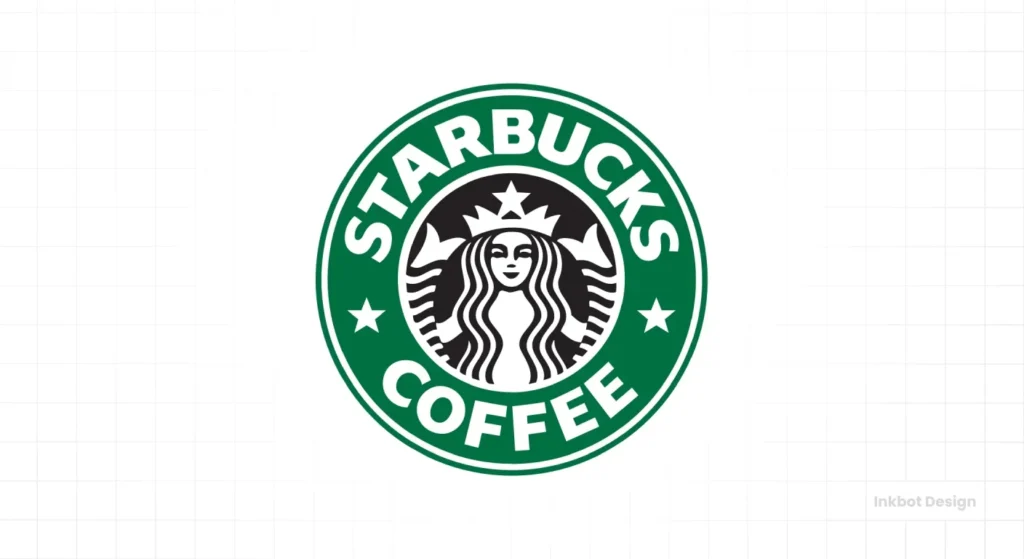
The 1992 update was subtle: a slight zoom-in on the siren, cropping her from the navel up. The splayed twin tails, while previously partially obscured by hair, were now entirely removed from view. This wasn’t about completely re-imagining the brand. It was about improving functionality.
As Starbucks expanded aggressively, opening stores across North America, the logo needed cleaner and more legible. It appeared on cups, signage, merchandise, and in countless advertisements. Removing the last awkward elements of the siren’s lower anatomy made the icon less busy and more adaptable.
The Lesson in Iteration
This wasn’t a revolution; it was a refinement. It demonstrates that a brand’s visual identity isn’t a “set it and forget it” task. It shows active management of public perception and a commitment to clarity.
Minor, iterative improvements, when consistently applied, can significantly enhance a logo’s functionality and longevity. It’s about being proactive, not waiting for a crisis.
Fine-tuning a visual identity is a core part of what a professional logo design service brings to the table. It’s about anticipating how your brand will be seen and used.
The 2011 “Naked” Siren: A Masterclass in Brand Confidence (and Public Outrage)
The 2011 redesign remains the most radical and arguably the most strategically brilliant. It also sparked significant public backlash.
The Business Case for Dropping the Name
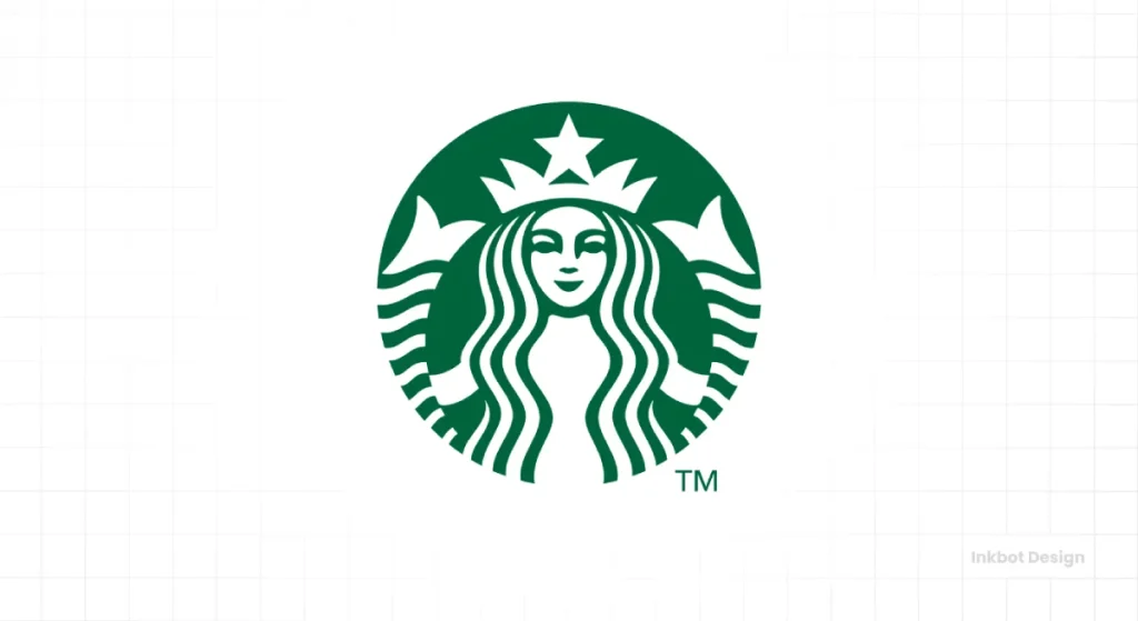
By 2011, Starbucks was far more than a coffee shop. They sold music, packaged coffee (like the VIA Ready Brew line), and food items, and they were expanding into grocery stores and other retail channels.
Their logo’s words “STARBUCKS COFFEE” had become a strategic liability. They constrained the brand to a single product category when the business diversified widely.
This wasn’t about being “minimalist” for minimalism’s sake. It was a calculated business decision. Starbucks wanted to become a lifestyle brand, unconstrained by a single product category. They needed a Starbucks logo without specifying “coffee.”
Deconstructing the Design: The Power of Removal
The 2011 logo aggressively stripped away all textual elements. The words were gone. The outer ring was gone. The siren was freed from her textual enclosure, rendered in a single shade of Starbucks green. The icon stood alone, bold and confident.
The goal was clear: to join the ranks of wordless, iconic brands like the Nike Swoosh, the Apple logo, and McDonald’s Golden Arches.
This is the endgame for a genuinely global, dominant brand—to be instantly recognisable by a symbol alone. It’s the ultimate expression of earned brand equity.
Managing the Backlash (Because It Always Comes)
The public reaction was immediate and intense. Many loyal customers felt a deep connection to the old logo and viewed the change as a betrayal. Social media was awash with outrage, petitions, and angry comments.
Contrast this with The Gap’s disastrous 2010 logo redesign, which was met with such an outcry that the company folded after just one week and reverted to its old logo. Starbucks, however, held its ground. They issued carefully worded statements, explained their strategy, and moved forward.
Ignoring this conflict misses a crucial point. Starbucks could survive the backlash because the strategic reasoning was sound, and its brand equity was immense.
They had earned the right to make such a bold move. It wasn’t about what some vocal customers liked but what the business needed for its future.
4 Brutally Practical Lessons from the Starbucks Logo for Your Business
Forget the myths. Here are the actionable takeaways:
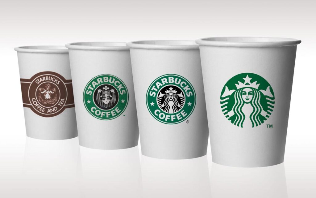
Lesson 1: Your Logo Must Evolve with Your Business Model
The Starbucks logo’s journey mirrors the company’s evolution:
- 1971: A quirky, niche retailer (complex, niche logo).
- 1987: A growing chain of coffee bars (clear wordmark, universal appeal, specific product).
- 2011: A global lifestyle brand and CPG giant (iconic, wordless, adaptable across categories).
If your business has shifted from local to national, from products to services, or from one niche to a broader market, your logo needs to reflect that. Stagnation in branding often results in stagnation in business.
Lesson 2: Simplification Creates Icons
Every iteration of the Starbucks logo moved towards greater simplicity. From a busy woodcut to a clean, geometric mark, the siren became more abstract and universally recognisable.
The less visual information you present, the easier it is for people can process, remember, and integrate your brand into their mental landscape.
Lesson 3: Earn the Right to Be Simple
Starbucks spent 40 years building brand recognition before it could drop its name from the logo. They earned that right through decades of consistent service, massive marketing investment, and ubiquitous presence.
A startup or small business, however, cannot afford this luxury. Your name must be on your logo until you’ve built undeniable recognition. Don’t chase the “minimalist” trend if your audience doesn’t already know who you are and what you do. Earn your simplicity.
Lesson 4: A Logo Is a System, Not Just a Mark
The “Starbucks Green” (specifically Pantone 3425 C) is as much a part of the brand’s identity as the siren itself. The circular shape, the font choices over the years, and the consistent use of green create an unmistakable identity system.
A logo is never alone; it’s always part of a larger visual language that includes colours, fonts, imagery, and tone of voice.
If you’re building a brand to last, you need more than a mark; you need a complete visual identity system. It’s a complex task where professional guidance is key. You can request a quote to see what that involves.
Stop ‘Perfecting’ Your Logo and Start Evolving It
The Starbucks logo is a monumental success, not because it was perfect from day one, nor because it remained unchanged.
It succeeded because the company treated it like a dynamic business tool, not a static piece of art. They were unsentimental, strategically ruthless, and willing to adapt their most visible asset to meet evolving business goals.
Is your logo actively serving your current business strategy? Or is it a relic of a past you’ve already outgrown? If it’s the latter, it’s time for a conversation.
FAQs
What is the main idea behind the Starbucks logo?
The Starbucks logo’s main idea is evolution. It started as a unique mark for a niche coffee bean seller and transformed into a simplified, wordless icon for a global lifestyle brand.
Who designed the original Starbucks logo?
Seattle-based designer Terry Heckler designed the original 1971 Starbucks logo.
Why is there a siren on the Starbucks logo?
The siren (or mermaid) was chosen for the original 1971 logo to evoke the maritime history of Seattle and the exotic nature of coffee beans imported by sea.
How many times has the Starbucks logo changed?
The Starbucks logo has had four main iterations: 1971, 1987, 1992, and 2011.
Why did Starbucks remove the words from its logo in 2011?
Starbucks removed the words “STARBUCKS COFFEE” in 2011 as a strategic move to signify that the brand was diversifying beyond just coffee and into other product categories and experiences.
What colour is the Starbucks logo?
The Starbucks logo’s dominant colour is a specific green shade, often called “Starbucks Green” (Pantone 3425 C).
Was the original Starbucks logo controversial?
Yes, the original 1971 Starbucks logo featured a bare-chested siren, which was considered provocative and would have been controversial if widely used today.
What can small businesses learn from the Starbucks logo evolution?
Small businesses can learn that logos must evolve with their business models, simplification is powerful, and you must earn the right to use a wordless, iconic design.
What is the significance of the 1987 Starbucks logo change?
The 1987 change was significant as it transitioned from a coffee bean retailer to an espresso bar, introducing the iconic green colour and clarifying the brand name.
Did people like the 2011 Starbucks logo change?
The 2011 logo change faced significant public backlash and criticism from customers who preferred the older design, but Starbucks held firm to its strategic decision.
Why is the Starbucks logo circular?
The circular shape provides a sense of unity, completeness, and continuity, which is visually appealing and adaptable for various uses, like coffee cups and signage.
Is the Starbucks logo a good example of branding?
Yes, the Starbucks logo is an exceptional example of branding due to its strategic evolution, strong recognition, and ability to adapt to changing business objectives while maintaining its core identity.
Your logo isn’t just a pretty picture; it’s a critical business asset. If your brand identity isn’t working as hard as it should for your business, it’s time to talk.
Explore how a strategic logo design can elevate your brand on Inkbot Design’s logo design services page or browse more real-world branding insights on our blog.
