Logotype vs Logomark: Which is Right for Your Brand?
You’re about to launch your business, and someone asks if you want a logotype or logomark. Your heart sinks. You’ve spent countless hours perfecting your business model. Still, this decision – one that could impact your brand for decades – leaves you frozen.
Most founders get this wrong. They rush to pick whatever “looks cool” without understanding a crucial truth: A logotype and logomark aren’t just design theory – it’s the difference between being instantly recognisable or completely forgettable in your market.
I’ve consulted with hundreds of brands and seen millions in revenue lost because companies chose the wrong logo style at the wrong time. But here’s what nobody tells you: The choice between logotype and logomark isn’t about what’s trending on design blogs – it’s about psychological triggers that make customers stop scrolling and start buying.
Let me show you exactly how to make this decision in the next 5 minutes, using the same framework that’s helped my clients generate consistent brand recognition and higher conversion rates.
- Logotype vs Logomark: Understanding the difference is vital for brand recognition and longevity in the market.
- Visual Identity: Your logo is the first impression; it must encapsulate your brand essence effectively.
- Emotional Connection: A well-crafted logotype or logomark triggers psychological responses that influence customer behaviour.
- Market Differentiation: Unique logos help set your brand apart in crowded industries, enhancing choice for consumers.
- Feedback and Adaptation: Continually seek audience feedback and refine your branding to stay relevant over time.
Definition of Logotype and Logomark
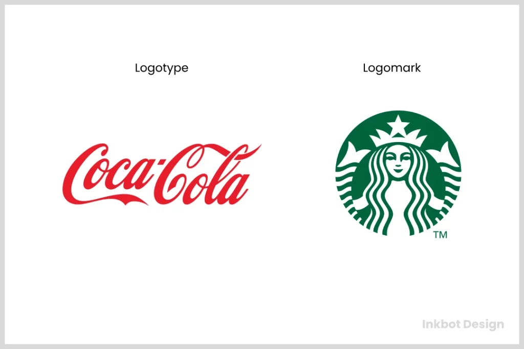
A logotype is essentially the textual representation of your brand. It’s your brand name styled in a particular font, often custom-designed to convey the essence of your business. Some well-known examples include Google and Coca-Cola. Their names aren’t just written; they’re crafted, dripping with character and personality.
On the flip side, a logomark is the symbol or graphic element that represents your brand. Think of Apple‘s Apple or the Nike swoosh. These symbols evoke a sense of familiarity without needing text to explain what they are. They’re simple but powerful, packing the emotional punch that words sometimes can’t deliver.
So, what’s the deal? Each serves a distinct role in your branding toolkit. While a logotype relies heavily on typography and name recognition, a logomark focuses on imagery and the feelings it invokes.
Importance of Choosing the Right Visual Identity
You might wonder why having a distinctive logotype or logomark matters. Isn’t it just a logo? Well, not quite. Your visual identity is your brand’s first impression—it’s what people remember when they think of you. Below are a few reasons why choosing the right components is essential in shaping your brand’s identity:
- Brand Recognition: A solid visual identity can make you immediately identifiable. Consider McDonald’s. The golden arches are as recognisable as the Big Mac. Your logo is your brand’s face; make sure it’s memorable.
- Communication of Brand Values: A well-designed logotype or logomark communicates your brand’s purpose and values at a glance. For instance, a tech company might opt for clean lines and modern fonts to convey innovation.
- Market Differentiation: In a saturated market, standing out matters. A unique logotype or logomark can set you apart from competitors, making it easier for consumers to choose you. Think about how many similar coffee shops there are—what makes yours unique?
- Trust and Professionalism: A polished logo signals to customers that you mean business. This can be the difference between a click on your website or a quick scroll past it. Statistics show that 75% of consumers judge a company’s credibility based on its website design, including logo quality.
Now, let’s be honest—most of us are visual creatures. It’s human nature to gravitate toward visuals that stir emotions. Make sure your first point of contact resonates with your audience. Consider this:
- What do you want your audience to feel when they see your logo?
- Is your logo versatile enough for various media—web, print, or merchandise?
- Does it withstand the test of time, or is it a trend that will fade away?
Whether you lean towards a logotype, a logomark, or even a combination of both, the key is to ensure that your choice encapsulates the soul of your brand. With the proper visual identity, you create a logo and build a brand legacy that resonates with your audience.
So, buckle up! The journey to solidifying your brand’s visual identity has just begun. And trust me, it’s going to be a fun ride.
Understanding a Logotype
Now that we’ve grasped the basics of logotypes and logomarks let’s dig deeper into logotypes specifically. It’s time to dissect what makes them tick and why they’re essential in shaping your brand identity.
Definition and Characteristics
A logotype is not merely a fancy word for a logo. It’s the textual representation of your brand and comes with several defining characteristics. Here’s what to keep in mind:
- Typography: At its core, a logotype is about fonts. The choice of typeface conveys your brand’s personality. Bold fonts can suggest strength; serif fonts might evoke tradition, while whimsical scripts can impart creativity.
- Simplicity: You want your logotype to be clean and easily legible. Complexity might look great in a design portfolio but can confuse your audience. Think of Apple—simple and to the point.
- Consistency: A successful logotype maintains a unified style across all branding materials. Whether on your website, business cards, or advertisements, it should always look and feel the same.
- Scalability: It must work in various sizes. Think about when you shrink your logo for a social media profile or blow it up for a billboard. A well-designed logotype should remain clear and legible no matter its size.
- Memorability: You want people to remember your logotype. It should stick in their minds—like that catchy song, you can’t help but hum! A memorable logotype is your wearable brand—as effective on a T-shirt as on your business card.
So, before you dive headfirst into the design, ask yourself what characteristics you want your logotype to embody.
Examples of Successful Logotypes
Let’s take a look at some successful logotypes that have made their mark in their respective industries:
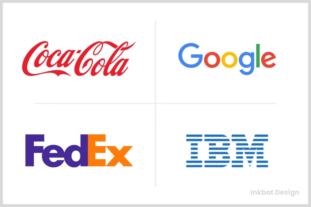
- Coca-Cola: One of the most recognised logotypes globally, Coca-Cola’s flowing script font gives a feeling of happiness and warmth. The brand’s heritage shines through, making it instantly identifiable.
- Google: The bold, colourful lettering of Google embodies innovation and fun. It’s approachable and speaks to the company’s focus on user-friendliness. If you see it, you know it’s time to search for something!
- FedEx: Here’s a fun little detail—if you closely observe the FedEx logo, you’ll find an arrow hidden in the negative space between the “E” and “x.” This clever design signifies speed and precision, key traits of their service.
- IBM: The simplicity of IBM’s block lettering gives off a sense of stability and professionalism. It’s bold, straightforward, and communicates that they mean business.
Now, why should I care about all this? Let’s be honest: getting your logotype right isn’t just about aesthetics; you’re making a statement. The right logotype can resonate with your target audience, communicate your brand values, and drive sales.
Imagine this momentarily: You’re scrolling down social media, and a logotype catches your eye. You’re intrigued. It could lead to a click, a visit, or a purchase. This is the power of a well-crafted logotype at work.
Here’s a quick checklist to guide your design process:
- Does it represent your brand’s identity?
- Is it versatile for various mediums?
- Does it create a strong first impression?
- Will it stand the test of time?
Understanding logotypes is crucial because they’re not just text but your brand’s voice. The right typeface and the perfect design can create an unforgettable impression. As you continue shaping your visual identity, remember that your logotype reflects who you are—so make it count!
Next, we’ll explore the intriguing world of logomarks and how they complement logotypes to form a cohesive brand identity. Stay tuned! 🎨
Exploring Logomark
Now that we’ve wrapped up our discussion on logotypes, let’s pivot to another powerful branding element—the logomark. While logotypes rely on textual representation, logomarks focus on symbols and graphics. Understanding what a logomark entails and its significance can be a game-changer for your brand.

Definition and Features
A logomark is a symbol or icon that represents your brand visually. Unlike a logotype, a logomark doesn’t usually contain any text; its power lies in its imagery. Think about it: sometimes a picture speaks a thousand words, right? Here are some defining features of a logomark:
- Simplicity: Successful logomarks are often simple and easily recognisable. A complex design can confuse your audience or become unrecognisable when scaled down. Take Twitter, for example. Their bird logo is minimalist but instantly tells you about the brand.
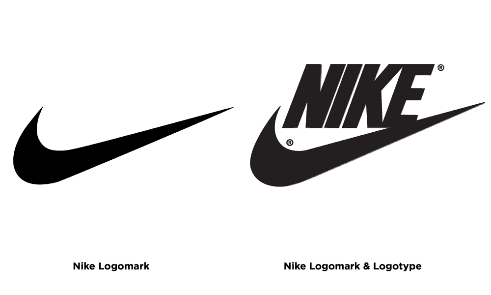
- Memorability: A well-designed logomark should stick in the minds of consumers. Consider the Nike swoosh; it’s simple yet so memorable that you can instantly identify it. You want your audience to connect just as strongly with your brand mark.
- Versatility: A logomark should work in multiple contexts. Whether on a website, print, or merchandise, it should be scalable and retain clarity. Flexibility is key, as you want your symbol to shine in any setting.
- Relevance: Your logomark should resonate with your brand’s values and purpose. It should reflect what you do, who you are, and how you want to be perceived. For instance, the World Wildlife Fund (WWF) uses a panda as its logomark, perfectly encapsulating its mission of wildlife preservation.
- Unique and Distinctive: Your logomark must differ in a sea of competing brands. It should set you apart from others in your industry. Think about how many coffee brands have lions—yours should stand out!
These features provide a framework for creating a successful logomark that leaves a lasting impression.
Advantages and Considerations
Now, let’s chat about the advantages of a logomark and some considerations to keep in mind during the design process.
Advantages
- Visual Impact: Logomarks often convey a message or value instantly through imagery. This gives them a unique advantage over textual logos, especially in crowded marketplaces. Remember, a picture can grab attention faster than a few words.
- Cultural Relevance: A good logomark can bridge language barriers. For instance, McDonald’s golden arches are recognised globally, regardless of language. A symbol can communicate what your brand stands for beyond words.
- Versatile Use: As mentioned, logomarks can fit in various formats, applications, or promotional materials. They can be embroidered on shirts, stamped on coffee cups, or even turned into animated symbols.
Considerations
- Over-Simplicity: While simplicity is a virtue, ensure your logomark isn’t too simple. If it lacks distinctive features, it may become forgettable.
- Cultural Sensitivity: When choosing imagery for your logomark, consider the cultural implications. Some symbols influence one culture but may not translate well in another. It’s essential to research and ensure appropriateness.
- Brand Evolution: Your logomark may need to adapt as your brand grows and evolves. Consider how your imagery will stand the test of time. Updating it doesn’t mean losing your brand identity; instead, it shows that your brand is alive and breathing.
- Testing with Target Audience: Before finalising your logomark, test it with your target audience. Gather feedback to see if it resonates and aligns with their perceptions of your brand.
Logomarks bring a unique visual element that can significantly enhance your brand identity. They provide a quick way for your audience to connect with what you do without reading an entire name.
Keep these features and advantages in mind as you explore options for your logomark. With the right design, you’ll create an image that communicates your brand’s essence in a way words simply can’t. 🌟
Next, we’ll explore how to make deliberate choices when combining logotypes and logomarks to create a cohesive brand identity. You won’t want to miss it!
Factors to Consider When Choosing
Having covered logotypes and logomarks, let’s get into the nitty-gritty of choosing the correct elements for your brand. Selecting the perfect visual identity is no small feat, and several key factors must be considered. Today, we’ll focus on two crucial aspects: brand identity, values, market positioning, and target audience. These elements serve as the bedrock for your branding decisions.

Brand Identity and Values
Your brand identity isn’t just about aesthetic choices; it’s the very soul of your business. When deliberating on your logotype and logomark, ask yourself:
- What does my brand stand for?
- What values do I want to communicate?
Here’s how to connect your visual identity with your brand values:
- Define Your Core Values: Begin by outlining what your brand believes in. Are you all about sustainability, innovation, or customer-centricity? Clarity in your core values will guide all your design choices.
- Express Personality Through Design: Your logotype and logomark should embody your brand’s personality. For instance, a playful brand like Disney uses whimsical fonts and characters to express its fun-loving nature. In contrast, a financial institution may opt for a more traditional font that conveys trust and stability.
- Consistency is Key: Ensure your logo aligns with all your branding materials. If your website has a modern aesthetic but your logo feels outdated, it creates a disjointed customer experience. Keep everything cohesive for maximum impact.
Personal anecdote alert! 🎉 When I was crafting the brand identity for Inkbot Design, we spent a lot of time defining our core values—creativity, professionalism, and innovation. This clarity helped us choose a sleek, modern logotype that perfectly encapsulated our vision. It was like the lightbulb moment we didn’t know we needed!
- Visual Storytelling: Think about how your logo can tell a story. For example, the WWF (World Wildlife Fund) logo tells the story of wildlife conservation through its panda symbol. Visual storytelling invites emotional connections with your audience.
In essence, ensure your logotype and logomark reflect who you indeed are. They should resonate with you and your audience, mirroring your brand’s mission and purpose.
Market Positioning and Target Audience
Next, let’s talk about the market positioning and target audience. Understanding these factors is essential for creating a brand identity that speaks directly to your ideal customers. Here’s how to navigate this landscape:
- Know Your Audience: Who are you trying to reach? Knowing the demographics and psychographics of your target market will help you tailor your visual identity to appeal directly to them. A modern, edgy logotype might work wonders if your audience is young and trendy.
- Research Competitors: Take a step back and assess your competitors. What do their logotypes and logomarks look like? You don’t want to blend in; aim to stand out! A well-researched approach can help highlight your unique selling proposition.
- Consider Your Market Positioning: Are you positioned as a luxury brand or a budget-friendly option? Your logo should align with your positioning. A high-end brand might choose a sleek, sophisticated logotype. In contrast, an affordable brand might opt for something more playful and accessible.
- Test Your Designs: Once you have a few designs in mind, gather feedback from your potential customers. Conduct surveys or focus groups to determine which logo resonates the most and why. Sometimes, you think you have the right fit, only to be surprised by your audience’s preferences.
- Adaptability: Ensure your logo can evolve with your brand. Market trends change, and your target audience may develop new expectations. A flexible logo can adapt without losing its essence.
Understanding your brand identity and values alongside your market positioning and target audience is crucial for crafting a compelling logo. Each decision should lead you closer to creating an authentic visual presence that resonates with your audience.
Next, we’ll explore how combining a logotype and logomark can create a cohesive brand identity that fortifies your market position. Stay with me! ✨
Combining Logotype and Logomark
Having wrapped up our brand identity and market positioning exploration, it’s time to delve into a crucial topic: effectively combining a logotype and logomark to create a cohesive brand identity. This powerful duo can elevate your brand while ensuring it resonates with your audience.
Creating a Cohesive Brand Identity
Regarding branding, marriage is key—specifically, the marriage between your logotype and logomark! They should work hand in hand, complementing each other to form a unified representation of your brand. Here’s how to achieve that:
- Design Harmony: Your logotype and logomark should share a unified visual style. Whether through colour palettes, typography, or shapes, they must feel like pieces of the same puzzle. Think about the balance between them—if one is playful, the other might adopt a light-hearted tone.
- Symbiotic Relationship: Each element should enhance the other. For instance, a bold logotype can be balanced by a more subtle logomark. The key is that both have distinct qualities but convey a consistent message together.
- Usage Flexibility: Consider how the combinations will work across different platforms. Sometimes, you may use the logomark (like on social media); at other times, you may include the full logotype and logomark (like on your website). Strive for a design that retains clarity in various contexts.
- Storytelling: Your combined elements should tell a story about your brand. Ask yourself if they evoke the right feelings. Does the logotype convey trust, while the logomark signifies innovation? When they harmonise, your brand’s narrative becomes clear.
Here’s a simple checklist to ensure synergy:
- Do the colours match?
- Does the style align visually?
- Does the combination convey the right message?
Case Studies of Effective Combinations
Let’s dive into a few case studies showcasing successful logotype and logomark combinations. Each of these examples highlights the beauty of cohesive branding.
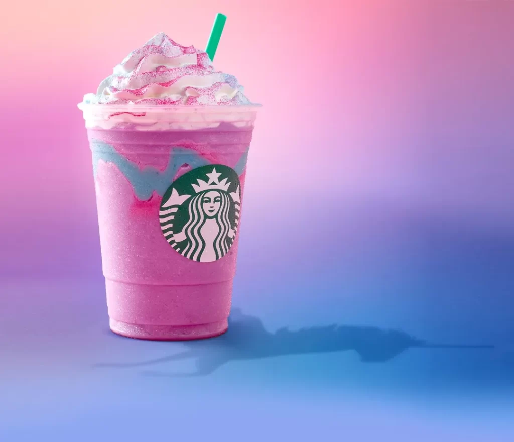
- Starbucks: The coffee titan combines a bold logomark (the iconic mermaid) with its accompanying logotype, which has undergone some well-thought-out revisions over the years. The mermaid is instantly recognisable, and when displayed alongside the name “Starbucks,” it tells a cohesive story about coffee culture and a rich heritage.
- Nike: Nike’s swoosh is minimalist yet powerful, perfectly paired with its bold logotype. The combination creates an identity that oozes movement and energy. Whether you see the swoosh by itself or with the name, it feels synonymous with athleticism.
- FedEx: The FedEx logotype is clean and professional, but what makes it remarkable is the clever use of negative space that forms an arrow in the logomark. Together, they represent speed and precision in logistics, making their identity instantly recognisable.
- BMW: The BMW logo fuses a logomark and logotype with artistic flair. The circular emblem contains the blue and white quadrants that evoke the Bavarian flag, reflecting the company’s heritage. The bold logotype reinforces the brand’s luxury positioning. The combination is a visual treat for car enthusiasts and casual observers alike.
These case studies demonstrate how a logotype and logomark can work in tandem to create a powerful brand identity.
In conclusion, blending your logotype and logomark involves more than just design—creating a harmonious relationship that effectively communicates your brand’s essence. When you nail this combination, you’re not just making a logo but crafting a visual identity that leaves a lasting impression.
Making the Decision
Having explored how to combine your logotype and logomark effectively, it’s time to tackle the most critical part of the branding journey—making the decision. This is where all your hard work pays off, but it requires careful thought and consideration. We’ll cover two crucial factors: evaluating brand objectives and consulting design professionals. Let’s get to it!
Evaluating Brand Objectives
Before you commit to a final design, take a step back and revisit your brand objectives. This is your opportunity to ensure that your visual identity aligns with your business goals. Here’s how to approach this:
- Clarify Your Mission and Vision: What are you trying to achieve with your brand? Your logo should encapsulate this mission clearly and effectively.
- Are you positioning yourself as a luxury brand, a fun experience, or an innovative leader?
- Make sure your visual identity reflects your brand’s essence.
- Define Your Target Outcomes: Identify your goals through your branding efforts. Consider questions such as:
- Do you want to increase brand recognition?
- Are you looking to attract a specific demographic?
- Knowing your objectives will guide the design process. For example, if your brand aims to capture a youthful market, your colours and typography should resonate with that demographic.
- Assess Market Trends: Keep your finger on the pulse of current trends in your industry. For instance, if sustainable branding is becoming popular in your niche, consider how your logotype and logomark can reflect this. Think eco-friendly colours or symbols that speak to environmental consciousness.
- Feedback Loop: Involve your team or trusted stakeholders in evaluating your branding direction. Ask for honest feedback regarding how well your designs align with brand objectives. This fresh perspective might help you see things you hadn’t considered!
After launching Inkbot Design, we regrouped to assess our objectives as we refined our branding. Our goal was to convey creativity and professionalism, ultimately influencing our design decisions. Aligning our logos with these objectives helped reinforce our brand’s narrative convincingly.
Consulting Design Professionals

Once you’ve evaluated your brand objectives and refined your designs, the next step is to consult with design professionals. This is a pivotal moment where expertise can elevate your branding process. Here’s why it’s essential:
- Expertise and Experience: Design professionals have a wealth of experience crafting memorable logos. They understand the principles of visual identity and can help ensure that your designs are eye-catching and effective.
- Fresh Perspectives: Sometimes, we get too close to our projects, making it hard to see the bigger picture. A designer can offer fresh insights and creative solutions you might not have considered. They can help you:
- Refine your ideas
- Suggest complementary styles or colour schemes.
- Identify any potential pitfalls.
- Market Insights: Designers often have access to industry trends and competitor analysis that can inform their design decisions. They can help you create a logo that stands out in a crowded market.
- Iterative Process: Working with professionals typically involves a collaborative process of iterations. They’ll present drafts, gather feedback, and refine designs until you achieve an outcome that resonates with your objectives. This back-and-forth will engage you in an invaluable creative dialogue.
- Ensuring Quality: A professional handling your design provides quality that DIY approaches often miss. From vector files for scaling to colour consistency across platforms, professionals bring technical proficiency.
Keep your momentum strong as we move into the final stages of your branding journey. Next, we’ll discuss the rollout and feedback process and strategies for adapting to market changes. 🚀 Let’s keep pushing forward!
Implementing and Evolving
Now that you’ve navigated the decision-making process and have your logotype and logomark ready, it’s time for the exciting part—implementation! But hold on, this isn’t just a “set it and forget it” situation. Implementing and evolving your new branding over time is crucial for long-term success. We’ll focus on the rollout and feedback process and how to adapt to market changes. Let’s dive in!
Rollout and Feedback Process
Implementing your new visual identity is exhilarating, but it needs to be strategic. Think of this as when your brand gets a fresh coat of paint! Here’s how to roll it out effectively:
- Create a Launch Plan: Outline how you will unveil your new branding. This can include:
- Press releases
- Social media announcements
- Internal communications to employees
- A well-structured rollout is essential. Don’t just spring it on people; let them know what’s coming!
- Engage Your Audience: Your audience should feel excited about the changes. Use storytelling to communicate the why behind your rebranding. Share the journey and the values that inspired your designs.
- Create teaser campaigns leading up to the launch.
- Use countdowns on your social media or share behind-the-scenes content.
- Collect Feedback: After the launch, actively solicit feedback. This can be done through:
- Surveys
- Social media polls
- One-on-one conversations with key clients or stakeholders
Feedback is the lifeblood of your branding effort. When I launched the new look for Inkbot Design, I carefully monitored comments and messages from our audience, eager to see how they responded to our fresh direction. This feedback provided invaluable insights that helped us feel confident about our changes.
- Monitor Performance: Keep an eye on engagement metrics across different platforms. Are people interacting with your posts? Is your audience growing? These insights will tell you whether your new branding resonates.
- Iterate Based on Insights: Don’t be afraid to adjust based on feedback. Maybe a particular element didn’t resonate as much as you’d hoped. That’s okay! Adapt and refine your branding based on real-world responses.
Here’s a quick checklist for your rollout:
- [ ] Launch plan in place
- [ ] Engaging storytelling to share the brand’s evolution
- [ ] Feedback mechanisms established
- [ ] Metrics to monitor performance
Adapting to Market Changes
The branding journey doesn’t end with a rollout. Markets are constantly evolving, and your brand must adapt to remain relevant. Here are some strategies to help you navigate those changes:
- Stay Informed: Keep an eye on industry trends, consumer preferences, and emerging technologies. Subscribe to newsletters, participate in webinars, and network with suppliers and competitors to stay ahead of the curve.
- Evaluate Periodically: Regularly assess your branding and how it aligns with your market. Ask yourself:
- Is your current visual identity working?
- Do you need a refresh to keep up with changing customer expectations?
Regular check-ins help maintain momentum and relevance.
- Flexible Design: Consider designing a visual identity that allows for evolution. This could mean establishing guidelines that would enable minor adaptations of your logos or graphics to keep up with trends while maintaining core brand elements.
- Feedback Loop: Just as you collected initial feedback during rollout, continue to solicit opinions on your branding. This can lead to actionable insights for future adjustments.
- Test New Approaches: Don’t hesitate to try new things. For example, create mock-ups and gather audience responses if you want to experiment with new colours or typography.
Implementing the right strategies for adapting to market changes is crucial. Remember my experience with Inkbot Design? We learned that our audience appreciated when we engaged with them about potential changes through testing and conversations. It established trust and enhanced our community connection.
Conclusion
As we wrap up our deep dive into branding, it’s time to reflect on the essential elements we’ve discussed—specifically, the differences between logotypes and logomarks and what to consider when shaping your brand’s visual identity. Let’s tie everything together and prepare you for your branding journey ahead.
Recap of Differences Between Logotype and Logomark
Let’s quickly recap the fundamental differences between a logotype and a logomark. Understanding these distinctions will set you up for success as you navigate your branding choices:
- Logotype: A logotype is focused on the textual representation of your brand. It involves the design of your brand name, styled uniquely through typography. Think of it as the name of your brand. Examples include:
- Coca-Cola: Its flowing script conveys a sense of tradition and warmth.
- Google: The distinctive and colourful lettering reflects fun and user-friendliness.
- Logomark: Conversely, a logomark encompasses symbols or icons associated with your brand. It visually represents an idea or feeling without needing words. Consider it as the face of your brand. Examples include:
- Nike’s Swoosh: This simple yet dynamic mark communicates motion and energy.
- Apple’s Apple: Instantly recognisable, it signifies innovation and simplicity.
Both elements serve distinct but complementary roles in your branding strategy. You can have one without the other, but the most potent brands often leverage both to create a cohesive visual identity that resonates with their audience.
Considerations for Your Brand’s Visual Identity
As you set out to establish or refine your visual identity, keep these key considerations in mind:
- Align with Brand Values: Your branding elements should represent your core values and mission. Be clear about what your brand stands for, and let that guide your design choices.
- Know Your Audience: Tailor your visual identity to suit your target demographic. Understand their preferences, needs, and pain points. Conduct surveys or engage with your audience to gather insights.
- Cohesion is Key: Ensure your logotype and logomark communicate a unified message. They should feel like parts of a whole rather than disjointed elements. Consistent branding will enhance recognition and build trust.
- Adaptability: Design your visual identity to be flexible across different mediums. Your logo should retain clarity and impact from websites to social media profiles, whether on a billboard or a business card.
- Seek Professional Guidance: Brand development can be a complex journey. Don’t hesitate to consult design professionals. Their expertise in crafting strong branding identities can help you navigate potential pitfalls and elevate your approach.
- Launch and Iterate: Implement your branding thoughtfully but remain open to feedback. After the rollout, continually assess how well your branding resonates with your audience. Be ready to adapt over time based on their insights and market dynamics.
In conclusion, remember that your brand’s visual identity is more than just aesthetics; it represents your business’s values, mission, and personality. By understanding the distinctions between logotypes and logomarks while keeping key considerations in mind, you’ll be equipped to create an identity that leaves a lasting impression.
As you embark on this journey, keep your audience at the forefront of your thoughts and be ready to evolve. With dedication and a willingness to adapt, your brand will thrive and grow stronger over time. Happy branding! 🚀✨


