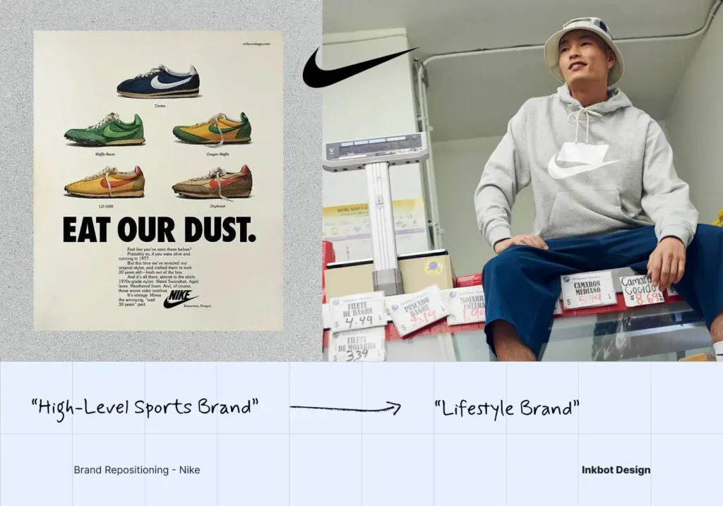
Why Logo Rebranding Should Be Your Last Decision, Not Your First
You’ve felt it in a pitch: the deck looks tired, a competitor’s identity looks sharper, and someone on the board says the logo needs “freshening up” before the next growth push.
That instinct is where most logo rebrands go wrong – not because the logo doesn’t matter, but because it’s the first thing to change and the last thing it should be.
For a professional services firm, the logo isn’t decoration. It’s a trust proxy in a business with no inventory to point at.
When you change it before you’ve settled what the firm now means, you’re not modernising – you’re asking clients mid-relationship to re-recognise you, for no reason they can see.
If you’re weighing this seriously, it’s worth understanding how a strategy-led rebranding agency sequences the work before committing to a single visual decision.
- Always do repositioning first; the logo is the last step that encodes an agreed change.
- A successful rebrand preserves recognition, reduces buyer friction, and signals a genuine shift in what the firm means. Supported by Arizona State University research.
- Optimise for recognition equity, friction cost and meaning signal. Ignore trend chasing and unanimous partner consensus.
- Choose a refresh when positioning is intact; choose a full rebrand only after real business change like merger or move upmarket.
- Do not brief visuals first; treat the logo as downstream of strategy to avoid losing recognition equity and wasting partner time.
Which Comes First – the Logo or the Repositioning?
The repositioning comes first, always. Logo rebranding is a business-transition problem, not a design exercise. The logo is the last step: it encodes a meaning change that has already been decided, and its job is to preserve recognition, reduce friction, and signal that something real has shifted.
- Change the logo before the strategy, and you broadcast a change you can’t yet explain.
- Change it after, and the new mark does useful work – it tells clients the shift is deliberate.
- The test is never “does it look better?” but “is the brand now easier to understand, trust, and buy from?”
A logo rebrand succeeds when it preserves recognition, reduces buyer friction, and signals a genuine change in brand meaning – not when it simply looks more modern.
The Criteria That Actually Matter (and the Ones That Don’t)
Firms deciding on a logo rebrand tend to argue about the wrong things. Six dimensions decide whether the change pays off – and two commonly-marketed ones barely register.
Recognition Equity: What Are Clients Already Trained to See?
Before you touch the mark, identify which elements clients already respond to.
Research summarised by Arizona State University found that when consumers are more attached to the original brand name, service evaluation and purchase intention decline after rebranding.
That attachment is an asset you can destroy for free.
A 40-partner firm whose clients recognise a specific colour and monogram is carrying equity in those two elements – the typography around them may be entirely disposable.
Friction Cost: How Hard Is It to Re-Recognise You?
Every rebrand imposes an adjustment tax on the people who already know you.
Arizona State University’s research notes that consumers may feel disoriented by a name change and have to make extra effort to adapt, which lowers their evaluation of the brand after rebranding.
For a professional firm, that disorientation lands during live relationships – a general counsel who half-recognises your new invoice is a general counsel who pauses.
Reducing friction is not aesthetic conservatism; it is protecting revenue in transit.
Meaning Signal: Does the Change Say Something True?
Logo rebranding should mark a real shift, not manufacture one.
The closer the new brand identity is to the service actually delivered, the more positive the response tends to be.
If your firm has genuinely moved upmarket, the mark should reflect that; if nothing has changed but the mood in the boardroom, you have no meaningful signal to give and no business in rebranding.
The Two That Don’t Matter
Trend alignment and internal consensus are the two criteria firms overweight. Matching 2026’s dimensional-icon trend earns nothing if your clients valued the old mark’s plainness.
And unanimous partner approval usually signals a design-by-committee compromise, not a decision – the mark that survives eleven opinions rarely says anything.
Logo Refresh: What It’s Best For, and Where It Fails
A logo refresh keeps the existing mark and adjusts it: cleaner type, corrected proportions, a tighter palette. It is the right choice when your positioning is intact, and only the execution has dated.
A firm that still does what it always did, for the same clients, but whose logo was drawn in 2009, needs a refresh, not a rebrand.
It fails when it’s used to paper over a strategic problem. If the firm has changed – new leadership, new service lines, a move into a different client tier – a refresh signals nothing and wastes the one moment clients were primed to notice.
Full Logo Rebranding: What It’s Best For, and Where It Fails
A full logo rebrand replaces the mark with minimal continuity from the original. It is correct when the underlying business has genuinely changed, and the old identity now misrepresents you – after a merger, a category shift, or a deliberate move to a higher-value market.
It fails when deployed as a growth tactic in its own right. A new logo does not create demand; it communicates a change that has already happened.
Firms that rebrand to grow, rather than because they’ve grown, discard recognition equity and get nothing back.

The Decision Table
| Your Situation | Recommended Choice | Why |
| Positioning unchanged, the mark looks dated | Refresh | Preserve equity; fix execution only |
| Moving upmarket to larger clients | Full rebrand (logo last) | New meaning needs a new signal |
| Post-merger, two identities in the market | Full rebrand | Consolidate recognition under one mark |
| Board wants “something fresh” pre-pitch | Neither yet | No meaning change to encode |
| New service line, same core clients | Refresh + verbal identity work | Signal evolution, not rupture |
| Acquisition due diligence underway | Pause | Rebranding after the deal defines the entity |
The Trap Most Firms Fall Into
The default mistake is treating the logo as the project. A managing partner says, “We need to rebrand,” a designer is briefed, and three months later, there’s a new mark and no answer to why clients should care.
The tell you’re about to make this error: your rebrand brief describes what the logo should look like before it describes what the firm now means.
A logo rebranding is downstream of a decision about meaning. When a firm briefs the mark before it has settled what has actually changed, it is not rebranding – it is redecorating a building whose address it hasn’t decided to move. The visual is the easiest part and the last part. Everything that determines whether it works happens before a designer opens a file.
If your rebrand conversation is mostly about colour and font, the strategy hasn’t been done yet – and the logo will inherit that emptiness.
Where This Stands in 2026
A July 2026 roundup described 2026 as one of the busiest years for brand redesigns in recent memory, citing rebrands or refreshes from Xbox, Google Workspace, the Tennessee Titans, FIFA World Cup 26, Mercedes F1, and Sam’s Club.
The volume matters less than the pattern: these are large ecosystems responding to changes in platforms and audiences, not firms restyling for their own sake.
That same roundup noted a shift away from static flat marks toward more dimensional, glassmorphic, context-aware iconography in product ecosystems like Google Workspace and Xbox.
Logo trend reporting for 2026 points further toward kinetic, sensory, multi-format identities rather than a single, fixed logo for every use case. For a consumer product spanning a dozen surfaces, that flexibility earns its keep.
For a professional services firm, most of it is noise. A litigation practice does not need a context-aware animated mark; it needs an identity that reads as competent on a letter of engagement and a LinkedIn avatar.
The useful signal in 2026’s reporting is the reframing itself – contemporary branding coverage increasingly treats rebrand decisions as responses to audience change, platform change, or strategic repositioning rather than visual restyling. That is the correct instinct, arriving late.
The logo follows the reason; it never leads it. Chase the dimensional-icon trend without a reason, and you’ve spent partner time making the firm harder to recognise for a look that dates by 2028.
The Variable You’re Actually Optimising For
Intelligent people default to “does it look better?” for a good reason: it’s the only question with a visible answer. You can hold two logos side by side and have an opinion in a second.
The strategic question – does this make us easier to trust and buy from – has no such instant verdict, so it gets skipped. That’s not stupidity; it’s the pull of the measurable over the meaningful.
But the measurable variable doesn’t predict the outcome.
Arizona State University’s research found that greater familiarity or equity in the new identity, relative to the old, is what drives a positive response – and that strong service brands increase customer trust, reduce perceived risk, and help people understand the offer more clearly.
None of that is visible in a side-by-side. The variable that predicts success is legibility of meaning, not the attractiveness of the mark.
I learned this the hard way on a client outside professional services, and the lesson transfers exactly. The Technical Traders needed to move from a retail-trading image into a premium wealth-stewardship brand for mature private investors. The market saw them as too speculative; in reality, they were disciplined, long-term, protective.
The mistake baked into the old brand was emotional: too much trading jargon, too little institutional calm, a visual language that signalled transaction where it needed to signal protection. Had we opened by redrawing the logo, we’d have prettified the wrong message.
Instead, we established a new category position – Asset Revesting – and only then rolled out a complete visual and verbal identity across the website, member experience, and print.
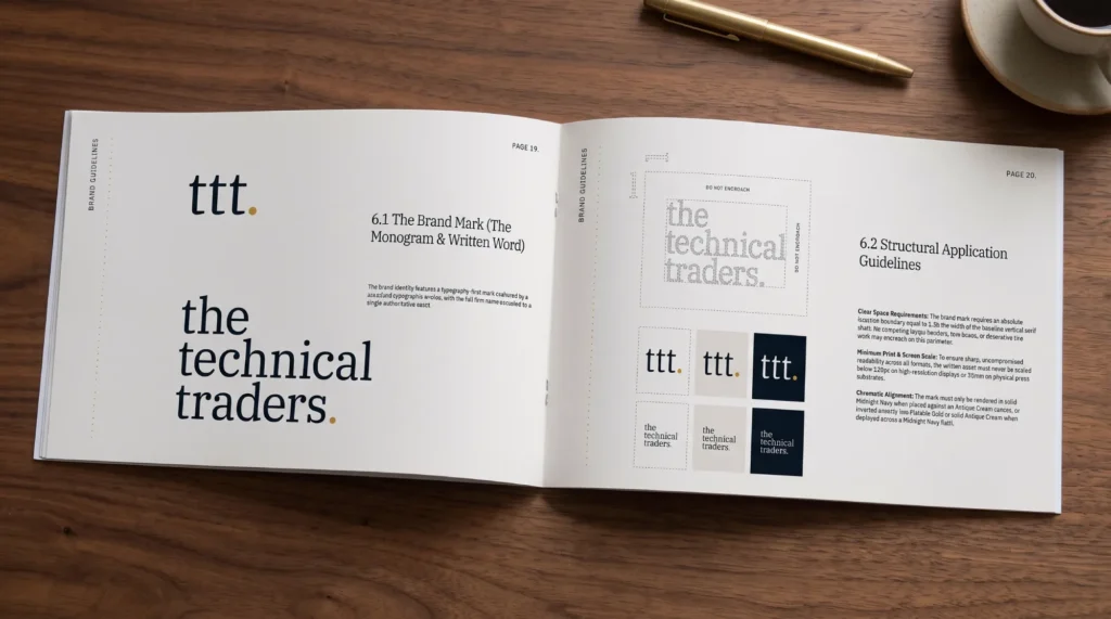
The outcome was a fully codified brand platform that separated the firm from standard trading competitors and aligned it with its target $1M–$10M private-investor market. The logo was the last thing we touched, and it worked because it was last.
If you want to see how sequencing plays out in real cases, our documented rebranding examples show the strategy-first order at work, and the rebranding failures worth studying almost all share one cause: the logo went first.
The Verdict
The logo is the easiest decision in a rebrand, and the one firms rush to make first. That inversion is why so many rebrands cost money and win nothing.
Get the order right, and the logo does real work – it preserves the recognition clients are trained on, lowers the friction of adjusting to you, and signals a change that has genuinely happened.
Get it wrong, and you’ve asked loyal clients to re-recognise a firm that means exactly what it did last week, for the price of a design project.
The distinction that runs through all of this is simple to state and hard to hold on to under boardroom pressure: a logo rebrand is a business transition problem, not a design exercise.
Arizona State University’s research makes the mechanism concrete: attachment to the old identity suppresses response, disorientation lowers evaluation, and clarity of meaning drives trust. Those are commercial forces, not aesthetic ones.
The mark is where a completed strategy becomes visible, which is precisely why it comes last.
So before anyone briefs a designer, answer one question: what has actually changed about what this firm is and who it’s for? If you can’t answer it cleanly, you don’t have a logo problem – you have a positioning problem wearing a logo costume.
Start there. Request a free Brand Equity Audit™, and we’ll tell you, in writing within 48 hours, exactly where your brand is losing commercial ground and whether the logo is the cause or a symptom.
FAQs
Why should the logo be the last decision in a rebrand?
Because the logo encodes a change in meaning that must be decided first, Arizona State University research shows attachment to the old identity suppresses response after rebranding, so changing the mark before the strategy broadcasts a shift you can’t yet explain and destroys recognition equity for nothing.
What’s the difference between a logo refresh and a full rebrand?
A refresh adjusts the existing mark – cleaner type, tightened palette – while keeping recognition intact. A full rebrand replaces the mark with minimal continuity. Choose a refresh when only execution has dated; choose a rebrand when the underlying business has genuinely changed.
How do we rebrand without losing client recognition?
Identify which specific elements clients are trained to see – often a colour or monogram, not the whole mark – and preserve those. Arizona State University research found that greater familiarity with the new identity relative to the old drives positive response, so continuity is protection, not timidity.
Is it true that a new logo will help us grow?
No – a logo communicates a change that has already happened; it doesn’t create demand. Firms that rebrand to grow, rather than because they’ve grown, discard recognition equity and gain nothing. Growth drives the rebrand, never the reverse.
When should a professional services firm rebrand its logo?
After a real change in what the firm means: a merger, a move upmarket, a new client tier, or a category shift, if nothing has changed except boardroom mood, there is no meaning to signal and no business case for touching the mark.
Why do most logo rebrands fail?
Because the logo is treated as the project rather than the final step, when a brief describes what the mark should look like before what the firm now means, the strategy hasn’t been done, and the logo inherits that emptiness. Sequence is the usual point of failure.
What actually predicts whether a logo rebrand works?
Legibility of meaning, not attractiveness of mark. Arizona State University research links positive response to familiarity, trust, reduced perceived risk, and clearer understanding of the offer – none of which is visible in a side-by-side comparison of two logos.
How much recognition does a rebrand really cost?
Enough to matter. Arizona State University research notes that consumers feel disoriented by identity changes and must expend effort to adapt, which lowers evaluation afterwards. For a professional firm, that disorientation lands during live client relationships, where hesitation directly threatens revenue.
Should we follow 2026’s dimensional, animated logo trends?
No, for most professional services firms, those trends are noise. A 2026 roundup shows dimensional, context-aware marks emerging in large product ecosystems like Google Workspace and Xbox. A litigation or advisory firm needs an identity that reads as competent on an engagement letter, not a kinetic icon.
What comes first, repositioning or logo design?
Repositioning, without exception. The logo is the last step in a brand transition because its job is to make a completed strategic change visible. Deciding the visual first means encoding a meaning you haven’t yet defined.
Does unanimous partner approval mean we’ve got the logo right?
No – unanimous approval usually signals a design-by-committee compromise rather than a decision. A mark that survives eleven opinions tends to say nothing. Strong identities take a clear position, which rarely pleases everyone in the room equally.
How do we tell if we have a logo problem or a positioning problem?
Ask what has actually changed about what the firm is and who it serves. If you can answer cleanly, the logo can encode it. If you can’t, you have a positioning problem wearing a logo costume – and no redesign will fix it.
