Why These 10 Best 1970s Logos Are Still Genius Today
Forget the shag carpets, the disco balls, and the bell-bottoms for a minute. The real, enduring revolution of the 1970s wasn’t happening on the dance floor; it was happening in the boardrooms and design studios of New York, London, and Tokyo.
This was the decade of brutalist, brilliant simplicity in logo design.
Too many people today see “70s design” and think of groovy, bubbly fonts in shades of brown and orange. They want to borrow the aesthetic, hoping some of that retro cool will rub off on their brand. This is a fundamental mistake. It’s like admiring a skyscraper for its paint job while ignoring the steel frame holding it up.
The best 1970s logos weren’t about a “vibe.” They were a violent reaction against the visual chaos of the late 1960s. They were systems of logic and clarity designed to build empires. They were built for longevity, not for a trend.
And that is the lesson every entrepreneur and small business owner needs to learn today. In a world saturated with visual noise, the principles of 1970s corporate design—radical simplicity, conceptual clarity, and systematic thinking—are more valuable than ever.
Let’s dissect the architecture, not just the paint.
- 1970s logos prioritised radical simplicity and conceptual clarity, reacting against 1960s visual chaos to ensure legibility and longevity.
- Design constraints (printing, TV, low-res reproduction) forced reductive, systemised identities built for consistent, global application.
- Effective branding focused on a single strong idea—typographic solutions or multi-layered symbols—that communicate emotion and endure across media.
What Drove 1970s Logo Design? It Wasn’t Just “Good Vibes”
To understand the logos, you must understand the problems they were built to solve. The stark minimalism of the 70s didn’t emerge from a vacuum. Specific cultural and technological pressures forged it.
A Reaction Against 60s Psychedelia
The late 1960s were a visual explosion. The psychedelic movement created a kaleidoscope of swirling, illegible typefaces, vibrating colours, and complex illustrations. It was exciting and culturally significant, but it was a nightmare for a multinational corporation trying to communicate a clear message. The 70s corporate identity movement was the inevitable hangover—a return to order, sobriety, and legibility.
The Dominance of Swiss Style (International Typographic Style)
The antidote to psychedelic chaos was Swiss Style. This design philosophy, which had been developing since the 1950s, championed objectivity over expression. It was built on the foundation of grid systems, mathematical precision, and the clean utility of sans-serif fonts like Helvetica. It was unemotional, universal, and incredibly clear. This was the language big business used to speak to a global audience.
Technology as a Brutal Editor
Designers today have infinite canvases and perfect pixel fidelity. In the 1970s, a logo had to survive a gauntlet of terrible technology. It had to be legible when faxed, photocopied, and shrunk for a newspaper ad on cheap pulp. It had to be recognisable on a fuzzy, low-resolution CRT television screen. It needed to be easily reproduced with just one or two ink colours.
These limitations were a creative blessing. They forced designers to strip their ideas down to the most essential, powerful forms. There was no room for gradients, shadows, or fussy details. Simplicity wasn’t an aesthetic choice; it was a technical requirement.
The Top 10 Logos of the 1970s, Deconstructed
Here are ten examples of logos from the era that demonstrate timeless principles of brand identity. Some were created before the 70s, but their influence and execution defined the decade’s design landscape.
1. I ♥ NY (1977) – The Power of a Simple Equation
The Designer & The Context In the mid-70s, New York City was on the verge of bankruptcy. Crime was rampant, and its public image was in the gutter. The state hired ad agency Wells Rich Greene to create a marketing campaign, and they brought in legendary designer Milton Glaser to design the logo. Glaser famously sketched the initial concept on a napkin in the back of a taxi. He did the work completely pro bono.
Deconstructing the Design The design is a rebus, a puzzle where pictures represent words. A capital ‘I’, a red heart symbol, and the letters ‘N’ and ‘Y’. The typography, a rounded slab serif called American Typewriter, feels friendly and solid, like a newspaper headline. It’s an equation: Person + Emotion + Place. It’s pure, instant communication that transcends language.
Why It Endures This isn’t just a logo; it’s a piece of graffiti the entire world was invited to write. It’s a statement of personal affiliation. Using a verb (‘♥’) transforms the viewer from a passive audience into an active participant. It sells a feeling, not a product, which is why it has been endlessly imitated and parodied for over 40 years.
The Takeaway for Your Business: Stop thinking about what you sell. Start thinking about what your customers feel. Can you distil your core value proposition into a simple, emotional statement? The strongest brands don’t just have customers; they have advocates.
2. NASA “The Worm” (1975) – The Beauty of Utilitarian Modernism
The Designer & The Context Created by Richard Danne and Bruce Blackburn, “the Worm” was part of a comprehensive new visual identity system for the National Aeronautics and Space Administration. It was a radical and controversial replacement for the original “Meatball” insignia, which was seen as cluttered and old-fashioned. The goal was to present NASA as a sleek, efficient, and forward-thinking agency.
Deconstructing the Design. There is no symbol. The name is the logo. It’s a custom, geometric sans-serif typeface where the letters are constructed from minimalist strokes—the ‘A’s lack a crossbar, giving them a rocket-nosecone shape. The entire logotype feels like a piece of machined hardware—functional, precise, and without decoration.
Why It Endures. It looked like the future. While the Meatball was charmingly nostalgic, the Worm was unapologetically modern. It spoke of engineering, technology, and precision. It was so conceptually pure that its recent revival in 2020 by NASA for select missions was met with applause from the design community. Its timelessness was finally officially recognised.
The Takeaway for Your Business: Don’t be afraid to let your name do the heavy lifting. Before brainstorming symbols and icons, ask yourself: can our company name, presented in a unique typographic form, be the brand? Sometimes the simplest solution is the most powerful.
3. Atari (1972) – Branding an Industry That Didn’t Exist
The Designer & The Context Atari pioneered a barely existing field: video games. They needed a mark that could represent this new form of entertainment. Designer George Opperman was tasked with creating something that felt futuristic and dynamic.
Deconstructing the Design. The result was the “Fuji” mark, so-named for its resemblance to the Japanese mountain. The logo is an abstraction. According to Opperman, it represents the game Pong, with two players on opposing sides and the centre line of the court. It also evokes a stylised ‘A’ for Atari. It’s symmetrical, dynamic, and contains a sense of upward movement.
Why It Endures, its abstract nature was its greatest strength. It didn’t depict a joystick or a screen. This allowed it to serve as a powerful umbrella brand for a vast universe of different games and hardware, from Pong to Pac-Man to the 2600 console. It represented the idea of video games, so it still resonates with generations of players.
The Takeaway for Your Business: If you are in a new or abstract industry (like AI, biotech, or SaaS), resist the urge to be literal. A literal logo can quickly become dated as technology changes. An evocative, abstract mark can have a much longer shelf life and contain more meaning.
4. HBO (1975) – Branding a New Frontier
The Designer & The Context Home Box Office was a revolutionary concept in the mid-70s: premium, uninterrupted television content delivered by cable. It wasn’t just another channel; it was a new entertainment category. The company needed a mark that felt bold, modern, and distinct from traditional broadcast networks.
Deconstructing the Design: The design is a masterclass in overlapping typography. The ‘H’ and ‘B’ are simple, bold, sans-serif letterforms. The genius is the ‘O,’ which is transformed into a bullseye or a lens, overlapping the ‘B.’ This single move created immense visual interest and conceptual depth. It suggests focus, a target audience, and the idea of looking into a new world of entertainment. It was often rendered in bright, vibrant colours, signalling excitement and a break from the monochrome world of basic television.
Why It Endures: The logo is conceptually brilliant. The “bullseye O” immediately communicates the idea of a premium target, the one channel to watch. It’s a simple, memorable visual hook that elevates a standard initial into a dynamic symbol. Its structure was so strong that it remained the company’s core identity for decades, even as the on-air graphics and colours evolved around it.
The Takeaway for Your Business: Look for opportunities within your brand name. Can one letter be transformed into a symbol that tells a story? A clever typographic interaction can create a unique and proprietary mark far more memorable than a generic symbol placed next to the company name.
5. Montreal Olympics (1976) – A Symbol of Unity
The Designer & The Context The logo for the 1976 Summer Olympics in Montreal, designed by Georges Huel, is a prime example of 70s modernist graphic design. The goal was to create a symbol representing the city of Montreal (‘M’), the Olympic rings, and the spirit of athletic achievement. It had to be simple, universal, and work across hundreds of applications, from tiny pins to massive stadium banners.
Deconstructing the Design: The logo brilliantly integrates three concepts into one form. The five Olympic rings are simplified and abstracted into a stylised letter ‘M’ for Montreal. At the same time, the central part of the ‘M’ forms an athletic track, while the entire structure can be seen as a podium for the winning athletes. It’s an incredibly efficient and elegant visual communication, rendered in a single, bold red colour.
Why It Endures: It is a perfect example of a multi-layered, conceptual mark. It’s not just a picture; it’s a puzzle that the viewer solves instantly. This act of discovery makes the logo more engaging and memorable. Its minimalist execution ensured it was timeless and easy to reproduce, becoming one of the most celebrated Olympic identities of the 20th century.
The Takeaway for Your Business: Can your logo mean more than one thing at once? The most intelligent brand marks often fuse two or three relevant concepts into a cohesive symbol. This creates a richer narrative and demonstrates a level of cleverness and sophistication for your brand.
6. PBS (1971) – The Human Profile
The Designer & The Context The Public Broadcasting Service (PBS) needed an identity that conveyed its mission: to be television for the people. They hired typographer and designer Herb Lubalin to create a mark that felt accessible, intelligent, and distinctly non-commercial.
Deconstructing the Design Lubalin’s solution was brilliant. He created a stylised profile of a face, representing the “public” or “Everyman,” and seamlessly integrated the letters’ P’, ‘B’, and ‘S’ into the form. The ‘P’ forms the main face, the ‘B’ the eye and nose, and the ‘S’ the chin and neck. It was humanistic, innovative, and friendly.
Why It Endures (Conceptually) The logo puts the viewer at the absolute heart of the brand. It was a visual promise: “This is about you.” While PBS has undergone numerous redesigns since, many of which are excellent, none have captured the clever, human-centric concept of the 1971 original. It remains a benchmark for mission-driven branding.
The Takeaway for Your Business: Who is your hero? Your logo doesn’t have to be about you; it can be about your customer. How can your visual identity reflect your core audience and your brand’s human values? Make your customer the star of the show.
7. American Bicentennial (1976) – A Modern Patriotism
The Designer & The Context To celebrate the 200th anniversary of the United States, the federal government commissioned a national symbol. The winning design, created by Bruce Blackburn (who also co-designed the NASA “Worm”), needed to feel patriotic without being old-fashioned, and modern without being cold. It had to represent 200 years of history while looking towards the future.
Deconstructing the Design Blackburn’s solution was a soft, five-pointed star rendered in a continuous, ribbon-like form of red, white, and blue. The star is a traditional American symbol, but its execution was pure 1970s modernism. The rounded corners and flowing lines gave it a friendly, accessible feel, a distinct departure from the sharp, rigid military or government insignia forms. It was patriotic, but in a soft, celebratory, and unifying way.
Why It Endures The logo was so successful because it perfectly balanced tradition with modern design sensibilities. It felt appropriate for a national celebration, not a political campaign. Its clean, simple form made it incredibly versatile, and it was embraced by the public and applied to everything from postage stamps to fire hydrants. It proved that a national symbol could be warm and contemporary.
The Takeaway for Your Business: If your brand deals with traditional values or a long history, you don’t have to resort to old-fashioned design clichés. Look for ways to reinterpret conventional symbols in a modern, simplified form. This shows respect for your heritage while signalling that your brand is still relevant and forward-looking.
8. Warner Communications (1972) – The “Worm” Before the “Worm”
The Designer & The Context Saul Bass was a giant of 20th-century design, creating iconic identities for AT&T, United Airlines, and countless others. In the early 70s, he was tasked with creating a new mark for the media conglomerate Warner Communications.
Deconstructing the Design. Similar to the NASA Worm, Bass focused on a purely typographic solution. He created a stylised, abstract ‘W’ composed of three bold, rounded parallel lines. It’s often referred to as the “Big W.” The mark is legible as a letter but also functions as a powerful abstract symbol. It feels monolithic, modern, and futuristic.
Why It Endures This is a “power logo.” It’s bold, confident, and conveys a sense of scale and importance. The rounded forms keep it from feeling too aggressive, giving it a touch of 70s softness. It’s a brilliant balance of corporate might and modern style.
The Takeaway for Your Business: A strong monogram or lettermark can convey a sense of establishment and confidence, even for a new business. It’s a way to look solid and professional from day one. Consider how a single letter or a set of initials can be abstracted to create a unique brand property.
9. Shell (1971) – The Wordless Icon
The Designer & The Context The Shell pecten is one of the world’s oldest corporate symbols. However, its most iconic form was finalised in 1971 by the industrial designer Raymond Loewy. As Shell expanded into a truly global force, it needed a symbol that could transcend language and be instantly recognised from a distance on a busy highway, anywhere in the world. The goal was to create a strong mark that no longer needed the company’s name attached.
Deconstructing the Design Loewy’s team stripped the existing shell symbol of all extraneous detail. They refined its proportions for better visual balance and chose a bold, vibrant red and yellow. The genius was in the simplification. The new pecten was clean, geometric, and perfectly symmetrical. It was less a realistic drawing of a shell and more a pure, graphic idea of one.
Why It Endures The 1971 revision was so successful that by the 1990s, the company could drop the word “Shell” from the logo in most applications. The symbol alone was enough. It’s a testament to the power of consistent application and bold, reductive design. It works at any size, in any country, with or without the brand name. It is the definition of an icon.
The Takeaway for Your Business: Strive to create a symbol so distinct and representative of your brand that it could one day stand alone. This requires a ruthless focus on simplification. Is your mark memorable enough for a customer to sketch it from memory after a glance?
10. Biba (1970s) – The Art Nouveau Revival
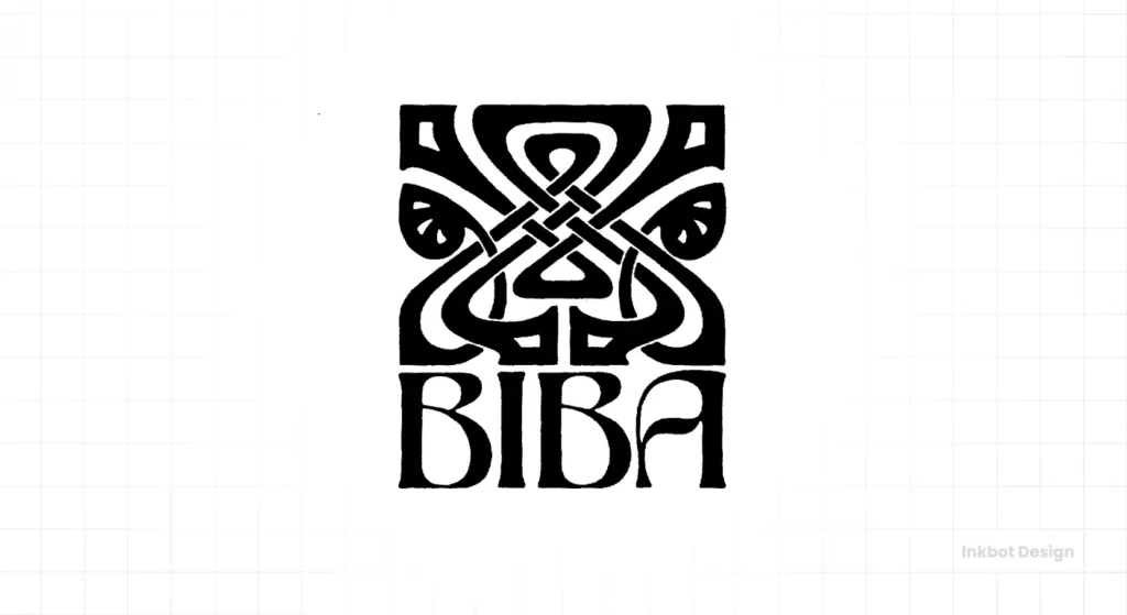
The Designer & The Context Finally, a counterpoint. Not everything in the 70s was minimalist Helvetica. The iconic London fashion store Biba, founded by Barbara Hulanicki, was the epicentre of a glamorous, decadent style. Its logo, designed in-house, was the complete antithesis of corporate modernism.
Deconstructing the Design The Biba logotype is pure theatre. It’s an ornate, delicate, and complex mark heavily influenced by the curves of Art Nouveau and the gilded geometry of Art Deco. Often rendered in gold on a black background, it was all about luxury, fantasy, and exclusivity.
Why It Endures: It was a perfect reflection of its brand. Biba wasn’t selling utility; it was selling a dream. The logo was an unapologetic statement of the brand’s ethos. It proves that breaking the rules of minimalism works, but only if it’s done in a way that is authentic to the brand experience you are creating. It was maximalism with a purpose.
The Takeaway for Your Business: The minimalist path is powerful but not the only one. A more decorative mark might be appropriate if your brand is all about craft, luxury, detail, and a rich, immersive experience. But you must understand the rules of modernism before you can break them effectively.
The Legacy of 1970s Logo Design
Looking back at these giants, a clear pattern emerges. The enduring brands of the 1970s were built on a foundation of:
- Clarity over Complexity: They strove to communicate a single idea in the most direct way possible.
- Concept over Decoration: Each logo was built on a strong, central idea, not just a passing visual style.
- Systems over One-offs: These weren’t just logos but the centrepieces of comprehensive visual identity systems designed for consistency across all applications.
These lessons are relevant and critical for survival in today’s infinitely cluttered digital world. Your brand must cut through the noise with a clear, simple, and powerful message.
Need a Logo with Lasting Power?
Understanding these principles is one thing. Applying them to your own business is a different challenge entirely. The designers of the 70s were masters of strategic reduction—of finding the one thing that mattered and discarding the rest.
If you’re an entrepreneur or business owner struggling to create a brand identity that feels as timeless and confident as the examples above, it might be time to talk to a professional. A great logo isn’t an expense; it’s a long-term investment in a core business asset.
At Inkbot Design, we specialise in creating brand identities built on strong concepts, not fleeting trends. Explore our logo design services or request a quote to see how we can make a brand for your business that will still look brilliant in 2050.
Frequently Asked Questions About 1970s Logos.
What defines a 1970s logo?
A typical 1970s corporate logo is characterised by minimalism, bold, geometric shapes, and clean sans-serif typography, heavily influenced by the International Typographic Style (Swiss Style). However, the decade also saw expressive, decorative styles in sectors like fashion and music.
What fonts were popular for logos in the 1970s?
Why are so many 1970s logos so simple?
Simplicity was driven by both philosophy and technology. Philosophically, designers were reacting against the visual chaos of the 1960s. Technologically, logos had to be simple to reproduce clearly via primitive methods like faxing, photocopying, and low-resolution television broadcasts.
Who were the most famous logo designers of the 1970s era?
Key figures whose work defined the era include Saul Bass (AT&T, Warner), Paul Rand (ABC, IBM), Milton Glaser (I ♥ NY), Herb Lubalin (PBS), and the firm Chermayeff & Geismar Associates (Mobil, Chase Bank).
What is the NASA “Worm” logo?
The “Worm” is the nickname for the logotype designed in 1975 by Richard Danne and Bruce Blackburn for NASA. It features a minimalist, geometric rendering of the agency’s name. It was used until 1992 before being revived for limited use in 2020.
Is retro logo design a good idea for a new business?
It can be, but it’s risky. A successful retro logo adopts an era’s principles (like simplicity and conceptual clarity), not just its superficial aesthetics (like colours and fonts). A poorly executed retro logo can make a new business look dated and unoriginal.
Why did so many 70s logos use circles?
The circle is a perfect, universal shape that conveys unity, completeness, and global scale. Designers like Paul Rand (ABC) and firms working on brands like Volkswagen used it to create enclosed, balanced, and timeless marks.
What is the difference between a ’70s and an ’80s logo?
’70s logos were often grounded in minimalist, modernist principles. In the 1980s, design usually became more expressive and colourful, influenced by Postmodernism, the Memphis Group, and the capabilities of new digital design tools, leading to more gradients, complex shapes, and playful aesthetics.
How can I apply 70s design principles to my modern logo?
Focus on the core idea. Strip away every non-essential element. Ensure your logo is clear and legible at any size, from a tiny favicon to a large sign. Build it around a strong concept, not a temporary style.
Where can I find more examples of 1970s logos?
Online archives like LogoLounge and Brand New often feature historical retrospectives. Design books dedicated to masters like Saul Bass, Paul Rand, and the firm Chermayeff & Geismar are also excellent resources.
