15 Rebranding Examples: The Truth Behind the Pivot
Most business owners treat a rebrand like a trip to the tailor. They believe that if they change the suit, the person underneath will become more successful. They’re wrong.
At Inkbot Design, I’ve spent years performing autopsies on failed identities. A rebrand isn’t a fresh coat of paint; it’s a structural renovation.
If you’re looking for “pretty” inspiration, go to Pinterest. If you want to understand why a multi-million-pound company would risk its entire market share to change a typeface, read on.
Ignoring the technical nuances of your rebranding strategy doesn’t just look bad—it costs money.
According to McKinsey & Company, brands with high design index scores outperform the S&P 500 by 211%. Conversely, a botched rollout can result in a 20% decline in revenue in a single quarter.
- Rebrands are structural renovations, not cosmetic fixes; fix operational issues before changing visual identity to avoid wasted investment.
- Protect Distinctive Brand Assets like Tropicana’s orange; maintain findability and cognitive fluency during redesigns.
- Balance legibility and style; tests like the Squint Test prevent logos becoming puzzles, as with Kia’s failed mark.
- Align operations with promises; branding without real change invites accusations of hypocrisy, as BP’s example shows.
- Technical scalability matters; use responsive vectors, SVGs, and accessible palettes so identity works from favicons to billboards.
Why These Rebranding Examples?
These Rebranding examples are documented instances where a company fundamentally alters its corporate image, identity, or market positioning. This process typically involves changing the name, logo, visual assets, or core messaging to distance the entity from negative perceptions or to align with a new strategic direction.
The 3 Core Elements of a Professional Rebrand:
- Visual Identity Evolution: Modernising typography and colour palettes for digital-first environments (e.g., shifting from complex gradients to flat, SVG-optimised vectors).
- Market Repositioning: Moving the brand from one category to another (e.g., from a “product” company to a “platform” company).
- Operational Alignment: Ensuring the internal culture and customer experience match the new outward promise.
1. Tropicana: The £27 Million Lesson in Visual Triggers
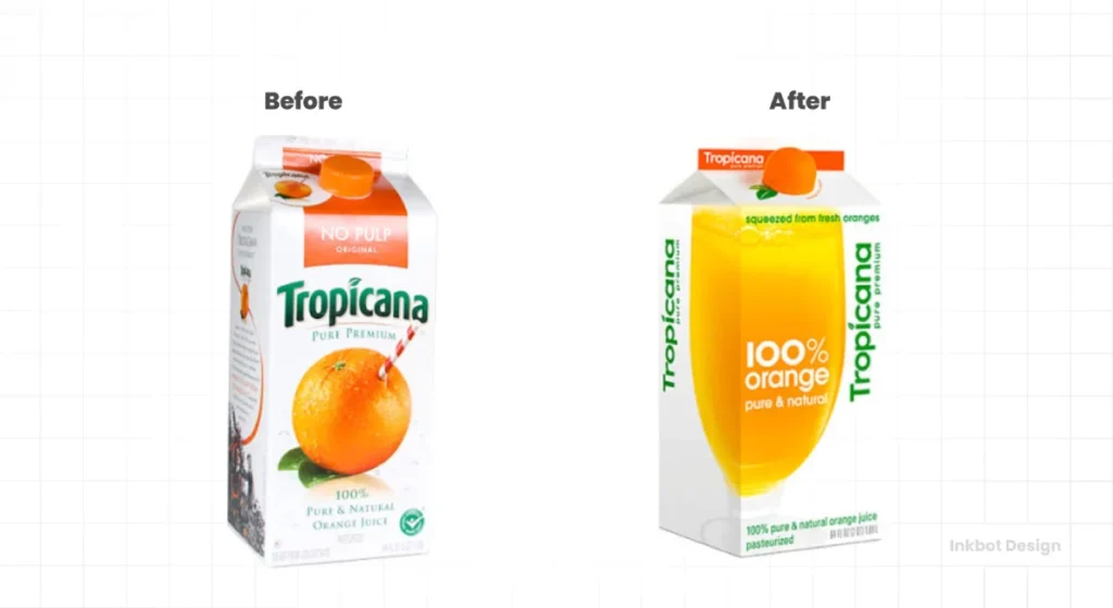
In 2009, Tropicana (owned by PepsiCo) decided to modernise. They replaced their iconic “straw-in-the-orange” imagery with a clean, minimalist glass of juice and a sans-serif typeface.
The Result: Sales plummeted by 20% in two months. They lost £27 million in revenue because consumers no longer recognised the product on the shelf.
The Technical Failure: They ignored “Cognitive Fluency.” When a consumer scans a supermarket shelf, they aren’t reading; they are pattern matching. By removing the orange—the primary visual anchor—Tropicana broke the pattern.
The Lesson: Never sacrifice “Findability” for “Aesthetics.” If you are considering a company rebranding, ensure your “Distinctive Brand Assets” (DBAs) are protected.
2. Dunkin’: Dropping the “Donuts” to Scale
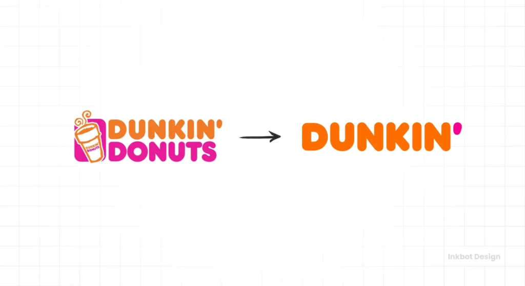
In 2019, Dunkin’ Donuts became just “Dunkin’.” This wasn’t just a shorthand nickname; it was a move to own the beverage market.
The Strategy: Research showed that 60% of their revenue came from coffee. By keeping the word “Donuts,” they were pigeonholed into a morning-only, food-heavy category. Dropping the suffix allowed them to compete directly with Starbucks.
The Technical Detail: They retained their iconic orange and pink colour palette and the “rounded” font style. This is a masterclass in a rebranding vs brand refresh strategy. They changed the name (Rebrand) but kept the visual equity (Refresh).
3. Burberry: From “Chav” to Couture
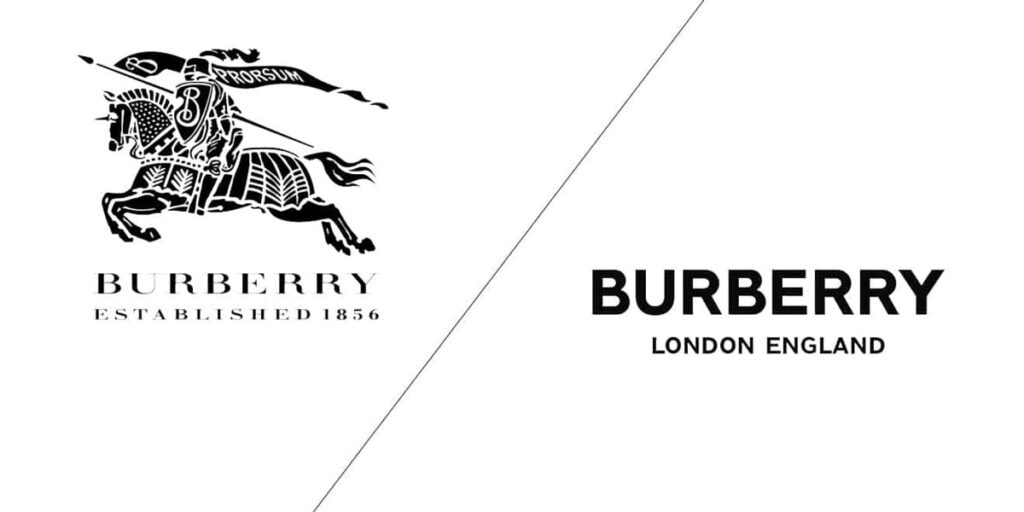
In the early 2000s, Burberry had a problem. Their signature check pattern was being mass-produced by counterfeiters and associated with “hooligan” culture in the UK.
The Consultant’s View: I often tell clients that your brand is not what you say it is; it’s what they say it is. Burberry responded by drastically reducing the use of the check pattern, hiring high-profile designers, and aggressively reclaiming its heritage.
The Outcome: By 2018, under Riccardo Tisci, they even modernised their logo to a bold, blocky sans-serif. This shift signalled a move toward “Streetwear-meets-Luxury,” a move that Gartner notes as a key driver for Gen Z luxury consumption.
Amateur vs Professional Rebranding
| Feature | Amateur Approach (The Mistake) | Professional Approach (The Solution) |
| Typography | Choosing a font because it looks “cool.” | Testing legibility at 8px and checking character kerning for accessibility. |
| Colour | Picking “Blue” because the CEO likes it. | Using Pantone-matched values with high contrast ratios for WCAG 2.1 compliance. |
| Logos | Complex illustrations that look muddy on a mobile screen. | Simplified, responsive vectors with minimal anchor points for fast loading. |
| File Formats | Using JPEGs for everything. | Using SVGs for web and high-resolution EPS for print to avoid rasterisation. |
4. Kia: The “KN” Legibility Crisis
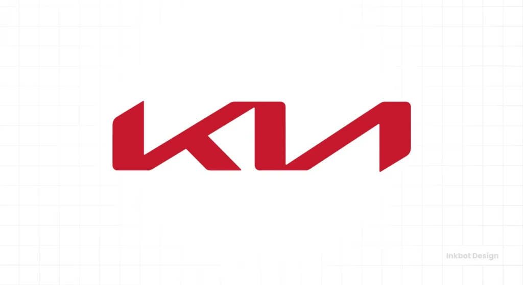
In 2021, Kia unveiled a sleek, minimalist logo. It was meant to represent “Movement that inspires.” Instead, it inspired 30,000 people a month to search Google for “KN car” because the ‘I’ and ‘A’ were merged into a single shape.
The Technical Failure: They prioritised “Symmetry” over “Legibility.” In branding, if your customer can’t read your name, you don’t have a brand; you have a puzzle.
The Lesson: Always perform “The Squint Test.” If you squint at your logo and the letters blur into an unrecognisable shape, your rebranding strategy is fundamentally flawed.
5. Old Spice: Reclaiming the “Grandpa” Brand
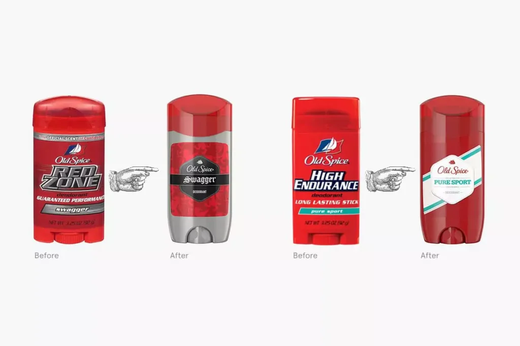
Before 2010, Old Spice was something your grandfather wore. It was stagnant. Then came “The Man Your Man Could Smell Like” campaign.
The Pivot: They didn’t just change their ads; they shifted their target audience. They realised that women buy 60% of male body wash. By creating a brand that appealed to women’s sense of humour while remaining “masculine,” they doubled their sales.
The Data: According to Nielsen, this campaign led to a 107% increase in sales of Old Spice Body Wash within 30 days of the Super Bowl ad.
6. Slack: Fixing the “Octothorpe” Mess
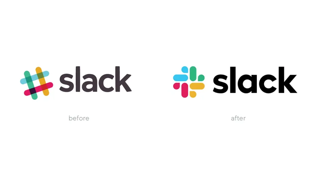
Slack’s original logo was a slanted hashtag (octothorpe) with 11 different colours. It was a nightmare to place on any background that wasn’t white.
The Technical Fix: In 2019, they simplified the palette to 4 primary colours and straightened the geometry. This reduced the “Visual Noise” and made the brand more cohesive across mobile apps and desktop notifications.
Why it Worked: It improved “Scalability.” A logo must work on a billboard and a 16px favicon. Slack’s original logo failed this; their new one passed. Use a rebranding checklist to ensure your assets are technically sound before launching.
7. Mastercard: The Post-Text Era
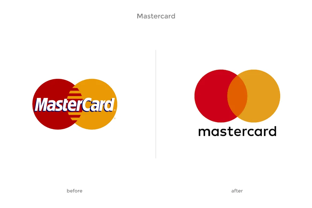
In 2019, Mastercard removed its name from its logo. They were so confident in their “Interlocking Circles” that they felt the text was redundant.
The Strategy: As we move toward a “Digital Wallet” economy, space on a smartphone screen is at a premium. By removing the text, the icon becomes larger and more recognisable.
The Result: They joined the ranks of Apple, Nike, and Target—brands so iconic they don’t need to introduce themselves. This is the pinnacle of “Symbolic Equity.”
The State of Rebranding in 2026
We are entering the era of Generative Identity. Over the last 18 months, the cost of generating visual assets has plummeted, while the value of a “Human-Centric Strategy” has skyrocketed. In 2026, a rebrand isn’t just a static logo; it’s a dynamic system.
- Variable Logos: Logos that automatically shift their weight or complexity based on the user’s screen brightness or device type.
- Algorithmic Palettes: Colours that adjust for accessibility in real-time.
- Sonic Branding: As voice-search and “Screenless” interfaces grow, your brand needs a sound, not just a look.
If your rebranding doesn’t account for these technological shifts, you are designing for the past. Request a quote if you want a brand built for the next decade, not the last one.
8. Airbnb: The “Belo” Controversy
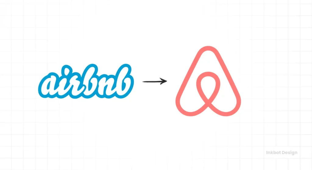
In 2014, Airbnb introduced “The Belo”—a symbol representing People, Places, Love, and Airbnb. The internet immediately compared it to… well, various parts of the human anatomy.
The Reality: Despite the initial mockery, the rebrand was a massive success. Why? Because they moved from a “Service” brand (renting a room) to a “Community” brand (belonging anywhere).
The Consultant’s Observation: I once audited a client who was terrified of negative Twitter comments during a launch. I told them: “Twitter is not your market.” Airbnb ignored the trolls and focused on the fact that the new logo was easy for hosts to draw on a chalkboard. It was a “Participatory” brand.
9. Apple (1997): The Return to Minimalism
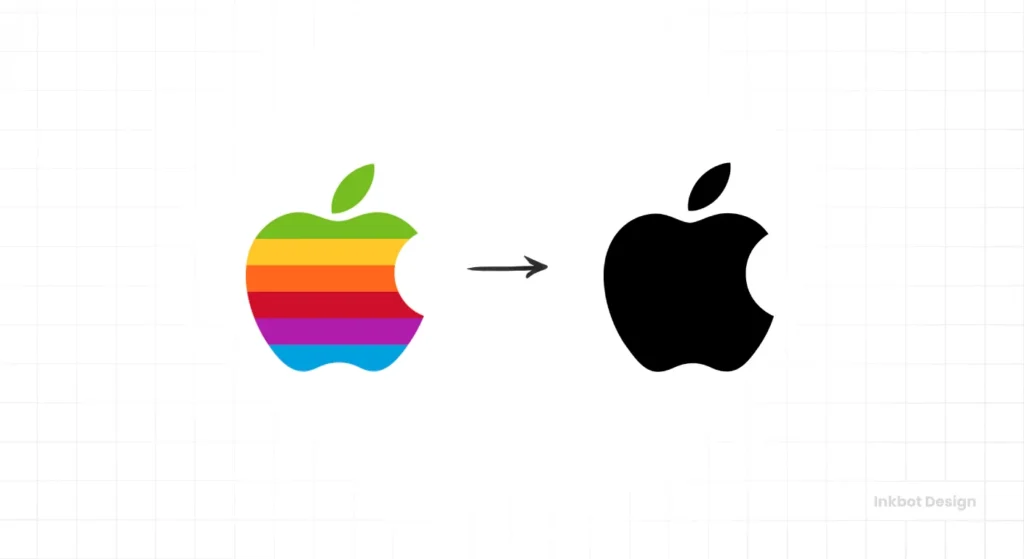
When Steve Jobs returned to Apple in 1997, the company was on the verge of bankruptcy. They had a rainbow logo and a cluttered product line.
The Move: Jobs simplified. He turned the rainbow logo into a sleek, monochromatic silhouette. This shifted the brand from “Wacky Computer Company” to “High-End Design Powerhouse.”
The Technical Impact: The monochromatic logo allowed for “Material Integration.” It could be embossed in aluminium, backlit on a laptop lid, or etched in glass. The rainbow logo would have looked cheap on a MacBook Pro.
10. BP: The “Greenwashing” Warning

In 2000, British Petroleum became “BP: Beyond Petroleum” and changed its shield logo to a “Helios” sunburst.
The Failure: While the design was beautiful, the company’s actions (including the Deepwater Horizon disaster) didn’t match the “Green” promise.
The Lesson: A rebrand that outpaces your actual operational reality is a lie. Consumers in 2026 have zero tolerance for “Brand Hypocrisy.” If you claim to be “Beyond Petroleum,” you’d better not be spilling it into the Gulf of Mexico.
Debunking the “Logo-First” Myth
Many “designers” will tell you that a rebrand starts with a sketch. They are wrong. A professional rebrand starts with an Audit.
The Myth: “A new logo will fix our declining sales.”
The Data: Research from Deloitte Insights suggests that 80% of brand perception is driven by “Customer Experience,” not “Visual Identity.”
If your product is subpar, a new logo is just an expensive way to tell people you’re still the same company they didn’t like before. You must fix the “Root Cause” before you fix the “Root Graphics.”
11. Instagram: Skeuomorphism to Flat Design

In 2016, Instagram replaced its retro camera icon with a vibrant, gradient-heavy glyph. The backlash was immense. People loved the “Classic” look.
The Technical Necessity: The old icon was “Skeuomorphic”—it attempted to resemble a real physical object. This style doesn’t scale well on high-resolution Retina displays. The new “Flat” design was built for the mobile-first era.
The Outcome: User growth didn’t skip a beat. People complained for a week, then forgot. This proves that “User Loyalty” is stronger than “Icon Nostalgia.”
12. Facebook to Meta: The Pivot to the Metaverse

In 2021, Facebook rebranded its parent company to Meta. This was a classic “Distancing Move.”
The Strategy: By separating the “Company” (Meta) from the “Product” (Facebook), they protected their other assets (Instagram, WhatsApp, Oculus) from the negative PR surrounding the Facebook social network.
The Visual: The “Infinity” loop is designed to work in 3D environments. It’s a logo meant to be viewed through a VR headset, not just on a 2D screen.
13. Domino’s: The “Pizza Turnaround”
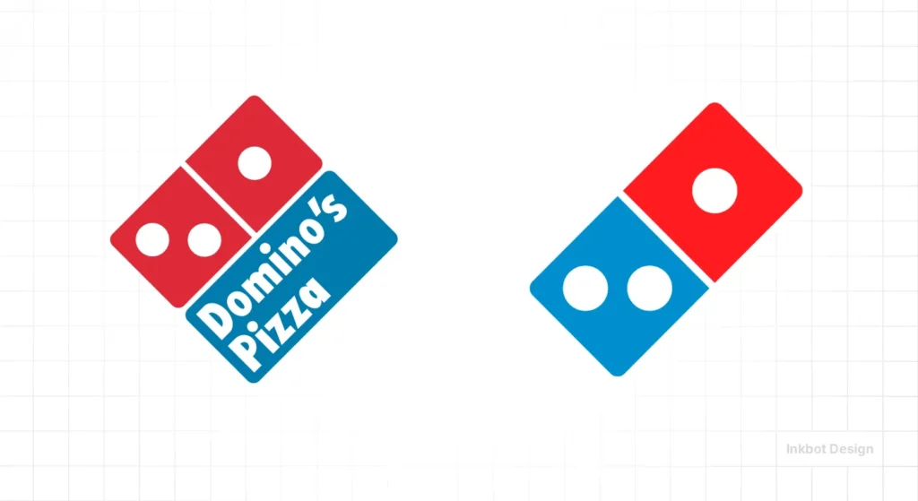
Domino’s did something brave in 2009: they admitted their pizza tasted like “cardboard.” They rebranded by being brutally honest.
The Rebrand: They didn’t just change the logo; they changed the recipe. They documented the process and made the “Chef” the star of the brand.
The Fiscal Result: Their stock price rose from £3 in 2008 to over £400 by 2021. This is the gold standard of an “Operational Rebrand.”
14. Kia (Again): The Cost of Trademark Failure
I’m mentioning Kia twice because their rebrand also highlights the “Global Trademark” issue. When you rebrand, you must ensure that your new mark doesn’t conflict with existing entities in every market where you operate.
The Risk: A conflict can result in a “Cease and Desist” after you’ve already spent millions on signage and stationery. Always consult a legal expert in conjunction with your Inkbot Design consultant.
15. Starbucks: Removing the “Coffee”
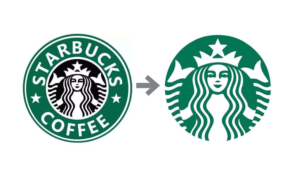
Like Dunkin’, Starbucks removed the words “Starbucks Coffee” from their logo in 2011.
The Reasoning: They wanted to sell tea, breakfast sandwiches, and even wine/beer in some locations. The word “Coffee” was a limitation.
The Technical Win: The “Siren” is now one of the most recognisable symbols in the world. By simplifying the mark, they made it easier (and cheaper) to print on millions of cups, napkins, and bags every year.
The Verdict
A rebrand is not an “Expense”—it is a Capital Reinvestment. If you are doing it because you’re “bored” with your current look, stop. You are about to burn money. If you are doing it because your business has outgrown its current skin, or because your technical debt is hindering your digital performance, then it is the most important move you will make this decade.
Rebranding is a forensic process. It requires an audit of your visual equity, a deep understanding of your customer’s “Pattern Recognition,” and a technical execution that works across every substrate—from a 16px favicon to a 40-foot billboard.
Next Step: Are you ready to stop guessing and start scaling? Request a quote for a forensic brand audit today, or explore our brand identity services to see how we fix what others break.
Frequently Asked Questions (FAQ)
Why do companies decide to rebrand?
Companies rebrand to reflect a change in ownership, a pivot in market strategy, or to modernise an outdated image. It is often a strategic move to distance the brand from negative associations or to appeal to a new, younger demographic that finds the current identity irrelevant.
How much does a professional rebrand cost?
For an SMB, a professional rebrand typically ranges from £10,000 to £50,000. For global corporations, the cost can run into millions, accounting for strategy, legal trademarking, and the massive logistics of replacing physical signage and assets across multiple territories.
What is the difference between a rebrand and a brand refresh?
A brand refresh is a tactical update to visual elements (like slightly tweaking a font or colour). A rebrand is a fundamental strategic shift that often involves changing the company’s name, core values, target audience, and entire visual identity system.
How long does the rebranding process take?
A thorough rebrand for a medium-sized business usually takes between 3 to 9 months. This includes the initial audit, strategy development, design phases, legal clearances, and the final rollout across all digital and physical touchpoints.
Why did the Tropicana rebrand fail so badly?
Tropicana failed because it ignored “Distinctive Brand Assets.” They removed the “Orange with a Straw” imagery, which was the primary visual cue consumers used to find the product. This broke the consumer’s “Cognitive Fluency” and led to an immediate drop in sales.
Can a rebrand help a company after a scandal?
Yes, it can, but only if the rebrand is accompanied by real operational change. Simply changing the logo (as BP did) without addressing the underlying issues often leads to accusations of “Greenwashing” or “Brand Laundering,” which can further erode trust.
How do I know if my business needs a rebrand?
You need a rebrand if your current identity no longer accurately reflects what you do, if you are struggling to attract your target audience, or if your visual assets are technically flawed (e.g., they appear poorly on mobile devices or are difficult to reproduce in print).
What is “The Squint Test” in logo design?
The Squint Test involves squinting your eyes while looking at a logo. If the shapes and letters blur into an unrecognisable mess, the design lacks “Visual Hierarchy” and “Legibility.” A good logo should remain recognisable even when its details are obscured.
Why are all modern logos starting to look the same?
This is a trend called “Blanding.” Many tech companies are moving toward simple, bold sans-serif fonts because they are highly legible on small mobile screens and convey a sense of “Reliability” and “Utility.” However, it can lead to a loss of brand personality.
What is the biggest mistake entrepreneurs make when rebranding?
The biggest mistake is “Personal Bias.” Founders often choose designs based on their personal taste rather than what will resonate with their target market. A rebrand should be driven by data and strategy, not the CEO’s favourite colour.
Does a rebrand always include a new name?
Not always. Many successful rebrands (like Dunkin’ or Starbucks) involve shortening or slightly modifying the name to allow for broader market appeal. A total name change is usually reserved for companies undergoing a complete structural or legal pivot.
How do I measure the success of a rebrand?
Success is measured through “Brand Health Metrics” (including awareness, sentiment, and recall) and “Financial Metrics” (such as sales velocity, market share, and customer acquisition costs). You should establish a baseline before the launch to accurately track the ROI of the pivot.
