The Ultimate Guide to App Logo Design
With so many apps in the various app stores, yours must be noticeable. It is not just evident but also attention-grabbing and memorable.
The logo of your app is not a mere decoration; it is the face of your digital creation — the first impression that could either make or break someone’s decision to download.
Nevertheless, most app logos are quickly forgotten.
They become one with the rest in our crowded screens, lost in similarity.
So, what makes for a great app logo? It should be able to start conversations. Think of it as an image version of those catchy jingles that get stuck in your head.
Creating such a logo doesn’t involve following trends or imitating giants. Instead, you must know what your app is about and visually represent this idea using something simple yet powerful that can speak volumes within seconds.
This guide isn’t solely focused on aesthetics; it aims at impact, too. Are you ready to develop an App Logo Design that won’t just sit on people’s screens but live inside their hearts? Then, let’s get started!
- App logos are crucial for brand identity, serving as the first impression to potential users.
- Memorable logos enhance brand recognition by 80%, fostering emotional connections with users.
- Design principles like simplicity, scalability, and colour psychology are essential for effective logos.
- Understanding logo types and avoiding common mistakes ensures a unique and recognisable brand symbol.
Understanding App Logos
More than a beautiful picture, your app logo represents your brand’s face and needs to attract potential users’ interest.
Types of App Logos
Logos can take various forms, each serving a different purpose and aesthetic within your branding strategy. Here's a breakdown of the primary types:
| Iconic Logos | Simple, recognisable symbols that represent your app. |
| Wordmark Logos | Your app's name is stylised through typography. |
| Combination Logos | A blend of icons and text to enhance recognition. |
| Emblem Logos | Logos that feature a seal or badge-like design. |
| Abstract Logos | Unique shapes that convey a concept or idea. |
This diversity allows you to choose what aligns best with your brand identity.
Importance of App Logos
Logos are vital for creating brand awareness and shaping customer perception. They act as visual triggers and emotional touchpoints for your audience.
Furthermore, it is essential to note that a logo can instantly summarise what your brand represents. According to studies, memorable logos can increase brand recognition by 80%.
The more frequently people come across your logo design, the more they become familiar with it, developing trust towards your application on a much deeper level emotionally.
Imagine your emblem is like shaking hands – this will be their initial contact point with users, so make sure it is firm yet welcoming enough for them to want to stay engaged.
Critical Factors in App Logo Design

Many factors contribute to the making of an app logo. However, some important ones will make it stand out and connect with your audience. Knowing these factors can help you turn a logo into a powerful symbol for your brand.
Here is what you should focus on:
- Brand Recognition
- User Perception and Trust
- Simplicity and Clarity
- Scalability
- Colour Psychology
Remembering these things while creating your logo will catch people’s attention and represent your brand identity better.
Design Principles
Following established design principles is vital when designing an app logo. Things like balance, contrast, hierarchy, etc., all increase its visual appeal and make it easy for users to recognise. You want something memorable yet straightforward that conveys what your brand stands for.
Colours significantly impact how people perceive things around them, especially regarding apps. Certain colours can trigger specific emotions, which creates a connection between the user and the application. This connection becomes vital in crowded markets where first impressions may build or destroy any brand's success.
According to recent research, 85% of consumers base their decisions on colour(s) while purchasing goods/services. This implies that apart from reflecting company values through chromatics, one should consider psychological triggers associated with particular shades.
For example, trustworthiness (blue) and excitement (red). In such a way or another, applying various tints in emblematic representation will foster emotional attachment among clients, thereby improving the overall customer experience with the organisation and its products/services/offerings.
Step-by-Step Logo Design Process
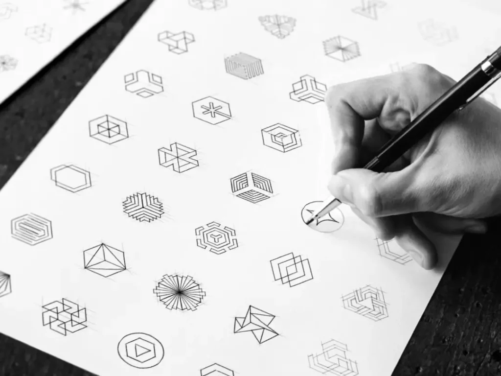
Not every logo can captivate an audience, but an effective app logo can make a difference. Here’s a streamlined approach to creating an unforgettable logo for your brand.
| Phase | Details |
| Initial Research | In the initial stage, I focus on understanding the market and competition. Analysing existing logos in your niche helps me identify trends and gaps, guiding the creation of a logo that stands out. This foundational step sets the tone for the entire design process. |
| Concept Development | During concept development, I brainstorm multiple ideas and create rough sketches. It’s about letting creativity flow and establishing a direction that aligns with your brand identity. I also craft mood boards to visualise colours, shapes, and styles that resonate with your target audience. |
| Prototyping and Feedback | Once I have several concepts, I move on to digital prototypes. Collecting stakeholder feedback ensures that the logo aligns with expectations and reflects the brand's core values. |
| Refinement and Finalization | After gathering feedback, it’s time for refinement. I make iterative improvements based on suggestions and prepare the logo for various formats and uses across different platforms. |
Initial Research
Exploring initial research is very important now. It means looking at the competition and finding trends in your market. Knowing what works and doesn’t work can help me make a logo that doesn’t only fit in but also stands out in crowded places.
Concept Development
That’s where the magic of concept development starts. I take the things I’ve learned from my research so far, and I begin to sketch ideas. This part is about being curious and creative – I can try many different things, never sticking to just one. Gradually, a vision for your brand will take shape as various elements are brought together.
When developing my concepts, strategy mixes with creativity. I strive for multiple iterations that express your brand’s values while accounting for how people see things emotionally.
Through this back-and-forth process of making many versions, we arrive at something real-feeling that connects with users on an emotional level; this prepares the ground for not just any other visible logo but one that stays memorable across minds, too.
Thus, every doodle represents more than design because it links your app or website on one side and its potential visitors or users on another, ensuring that the sign will attract attention among the countless options available.
Tips for Effective App Logo Design

Now, let’s look at some practical tips for creating an app logo that will be effective in today’s crowded marketplace. The logo is not just a visual representation of your brand; it is also its most critical touchpoint. Keep these points in mind as you start on your design journey:
- Keep it straightforward so that people can recognise it quickly.
- Make sure that the logo can scale well to different devices.
- Choose colours carefully because they can evoke certain emotions.
- Use typography alongside iconography to effectively communicate what you want your message or storyline to be about.
- Ask for feedback early and often throughout the design process to refine your work further or make necessary changes where required.
It may seem overwhelming initially, but following these pointers should also help you craft something memorable that reflects your brand vision.
Scalability First
When considering scalability, some aspects of design become more important than others. Your main goal when designing a logo should be versatility – how will this look on my iPhone versus being displayed on Times Square?
Ensure you test various sizes and formats so that regardless of where or how it is used, people can still easily read and identify with your symbol. This adaptiveness matters in the current multi-device scenario where users continuously interact with brands through different platforms.
Playing with Type
Now let us talk about typefaces and their relationship in the app logotype creation process; believe me, it plays one colossal role!
Fonts have personalities they would express if given a chance, thus making them perfect candidates for emotional enhancement or even general awareness improvement when used correctly within logos.
You must consider factors like readability levels plus style synchronisation for an overall organisational image before choosing any lettering system to accurately represent your company across all marketing materials’ designs, among other applications!
The fonts you choose for your logo will say more about who you are than the words themselves ever could.
A suitable typeface adds personality and distinctiveness to any mark, instantly making it memorable. For example, if you were creating a tech app logo, then using heavy sans-serif might be best; conversely, elegant serif could work better for lifestyle brands – just make sure everything matches up aesthetically, in any case!
Remember, every detail counts when creating something that authentically communicates what your brand stands for.
Pros and Cons of Different Logo Types
When choosing a logo for your app, consider the best type.
Logos come in three basic types: text-based, icon-based, or a combination.
Each has advantages and disadvantages, which I will review now so that you can make an informed choice about which suits your brand.
Text-Based Logo Pros and Cons
| Pros | Cons |
| High brand recognition through name emphasis. | It can be less memorable compared to graphic logos. |
| Easy scalability with various fonts. | It may lack uniqueness if overused fonts are chosen. |
| A clear indication of brand identity. | Limited emotional connection without visual elements. |
| Versatile usage across marketing materials. | Potentially hard to read in smaller formats. |
| Direct communication of your brand's name. | There is less opportunity for creative interpretation. |
Text-Based Logo Pros and Cons
When making a logo out of text, it should be noted that the brand name is crucial. This clearness can help people understand and recognise what it represents quickly.
However, the problem is making your logo different from other companies, especially when many brands settle for standard fonts that might not easily stick into people’s minds.
A good logo should be readable enough while still maintaining its individuality.
Icon-Based Logo Pros and Cons
| Pros | Cons |
| Strong visual impact and memorability. | It may require more time for brand recognition. |
| Can convey complex ideas through imagery. | Risk of being too abstract or misinterpreted. |
| Flexibility in various media and sizes. | Less direct identification with the brand name. |
| Easier integration into digital interfaces. | It may translate poorly to some marketing materials. |
| Uniqueness can set the brand apart visually. | Creating a distinctive icon can be challenging. |
Icon-Based Logo Pros and Cons
A powerful visual representation of what they stand for is an icon-based logo.
The most captivating thing about these logos is their ability to communicate intricate ideas or feelings quickly. However, one must remember that an icon can be too abstract and fail to resonate with the intended market, requiring additional branding activities.
Understanding Icon-Based Logo Pros and Cons
| Pros | Cons |
| Visually engaging and easy to recognise. | It is less effective alone without accompanying text. |
| It can be more versatile across platforms. | It may require multiple iterations to get right. |
| Potential for symbolic relationships with users. | There is a need for careful consideration of cultural implications. |
| Instils an emotional connection through visuals. | It may need more clarity if too many elements are involved. |
| Often timeless and less likely to go out of style. | It can become cliché if not innovatively designed. |
By assessing the pros and cons of each logo type, you can make a strategic decision that reflects your brand's identity and resonates with your audience.
Understanding these distinctions allows for a personalised approach to your app's visual representation, ensuring it stands out in a competitive market while fostering brand loyalty.
Tools and Resources for Designing App Logos
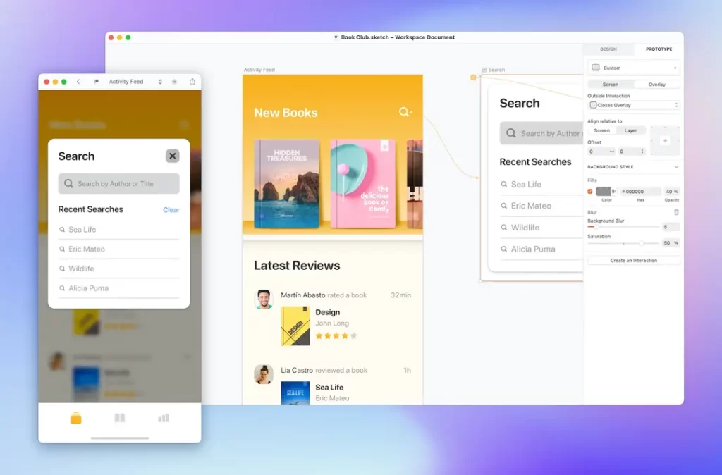
Again, I’d like to stress the importance of using the right tools for app logo design.
Employing these can bring your concept to life and make it a recognisable symbol of your brand instead of just another image that people forget about.
So, let’s take a closer look at what I consider pretty useful when designing logos.
Options for Design Software
When creating an app logo, you’ll need powerful software friendly to those new to design and experienced designers alike.
You can do this with Adobe Illustrator, Sketch or Figma, which provide extensive features necessary for making detailed vector graphics that will stay sharp on any size screen, no matter how small.
Each option has strengths, so think about which will work best for you according to your design style and workflow.
Online Logo Generators
Online logo generators might be tempting because they offer quick solutions but don’t require much skill in graphic arts themselves; however, there are still some caveats here, too – namely, lack of originality or depth inherent in any product coming out through cookie-cutter method like this..!
Nowadays, resources for online logo generators seem limitless. Canva, Looka, and Hatchful are great examples of how users can quickly try different templates and styles without hassle!
Still remember, though – if too many people follow the same fast-track approach, their designs will eventually start looking the same… And so, if pursuing such a route, please add lots more personalised touches so that the design is truly a unique representation of your brand.
Remember that compelling logos should look nice and tell the story about your company.
Comparison of Tools
| Tool | Features |
| Adobe Illustrator | Industry-standard software for vector graphics, offering advanced design capabilities. |
| Sketch | User-friendly interface focusing on web and mobile design; great for collaboration. |
| Figma | A cloud-based design tool that allows for real-time collaboration and prototyping. |
| Canva | Easy-to-use platform with a wide array of templates; ideal for beginners. |
| Looka | AI-powered logo maker that generates options based on user preferences. |
As you explore these tools, consider how each aligns with your goals for your app logo.
Ultimately, the right choice can facilitate a more effective design process, helping you create a logo that resonates with your target audience.
Common Mistakes to Avoid
Many designers and entrepreneurs forget fundamental principles when making an app’s logo. Aiming for a unique design is good, but knowing what not to do is essential.
Making things too complicated
Simplicity is vital if you want your logo to be memorable. When it comes down to it, complex designs can confuse people and dilute the intended message of a brand. Clean designs work better on smaller screens, which need clarity for recognition.
Not consistent with the brand
If your logo does not match up with other visual elements or overall identity, this could create confusion among viewers, thus weakening its impact as part of your branding strategy. A logo should amplify a brand, not contradict it – so always ensure that colours used in logos reflect the core messages being communicated by brands.
Test with users
Forgetting user testing is common practice, even amongst some experienced professionals who assume they have created the best design ever made without consulting anyone outside their team.
User experience will help you understand whether or not people like what they see in terms of how easy or difficult something may be understood at first glance.
You might love your creation, but unfortunately, this doesn’t mean everybody else will, too, especially those supposed to use such apps most frequently.
A/B testing is another great way to obtain feedback from different individuals simultaneously, saving time while still receiving quality data.
FAQs
Why is a logo important for brand recognition?
An app logo acts as the visual foundation of your brand. Users usually notice it first, which can significantly affect their ability to remember your app, among many others. Just think about the small Apple or Instagram camera. When a logo has been created well, it becomes synonymous with the service or product it represents; this makes people connect instantly in their minds, leading them back again and again.
In what ways does design influence user trust?
A logo stands and speaks for your values and professionalism as a brand. People often link sleekness in designs with dependability; therefore, when they come across an attractive-looking emblem consistent across different platforms, they are more likely to believe in the application and feel comfortable inputting their time and data into it. Thoughtful logos can elicit positive emotions, which is imperative when fostering user loyalty.
What should be included in a primary yet effective app logo?
Simplicity reigns supreme over everything else in terms of designing logos. An ideal one should be memorable, versatile enough to work at various scales, both small and large, and have few colours, if any at all, alongside minimal details added to it, too. Simple ones get easily recognised, thus fitting perfectly on any screen size or resolution — ensuring that individuals will recall them fast, even from afar.
How significant is colour psychology when making logos for apps?
Colour plays a crucial role during this process since they have power over how we perceive things and our emotions towards them. Each hue has its associations that can significantly affect user behaviour. For example, blue symbolises trust, while red shows energy. Picking shades that match your brand’s character creates an image and triggers desired emotional responses from clients, thus making software more relatable.
What mistakes are commonly made in app logo design, and how can I avoid them?
Overcomplicating designs, failing to maintain branding consistency or ignoring user feedback are standard errors. To avoid these pitfalls, keep it simple yet clear in terms of visuals; ensure that your company’s emblem fits into a broader identity system; seek opinions about different versions of the same from various people who use similar programs. Consider this: People-centered design builds lasting relationships, but aimless aesthetics may mislead you.
Is it necessary to hire a professional designer, or can I use software to create my logo?
This largely depends on what you have and where you want things done. Experts come with lots of skills plus fresh insights, which enable them to produce symbols that seamlessly reflect your brand strategy. Conversely, designing tools found online coupled with appropriate programs could save money while still allowing flexibility for individuals with clear visions. Ultimately, look at things from both sides; if the design is outside the priorities, then seeking expert assistance might yield surprising results.
What steps should I follow when designing an app logo?
Begin by doing some research! Examine what others in the industry are doing and gather ideas for yourself. Then get creative — think about everything your brand stands for while sketching possible concepts or creating mood boards based on those themes. Prototyping is also essential, so make sure people see different drafts before settling down on one idea only after receiving feedback from potential users. Finally, polish up everything until it shines brightly across platforms. Remember, each step counts!

