Logo Placement Rules: 10 Brand Guidelines You Can’t Break
Logo placement rules are not housekeeping. They are the single most enforced section of any brand guideline document, and the most frequently broken by well-meaning designers who were never told why the rules exist in the first place.
Most logo placement documentation in brand guidelines is written to prevent junior designers from making mistakes, not to maximise brand recognition. That distinction matters more than any spacing measurement.
When a rule document tells a designer “leave 2x the logo height as clear space on all sides” without explaining that this protects the logo’s visual weight from competing elements, the designer treats it as an arbitrary constraint — and ignores it the moment they’re under deadline pressure.
Good logo design starts with strategy, but it only survives in the market through disciplined placement.
A mark that costs £15,000 to create and six months to trademark can be made visually incoherent by a marketing executive who drops it into a busy event banner with a 3px margin.
This guide gives you the rules — and, more usefully, the reasoning that makes them stick.
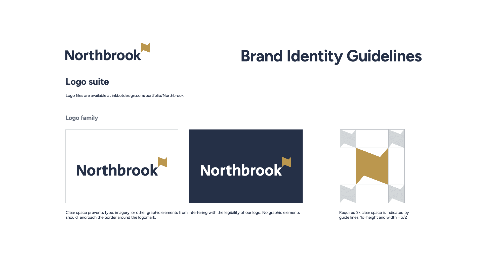
- Express clear space as a ratio of a repeating logo element (typically 1×–1.5×) so spacing scales and preserves visual salience.
- Document exact placement grids for every context: desktop web, mobile, email, social, packaging, signage and presentations with anchor crosshairs.
- Specify separate minimum sizes: millimetres for print and pixels for digital, with visual examples showing illegibility below thresholds.
- List approved background treatments explicitly and include at least six specific misuse examples with correct treatments shown visually.
- Define variant hierarchy, co-branding rules, motion placement templates and strict file version control to prevent inconsistent application.
What Are Logo Placement Rules?
Logo placement rules are the documented specifications within brand guidelines that govern the exact position, minimum size, clear space, colour usage, and contextual application of a logo mark across all brand touchpoints — print, digital, environmental, and motion.
Key Components:
- Clear space zones — the minimum exclusion area around the logo, measured as a ratio of a repeating element (often the cap height of the wordmark or the width of a logo icon)
- Position specifications — defined grid anchors for primary placement on documents, interfaces, signage, and packaging
- Minimum size thresholds — the smallest dimensions at which the logo remains legible, specified separately for print (mm) and digital (px)
Logo placement rules in brand guidelines define the exact position, minimum size, clear space, and background usage of a logo to maintain consistent brand recognition across all touchpoints.
Rule 1: Define Clear Space as a Ratio, Not a Fixed Measurement
Clear space must be expressed as a ratio relative to a repeating logo element, not as a fixed pixel or millimetre value. The reason is simple: a fixed measurement of 20px around a 200px logo is proportionate; the same 20px around a 40px favicon is nothing at all.
The Ehrenberg-Bass Institute’s research on distinctive brand assets shows that visual salience — how quickly and reliably a brand element is noticed in context — is directly affected by the amount of competing visual information surrounding it.
A logo crowded by text, imagery, or UI elements takes longer to process and produces weaker memory encoding. The clear space rule exists to preserve visual salience, not to satisfy a designer’s sense of tidiness.
The standard measurement unit is the x-height — the height of the lowercase ‘x’ in the logo’s wordmark, or the width of a distinctive repeating element in a symbol mark. Adidas uses the width of one stripe from its three-stripe mark as the clear space unit. Apple uses a proportion of its Apple symbol height. Neither figure is arbitrary.
The rule to document: Express clear space as 1x or 1.5x of your chosen measurement unit. Specify it in both a digital mockup (visual) and a written calculation so designers on any platform can reproduce it correctly.
Most brand guidelines specify clear space as a fixed measurement because it’s quicker to write. This is the wrong choice. Fixed measurements produce inconsistent visual weight across applications because they don’t scale with the logo. A ratio tied to a logo element scales correctly at every size, maintains visual salience across applications, and reduces guideline enforcement disputes because the maths is observable rather than arbitrary.
Rule 2: Specify Primary Placement Grid Positions — All of Them
The primary placement position for a logo must be explicitly documented for every major application context: website header, email signature, document header/footer, social media profile, social media cover image, packaging, signage, and presentations.
This feels excessive until the first time someone on your marketing team produces a proposal document with the logo bottom-right in the footer, in grey, because “there wasn’t room.”
The placement chaos that follows a vague guideline is not a design problem — it is a documentation problem.
Eye-tracking research from the Nielsen Norman Group (NN/g), the UX research consultancy, found that website visitors in Western markets fix first on the top-left of a page in an F-pattern reading motion.
This is real and documented. But it applies specifically to desktop web interfaces and content-heavy pages. On mobile — which accounts for over 60% of global web traffic according to Statista’s 2024 Digital Insights Report — the top-left position is occupied by navigation controls.
Brands that rigidly place their logo in the top-left on mobile layouts often overlap it with hamburger menu icons, creating visual interference that reduces logo recognition.
The practical solution is a primary position (top-left for desktop web, centred for mobile header, top-left for print documents) plus explicit exceptions for documented contexts.
The rule to document: Create a placement grid for each major template type. Mark the logo anchor point with crosshairs, not just a shaded zone. A shaded zone tells a designer where not to place other elements; crosshairs tell them exactly where the logo lives.
Logo placement documentation that covers only the website header is incomplete. Every application context where the logo will appear — from email signatures to event signage to Instagram story frames — has different compositional constraints. A brand guideline that doesn’t map placement to context forces individual designers to make placement decisions that should have been resolved at the brand strategy level. The cost of that forced improvisation is accumulated inconsistency.
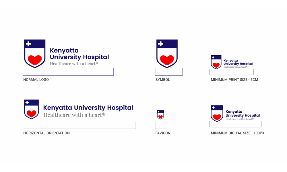
Rule 3: Document Minimum Size Separately for Print and Digital
The minimum legible size of a logo must be documented in two separate measurement systems: millimetres for print applications and pixels for digital. A single number does not convey context correctly.
Print and digital rendering are fundamentally different processes. In print, logo reproduction at small sizes is limited by the output device’s resolution and the substrate’s absorbance.
A logo with fine detail — thin strokes, tight letter-spacing, or a detailed icon — can become visually illegible at sizes that look acceptable on a 2x Retina display. Offset printing at 300 DPI renders fine strokes differently from a laser printer at 600 DPI, and neither matches inkjet.
Baymard Institute’s research on UI scaling found that interactive elements below 44px in height are functionally unusable on touchscreen interfaces.
While this applies primarily to buttons, the principle extends to logos used as home navigation targets—a common use case in which logo and navigation function are merged.
A logo used as a clickable homepage link that is smaller than 44px fails as both a brand element and a UI control simultaneously.
The rule to document: Specify minimum print size (typically 15–25mm for a horizontal wordmark, smaller for a standalone icon) and minimum digital size (typically 24px height for icon-only, 120px width for full horizontal lockup).
Include a visual example showing the logo at minimum size alongside an illegibility example showing what happens below that threshold.
Designers routinely produce logos at sizes they believe are acceptable because their screen displays them adequately. Print production managers, app developers, and digital ad buyers operate at different resolution contexts. A brand guideline that specifies minimum size in only one measurement unit will be misapplied in every other context — not through carelessness, but through a genuine absence of the right information.
Rule 4: Define Approved Background Treatments Explicitly
Every permitted background treatment for the logo must be listed explicitly in the brand guideline. Unlisted backgrounds are not implicitly permitted — they are an invitation to improvisation.
The standard approved background set includes: the brand’s primary background colour, white, black, and any approved photographic or textured background usage. Each requires its own logo variant specification.
A full-colour logo on a dark background may need a reversed-out (white or light) variant. A logo used in photography needs a clear space treatment that ensures legibility against variable content.
The rule to document: Create a 2×3 grid showing the logo on every approved background. Add a “do not use on” section with three specific examples of unapproved backgrounds — for example: do not use a full-colour logo on photography without a solid colour backing panel; do not use on gradient backgrounds from the palette midpoint; do not use reversed-out on backgrounds below 40% contrast ratio.
The most common brand guideline failure is the list of approved logo backgrounds that omits photography, gradients, and mid-tone colours — the three contexts where logos appear most frequently in real marketing applications. A guideline that documents only the obvious cases (white background, black background) trains designers to make unguided decisions when reality exceeds the documentation.
Rule 5: The Top-Left Myth — Why Default Position Is Contextually Wrong
The top-left corner is not always the correct logo placement position, and brand guidelines that declare it the universal default are applying a desktop web convention from 2005 to a multi-platform, multi-device, multi-format world.
The top-left convention originated in Western reading pattern research — specifically, F-pattern eye-tracking studies showing that users first fixate on the top-left of content-heavy interfaces. This research, documented by the Nielsen Norman Group (NN/g) through studies conducted between 2006 and 2017, was valid in context. The problem is that it was never intended to govern logo placement across every brand application — it was guidance for information-heavy website layouts.
Spotify, Airbnb, and Notion all use centred logo placement on key acquisition and app landing pages. None has experienced measurable navigation confusion as a result.
Centred placement on mobile interfaces avoids the navigation element collision problem described in Rule 2 and provides greater visual prominence in the proportionally narrower mobile viewport.
A logo centred on a 390px-wide mobile screen naturally occupies the optical midpoint; a top-left logo on the same screen sits in the corner of a frame, competing with a navigation icon 44px away.
The original rationale for top-left placement — print conventions and early web navigation patterns — is structurally irrelevant for the majority of digital-first SMBs in 2026.
The alternative directive: Define placement by context, not by a single universal rule. Top-left for document headers and desktop web. Centred for mobile headers, hero sections, and splash screens. Bottom-left or bottom-right for document footers. Each placement has a different compositional logic — document it.
Declaring the top-left as the default logo placement without contextual qualification is the design equivalent of giving a new employee a dress code that covers only office attire. They’ll know what to wear to a Tuesday meeting. They’ll guess at everything else. Context-specific placement rules produce consistent outcomes; universal rules produce consistent misapplication.
Rule 6: Specify Logo Lockups and Their Hierarchy
A logo system typically includes a primary lockup, a stacked variant, an icon-only version, and sometimes a wordmark-only version. Brand guidelines must specify not just what these variants are, but when each is permitted.
The absence of a clear hierarchy between logo variants is one of the most consistently exploited ambiguities in brand guidelines.
When a designer is given four logo files and no instructions about which takes precedence, they choose based on aesthetics or fit — neither of which reflects brand strategy. The result is a brand that appears as four different identities across its touchpoints.
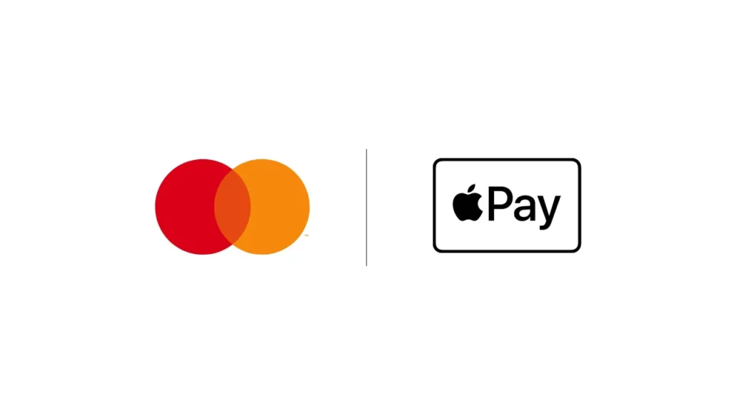
MasterCard’s 2019 decision to remove the Mastercard wordmark from its logo for use in digital applications — announced by the company directly — was premised on internal research showing that the interlocking red and yellow circles had achieved sufficient consumer recognition to function without the name.
The brand had spent decades building recognition through consistent primary lockup usage before allowing the symbol-only variant to operate independently.
That sequencing — establish recognition with the full lockup, then permit abbreviation — is the model every brand guideline should follow, scaled to the brand’s actual stage of recognition development.
The rule to document: Define a primary lockup (the default, used everywhere unless a specific exception applies), a compact/stacked variant (used when horizontal space is constrained below a defined width threshold), an icon/symbol-only variant (used only in specific, defined contexts like social media avatars and favicons), and a wordmark-only variant where applicable.
The logic of a logo variant hierarchy mirrors the logic of any system of defaults and exceptions: one option is authoritative; all others require a reason. Brand guidelines that present all variants as equivalent create a decision burden at the point of application, resolved by whoever is closest to the deadline, not by whoever understands the brand best.
Rule 7: Document Co-Branding and Third-Party Placement Rules
When your logo appears alongside another brand’s mark — on a partnership announcement, a co-branded product, a sponsored event, or a supplier’s website — the placement relationship between the two marks requires explicit specification.
Co-branding is where logo placement rules fail most visibly. Without guidance, the relative size, spacing, and visual hierarchy of your logo and a partner’s mark are negotiated informally at the project level, resulting in inconsistent results.
A partner brand with more aggressive design standards will push your mark to a smaller size, a less prominent position, or a weaker colour treatment unless your guidelines specify otherwise.
The minimum specification required is: a size relationship rule (your logo should be no smaller than X% of the co-brand partner’s logo, or both logos at equal size), a divider treatment (the separator between the two marks specified in weight and proportion), and a minimum clear space between the two marks expressed as a multiple of your clear space unit from Rule 1.
The rule to document: Create a co-branding template showing your logo in both left and right positions relative to a neutral grey placeholder mark. Specify the minimum size ratio, the separator treatment, and the minimum distance between the two marks. Include a “where your logo appears secondary” variant for contexts where your brand is the sponsor or exhibitor rather than the host.
Every brand that enters a partnership, a co-marketing agreement, or a trade event eventually faces the question of how its logo sits next to someone else’s. Without documented co-branding rules, that question is answered by whoever is managing the relationship on the day, and that person’s priority is the relationship, not the brand.
Rule 8: Set Version Control Rules for Logo Files
Brand guidelines must specify which logo file versions are approved for distribution, who controls that distribution, and what happens to legacy files when the logo is updated.
Logo version sprawl is a real problem that affects every organisation with more than three years of brand history and more than five people creating branded materials. A Google Drive folder titled “Logo Files” containing 23 files, six of which are from a previous brand iteration, two of which are low-resolution screenshots, and one of which is a web-compressed JPEG with a white background permanently burned in, is not a brand asset library. It is a liability.
The rule to document: Define the canonical file set: SVG (master), EPS (print production), PNG transparent (digital, minimum 1000px wide), PNG white background, PDF (for print applications where EPS is not supported). Each file should carry a version number in the filename (e.g., BrandName_Logo_Primary_v2.svg).
Specify who has write access to the canonical file location, and include a rule about what happens to approved materials created before a logo update — a grace period for transition, not blanket permission to continue using outdated versions indefinitely.
A brand guideline that documents how the logo should look, but not how logo files are managed, creates a documentation-to-delivery gap. The guideline says one thing; the actual files in circulation say another. Version control rules close that gap. They are unglamorous, take 10 minutes to write, and prevent the single most common cause of off-brand logo usage in organisations of any size.
Rule 9: Define Misuse Examples — With Specificity

The “do not do this” section of a logo placement guideline must list specific, named misuses—not abstract warnings.
“Do not distort the logo” is insufficient. “Do not stretch the logo horizontally or vertically outside its locked aspect ratio” is a rule a designer can actually follow.
The most common misuse examples relevant to placement are: placing the logo on a background with insufficient contrast; using the full-colour version on a coloured background when the reversed version should be used; stretching the logo to fill a space instead of scaling it proportionately; cropping the logo to fit a template; placing the logo over a busy area of a photograph; and using the wordmark at a size where individual letterforms become illegible.
Each misuse should be shown as a visual example — the logo as misused, followed by the correct treatment. Without the visual, designers read “do not crop the logo” and do not connect it to the specific action they are tempted to take when fitting a logo into an awkward template space.
The documentation rule: a minimum of 6 misuse examples, each with a visual. Prioritise the most frequent misuse in your specific brand context. Tailor the misuse gallery to the actual failure modes you observe, not a generic list copied from another brand’s guidelines.
The value of a misuse section is entirely determined by its specificity. Generic warnings have no behavioural effect because they do not connect to the specific decisions designers make under pressure. Specific visual examples with clear correction labels produce measurable improvement because they provide the designer with a reference point in moments of ambiguity. Vague rules protect the brand strategist’s conscience; specific examples protect the brand.
Rule 10: Address Logo Placement in Motion and Digital Animation
Every brand guideline produced in 2026 must include logo placement rules for motion contexts: video endcards, animated GIFs, social media story templates, loading animations, and broadcast lower thirds.
Motion is not a secondary context. According to Cisco’s Visual Networking Index projections, video traffic has accounted for the majority of global internet traffic since 2022.
A brand that operates on any digital channel — which is every brand — regularly has its logo appearing in motion contexts. Brand guidelines that stop at static applications leave the most consumed format unspecified.
The placement considerations for motion differ from static contexts in three specific ways. First, the logo’s entry position and final resting position may differ — specify both.
Second, the safe zone for broadcast-format video (the title-safe and action-safe areas defined by broadcast standards) must be respected, placing the logo within the inner 80% of the frame regardless of preferred placement.
Third, the logo in motion should follow the brand’s static placement convention at its resting state — movement is a transition, not a new position.
Adobe’s motion design guidelines, published for internal and partner use, specify the logo’s resting position in every video format template. This practice — extending static placement rules into motion via format-specific templates — is the correct approach regardless of brand size.
The rule to document: Create one motion placement template per primary video format used by the brand (16:9, 9:16, 1:1 as a minimum). Show the logo at its entry keyframe and its final resting position. Specify whether motion is permitted in the logo itself or only in its entry transition. Lock the final resting position to the static placement rule.
A brand guideline that treats motion as an afterthought results in a branded video that looks like another company made it. The static brand and the motion brand diverge not because anyone chose divergence, but because no one specified continuity. Motion placement rules are not a premium addition to a brand guideline — they are a baseline requirement for any brand operating in 2026.
Amateur vs Professional Logo Placement: The Data Comparison
The difference between a brand guideline that works and one that doesn’t is rarely in the quality of its intentions. It’s in the specificity of its documentation.
| Placement Decision | The Wrong Way (Amateur) | The Right Way (Pro) | Why It Matters |
|---|---|---|---|
| Clear space specification | “Leave some space around the logo” | 1× cap-height on all sides, expressed as a ratio and shown visually | Ratio scale; vague instructions don’t |
| Minimum size | One measurement in pixels only | Separate specs: mm for print, px for digital | Print and digital render at different resolutions |
| Background approval | “Use on white or dark backgrounds” | Explicit 2×3 grid of approved backgrounds with a variant shown for each | Unapproved contexts are used unless explicitly excluded |
| Variant hierarchy | Four files in a folder, no usage context | Primary, compact, icon-only, and wordmark-only with defined usage triggers | Ambiguity produces inconsistent variant selection |
| Misuse documentation | “Do not distort or alter the logo” | Six specific visual examples of misuse with correction are shown | Specific examples change behaviour; abstract warnings don’t |
| Motion placement | Not addressed | Resting position specified per video format, entry animation documented | Motion is the majority of digital content consumption |
| File version control | Shared folder with mixed legacy files | Named canonical file set, version-numbered, access-controlled | Version sprawl produces off-brand usage without intent |
10 Logo Placement Rules — Summary Reference

| Rule | Core Directive |
|---|---|
| Rule 1 | Express clear space as a ratio, not a fixed measurement |
| Rule 2 | Document placement for every major application context |
| Rule 3 | Specify minimum size separately for print (mm) and digital (px) |
| Rule 4 | List approved backgrounds explicitly; unapproved is not implicitly permitted |
| Rule 5 | Replace the “always top-left” default with context-specific placement rules |
| Rule 6 | Define a variant hierarchy with triggers for each variant |
| Rule 7 | Document the co-branding placement and size relationship rules |
| Rule 8 | Establish version control rules for logo file distribution |
| Rule 9 | Show misuse examples visually, with at least six specific cases |
| Rule 10 | Specify placement in motion contexts for every primary video format |
The Verdict
The argument this article opened with holds: most logo placement rules are written to prevent mistakes, not to maximise recognition.
The evidence is in the guidelines themselves — documents that cover website headers and business cards while leaving event signage, email signatures, co-branding, motion, and dark mode to individual interpretation.
The ten rules above do not represent a more comprehensive version of the same approach. They represent a different approach entirely: placement rules anchored to the contexts where brand inconsistency actually occurs, expressed in terms specific enough to survive interpretation by a non-designer using an AI layout tool at 5 pm on a Friday.
Brand recognition is built through consistent, correctly placed exposure over time.
The Ehrenberg-Bass Institute’s research on brand salience is unambiguous on this point: distinctive assets require consistent repetition across contexts before they achieve reliable consumer recognition.
Logo placement rules that cover only two contexts cannot produce that consistency. They maintain consistency in the contexts the brand manager envisioned and improvise everywhere else.
Every brand that has survived long enough to become recognisable has done so through placement discipline applied at scale.
That discipline does not emerge naturally from creative teams. It is documented, enforced, and updated as new contexts arise.
Write better placement rules. Your logo will thank you.
If your current brand guidelines lack the specificity described here, the Inkbot Design team can audit your existing documentation and rebuild it properly. Explore our logo design and brand guidelines services to see how we approach placement documentation for brands at every stage of growth.
Frequently Asked Questions
What is the correct clear space for a logo?
Clear space should be expressed as a multiple of a repeating logo element — typically the cap height of the wordmark or the width of a symbol component. The standard is 1× to 1.5× of this unit on all sides. Fixed pixel or millimetre measurements are insufficient because they do not scale proportionately across all logo sizes.
Why does my logo need separate minimum sizes for print and digital sizes?
Print and digital reproduction work differently. A logo legible on a 2× Retina screen may reproduce poorly at 300 DPI offset printing because fine strokes and tight letter-spacing behave differently on absorbent substrates. Specifying minimum sizes in millimetres for print and pixels for digital ensures legibility in both environments.
Is the top-left corner always the correct logo placement?
Top-left is conventional for desktop website and print document headers, based on Western F-pattern reading behaviour. It is not universally correct. On mobile interfaces, centring the logo avoids collisions with navigation elements. Brand guidelines should specify placement by context, not a single universal default.
How many logo variants should a brand guideline document have?
A complete logo system typically includes four variants: a primary horizontal lockup (the default), a stacked/compact variant for constrained spaces, an icon or symbol-only version for small applications, and a wordmark-only version where applicable. The guideline must specify which contexts trigger each variant, rather than simply listing the files.
What should a logo misuse section include?
A minimum of six specific visual examples of incorrect usage, each accompanied by the correct treatment. Common misuse cases include placing the full-colour logo on an incompatible background, stretching outside its aspect ratio, cropping to fit a template, and using the wordmark below the documented minimum size. Generic written warnings without visuals produce negligible behaviour change.
Do logo placement rules apply to motion and video?
Every brand guideline produced in 2026 should include motion placement specifications. This means defining the logo’s resting position in each primary video format (16:9, 9:16, and 1:1 as a minimum), specifying the entry animation treatment, and applying broadcast-standard safe-zone rules for television and streaming formats.
What is the difference between a primary logo and a secondary logo lockup?
A primary lockup is the default version used in all standard applications — typically a horizontal arrangement of the symbol and wordmark. A secondary lockup (often stacked or compact) is used only when the primary cannot fit within the available space. The secondary should have a defined trigger — for example, “use stacked lockup when available horizontal width is below 180px or 50mm.”
How should logo placement rules address co-branding?
Co-branding rules should specify the minimum size relationship between your logo and a partner logo, the approved separator treatment, and the minimum clear space between the two marks. Templates showing the logo in both left and right positions relative to a neutral placeholder are the most practical reference format.
When is it acceptable to use a logo on a photographic background?
A logo may be placed on photography only when legibility is maintained at the minimum contrast ratio, and a defined placement zone (typically a clear area of the photograph) is respected. Most brand guidelines require a solid colour backing panel or a semi-transparent overlay behind the logo when photographic backgrounds cannot be controlled.
What happens to existing branded materials when a logo is updated?
Brand guidelines should specify a transition period — typically 60 to 90 days — during which existing materials using the previous logo version may remain in circulation. After the transition period, only the updated logo should be used. Digital assets should be updated immediately upon logo change.
How should dark mode logo variants be documented?
Dark mode documentation should specify the approved logo treatment for dark backgrounds (typically a reversed-out variant), the minimum contrast ratio between logo and background (WCAG 2.1 Level AA requires 3:1 for graphical elements), and the contexts in which dark mode treatment is mandatory. As dark mode is now the default setting for most iOS users, it is a baseline requirement, not a premium add-on.
Is it necessary to document logo placement for internal documents as well as external communications?
Internal document placement is worth documenting because internal documents frequently become external — proposals, reports, and presentations are shared with clients, prospects, and partners. A logo placed inconsistently in an internal template will appear inconsistently in every external communication produced from that template.
