Is a Logo Redesign Enough, or Do You Need a Full Rebrand?
Most businesses requesting a logo redesign don’t actually need one. They need a better offer, a clearer message, or more customers.
They see a new logo as a silver bullet for deeper business problems. It’s not. It’s an expensive and public way to announce you’re rearranging the deck chairs on the Titanic.
This guide is designed to help you avoid that mistake.
It’s a framework for determining whether you need a minor visual tweak, a full logo redesign, or a complete rebrand from the ground up.
We’ll cover the right reasons, the terrible reasons, and the process for executing a change without setting your money on fire.
- Many businesses needing a logo redesign often require a clearer message or marketing strategy instead.
- A logo redesign updates visual elements, while a rebrand alters core identity and strategy.
- Redesigns should be based on specific needs like market evolution or business mergers, not superficial reasons.
- Executing a redesign involves strategic planning and communication to preserve brand equity and avoid backlash.
First, Let’s Settle This: Redesign vs. Rebrand
These terms are thrown around interchangeably, but have different operations with different price tags and consequences. Getting this wrong is the first step toward disaster.
A Logo Redesign is a Haircut

A logo redesign is a visual update to an established brand identity.
You’re the same person with the same name, values, and personality. You’ve updated your look to be more modern, professional, or appropriate for a new context. It’s a tactical change.
The core idea of the business remains unchanged. The goal is to improve the visual execution of that idea.
A Rebrand is a Personality Transplant

A rebrand is a fundamental shift in your business strategy.
You are changing something core to your identity: your name, mission, target audience, or core service offering. The business is so different now that the old identity is no longer an honest representation of who you are.
The new logo is just the final confirmation of this deeper strategic pivot. It’s your new ID card reflecting a new life.
The Only 5 Good Reasons to Redesign Your Logo
Before you contact a single designer, see if your situation fits one of these five scenarios. If it doesn’t, you probably don’t need a redesign. You need a better marketing plan.
Logo Performance Audit
Is your logo helping you grow, or holding you back? Answer 8 technical and design questions to get a Letter Grade (A-F) for your current logo.
Question…
1. Your Logo is Technically Broken
This is the most practical and least glamorous reason. A logo has a technical job to do. If it fails, it needs to be fixed.
A logo is broken if it:
- Becomes an unreadable smudge when scaled down for a website favicon or social media profile picture.
- Uses a dozen gradients and colours, making it impossible to reproduce in a single colour for things like merchandise or packaging.
- It is so intricate and detailed that it looks messy and confusing.
- It is saved as a low-resolution JPG, making it unusable for professional printing.
This isn’t a matter of taste. It’s a functional failure.
2. Your Business Has Genuinely Evolved
Your identity should be a true reflection of what you do. When it becomes a lie, it’s time for a change.
Maybe you started as “Nottingham Web Design“, but now 70% of your business is national SEO consulting. The name and logo have become a limiting factor. The logo no longer tells the right story; it tells the wrong one.
3. You’re Repositioning to a More Premium Market

Perception is reality. If you want to charge £5,000 for a service, you can’t have a logo that looks like it was made for £5 on Fiverr.
A cheap, amateurish logo acts as a repellent for high-value clients. It signals a lack of investment and attention to detail. Upgrading your visual identity is necessary to align your brand’s perceived value with its price tag.
4. A Merger or Acquisition Forces Your Hand
This is the most straightforward reason. Two companies are becoming one. A new, unified identity is a non-negotiable part of the process, signalling change to the market, employees, and customers.
There’s no strategic debate here; it’s a necessity.
5. It’s Genuinely Outdated and Harming Credibility
This is a thin line, so be honest with yourself. This isn’t about you being bored with it. This is about your logo, which appears to have been created in 1998 using Microsoft WordArt.
If your logo conveys a sense of “out of touch” and actively undermines the credibility of your tech or consulting firm, it’s a problem. A good rule of thumb is to critically evaluate your logo every 10-15 years. If it has survived that long, it might be timeless. If it looks like a fossil from a bygone design era, it’s probably holding you back.
Red Flags: 7 Terrible Reasons for a Redesign (And When to Abort the Mission)
Now for the dangerous territory. Most failed redesigns start with one of these poor justifications. These are symptoms of internal problems, not a sound business strategy.
The most common terrible reasons for a redesign include:
- “I’m bored with it.” Your customers are not. They don’t think about your logo at all. Changing it for this reason erases brand equity for zero gain.
- A new marketing manager wants to “make their mark.” A classic. It’s a vanity project disguised as a strategic initiative.
- Your competitor just redesigned their logo. A purely reactive move that shows a lack of leadership and a misunderstanding of your brand.
- You saw a cool trend on Pinterest. Chasing trends is the fastest way to make your brand look generic and guarantees you’ll need another redesign in 3 years.
- It’s a vanity project for the founder/CEO. The business exists to serve customers, not the founder’s ego.
- To distract from bad press or a failing product. This is like putting a fresh coat of paint on a condemned building. It fools no one.
- “We just need a refresh.” This meaningless phrase is a giant red flag. It shows no clear goal, defined problem, or metric for success.
The Gap Precedent: What Happens When You Fix What Isn’t Broken

In 2010, clothing retailer Gap replaced its iconic, 20-year-old logo. They dropped a new design with no warning: a generic Helvetica font with a small blue gradient square.
The public backlash was instant and brutal. Customers, designers, and branding experts savaged the new logo online. The company had reportedly spent $100 million on solving a problem that didn’t exist.
Within 6 days, they scrapped the new logo and reverted to the old one. They had completely ignored the immense brand equity built into their classic mark. It’s the ultimate cautionary tale.
The Uber Identity Crisis
Uber’s history of logo changes is a public display of a company struggling to define its core identity. From the original “U” to the “bits and atoms” concept in 2016, to the simplified wordmark in 2018, each change felt like a reaction to internal turmoil or a new strategic whim.
A stable brand builds trust. When a company continually changes its image, it suggests that it doesn’t know who it is. A logo redesign can’t fix a chaotic internal culture.
The Rebrand Playbook: When to Go All In
If you’ve read this far and realised your problem is bigger than an old logo, you might need a complete rebrand. This is a central strategic pivot. It’s only warranted in a few high-stakes situations.
Your Core Mission Has Fundamentally Changed
This is the Airbnb story. They started as “Air Bed and Breakfast,” a functional solution for finding affordable accommodations. However, their vision evolved into a global travel platform centred on community and belonging.
Their 2014 rebrand introduced the “Bélo” symbol and the tagline “Belong Anywhere.” This was not a simple redesign. It strategically repositioned the entire company from a service to a philosophy. The new visual identity was necessary to communicate this massive internal shift.

You’re Targeting a Completely Different Customer
Imagine a software company that has successfully sold a simple tool to individual freelancers for years. They’ve built an enterprise version and want to sell it to FTSE 100 companies.
Their quirky, friendly, startup-style branding will actively work against them. It signals “small and cheap” to a market that values “stable and secure.” A complete rebrand is necessary to update their messaging, pricing, sales process, and visual identity, thereby earning the trust of this new, more lucrative audience.
You Need to Escape a Negative Reputation
This is the most extreme reason for a rebrand. When a company’s name becomes so toxic that it poses a liability, a change is necessary for survival.
Think of Philip Morris, the cigarette giant, changing its corporate name to Altria Group to distance itself from the adverse health connotations of its core product. This is a high-stakes, expensive move that must be backed by genuine operational change, or the public will see right through it.
The No-Nonsense Logo Redesign Process in 5 Steps

You need a process if you’ve determined a redesign is right. A good process protects you from subjective opinions and ensures the final result solves a real problem.
Step 1: The Audit (What’s Wrong?)
Start with an objective analysis. Gather your logo everywhere: on the website, invoices, social media, vehicles, and presentations.
Where does it fail? Be specific. “It looks blurry on our mobile app.” “The thin lines vanish when printed on a pen.”
Gather feedback from a small, trusted group of employees and a few loyal customers. The goal is to define the problem with data, not opinions.
Step 2: The Brief (Write Down the Goal)
Create a one-page document that answers these questions:
- What is the primary business problem this redesign must solve? (e.g., “Communicate our shift to a more premium market.”)
- Who is our target audience now?
- Who are our main competitors, and what do their visual identities look like?
- What are the non-negotiable elements that must stay? (e.g., the colour blue)
- What is the most critical word the new logo should communicate? (e.g., “Trust,” “Innovation,” “Speed”)
This document becomes your objective guide for the entire project.
Step 3: The Design Phase (Evolution vs. Revolution)
Your brief will determine the path.
Evolution is about refining and modernising what you already have. The classic example is Instagram. They kept the core concept of a camera but simplified it into a clean, modern gradient icon. They retained their brand equity while updating the execution.
Revolution is a complete conceptual change. When Slack rebranded, they abandoned their original hashtag logo. It was quirky, but didn’t work well in different contexts and didn’t feel like the enterprise-level tool they had become. Their new, simpler “pinwheel” logo was a revolutionary change designed for scalability and a more corporate audience.
Step 4: The Reality Check (Decisive Feedback)
This is not the time for the committee to design. A tiny group should decide for 1-3 key stakeholders.
The only question that matters is: “Does this design solve the problems outlined in the brief?”
Feedback like “I don’t like green” is irrelevant. Feedback like “This font feels less trustworthy than our current one, which contradicts the brief” is valuable. Be disciplined.
Step 5: The Rollout (Announce, Don’t Just Drop)
Don’t just change the logo on your website overnight. Prepare for the launch.
Have all your new assets ready: website headers, social media profiles, email signatures, business cards, and invoice templates.
Write a simple blog post or email to your customers explaining the change. Tell them the story. “We started doing X, but now we’ve grown to do Y. We’ve updated our look to reflect better who we are today.” This simple act of communication can prevent the kind of backlash Gap experienced.
The Uncomfortable Question: What Does a Logo Redesign Cost?

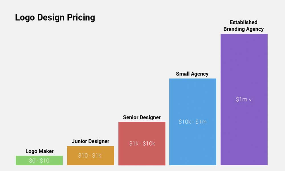
The price varies wildly based on who you hire. The cost is directly tied to the amount of strategic thinking involved, not just the time spent drawing.
The DIY / Freelancer Route: £100 – £2,000
You can use an online logo maker or hire a junior designer on a freelance platform.
- Pros: It’s cheap.
- Cons: You get what you pay for. The process will involve zero strategic thinking. You risk getting a generic, forgettable design with technical flaws or, in a worst-case scenario, being plagiarised.
The Small Agency / Boutique Studio Route: £2,000 – £15,000
This is the sweet spot for most serious small and medium-sized businesses.
- Pros: You are paying for a strategic process, not just a drawing. A good studio will guide you through the audit and brief, provide multiple well-reasoned concepts, and deliver a full suite of professional-grade files. This is where you find the best value.
For businesses that understand branding is an investment, a professional logo design service from an experienced agency is the most logical choice.
The Big Agency Route: £20,000 – £1,000,000+
This is the world of global corporations.
- Pros: You get a world-class team.
- Cons: The price tag can be astronomical, and you may be paying for unnecessary features and buzzwords. The infamous 2008 Pepsi rebrand cost $1 million for the logo alone. It came with a 27-page document explaining the design, which included jargon about “the gravitational pull of the Earth” and “the ethos of the brand.” It’s a cautionary tale about paying for hot air.
A logo redesign is a powerful tool when used correctly. But it’s a strategic business decision, not an art project. It must be justified by a genuine business need and executed through a disciplined, objective process.
Before you ask how to change your logo, ask yourself a more critical question: Are you just trying to change your logo, or are you avoiding the more complex work of transforming your business?
Frequently Asked Questions about Logo Redesigns
What is the difference between a logo redesign and a rebrand?
A logo redesign is a visual update of your logo while the company’s core mission, name, and audience remain the same. A rebrand is a fundamental shift in the company’s strategy, mission, or target audience, accompanied by a new visual identity that reflects this change.
How often should a company redesign its logo?
There is no set timeline. A redesign is necessary only when there’s a strong strategic reason, such as technical failure, significant business evolution, or a severely outdated appearance (typically after 10-15 years). Redesigning for trends is a mistake.
How much does a professional logo redesign cost?
For a small to medium-sized business working with a professional design agency, a realistic budget is typically between £2,000 and £15,000. This covers strategy, design exploration, and delivery of final assets.
What are the biggest mistakes to avoid in a logo redesign?
The biggest mistakes include redesigning for the wrong reasons (such as boredom), not having a clear strategic brief, involving too many people in the decision-making process (design by committee), and ignoring existing brand equity.
Is a “brand refresh” the same as a logo redesign?
The term “brand refresh” is often used to describe minor updates to a visual identity, which could include a logo redesign. However, the term is vague and usually indicates a lack of a clear strategic goal. It’s better to be specific: are you redesigning the logo, updating typography, or changing the colour palette?
How long does a logo redesign process take?
A typical logo redesign project for a professional agency takes 4 to 8 weeks. This includes time for discovery and auditing, strategic briefing, design concepting, revisions, and final asset delivery.
Do I need to trademark my new logo?
If your logo is a critical asset for your business identity, it is highly recommended that you seek legal counsel and trademark the latest design to protect it from competitors’ use.
What files should I receive from a designer after a redesign?
You should receive a comprehensive package that includes vector files (AI, EPS, SVG) for scalability and raster files (JPG, PNG) for web and digital use. This should include full-colour versions, single-colour (black and white), and other specified variations.
How do I announce a logo redesign to my customers?
Announce it proactively. Use a blog post, email newsletter, and social media to explain the story behind the change. Frame it around how the evolution benefits them or better reflects your value. This builds transparency and prevents confusion.
Can a logo redesign hurt my brand?
Yes. If done for the wrong reasons, if it ignores valuable brand equity, or if the new design is poorly executed, it can confuse customers and damage brand recognition, as seen in the infamous 2010 Gap logo redesign.
If this guide has helped you realise your logo is the problem, that’s a strategic issue worth solving correctly. A well-executed redesign can clarify your message and attract the right customers.
You can explore what’s involved in a professional logo design process to see how it differs from a simple contest site. Or, if you’re ready to define the strategy behind the change, you can request a quote from our team.
