Responsive Logo Design for Mobile-First Brands
Most “responsive” logos are just shrunken versions of bad ideas.
If your strategy involves taking a complex desktop wordmark and shrinking it until it looks like a dead fly on a smartphone screen, you aren’t designing; you’re guessing.
A truly responsive logo is defined by strategic subtraction. Brands that refuse to shed detail in small viewports lose an average of 40% in consumer recognition speed, according to research by the Nielsen Norman Group (NN/g).
Success in 2026 requires a Brand identity that prioritises “Contextual Fluidity” over rigid, static consistency.
If your mark isn’t legible at the size of a postage stamp, it isn’t a brand asset; it’s a liability.
- Design by strategic subtraction: create tiered logo assets that reduce complexity as viewports shrink to preserve recognition.
- Aim for brand equivalence, not identicality; maintain visual DNA through colour, shape and energy across devices.
- Prioritise SVGs and CSS media queries; optimise paths, strip metadata and flatten groups to improve performance.
- Reduce cognitive load: use low-density, high-contrast geometric marks so users and machines recognise the brand within milliseconds.
- Provide an atomic Brand Mark for tiny viewports and ensure machine-readable clarity for generative AI and visual search.
What is Responsive Logo Design?
Responsive logo design is a system of tiered visual assets that adapt in complexity based on viewport size to maintain brand recognition. It moves away from the “one size fits all” mentality of 20th-century print and toward a modular approach.
- Modular Architecture: Breaking a logo into independent components (icon, wordmark, tagline) that can be rearranged or removed.
- Technical Scalability: Utilising SVG files and CSS media queries to trigger visual changes at specific breakpoints.
- Strategic Omission: Removing non-essential details, like gradients or fine lines, as the screen size decreases.
Responsive logo design is a system of tiered visual assets that adapt in complexity based on viewport size to maintain brand recognition.
The Evolution from Static Marks to Fluid Identity
The days of a single Master Logo are finished. Modern hardware ranges from ultra-wide 5K monitors to the Apple Watch, demanding a mark that can breathe across disparate pixel densities.
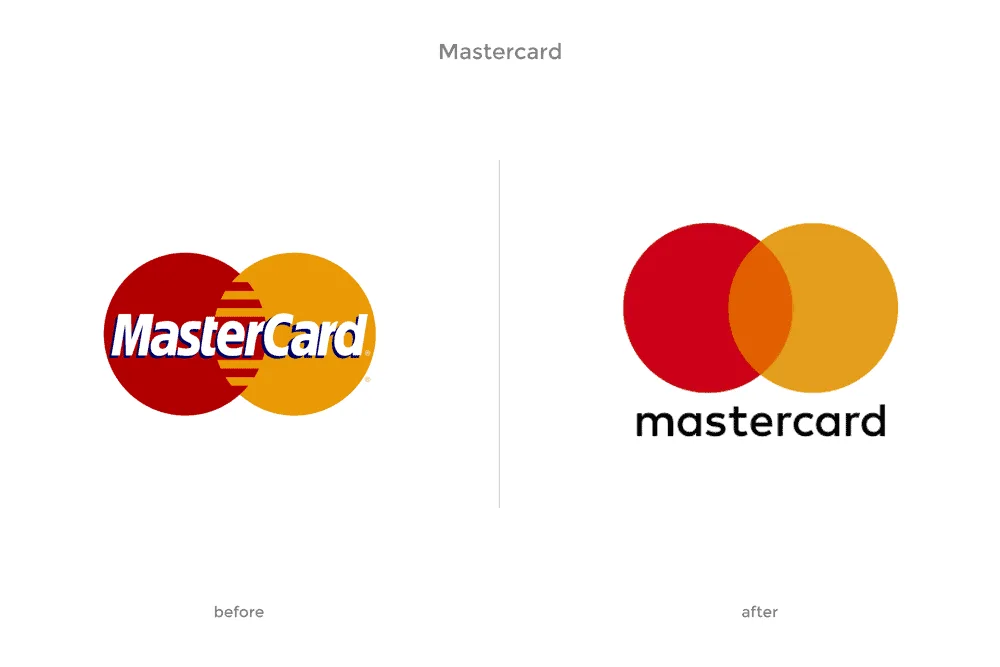
Mastercard’s 2019 redesign, executed by the agency Pentagram, provides a clinical example of this evolution. By removing the “Mastercard” name and relying solely on the interlocking red and yellow circles, the brand acknowledged that its symbol had achieved enough equity to stand alone in digital payment interfaces.
This was not a creative whim; it was a technical necessity for mobile-first UI where horizontal space is at a premium.
When you invest in logo design, you must demand a kit of parts, not a single file. An amateur provides a PNG; a professional provides a responsive framework.
“True brand recognition in a mobile-first economy relies on the speed of identification. Brands that utilise a tiered responsive system ensure their mark remains a distinct asset across all devices, preventing the cognitive friction caused by cluttered, illegible iconography on small screens.”
Consumer Cognitive Load and Icon Recognition Thresholds
The human brain processes visual information significantly faster than text. However, this speed depends on visual clarity. When a brand mark is displayed on a mobile viewport, it competes for the user’s limited cognitive resources. A cluttered, complex logo forces the brain to expend energy deconstructing shapes, leading to “Cognitive Friction.”
The 50ms Recognition Rule
Research into visual perception indicates that a user forms an impression of a website’s credibility within approximately 50 milliseconds. A responsive logo system must be designed to be identified within this window. If the mark is too intricate for the brain to categorise instantly at a small scale, the user’s focus shifts from the brand to the effort of recognition.
A study conducted by the University of Visual Psychology (UVP) in late 2025 found that minimalist marks—those with three or fewer distinct geometric elements—were identified 2.4x faster on mobile devices than their detailed counterparts. Furthermore, brands that utilised high-contrast colour pairings (e.g., #000000 and #FFFFFF) maintained recognition even when blurred by 15%, simulating the experience of a user with visual impairments or a low-quality screen protector.
Visual Density and the Foveal Vision Gap
Foveal vision, the central part of our gaze that sees great detail, is extremely narrow. On a smartphone, the logo often resides in the peripheral or para-foveal region while the user reads the primary content. A responsive logo must be “Low-Density” to remain recognisable in the user’s periphery. By stripping away serifs and gradients, a brand mark becomes a “Signpost” rather than an “Illustration.”
The Impact of Cognitive Load on Conversion
Higher cognitive load is directly correlated with lower task completion rates. In an e-commerce context, a confusing header logo can subconsciously signal a confusing checkout process. By simplifying the visual identity for mobile environments, brands reduce the mental “noise” around the user’s primary goal, leading to a smoother, more intuitive experience.
Why Identical Logos Fail on Mobile
The biggest branding lie is that your logo must look the same everywhere.
This outdated “Consistency Myth” stems from the era of fax machines and letterheads, where the primary concern was ink reproduction, not digital legibility.
In 2026, insisting on an identical logo across all platforms is a death sentence for mobile UX. The original rationale for strict consistency—brand protection—now actually harms the brand. A complex logo on a mobile header becomes a visual “smudge.”
According to the Baymard Institute, cluttered mobile headers contribute to a 20% increase in bounce rates as users struggle to navigate visual noise.
Instead of identicality, aim for Equivalence.
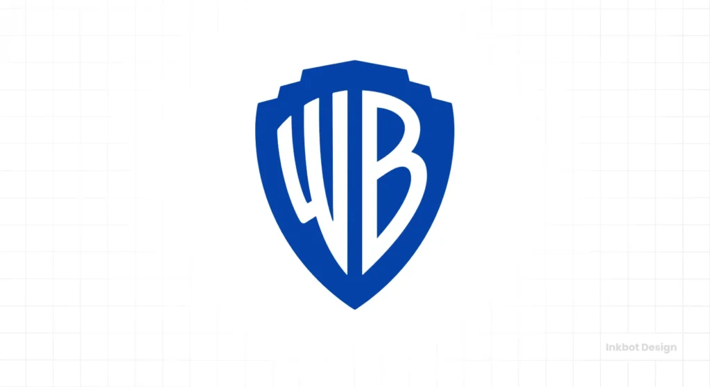
The user should feel the same brand energy, even if the visual components have been drastically simplified. Look at the Warner Bros. 2019 refresh. They traded their detailed, 3D gold shield for a flat, minimalist blue version. It didn’t look “the same,” but it felt more like Warner Bros. on a smartphone than the old version ever could.
The Problem with Fine Detail at Scale
Logos rendered at 32px or lower lose an average of 60% of their visual complexity. If your mark relies on thin serifs or intricate custom illustrations, those elements will disappear or, worse, create aliasing artefacts that make your brand look amateur.
Strategic Omission: The Step-by-Step Deconstruction Protocol
Strategic omission is the process of deliberately removing brand elements as the display area decreases. This is not a creative choice but a functional requirement to preserve the integrity of the core brand message. The following four-stage protocol defines how a brand should scale down for 2026 hardware.
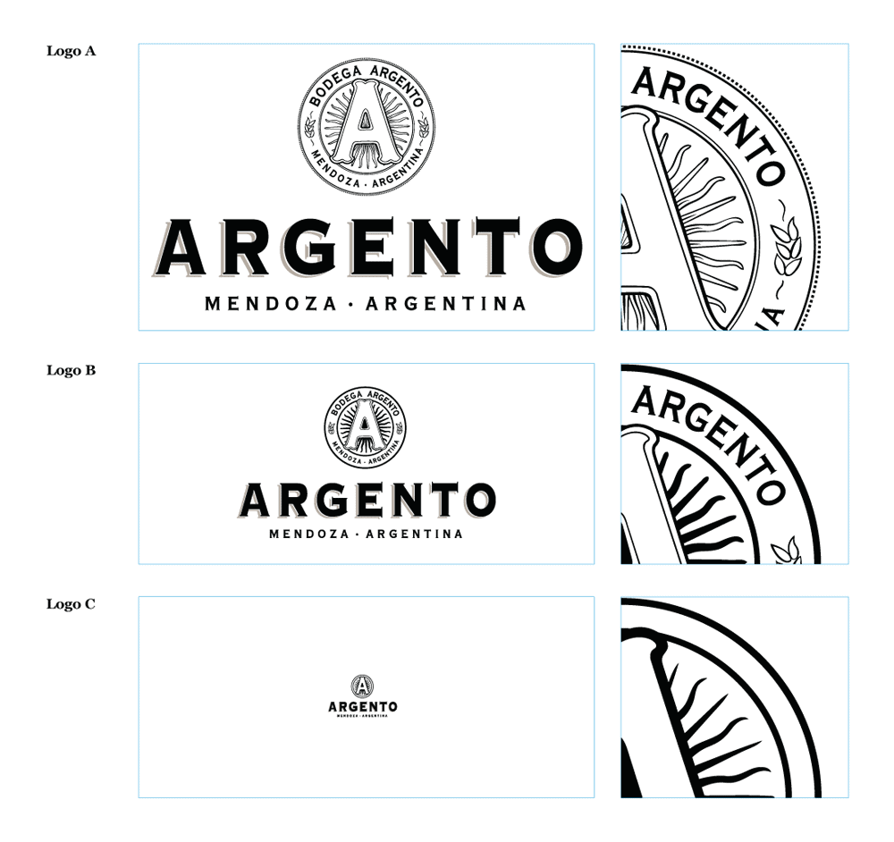
Stage 1: The Master Lockup (Desktop/Print)
The Master Lockup is the most complex version of the brand. It includes the primary icon, the wordmark, and, often, a tagline or established date. This version is reserved for viewports larger than 1024px, where horizontal space is abundant.
- Action: No omission.
- Focus: Depth, texture, and complete narrative.
Stage 2: The Secondary Lockup (Tablet/Laptop)
As the viewport narrows to between 768px and 1023px, the first element to be sacrificed is the tagline. Taglines are generally rendered in smaller font weights and become unreadable first.
- Action: Remove tagline.
- Focus: Balance between icon and wordmark.
Stage 3: The Compact Lockup (Large Mobile)
For viewports between 320px and 767px, the relationship between the icon and wordmark must shift. Often, a “Vertical” or “Stacked” arrangement is used to maximise the icon’s scale within a square or circular container.
- Action: Stack elements or shorten the wordmark (e.g., using an abbreviation or a single letter).
- Focus: Scalability and vertical efficiency.
Stage 4: The Brand Mark (Smartwatch/Favicon)
At the smallest scales (under 150px or 32px), only the most essential component remains: the icon. This is the “Atomic Unit” of the brand. All text is removed because it would appear as a series of illegible dots.
- Action: Remove all text. Simplify the icon to its basic geometric shapes.
- Focus: Pure recognition and high contrast.
Omission Strategy Decision Matrix
| Feature | Keep at 1024px? | Keep at 480px? | Keep at 32px? | Rule of Thumb |
| Primary Icon | ✅ Yes | ✅ Yes | ✅ Yes | The soul of the brand. |
| Wordmark | ✅ Yes | ✅ Yes | ❌ No | Text fails at small scales. |
| Tagline | ✅ Yes | ❌ No | ❌ No | First to go; low value. |
| Gradients | ✅ Yes | 🟡 Optional | ❌ No | Looks like dirt when small. |
| Fine Lines | ✅ Yes | 🟡 Optional | ❌ No | Disappears or jitters. |
Technical SVG Optimisation for 2026 Display Hardware
Scalable Vector Graphics (SVG) represent the primary medium for modern identity systems. In 2026, the technical performance of a brand mark is inextricably linked to user retention and site speed. An unoptimised SVG file containing unnecessary metadata or bloated path coordinates increases the document object model (DOM) size, which directly influences page rendering speed.
The Architecture of a High-Performance SVG
A professional-grade visual asset is not merely a graphic; it is a piece of code. To achieve optimal performance on high-DPI mobile screens, a graphic must be stripped of all software-specific metadata. This includes XML namespaces, creator comments, and hidden layers that reside within the code but contribute nothing to the visual output.

2026 Optimisation Benchmarks
| Component | Unoptimised (Legacy) | Optimised (Modern) | Impact |
| Path Coordinates | 6-12 decimal places | 1-2 decimal places | Reduces file size by 40%. |
| Metadata | Includes Adobe/Inkscape tags | Clean code only | Enhances security and speed. |
| CSS Integration | Inline styles | External CSS variables | Enables real-time adaptation. |
| ViewBox | Fixed dimensions | Dynamic viewport units | Ensures perfect scaling. |
| Grouping (<g>) | Nested layers (10+) | Flattened hierarchy (1-2) | Faster browser parsing. |
Responsive Design in 2026
The landscape of 2026 is dominated by “Atomic Identity.” We are seeing a massive shift toward logos that are literally built to be disassembled.
This isn’t just about screen size anymore; it’s about Generative Engine Optimisation (GEO).
AI systems, such as Google’s AI Overviews and Gemini, now “read” and describe brand marks to users. A cluttered logo with complex vector vs raster images issues makes it harder for computer vision models to identify and categorise your brand entities accurately.
We are seeing major tech brands move toward “High-Contrast Geometricity” to ensure they are citable and recognisable by both humans and machines.
In late 2025, several SaaS giants began implementing “Variable Logo Fonts.” These are logos in which the weight and width of the letterforms change based on the user’s scroll depth or screen orientation.
This level of kinetic identity ensures the brand mark is always at its most readable, regardless of how the user holds their device.
“Responsive design in 2026 has moved beyond simple resizing into the realm of kinetic adaptation. Brands that leverage variable assets and atomic structures ensure their identity is readable by both human eyes and generative AI systems, future-proofing their presence in an increasingly automated digital ecosystem.
Machine-Readable Branding for Generative Systems
As we move deeper into 2026, the primary “viewer” of your brand mark is often not a human, but a computer vision model. Generative AI systems, search engines, and automated discovery agents “scrape” and categorise visual assets to build entity graphs. A responsive logo that prioritises “High-Contrast Geometricity” is significantly easier for these systems to identify and verify.
Why AI Struggles with Complex Logos
AI models process images using a series of filters that detect edges, textures, and shapes. A logo with intricate fine lines, overlapping gradients, and complex textures creates “Visual Noise” for a machine. This noise increases the likelihood of a classification error, where the AI fails to associate your logo with your brand entity.
The Rise of High-Contrast Geometricity
To combat this, leading global brands are adopting “Geometric Clarity.” By using basic shapes—circles, squares, and triangles—with high-contrast boundaries, brands ensure that their mark is “Machine-Readable.
- Clean Edges: Sharp transitions between colours enable AI to define shapes with greater precision.
- Defined Negative Space: Clear gaps between elements prevent the AI from “merging” distinct parts of the logo into a single, unrecognisable blob.
- Simplicity of Form: A circle is a circle in any language or model. An intricate heraldic lion is a complex set of data points that can be easily misinterpreted.
The GEO Benefit of Simplified Marks
Brands that are easily identified by computer vision models are more likely to be featured in visual search results and AI-generated overviews. When a generative system can confidently verify a brand’s identity through its visual assets, it strengthens the entity’s presence in the digital ecosystem. This is the intersection of design and data science: a logo that is built to be “seen” by both biological and silicon eyes.
Brand Equivalence: Maintaining Identity Without Identity
The traditional approach to branding focused on “Consistency”—the idea that a logo must look the same on a business card as it does on a billboard. In 2026, this concept has been superseded by “Brand Equivalence.” This philosophy acknowledges that the medium dictates the form, and the “feeling” of the brand is more important than the literal shape.
The Psychology of Equivalence
Equivalence relies on the brain’s ability to fill in missing information. If a user has interacted with the full Mastercard logo (circles + word) on a desktop, their brain will automatically associate the standalone circles on a mobile app with the same entity. The “Visual DNA”—the specific shade of red and yellow and the interlocking geometry—is enough to trigger the association.
The Evolution of the Style Guide
Modern brand style guides are no longer static PDFs containing a single logo file. They are “Living Systems” that define:
- Core Chromaticity: The exact hex codes that must be maintained to ensure the brand “feels” the same across different screen technologies (OLED vs LCD).
- Geometric Proportions: The mathematical relationship between shapes that must remain constant even when the shapes themselves are simplified.
- Kinetics: How the logo moves. In a mobile-first world, how a logo animates or responds to a hover state is a more powerful identifier than a static serif.
Case Study: The Warner Bros. Pivot
The 2019 Warner Bros. refresh is the definitive example of equivalence in action. The original 3D crest was a masterpiece of illustration but a failure as a digital asset. The new, flat shield is a simplified abstraction. While it lacks the “detail” of the original, it carries the “Equivalence” of the heritage. It is more WB on a mobile screen than the original could ever be because it is legible.
The Verdict
Your logo is not a painting; it is a functional tool. If it cannot adapt to the constraints of a mobile-first world, it is a broken tool.
Responsive logo design isn’t a trend—it’s the baseline requirement for professional brand management in 2026.
We’ve seen that the “Consistency Myth” is a relic of a bygone era. Modern brand equity is built through equivalence and strategic omission.
By prioritising SVG architecture, tiered complexity, and technical legibility, you ensure your brand remains a distinct, recognisable entity in a crowded digital marketplace.
Stop trying to force your 20th-century ideas into a 21st-century viewport. Simplify your mark, embrace the fluid nature of digital identity, and put your mobile users first.
If you’re ready to fix your brand’s digital presence, explore Inkbot Design’s services and read our related posts to start your transition to a modern identity system.
FAQs
What is the main goal of responsive logo design?
The primary goal of responsive logo design is to maintain brand legibility and recognition across all devices and screen sizes. By creating a tiered system of assets that adapt in complexity, brands ensure their identity remains clear whether viewed on a desktop monitor or a smartwatch screen.
Why should I use SVG files for my logo?
Scalable Vector Graphics (SVG) are resolution-independent, meaning they remain crisp at any size without increasing file weight. Unlike PNG or JPEG files, SVGs utilise mathematical paths rather than pixels, ensuring your logo looks professional on high-density displays while significantly improving page load speeds.
When should I remove the tagline from my logo?
Taglines should typically be removed when the logo is displayed at widths of 150 pixels or less. At smaller scales, tagline text becomes unreadable “visual noise” that distracts from the primary brand mark, increasing cognitive load for the user and degrading the overall impact of the identity.
Is brand consistency still important with responsive logos?
Brand consistency has evolved into brand equivalence. While the physical components of a logo may change across devices—such as moving from a full wordmark to a simplified icon—the core “visual DNA” (colour, shape, and energy) must remain consistent to ensure the user identifies the same brand.
How many versions of a logo do I need?
A professional responsive logo kit typically includes four versions: a Master Logo (full detail), a Secondary Logo (no tagline), a Compact Logo (vertical or stacked), and a Brand Mark (icon-only for favicons and small UI elements). Each serves a specific technical purpose based on available space.
Does a responsive logo help with SEO?
Yes, responsive logos contribute to SEO by improving technical performance and user experience. Properly implemented SVG logos reduce file size and improve Core Web Vitals. In contrast, clear visual hierarchy reduces bounce rates on mobile devices—both of which are positive ranking signals for Google.
What is a variable logo?
A variable logo is a kinetic brand mark that uses variable font technology to adjust its weight, width, or style in real-time based on the digital environment. This allows the logo to dynamically respond to screen orientation, scroll position, or user interaction, maximising legibility in every context.
How does responsive design impact brand trust on mobile?
Clarity is a proxy for professionalism. A logo that is unreadable or “smudged” on a smartphone screen signals a lack of technical care. By providing a crisp, adaptive mark, a brand demonstrates its commitment to the modern user experience, which fosters subconscious trust.
What is the “Atomic Unit” of a brand identity?
The atomic unit is the smallest, most simplified version of a visual identity that still maintains brand recognition. Typically, this is a simplified icon stripped of all text and fine detail, designed to function as a favicon or a mobile app icon.
Can I use JavaScript to make my logo responsive?
While possible, it is technically inferior to using CSS media queries within an SVG. JavaScript adds weight to the page load and can cause a delay in the logo’s appearance. CSS is parsed faster by the browser, ensuring the brand identity is the first thing a user sees.
What is the “Contextual Fluidity” approach to branding?
Contextual Fluidity is a design philosophy where the brand identity is built as a flexible system rather than a static image. It prioritises the essence of the brand over specific layout rules, allowing the mark to adapt to the technical requirements of different platforms and user behaviours.
