Logo Design Cost in 2026: Full Pricing & Budget Guide
The price of your logo does not determine its quality. The price tier you choose determines which type of problem you’re equipped to solve — and most pricing guides miss this entirely.
Entrepreneurs treating logo cost as a straightforward quality ladder — cheap at the bottom, good at the top — are making a category error.
A £500 freelancer working from a solid brief can outperform a £15,000 agency padded with account managers.
The variable that actually matters is not the total fee. It is the ratio of strategic thinking to production time built into the engagement.
Before you read another pricing breakdown, understand the real reason costs vary: overhead, process depth, and intellectual property. When you pay £150 on Fiverr, you are paying only for execution time.
When you pay £7,500 with a specialist branding studio, you are paying for a proprietary research and discovery process that may never appear in the deliverable document but shapes every decision within it. Understanding that distinction is the only way to budget honestly.
Professional logo design operates across five distinct price tiers in 2026, each built around a different client problem.
What follows is the most complete breakdown of those tiers available — including what each tier includes, excludes, and costs you when you choose it incorrectly.
- Price does not equal quality; the fee indicates which strategic problem is being solved, not inherent design excellence.
- Logo pricing falls into five tiers from £0 to £150,000, each suited to different business needs and risk profiles.
- AI tools commoditised visual production, lowering costs but increasing premium for distinctive, strategically grounded identity; AI marks often lack trademark eligibility.
- Demand a written discovery process, sample briefs, clear deliverables, and trademark pre-clearance before hiring a designer.
- Budget total cost: include UK IPO fees (£205), rollout expenses, and expect rebrand to cost two to three times a cheap logo.
What Does Logo Design Cost?
A professional logo design in 2026 costs between £300 and £150,000, depending on whether you hire a freelancer, a boutique agency, or a global branding consultancy, with the price tier determining the type of strategic problem being solved rather than the quality of the output.
Key components:
- Discovery and research time (brief analysis, competitor audit, audience profiling)
- Concept development (number of initial directions presented)
- Revision rounds (how many feedback cycles are included)
- Final deliverables (file formats, usage guidelines, brand standards)
The Five Logo Design Price Tiers in 2026
Logo design pricing in 2026 clusters into five tiers, each with a distinct risk profile and appropriate use case. Understanding them prevents the single most common mistake in brand investment: buying the wrong tier for your actual problem.
Tier 1: DIY and AI Logo Generators (£0–£50)
AI logo generators — including Canva’s Logo Maker, Looka, Tailor Brands, and Wix Logo Maker — produce a usable visual mark in under ten minutes for between £0 and £50. These tools do not conduct discovery, do not audit your competitive landscape, and do not produce original intellectual property. The resulting files are permutations of licensed template elements.
This tier is appropriate for: hobby projects, placeholder branding during pre-revenue stages, and internal-use documents where visual identity is not a commercial priority.
This tier is inappropriate for any business where a competitor could, legally or practically, use the same mark. Because AI generator outputs derive from shared asset libraries, distinctiveness is structurally limited. The Ehrenberg-Bass Institute at the University of South Australia has documented that distinctive assets require consistent, differentiated exposure over five to seven years to achieve reliable consumer recognition — a standard no template-derived logo can meet from a standing start.
Canva’s Dream Lab AI image generator, launched in late 2024, has changed how non-designers approach logo creation by enabling prompt-driven mark generation. The tool produces aesthetically credible outputs but has an important limitation: the resulting marks are not eligible for trademark registration in most jurisdictions because they do not meet the human authorship threshold required by UK intellectual property law.
Spending £0 on a logo is a legitimate choice for pre-revenue businesses. Spending £0 on a logo while operating a growth-stage company with competitors is not frugality — it is a deferred liability that will cost multiples of a proper design fee when you finally address it.
Tier 2: Freelance Marketplaces and Crowdsourcing (£50–£500)
Platforms such as Fiverr, 99designs, and DesignCrowd fall in the £50–£500 range. The work is produced by human designers, which addresses the intellectual property problem of AI tools, but the engagement model introduces a different risk: spec work and zero strategic input.
On 99designs’ contest model, designers submit finished concepts without a brief, based only on a description you write in their form. The winning entry is produced without knowledge of your competitive set, your target audience, or your existing brand perception. You are selecting the output you personally find attractive, not the mark most likely to achieve commercial recognition in your actual market.
Within this tier, experienced freelancers working directly—not via a contest—produce better results. A senior freelancer charging £400–£500 with a disciplined process will outperform a £5,000 agency proposal built around junior production staff and account management overhead. The process disciplines are what matter. The price is not the proxy.
Specific risk at this tier: UK trademark registration requires a distinctive mark — one that is not generic, descriptive, or confusingly similar to an existing registration. Cheaply produced logos in competitive categories are frequently flagged during trademark searches. A 2023 report by the UK Intellectual Property Office noted that a significant proportion of failed trademark applications involve marks that were never subject to a professional distinctiveness review before submission.
The cheapest logo is not the one with the lowest design fee. It is the one that requires the fewest revisions, passes trademark clearance on the first try, and does not need redesigning within three years of launch.
Tier 3: Independent Professional Designers and Small Studios (£500–£3,000)

The £500–£3,000 tier covers independent professional designers and small specialist studios operating with a structured process. This is the most varied tier in terms of output quality — the range between a £600 recent graduate and a £2,800 experienced brand specialist is substantial.
Within this tier, you should expect: a written brief or discovery questionnaire, a defined number of initial directions (typically 2 or 3), structured revision rounds, and a final delivery package in SVG, EPS, PNG, and PDF formats. A professionally structured brand guidelines document — covering clear space, minimum size, colour values, and usage rules — is standard at the upper end of this range.
The pricing here reflects time, not overhead. An experienced independent designer charging £2,500 for a logo project may spend twenty to twenty-five hours on research, concept development, and refinement. At a day rate of £600–£800 — a standard professional rate in the UK design industry — this is not generous. It reflects the actual cost of experienced thinking applied at appropriate depth.
This tier is appropriate for: early-stage businesses with a clear identity direction, established SMBs refreshing an existing mark, and professional services firms that need credibility without enterprise-level budgets.
For a detailed breakdown of how these fees are structured by project scope, Inkbot Design’s logo design pricing guide covers the specific variables that move a project up or down within this range.
A professional designer charging £2,000–£2,500 for a logo project is not expensive. They are billing for the twenty-plus hours of disciplined thinking that separates a mark with long-term commercial utility from one that looks fine on a screen today.
Tier 4: Boutique Branding Studios (£3,000–£25,000)

Boutique branding studios — specialist agencies with fewer than fifteen staff, focused exclusively on brand identity work — operate in the £3,000–£25,000 range for logo and identity projects. The fee at this tier covers process infrastructure that does not exist at the freelance level: proprietary research frameworks, competitive landscape analysis, audience perception audits, and structured presentation methodology.
The output is not just a logo. It is a brand identity system: primary and secondary marks, a defined colour architecture with documented rationale, a typography hierarchy, iconographic and illustration principles, photography or art direction guidelines, and a brand standards document suitable for use by internal teams and external suppliers.
This tier is appropriate for: growth-stage businesses seeking investment, companies undergoing repositioning, professional services firms requiring a system (not a mark), and any organisation where brand consistency across multiple touchpoints is a commercial requirement.
Millward Brown (now Kantar BrandZ), the brand equity research consultancy, has documented in its annual BrandZ global reports that brands with coherent visual identity systems consistently outperform fragmented competitors in both aided recall and purchase intent metrics. The investment in a complete system rather than a standalone mark is not aesthetic preference — it is a documented commercial advantage.
When BP commissioned Landor Associates to redesign its visual identity in 2000, the project — which produced the now-ubiquitous helios mark — reportedly cost more than $211 million, including global rollout costs. The brand architecture work that preceded the final mark was a disproportionate share of that budget. The mark itself was not the expensive part. The strategic positioning that made the mark appropriate was.
Boutique agency fees are not premium pricing for the same service. They are pricing for a fundamentally different service — one that produces a system, not a symbol.
Tier 5: Global Branding Consultancies (£25,000–£150,000+)

Global consultancies — including Wolff Olins, Pentagram, Landor & Fitch, and Interbrand — operate at £25,000 to £150,000 and beyond for logo and identity engagements. The fee at this tier is not primarily for design. It is for proprietary strategic frameworks, global competitive intelligence, trademark pre-clearance, and the institutional credibility that supports a global rollout.
At this tier, the designer — in many cases, a named creative director — is not doing production work. They are making strategic and aesthetic judgements informed by decades of pattern recognition across industries, geographies, and brand lifecycles. Junior teams carry out production work under their direction.
This tier is appropriate for: publicly listed companies, global consumer brands, organisations undergoing significant M&A, and government or institutional bodies where the brand mark carries legal and reputational weight at scale.
Most SMBs reading this article do not need this tier. Stating that explicitly is more useful than implying it might be appropriate if you have the budget. It is not. The minimum viable client for this tier has multi-market distribution, a dedicated brand management team, and a legal requirement for trademark registration across multiple jurisdictions.
Global consultancy fees fund institutional knowledge, not exceptional design. A talented independent designer working at Tier 3 can produce a more commercially effective mark for a UK SMB than Interbrand could. Because the brief is specific, the relationship is direct, and the overhead is absent.
Logo Design Cost in 2026
The logo design market underwent a structural shift between 2024 and 2026 that most pricing guides have not yet accounted for.
Two forces collided: the commoditisation of AI-assisted production at the bottom of the market, and a simultaneous increase in the commercial value of strategic differentiation at the top.
How AI Tools Changed the Market Floor
Between late 2023 and mid-2025, the per-unit cost of producing a visually credible logo dropped to near-zero for non-professionals. Tools including Adobe Firefly, Midjourney version 6, and Canva’s AI suite enabled a founder with no design training to produce a mark that, at a glance, looks professional.
This did not reduce demand for professional logo design. It increased the price premium attached to a distinctive logo design. When any business can produce a generic-but-credible mark in minutes, the competitive advantage of a genuinely original, strategically grounded identity widens.
The middle of the market — £100–£400 marketplace logos that used to pass as professional — has been compressed by AI tools, producing equivalent outputs at lower cost. Experienced professionals in the £1,500–£5,000 range have seen demand increase as clients seek work that cannot be replicated by a prompt.
Freelance Day Rates in 2026
According to industry salary and rate data published by the Design Council UK, mid-to-senior freelance brand designers in the UK charge between £500 and £900 per day in 2026.
A structured logo project requiring genuine strategic input — discovery, research, two to three directions, and a complete file delivery — requires a minimum of three to four days of professional time. This sets a realistic market floor for professional work at approximately £1,500–£2,500 before any project management overhead.
Any quote significantly below this figure means one of three things: the designer is early-career and building a portfolio; the process has been abbreviated; or the work will be produced offshore and reviewed locally. None of these is automatically wrong — but all three require the client to know which one applies.
The “Higher Price Guarantees Better Results” Myth

This is the most expensive piece of advice in the logo design industry. It is not true, and it costs businesses real money annually.
The myth has a legitimate origin. In an era before freelance platforms, offshore production, and AI tools, price was a reasonable proxy for experience.
A studio charging £5,000 in 2005 almost certainly had more process depth than one charging £500. The market was less transparent, and the price signal was carrying information it no longer carries.
In 2026, price reflects overhead, location, and business model more reliably than it reflects design quality or strategic capability. A London agency charging £8,000 for a logo is not automatically producing work worth more than a Belfast-based independent charging £2,200.
The London price covers desk space in Shoreditch, a sales team, a project manager, and the margins required to sustain that structure. None of those costs appears in the final logo file.
The real quality signal is process, not price. Before engaging any designer at any tier, ask for:
- A written account of how they conduct the discovery phase
- Examples of the brief documents they use
- A clear description of what is included in the deliverables
- Their approach to trademark pre-clearance
A designer who cannot answer these questions clearly — regardless of their day rate — will not produce work proportionate to their fee. A designer who can answer them clearly at a lower rate is the better commercial decision.
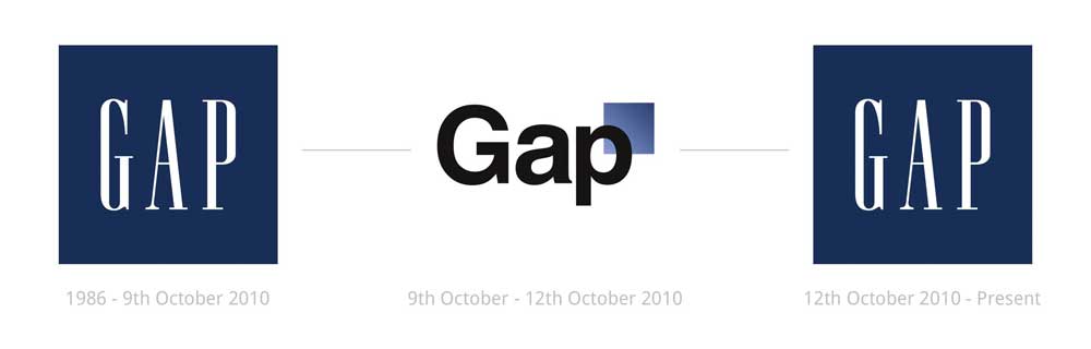
Gap Inc.’s 2010 logo redesign — produced by an internal design team following a significant budget allocation — was reverted within 6 days due to public backlash. The replacement cost, combined with the PR impact of the public reversal, was later estimated by AdAge to represent a substantial multiple of the original design investment.
The failure was not a design quality problem. It was a strategy problem: the new mark was produced without adequate stakeholder research and tested insufficiently before launch. No fee level prevents that outcome. Only process depth does.
Price is a proxy for process only when the market is opaque. In 2026, the logo design market is transparent enough that process depth is directly visible before engagement. Ask for it explicitly rather than using price as a substitute signal.
What Logo Design Cost Actually Includes (and Doesn’t)
Most pricing disputes in the logo design industry arise not from the headline fee but from what was never included in it.
Understanding the standard inclusions and exclusions at each tier prevents the most common source of client-designer conflict.
The Data Comparison: Amateur vs Professional Deliverables
| Decision Point | The Wrong Way | The Right Way | Why It Matters |
| File format delivery | JPG only, or PNG at screen resolution | SVG + EPS (vector) + PNG at 300dpi + PDF | Raster-only files cannot be scaled to print size without quality loss |
| Colour specification | Hex code only | Hex + RGB + CMYK + Pantone PMS reference | Print and digital colour environments require different specifications; hex alone fails at print |
| Trademark pre-clearance | None conducted | Search conducted against the UK IPO database before finalising the concept | A mark with an existing registration is commercially worthless regardless of its aesthetic quality |
| Revision scope | Unlimited revisions implied | Defined revision rounds in contract (typically 2–3) | Unlimited revision structures incentivise indecision and typically inflate project cost for both parties |
| Usage guidelines | None provided | Minimum clear space, minimum size, approved colour variants, prohibited uses | Without guidelines, a mark degrades inconsistently across applications |
| Brand system vs standalone mark | Single mark delivered | Primary mark + reverse/knockout + monochrome + favicon/app icon variants | Single marks fail at application extremes (dark backgrounds, 16px favicon, embroidery) |
| File ownership | Designer retains copyright, grants licence | Full IP assignment included in the fee | Retained copyright means the client cannot legally modify the mark without the designer’s consent |
What Is Never Included (Unless Specified)
At every tier below Tier 5, the following are typically excluded unless negotiated explicitly:
- Trademark registration filing — the designer may conduct a preliminary search, but formal filing with the UK IPO or EUIPO is a separate legal cost (£170–£600 per class, depending on application type)
- Brand strategy documentation — a positioning statement, brand personality framework, or audience brief — is input to the design process, not an output; if you need them produced, they are a separate scope item.
- Stationery and collateral design — business cards, letterheads, and email signatures are separate applications, not logo design deliverables.
- Social media assets — profile image crops, cover image templates, and channel-specific adaptations are a separate digital brand asset project.
- Animation or motion variants — an animated logo for video introductions requires motion design skills and is priced separately from the static mark
UK Trademark Registration Costs: The April 2026 Shift
A logo that cannot be protected is a liability, not an asset.
From 1 April 2026, the UK Intellectual Property Office (UK IPO) implemented its first significant fee increase in decades. This change fundamentally alters the “total cost of ownership” for a new logo.
Current UK IPO Fee Structure (Post-April 2026):
- Standard Online Application: £205 (previously £170) for one class.
- Additional Classes: £50 per class.
- Right Start Application: £100 upfront + £105 on completion.
When budgeting for a logo, the design fee is only the first half of the equation. If your designer does not conduct a “knockout” search against the TM3 registry, you risk paying £205 for a filing that will be rejected.
The Hidden Costs of Getting Logo Design Wrong
The sticker price of a logo redesign is not the full cost of the original bad decision. Three cost categories are consistently underestimated.
Rebranding Cost
A professional rebrand — replacing an inadequate original mark with a properly researched identity — typically costs two to three times the original logo investment. A business that spent £300 on a Fiverr logo and now needs a professional rebrand is not looking at a £300 upgrade.
They are looking at a £2,500–£5,000 replacement project, plus the cost of updating every application: website, signage, stationery, social profiles, and any printed collateral already in circulation.
Trademark Risk
A logo produced without any trademark clearance process is a liability, not an asset. If the mark is confusingly similar to an existing registered trademark, the business faces a choice between voluntary rebranding and defending a legal challenge.
A 2022 analysis of UK IPO litigation data showed that trademark infringement disputes involving SMBs most commonly arise within the first three years of trading — typically just as brand equity begins to accumulate.
Budgeting for the Rollout: The 10-15% Revenue Benchmark
In 2026, mid-market UK firms are moving away from “fixed-fee” thinking. Professional guidance now suggests allocating 10-15% of projected annual revenue for a comprehensive rebrand.
Why the “Logo Only” Budget Fails:
The design of the mark typically represents only 40% to 60% of the total branding investment. The remaining budget must account for:
- Digital Asset Replacement: Updating social headers, email signatures, and website UI.
- Physical Collateral: Signage, vehicle livery, and stationery.
- Internal Alignment: Training staff on the new brand voice and “Brand Standards” (Guidelines).
Estimated UK Branding Rollout Costs 2026
| Service Level | Design Fee | Rollout Budget (Est.) | Total Investment |
| Startup Starter | £1,500 | £1,000 | £2,500 |
| SME Growth Pack | £5,000 | £4,500 | £9,500 |
| Corporate Rebrand | £15,000+ | £20,000+ | £35,000+ |
Brand Recognition Equity Loss
The Ehrenberg-Bass Institute at the University of South Australia, in research underpinning Professor Byron Sharp’s How Brands Grow (Oxford University Press, 2010), documented that brand distinctive assets — marks, colours, characters, and other identifying signals — require five to seven years of consistent, high-frequency exposure before they achieve automatic consumer recognition. Every rebrand resets this clock.
A business that rebrands at Year Two because the original logo was inadequate loses two years of recognition accumulation. The commercial cost of that loss is not visible on a balance sheet, but it is real.
The true cost of a cheap logo is not the fee. It is the rebranding cost, the trademark exposure, and the lost recognition equity from the years spent building the wrong mark.
The Verdict
The price of your logo does not determine its quality. That was the opening claim. The evidence bears it out.
Gap’s expensive internal rebrand failed within six days. Tropicana’s £30 million redesign campaign — documented by AdAge — lost the brand an estimated $30 million in sales within two months of launch.
Price and process are not the same thing. A well-briefed professional designer at £2,500 with a structured discovery process produces more commercially durable work than an underbriefed agency at £12,000 producing executions they think look good.
The right question is not ‘how much should I spend on a logo?’ The right question is: ‘What is the minimum investment that produces a distinctive, trademark-safe, professionally delivered mark built on a real brief?’
In 2026, that minimum is approximately £1,500 from a credible professional operating at Tier 3 — with a written brief, structured revision rounds, full vector file delivery, and at least a preliminary trademark search.
Below that figure, you are accepting meaningful structural risks that will almost certainly cost more than the savings when they materialise.
If your business is pre-revenue and the mark is a placeholder, spend £0 and use an AI tool honestly. If your business is operational, revenue-generating, and competing for clients, invest at the right tier.
Ready to find out what professional identity work looks like at a realistic budget?
Explore Inkbot Design’s logo design services and see what a structured brief-to-delivery process produces.
For a full breakdown of project scope and what moves fees up or down, the logo design pricing guide covers every variable in detail.
Frequently Asked Questions
How much does a logo design cost in the UK in 2026?
Professional logo design in the UK costs between £300 and £150,000 in 2026, depending on the provider tier. A competent independent designer charges £1,500–£3,000 for a complete project. Boutique studios charge £3,000–£25,000. Global consultancies begin at £25,000. AI generator tools produce marks for £0–£50, but without strategic input or original intellectual property.
Why do some logos cost more than others?
Logo fees vary because of process depth, not design quality. Higher fees reflect structured discovery, competitive research, proprietary methodology, and institutional overhead — not a guaranteed improvement in the final mark. A designer’s hourly cost of thinking is the primary variable. Production execution costs have been compressed by AI-assisted tools across all tiers.
Is it worth paying more for a logo designer?
Paying more is worth it only when the additional fee buys demonstrably more process depth — a structured brief, competitive audit, trademark pre-clearance, and a defined revision framework. Paying more for a larger agency, a London address, or an impressive client list without those process guarantees is not a reliable path to a better outcome.
What is included in a professional logo design fee?
A professional logo design fee at Tier 3 (£1,500–£3,000) should include: a discovery questionnaire or brief session; two to three initial design directions; two structured revision rounds; final delivery in SVG, EPS, PNG (multiple resolutions), and PDF; a basic brand guidelines document covering clear space, colour values, and minimum size rules; and a full intellectual property assignment.
How long does a professional logo design take?
A structured professional logo project takes three to six weeks from brief sign-off to final delivery. Projects compressed into less than two weeks are typically skipping research, competitor analysis, or adequate internal review — all of which reduce the probability of a commercially durable outcome.
Can I trademark a logo I bought on Fiverr?
A logo purchased on a freelance marketplace can be subject to trademark registration if it meets the distinctiveness threshold required by the UK Intellectual Property Office and is not confusingly similar to an existing registered mark. The practical risk is higher with marketplace logos because they are frequently based on common template elements that may not clear a distinctiveness review.
What is the difference between a logo and a brand identity?
A logo is a single visual mark — a wordmark, symbol, or combination — that identifies a business. A brand identity is the complete system of visual, verbal, and behavioural signals through which a business presents itself consistently across all touchpoints: mark, colour system, typography hierarchy, imagery guidelines, and tone-of-voice documentation. A logo is one component of a brand identity.
Do I need a brand guidelines document with my logo?
A basic brand guidelines document is essential for any organisation with more than one person producing communications. Without documented clear space rules, colour specifications, and usage prohibitions, a logo degrades inconsistently across applications — appearing at wrong sizes, in unapproved colours, on inappropriate backgrounds. This degradation directly undermines the recognition equity being built through consistent use.
When should I rebrand my logo?
A logo rebrand is commercially justified when: the mark is associated with a market position the business has moved away from; the mark fails at modern digital applications (favicons, app icons, social thumbnails); the mark cannot be trademark-registered due to inadequate distinctiveness; or the business has undergone a merger, acquisition, or significant strategic repositioning. Age alone is not a valid reason to rebrand — many of the most recognised marks in the world are decades old.
How do I write a good logo design brief?
A commercially effective logo design brief includes: a description of the business and its market position; the target audience with specific demographic and psychographic detail; three to five competitors with notes on what their visual identity communicates; a description of three to five brand personality traits (not generic adjectives); examples of visual styles that appeal and, equally, styles that do not; and the specific applications the mark must work across (digital, print, signage, apparel, and so on).
What file formats should I receive with my logo?
A complete logo delivery should include: SVG (scalable vector, required for web and digital use); EPS (vector, required for print vendors and large-format output); PNG at minimum 1000px on the longest edge (for general digital use); PNG with transparent background; PDF (vector, for document use); and a favicon or app icon version at 512×512px. Delivery in JPG only, or in a PNG without a transparent background, indicates an incomplete deliverable.
Is it true that AI can now replace professional logo designers?
AI tools can generate visually credible logo marks at near-zero cost. They cannot conduct competitive distinctiveness analysis, advise on trademark registration risk, develop a brand strategy, or produce original intellectual property with legal certainty. In 2026, professional designers will not be competing with AI tools on production speed. They are competing on strategic judgement — a capability that prompt-driven generation does not replicate.
