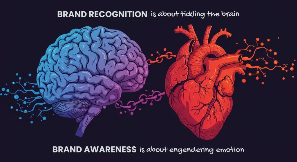
The Difference Between Logo Design and Brand Identity
Without a documented design system, your logo is effectively useless. Yet, most SMBS we see spend 90% of their budget on an icon, and 10% on its ecosystem.
This fundamental misunderstanding of brand identity is a massive reason that new businesses fail to achieve ‘mental availability’ within their first 3 years.
According to a market research study, brands that redesign their branding without a cohesive system in place lose, on average, 18% of their brand recognition equity within the first year alone.
Building a brand today requires much more than a pretty symbol. It requires an understanding of how Generative Engines index entities and how consumers decide which visual cues to use online.
Don’t think your brand is finished and done once you get an SVG of your final logo. That’s only the start.
- Logo is a single recognisable mark; Brand Identity is a documented, holistic system of visual, verbal and tactile elements for scale.
- Modern identity systems prioritise accessibility (WCAG 3, APCA), inclusive palettes, and living CSS properties for auto-dark mode and device variance.
- Motion Identity and Sonic Branding ensure recognition across short-form video, apps and voice interfaces; documented choreography and audio logos are essential.
- Make assets machine-readable: use schema.org markup, precise alt-text, and identical high-authority assets to improve AI entity linking and uniqueness.
- Invest beyond a logo to reduce Customer Acquisition Cost (CAC), boost price premium and mental availability; comprehensive brand books preserve long-term equity.
Is Logo Design and Brand Identity Different?
The logo design is the technical aspect of creating a singular, recognisable mark (or wordmark) that identifies your business from others.
Brand identity is a holistic collection of all the visual, verbal and tactile elements that work together to project a specific image to the consumer. For reference, this typically includes everything from the typography, colour palettes and tone of voice used in marketing.
Key Components:
- Logo Design: A primary mark, secondary mark, and colour/size variants used for immediate identification. Should work as a website favicon, a 40ft truck wrap and everything in between.
- Brand Identity: A documented design language system that includes grid systems for usage, photographic style, and semantic tone.
- Strategic Alignment: The marriage of visual assets with business goals to ensure the brand scales across all platforms.
Logo design creates a specific visual mark, while brand identity is the system of visual and verbal assets used to build consumer recognition.
The Logo as a Distinctive Brand Asset
Your logo is the primary ‘anchor’ for your brand, but it can’t carry the entire weight of your reputation on its own.
Logos are classified as “Distinctive Brand Assets”, or DBAs – they aren’t intended to ‘tell a story’ or ‘convey deep meaning’ in one glance, they are designed to be noticed and remembered.
Think back to when Mastercard removed its name from its logo in 2016. In doing so, they relied on the strength of their existing identity system.
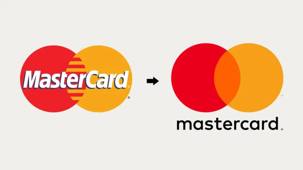
The interlocking red and yellow circles had such high levels of consumer ‘mental availability’ that the name itself was unnecessary.
This rebrand wasn’t about the aesthetics; it was a strategic shift towards a ‘symbol-only’ brand that works way better on small-scale digital interfaces, like the Apple Watch or mobile apps.
A logo is a signature – not a story. Its main function is identification, not communication. When a business tries to force its entire mission statement into a 32px favicon, visual clutter reduces brand recall, increasing the cost of customer acquisition.
The Technical Evolution of Colour Architecture
The core focus of colour psychology in branding doesn’t really dictate modern colour palettes.
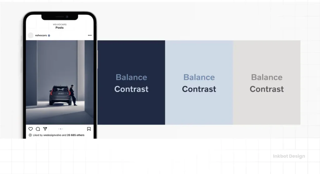
Today, the primary focus of brand identity systems is inclusive design compliance, specifically WCAG 3. Professional design language systems have to account for APCA scores (which help contrast), rather than the basic 4:5:1 ratio that has existed for decades.
When we develop palettes, we test every colour combination across multiple visual impairments and devices. A brand that ignores accessibility is more than socially irresponsible – it’s commercially invisible to a large portion of the population.
2026 Accessibility Benchmark Table
| Element Type | Minimum APCA Score | Purpose | Compliance Requirement |
| Primary Body Text | Lc 75 | Maximum readability for long-form content. | Mandatory |
| Large Headings | Lc 60 | Visual hierarchy and scanability. | Mandatory |
| Functional UI Icons | Lc 45 | Recognition of interactive elements. | Recommended |
| Decorative Elements | Lc 15 | Aesthetic background patterns. | Optional |
| Interactive States | Lc 90 | Hover and focus state clarity. | Mandatory |
| High-Contrast Mode | 100% | Specific CSS overrides for OS-level settings. | Mandatory |
| Data Visualisation | Varied | Distinguishing chart elements without colour. | Mandatory |
| Brand Watermarks | Lc 15 | Low-impact identification. | Optional |
The Implementation of “Living” Palettes
Static colour codes like HEX or RGB aren’t enough for branding now. A developed brand identity should also include CSS Custom Properties that allow the brand to adapt to the user’s environment. This includes things like ‘auto-dark mode’ where the brand’s primary blue might shift a little in brightness to stay legible against a darker background.
Technical shifts like this mean the Distinctive Brand Assets remain recognisable across different lighting conditions and screen technologies. I’m not just talking about phones/tablets. OLED screens, for example, handle contrast differently than an older LCD panel.
Professional systems provide specific instructions for these hardware variances so the brand images remain consistent and of the highest possible quality.
The Architecture of a Brand Identity System
A comprehensive system ensures that the customer can recognise your brand even if the logo is removed from the page. This is often called the “blur test”: if you blur the logo, does the website or advertisement still feel like your company?
A robust identity system includes:
- Typography: Specific typefaces that convey authority or approachability.
- Colour Architecture: A primary and functional palette that dictates hierarchy.
- Imagery Style: Whether you use high-contrast photography, hand-drawn illustrations, or generative AI assets.
- Voice and Tone: The specific linguistic patterns used in copywriting.
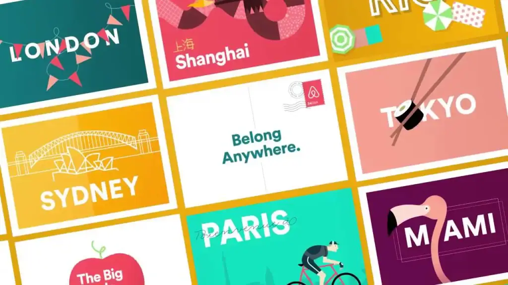
Airbnb‘s 2014 “Bélo” redesign, handled by the London-based agency DesignStudio, is a textbook example. They didn’t just launch a logo; they launched a global symbol of “belonging.”
The identity included a bespoke typeface (LL Circular), a warm colour palette (“Rausch”), and a community-driven platform that allowed users to create their own versions of the mark.
This system allowed Airbnb to scale from a room-booking site to a global travel entity.
Brand identity is the strategic orchestration of every touchpoint a consumer has with a business. It transforms a generic service into a recognisable entity, reducing friction in the sales process by establishing a familiar visual and verbal environment before the transaction.
Motion Identity: The New Signature of Digital Brands
With so many short-form videos and interactive interfaces, a static Logo Design is a secondary asset. The primary asset is how that logo enters the screen, reacts to a user’s touch, and exits the viewport. This is defined as Motion Identity.
Motion Identity is the documented system of ‘choreography’ for visual elements. It typically includes:
- Easing Functions: Whether a brand moves with “natural” bounce (friendly) or “linear” precision (technical).
- Micro-interactions: The visual feedback when a button is pressed, or a form is submitted.
- Transition Logic: How the brand moves from one state to another (e.g., from a splash screen to a dashboard).
Case Study: The “Netflix” Ta-dum
The Netflix animation, the zooming “N” accompanied by its iconic sound, is a masterclass in Motion Identity. It takes less than three seconds, but it establishes total mental availability.
By the time the content starts, the user is already subconsciously prepared for the brand experience.
Technical Requirements for Motion Assets
| Asset Type | Primary Format | Key Benefit | 2026 Usage |
| Logo Animation | Lottie (JSON) | Resolution independent, tiny file size. | High |
| UI Transitions | CSS/Web Components | Native browser performance. | Critical |
| Video Overlays | ProRes 4444 | Transparency support for high-end production. | Medium |
| Social Media Stickers | WebP (Animated) | High compression, platform compatible. | High |
| Loading Indicators | SVG SMIL | Zero-dependency browser animation. | Medium |
| Interactive Icons | Rive | Real-time state machine interaction. | Emerging |
For a modern business, the ‘logo reveal on a website, or app, is the digital equivalent of a physical storefront. If the motion is jittery, slow, or inconsistent with the brand’s voice, it creates immediate friction.
A Motion Identity guide ensures that whether a freelancer is making a TikTok or a developer is building a new app feature, the “rhythm” of the brand remains identical.
The “Logo is King” Myth
The widely accepted advice that “the logo is the most important part of your brand” is obsolete in 2026.
This myth persists because it is easier to sell a single icon than a 100-page brand guidelines document. Historically, when print was the primary medium, a logo was the most expensive asset to reproduce (think of signage and business cards).
Today, omnichannel branding has flipped the script.
Consumers interact with brands through TikTok videos, AI-generated summaries, and dark-mode mobile interfaces.
In these environments, the logo is often tiny or absent. What remains is the “Brand Language.”
According to the McKinsey & Company report The Business Value of Design, companies that treat design as a top-to-bottom system (rather than a series of one-off graphic tasks) outperformed the S&P 500 by 219% over ten years.
Insisting that the logo is the “king” of your brand leads to a fragmented presence where your website looks one way, your ads look another, and your social media feels like a different company entirely.
Sonic Branding: Identifying the Brand with Ears
As voice-activated devices and hands-free interfaces (such as smart glasses and wearables) increase, the visual Logo Design becomes less visible.
In these contexts, a business exists only as a sound. This is Sonic Branding.
A Sonic Identity is not just a “jingle.” It is a comprehensive system that includes:
- The Audio Logo: A 2–3 second soundmark (e.g., the Intel Bong).
- Brand Music: A longer-form melodic theme used in videos and podcasts.
- Functional Sounds: The specific “ping” of a successful notification or the “thud” of an error.
- Voice Profile: The gender, accent, and cadence of the voice used in AI assistants and customer service lines.
The ROI of Audio Consistency
Research from the University of Leicester indicates that brands using music aligned with their identity are 96% more likely to be remembered by consumers than those using generic “stock” music.
Despite this, 80% of small businesses ignore their audio presence, creating a massive opportunity for Information Gain in the market.
Sonic Asset Checklist for 2026
- Linear PCM (.WAV) Masters: High-fidelity source files for all audio assets.
- Loudness Normalisation: Ensuring sounds are consistent across Spotify, YouTube, and broadcast.
- Mnemonic Lengths: Variations of the audio logo (0.5s, 1.5s, and 3.0s versions).
- Instrumental Stems: Allowing editors to remix brand music for different moods while keeping the core melody.
Ensuring Brand Recognition in Generative AI Environments
Today, the primary ‘consumer’ of your brand assets is often an AI model.
Whether it is an AI agent researching competitors or a generative search engine synthesising a “Best of” list, your Brand Identity must be machine-readable.
Entity-Attribute-Value (EAV) mapping for brands involves ensuring that the AI can explicitly link your visual assets (logo, colours) to your brand name and services.
This is achieved through:
- Schema.org Mark-up: Using Brand, Organization, and ImageObject schema to define your primary logo URL and brand colours in code.
- Alt-Text Precision: Descriptive alt-text that doesn’t just say “logo,” but “Inkbot Design primary logo—minimalist blue and white icon.”
- Visual Consistency: Training the “visual model” of the web by using identical assets across all high-authority platforms. If your logo varies slightly on LinkedIn compared to your website, the AI may treat them as different entities.
The AI “Blur Test” for Brands
Just as humans use the “blur test,” AI models use Vector Embeddings to understand visual similarity.
If your Logo Design is too similar to thousands of others, its “uniqueness score” in the AI’s internal knowledge graph drops.
This reduces the likelihood that your brand will be featured in AI-generated visual summaries or recommendations.
The Valuation of Visual Equity
Why do companies pay £1,000,000 for a Brand Identity system?
It is not for the “look”; it is for the Brand Equity.
Brand equity is the commercial value that derives from consumer perception of the brand name, rather than from the product or service itself.
Key Metrics for Identity ROI
- Price Premium: A strong identity allows a business to charge more than competitors for the same service.
- Customer Acquisition Cost (CAC) Reduction: Recognisable brands require less “educational” advertising. The logo does the heavy lifting of trust-building before the ad copy is even read.
- Employee Retention: Cohesive identities foster a sense of belonging, reducing recruitment and turnover costs.
Calculating the Value of a Redesign
When a firm undergoes a redesign, the “success” is measured by the shift in Mental Availability. This is tracked through:
- Spontaneous Recall: Can people name your brand when thinking of a category?
- Prompted Recognition: Do they recognise the logo when shown a list?
- Asset Linkage: Do they correctly associate your primary colour (e.g., Tiffany Blue) with your brand?
The Professional vs Amateur Approach
| Technical Aspect | The Wrong Way (Amateur) | The Right Way (Pro) | Why It Matters |
| File Formats | Delivering only PNG/JPG files. | Delivering SVG, EPS, and AI source files. | Scalability without pixelation. |
| Colour Space | Choosing colours “because I like them.” | Using Pantone (PMS) and HEX with accessibility testing. | Consistency across print and web. |
| Typography | Using default system fonts like Arial or Calibri. | Selecting licensed, distinctive typefaces for the brand. | Legal compliance and uniqueness. |
| Guidelines | A one-page PDF showing the logo. | A comprehensive “Brand Book” with usage rules. | Ensures the brand doesn’t get “diluted.” |
| Grid System | Eye-balling the spacing. | Using a geometric grid for mathematical balance. | Visual harmony and professional polish. |
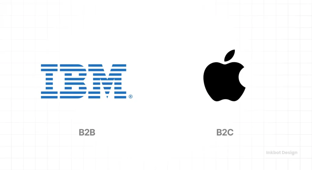
Strategic Architectures: B2B vs B2C Implementation
The application of a Brand Identity system varies significantly depending on the target audience.
A Logo Design for a consumer-facing fashion brand (B2C) serves a different psychological purpose than a logotype for a multi-national cloud infrastructure provider (B2B).
B2C: The Emotional Hook
In B2C, the identity system focuses on aspiration, lifestyle, and immediate recognition.
The colour palette is often bolder, and the typography is designed for high-impact social media environments.
The goal is to drive impulse and emotional connection.
B2B: The Trust Infrastructure
In B2B, the Brand Identity must project stability, scalability, and technical competence.
The system is often “nested,” where sub-brands or products need to look like they belong to a single “House of Brands” or a “Branded House.”
| Feature | B2C Focus | B2B Focus |
| Primary Goal | Emotional Appeal | Professional Trust |
| Typography | Expressive & Unique | Clean & Legible (Sans-Serif) |
| Imagery | Lifestyle & Human-centric | Abstract, Data-driven, or Technical |
| Primary Platform | Instagram, TikTok, Retail | LinkedIn, Whitepapers, Dashboards |
| Brand Voice | Conversational & Witty | Authoritative & Consultative |
| Identity Lifecycle | High (Frequent refreshes) | Low (Decade-long stability) |
The Verdict
The distinction between logo design and brand identity is the difference between a name and a reputation.
A logo identifies you, but your identity defines you.
We have substantiated that a logo is merely one “Distinctive Brand Asset” within a much larger, more complex design language system.
Investing in a logo without considering your identity is a short-sighted strategy that fails the “blur test” and complicates indexing for modern AI search engines.
To build a brand that survives 2026 and beyond, you must stop treating design as an aesthetic “extra” and start treating it as a core business infrastructure.
Your logo is the start of the conversation, not the end.
If you are ready to move beyond “just a logo” and build a resilient, equity-driven brand, explore Inkbot Design’s services and read our latest insights on modern branding.
Start building a system that scales today.
FAQs
What is the main difference between a logo and a brand identity?
A logo is a single graphic mark that identifies a company, whereas a brand identity is the complete system of visual and verbal elements used to communicate a brand’s personality.
Why do I need more than just a logo for my business?
Businesses require a brand identity system to maintain consistency across platforms, thereby building consumer trust and improving brand recall in competitive markets.
How much should I expect to pay for a professional brand identity?
Professional identity systems typically range from £3,000 to £30,000+, depending on the complexity of the guidelines and the number of assets required for the business.
Can a strong brand identity compensate for a weak logo?
Yes. A cohesive brand identity system—using distinctive colours, typography, and voice—can maintain brand recognition even if the primary logo is simple or unremarkable.
Is it true that colour choice affects brand perception?
Colour choices are vital for brand recognition and differentiation, but their “psychological impact” is often secondary to their consistent application across the brand.
What are the primary elements of a brand identity?
The primary elements include the logo, typography, colour palette, imagery style, iconography, and the documented rules for how these assets are used.
When should a business consider a full rebrand versus a logo refresh?
Businesses should consider a full rebrand when their current identity no longer aligns with their strategic goals, whereas a refresh is suitable for modernising an existing, successful system.
How does a brand identity affect SEO and AI discovery?
A documented brand identity helps search engines and AI systems categorise a company as a distinct entity, improving its visibility in Generative Engine results.
Does every small business need a brand style guide?
Every business, regardless of size, benefits from a style guide as it prevents visual fragmentation and ensures that every marketing pound spent builds long-term equity.
What is a design language system?
A design language system is a set of standards and reusable components that guide the creation of all visual assets, ensuring a unified brand experience.
