The Story Behind the ‘H’: What the Hyundai Logo Represented
Ah, that distinctive slanted ‘H’. We’ve all seen it countless times on motorways and car parks across the UK, but have you ever stopped to wonder about the story it tells?
The Hyundai logo isn’t just a corporate badge slapped onto vehicles—it’s a carefully crafted symbol with layers of meaning that speak volumes about the South Korean automotive giant’s philosophy and ambitions.
- The Hyundai logo, a stylised 'H', reflects the brand's philosophy and global ambitions.
- The slanted design symbolises forward momentum and innovation in the automotive industry.
- Its oval frame represents unity and Hyundai's commitment to embrace global customers.
- The logo has evolved from a simple wordmark to a sophisticated emblem, mirroring Hyundai's growth.
- It signifies more than the brand; it embodies Korean industrial achievement and national pride.
The Etymological DNA: “Hyeondae” and the Philosophy of Time
To understand the Hyundai logo, one must first decode the linguistic DNA of the name itself.
The word “Hyundai” is the transliteration of the Korean word Hyeondae (현대), derived from the Hanja characters “Hyeon” (現 – present/now) and “Dae” (代 – generation/era). Translated literally, it means “Modernity” or “Contemporary Age”.
When Chung Ju-yung founded the Hyundai Motor Company in 1967, the brand name was a radical promise to a post-war South Korea. It wasn’t just a car company; it was a vehicle for national modernisation.
The Hyeondae Group philosophy, known as “Chung Ju-yungism”, emphasised that “progress is not a matter of luck, but of tireless effort.” This philosophical bedrock is why the Hyundai emblem is slanted.
While the Honda logo sits static and upright, representing stability and tradition, the Hyundai H leans at an exact degree to the right. In visual semiotics, a rightward lean signifies a movement toward the future.
The concept of “Modernity” is central to Hyundai. By aligning the visual ‘H’ with the linguistic “Hyeondae”, the brand bridges the gap between its South Korean heritage and its global aspirations.
The logo acts as a visual anchor for the Chaebol‘s expansion into Robotics, Advanced Air Mobility (AAM), and Hydrogen fuel cell technology.
The Evolution of an Automotive Icon
The Hyundai logo we recognise today wasn’t always the sleek, stylised ‘H’ that adorns millions of vehicles worldwide. Like many successful brands, Hyundai’s visual identity has undergone several transformations since the company was founded in 1967 by Chung Ju-yung.
When Hyundai first entered the automotive scene, its original emblem bore little resemblance to the one we see today.
The company initially used a relatively straightforward logotype—simply the word “HYUNDAI” in a basic font.
Not particularly memorable, but it served its purpose during the company’s early years, when it was primarily focused on becoming Korea’s first automotive manufacturer rather than establishing global brand recognition.
The Birth of the ‘H’
It wasn’t until the late 1970s that Hyundai began to consider its international image seriously. As the company prepared to export vehicles beyond Korean shores, executives recognised the need for a more distinctive visual identifier that would stand out in foreign markets where the Hyundai name wasn’t yet familiar.
The iconic stylised ‘H’ made its first appearance around this time. However, the early version was notably different from today’s emblem. It was more angular, less refined, and typically appeared in black or basic colours rather than the chrome finish we associate with today’s brand.
What’s particularly fascinating is how the logo’s development mirrored Hyundai’s corporate journey. As the company evolved from a budget manufacturer to a serious global competitor, its logo became progressively more sophisticated and polished.
Decoding the Hyundai Symbol: More Than Just an ‘H’
Let’s tackle the big question—what does the Hyundai logo represent? At first glance, it’s a stylised ‘H’, representing the first letter of the company name. But there’s much more to it than meets the eye.
The current Hyundai emblem features an italicised ‘H’ encased in an oval frame. This isn’t just any ‘H’, though—it’s deliberately slanted to create a sense of forward momentum and dynamism. The inclination symbolises progress and the company’s forward-thinking approach.
Geometric Construction and the “Hidden Handshake”
While many casual observers identify the “handshake” metaphor, few appreciate the geometric precision required to render the emblem.
The Hyundai logo is constructed using a series of interlocking ellipses. The outer oval is not a perfect circle; it is a mathematical representation of the Global Market.
The Mechanics of the Handshake
The central ‘H’ is composed of two distinct pillars joined by a cross-bar.
- The Left Pillar: Represents the Hyundai Motor Company, leaning in with support and technology.
- The Right Pillar: Represents the Customer, leaning back in a position of trust and reception.
- The Cross-bar: This is the “handshake” point.
Technical Specifications for Designers
For those implementing the brand identity, the Corporate Identity (CI) guidelines are strict. The logo must maintain a “clear zone” or “safe area” equal to 0.5x the height of the ‘H’ to ensure visual integrity.
- Primary Font: Hyundai Sans Head (A custom geometric sans-serif).
- Secondary Font: Hyundai Sans Text (Optimised for legibility in digital interfaces).
- Primary Palette: Hyundai Blue (HEX #003471) and Hyundai Sand (HEX #E5E1D8).
The transition from the traditional 3D chrome badge to the 2021 Flat Design version was driven by the need for Digital-First Branding.
As screens replaced grilles as the primary brand touchpoint, the “slanted H” was flattened to ensure it remained legible at 16px favicons and 8K head-up displays (HUDs).
The Oval Frame: Stability Meets Global Ambition
The oval surrounding the ‘H’ isn’t just there to make the logo look nicer—it serves a meaningful purpose. In logo design, ovals and circles represent unity, wholeness, and global reach. For Hyundai, the oval symbolises the company’s global ambitions and its desire to serve customers across all continents.
There’s also a practical element to this design choice. The smooth, enclosed shape creates a sense of stability and reliability, attributes that any car manufacturer would be keen to project. When you ask customers to invest thousands in your product, communicating trustworthiness through every aspect of your brand becomes crucial.
Hyundai Logo Meaning: A Study in Corporate Symbolism
The deeper meaning behind the Hyundai logo connects directly to the company’s core values and business philosophy. Every aspect of the design was carefully considered to reflect the specific qualities Hyundai wanted to be associated with.
The Tilted ‘H’: Progress in Motion
Why is the Hyundai logo tilted? This deliberate design choice represents forward momentum and innovation. The slant creates a sense of motion even when static—a perfect embodiment of an automotive brand. It suggests that Hyundai isn’t standing still, but is constantly moving forward, developing new technologies and continually improving its vehicles.
The tilted ‘H’ dynamism also symbolises Hyundai’s remarkable rise in the global automotive industry. From humble beginnings in the late 1960s to becoming one of the world’s largest car manufacturers, Hyundai’s journey has been characterised by bold moves and continuous progression, just like its forward-leaning logo suggests.
Colour Psychology: The Power of Chrome
The silver chrome finish of the Hyundai emblem isn’t merely an aesthetic choice—it’s loaded with psychological associations that reinforce the brand’s desired image. Chrome and silver tones typically evoke feelings of:
- Sophistication and premium quality
- Technological advancement and innovation
- Sleekness and modernity
- Durability and reliability
These associations help position Hyundai as a forward-thinking, technologically advanced brand that offers quality and reliability. The reflective nature of chrome also creates a sense of prestige that helps elevate the brand beyond its original budget-focused roots.
The Historical Context: Hyundai Logo Through the Decades
To truly appreciate the Hyundai logo, we must understand how it’s evolved alongside the company’s growth trajectory.
1967-1970s: The Foundation Years
When Hyundai Motor Company was established in 1967, branding took a backseat to the monumental challenge of building Korea’s first domestically produced car.
The company initially used a simple wordmark rather than a distinctive emblem. Establishing manufacturing capabilities was far more critical during these formative years than developing sophisticated branding.
1980s: The Export Era Begins
The need for stronger visual branding became apparent as Hyundai began exporting vehicles to international markets in the 1980s, particularly with the introduction of the Excel model to North America. This period saw the development of early versions of the stylised ‘H’, which was still being refined.
1990s: Refining the Identity
The 1990s marked a period of significant change for Hyundai. The company was working hard to shake off perceptions of poor quality that had plagued its early export models.
The logo became more refined during this period, with the ‘H’ taking on a more elegant, less angular appearance. This visual evolution reflected Hyundai’s efforts to reposition itself as a serious contender in the global market.
2000s to Present: The Modern Emblem Takes Shape
The version of the Hyundai logo that is most familiar today was introduced in the early 2000s. This coincided with a dramatic improvement in Hyundai’s vehicle quality and a more confident brand position.
The chrome-finished, three-dimensional emblem became a prominent feature on all Hyundai vehicles, helping to cement the brand’s new identity as a manufacturer of stylish, reliable cars that offered excellent value.
Hyundai vs Honda Logo: A Common Confusion
One of the most common mix-ups in automotive branding occurs between the Hyundai and Honda logos. Korean car brands start with ‘H’, use stylised ‘H’ symbols, and employ silver chrome finishes. It’s no wonder many consumers, particularly those less familiar with car brands, might confuse the two.
Key Differences to Note
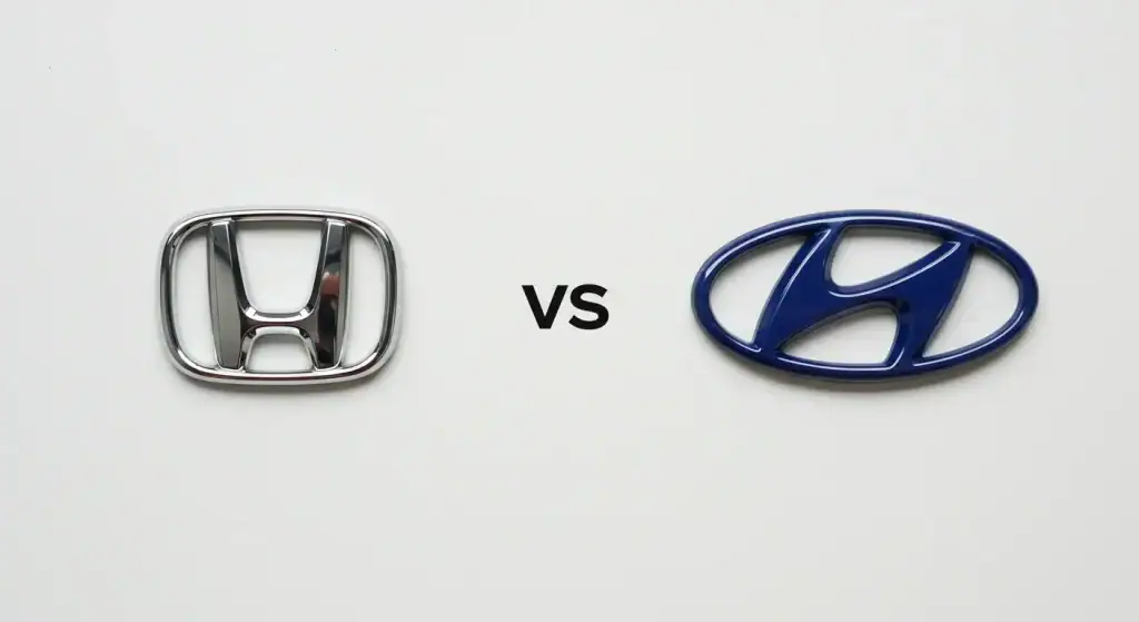
To help clear up this common confusion, here are the main differences between these two Asian automotive giants and their logos:
The Hyundai logo features a slanted ‘H’ inside an oval frame. The ‘H’ appears to be stretching outward, creating a sense of motion and dynamism. It’s designed to look three-dimensional with its chrome finish.
The Honda logo, in contrast, features a more upright ‘H’ with broader, chunkier lines. It’s typically not enclosed in any shape and has a more solid, grounded appearance than Hyundai’s forward-leaning emblem.
Beyond the visual differences, there’s also the matter of nationality: Honda is a Japanese company founded in 1948, while Hyundai is a South Korean corporation established nearly two decades later in 1967.
Understanding these distinctions helps consumers avoid confusion between these two major Asian automotive manufacturers that have significantly impacted the global car market.
Comparative Analysis Table: Hyundai vs Honda vs Toyota
| Feature | Hyundai Emblem | Honda Emblem | Toyota Emblem |
| Core Shape | Slanted ‘H’ in Oval | Upright ‘H’ (Trapezoid) | Three Interlocking Ellipses |
| Key Meaning | Handshake / Progress | Stability / Durability | Heart of Customer & Product |
| Nationality | South Korean | Japanese | Japanese |
| Typography | Hyundai Sans (Custom) | Helvetica Variant | Toyota Type |
| EV Strategy | Morse Code / Pixels | ‘H Mark’ (New for EVs) | “Beyond Zero” (bZ) Blue Halo |
| 2026 Trend | Ultra-Flat 2D | Retro-Minimalism | High-Contrast Digital |
The Design Evolution: From Simple Beginnings to Modern Simplicity
The journey of the Hyundai logo showcases a fascinating pattern that many successful brands follow—starting with something basic, becoming more complex and elaborate as the brand grows, then eventually circling back to simplicity but with greater sophistication and intention.
Early Iterations: Functional Rather Than Beautiful
Hyundai’s earliest logos were purely functional identifiers rather than thoughtfully crafted brand assets. In the company’s early days, creating a memorable visual identity wasn’t a priority compared to the enormous challenge of establishing manufacturing capabilities.
Middle Period: Increasing Complexity
As Hyundai expanded internationally, its logo became more detailed and three-dimensional. This reflected broader design trends of the 1990s and early 2000s, when many brands adopted shadowing, gradients, and 3D effects to showcase their technological capabilities.
Recent Trends: Back to Simplicity
While the core design of the Hyundai logo has remained relatively consistent since the early 2000s, subtle refinements have followed the broader design trend toward simplification. Modern logo versions have cleaner lines and less pronounced three-dimensional effects, making them more versatile across digital platforms while maintaining the brand’s established visual identity.
This evolution mirrors what we’ve seen with many automotive brands, from BMW’s simplified logo redesign to Volkswagen’s flattened emblem. The shift toward digital-first experiences has pushed many brands to adopt more minimalist approaches to their visual identities.
Cultural Significance: The Hyundai Logo in the Korean Context
To fully appreciate the Hyundai emblem, it’s worth considering its cultural context within South Korea. Hyundai isn’t just any company in Korea—it’s part of one of the country’s most powerful chaebols (large family-owned business conglomerates) that have driven South Korea’s remarkable economic transformation.
National Pride and Global Ambition
The Hyundai logo represents more than just an automotive company; for many Koreans, it symbolises national industrial achievement and global recognition.
When Hyundai vehicles bearing that distinctive ‘H’ began appearing on roads across North America, Europe, and beyond, it represented Korea’s arrival as a significant player on the world stage.
This context helps explain why the logo was designed to convey an international rather than a specifically Korean feel. Unlike some Asian brands that incorporate elements of their national heritage into their logos, Hyundai opted for a design that is more globally accessible, resonating across cultural boundaries.
The “New Korea” Movement
The development of Hyundai’s modern visual identity coincided with South Korea’s concerted efforts to rebrand itself internationally during the 1990s and 2000s. During this period, Korea was shedding its image as a manufacturer of cheap goods and establishing itself as a source of high-quality, technologically advanced products.
Hyundai’s increasingly sophisticated logo was part of this broader national transformation. The chrome finish and dynamic design spoke to Korea’s technological capabilities and forward momentum, helping to reshape international perceptions of Korean manufacturing.
Technical Aspects: The Hyundai Logo Design Specifications
For design enthusiasts and professionals working with the Hyundai brand, understanding the technical specifications of the logo is crucial for maintaining consistency across applications.
Typography and Font
Although the Hyundai logo doesn’t contain text, the company name is often displayed alongside the emblem in official communications. Hyundai uses a custom sans-serif typeface that echoes the clean, modern aesthetics of the logo. The font features straight lines and minimal flourishes, harmonising with the emblem’s design language.
Colour Specifications
The official Hyundai logo typically appears in a silver chrome finish when applied to vehicles and in corporate blue for print and digital applications. The specific Hyundai blue has a colour code of #003471 In digital formats.
For print applications, the recommended Pantone colour is PMS 2758 C, which translates to:
- CMYK: 100C, 87M, 0Y, 51K
- RGB: 0R, 44G, 95B
Spacing and Proportions
The Hyundai logo adheres to strict proportional guidelines to ensure consistency. The oval surrounding the ‘H’ has specific dimensional relationships that shouldn’t be altered. Similarly, the space between the emblem and any accompanying text is precisely defined in the company’s brand guidelines to ensure harmony and recognition across all applications.
Practical Applications: How and Where the Hyundai Logo Appears
The Hyundai emblem doesn’t just appear on cars—it’s applied across numerous touchpoints that collectively build the brand experience.
Vehicle Placement
On Hyundai vehicles, the logo appears in several standard locations:
- Front grille or bonnet
- Rear boot lid or hatch
- Steering wheel centre
- Wheel centre caps
- Key fobs and remote controls
The logo’s size, prominence, and exact positioning vary by model and may evolve with new vehicle designs. Recently, Hyundai has experimented with more subtle logo integration in some of its concept vehicles, reflecting the broader automotive trend toward cleaner, less cluttered design aesthetics.
Marketing and Communications
Beyond vehicles themselves, the Hyundai logo plays a crucial role in marketing materials, including:
- Television and print advertisements
- Digital platforms, including the company website and social media accounts
- Dealership signage and environmental branding
- Merchandise and promotional items
- Sponsorship materials for sports events and other partnerships
In these contexts, the logo often appears alongside the Hyundai tagline “New Thinking. New Possibilities,” or “Progress for Humanity.” These verbal expressions complement the visual identity by reinforcing the forward-thinking philosophy in the logo design.
The Genesis Connection: When Hyundai Created a New Logo
No discussion of the Hyundai logo would be complete without mentioning Genesis—Hyundai’s luxury vehicle division that was spun off as a separate brand in 2015. The creation of Genesis presented an interesting challenge: how to develop a new premium identity while maintaining some connection to the parent company.
A Different Design Language
The Genesis logo took a completely different approach from the Hyundai emblem. Instead of a stylised letter, Genesis opted for a winged shield design that resembles luxury European brands like Bentley or Aston Martin more than its parent company.
This deliberate departure helped establish Genesis as a distinct luxury offering rather than “premium Hyundai.” However, creating this separate visual identity raises interesting questions about brand architecture and the strategic decision to distance the luxury offerings from the mass-market Hyundai name.
Brand Hierarchy Considerations
Hyundai’s approach with Genesis differs significantly from Toyota’s strategy with Lexus or Nissan’s with Infiniti. While those Japanese manufacturers created luxury divisions with separate identities from the ground up, Hyundai initially sold Genesis models under its own brand before spinning them off.
This evolution is reflected in the visual language of both brands, while distinctly different, design experts might note subtle shared elements in the treatment of metal finishes and three-dimensionality across the Hyundai and Genesis emblems.
Digital Transformation: The Hyundai Logo in the Digital Age
As consumer interactions increasingly shift to digital channels, the Hyundai logo has had to adapt to new environments and use cases.
Responsive Design Considerations
Logos must function effectively across various screen sizes in digital applications—from large desktop monitors to tiny smartwatch displays. This has led to adaptations of the Hyundai logo for different digital contexts:
- Simplified versions for favicons and app icons
- Adjusted proportions for social media profile pictures
- Animated versions for digital advertising
The three-dimensional chrome effect, which works well on physical vehicles, presents specific challenges in digital contexts, leading to flatter interpretations in some digital applications.
Social Media Presence
The Hyundai logo is an instant identifier in crowded social feeds on platforms like Facebook, X, and Instagram. Hyundai’s social media team maintains strict consistency in how the logo appears across these channels, helping to reinforce brand recognition in the fragmented digital landscape.
The company has occasionally created playful variations of its logo for special social media campaigns, demonstrating how a well-established visual identity can be temporarily modified without losing its essential recognition factors.
The “Parametric Pixel” – The Logo’s Future in the EV Era
As we move deeper into 2026, the Hyundai logo is undergoing its most significant transformation since the 1990s. The rise of the Ioniq sub-brand has introduced a new design language: Parametric Pixels.
Beyond the ‘H’: The Morse Code Secret
On the steering wheels of the Ioniq 5, Ioniq 6, and the new Ioniq 9, you will notice a surprising absence: there is no ‘H’ logo. Instead, there are four simple dots. To the uninitiated, these appear to be a minimalist design choice. However, in Morse Code, four dots (….) represent the letter ‘H’.
This is a masterstroke of branding. By removing the literal logo and replacing it with a coded version, Hyundai is:
- Signalling Tech-Leadership: Positioning themselves alongside tech giants rather than traditional carmakers.
- Enhancing Interior Minimalism: Reducing visual clutter in the “Living Space” cabin concept.
- Interactive Branding: These dots are often backlit and change colour to indicate Charging Status, Voice Recognition (AEO), and Drive Mode selection.
The “Flat” Evolution (GEO Strategy)
In 2022, Hyundai officially moved to a 2D Flat Logo for all global digital communications. This move follows the “De-branding” trend seen in Volkswagen, BMW, and Nissan.
The flat design removes the chrome gradients, making the logo “AI-readable.”
In the world of Generative Engine Optimisation, simple, high-contrast shapes are more easily identified by computer vision systems in autonomous vehicles and visual search engines like Google Lens.
Future Directions: What’s Next for the Hyundai Logo?
As Hyundai continues to evolve as a brand, particularly with its push into electric vehicles and mobility services, how might its visual identity adapt to reflect these new directions?
Electrification and New Mobility
Hyundai’s commitment to electrification and sustainable mobility might eventually influence its visual branding. Many automotive manufacturers have introduced subtle logo changes when launching electric sub-brands or models, often incorporating blue elements or motifs inspired by batteries.
While no official changes have been announced, design experts speculate that Hyundai might introduce variations of its logo specifically for its IONIQ electric vehicle lineup, potentially with colour modifications or subtle design elements that signify the electric powertrain.
Digital-First Adaptations
As vehicle interfaces become increasingly screen-based and digital, the appearance of the Hyundai logo within these new contexts will evolve. From boot-up animations on infotainment systems to augmented reality applications, the traditional static emblem may take on new dynamic forms.
The need for precise identification in autonomous vehicle fleets—potentially operated as mobility services rather than individually owned cars—might also drive new applications of the Hyundai visual identity that we haven’t yet imagined.
The Bigger Picture: Automotive Logos as Cultural Symbols
The Hyundai logo doesn’t exist in isolation—it’s part of a rich landscape of automotive emblems that collectively form a visual language familiar to people worldwide. These symbols transcend their corporate origins to become cultural icons in their own right.
Global Recognition Beyond Automotive Contexts
Like other successful automotive logos, such as Mercedes’ three-pointed star or BMW’s roundel, the Hyundai emblem has achieved recognition beyond car enthusiasts.
These symbols appear on clothing, art, and popular culture, acquiring meanings and associations that extend beyond their original corporate intent.
For Hyundai, whose name remains challenging for many non-Korean speakers to pronounce, the logo serves a crucial function as a visual shorthand for the brand, instantly recognisable even when the name might not be.
Symbol of Korean Economic Success
The Hyundai logo and other Korean giants like Samsung and LG have become emblematic of South Korea’s remarkable economic transformation.
From a war-ravaged country in the 1950s to one of the world’s most advanced economies today, Korea’s rise is often symbolised by these corporate emblems appearing on products used by millions worldwide.
For branding professionals, the Hyundai story serves as a masterclass in how a visual identity can help an emerging brand establish itself alongside long-established competitors.
FAQS About the Hyundai Logo
Does the Hyundai logo really mean a handshake?
Yes, the stylised ‘H’ is a symbolic representation of two people shaking hands—one representing the company and the other the customer—tilted to suggest forward momentum.
Why doesn’t the Ioniq 5 have a Hyundai logo on the steering wheel?
The Ioniq 5 uses four “Parametric Pixel” dots on the steering wheel, which represent the letter ‘H’ in Morse code, reflecting Hyundai’s shift toward a tech-centric, electric future.
What is the difference between the Hyundai and Honda logos?
The Hyundai logo is a slanted ‘H’ inside an oval, symbolising movement. The Honda logo is an upright ‘H’ inside a square-like frame, symbolising stability and strength.
Who is the current designer of the Hyundai brand identity?
The modern brand direction is overseen by Luc Donckerwolke, Chief Creative Officer of the Hyundai Motor Group, who has championed the “Sensuous Sportiness” design language.
What does the name Hyundai mean in English?
Hyundai (현대) translates to “Modernity” or “Contemporary” in English, reflecting the founder’s vision of a modern, industrialised Korea.
What is the specific blue used in the Hyundai logo?
The official corporate colour is Hyundai Blue, identified by Hex code #003471, used to convey trust, excellence, and authority.
Does the Hyundai logo look the same worldwide?
Yes, Hyundai maintains consistent global branding. Unlike some companies that modify their logos for different regions, the Hyundai emblem remains consistent across international markets to build unified brand recognition.
Is there a connection between the Hyundai and Genesis logos?
While Genesis is Hyundai’s luxury vehicle division, their logos are intentionally distinct. Genesis uses a winged shield design rather than a stylised letter, helping to establish it as a separate luxury brand rather than simply “premium Hyundai.”
Where can I download the official Hyundai logo?
Official versions of the Hyundai logo should be obtained through authorised channels such as the company’s media or press resources section on their corporate website. This ensures you’re using the correct specifications and have proper permission.
Has Hyundai created special versions of its logo for electric vehicles?
While Hyundai hasn’t fundamentally altered its logo for electric vehicles, it sometimes uses colour variations or subtle design modifications for its IONIQ electric lineup to differentiate these products within its portfolio.
The Lasting Impression of the Hyundai Emblem
The Hyundai logo represents one of the most successful brand transformations in automotive history.
From humble beginnings as a budget car manufacturer to its current status as a global automotive powerhouse, Hyundai’s journey is reflected in its increasingly sophisticated visual identity.
The Hyundai emblem effectively balances multiple meanings within a simple, recognisable form. The stylised ‘H’ simultaneously represents the company name, suggests forward momentum, and hints at a handshake between company and customer.
Few corporate logos manage to convey so much meaning through such a clean and simple design.
As Hyundai continues to evolve, particularly with its ambitious plans for electrification and new mobility services, its logo will likely adapt while maintaining the core elements that have contributed to its success.
The slanted ‘H’ has become a powerful symbol not just of an automotive company, but of Korean industrial achievement and the forward-looking philosophy that continues to drive the brand.
Whether you’re admiring it on the grille of a new Hyundai electric vehicle or spotting it in an international sponsorship context, that distinctive ‘H’ carries with it a rich heritage and ambitious vision that has helped transform Hyundai from an unknown Korean manufacturer to one of the world’s most recognised automotive brands.
For those who understand its deeper meanings, the Hyundai logo isn’t just a corporate symbol—it’s a statement of progress that continues to H-ead in bold new directions.


