eCommerce Logo Design for Startups: Stop Looking Like an Amateur
I’ve seen countless entrepreneurs spend months sourcing products, building their Shopify store, and mapping out marketing funnels, only to sabotage the entire operation at the last second.
How?
With a cheap, illegible, or generic logo they grabbed from a contest site or threw together in Canva in ten minutes.
As a design consultant for Inkbot Design, I have to be honest: your logo is not art. For an ecommerce business, it is your single hardest-working employee. It’s your security guard, your salesperson, and your brand ambassador, all rolled into one. And in most cases, it’s failing.
It’s failing to build trust. It’s failing to look professional. And it’s failing to be memorable.
Before we get into the “how-to,” let’s clear the air. Here are my biggest issues in ecommerce logo design. If you’re guilty of one of these, don’t worry—we’re going to fix it.
- The “Canva Special”: You use a free template. The problem? So have 10,000 other dropshipping stores. When a customer sees that same generic mountain peak or minimalist leaf, their subconscious screams “generic,” “low-effort,” and “is this a scam?” You’ve lost the sale before they’ve even added to their cart.
- The “Illegible Scribble”: You’ve fallen in love with a complex, swirling script font. It looks lovely in your giant design file. However, when you shrink it to a 90px-high mobile header, it resembles a strand of tangled hair. If they can’t read your name, they can’t trust your name.
- The “Monogram Mistake”: You’re “Sarah’s Sustainable Soaps,” and you decide your logo should just be “SSS.” You are not Yves Saint Laurent. You have zero brand recognition. Using initials is a privilege reserved for brands that have spent decades (and billions) building a reputation. Please state your full name. Clearly.
- The “Too-Complex Icon”: That beautiful, hand-drawn illustration of a phoenix rising from a detailed crest? It’s about to become a 16×16 pixel favicon. It will look like a grey smudge. A spec of dust. It’s useless.
The truth is, an ecommerce logo isn’t like a logo for a law firm or a restaurant. It lives in a much harsher, more competitive, and technically demanding environment.
- Don’t use generic Canva templates; they scream low-effort and destroy trust before a customer adds to cart.
- Design for smallest sizes first — favicon and mobile header legibility are non-negotiable.
- Prefer a combination mark (icon + name) and a responsive logo system for scalability and recognition.
- Invest in professional design — cheap logos cost sales, redesigns, and credibility.
Why Your Ecommerce Logo Design is a Different Beast
A logo for a physical shop just needs to look good on a sign and a business card. Your ecommerce logo has to fight for its life every single day in a dozen different formats.
It’s the tiny icon in a sea of open browser tabs, fighting for a click.
It’s the profile picture on your Instagram feed, trying to stop a thumb from scrolling.
It’s the reassuring presence in the checkout header, silently telling the customer it’s safe to enter their credit card details.
This is where so many new businesses fail. They don’t grasp that their logo is the anchor for their entire logo design and branding strategy. In ecommerce, that strategy is built on two pillars: Trust and Scalability.
- Trust: You are not Amazon. You are not Target. A new customer landing on your site is instinctively wary. They are asking, “Is this a real business? Will I actually get my product? Is my payment info safe?” A professional, clear, and unique logo is the first and fastest way to answer “yes.” A generic or sloppy logo screams “fly-by-night.”
- Scalability: Your logo will be stretched, shrunk, and cropped more than any other brand asset. It must work everywhere, without losing its identity.
This isn’t theory. This is the practical reality of selling online.
The Technical Hellscape: Where Most Logos Die
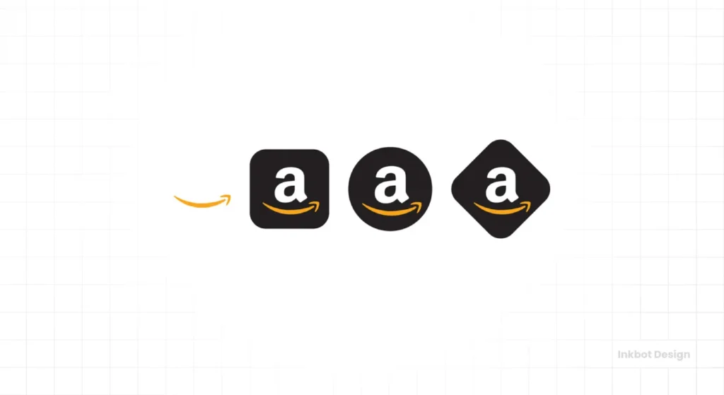
Before you even think about colours or fonts, you must accept the brutal technical constraints of the web. Your logo designer should design for the smallest possible use case first, not the largest.
That smallest use case? The favicon.
A favicon (short for “favourite icon”) is the tiny 16×16 or 32×32 pixel icon that appears in the browser tab.
This tiny square is your logo’s most hostile environment. Ninety per cent of detailed logos fail this test. They become unreadable, pixelated blurs.
Observation: I’ve audited checkouts where a complex logo in the header turns into an unidentifiable smudge in the browser tab. This creates a brief moment of cognitive dissonance for the customer—a fleeting doubt. In the high-stakes world of checkout conversion, doubt is a death sentence.
Your logo must be recognisable at this size. This means it either needs to be an extremely simple icon (a brandmark) or have a simplified version of your logo specifically designed for this purpose (a responsive logo).
The Ecommerce Logo Test
Before you approve any design, run it through this wringer. If it fails even one of these, send it back to the designer.
| Test Case | Dimensions (Approx.) | Why It Matters (The “So What?”) | Pass / Fail? |
| 1. The Favicon Test | 16×16 pixels | Trust & Navigation: Is it a recognisable mark in a crowded browser tab? A generic globe icon is a fail. It must be yours. | |
| 2. The Social Media Test | 110×110 pixels (Circular) | Recognition: Does it work inside a circle? Is your text cut off? A horizontal logo (wordmark) will be resized to fit. You need an icon. | |
| 3. The Mobile Header Test | 80-120 pixels (Height) | Legibility: Can you read your brand name clearly on a small, bright phone screen? Is the script font legible? Is the icon clear? | |
| 4. The Email Header Test | 150-300 pixels (Width) | Professionalism: How does it look in an email inbox? Does it reinforce your brand, or does it look stretched and amateurish? | |
| 5. The B&W Test | N/A (Black & White) | Versatility: Does the logo work in one colour? It will need to be used for packaging slips, invoices, or simple box printing. If it relies on colour gradients to work, it’s a weak design. |
This isn’t just a checklist. It’s a filter that will save you thousands in redesign costs and lost sales.
Choosing Your Weapon: Logo Types for Online Stores
There are many types of logos, but for ecommerce, your choices are more limited. Let’s break down the main contenders through the practical lens of an online store.
1. The Wordmark (or Logotype)
This is a font-based logo that just spells out your business name.
- Examples: Google, Allbirds, Coca-Cola.
- Best for: Brands with a short, catchy, and unique name.
2. The Brandmark (or Icon)
This is a single, graphic-based symbol.
- Examples: The Apple apple, the Nike swoosh, the Twitter bird.
- Best for: This is extremely dangerous for new stores. Avoid this. It relies 100% on pre-existing brand recognition, which you don’t have.
3. The Lettermark (or Monogram)
A logo made of the brand’s initials.
- Examples: LV (Louis Vuitton), YSL (Yves Saint Laurent), NASA.
- Best for: Again, avoid this. This is my “Monogram Mistake” pet peeve. You are not YSL.
4. The Combination Mark
This is the holy grail for ecommerce. It combines a Wordmark with a Brandmark (icon).
- Examples: Gymshark (the shark icon + the name), Adidas (the three stripes + the name).
- Why it’s perfect:
- It builds recognition: It shows your icon and your name, teaching customers to associate the two.
- It’s versatile: You can use the full combination mark in your site header.
- It’s scalable: You can use just the icon (the brandmark) for your favicon and social media profile picture. It’s the best of all worlds.
Here is a simple breakdown of how these stack up for an ecommerce business.
Pros & Cons Table for Ecommerce Logos
| Logo Type | Favicon Legibility (1-10) | New Brand Recognition (1-10) | Social Media Impact (1-10) | My Recommendation |
| Wordmark (e.g., Allbirds) | 2/10 (Usually unreadable) | 9/10 (They read your name) | 4/10 (Hard to fit) | Good, if… your name is short and you have a separate icon for a favicon. |
| Brandmark (Icon) (e.g., Apple) | 10/10 (Perfect) | 1/10 (Means nothing) | 10/10 (Perfect) | Dangerous. Avoid using this alone until you are world-famous. |
| Lettermark (e.g., “SSS”) | 8/10 (Initials can fit) | 1/10 (Means nothing) | 8/10 (Can fit) | Avoid. You’re sacrificing recognition for a vanity monogram. |
| Combination Mark (e.g., Gymshark) | 10/10 (Use the icon part) | 10/10 (They see both) | 10/10 (Use the icon part) | The Winner. This is the most flexible, professional, and scalable option for 99% of online stores. |
The Rise of the “Responsive Logo”
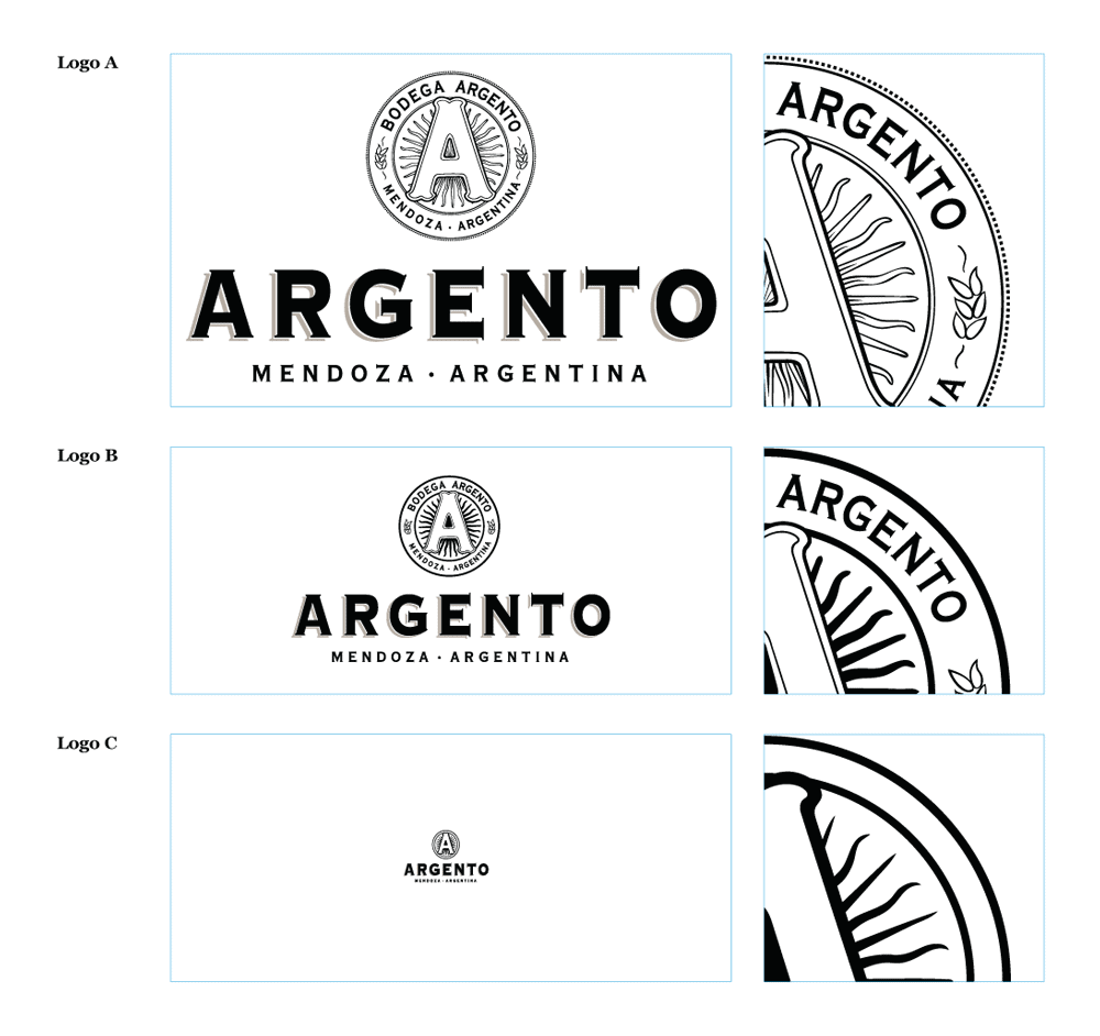
The solution to the scalability problem is what we call a responsive logo.
Just like a responsive website adjusts its layout for desktop, tablet, and mobile, a responsive logo adapts its level of detail to fit the space it occupies.
It’s not one logo. It’s a system of logos.
For an ecommerce brand, this system might look like this:
- Large (e.g., Homepage Banner): The full Combination Mark (Icon + Full Business Name + Tagline).
- Medium (e.g., Site Header): The Combination Mark (Icon + Full Business Name).
- Small (e.g., Social Media Profile): Just the Icon (Brandmark).
- Tiny (e.g., Favicon): The Icon, or an even more simplified version of it.
When you hire a designer, you aren’t just buying “a logo.” You are investing in a responsive logo system. If your designer is unfamiliar with this concept or fails to provide it, they are not a professional logo designer. They are a hobbyist.
Real-World Ecommerce Teardowns: Good, Bad, and Ugly
Let’s look at a few examples in the wild.

- The Good: Allbirds
- Logo: A simple, bold, sans-serif wordmark.
- Why it Works: “Allbirds” is a unique, memorable name. The font is exceptionally clean and legible at almost any size. It’s confident and minimalist, just like
their product. - Scalability: For their favicon, they don’t try to cram the whole name in. They use a simple “a”. This is a smart, responsive approach.
- The Good: Gymshark
- Logo: A classic combination mark. A simple, aggressive shark icon paired with a strong, all-caps wordmark.
- Why it Works: It’s a perfect marriage. The name “Gymshark” is literally a description of the logo.
- Scalability: This is its genius. The full logo sits in the site header. But on Instagram, Twitter, and in their app icon, they only use the shark icon. They have spent years teaching their audience to associate the two, and it’s paid off. The icon is now instantly recognisable.
- The Bad (Hypothetical): “Sarah’s Sustainable Soaps”
- Logo: Let’s imagine our “SSS” monogram. Sarah loved it. It was set in a beautiful, flowing script.
- Why it Fails:
- No Recognition: No one knows what “SSS” stands for.
- Illegible: The script font is unreadable in the mobile header.
- Untrustworthy: In the checkout, the “SSS” logo appears weak and unofficial, leading to cart abandonment among nervous buyers.
- Favicon Failure: The “SSS” in script is a blurry mess at 16×16. Sarah’s site just has the default globe icon.
This isn’t just about aesthetics. This is about sales.
I once worked with a small business selling high-end craft supplies. They “rebranded” themselves with a very minimalist, grey-and-white wordmark, thinking it looked “premium.”
Their sales dropped 30% in two months. Why?
Their audience loved colour, creativity, and vibrancy. The new logo felt sterile, corporate, and completely disconnected from the products.
We switched back to a logo system using their original, vibrant colour palette and a simple, custom “craft” icon. Sales recovered almost immediately.
Your logo isn’t for you. It’s for your customer.
The DIY Trap: Why a $50 Logo Will Cost You $5,000
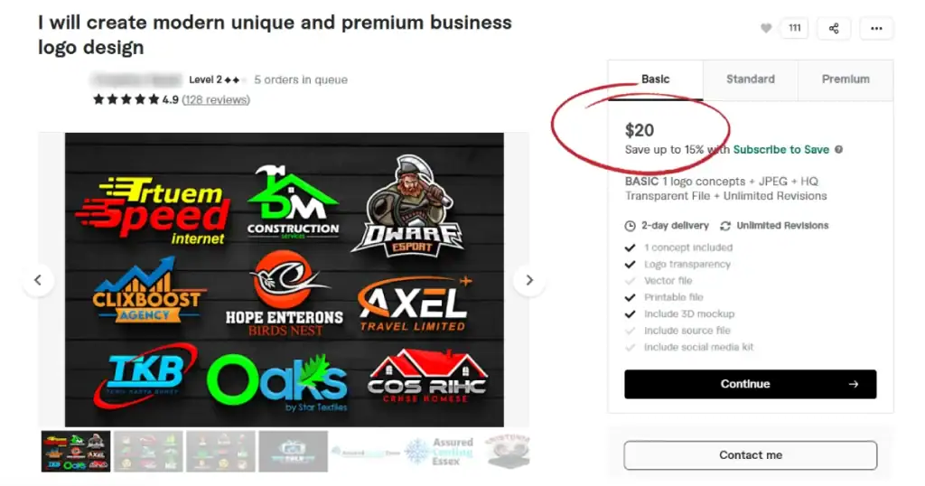
I understand the temptation. You’re a startup. Cash is tight. Why spend $1,000+ on a logo when you can get one on Fiverr for $50 or use a free logo maker?
This is the definition of a false economy.
- A $50 logo is almost always a template. It’s not unique. You can’t trademark it. And as we’ve established, it’s probably not technically sound.
- A logo maker spits out generic icons and basic fonts. It cannot understand your audience, your brand strategy, or the technical demands of a responsive system.
- A contest site is a race to the bottom, encouraging designers to churn out low-quality, derivative work as fast as possible, often infringing on copyright.
A cheap logo costs you in tangible ways:
- Lost Trust & Sales: Customers bounce because your site feels unprofessional.
- Redesign Costs: Six months later, you realise it’s failing, and you have to pay a professional to do it all over again.
- Reprinting Costs: You will need to reprint your packaging, business cards, and marketing materials.
- Wasted Time: You’ve spent months building a brand on a broken foundation.
Investing in professional logo design isn’t a cost. It’s an investment in your single most valuable asset. A professional designer doesn’t just “make a graphic.” They:
- Research your audience and competitors.
- Strategise your brand’s position in the market.
- Design a system that is unique, memorable, and technically robust.
- Deliver all the correct file types (SVG for web, PNG, AI) and colour variations (RGB, CMYK, B&W) you will ever need.
You wouldn’t build a house on a foundation of quicksand. Don’t build your business on a $50 logo.
Final Verdict: Your Logo Is a Tool, Not a Decoration
Stop thinking of your logo as a piece of art. Start thinking of it as a high-performance tool designed for a specific job.
A great ecommerce logo:
- Builds Instant Trust: It looks professional, unique, and legitimate.
- Is Legible Everywhere: It can be read clearly in a mobile header.
- Is Scalable: It has a simplified icon version that is still recognisable as a 16×16 pixel favicon.
- Is Relevant: It speaks to your target customer, not just your personal taste.
Your logo is the face of your online business. It’s working 24/7. It’s either building trust and welcoming customers, or it’s silently turning them away at the door.
If you’ve looked at your current logo while reading this and realised it’s not working hard enough, it might be time for a professional review.
At Inkbot Design, we specialise in creating strategic logo systems that function as hard as you do. Take a look at the logo design services we offer. If you’re ready to get specific about your project, you can request a quote directly.
FAQs (Frequently Asked Questions)
What makes a good ecommerce logo?
A good ecommerce logo is simple, memorable, and scalable. It must be legible in a mobile header and recognisable as a tiny favicon. Most importantly, it must look professional to build customer trust.
How is an ecommerce logo different from a regular logo?
An ecommerce logo lives in more technically demanding places. It must work as a 16×16 pixel favicon, a circular social media profile picture, and a narrow mobile header, all while building trust for online payments.
What is the best logo type for an online store?
For most new online stores, the Combination Mark (an icon + the business name) is the best choice. It builds brand recognition while providing a scalable icon for favicons and social media.
Can I just use a Canva logo for my Shopify store?
You can, but it’s a risky move. Using a generic template shared by thousands of other stores can make your brand appear amateurish and untrustworthy, which can negatively impact your conversion rates.
Why is a scalable logo so important for ecommerce?
Your logo will appear in various sizes, ranging from a large homepage banner to a small browser tab (favicon). If it’s not designed to scale, it will become an illegible smudge at small sizes, breaking brand recognition and trust.
What is a favicon and why does it matter?
A favicon is the small 16×16-pixel icon displayed in your browser tab. It’s a critical, often-overlooked branding tool that helps customers identify your site in a sea of open tabs and builds a sense of professionalism.
What is a responsive logo?
A responsive logo is a logo system that changes its detail level to fit the space. It might be a full logo with a tagline on desktop, just an icon and name on mobile, and only the icon as a favicon.
What file types are required for my ecommerce logo?
At a minimum, you need web-optimised files, such as SVG (a scalable vector file that remains crisp at any size) and PNGs (with transparent backgrounds), for your website.
Should my logo be an icon or my business name?
For a new brand, it should be both (a combination mark). Using just your name (wordmark) is hard to scale down. Using just an icon (brandmark) is risky because no one knows who you are yet.
How does my logo directly affect customer trust?
A professional, unique, and clear logo signals that you are a legitimate, serious business. A sloppy, generic, or illegible logo creates subconscious doubt, making customers less likely to enter their credit card information.
