Brand Book Essentials: What to Include for a Guide People Use
A brand book is a user manual for your brand. Full stop.
It’s the single source of truth that tells everyone—your team, your new marketing hire, your freelancer, the local printer—exactly how to use your brand assets.
It defines your logo, colours, typography, and voice to ensure your brand looks and sounds the same everywhere, every time.
Here’s what it is not: It is not a 100-page, leather-bound coffee table book. It’s not a marketing brochure to impress investors. It’s not a design graveyard where good ideas go to die.
A brand book is a tool, not a trophy.
People get tangled in the jargon. Brand Book, Style Guide, Brand Identity Guidelines… they are 99% the same thing. They all serve one function: enforcing consistency.
Don’t get hung up on the name. Get hung up on whether or not people are actually using it.
- Brand book is a practical single source of truth that enforces consistency across logo, colours, typography, voice, and imagery.
- Without one you get Brand Chaos: wasted time, rework, and loss of trust; a concise, accessible guide prevents amateurish presentation.
- Start with a simple digital "One‑Page Wonder" covering five core sections; make it usable, updatable, and easy to share.
Why Your Small Business Is Wasting Money Without One

You are wasting money without a brand book because you are paying for “Brand Chaos.”
Brand Chaos is the default setting for most small businesses.
It’s when the sales team uses an old logo from their desktop, the social media intern uses a random pink because it ‘feels right’, and your new flyer looks like it came from a different company.
The real cost isn’t just ‘looking bad’. The real cost is time, trust, and rework.
You pay your designer (again) to find the right logo. You pay the printer (again) to fix the wrong blue. You waste hours in meetings trying to ‘fix the branding’.
Key Benefit 1: It Stops You From Looking Amateurish
Consistency is the uniform of a professional business. Inconsistency signals amateurism, which makes customers pause right before they’re about to buy.
Key Benefit 2: It Makes Onboarding & Outsourcing 10x Faster
Stop explaining your brand for 45 minutes on a Zoom call. Just send the link. A good brand book lets a new designer, writer, or VA get 90% of the way there in 10 minutes.
Key Benefit 3: It Protects Your Single Biggest Brand Investment
You (hopefully) paid good money for your logo and brand identity. A brand book is the insurance policy that stops people from destroying that investment by stretching it, squashing it, or putting a god-awful drop shadow on it.
The Anatomy of a Useful Brand Book (The Core Components)
Your first goal is not to build the 100-page bible. Your goal is to build the “One-Page Wonder.”
A single, simple document with the absolute essentials. You can add the rest later. Focus on these core sections.
Section 1: The Logo (The Non-Negotiables)

Start this section by showing all your approved logo variations.
You need several logo versions, such as your primary logo (the main one), secondary logos (e.g., stacked or horizontal versions), and your brand marks (the icon or favicon).
The Golden Rule: Clearspace
This is the ‘breathing room’ or exclusion zone around your logo. It’s a simple rule, like ‘$\frac{1}{4}$ the height of the logo on all sides,’ that stops other elements from crowding it.
Minimum Size
Define the smallest size your logo can be used at (in pixels for web, in mm/inches for print) before it becomes an unreadable smudge. This is crucial for things like app icons or footer graphics.
Logo Misuse: The 3-5 Examples You Actually Need
I’ve seen guides with 30 slides on this. It’s performance art. You don’t need to show the logo on fire or tiled over a picture of a dog.
You only need 3-5 key rules. Show these examples:
- Don’t stretch or distort.
- Don’t change the colours.
- Don’t place it on a ‘busy’ or low-contrast background.
- Don’t add filters or effects (like drop shadows).
- Don’t re-type the name in a different font.
That’s it. Move on.
Section 2: The Colour Palette (The Full DNA)
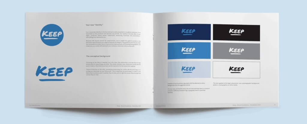
This section defines the exact, non-negotiable colours that are your brand.
Primary Colours
List your main 1-3 brand colours. These are the dominant colours people associate with you.
Secondary Colours
These are your accent, neutral, and functional colours. Accent colours are for call-to-action buttons. Neutral colours (like greys, off-whites) are for backgrounds and body text. Functional colours are for things like ‘success’ (green) or ‘error’ (red) messages.
The ‘Colour Codes’ You Must Include
This is the most critical part. You must provide the digital and print values for each colour.
- HEX: For websites and digital (e.g., #FFFFFF).
- RGB: For digital screens (e.g., R:255, G:255, B:255).
- CMYK: For printed materials like brochures and business cards (e.g., C:0, M:0, Y:0, K:0).
A quick note on Pantone (PMS): This is a ‘spot colour’ system for professional printing. Include this code if you have it (your designer should provide it) to ensure your ‘Coke Red‘ is the exact Coke Red every single time it’s printed on merchandise.
Without these codes, you’re just guessing. ‘Coca-Cola Red’ is not ‘just any red’ (it’s Pantone 484 C). Their brand book guarantees it.
Section 3: Typography (How You Speak Visually)

Typography is your brand’s voice, visualized. This section establishes a clear hierarchy.
The Font Hierarchy
Don’t just list your fonts. Show how to use them. Define a system:
- Headline Font: The big, bold statement (e.g., Poppins Bold, 48px).
- Subheading Font: The section divider (e.g., Poppins Medium, 24px).
- Body Copy Font: The readable paragraphs (e.g., Lato Regular, 16px).
- Captions/Accents: For small print or quotes.
Specify the exact font names, weights (Light, Regular, Bold), and sizing rules (or ratios). This stops your website from looking like a ransom note.
A note on web fonts vs. print fonts: Make sure you have the correct licences for your fonts. Web fonts (like Google Fonts) are for your website. Desktop fonts are for creating print PDFs. They are not always interchangeable.
Section 4: Brand Voice & Tone (How You Sound)

This is the most skipped section, and it’s a massive mistake. Your brand is what you say as much as what you look like.
This is not the 20-page ‘Our Guiding Spirit’ or ‘Our Brand Aura’ section. That is self-indulgent fluff that no copywriter can use.
This section should be a simple, practical guide for anyone writing for your brand, from a social media post to a sales email.
Use the ‘We Are This, Not That’ Framework.
This is the fastest way to define your voice. Create a simple table:
| We Are… | We Are Not… |
| Confident | Arrogant |
| Helpful | Patronising |
| Witty | Goofy |
| Clear | Academic |
Think about Mailchimp. Their voice is famously quirky, human, and encouraging. It’s a core part of their brand. Now think of your bank. Their voice is probably formal, secure, and risk-averse. Both are intentional. Both are defined in a brand book.
Section 5: Imagery & Photography (The Vibe)

This section sets the rules for all visual assets that aren’t your logo.
What’s the style? Don’t just say ‘authentic.’ That means nothing. Get specific.
Are your photos warm and human, showing real customers? Or are they clean and corporate, with bright lighting and staged models? Are they gritty and real, with high contrast and urban settings?
Provide 3-5 ‘Do This, Not That’ Examples.
Show an example of a perfect ‘on-brand’ photo. Next to it, show an ‘off-brand’ photo (e.g., a cheesy, generic stock photo).
This visual guide is faster than writing 1,000 words. Think of Apple. You know an Apple photo: minimalist, product-as-hero, clean light, soft shadows. That is rigidly enforced by their brand guidelines.
The “Level 2” Elements (Add These Later)
Once you have the core 5 sections, then you can expand. Don’t let these stop you from starting.
- Iconography: The style of icons used on your website.
- Patterns & Textures: Any background elements or brand patterns.
- Social Media Layouts: Templates for Instagram posts or banners.
- Stationery & Templates: Business cards, letterheads, and presentation slides (e.g., PowerPoint/Google Slides).
How to Create a Brand Book: The Practical Steps
You have two paths. The bootstrapper’s path and the professional path.
Path 1: The DIY Approach (For Bootstrappers)
To create a DIY brand book, your first step is to audit and gather your existing assets.
- Step 1: Find all your final logo files (AI, EPS, PNG, SVG). If you don’t have these, stop right now and get them from your designer.
- Step 2: Use a simple tool you already have. A Google Slides or Canva document is perfect. A Notion page works. A simple PDF is fine. Stop overthinking the tool.
- Step 3: Create one page/slide for each of the 5 core sections: Logo, Colours, Typography, Voice, Imagery.
- Step 4: Export as a PDF and share it. Put the link in your team’s central hub.
The pro of this path is that it’s free. The con is that you lack objectivity. You’re too close to your brand, and you probably aren’t a professional designer. It’s a great start, but it’s not a final solution.
Path 2: The Professional Approach (The “Done for You”)
The professional approach involves hiring an agency to create your entire brand identity, with the brand book as a key deliverable.
This is what we do at Inkbot Design. The process isn’t just ‘making a logo’.
The agency process looks like this:
- Discovery & Strategy: We figure out who you are, who you serve, and why you’re different.
- Identity Design: We develop the logo, colours, and typography based on that strategy.
- Guideline Creation: We build the brand book to codify all those new rules and assets.
This isn’t just a service; it’s a foundational business asset. A proper Brand Identity service is what sets a serious business apart from a hobby.
The cost can vary wildly. A simple guide from a freelancer might be $1,000. A comprehensive identity system from an agency can be $10,000 to $50,000+. You get what you pay for.
The Single Biggest Mistake: Making Your Brand Book Unusable

The biggest mistake is creating a 100-page, over-designed PDF that no one ever reads.
I see it all the time. It’s a beautiful PDF. It cost a fortune. And it’s saved in a forgotten Dropbox folder.
Your brand book is useless if it’s not accessible.
Your Brand Book Should Be a Living Document, Not a Stone Tablet. You’ll add new logos, update your voice, or add a secondary colour palette. It needs to be easy to update.
The best format is digital and cloud-based. A Google Slide deck, a Notion page, or a dedicated service like Frontify is far more useful than a 200 MB PDF that crashes Outlook.
Who needs it? Everyone. Your internal team, your new hires, your marketing freelancers, your web developer, your printer, and your partners. If they have to ask you for the logo, your brand book has failed. Give them the link.
Stop Guessing. Build Your “Single Source of Truth.”
A brand book is not a ‘nice-to-have’ for when you’re ‘big enough’. It’s a ‘must-have’ if you ever want to get big.
It’s a tool, not a trophy.
It builds consistency. Consistency builds trust. And trust is what builds a real, lasting business.
Frequently Asked Questions (FAQs) About Brand Books
What is a brand book?
A brand book (or brand guidelines) is a document that provides a set of rules for how your brand should be presented. It’s a “user manual” for your logo, colours, fonts, and voice to ensure 100% consistency.
What is the difference between a brand book and a style guide?
Honestly, nothing. The terms are used interchangeably. “Style guide” is common in publishing and web design, while “brand book” is common in branding. Both aim to create consistency.
Why does my small business need a brand book?
You need one to stop wasting time and money on “Brand Chaos.” It ensures you look professional, makes onboarding new hires or freelancers 10x faster, and protects the investment you made in your logo.
What are the 5 most essential things in a brand book?
Logo Suite & Rules (clearspace, minimum size, misuse)
Colour Palette (with HEX, RGB, and CMYK codes)
Typography (font hierarchy, names, weights, and sizes)
Brand Voice & Tone (the “We Are This, Not That” framework)
Imagery Style (examples of ‘on-brand’ photography or illustration)
What is brand voice?
Brand voice is the distinct personality your brand uses in its communication. It’s not what you say, but how you say it. For example, your voice could be helpful, witty, and confident.
What is the difference between brand voice and tone?
Your voice is your permanent personality (e.g., helpful). Your tone is the emotional inflection that changes with the situation (e.g., your helpful voice becomes more comforting when replying to a customer complaint).
How long should a brand book be?
As short as possible, but as long as necessary. A small business can start with a 5-10 page “One-Page Wonder.” A global corporation like Uber might have a 100+ page interactive website. Focus on utility, not page count.
What format is best for a brand book?
An accessible, digital format is best. A cloud-based document (like Google Slides or Notion) or a simple, shareable PDF is far more useful than a giant, high-resolution PDF file that’s hard to email and never gets opened.
How much does a professional brand book cost?
The brand book is usually the final deliverable of a full brand identity project. This entire process can cost anywhere from $1,000 for a basic freelancer package to over $50,000 for a comprehensive strategy and system from a top agency.
Can I make a brand book myself?
Yes. You can use a tool like Canva or Google Slides to gather your logo, list your HEX codes, and define your fonts. A basic, self-made guide is 100x better than no guide at all.
Build Your Brand’s Foundation
If you’re still running on ‘Brand Chaos,’ it’s time to get serious. Building a proper brand identity is the foundation. If you’re ready to build that ‘single source of truth’ and stop guessing, let’s talk.
Check out our Brand Identity services or request a quote to see how we can build your manual.

