
Law Firm Website Design: How to Turn a Strong Firm Into an Obvious Choice
A prospect comparing your firm to four others has already decided something about you before a single word is read — and the deciding factor is rarely the quality of your law.
It’s about whether the site makes it feel safe to trust you with something expensive and irreversible. Get that wrong, and you lose the instruction to a firm with worse lawyers and a clearer website.
That is the outcome good law firm website design produces: it lowers the perceived risk of choosing you until you become the obvious choice.
The most common reason DIY and template rebuilds fail is that they start with the interface — colours, hero image, menu — and only bolt proof and intake on at the end.
Those last two are the parts that actually convert. Built in the wrong order, the site looks tidy and persuades no one.
The stakes are measurable. MyCase reports that 75% of clients visit two to five law firm websites before contacting a firm. You are never being judged in isolation. You are being compared, in a tab, against direct competitors — and the firm that reduces risk fastest wins the call.
If your brand undersells your capability, that comparison is exactly where the loss happens. Fixing it is the core work of a specialist law firm branding agency, and it starts long before the visual design.
- Position: agree one clear one‑sentence claim the partnership shares before design so the site argues, not merely looks tidy.
- Proof: use named matters and outcomes; generic testimonials fail. MyCase shows 75% of clients compare two to five firms before contacting.
- Journey and intake: design for an anxious, comparing prospect; treat intake as brand and respond fast; CallRail found 81% lost business to slow responses.
How Law Firm Website Design Wins Clients
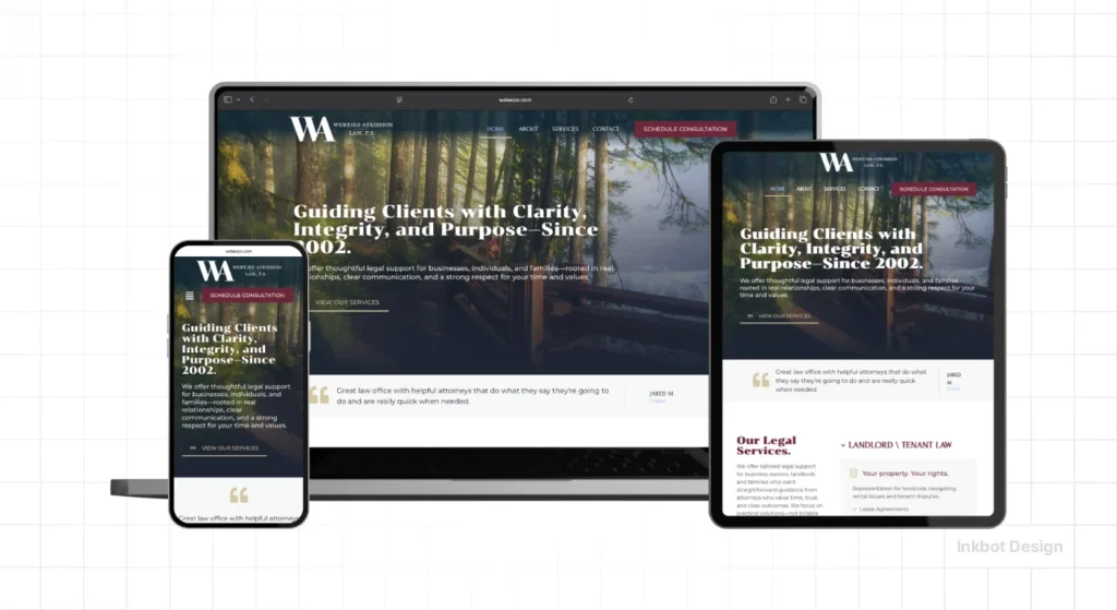
Law firm website design wins clients by reducing perceived risk across four connected stages — position, proof, journey, and intake — so a comparing prospect chooses your firm over the others in their open tabs. Visibility gets you into the comparison; risk-reduction wins it. The four stages must be built in that order.
- Position decides what the site is arguing before any element is designed.
- Proof makes the position believable with specific, named evidence rather than generic reassurance.
- Intake converts interest into contact across the channels clients actually use.
Law firm website design succeeds by reducing a prospect’s perceived risk through clear positioning, specific proof, and fast intake — not by increasing visibility alone.
What You Need in Place Before You Touch the Design
You need an agreed answer to one question before design begins: what does this firm do better than the firms it loses to, and for whom?
Most 10–50 partner firms cannot answer this consistently. In 17 years of brand work, the pattern I see most often is three partners describing the same firm three different ways in the same pitch.
If the partnership has not agreed on its position, a redesign will faithfully render the confusion in a nicer typeface. Fix the argument first. The design is downstream.
Stage One: Define the Position the Site Will Argue
The position is the single claim the whole site exists to prove. It is not a tagline; it is the answer to “why this firm, for this kind of matter?”
When done right, every subsequent page becomes easy to write because each one provides evidence for the same claim. Done wrong, the site lists services and hopes the prospect assembles a reason to choose you.
You know the position is set when a partner can state it in one sentence, and the other partners agree without editing.
The failure mode here is settling for a position so broad it fits every competitor — “trusted, experienced, client-focused” describes nobody. A defined position is the input; clear positioning that builds client trust is the output that the rest of the site delivers.
“A law firm’s position is not what it says about itself. It is the specific reason a prospect can give a colleague for choosing it. If that reason is interchangeable with any competitor, the firm has no position — it has a description.”
Stage Two: Make the Proof Specific Enough to Believe

Proof converts a claim into a credible one, and specificity is the entire mechanism. “We have extensive experience in commercial litigation” is a claim.
“We recovered £2.3m for a manufacturing client after an 18-month dispute” is proof — it is checkable, particular, and hard to fake. The prospect’s brain treats the specific as true and the generic as marketing.
Reputation lives across more than your own pages. Research on local business reviews finds that 97% of consumers read reviews and 75% of clients check two to five firm sites before contacting one, per MyCase — meaning your proof must survive cross-referencing.
The failure mode is stacking generic testimonials (“great service, highly recommend”) that read identically to every rival’s. Named matters, named outcomes, named sectors: that is proof a comparing prospect cannot dismiss.
Stage Three: Design the Journey Around the Comparing Prospect
The journey is the path from landing to contact, designed for a prospect who is anxious and comparing, not browsing. Every page should reduce one specific doubt: is this firm right for my kind of matter, have they done this before, and what happens if I get in touch?
Structure follows the client’s questions, not the firm’s org chart.
This is where UK firms with 10–50 partners routinely over-build. LexisNexis, citing Hinge research, notes high-growth firms spend 16.5% of revenue on marketing versus 5% for no-growth firms — but the spend that pays is on clarity, not features.
The failure mode is a site architected around practice groups when the client thinks of problems. A litigation prospect does not want your “Dispute Resolution Department”; they want the page that says “we handle exactly your situation.”
Stage Four: Treat Intake as Part of the Brand, Not the Afterthought
Intake is where most firms quietly lose the clients the site worked to win. The website’s job ends at “get in touch”; the brand’s job continues into how fast and how well that contact is handled.
A prospect who has just overcome their doubt is at peak willingness — and a slow or missed response resets them straight back to the comparison tab.
The evidence is stark. CallRail’s 2026 legal marketing research found that 81% of firms lost business due to slow responses, and 52% specifically cited missed calls.
MyCase reports 46% of clients first make contact by phone and 27% by email — so a form-only site fails nearly half of them at the final step. Intake is not operations. It is the brand’s last, most expensive surface.
Where the Judgement Actually Sits
The stages are a sequence, but two points within them require expert judgement rather than a checklist, and this is where an experienced hand distinguishes a working site from a cosmetic one.
The first is deciding what to leave out — a 10–50 partner firm’s instinct is to show everything, which dilutes the position until nothing lands. Restraint is a skill.
The second is calibrating proof to the stakes of the matter. A conveyancing prospect and a £5m commercial dispute prospect need different reassurance, and the same homepage rarely serves both.
Judging which client the firm is actually built to win — and designing for that one — is the decision AI-generated competitor content cannot make, because it requires knowing the firm.
The Trust System: Why Sequence Beats Visibility
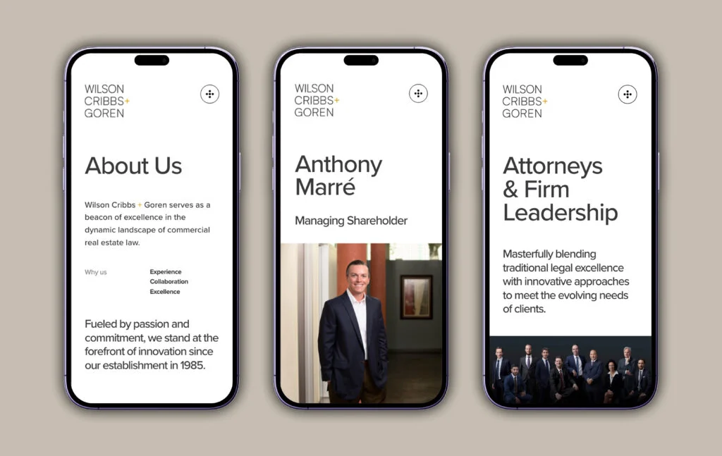
Here is the position this whole piece has been building toward. Most UK firms in the 10–50 partner range do not have a marketing problem.
They have a trust-conversion problem: vague positioning, generic proof, and a fragmented path from click to contact. Adding traffic to that pours more prospects into a system that loses them.
The prevailing advice — do SEO, run paid search, post on LinkedIn — is held by intelligent people for a good reason: visibility is measurable and feels like progress.
CallRail confirms more prospects now begin with AI assistants, and Clio’s Legal Trends research notes growing firms are meeting the 50%+ of clients who now turn to AI first. Being found genuinely matters more each year.
But visibility only sets the comparison in motion; it never wins it. When MyCase’s 75% of prospects open five tabs, the firm that converts is the one that reduces risk fastest — clearest position, most specific proof, fastest intake.
Build those in order and traffic converts. Build traffic first, and it evaporates at the point of contact.
“Visibility gets a law firm into the comparison. It never wins. The firm that converts is the one whose website, reviews, and intake answer the client’s real question — “why should I trust you with this?” — faster than anyone else in the open tabs.”
The replacement directive is simple: before spending another pound on being found, fix the order. Position, proof, journey, intake — in that sequence. A firm that does this outperforms a more visible competitor with a vaguer site, every time.
“We already rank well — isn’t traffic the point?”
Ranking is necessary and insufficient. Traffic that lands on a site with an interchangeable position converts at the rate of the weakest tab in the comparison.
MyCase’s 75% comparison behaviour means your conversion is decided relative to competitors, not by your traffic volume. More visitors to an unpersuasive site produce more people choosing someone else.
“Isn’t this just branding jargon for a redesign?”
No. A redesign changes how the site looks; this changes what it argues and how it converts.
The order is the whole point — a firm can spend £40k on a beautiful rebuild that still opens with a generic position and a form-only contact page, and lose the same clients it always did. The judgment sits in sequence and specificity, not visuals.
Where This Stands in 2026
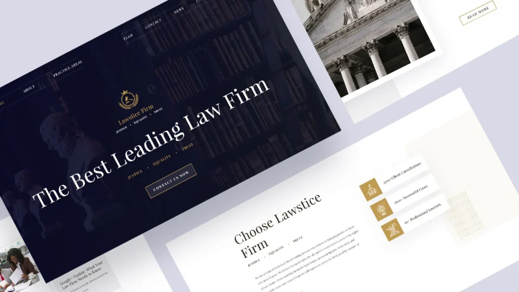
Law firm marketing is shifting under firms’ feet, and the direction reinforces the trust-first case rather than undercutting it.
CallRail reports AI assistants are changing both how clients discover firms and what they expect from conversion — prospects arrive further along, with sharper questions, and less patience for vagueness.
Attorney at Work’s 2026 trends piece points to voice search, AI-driven SEO and GEO, video, chatbots, and personalisation as the major movements.
Two data points matter most to a 10–50-partner firm deciding where to spend.
First, LexisNexis’s Hinge finding — high-growth firms invest 16.5% of revenue in marketing, compared with 5% for stagnant ones — confirms that marketing spend correlates with growth but says nothing about what the spend buys.
Second, CallRail’s intake findings show the leak is at conversion, not acquisition.
Over three-quarters of consumers now watch video when researching local businesses, which is why attorney explainers and short credibility content earn their place — not as decoration, but as proof that reduces risk before contact.
The 2026 reading is consistent: discovery is fragmenting across Google, AI assistants, and video, while the deciding moment stays the same.
The firm that reduces perceived risk fastest wins. Everything new in the market is another channel into the same trust system — and a system with a weak position or slow intake wastes every one of them.
The Verdict
A strong firm loses to a weaker one when the weaker firm’s website makes it feel safer to trust. That is the whole argument, and every stage in this guide serves it: position tells the prospect who you are for; proof makes it believable; the journey removes doubt page by page; and intake converts the moment of willingness before it cools.
MyCase’s finding that 75% of clients compare five firms before calling, and CallRail’s that 81% lose business to slow responses, are the same story told twice — the client’s decision is made on perceived risk, and it is made against competitors, not in your favour by default.
The reframe worth keeping: your firm almost certainly does not have a marketing problem. It has a trust-conversion problem wearing a marketing costume.
More visibility poured into vague positioning, generic proof, and fragmented intake produces more prospects who choose someone clearer. Fix the order, and the same traffic starts converting.
The single action to take today: write your firm’s position in one sentence, then ask three partners to state it independently.
If the three answers differ, you have found the real problem — and no amount of website design will fix it until that sentence is agreed upon. Once it is, everything downstream gets easier.
If you want that diagnosis done properly, request a free Brand Equity Audit™ — a structured, written assessment of exactly where your brand is losing commercial ground and what to do about it, delivered without a sales call.
FAQs
Why do clients visit several law firm websites before contacting one?
Clients compare firms to reduce the risk of choosing wrongly on a matter that is often expensive and irreversible. MyCase reports that 75% of clients visit two to five firm websites before making contact, which means each firm is judged relative to competitors rather than on its own merits.
How fast should a law firm respond to a website enquiry?
As close to immediately as the firm can manage, CallRail’s 2026 legal marketing research found 81% of firms lost business to slow responses and 52% to missed calls specifically. A prospect who has just decided to make contact is at peak willingness, and delay sends them back to comparing competitors.
What’s the difference between a law firm website redesign and a rebrand?
A redesign changes how the site looks; a rebrand changes what it argues and who it is for. A firm can spend heavily on a beautiful redesign that still opens with a generic position and converts no better. The strategic input — the position — is what a rebrand fixes.
Is it true that law firms mostly have a visibility problem?
No — firms with 10–50 partners more often have a trust-conversion problem. Visibility sets a comparison in motion; it never wins it. The firm that converts is the one whose position, proof, and intake reduce a prospect’s perceived risk fastest against the other firms being compared.
What should a UK law firm website include to look premium?
A clear position, specific and named proof, a journey structured around the client’s questions, and intake across phone, email, and form. MyCase found 46% of clients were first contacted by phone and 27% by email, so a form-only site fails nearly half of prospects at the final step.
When should a firm fix the positioning rather than redesign the site?
Positioning first, always. A redesign built on an unagreed position renders the firm’s confusion in a nicer typeface. Once partners agree, in one sentence, on what the firm does better and for whom, every downstream page becomes easy to design and argue.
How does AI search change law firm website design?
AI assistants change discovery and raise conversion expectations. CallRail reports that more prospects now start with AI assistants, and Clio notes that growing firms are meeting the needs of the 50%+ of clients who turn to AI first. Prospects arrive further along and are less tolerant of vague positioning, making clarity more valuable than ever.
Why isn’t a good website generating more enquiries?
Traffic converts at the rate of the weakest element in a prospect’s comparison. If the position is interchangeable and the proof is generic, more visitors simply means more people choosing a clearer competitor. Conversion is decided relative to rival firms, not by traffic volume alone.
How much should a law firm spend on marketing?
LexisNexis, citing Hinge research, found high-growth firms spend 16.5% of revenue on marketing versus 5% for no-growth firms. The correlation is real, but the figure says nothing about what they spend. Spend directed at clarity and intake converts; spend directed at visibility alone often leaks.
What role do reviews play in law firm website design?
Reviews are external proof that must survive a prospect’s cross-referencing. Research on local businesses finds 97% of consumers read reviews. Because clients check multiple firm sites, your reviews are read alongside competitors’, so specific, named feedback outperforms generic praise that reads identically everywhere.
Should a law firm website prioritise phone or online contact?
Both, because client preference splits. MyCase reports 46% of first contacts are by phone and 27% by email. A site that offers only a contact form fails the phone-first majority, so visible phone numbers, forms, and email should all be present and monitored for a fast response.
Does video content matter for law firm websites?
Yes — over three-quarters of consumers now watch video when researching local businesses. Attorney explainers and short credibility content reduce a prospect’s perceived risk before contact by making the firm feel known and specific, which is why video functions as proof rather than decoration.
