
Law Firm Website Conversion Is a Risk Test, Not a Sales Pitch
A prospective client lands on your homepage carrying a problem they would rather not have—a contract dispute. A shareholder falling out. A regulatory letter that arrived on a Friday afternoon.
In the first 12 seconds, they are not deciding whether your firm is impressive. They are deciding whether contacting you feels safe enough to say any of that out loud.
That is the reframe most conversion advice misses. Treat the opening screen as a pitch, and you optimise the wrong thing—bigger claims, more awards, a punchier strapline.
What is law firm website conversion?
Law firm website conversion is the process of turning a website visitor into an instructed client. In the legal sector, conversion relies on reducing perceived risk: a prospect must decide whether contacting the firm feels safe, highly relevant to their specific problem, and professionally predictable before they will complete an enquiry form.
Treat it as a risk-reduction test, and you optimise the thing that actually loses the enquiry: the visitor’s fear of choosing the wrong adviser, wasting time, or exposing something sensitive to a firm that turns out not to handle their kind of matter.
Good law firm website design is built around that fear, not around the firm’s ego.
- Treat the homepage as a risk-reduction test; visitors decide in 12 seconds whether contacting you feels safe, not if you look impressive.
- State whom you help in non-lawyer language so visitors instantly recognise their problem and feel the firm is relevant.
- Show issue-specific proof and offer a proportionate, predictable first step so making contact feels low risk and clear.
- Win confidence before convenience: online intake tools convert more once the homepage has already reduced perceived risk.
What a Law Firm Website Conversion Really Tests in the First 12 Seconds
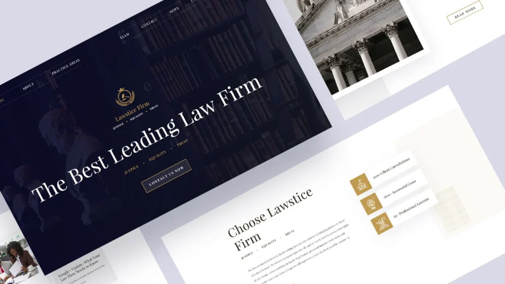
A law firm website conversion is the moment a visitor decides to reveal a legal problem and take the next step—and in the opening seconds, that decision turns almost entirely on perceived risk rather than persuasion.
The prospect is asking three questions: am I in the right place, do these people understand my situation, and do I know what happens if I make contact?
- Immediate practice-area relevance signals “you handle matters like mine” before any sales copy is read.
- Proof tied to the visitor’s specific issue reduces risk more than a wall of generic awards.
- A single, proportionate next action (“we respond within one business day”) makes contact feel predictable.
Law firm website conversion is decided in the first 12 seconds, when a prospect judges whether contacting the firm feels safe and relevant.
The Visitor Is Running a Risk Check, Not Reading Your Awards
Prospects arrive already primed to be cautious.
In Clio’s 2025 survey data, 59% of solo and small law firms said referrals were their primary source of leads, suggesting a role for word of mouth. Still, it is really a point about verification.
A referred prospect almost always validates the firm online before making contact. The referral opens the door. The website decides whether they walk through it.
That changes what the opening screen is for. A referred visitor is not asking, “Is this firm any good?”—someone they trust has already said so.
They are asking a narrower, more anxious question: is this the right firm for my problem, and will contacting them be straightforward or a mistake I regret? Awards do not answer that. Relevance does.
I have watched partners spend a rebrand budget to make the homepage look more prestigious, only to wonder why enquiries did not move. The site got grander. It did not get safer.
“A law firm homepage is not a sales pitch; it is a verification layer. Prospects often arrive via a referral or AI recommendation, and use the website to verify if the firm is relevant to their specific problem before making contact.”
What the Opening Screen Must Actually Do
The opening screen has one job: translate competence into low perceived risk, fast. Not “we are a leading commercial firm”—every firm says that, and to an anxious buyer it reads as noise.
To understand the shift in approach, compare how standard websites operate against those built for risk reduction:
| Website Element | The Traditional “Sales Pitch” | The “Risk-Reduction” Approach |
|---|---|---|
| Primary Headline | “Award-Winning Commercial Lawyers” | “We protect business owners during partner disputes” |
| Trust Signals | Generic 5-star badges and firm history | Issue-specific case studies and sector outcomes |
| Language | Legal jargon and complex service lists | Client-focused problem identification |
| Call to Action (CTA) | “Contact Us Today” (Open-ended) | “Speak to our employment team. Replies in 24h.” |
The screen has to do four concrete things before it earns the right to ask for anything.
State whom you help in non-lawyer terms.
A managing partner reads “commercial litigation and regulatory advisory” and sees precision. A frightened business owner reads it and is not sure it means them.
“We help business owners when a deal, a partner or a regulator becomes a legal problem” carries the same competence and removes the doubt.
The buyer needs to recognise their own situation in your words within seconds, or they leave to find a firm that describes it back to them.
This is the same relevance discipline that governs well-built law firm practice-area pages—the opening screen is just a compressed version.
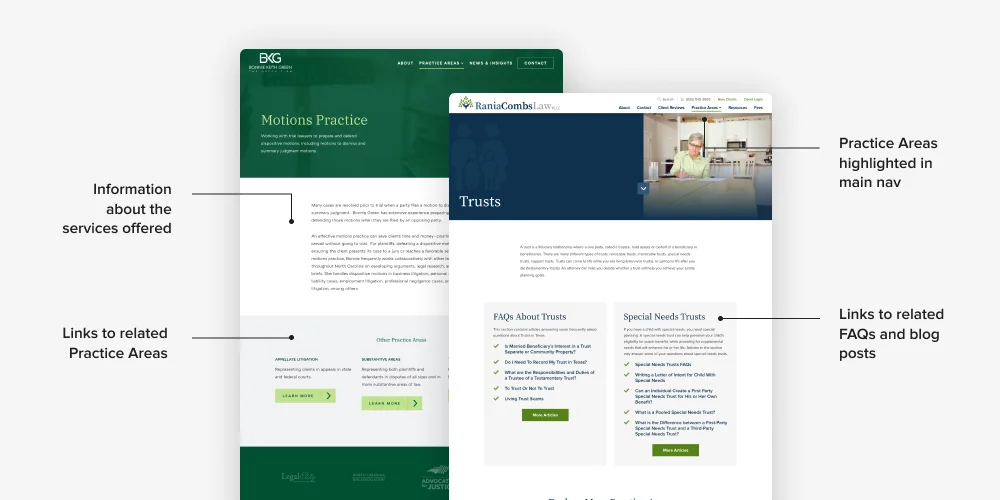
Show proof that matches the visitor’s issue.
A personal-injury testimonial does not reassure a tax investigation prospect. Relevant proof—a matter type, an outcome, a named sector—reduces risk in a way a generic “5-star” badge cannot, because it answers the specific fear that you do not really do this.
Trust in legal is issue-specific, which is why client trust signals for law firms have to be targeted rather than decorative.
Make the next action proportionate.
“Request a consultation” can feel like a commitment to a stranger. “Speak to our employment team; we will respond within one business day”, tells the visitor exactly what happens, how fast, and to whom.
Predictability lowers the perceived cost of the click.
Clio found improved conversion among firms using online intake forms—2% for solo firms and 5% for small firms in its analysis—not because forms are magic, but because a clear, contained first step is easier to take than an open-ended one.
Be honest about how contact works, including any automation.
If an AI assistant or automated intake handles the first response, say so. A prospect revealing a sensitive matter wants to know whether a person or a bot is on the other end. Concealing it adds risk exactly where you are trying to remove it.
“In the first 12 seconds, a law firm website is not selling expertise. It is answering one question the visitor will never ask aloud: if I contact these people about something I find frightening, will that feel safe, or will it feel like a mistake? Reduce that risk, and the enquiry follows. Fail to, and no amount of persuasion copy recovers it.”
In 17 years of brand work, the pattern I see most often is firms optimising for how the site makes them feel, not for how safe it makes the buyer feel.
Does Reducing Perceived Risk Actually Move Revenue?
Reducing friction and perceived risk has a measurable commercial effect—but the sequence matters, and the website’s job is to win confidence first.
“A clear, proportionate call-to-action—such as ‘speak to our employment team; we will respond within one business day’—lowers the perceived cost of reaching out by making the next step entirely predictable for the prospect.”
Among solo firms in Clio’s analysis, those using a set of digital intake tools—e-signatures, online search ads, online scheduling, online intake forms and text messaging—had 53% higher revenue; the equivalent figure for small firms was 28%.
Do not read that as “the website earns you 53% more.” Read it as: once initial confidence is won, an accessible, joined-up next step converts far more of the confidence you have already earned.
The lead numbers point the same way, with the same caveat. Solo firms using that group of tools recorded 48% more client leads; small firms recorded 6%. Clio also reports growing firms were 18% more likely than stagnant or shrinking ones to adopt electronic payments, online scheduling and automated communications.
The tooling compounds confidence the homepage wins—it does not manufacture it.
Here is the mechanism a Managing Partner should care about. A clearer, lower-risk opening screen increases the proportion of qualified visitors who take the first step.
The intake tooling then converts more of those first steps into instructed matters. Miss the first stage, and you are pouring better plumbing into a house nobody feels safe entering. The two work in sequence, and the sequence is not negotiable: confidence, then convenience.
The cost of getting this backwards is invisible and continuous. You never see the litigation prospect who read your homepage, felt unsure you handled their matter, and clicked back to Google.
There is no bounce-report line labelled “felt unsafe.” The enquiry just never arrives. It instead arrives at the firm whose opening screen answered the risk question first. That is the enquiry you lost without ever knowing it existed.
The Website Is Now the Verification Layer, Not the Discovery Point
The law firm website has become the verification layer between discovery and instruction.
Prospects may arrive through a referral, Google, a review platform, social content, an AI-generated answer or paid search—but wherever they start, they still make one fast personal judgement before they enquire: is this firm relevant to me, can I trust it with a sensitive problem, and what happens if I get in touch.
AI has changed who arrives, not just how many. Clio reports that more than half of consumers have used or would consider using AI to answer a legal question. Among those who have used AI, 28% were directed to contact a lawyer.
A prospect sent to you by ChatGPT has already been told what kind of lawyer they need. They are not browsing. They are checking whether you match the description they were handed—and they spot a vague homepage faster than a cold visitor ever would.
That raises the bar for the opening screen, not lowers it.
A pre-informed visitor spots vagueness faster and abandons a page that does not quickly confirm specialism, relevance and next steps. This is why AI visibility for law firms and on-page clarity are the same project, not two separate ones.
The practical implication is that your homepage no longer makes a first impression. It gets to pass or fail a verification that the visitor is actively running.
State who you help and what matters you handle in language a non-lawyer recognises. Provide proof relevant to their issue. Make contact feel proportionate and predictable.
Do that, and the site confirms what the referral, the review, or the AI answer already suggested.
Fail, and it contradicts them, which is worse than no site at all.
“Isn’t a Fast Site With a Clear Call-to-Action Enough?”

There is a strong version of the opposing view, and intelligent partners hold it. Page speed, mobile responsiveness and a prominent call-to-action are genuinely necessary.
A slow, cluttered site loses prospects before any messaging is read, and both Brave New Agency and SimpleLaw are right that conversion optimisation, dedicated practice-area pages and streamlined contact forms move the numbers. None of that is wrong.
It is just not sufficient—and this is where the checklist view quietly fails.
A site can load in under two seconds, display an unmissable “Book a Consultation” button, and still convert poorly, because speed and prominence answer “Can I use this page?” not “Should I trust these people with this problem?” The fast, clean site that describes the firm rather than the visitor’s situation clears the technical bar and fails the risk test.
“Website speed and a prominent call-to-action are necessary for usability, but they are not sufficient for conversion. They answer whether a page is usable, not whether a firm feels safe to contact about a sensitive legal issue.”
Clio’s own data makes the point: intake tools lifted revenue and leads, but only as the convenience layer on top of confidence already won.
Remove the confidence, and you are optimising the click-through on an enquiry the visitor has already decided not to make.
So the honest answer to “isn’t fast-plus-clear-CTA enough” is: it is the price of entry, not the win. Speed stops you from losing on technicals.
Relevance and proportionate contact are what win the enquiry once you are in the room.
The Verdict — Reduce the Risk Before You Make the Ask
Stop treating your homepage as a pitch and start treating it as the moment when a nervous buyer decides whether to contact you is safe.
The firm that looks most impressive does not win the enquiry. The firm whose opening screen says you are in the right place, we understand this problem, and here is exactly what happens next, does—and Clio’s 2025 data shows that once that confidence exists, better intake converts far more of it into instructed work.
Your practice-area relevance, your issue-specific proof and your proportionate next step are not conversion tactics bolted onto a brand. They are the brand, doing its commercial job in the only 12 seconds that decide anything.
The single action worth taking this week: open your own homepage as a frightened, non-lawyer prospect with a real problem, and ask whether the first screen reduces their risk or flatters your firm.
If you want that judgement made rigorously rather than by instinct, request a free Brand Equity Audit™. This structured diagnostic identifies exactly where your brand is losing commercial ground and what to do about it.
Frequently Asked Questions
What is a law firm website conversion?
Law firm website conversion is the process of turning a website visitor into an enquiry or instructed client. In legal specifically, it turns on perceived risk: a prospect decides whether contacting the firm feels safe, relevant and predictable before completing any form or call.
Why do prospects leave a law firm website without enquiring?
Most leave because the opening screen fails a quick risk check—it does not confirm that the firm handles their specific matter, offers no evidence relevant to their issue, or makes the next step feel like an open-ended commitment. Speed and design rarely fix a relevance or trust gap.
How should a law firm’s homepage open to improve conversion?
Open by stating who the firm helps in non-lawyer terms, showing proof relevant to the visitor’s issue, and offering one proportionate next action, such as “speak to our employment team; we respond within one business day.” Relevance and predictability reduce perceived risk more quickly than awards do.
Does improving a law firm’s website actually affect revenue?
Yes—Clio’s 2025 analysis found that solo firms using a group of digital intake tools had 53% higher revenue and 48% more leads, with small firms at 28% and 6%, respectively. But the tools convert confidence the opening screen has already won; the sequence is confidence first, convenience second.
Do clients still use websites now that AI answers legal questions?
Yes—Clio reports more than half of consumers have used or would consider AI for a legal question, and 28% of AI users were directed to contact a lawyer. Those visitors arrive better informed and verify the firm’s relevance and trustworthiness on-site before enquiring.
Is a fast website with a clear call to action enough for conversion?
No—speed and a prominent call-to-action are necessary but not sufficient. They answer whether the page is usable, not whether the firm feels safe to contact about a sensitive problem. Practice-area relevance and a proportionate next step are what convert the enquiry.
