Your Law Firm Practice Area Pages Are Built in the Wrong Order
A worried client now arrives at your practice area page having already asked AI the legal question. What they need from the page is different: proof of fit, reduced risk, verification of the firm, and a safe next step. Structure the page around those four decisions, in that order.



On this page9 min left
Someone with a possible unfair dismissal claim opens a chat with an AI assistant before they ever type your firm's name into Google.
They get a serviceable explanation of the law in ninety seconds.
By the time they reach your employment practice page, the one thing they do not need is another definition of unfair dismissal.
Yet that is what most practice area pages lead with — a tidy legal explainer, written as if the reader arrived knowing nothing, competing to re-answer a question that has already been answered.
Clio's Legal Trends Report data indicates 57% of consumers say they have used or would use AI to answer legal questions.
The page that greets them has to do a different job now.
Getting that job wrong is a positioning problem before it is an SEO one, which is why it sits squarely in the remit of a law firm branding agency rather than a copywriter working from a template.
What Law Firm Practice Area Pages Are For Now
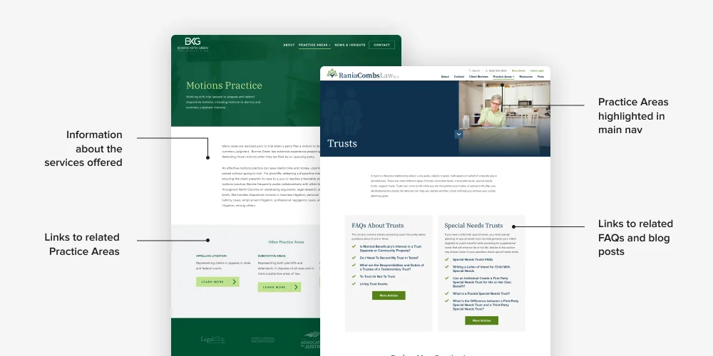
A law firm practice area page is a structured decision page that helps a prospective client determine whether the firm fits their situation, reduce the risk they feel when acting, verify the firm's credibility, and take a safe next step. It is not a legal explainer and not an SEO landing page. Those are components; the decision is the job.
- The reader is rarely asking whether you can define the area of law. They are asking whether their problem is one you handle.
- Clio's Legal Trends Report data indicates 28% of consumers who used AI for a legal question were directed to contact a lawyer — the practice area page is where that instruction either converts or evaporates.
- Every element on the page should move the reader through fit, risk, verification, and action, in that order.
A law firm practice area page should be structured as a decision page that helps a prospective client establish fit, reduce risk, verify the firm, and act.
The 4 Jobs a Practice Area Page Must Do, in Order

The order matters more than the inventory.
Most guidance hands you a checklist — keywords, 1,500 words, FAQs, internal links, schema, a CTA — and leaves you to arrange it however the page builder falls.
A worried buyer does not read into that arrangement. They run four questions in sequence, and a page that answers them out of sequence loses them between questions two and three.
Job one: establish fit.
The reader's first question is “Is this my situation?”
Answer it in the opening screen with the specific scenarios you handle, in the words clients use — “being pushed out after raising a grievance,” not “constructive dismissal claims arising from protected disclosures.”
A worried reader scans the first screen and decides in seconds whether to stay.
If the page opens on a definition rather than a recognisable situation, the reader, who is your client, cannot tell, and leaves before the firm's expertise is ever in play.
Job two: reduce perceived risk.
Once a reader believes the firm can handle their problem, the next question is: “What happens if I act — or wait?”
This is where scope and process transparency do real work.
The Legal Services Board reported in June 2026 that around 32% of adults in England and Wales who experience a legal problem receive no professional support.
A meaningful share of that gap is due to uncertainty, not cost — people do not know what contacting a firm entails.
A page that states plainly what the first conversation involves, what it costs, and what it does not commit the reader to removes the specific friction that keeps people from picking up the phone.
Job three: verify the firm.
Now the reader wants to know, “Can these people credibly help me?” Generic proof fails here.
A “Leading Firm” badge or “decades of combined experience” reassures nobody who is paying attention.
Specific corroboration does: a named ranking, a described (anonymised) outcome, a partner's actual track record in this exact area.
Strong verification connects naturally to how you present law firm case studies without breaching client confidentiality, because the proof a buyer trusts is proof that survives their scepticism.
Job four: enable the next step.
Only now — after fit, risk, and verification — does the call to action earn its place. A worried professional will not commit to a form field until the first three jobs are done.
When they are, the next step should be low-friction and specific: not “contact us,” but “book a fifteen-minute call to see whether we're the right firm for this.” The reduced-commitment framing pays off the risk-reduction work you did in job two.
Decision job | The reader's question | What the page must supply |
|---|---|---|
Fit | Is this my situation? | Recognisable scenarios in client language |
Risk | What happens if I act or wait? | Scope, process, and cost transparency |
Verify | Can these people credibly help me? | Specific, corroborated proof — not badges |
Act | Can I safely contact them? | Low-commitment, specific next step |
AI Search and the 2026 Legal Buyer
The decision-page model is not a reaction to a passing trend. It follows the direction the search itself has moved.
Google published dedicated guidance on optimising for generative AI in Search in May 2026, reinforcing that visibility in AI-powered search still depends on useful, distinctive content and sound SEO fundamentals rather than a separate set of gimmicks.
A commodity page that restates the head term “employment lawyer” fifteen times has nothing distinctive for an AI system to surface.
Google made Gemini 3.5 Flash the default model in AI Mode globally in May 2026, and search journeys have become more conversational as a result.
A practice area page should answer the sequence of questions a prospective client will ask, not merely repeat a head term — which is precisely what the four-job structure does.
The market rewards it commercially, too. The 2026 State of the US Legal Market reported one of the strongest periods of demand growth in more than a decade, while smaller firms captured a disproportionate share as buyers moved work from higher-cost providers.
When buyers compare firms on value and fit, a generic claim of expertise persuades less than a clear demonstration of specific relevance.
Clio reported in March 2026 that 86% of mid-sized firms use AI and 65% say it enables higher work volumes — faster handling alone is not a positioning strategy, which raises rather than lowers the premium on visibly articulated specialist capability.
There is a governance point buyers care about, and it connects to AI visibility for law firms.
The Legal Services Board published research in June 2026, finding both enthusiasm for AI-driven improvements in access and demand for protections and accountability.
Readers want ease, but not a frictionless experience that hides who is responsible. The page that shows who delivers the advice and how wins the buyer who has been burned by faceless service.
Where Judgement Beats the Checklist
The checklist cannot tell you which two of your fifteen practice areas deserve a fully built decision page and which should be a paragraph.
It cannot tell you how much process transparency reassures versus how much it reads as defensive over-explaining. It cannot judge whether a specific anonymised outcome will land as proof or as vagueness.
Those are positioning calls, and they are where a firm's brand either does or does not command a premium — the same judgement that governs how you handle client trust across the whole firm, not just one page.
“A practice area page does not fail because it is missing a component. It fails because a worried person could not find their own situation, could not tell what contacting the firm would commit them to, and could not verify that these particular people had handled a problem like theirs before.”
The Step Everyone Does in the Wrong Order
Intelligent practitioners lead with the legal explanation for a defensible reason: for years, content has been ranked, and it demonstrates expertise.
The Michbar and legal-marketing consensus both start there. That reasoning held when the practice area page was the reader's first encounter with the subject.
It no longer is. Clio's Legal Trends Report data indicates 53% of consumers who used AI for a legal question felt it answered their question sufficiently. The reader arriving at your page has, more often than not, already had the explainer.
Leading with a second one wastes your most valuable screen space by re-answering a settled question, while the reader's actual questions — fit, risk, verification — go unanswered above the fold.
The correction is a reordering, not an addition. Move fit to the top.
Push the legal explanation down to where it belongs: supporting material for the reader who wants depth, not the opening argument.
The firms losing instructions to smaller competitors are frequently not the weaker firms — they are the firms whose pages made a strong buyer work to find out whether they were in the right place.
A sceptical partner will object that this reads as dumbing down the firm's expertise. It is the opposite: expertise the buyer never reaches does not convert, and leading with recognisable fit is what lets a genuinely capable firm prove it.
This connects to how the page fits within the law firm website design as a whole — the practice area page is one facet of a site built to convert, not to catalogue.
The Verdict
The practice area page that wins the instruction is not the most thorough explainer or the most keyword-dense landing page.
It is the one that reads a worried person's four questions in order — is this my situation, what happens if I act, can these people help me, can I safely reach them — and answers them in that order before asking for anything.
Most firms have the components. Almost none have the sequence.
Do one thing today: open your most commercially important practice area page and read only the first screen. If it opens with a definition rather than a recognisable client situation, you have found the reason it underperforms.
If you want a structured diagnosis of where your brand is losing commercial ground across the site, request a free Brand Equity Audit™.
Frequently asked questions
How should a law firm structure a practice area page?
Structure it around four decisions in order: establish fit (is this my situation), reduce risk (what happens if I act), enable verification (can these people help me), then present a low-commitment next step. Lead with recognisable client scenarios, not a legal definition, and place the explainer as supporting depth.
Do practice area pages still matter now that clients use AI for legal questions?
Yes — they matter more. Clio's Legal Trends Report data indicates 28% of consumers who used AI for a legal question were directed to contact a lawyer, and the practice area page is where that referred, informed researcher decides whether to contact your firm specifically. The page converts the AI-informed reader.
How long should a law firm's practice area page be?
Long enough to do four jobs well and no longer. Length is not the target; sequence and specificity are. A focused page answering fit, risk, verification, and next step convincingly outperforms a longer page padded with definitions the reader already obtained elsewhere before arriving.
What's the difference between a practice area page and a blog post?
A blog post educates and can rank for informational queries. A practice area page has one job — helping a prospective client decide whether to contact the firm. Treating the practice area page like a blog post, leading with an explanation, is the most common structural error.
Is it true that more content always ranks better for practice area pages?
No — distinctiveness beats volume. Google's May 2026 guidance on generative AI in Search reinforces that visibility depends on useful, distinctive content rather than gimmicks. A page bloated with generic legal explanation gives AI systems nothing to distinguish it from a thousand identical pages.
When should a firm rebuild its practice area pages?
When enquiries from a page are low despite traffic, when the page opens with a definition rather than a client scenario, or when partners feel the firm's capability is undersold. Rebuild the two or three most commercially important pages first, applying the four-job order, before touching the rest.