Nestlé Logo Design: A 150-Year Branding Evolution
As the founder of a boutique branding agency, Inkbot Design, I’m often asked about the secret to creating iconic logos that stand the test of time.
And let’s be honest, there’s no better example to study than the Nestlé logo – a design that has become synonymous with the global food and beverage giant.
So, pull up a chair, grab a (responsibly sourced) KitKat, and let me share my insights on how Nestlé’s logo designers achieved logo perfection.
Whether rebranding your business or tackling a high-stakes client project, you will pick up some valuable tips.
🔰 TL;DR: The Nestlé logo is a testament to the power of simplicity, symbolism, and emotional resonance in branding. By incorporating a clean wordmark and the iconic nest and bird emblem, the design has stood the test of time and become one of the most recognisable brand identities worldwide.
| Attribute | Details |
|---|---|
| Name | Nestlé S.A. |
| Founded | 1866 (as Anglo-Swiss Condensed Milk Company) |
| Founder | Henri Nestlé |
| Headquarters | Vevey, Switzerland |
| Industry | Food and Beverage |
| Market Capitalisation | Approximately $252.12 billion (as of October 2024) |
| Annual Revenue | $92.11 billion |
| Number of Employees | Approximately 339,000 |
| Key Products | Baby food, bottled water, cereals, chocolates, coffee, dairy products, pet care products |
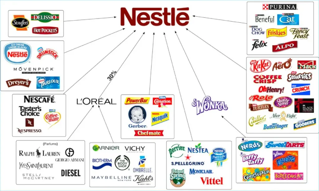
| Major Brands | Nescafé, Kit Kat, Maggi, Gerber, Purina |
| Stock Ticker Symbols | NESN (Switzerland), NSRGY (ADR in the United States) |
| CEO | Laurent Freixe |
- Timeless Design: The Nestlé logo showcases the power of simplicity and symbolism in effective branding.
- Emotional Resonance: The logo evokes feelings of nourishment and family, fostering a deep connection with consumers.
- Adaptability: It maintains a consistent visual identity while evolving for digital landscapes and modern recognisability.
- Brand Heritage: The logo reflects Henri Nestlé's family values, integrating a strong sense of heritage into its design.
A Quick History of the Nestlé Logo

The Nestlé logo has remained unchanged since 1868, when Henri Nestlé founded the company. The original design featured a simple wordmark in an elegant script font, conveying a sense of premium quality and craftsmanship.
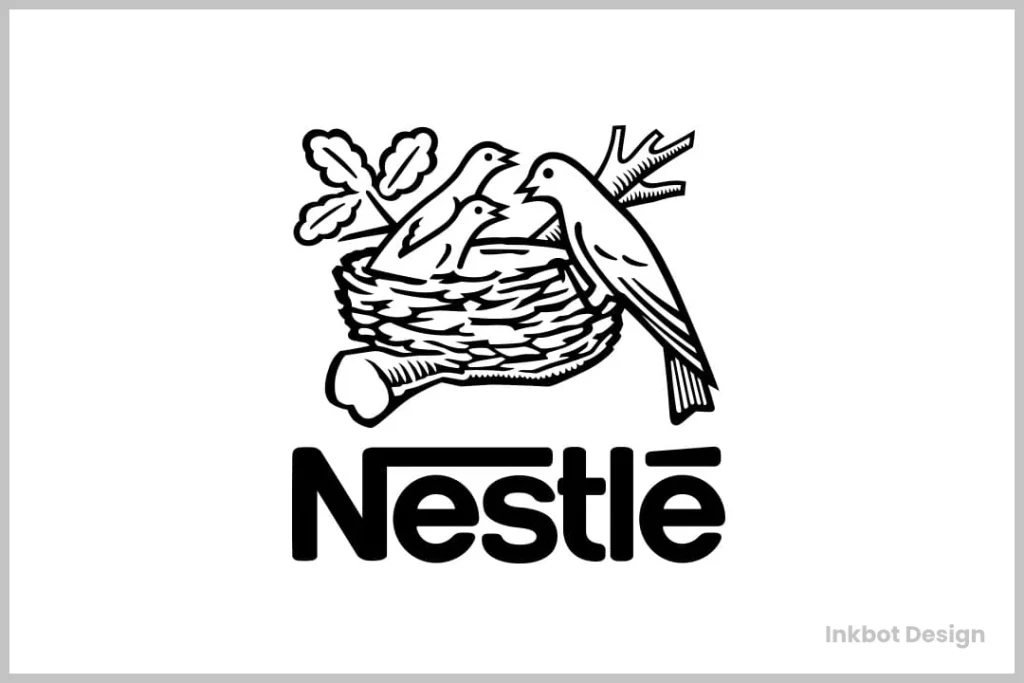
In 1938, the iconic Nestlé nest and bird emblem was added to the logo, cementing its status as one of the most recognisable brand marks in the world.
This clever symbol not only references the company’s name (derived from the German word “Nestlé”, meaning “little nest”) but also represents nourishment, family, and the brand’s Swiss heritage.
Intriguingly, the number of chicks in the nest has varied over the years – from as few as two to as many as five. The current version, featuring three birds, represents the three core aspects of the Nestlé business: quality, innovation, and social responsibility.
Despite these minor tweaks, the Nestlé logo has maintained a cohesive and consistent visual identity that has stood the test of time. And let me tell you, that’s no easy feat in an age of short attention spans and fickle consumer loyalties.
The Original Meaning: A Family Crest Reimagined
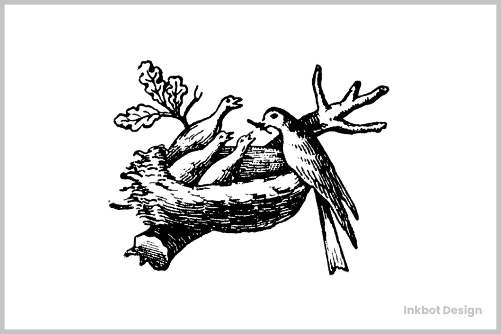
Henri Nestlé’s original logo drew inspiration from his family name, which means “nest” in German. He transformed his family crest into a bird’s nest with three young birds being fed by their mother – a brilliant piece of visual storytelling that:
- Represented family values
- Highlighted nurturing and care
- Created an instant emotional connection
- Established brand heritage
The Evolution of an Icon: Strategic Design Changes
1868-1938: The Foundation Years
- The initial design featured detailed illustration
- Black and white rendering
- The complex nested bird motif
- Hand-drawn aesthetic

1938-1988: Modernisation Phase
- Simplified line work
- Removal of intricate details
- Enhanced scalability
- Introduction of consistent proportions
In 1966, the company’s trademark underwent a significant revamp to mark its 100th anniversary. The updated design presented a more contemporary look, reflecting the evolving brand identity and aligning with the modern aesthetic trends of the time.
The new trademark symbolised progress and tradition by infusing elements that resonated with the 1960s stylistic preferences, embodying a balance between honouring the past and looking toward the future.

1988-Present: Digital Optimisation and Strategic Branding
In 1988, Nestlé embarked on a significant transformation of its branding and logo, setting the stage for a cohesive global identity that continues to evolve today.
- Standardized Naming: Subsidiaries adopted standardised names integrating ‘Nestlé,’ creating a unified and recognisable brand presence across all markets.
- Logo Simplification: The logo was refined to feature two young birds, symbolising simplicity and clarity. This became the strategic umbrella trademark, aligning the company’s diverse operations under one cohesive visual identity.
- Further Streamlining of Design Elements: Building on the 1988 changes, Nestlé continued to refine its design elements for perfect geometric balance, enhancing visual appeal and consistency.
- Improved Digital Reproduction: With the digital era’s onset, the logo was optimised for digital reproduction, ensuring clarity and impact across various digital platforms.
- Adoption of the Nestlé Corporate Type Font: To further unify its brand identity, Nestlé adopted a corporate type font, enhancing readability and brand recognition in print and digital media.
This evolution reflects a strategic blend of traditional branding principles with modern digital optimisation, positioning Nestlé as a forward-thinking leader in global markets.
The Psychology Behind the Nestlé Logo Design
So, what about the Nestlé logo? Does it make it so darn compelling? Let’s dive into the psychology and design principles at play:
1 – Simplicity and Memorability
The Nestlé logo is a masterclass in simplicity. Its bold wordmark, distinctive nest icon, and limited navy blue and white colour palette make it easy to recognise and remember. This is critical in a crowded marketplace where consumers are bombarded with countless brand messages daily.
The great designer Paul Rand once said, “Simple is good.” And Nestlé’s designers have certainly taken that advice to heart. By stripping away unnecessary flourishes and focusing on the essentials, they’ve created a logo that is clean, timeless, and instantly recognisable.
2 – Symbolism and Storytelling
But the Nestlé logo isn’t just a pretty face – it’s also bursting with meaningful symbolism. As I mentioned, the nest icon is a nod to the company’s name and heritage, evoking feelings of nourishment, comfort, and family.
This visual storytelling is compelling, as it allows Nestlé to communicate its brand values and positioning without saying a word. When you see that iconic nest, you instantly think of quality, trust, and the warm embrace of a mother bird caring for her young.
3 – Versatility and Adaptability
Another key strength of the Nestlé logo is its versatility and adaptability. The simple, geometric shapes and bold, legible typography allow the logo to work equally well across various applications – from product packaging and advertisements to digital interfaces and corporate stationery.
This flexibility is crucial in today’s multi-channel marketing landscape, where brands must maintain a consistent visual identity across an ever-expanding array of touchpoints.
The Nestlé logo can seamlessly transition from a tiny favicon to a towering billboard, ensuring the brand is always recognisable and impactful.

4 – Emotional Connection
Perhaps most importantly, the Nestlé logo has forged a deep emotional connection with consumers worldwide. This is no small feat, especially for a brand that operates in such a competitive and commoditised industry.
But by tapping into universal themes of nourishment, comfort, and family, the Nestlé logo has transcended its functional purpose as a mere identifier. It’s become a symbol of the brand’s values and consumers’ positive associations with its products.
When you see that nest, you don’t just think “Nestlé” – you think of childhood memories, the warmth of a cup of hot chocolate on a cold day, or the indulgent pleasure of a Milky Bar.
It’s a logo that elicits a visceral, emotional response, and that’s the holy grail for any brand.
Recent statistics showcase the logo’s effectiveness:
- 94% global brand recognition (2023 Brand Finance report)
- $59.2 billion brand value in 2024
- Present in 186 countries
- Consistent top 10 ranking in most valuable brands worldwide
Lessons for Designers and Small Agencies

So, what can we learn from the Nestlé logo that can be applied to our branding and design work? Here are a few key takeaways:
Focus on Simplicity and Timelessness
When it comes to logo design, less is often more. Resist the temptation to cram in every possible visual element or trend. Instead, strive for a clean, elegant design that will stand the test of time.
Take a leaf out of Nestlé’s book and prioritise simplicity, memorability, and versatility. Your logo should be instantly recognisable, whether plastered on a billboard or printed on a business card.
Incorporate Meaningful Symbolism
The most iconic logos tell a story and convey the brand’s essence through visual metaphor. Look for ways to imbue your design with symbolic meaning that resonates with your target audience.
What unique aspects of your brand or industry can you represent visually? How can you tap into universal human experiences and emotions? Feel free to get creative and dig deeper to uncover those meaningful connections.
Maintain Consistency and Adaptability
Consistency is critical to brand identity, but that doesn’t mean your logo has to be completely static. Look for ways to subtly evolve and adapt your design over time while preserving the core brand essence.
The Nestlé logo is a prime example of this balance – it has undergone minor tweaks and refinements, but the overall look and feel have remained unchanged for decades. This ensures the brand maintains a cohesive visual identity as it grows and evolves.
Evoke Emotional Responses
The most successful logos forge a deep, emotional connection with their audience. Consider the feelings and associations you want to cultivate, and design with those in mind.
What do you want your logo to make people feel? How can you tap into universal human experiences and values?
By understanding the psychology of design and the power of symbolism, you can create a logo that resonates visceral and becomes a cherished part of your brand’s identity.
Designing a Captivating Nestlé-Inspired Logo for Your Business

Now that we’ve explored the lessons we can learn from Nestlé’s iconic logo, let’s apply these principles to design a captivating logo for your own business. 🎨
Step 1: Uncover Your Brand’s Roots
Start by reflecting on the history and values that underpin your business. What is the story behind your company’s founding? What core principles or beliefs guide your mission?
By tapping into these foundational elements, you can create a logo that authentically represents your brand and resonates with your target audience.
Step 2: Brainstorm Symbolic Elements
Brainstorm visual elements that could serve as powerful symbols for your brand. What imagery or metaphors could effectively convey the essence of your business? Consider incorporating these symbolic elements into your logo design to create a lasting, meaningful connection with your customers.
Step 3: Prioritise Simplicity and Timelessness
As you explore different logo design concepts, keep simplicity and timelessness at the forefront of your mind. Avoid overly complex or trendy elements that may become outdated quickly. Instead, focus on creating a clean, elegant design that can stand the test of time and remain relevant to your audience.
Step 4: Embrace Adaptability and Evolution
While it’s essential to maintain a consistent brand identity, be open to making thoughtful updates and refinements to your logo as your business evolves.
Keep a close eye on market trends, customer feedback, and the competitive landscape to ensure that your logo remains fresh, engaging, and aligned with the needs of your target audience.
Step 5: Cultivate Brand Consistency
Once you’ve landed on your captivating logo design, make a concerted effort to maintain a consistent visual identity across all your brand touchpoints.
From your website and marketing materials to your product packaging and social media profiles, ensure your logo is prominently and consistently displayed to reinforce your brand’s identity and build substantial brand equity.
Remember, the journey to designing a genuinely captivating logo is not a sprint but a marathon.
By embracing the lessons from Nestlé’s iconic brand story and staying true to the essence of your own business, you can create a logo that will stand the test of time and help your brand thrive, even in the face of stiff competition. 💪
What’s Next?
After 150+ years, Nestlé’s logo remains a benchmark for brand evolution. At Inkbot Design, we often reference it as the perfect example of maintaining brand heritage while embracing modern design principles.
Are you looking for expert guidance on your brand’s visual identity? Let’s discuss how Inkbot Design can help you create or evolve your logo for the digital age. Contact us for a consultation about your brand’s visual future.
Remember: Great logos aren’t just designed – they evolve by carefully considering heritage, purpose, and future applications.
Need help with your brand’s evolution? Visit Inkbot Design’s portfolio to see how we’ve helped other brands transform their visual identity for the modern age.
FAQs on the Nestlé Logo Design
Why did Nestlé choose a bird’s nest as their logo?
It was based on Henri Nestlé’s family coat of arms and reflected his surname’s meaning (“little nest” in German).
How many significant redesigns have the logo undergone?
Four significant redesigns: 1938, 1968, 1988, and 2015.
What’s the significance of the blue colour?
Blue represents trust, reliability, and professionalism while ensuring good application visibility.
Does the trademark protect the current logo?
Yes, the bird’s nest symbol and the Nestlé wordmark are protected globally.
Why was the logo simplified over time?
Improve digital compatibility, ensure better recognition at small sizes, and align with modern design trends.
Can other companies use a similar bird’s nest design?
While bird’s nest imagery isn’t exclusive to Nestlé, their specific design is protected by copyright and trademark laws.
What makes the current logo successful?
Its simplicity, scalability, recognition factor, and ability to work across all modern applications while maintaining brand heritage.
How does Nestlé’s logo compare to other food company logos?
It’s one of the few that has maintained its core design element (the bird’s nest) for over 150 years while modernising its execution.
What’s the most significant change in the logo’s history?
The 1968 modernist redesign dramatically simplified the Victorian-era detailed illustration.
Does Nestlé use different versions of their logo?
They maintain several versions optimised for different applications while keeping the core design consistent.
