Mitsubishi Logo Design: How to Create an Iconic Brand Mark
As the founder of Inkbot Design, I've had the privilege of working with businesses of all sizes to craft memorable, impactful logos. But one logo has always fascinated me – the iconic three-diamond Mitsubishi mark.
Instantly recognisable around the world, the Mitsubishi logo is a masterclass in timeless brand design. This emblem has remained a stalwart symbol of the Japanese industrial giant through wars, economic booms and busts, and shifting cultural trends.
How did Mitsubishi create a logo that has remarkably stood the test of time? And more importantly, what lessons can small business owners and entrepreneurs learn from their approach to logo design?
In this in-depth brand study, I'll take you behind the scenes to unpack the history, symbolism, and design principles that have made the Mitsubishi logo one of the most recognisable brand marks on the planet. 🌍
Whether you're starting a new business, refreshing an existing logo, or simply fascinated by brand design, this deep dive will provide plenty of inspiration (and actionable tips) for crafting an iconic logo of your own.
🔰 TL;DR: The Mitsubishi logo is a masterclass in timeless, iconic branding. By rooting its three-diamond design in centuries-old Japanese cultural symbolism, Mitsubishi has created a logo with deep meaning and significance that has stood the test of time.
| Detail | Information |
| Company Name | Mitsubishi Corporation |
| Founded | 1870 |
| Incorporated | 1918; Refounded in 1954 |
| Founder | Yataro Iwasaki |
| Headquarters | Marunouchi Park Building, Marunouchi, Chiyoda, Tokyo, Japan |
| Current CEO | Katsuya Nakanishi |
| Capital | 204,446,667,326 yen (JPY) |
| Number of Employees | Approximately 80,037 |
| Business Segments | Energy, industrial finance, banking, machinery, chemicals, food, and more |
- Timeless Design: The Mitsubishi logo exemplifies classic branding with its simple, three-diamond design reflecting deep cultural symbolism.
- Symbolic Meaning: Each diamond represents integrity, reliability, and success, rooted in the company's history and cultural significance.
- Adaptability: Over 150 years, the logo has evolved while maintaining its core identity, demonstrating the importance of refreshing brand visuals.
- Strategic Simplicity: A balance of simplicity and depth ensures the logo remains recognisable across various applications and resonates with audiences.
- The Origins of the Mitsubishi Logo: Humble Beginnings, Enduring Legacy
- The Power of Symbolism in Branding
- Simplicity, Scalability, and the "Goldilocks" of Logo Design
- Adaptability: The Key to Longevity in a Changing World
- What Can Small Businesses Learn From the Mitsubishi Logo?
- Mitsubishi Logo FAQs
The Origins of the Mitsubishi Logo: Humble Beginnings, Enduring Legacy

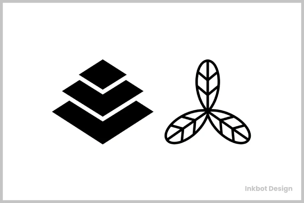
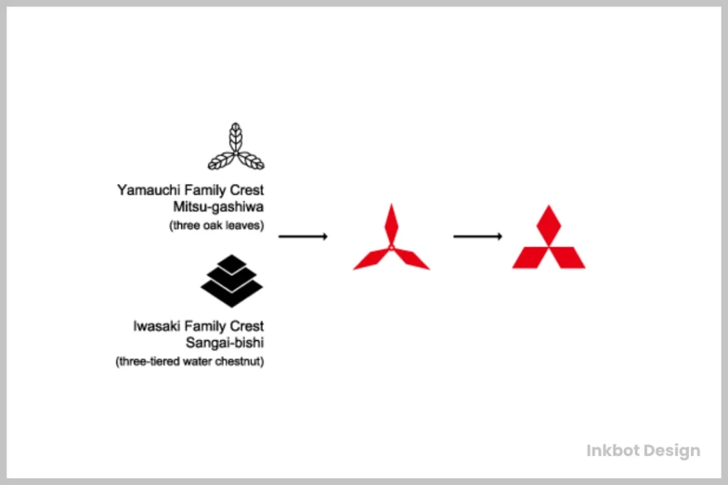
The Mitsubishi logo's story begins in 1870 when the company was founded as a shipping firm by Yatarō Iwasaki. At the time, Iwasaki chose the three-diamond mon (traditional Japanese family crest) as the company's emblem – a design that reflected the founder's family history and ancestral roots.
The three-diamond motif wasn't just a pretty design, however. Each element held deep symbolic meaning:
💎 The three diamonds represented the integrity, reliability, and success principles guiding the young company.
💎 Arranged in a triangle shape, the three diamonds also evoked the image of a Mitsubishi – an archaic Japanese term for a type of water chestnut with three leaves.
💎 This three-leaf motif was no accident. It directly referenced the family crest of the Tosa Clan, from which Iwasaki's family originated. Subtly aligning the brand with this noble lineage was a shrewd move to lend the new company an air of prestige and pedigree.

From these humble beginnings, the Mitsubishi logo has become one of the most recognisable brand marks in the world. But the secret to its enduring success lies not just in the elegant simplicity of the design itself but in the rich symbolism and history that underpins it.
The Power of Symbolism in Branding
One of the critical factors that has allowed the Mitsubishi logo to stand the test of time is the deep well of symbolic meaning it draws from. In a world where visual branding is increasingly homogenised and generic, Mitsubishi's logo is a shining example of the power of purposeful, culturally grounded symbolism.
By rooting their brand identity in the traditional mon crest of the Tosa Clan, Mitsubishi imbued their logo with a sense of history, heritage, and authenticity beyond mere aesthetics. The three diamonds don't just look nice – they carry the weight of centuries-old cultural significance that resonates on a primal level with customers.
This strategic use of symbolism is a hallmark of the most iconic brand logos. Think of the instantly recognisable Apple logo and its subtle nod to the forbidden fruit of the Tree of Knowledge. Or the hidden arrow in the FedEx wordmark, subtly communicating the company's speed and efficiency.
These symbolic associations aren't just aesthetically pleasing – they forge deep, almost instinctive connections between a brand and its customers. As Mitsubishi has demonstrated over the past 150+ years, resonance is the key to building a logo that stands the test of time.

Of course, not every business owner has the luxury of drawing from centuries of family history and cultural tradition. But that doesn't mean you can't infuse your logo with equally powerful symbolic meaning.
The trick is to get creative and think about your business's core values, personality traits, and unique selling points. What imagery, iconography or metaphors could you leverage to communicate those attributes in a memorable, emotionally resonant way?
Your eco-friendly brand could feature a leaf or a tree symbol. Or your tech startup's playful, innovative nature could be expressed through an abstract shape or geometric pattern. The possibilities are endless – the key is to dig deep and uncover symbols that genuinely capture the essence of your brand.
Simplicity, Scalability, and the “Goldilocks” of Logo Design
But crafting a symbolically rich logo is only half the battle. To truly stand the test of time, a brand mark must also nail the fundamentals of excellent logo design: simplicity, scalability, and versatility.
And once again, the Mitsubishi logo shines as a prime example. Stripped down to its most essential elements – three equilateral diamonds arranged in a triangular formation – this design is the very definition of simplicity. There are no extra flourishes, unnecessary details, or distracting gradients or effects. It is just a clean, elegant, abstract, instantly recognisable shape.
This level of visual simplicity is crucial for logos that must work across various applications – from tiny social media avatars to massive building facades. The Mitsubishi logo is just as legible and impactful at 2 inches as at 20 feet, a testament to the timeless principles of scalable logo design.
But the real genius lies in striking that perfect “Goldilocks” balance between simplicity and nuance. While the overall logo design is clean and minimal, the subtle nods to cultural symbolism and heritage give it a richness and depth that sets it apart. It's simple enough to be instantly recognisable yet complex enough to feel meaningful and substantial.

This is the holy grail for logo designers – a mark simultaneously bold, understated, basic, and profound. It's a delicate balance that Mitsubishi has maintained for over a century.
Of course, crafting a logo that hits this sweet spot can be challenging. It takes a deep understanding of design principles, a keen eye for detail, and the ability to think strategically about a brand's unique identity. But if you can pull it off, the results can be truly extraordinary.
Just look at the Mitsubishi logo. Simple enough to be instantly recognisable yet layered with symbolic meaning that gives it a sense of gravitas and significance. It's a masterclass in timeless brand design that small business owners and entrepreneurs would do well to study and emulate.
Adaptability: The Key to Longevity in a Changing World
Of course, even the most iconic logo design in the world isn't immune to the ravages of time. Fashions change, cultures evolve, and businesses must adapt to survive. And the Mitsubishi logo is no exception.
Over the past 150+ years, the core three-diamond design has remained consistent. However, the company has periodically refreshed and modernised the logo to keep it fresh and contemporary. Here are a few of the critical updates and iterations the Mitsubishi logo has undergone:
- 1870: The original three-diamond mon crest featuring a simple black and white colour scheme.
- 1914: The first significant redesign, adding depth and volume to the diamonds through gradients and highlights.
- 1946: A sleeker, more minimalist take on the design, stripping away the 3D effects in favour of a flatter, two-dimensional look.
- 1962: Another round of refinements, further simplifying the shape and introducing a vibrant red colour scheme.
- 1990s: The most recent update, honing the proportions and shapes of the diamonds for a more precise, geometric aesthetic.

Through each of these changes, the essence of the Mitsubishi logo has remained intact. The three-diamond symbol has persisted as the instantly recognisable heart of the brand, even as the execution has evolved to stay contemporary.
This careful balance of consistency and adaptability is critical to the longevity of any iconic logo design. While it's essential to maintain the core symbolic meaning and visual DNA of a brand mark, it's equally vital to periodically refresh and modernise the aesthetic to keep up with the times.
After all, even the most beautifully designed logo will feel dated and irrelevant if it remains static and unchanging. Brands must be willing to evolve – not by abandoning their core identity but by thoughtfully updating the visual expression of that identity.
And that's precisely what Mitsubishi has done so successfully over the decades. By maintaining the deep cultural symbolism and timeless minimalism of the three-diamond motif while iteratively refining the execution to stay modern and fresh, they've created a classic and contemporary logo.
It's a masterclass in brand adaptation – one that small business owners would do well to study and emulate as they work to craft their own iconic, enduring logos.
What Can Small Businesses Learn From the Mitsubishi Logo?

So, what key takeaways can small business owners and entrepreneurs apply to their logo design efforts? Here are a few of the most critical lessons from the Mitsubishi case study:
- Embrace Symbolic Meaning: Don't just create a nice logo – infuse it with more profound symbolic significance that resonates with your target audience. What values, attributes or cultural associations can you leverage to make your brand mark truly meaningful?
- Keep It Simple (But Not Too Simple): Strive for that sweet spot of minimal, scalable design that still feels rich and substantial. Overly complex logos will get lost, while too basic logos can be forgettable or generic.
- Be Willing to Evolve: Be bold and periodically refresh and modernise your logo to keep up with the times. But do so in a way that maintains your brand's essence and identity.
- Focus on Timelessness, Not Trendiness: Great logos aren't built to capitalise on momentary fads – they're designed to stand the test of time and prioritise principles of classic, enduring design over short-term aesthetic flourishes.
- Leverage Your History and Heritage: Even if you don't have centuries-old family crests to draw from, chances are your business has an interesting origin story or unique cultural ties that you can weave into your logo design. Feel free to get creative and dig into your brand's backstory.
Implementing these principles won't guarantee you'll end up with an icon as legendary as the Mitsubishi logo. After all, Yatarō Iwasaki and his team had the benefit of over a century of brand-building experience that most small businesses simply don't possess.
But by emulating the core tenets that have made the Mitsubishi logo such an enduring success – symbolic meaning, simplistic elegance, and adaptive longevity – you can certainly give yourself the best chance of crafting a genuinely iconic, memorable brand mark.
And who knows? With creativity, strategic thinking, and determination, you might create the next great logo design that stands the test of time.
Mitsubishi Logo FAQs
What does the Mitsubishi logo represent?
The Mitsubishi logo consists of three diamond shapes arranged in a triangular formation. This three-diamond motif, known as a “Mitsubishi” mon, was originally the family crest of the Tosa Clan in feudal Japan. Mitsubishi's founder, Yatarō Iwasaki, chose it as a symbol of integrity, reliability, and success.
When was the Mitsubishi logo first introduced?
The original Mitsubishi logo was introduced in 1870 when the company was founded as a shipping firm. The three-diamond mon crest has remained the core visual identity of the Mitsubishi brand for over 150 years despite undergoing several minor aesthetic updates and refinements over the decades.
How has the Mitsubishi logo evolved?
While the core three-diamond symbol has remained consistent, the Mitsubishi logo has seen several subtle visual updates and redesigns since its inception in 1870:
1914: First significant redesign, adding depth and volume to the diamonds through gradients and highlights.
1946: Simplified to a flatter, two-dimensional look, stripping away the 3D effects.
1962: Introduction of a vibrant red colour scheme.
1990s: Latest update, further refining the proportions and shapes of the diamonds.
Through each iteration, the goal has been to maintain the timeless essence of the three-diamond symbol while modernising the aesthetic to stay contemporary.
Why has the Mitsubishi logo been so successful?
The enduring success of the Mitsubishi logo can be attributed to a few key factors:
Deep Symbolic Meaning – The three-diamond motif is rooted in centuries-old Japanese cultural tradition, lending the logo a sense of prestige, heritage, and authenticity.
Simplicity & Scalability – The clean, minimal design is instantly recognisable and works seamlessly across various applications and scales.
Adaptive Consistency – Mitsubishi has carefully balanced maintaining the core visual identity while periodically refreshing the aesthetic to stay modern and relevant.
By blending timeless symbolism with adaptable, iconic design, Mitsubishi has crafted a classic and contemporary logo – a rare feat accomplished by only the most legendary brand marks.

