Dior Logo Design: Secrets of Luxury Branding Revealed
Ever stared at a Dior logo and wondered, “What’s so special about those four letters?”
Buckle up because we’re about to ride through the glitzy world of high-fashion branding. And trust me, it’s more exciting than front-row seats at Paris Fashion Week (and I’ve been there, albeit in the nosebleed section).
As the founder of Inkbot Design, I’ve seen my fair share of logos. Some good, some bad, and some that make you want to gouge your eyes out with a rusty spoon. But the Dior logo? It’s in a league of its own.
So, grab your favourite overpriced latte, and let’s dissect this beauty like it’s the season’s hottest trend.
🔰 TL;DR: Dive into the world of luxury branding with this deep dive into the Dior logo. We’ll unpack its history, design elements, and cultural impact. Discover actionable tips to create your iconic logo, even on a shoestring budget. Spoiler: It’s not about the money but the message.
| Company Name | Christian Dior SE |
| Founded | December 16, 1946 |
| Founder | Christian Dior |
| Headquarters | 30 Avenue Montaigne, Paris, France |
| Estimated Value | Approximately €100 billion (as of 2023) |
| Key People | Delphine Arnault (CEO), Antoine Arnault (Vice Chairman) |
| Products | Clothing, cosmetics, fashion accessories, jewellery, perfume, wine & spirits, watches |
| Subsidiaries | Christian Dior Couture, LVMH (42.36% ownership) |
| Website | dior.com |
- Dior's logo showcases luxury and elegance, established from its 1946 origins, reflecting timelessness in fashion branding.
- The 2018 logo update emphasised simplicity, dropping “Christian” and adopting modern typography for global recognition.
- A minimalist design approach enhances brand appeal, creating an instant recognition across various cultures and markets.
- Beyond fashion, the logo's presence in pop culture elevates it to a cultural touchstone, symbolising luxury and success.
- Key lessons from Dior's branding include the power of consistency, the impact of simplicity, and prioritising emotional connections.
The Birth of a Legend: Dior’s Logo Origin Story
From Sketch to Icon: The Evolution of Dior’s Visual Identity
It’s 1946, and Christian Dior is hunched over his desk, probably sipping some fancy French wine. He’s sketching furiously, trying to capture the essence of his brand in a few simple lines.
Little did he know, those scribbles would become one of the most recognisable logos in fashion history.
The original Dior logo was a bit like that first awkward school photo – charming, but definitely room for improvement. It featured the full “Christian Dior” name in a serif font that screamed, “I’m fancy, look at me!
But as we all know, fashion evolves faster than you can say “last season’s trends.”
The Makeover: When Simplicity Met Sophistication
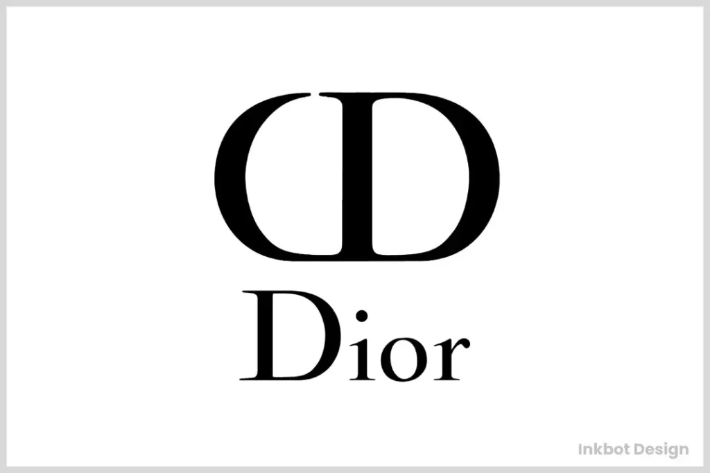
Fast forward to 1967. Yves Saint Laurent (yes, that YSL) takes the reins and decides it’s time for a logo facelift. Out with the old, in with the… slightly less old?
The new logo kept the essence of the original but stripped it down to its bare essentials. “Christian” got the boot, leaving just “Dior” to carry the torch.
This version introduced the now-iconic contrast between thick and thin strokes, creating a visual rhythm that’s more catchy than the latest pop hit.
Changes to the 2018 Dior Logo Design and Their Significance
In 2018, Dior made strategic adjustments to its beloved logo, reflecting a shift towards a more modern aesthetic while retaining its hallmark elegance.
Key Changes:
- Dropping ‘Christian’: The most notable change was the removal of ‘Christian’ from the logo, spotlighting the single word ‘Dior’. This simplification underscores the brand’s global identity.
- Typography Transformation: The text was updated to be fully capitalised with even spacing and uniform height, fostering a sense of modernity and confidence.
- Consistent Monochrome Palette: Despite these changes, the logo maintained its classic black-and-white colour scheme, preserving its timeless appeal.
What These Changes Signify:
- Modern Appeal: The streamlined design aligns with contemporary trends, appealing to a broader and more diverse audience without alienating its traditional base.
- Global Recognition: By focusing on ‘Dior’, the brand emphasises its widespread recognition and simplifies its identity in a way that resonates across various cultures.
- Sophisticated Simplicity: The clean and minimalist approach reflects current societal trends where simplicity is often valued more than complexity, especially in a fast-paced digital world.
- Balancing Heritage and Innovation: The logo update is a testament to Dior’s ability to blend its rich heritage with a forward-looking vision, showing evolution without losing connection to its storied past.
Anatomy of Elegance: Dissecting the Dior Logo
The Font: More Than Just Pretty Letters
Let’s talk typography, shall we? The Dior logo uses a custom serif font like the James Bond of typefaces – sophisticated, timeless, and just a bit dangerous.
The serifs aren’t your run-of-the-mill flicks. Oh no, they’re elongated and sharpened, like stiletto heels ready to step on the competition.
And those varying stroke widths? They’re not just showing off. They create a dynamic tension that keeps your eye moving, much like a well-designed runway show.
Colour Me Impressed: The Psychology of Black and White
You might be thinking, “It’s just black and white. What’s the big deal?” Oh, my sweet summer child, let me enlighten you.
Black symbolises power, elegance, and mystery. It’s the little black dress of the colour world – always appropriate, always chic.
White represents purity, cleanliness, and new beginnings. It’s the blank canvas on which Dior paints its seasonal stories.
Together, they create a stark contrast between haute couture and off-the-rack (trust me, I’ve experienced both, and my wallet still hasn’t recovered).
Negative Space: The Unsung Hero
Here’s where it gets exciting. The Dior logo isn’t just about what you see – it’s also about what you don’t see.
The negative space between the letters creates a sense of airiness and luxury. It’s like the breathing room between courses at a Michelin-starred restaurant – necessary for full appreciation.
This clever use of space ensures the logo remains legible even when scaled down to adorn a tiny perfume bottle or blown up to grace a billboard.
How Does the Dior Logo Design Maintain Global Recognition and Appeal?
The design of the Dior logo plays a pivotal role in maintaining its global recognition and broad appeal. The brand strategically underscores its essence of luxury and elegance by simplifying the logo and focusing on the singular name. This minimalist approach ensures immediate identification and reinforces the brand’s status as a symbol of sophisticated fashion.
Key Elements of Global Recognition and Appeal:
- Simplicity with Impact: Streamlining the logo to feature only the iconic name heightens its impact. This simplicity echoes universal luxury, making it instantly recognisable across diverse cultures and markets.
- Universal Symbol of Elegance: The decision to hone in on just the name enhances its global appeal. This approach allows for easy recall and connects with audiences seeking elegance and style.
- Enhanced Accessibility: Dior opens its doors to a broader audience using a straightforward design. The clarity in branding makes it approachable while retaining an air of exclusivity.
The Cultural Impact: More Than Just a Pretty Face
From Runways to Rap Lyrics: Dior in Popular Culture
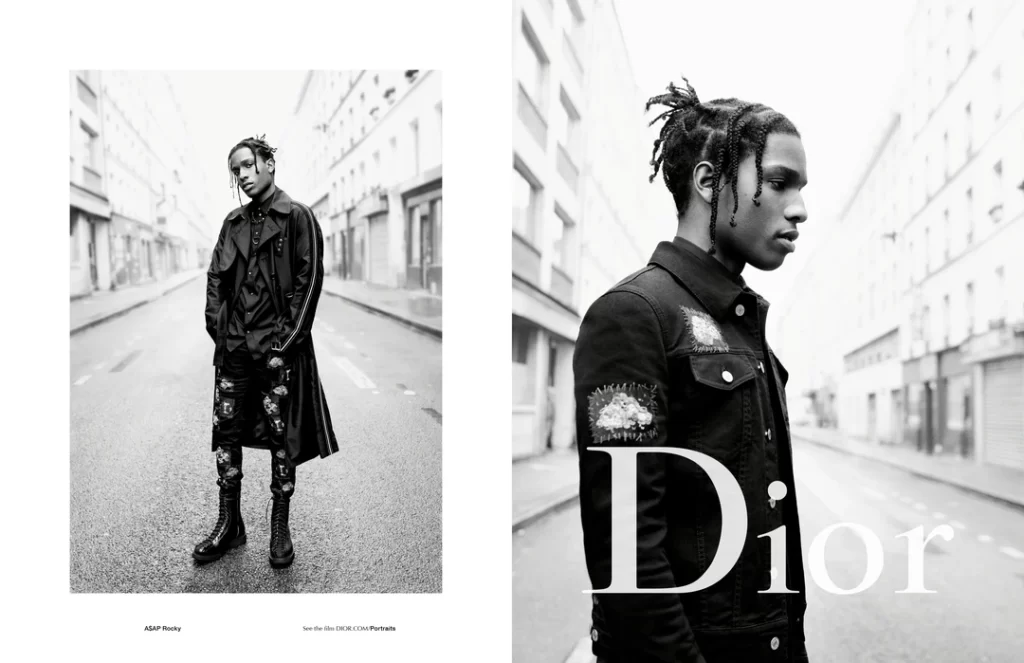
The Dior logo isn’t just confined to fashion circles. Oh no, it’s infiltrated pop culture faster than a viral TikTok dance.
🎵 “I’m in my Christian Dior, she’s in her Christian Dior” 🎵
Sound familiar? That’s because rappers can’t stop name-dropping Dior in their lyrics. It’s become shorthand for luxury, success, and “I’ve made it” status.
But it’s not just music. The Dior logo has graced everything from red carpets to museum exhibitions. It’s no longer just a brand; it’s a cultural touchstone.
The Knock-Off Economy: Imitation as the Sincerest Form of Flattery?
Here’s a fun fact: the Dior logo is one of the most counterfeited in the world. Before you rush off to buy a “Diir” bag from a sketchy street vendor, let’s break this down.
Counterfeiting is a massive problem in the fashion industry, costing brands billions annually. But it’s also a backhanded compliment. After all, no one’s faking brands no one wants, right?
The prevalence of Dior knock-offs speaks to the logo’s power and desirability. It’s so good that everyone wants a piece – even if it’s fake.
Lessons from Luxury: What Can We Learn?

Consistency is Key (But Don’t Be Boring)
One of Dior’s biggest strengths is its consistency. The logo has mostly stayed the same since 1967. That’s longer than most marriages!
But – and this is crucial – they’re not afraid to play. Limited editions, collaborations, and seasonal variations keep things fresh without losing the core identity.
Takeaway: Establish a strong core identity, but be bold and have fun with it occasionally.
Less is More (Except When It Isn’t)
The Dior logo proves that sometimes, less really is more. Four letters. Two colours. Infinite impact.
But here’s the kicker: Dior knows when to dial it up. Their packaging, store designs, and runway shows are often extravagant affairs.
Takeaway: Keep your core branding simple and robust, but know when to increase the volume for maximum impact.
Emotion Trumps Logic
Let’s be honest: there’s nothing inherently special about the word “Dior.” It’s just some guy’s name.
But what are the emotions and associations tied to that logo? Priceless.
Dior has spent decades cultivating an image of luxury, creativity, and aspiration. When people see that logo, they see letters and a lifestyle.
Takeaway: Focus on building emotional connections with your audience. Logic sells, but emotion creates loyalty.
From Haute Couture to Your Company: Practical Tips for Logo Design
1. Know Your History (But Don’t Be Trapped By It)
Dior’s logo evolution teaches us the importance of respecting heritage while staying relevant. When designing your logo, consider the following:
- Your company’s origin story
- Key milestones in your industry
- Cultural shifts that might impact perception
Pro Tip: Create a mood board with historical references and contemporary trends. This visual guide can help bridge the gap between tradition and innovation.
2. Embrace Simplicity (But Make It Meaningful)
The Dior logo is a masterclass in simplicity, but every element serves a purpose. When crafting your logo:
- Start with complex ideas, then gradually strip away non-essential elements
- Ensure each remaining component has a specific role or meaning
- Test for scalability – your logo should look good on a business card and a billboard
Pro Tip: Try the squint test. If you can still recognise the critical elements of your logo while squinting, you’re on the right track.
3. Choose Your Typography Wisely
Dior’s custom typeface is a crucial part of its brand identity. When selecting or creating typography for your logo:
- Consider the personality you want to convey (e.g., modern, traditional, playful)
- Test legibility at various sizes
- Explore custom options if budget allows, or carefully modify existing fonts
Pro Tip: Create a typography hierarchy for your brand, starting with your logo font and including complementary fonts for various applications.
4. Colour Psychology Matters
While Dior sticks to a classic black-and-white palette, colour can be a powerful tool in logo design. Consider:
- The emotional associations of different colours
- Cultural implications of colour choices
- How colours interact with each other and with various backgrounds
Pro Tip: Design your logo in black and white first. If it works without colour, it’ll be even stronger with it.
5. Test, Test, and Test Again
Before finalising your logo, put it through its paces:
- Test in various sizes and applications (digital, print, merchandise)
- Gather feedback from your target audience
- Consider how it looks alongside competitor logos
Pro Tip: Create a “logo in the wild” mockup. Photoshop your logo onto real-world objects and environments to see how it performs.
The Dior Effect: Measuring Logo Impact
Brand Recognition: The Holy Grail of Marketing
According to a 2023 study by Brand Finance, Dior ranks as the 4th most valuable luxury brand globally, with a brand value of $11.9 billion. That’s not just selling clothes; that’s selling an idea, a lifestyle – and it all starts with that logo.
The Social Media Factor
In today’s digital age, a logo must work harder than ever. It needs to be instantly recognisable in a tiny Instagram profile pic or as a fleeting image in a TikTok video.
Dior’s social media presence is a masterclass in logo utilisation. Their Instagram account (@dior) boasts over 46 million followers as of Q4 2024. Each post, whether a runway show or a product close-up, reinforces the brand identity through consistent logo placement.
Beyond Fashion: Dior’s Cross-Industry Impact
The influence of the Dior logo extends far beyond the fashion world. In a 2023 survey of graphic design students, the Dior logo was cited as one of the top 5 most inspiring luxury brand logos, alongside titans like Apple and Nike.
This cross-industry admiration speaks volumes about the logo’s design strength and cultural impact.
FAQs: Unravelling the Mysteries of the Dior Logo
Has the Dior logo ever changed?
While the core design has remained consistent since 1967, Dior occasionally releases limited edition variations for special collections or collaborations.
Who designed the current Dior logo?
The current logo was created under the direction of Yves Saint Laurent in 1967 when he was the creative director of Dior.
Why is the Dior logo so simple?
Simplicity ensures versatility and memorability. It allows the logo to be easily recognisable across various mediums and sizes.
Is the Dior logo copyrighted?
The Dior logo is protected by copyright and trademark laws. Unauthorised use can result in legal action.
How does Dior use its logo in marketing?
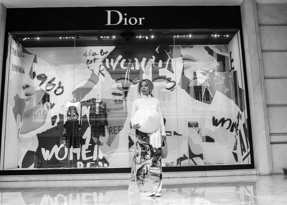
Dior strategically places its logo on all products, packaging, and marketing materials. It’s also prominently featured in their retail spaces and runway shows.
Can I use a font similar to the Dior logo for my brand?
While you can’t use the exact Dior font, you can draw inspiration from its style. However, be cautious to avoid creating confusion or potential legal issues.
Does Dior ever use colour in its logo?
While the primary logo is black and white, Dior occasionally uses gold or other colours for special editions or specific product lines.
How important is the logo to Dior’s brand value?
The logo is crucial to Dior’s brand value. It’s a key identifier representing the brand’s heritage, quality, and luxury positioning.
Are there hidden meanings in the Dior logo?
While no confirmed hidden meanings exist, the logo’s design elements (like the contrast between thick and thin strokes) often represent the balance between tradition and modernity.
How does the Dior logo compare to other luxury fashion logos?
The Dior logo stands out for its simplicity and elegance. Unlike some luxury brands that use symbols or monograms, Dior relies solely on its name, emphasising the power of its brand identity.
The Final Stitch: Wrapping Up Our Dior Logo Deep Dive
We’ve journeyed through the glittering world of Dior’s logo design, from its humble beginnings to its current status as a global icon. So, what’s the takeaway?
Creating a logo that stands the test of time isn’t about following trends or throwing money at the problem. It’s about understanding your brand’s essence and distilling it into a visual form that resonates with your audience.
The Dior logo succeeds because it embodies the brand’s values: elegance, simplicity, and timeless luxury. It’s not just a logo; it’s a promise.
As you embark on your logo design journey, remember you don’t need millions to create something iconic. You need clarity of vision, a deep understanding of your brand, and the courage to keep it simple.
And if you’re feeling overwhelmed? Well, that’s where we come in. At Inkbot Design, we specialise in turning brand visions into visual realities. We might not be able to get you front-row seats at Paris Fashion Week, but we can certainly help you create a logo that turns heads.
Ready to make your mark? Let’s create something legendary together. After all, every iconic brand starts with a single, well-designed stroke.
