Red Bull Logo Design: A Complete Brand Analysis
If you’ve ever wondered how the Red Bull logo became so recognisable and impactful, you’re in the right place.
As the founder of a branding and design agency called Inkbot Design, I’ve spent years studying the psychology and strategy behind some of the world’s most iconic logos.
And I’m here to share those insights with you – whether you’re a seasoned designer or a beginner. The truth is that creating a logo as memorable as Red Bull’s is achievable, even if you think you lack the skills or experience.
In this in-depth brand study, I’ll pull back the curtain on the design process behind the Red Bull logo. I’ll reveal the psychology and symbolism woven into its timeless aesthetic and share practical tips to craft your attention-grabbing brand identity.
By the end, you’ll have a blueprint for designing a logo that commands respect, builds trust, and leaves a lasting impression on your target audience. So grab an energy drink (or cup of coffee), and let’s dive in!
| Company Info | Details |
| Company Name | Red Bull GmbH |
| Founded | 1984 |
| Founders | Dietrich Mateschitz and Chaleo Yoovidhya |
| Headquarters | Fuschl am See, Salzburg, Austria |
| Estimated Value | Over $20 billion (as of 2023) |
| Product Range | Energy drinks, sugar-free drinks, organic sodas |
| Market Presence | Available in over 171 countries |
| Annual Sales | Over 12 billion cans sold in 2023 |
| Notable Events | Sponsorship of sports teams and events globally |
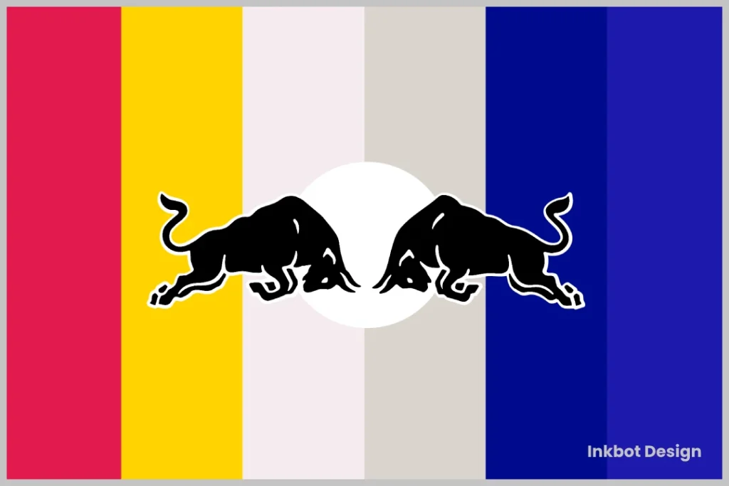
- Recognisable Branding: The Red Bull logo exemplifies effective visual storytelling that contributed to a £15.8 billion brand.
- Powerful Symbolism: Two charging bulls embody strength and competitive spirit, aligning with the Red Bull brand's adventurous identity.
- Simplicity & Impact: The logo's simplified design enhances memorability, demonstrating that less can indeed be more.
The Origins of the Red Bull Logo
The Red Bull logo is one of the most recognisable brand symbols in the world. But did you know it wasn’t always that way?
The original product, Krating Daeng (“red gaur”), was created by Chaleo Yoovidhya in Thailand. The logo featured two red gaur bulls charging toward each other – a powerful symbol in Thai culture.
When Dietrich Mateschitz partnered with Yoovidhya in 1984, they didn’t just adapt the logo; they evolved it.
Changes to the Red Bull Logo in 2008 and 2014
2008 Logo Update:
In 2008, Red Bull embarked on a rebranding journey, opting for a modernised logo that introduced several key changes:
- Bull Design: The bulls were given a more stylised appearance, enriched with gradient shading to add depth.
- Background Colour: The familiar blue circle was replaced with a sleek silver background, enhancing the contemporary feel.
- Typography: The company’s name was redesigned using a new font, contributing to a bolder and more impactful look.
This revamped design aimed to appeal to a broad audience by providing a fresh yet bold identity.
2014 Logo Update:
Continuing its evolution, Red Bull made further modifications to its logo in 2014:
- Streamlined Bull Illustration: The bull design was simplified, making it cleaner and more straightforward.
- Background: The logo removed the silver background, opting for a more minimalist approach.
- Refined Typography: Although the font for the company name was updated again, it retained similarities to the previous version, maintaining brand consistency.
The 2014 revamp strengthened the iconic logo, ensuring it remained easily recognisable across various platforms.
The Western Evolution
Here’s where it gets interesting:
- They simplified the bulls’ design
- Enhanced the dynamic positioning
- Added the bold red, yellow, and blue colour scheme
Why did this matter? Because simplicity scales. I’ve seen countless brands overcomplicate their logos, trying to tell their entire story in one image. Red Bull understood that less is more.
In 1987, when Red Bull first launched in Austria, their logo was a much simpler affair. It featured the iconic Red Bull wordmark in a basic all-caps font with no imagery or additional design elements.
While this stripped-back approach had minimalist charm, it lacked the visual impact and memorability that would later propel Red Bull to global domination.
It wasn’t until 1997 that the brand introduced the now-famous Red Bull “bulls” icon – the pair of red bulls locked in an aggressive, head-to-head stance. This bold, dynamic illustration instantly elevated the logo into a recognisable and profoundly symbolic brand mark.
But what was the thinking behind this redesign? What creative decisions and psychological principles were at play?
The Psychology of the Red Bull Logo Design
When it comes to branding and logo design, psychology is everything. The most successful logos aren’t just aesthetically pleasing – they’re carefully crafted to tap into our profound emotional triggers and subconscious associations.
And the Red Bull logo is a masterclass in this approach.
At the heart of the design is the depiction of two red bulls engaged in a fierce, head-to-head confrontation. This powerful, dynamic imagery is layered with rich symbolic meaning that speaks directly to the Red Bull brand’s core values and positioning.
Symbolism of the Bulls
Bulls are recognised as symbols of strength, masculinity, and unbridled power. In many cultures, they’re associated with masculinity, aggression, and a fierce, uncompromising spirit.
By placing two bulls in an aggressive, head-to-head pose, the Red Bull logo taps into these deep-seated cultural archetypes. It instantly conveys a sense of raw, untamed energy – the embodiment of the Red Bull brand’s adventurous, adrenaline-fueled identity.
But the symbolism goes even more profound. The confrontation between the two bulls also suggests a fierce competitive drive and a refusal to back down in the face of a challenge. This aligns perfectly with Red Bull’s positioning as a brand that empowers people to push their limits and conquer their fears.
Colour Psychology
Colour is another crucial element of the Red Bull logo’s psychological impact. The bold, fiery red hue immediately grabs our attention and stimulates feelings of excitement, passion, and intensity.
Red is widely associated with power, aggression, and physical arousal – all qualities that perfectly complement the visceral, high-octane energy of the Red Bull brand. The colour also subtly nods to the “bull” theme, evoking these majestic creatures’ fiery, untamed nature.
Interestingly, using a single, unifying colour throughout the logo design also contributes to its memorability and visual impact. By eschewing a more complex colour palette, Red Bull has created a clean, instantly recognisable brand mark that’s easy for consumers to recall and identify.
Sense of Movement
Another critical psychological element of the Red Bull logo is its strong sense of movement and dynamism. The bulls’ locked horns, flared nostrils, and tensed muscles suggest intense, barely-contained energy – as if the logo itself is about to burst into motion at any moment.
This strategic use of dynamic, kinetic imagery taps into our innate human fascination with speed, power, and physical prowess. It aligns the Red Bull brand with a sense of adrenaline, athleticism, and the pursuit of peak performance – values that resonate strongly with the brand’s target audience of thrill-seekers and adventure enthusiasts.
Lessons for Aspiring Logo Designers
What can we learn from the Red Bull logo and apply it to our branding and design efforts? Here are a few key takeaways:
1. Embrace Symbolism and Archetypes
Be bold and tap into universal cultural symbols and archetypes when crafting a memorable logo. You can forge a powerful emotional connection with your target audience by aligning your brand with deeply resonant imagery and symbolism.
The Red Bull Bulls, for example, draw on timeless associations with strength, aggression, and competitive drive. What symbols or archetypes might be relevant to your brand?
2. Use Colour Strategically
Colour is a crucial element of logo design, capable of evoking specific emotional responses and reinforcing your brand’s personality.
Pay close attention to the psychological associations of different colours and how they might align with your brand’s values and positioning. The bold, fiery red of the Red Bull logo is a perfect example of a colour used to maximise effect.
3. Emphasise Movement and Dynamism
Try to imbue your logo design with energy, motion, and dynamism. This makes your brand mark more visually engaging and helps capture the adventurous, high-octane spirit many consumers are drawn to.
The clashing bulls in the Red Bull logo are a prime example of this principle in action. What kinds of dynamic, kinetic elements might you be able to incorporate into your logo design?
4. Strive for Simplicity and Memorability
While the Red Bull logo may seem complex initially, its elegant simplicity is crucial to its enduring success. By distilling the design down to its most essential elements, Red Bull has created a logo that is easy to remember, recognise, and mentally “file” in the minds of consumers.
As you’re designing your logo, keep this lesson in mind. Resist the temptation to overcrowd your design and focus instead on crafting a clean, clear, and instantly recognisable brand mark.
FAQs
What makes the Red Bull logo so recognisable?
The Red Bull logo is so recognisable thanks to its bold, dynamic imagery, strategic use of colour, and deep symbolic meaning. The confrontation between the two Red Bulls instantly conveys a sense of raw energy, power, and competitive drive – qualities deeply aligned with the Red Bull brand’s identity and positioning.
How can I incorporate symbolism and archetypes into my logo design?
When designing a logo, look for ways to tap into universal cultural symbols and archetypes that resonate with your target audience. Consider your brand’s core values and personality, then brainstorm visual elements that embody those qualities. For example, an energy drink brand might use a lion or eagle to convey strength and vitality.
Why is simplicity so important in logo design?
Simplicity is crucial in logo design for a few key reasons:
It makes the logo easy to remember and recognise, even at small sizes or from a distance.
It allows the logo to work well across various mediums and applications, from digital to print.
It creates a sense of sophistication and professionalism rather than looking cluttered or amateurish.
The Red Bull logo perfectly shows how stripping a design down to its essential elements can create a genuinely iconic, memorable brand mark.
How can I make my logo more dynamic and visually engaging?
To inject a sense of movement and energy into your logo, consider incorporating graphic elements that suggest motion, tension, or a barely contained dynamism. This could involve illustrating overlapping shapes, implied directionality, or asymmetrical compositions that create a feeling of momentum.
You can also experiment with colour choices, typography, and the overall styling of your logo to amplify its visual impact. For example, using bold, sans-serif fonts or vibrant, high-contrast hues can help your brand mark feel more contemporary and eye-catching.
What’s the most important thing to remember when designing a logo?
When designing a logo, the most important thing to remember is your target audience and how they will perceive and respond to your brand mark. Every design decision – from the choice of imagery to the colour palette to the overall aesthetic – should be rooted in a deep understanding of your customers’ values, preferences, and pain points.
By keeping your audience at the forefront and crafting a logo that speaks directly to their needs and desires, you’ll be well on your way to creating a brand identity that resonates and stands the test of time.
Conclusion: Unleash Your Brand’s Potential with a Knockout Logo
Designing an iconic logo like Red Bull’s may seem like a tall order, but I hope this deep dive has shown you that it’s achievable – even if you’re just starting in branding and design.
By tapping into the power of symbolism, colour psychology, and dynamic visual elements, you can craft a logo that commands attention, builds trust, and helps your brand cut through the noise. And if you ever need a trusted partner to bring your creative vision to life, you know where to find us. 😉
Ready to develop your own iconic brand identity? At Inkbot Design, we specialise in creating timeless logos that drive business success. Contact us to start your branding journey.
