The Commercial Importance of a Logo Beyond Aesthetics
You can get a “logo” for £5. You can get one from an AI generator in about 30 seconds. The market is flooded with cheap, fast options that promise you a brand identity for the price of a coffee.
And that’s the problem.
This accessibility has tricked entrepreneurs into thinking a logo is a decorative afterthought. You stick a tiny graphic on your website before you get to the “real” work.
This mindset is costing businesses a fortune.
The purpose of this article isn’t to sell you a logo. It’s to reframe your understanding of a logo: arguably the most critical commercial tool at your disposal. It’s not about looking pretty; it’s about being remembered.
- A logo is a critical commercial tool, essential for brand identification and memory, not just a decorative element.
- Great logos create powerful first impressions, strategic differentiation, and foster brand loyalty through recognition over time.
- Professional logo design requires a strategic approach; it must resonate with your target audience, not just personal taste.
- A well-designed logo significantly enhances perceived value, cohesion, and professionalism across all business materials.
Let’s Be Clear: A Logo Is a Tool, Not a Painting
Before we can talk about importance, we have to agree on what a logo is. Most people get this wrong from the start.
It’s Not Art, It’s a Strategic Shortcut
A logo is not a piece of art to be hung in a gallery. Its primary function is identification.
Think of it like a flag for a country. The Union Jack isn’t just a pattern; it’s a visual shortcut for the entire history, culture, and identity of the United Kingdom. You don’t just see red, white, and blue when you see it—you feel something. You recognise it instantly.
Your logo does the same job for your business. It is the single most recognisable brand asset you own, designed to trigger the memory of every customer experience with you. Its job is to work, not to be beautiful.
Your Personal Taste is (Mostly) Irrelevant
A phrase makes professional designers want to tear their hair out: “I’m not sure what I want, but I’ll know it when I see it.”
This approach treats logo design like shopping for a new shirt. It’s based on personal, subjective taste. But you are not your customer.
A successful logo isn’t designed to please you. It’s engineered to resonate with your target audience. It must communicate your intended message to them in a way they understand and remember. A construction company owner might love delicate, script fonts, but that would be a disastrously inappropriate choice for a logo that must convey strength and reliability.
The 4 Core Commercial Functions of a Great Logo
What does this tool actually do? Why is it so important? Its value lies in four distinct commercial functions.
Function 1: It Makes a First Impression (In Under 10 Seconds)
You don’t get a second chance to make a first impression. Research shows it takes 10 seconds for a consumer to form an initial opinion of a logo, and it only takes 5 to 7 brand impressions to recognise it.
They see your logo before they’ve read a word on your website or spoken to a single employee.
In that instant, their brain makes snap judgments. Does this look professional? Does this look cheap? Is this a modern company? Is this a trustworthy one? A poorly designed, pixelated, or generic logo screams “amateur.” A clean, professional mark signals quality and credibility before you’ve even made your pitch.
Function 2: It Provides Strategic Differentiation
Your business does not exist in a vacuum. You are fighting for attention in a sea of competitors shouting the same things. Your logo is your visual differentiator.
Imagine searching for a local plumber. You see a list of ten names. Nine have generic clipart logos of a wrench or a water droplet. One has a strong, unique, and professional mark. Which one are you going to click? Which one feels more established and reliable?
A great logo helps you stand out and carves out a distinct visual space in the minds of your customers. It’s how they find you in a crowd.
Function 3: It’s the Bedrock of Brand Memory
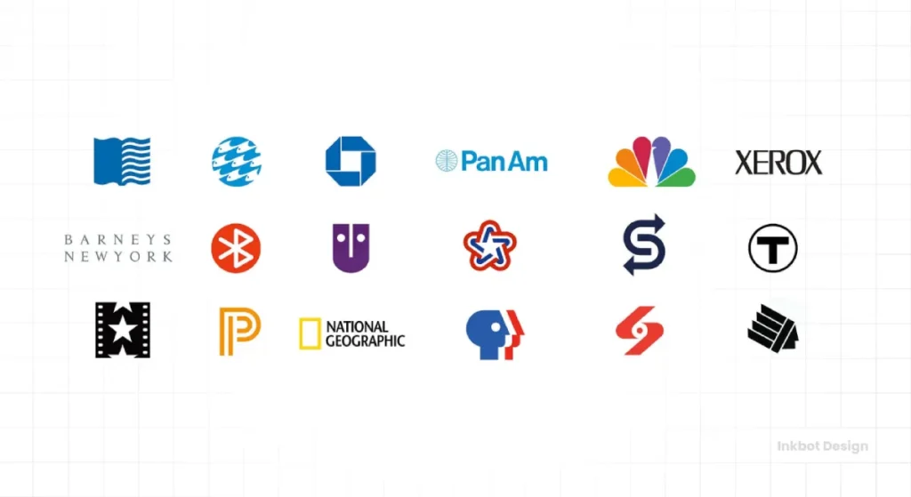
Humans are visual creatures. We are hardwired to remember images and symbols far more easily than words or names.
This is why simple, iconic symbols represent the world’s most valuable brands. You don’t need to read the word “Nike” to recognise the Swoosh. You don’t need to see “Apple Inc.” to know what the bitten apple represents.
These logos are straightforward. That’s not an accident. Simplicity makes them easy to recall. A complex, overly detailed logo is difficult for the brain to process and even harder to remember. A great logo is a sticky visual that latches onto the memory.
Function 4: It Fosters Brand Loyalty (Eventually)
A logo begins its life as an empty vessel. It has no inherent meaning. But over time, through positive interactions with your business, it becomes a container for trust and familiarity.
Think about your favourite coffee shop. The first time you saw its logo, it meant nothing. But after dozens of visits, excellent coffee, and friendly service, that logo triggers feelings of comfort and satisfaction.
It becomes a familiar face in a crowd. This recognition is a cornerstone of brand loyalty. Customers are drawn to what they know and trust; your logo symbolises that relationship.
The Tangible ROI: How a Logo Actually Makes You Money
These functions aren’t just abstract marketing concepts. They have a direct and measurable impact on your bottom line.
It Commands a Higher Perceived Value
Strong branding makes you look more expensive. A business with a polished, professional logo and consistent visual identity is perceived as more established, credible, and of higher quality.
This perception is powerful. It allows you to position yourself as a premium option in your market and charge prices that reflect your value. A cheap logo makes you look like a bargain-basement option, and you’ll be forced to compete on price—a race to the bottom you can’t win.
It Creates Cohesion and Professionalism
Your logo is the unifying element across all your business materials. It’s the visual thread that ties together your:
- Website and mobile app
- Business cards and letterheads
- Social media profiles
- Packaging and products
- Company uniforms and vehicles
When your logo is applied consistently everywhere, you present a professional, cohesive, and reliable front. Studies have shown that brands with consistent presentation are 3.5 times more likely to enjoy excellent brand visibility. This consistency builds trust and makes your brand look like it has its act together.
What a Logo Is NOT (And Where People Go Wrong)
Part of understanding the importance of a logo is understanding its limitations. The obsession with certain myths leads many businesses down the wrong path.
It is Not Your Entire Brand
This is the most common and dangerous misconception. Your logo is the symbol of your brand, but it isn’t the brand itself.
Your brand is the total of every interaction someone has with your company. It’s your customer service, product quality, reputation, and tone of voice.
A great logo on a terrible business is just lipstick on a pig. It sets an expectation that the company fails to meet, creating even more disappointment. Your logo is the promise; your brand is the delivery.
It Doesn’t Need a “Hidden Meaning”
People love the story of the arrow hidden in the FedEx logo. It’s clever. It’s a significant bit of trivia. But it’s not why the logo is successful.
The FedEx logo is successful because it is simple, bold, distinctive, and uses a timeless font. It communicates solidity and professionalism. The arrow is a bonus for those who spot it, not the core strategic element.
Entrepreneurs spend countless hours cramming three different “hidden meanings” into one graphic. This inevitably leads to a cluttered, confusing, and unmemorable logo. Your goal should be clarity, not cleverness.
The Commercial Cost of Getting It Wrong: A Cautionary Tale
If you think a logo is just a small detail, consider the infamous Gap redesign of 2010.
For over 20 years, Gap had a simple, iconic logo: the word “GAP” in a tall, serif font inside a dark blue box. It was instantly recognisable and had accumulated enormous brand equity.
In October 2010, they abruptly replaced it with “Gap” in a generic Helvetica font, with a small, gradient blue box floating awkwardly behind the ‘p’.
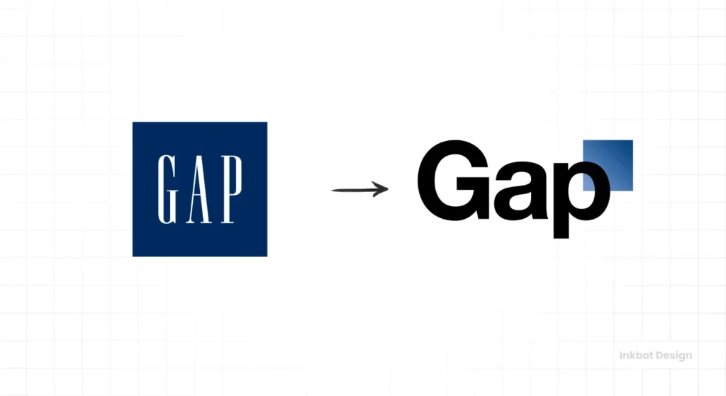
The public backlash was immediate and brutal. Customers, critics, and designers lambasted it as cheap, lazy, and soulless. It looked like a logo a first-year design student would create in ten minutes. Within six days, the company scrapped the new design and reverted to the original, having spent a reported $100 million on the failed rebranding effort.
They didn’t just create a bad design; they publicly disrespected customers’ connection with their brand. They traded a trusted symbol for a generic placeholder and paid a steep price.
So, How Do You Get a Logo That Actually Works?
A logo that functions as a strategic asset isn’t born from a moment of inspiration or a few clicks on a generator. It’s the result of a deliberate process.
This process involves deep diving into your business, audience, and competition. It requires a clear strategic brief, thorough market research, the exploration of multiple design concepts, and a rigorous refinement process to ensure the final mark is simple, versatile, and timeless.
This strategic approach is the core of any professional logo design process. It’s what separates a functional business tool from a simple decorative graphic.
The Bottom Line
Your logo is the face of your company. It’s the first thing people see and the last thing they remember.
A silent ambassador works for you 24/7, shaping perception, differentiating you from the noise, and building trust. Treating it as a low-priority expense is one of the most shortsighted decisions a business can make.
Investing in a professional logo isn’t about buying a picture. It’s about investing in the future memory of your business. It’s about giving your reputation the face it deserves.
Frequently Asked Questions about the Importance of a Logo
What is the most essential function of a logo?
The most crucial function of a logo is identification. It must allow customers to recognise and differentiate your business from competitors quickly and easily.
How much should a small business spend on a logo?
This varies wildly, but you should view it as an investment, not a cost. A professional logo from an experienced designer or agency can range from a few hundred to several thousand pounds, reflecting the strategic process involved. Avoid ultra-cheap options, as they often lead to generic or plagiarised designs.
Can a bad logo really hurt my business?
Yes. A bad logo can make your business appear unprofessional, untrustworthy, and cheap. This can deter potential customers, weaken your negotiating power on price, and make it challenging to build a memorable brand.
What is the difference between a logo and a brand?
A logo is a visual symbol that represents your business. Your brand is customers’ overall perception and experience with your company, including your reputation, customer service, and product quality. The logo is the face of the brand.
How often should I redesign my logo?
Only when there is a significant strategic reason to do so. This could be a major shift in your business model, a merger, or if your logo looks incredibly dated. Minor refreshes every 5-10 years can be helpful, but complete redesigns should be cautiously approached to avoid losing brand equity.
What are the key elements of a good logo?
A good logo is simple, memorable, versatile (works in different sizes and colours), appropriate for its industry, and timeless.
Do I really need a professional designer to create a logo?
While DIY tools exist, a professional designer brings strategic thinking, technical skill, and industry experience that a generator or amateur cannot replicate. They design a tool based on your business goals, not just a picture based on your taste.
Is a simple logo better than a complex one?
Almost always, yes. Simple logos are easier to recognise, remember, and reproduce across various media. Think of Nike, Apple, and Target logos—they are straightforward and globally recognised.
Does my logo need to show what my company does literally?
No, and it often shouldn’t. Apple doesn’t sell fruit, and Starbucks’ mermaid doesn’t sell coffee. A logo should communicate a feeling or a brand essence, not be a literal illustration of your product or service.
What’s more important: the logo’s colour or shape?
The shape or silhouette is more important. A strong logo should be recognisable even in black and white. Colour is a powerful but secondary element that adds an emotional layer.
What is a ‘logotype’ versus a ‘brand mark’?
A logotype (or wordmark) is a logo designed around the company name, like Google or Coca-Cola. A brand mark (or symbol) is a purely graphic symbol, like the Apple logo. A combination mark includes both.
Can I just use a font for my logo?
Yes, this is called a logotype. However, it should be a well-chosen font, with custom modifications to the lettering to make it unique and ownable, like the FedEx or a Sony logo.
Let’s Talk Strategy
Understanding the importance of a logo is the first step. The next step is building one that gives your business the strategic advantage it deserves.
It might be time for a conversation if you’re ready to move beyond a simple graphic and develop a professional mark that builds trust and recognition.
At Inkbot Design, we focus on the strategy behind the design. Explore our logo design services to see our process or request a quote to discuss your project with us directly.
