Designing Logos with a Grid System: The Professional’s Secret
You’ve seen it. That logo from a cheap design contest. Something about it just feels… off. The spacing is weird. The icon doesn’t quite align with the text. When you shrink it for your website’s header, it becomes a blurry mess.
The problem isn’t the idea. It’s the execution. It lacks structure.
As a brand consultant, the most common flaw I see in “rescued” logos from entrepreneurs is a total absence of an underlying framework. The design was “eyeballed.” It was built on “feel.” And “feel” doesn’t scale.
A grid system is the invisible scaffolding that separates a professional, functional brand asset from a simple amateur graphic. But it’s also one of the most misunderstood topics in design.
Before we get into the “how-to,” let’s clear the air. I have some strong opinions as someone who has to fix these problems.
- The “Golden Ratio” Crutch: Stop it. Just stop. Slapping a Fibonacci spiral on top of your finished logo doesn’t make you Da Vinci. The Golden Ratio is a proportioning tool, not a magic “make-it-good” button. More often than not, it’s a justification, not a foundation.
- Retroactive Gridding: This is a portfolio-padding trick. A designer makes a logo by “feel,” then spends three hours meticulously drawing complex circles and lines over it after the fact to look like a genius. The grid must inform the design process, not just be a fancy costume.
- The “Scalability Blind Spot”: The number one failure. I’ve seen logos that look stunning on a 27-inch monitor. But when you shrink them to a 16x16px favicon, they’re an unreadable smudge—a grid forces you to think in modular terms, which is essential for scalability.
- “Design by Vague Feedback”: A grid system ends the nightmare feedback loop of “Can you move that a tad to the left?” It introduces an objective language. “We will move the icon two grid units to the left” is a concrete, testable decision. “A tad” is a path to madness.
Now that’s out of my system, let’s talk about what a grid actually is and why it’s the most valuable tool in your design arsenal.
- Use a grid as invisible scaffolding to ensure proportional, aligned, and harmonious logo elements.
- Define a base unit so strokes and spacing scale predictably, passing the 16x16 favicon test.
- Choose the grid type to suit the concept: modular for geometric, baseline for text, circular for curves.
- Grid provides objective language for feedback, preventing vague "tad" adjustments and design-by-committee issues.
- Know the rules to break them: use optical adjustments when necessary, but build on a solid grid foundation first.
What is a Logo Grid System (And What It’s Not)?
A logo grid system is a set of invisible lines, curves, and measurements used to build a logo. Think of it as the architectural blueprint for your brand’s cornerstone. It dictates the logo’s proportions, spacing, and alignment, ensuring every element is harmonious and logical with every other element.
That’s it. It’s not magic. It’s not a creative prison. It’s a tool for consistency.
What a Grid System is NOT
- It is NOT a “paint-by-numbers” solution. A grid doesn’t give you the idea. A brilliant concept is still paramount.
- It is NOT just for geometric or ‘corporate’ logos. Even fluid, organic, or hand-drawn logos benefit from a grid (like a baseline grid) to ensure they align properly with text and other elements.
- It is NOT a rigid, unbreakable law. The best designers know when to break the grid for optical adjustment. But you must know the rule before you can break it effectively.
A grid simply provides the framework. It’s the difference between a house built on a solid foundation and one built on a muddy field.
Why Bother? The Business Case for a Logo Grid
As an entrepreneur, you don’t care about design theory. You care about results. So why should you care if your designer uses a grid?
Because it directly impacts your bottom line.
1. It Guarantees Scalability (The ‘Favicon Test’)
This is the big one. Your logo will appear in dozens of places:
- A massive trade show banner
- A tiny 16×16 pixel website favicon
- A mobile app icon
- Embroidered on a shirt
- The side of a van
A logo built without a grid often has inconsistent stroke widths or tiny, delicate gaps. When shrunk, those strokes vanish and the gaps fill in, turning your logo into an unreadable blob.
A grid system solves this by enforcing a base unit. For example, a designer might set the thinnest stroke to be $1x$. All other strokes will be multiples of that (e.g., $2x$, $4x$), and all spacing will also be relative (e.g., $0.5x$, $1x_). This ensures that its internal proportions remain intact and legible as the logo scales up or down.
Real-World Example: I once consulted for a tech startup whose app icon was a complex, free-drawn flame. In the App Store, it was an ambiguous orange splotch. Their competitor, who used a simple, grid-based ‘F’, was instantly recognisable. We had to redesign their mark on a modular grid just to compete.
2. It Creates Objective Harmony (It Just ‘Looks Right’)
You know that feeling when a design just “looks right”? That’s not magic; it’s harmony. It’s the result of balance, rhythm, and visual hierarchy.
A grid provides this harmony. It ensures the space between your icon and your text is deliberate. It dictates that the height of your icon relates to the height of your wordmark. This underlying order creates a sense of stability, professionalism, and calm. This is a core part of professional logo design and branding.
3. It Defends Against “Design by Committee”
This is a massive time and money saver. As mentioned in my pet peeves, a grid removes vague, subjective feedback.
- Without a grid: “I don’t like it. The icon feels… floaty.”
- With a grid: “The icon is currently aligned to the cap-height of the text. Would you like to see a version that aligns with the x-height?”
See the difference? One is a problem; the other is a discussion with a clear solution. It gives you and your designer a shared language to make objective improvements, not just chase a “feeling.”
4. It Ensures Future Consistency
Dozens of people will handle your logo over its lifetime: web developers, printers, social media managers, and sign makers.
A grid system is a key part of your brand guidelines. It provides a “master plan” that shows any third party exactly how the logo is constructed. This stops a lazy web developer from stretching it. It prevents a printer from re-typesetting your wordmark and getting the spacing wrong.
It’s the ultimate tool for brand protection.
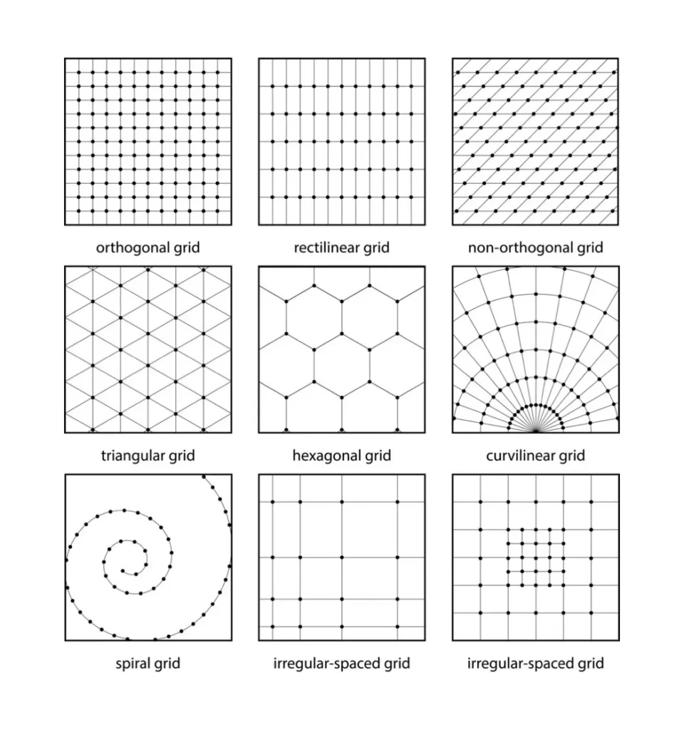
The Toolkit: Common Grid Systems Used in Logo Design
A grid isn’t a one-size-fits-all solution. A good designer picks the correct type of grid for the job. For you, the business owner, knowing these helps you understand the why behind your logo’s construction.
Here are the most common types, stripped of the jargon.
Choosing Your Grid: Tool vs. Task
| Grid Type | What It Is (In Plain English) | Best For… | My Honest Take |
| Modular (Square) Grid | Simple graph paper. A grid of perfect squares. | App icons, geometric marks, pixel art, and any logo must be ‘pixel-perfect’ at small sizes. | The workhorse. Start here if you’re building an app icon or a blocky monogram. It’s the most straightforward path to scalability. |
| Column/Row Grid | Basic vertical and horizontal lines, not necessarily square. | Wordmarks (logotypes) and combination marks (icon + text) to ensure basic alignment. | A good starting point, but usually needs a Baseline Grid to be genuinely effective. It’s for basic layout. |
| Baseline Grid | A grid of horizontal lines based on the rules of typography. | Any logo that includes text. This is non-negotiable for logotypes or logos with taglines. | This is what stops your icon from “floating” above your text. It ensures the text and mark sit on the same “shelf.” It’s essential. |
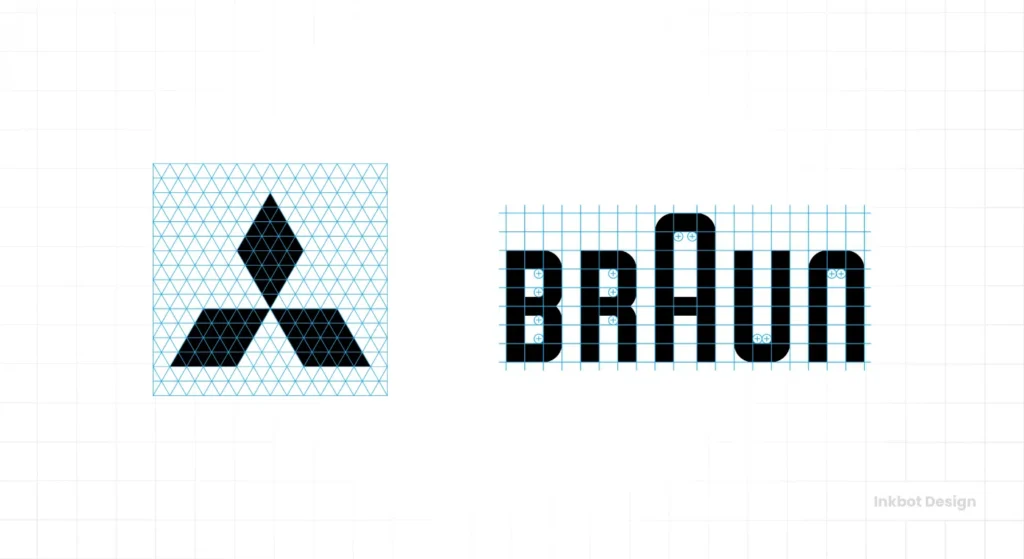
| Circular Grid | A grid built from concentric and overlapping circles. | Logos with perfect, geometric curves (like the Twitter bird or the Apple logo). | It looks imposing, but it’s the one that is most often “faked” retroactively. When used properly, it builds beautiful, fluid curves. |
| The “Golden Ratio” | A proportional system based on the 1:1.618 ratio. | Creating specific, “organic” feeling proportions in logos like the old National Geographic mark. | The most overhyped tool in the box. It’s just a set of proportions. It can be helpful, but it’s not a magic bullet. Don’t ask for it; let your designer use it if it serves the concept. |
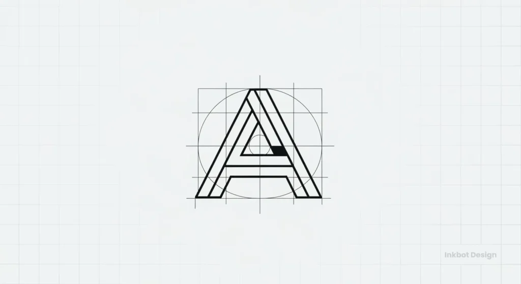
A Practical Walkthrough: Building a Simple Logo on a Grid
This isn’t a software tutorial. This is a conceptual walkthrough of how a grid informs design.
Imagine we’re creating a simple, strong monogram logo for “Apex Solutions.” We just want the letter ‘A’.
Step 1: The Brief & The Sketch (No Grid Yet)
The brief calls for a logo that is “stable, modern, and tech-focused.” A simple, bold, geometric ‘A’ makes sense. I’ll sketch a few ‘A’ shapes on paper. The idea comes first. I decide on a concept: a strong, stable ‘A’ with no crossbar, just a peak.
Step 2: Choose Your Grid
A modular (square) grid is the obvious choice for a stable, geometric’ A’. It will enforce strong angles and consistent proportions. Let’s set up a 10×10 grid in our design software.
Step 3: Define Your Base Unit (The $x$ Value)
This is the most crucial step. We must decide on our “master measurement.” The central stroke thickness of the ‘A’ will be two grid units wide. We’ll call this $2x$.
- Main Stroke: $2x$ (2 units)
- Negative Space (The gap inside): We’ll try to relate this. Let’s make the gap $1x$ (1 unit) at its narrowest.
Step 4: Block Out the Main Shapes
Now, we build the ‘A’ using the grid lines.
- We start the left leg at the bottom-left corner (0,0). We draw it two units wide.
- We draw the right leg, making it mirror the left.
- The peak of the ‘A’ will touch the top line (the 10th-unit line).
- The angles of the ‘A’ are forced to snap to grid intersections. This ensures they are symmetrical.
- The negative space in the middle is now perfectly defined by the grid.
Step 5: Refine and Test (The “Is It Right?” Phase)
We look at the blocked-out ‘A’. Maybe the peak looks too “pinched.” The grid gives us a way to fix this objectively.
- Problem: “The peak looks too sharp.”
- Solution: “Let’s flatten the top. Instead of a sharp point at the 10-unit line, the peak will be a flat line, $2x$ wide, running from grid line 4 to 6.”
We make the change. The logo is still 100% grid-based, but the decision was a creative one, enabled by the system.
Step 6: The Squint Test & The Favicon Test
Now for the moment of truth.
- Squint Test: We squint our eyes. Does the ‘A’ still hold its shape? Yes. The strong positive and negative shapes are precise.
- Favicon Test: We shrink the 10×10 grid (with the ‘A’ on it) down to 16×16 pixels. Because we used a base unit of $2x$, the thinnest parts of our logo are still visible. It doesn’t blur into a blob. It’s legible.
The logo is a success. It’s balanced, modern, and scalable.
Real-World Grid Audits: The Good, The Bad, and The Overhyped
Looking at authentic logos is the best way to see why this matters.
| Logo | Grid System Analysis | Why It Works (Or Doesn’t) | Scalability Score |
| Apple | Famously based on a circular grid with proportions that align with the Golden Ratio. | The curves are optically perfect and balanced. It feels harmonious because its proportions are all mathematically related. This isn’t fake; it’s built-in. | A+ |
| Twitter (Bird) | Built entirely from a complex circular grid. No straight line or bézier curve was drawn “by hand.” | This is the epitome of grid-based construction. It creates a fluid, organic, yet perfectly reproducible and balanced shape. | A |
| Google (G) | A hybrid. It uses a circular grid for the main ‘G’ shape, but the crossbar and cut-offs are optically adjusted and don’t perfectly follow a simple geometric rule. | This is an excellent example of “know the rules, then break them.” The grid provides the foundation, but the final design is tweaked by a human eye for perfect clarity. | A- |
| FedEx | A masterclass in typographic and baseline grids. The magic “arrow” in the negative space only exists because of meticulous letter-spacing (kerning). | The grid here is about relational spacing. The grid creates the arrow. It’s a triumph of function and a perfect example of a non-obvious grid. | A+ |
| [Generic Contest Logo] | (Shows a conceptual ‘Swoosh’ logo) No clear grid. The swoosh is a “free-drawn” curve. The text is “eyeballed” under it. | It might look large, but the swoosh is too thin and complex. The text is unaligned. Shrink this, and the swoosh vanishes while the text becomes a blur. | D |
When to Break the Grid (Or Not Use One at All)
A grid is a tool, not a religion. A professional designer knows when to put it down.
- For Organic, Hand-Drawn Logos: If your brand is a rustic bakery and the logo is a hand-lettered script, forcing it onto a rigid modular grid will kill its soul. The point is its human imperfection.
- The Caveat: Even then, a designer will still use a baseline grid to ensure that a hand-drawn wordmark aligns properly with a tagline or sits predictably in a website header.
- For Optical Adjustments: This is a high-level skill. Sometimes, what is mathematically correct looks optically wrong. A classic example is centring a triangle in a square. It will look too low if you centre it by its mathematical midpoint. You have to “nudge” it up.
- The grid gets you 99% of the way there. The final 1% is the designer’s eye, deliberately choosing to break the grid for a better-looking result.
Our Process: How We Use Grids at Inkbot Design
I’m direct about this because at Inkbot Design, we’ve seen the costly disasters without a proper foundation.
Our process isn’t “grid-first.” It’s “strategy-first.”
- We start with your brief, your audience, and your competitors.
- We develop a concept that solves your business problem.
- Then, we bring that concept onto a grid. We build, test, and refine it using the principles of structure and scalability.
We use a grid system not to constrain creativity, but to ensure that the logo we design for you is a bulletproof, long-term asset. It’s a core part of our logo design philosophy because it means your logo will work everywhere, every time.
It’s the difference between buying a graphic and investing in a brand identity.
A Grid Isn’t a Prison; It’s a Blueprint
You don’t need to know how to draw a grid if you’re an entrepreneur. But you absolutely need to understand it matters.
A grid system is your insurance policy. The invisible framework ensures your logo—the most critical piece of your brand—is balanced, professional, and functional. It allows it to be as powerful on a 16px favicon as on a 16-foot billboard.
If your current logo “feels off,” if it breaks at small sizes, or if it’s a nightmare to align, you almost certainly have a structure problem.
Tired of “eyeballing” your brand? It may be time to build it on a proper foundation.
If you’re ready to create a logo built to last, you can explore our logo design services to see how we build functional, timeless brands. Or, if you know your brand is ready for a professional build, request a quote and let’s talk structure.
FAQs About Logo Grid Systems
What is a grid system in logo design?
A grid system is an underlying structure of lines, squares, or circles that a designer uses to ensure a logo’s elements (icon, text, spacing) are proportional, balanced, and aligned.
Why is a grid system so crucial for logos?
Its main benefits are scalability (it looks good at any size), consistency (it’s reproduced correctly every time), and professionalism (it creates balance and harmony).
Does every logo need a grid system?
Most do. Even hand-drawn or script logos use a baseline grid for alignment. The only exceptions are intentionally “grunge” or abstract designs where a lack of structure is part of the concept.
What is the golden ratio in logo design?
It’s a specific mathematical proportion (1:1.618) that can create pleasing, “organic” looking shapes and layouts. It’s a valuable tool, but often overused and mythologised.
How does a grid help with logo scalability?
A grid forces designers to use consistent measurements (a “base unit”) for strokes and spacing. This ensures that its internal proportions remain intact and legible when the logo is shrunk.
What’s the difference between modular and baseline grids?
A modular grid is a grid of squares (like graph paper), best for geometric icons. A baseline grid is a grid of horizontal lines (like notebook paper), essential for aligning text.
Can I use a grid for a hand-drawn logo?
Yes. While you wouldn’t use a rigid modular grid (it would kill the “hand-drawn” feel), you would use a baseline grid to ensure the logo aligns perfectly with any text next to it.
How do you choose the right grid for a logo?
The concept dictates the grid. A geometric, blocky logo needs a modular grid. A logo with perfect curves needs a circular grid. A text-only logo (logotype) needs a baseline grid.
What is the ‘favicon test’?
It’s a simple test where you shrink a logo design to 16×16 pixels (the size of a browser tab icon). If it becomes an unreadable blob, it has failed the test and lacks scalability.
Do I need to show the grid with my final logo?
No. The grid is the “scaffolding” used to build the logo. The final logo is delivered as a clean file. However, the grid will be included in your official brand guidelines to show future designers how it was constructed.
What software is used to create logo grids?
Professionals use vector software like Adobe Illustrator. Its built-in grid, guide, and “snap-to-grid” functions are the tools used to apply grid system principles.
