Wordmark vs Monogram vs Symbol: Pick a Sequence, Not a Winner
Wordmark, monogram and symbol are three recognition strategies dressed as visual styles. Professional services firms should lead with the full name, because clients cannot decode a mark they have never been taught. Build the monogram and symbol as supporting assets, letting them stand alone only once exposure has earned it.


On this page9 min left
- Which logo format should a professional services firm choose?
- What each format asks your clients to do
- Why “short name, long name” is the wrong test
- What happens to the recognition you already have
- Can you actually own it?
- Which format fits your situation?
- Lead with the name. Earn the rest.
- Wordmark vs Monogram vs Symbol FAQs
Your clients already recognise your firm by something. Usually, that something is the name. It is on the engagement letter and in the email signature, and a satisfied client says it to a peer over lunch.
A rebrand that demotes the name in favour of a clever symbol asks those clients to learn you again. Most won't.
That is the real stake in wordmark vs monogram vs symbol. According to Ipsos, the global market research company, only 19% of the logos it tested met its Gold standard for distinctiveness.
Ipsos was not scoring the format. It measured whether people could uniquely and correctly link a mark to the business behind it, and roughly four in five logos failed.
This guide treats the three formats as recognition strategies. It is written for firms heading into a rebrand ahead of growth, a merger or a sale, and it sits within our wider thinking on professional services logo design.
Which logo format should a professional services firm choose?
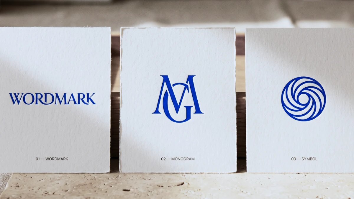
Lead with a wordmark. A professional services firm's full name is the asset clients search for and refer by, so it carries recognition from day one. Add a monogram for spaces too small for the name. Let a symbol stand alone only once repeated exposure has taught clients what it means.
- A wordmark immediately conveys recognition because it spells out the name buyers already use in referrals and searches.
- A monogram works as shorthand only when the audience already knows the name it abbreviates.
- A symbol carries no meaning at launch; meaning arrives through consistent, repeated exposure over the years.
Professional services firms should lead with a wordmark, add a monogram for small spaces, and let a symbol stand alone only after sustained exposure.
The format decision is one part of a wider logo design process for established businesses. It is also the part most often decided on taste.
What each format asks your clients to do
Forget which one looks better. Each format asks the viewer to do a different amount of work, and clients are busy people who will do the bare minimum.
Wordmark: asks clients to read
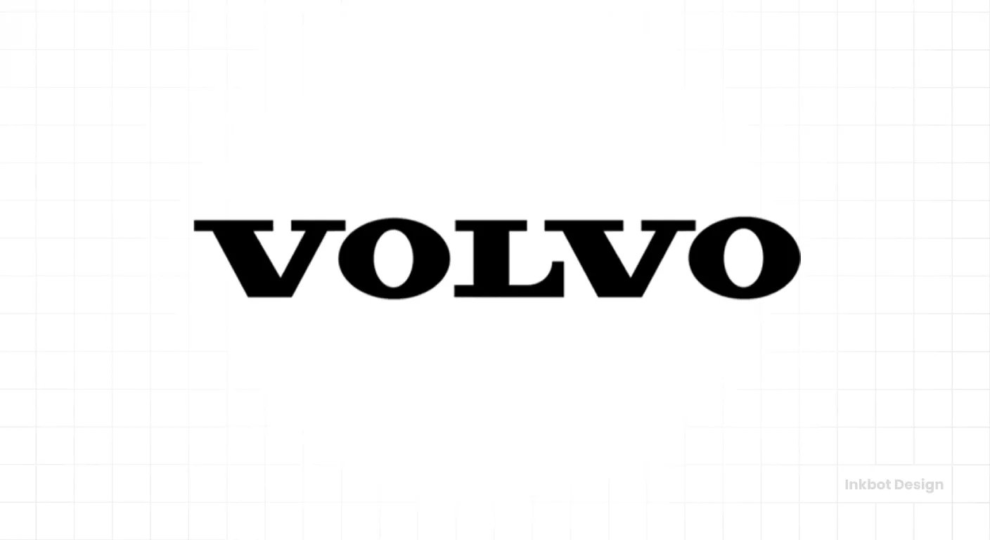
A wordmark is the full firm name set in custom or customised typography. It asks the least of the audience: anyone who can read can recognise it.
A wordmark works best when the name is already the currency of referrals. It fails when the name is generic (“Partners”, “Associates”, “Advisory”) and a typeface is the only distinctive thing left.
At that point, you have a name in a font, and so does the firm down the road.
Monogram: asks clients to remember.
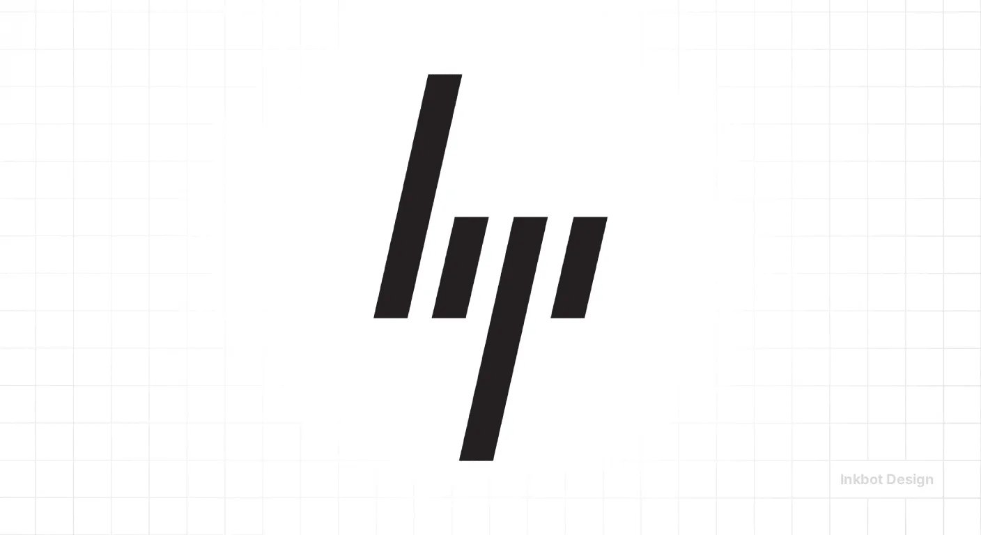
A monogram compresses the name into initials or a single letterform. It asks the audience to hold the full name in memory and connect the shorthand to it.
That is why a monogram belongs in favicons, app icons, LinkedIn avatars and embossed stationery, where the name physically won't fit.
It fails when a firm introduces one to people who don't yet know the name. “HWB” in a navy serif is three letters, and plenty of other firms' letterheads carry three letters too.
Symbol: asks clients to learn
A symbol (pictorial or abstract) has no built-in link to the firm's name. It asks the audience to learn an association from nothing.
Picture a 90-person accountancy practice unveiling an abstract mark at its annual client event. Every attendee needs the name beside it to know what they are looking at, so for the next five years, the symbol is decoration, and the name does the work.
Symbols suit firms with decades of consistent exposure and the budget to keep deploying the mark. As the lead asset at a rebrand, a symbol asks clients to do homework they never agreed to.
Why “short name, long name” is the wrong test
The name-length rule survives because it is partly true.
A 40-character firm name really does collapse at 32 pixels, and a short, distinctive name really does make a better wordmark.
Agencies repeat the rule because it gives a nervous board a quick, defensible answer. It sounds like a strategy.
It optimises for the wrong variable, though. Name length predicts which format fits the space. It says nothing about which format your audience can decode, and decoding is what predicts whether recognition survives the rebrand.
The evidence runs against the either/or framing.
PayPal has a six-letter name, which is short by any standard.
Under the rule, PayPal should need nothing but a wordmark. Instead, Pentagram describes the new custom PayPal wordmark as the identity's “foundational element”.
It then refined the familiar double-P monogram and freed it to work independently of the name. PayPal uses the wordmark when the audience needs to know who it is, and the monogram when space is tight, and recognition already exists.
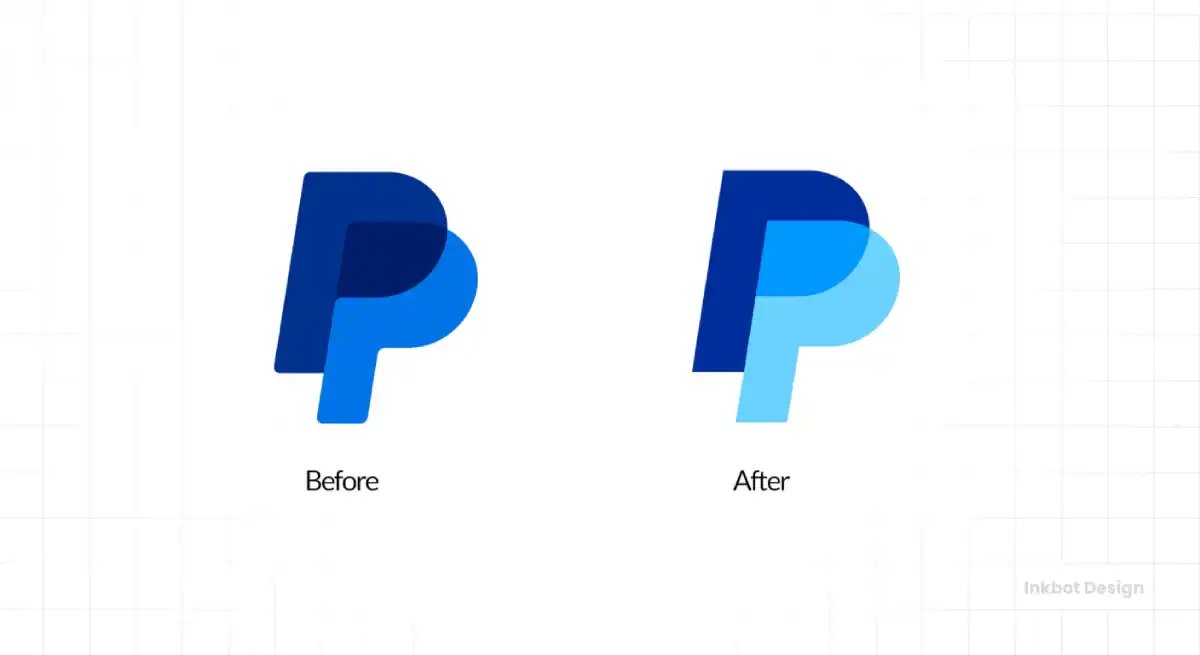
So a short name still needed a monogram.
The Hartford's stag dates back to 1875.
In its 2025 refresh, Pentagram put a redesigned stag at the centre of the system. Pentagram simplified the silhouette and kept enough dimensional detail for it to hold up across scales, digital and physical.
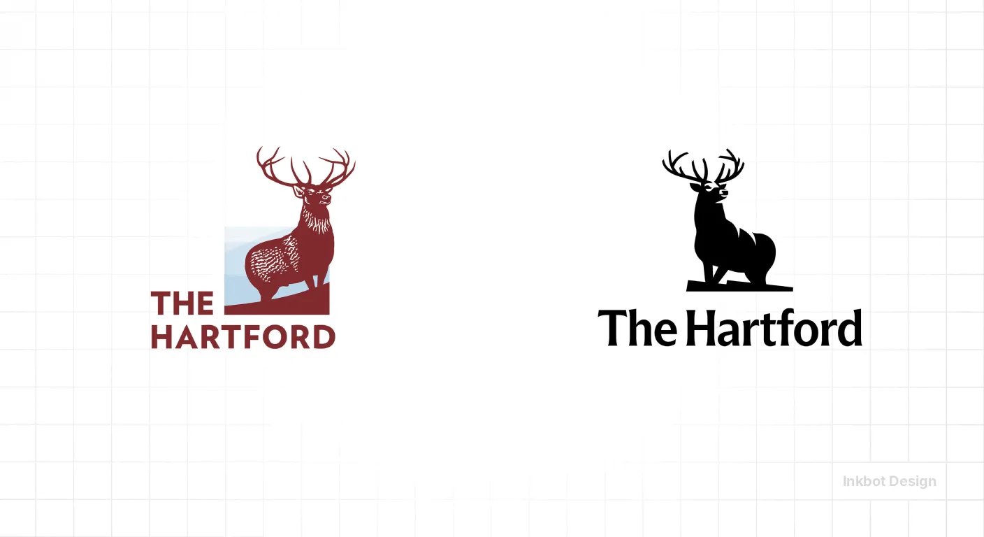
Even so, the system retains a wordmark and adds an “H” monogram and an 1810 heritage mark. The Hartford has had roughly 150 years of exposure and still doesn't rely on the symbol alone.
“A symbol does not create recognition. It stores it. Every brand that can run a mark without its name got there by running the mark alongside its name for years, consistently, until the association did the work. Firms that launch with a standalone symbol are skipping the part where the audience learns what it means, and then paying to fix it.”
Eventbrite shows what a monogram can do beyond abbreviation.
Eventbrite's 2025 refresh replaced its circular lowercase “e” with The Path, a mark the company says represents the journey from discovering an event to remembering it. The Path takes on distinct textures for communities such as food, plants, music and art.
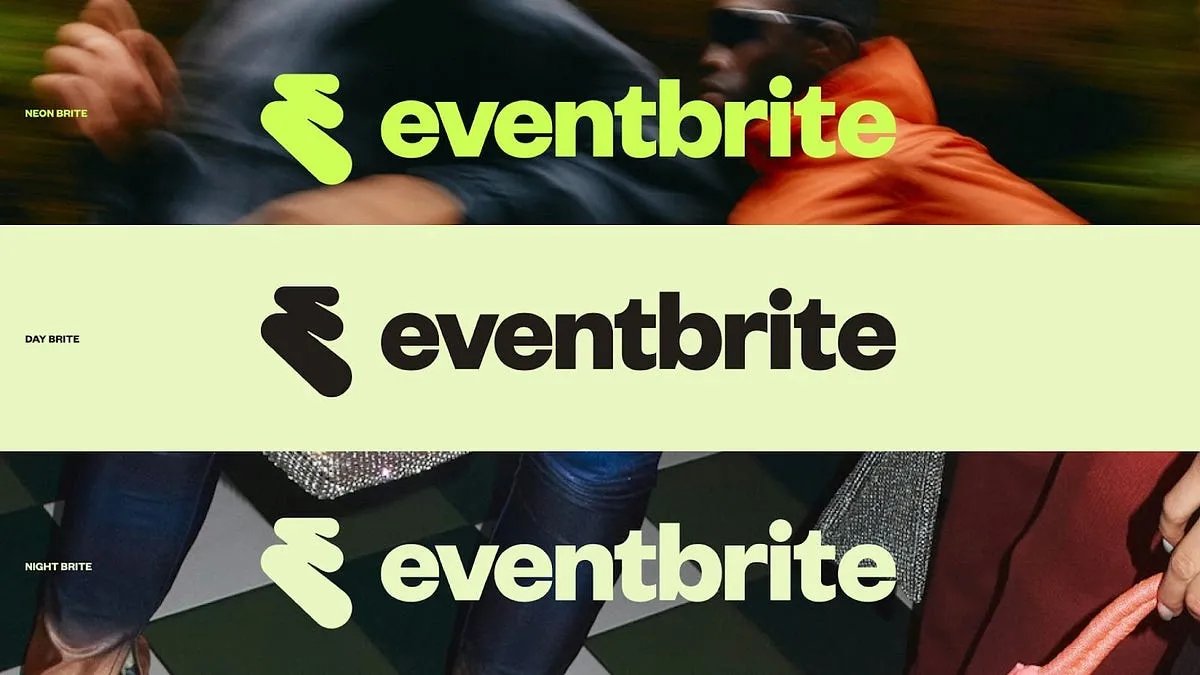
It is paired with an updated orange, an extended palette, gradients, illustration and typography. That is a monogram with enough structure to generate coherent expression across touchpoints, a principle we cover in more depth in dynamic logos for adaptive brand systems.
None of the three cases is a single static logo. Each is a system of assets that reinforces one another.
High-performing ads used distinctive brand assets 52% more often than average ads, which is consistent with the idea that the wordmark, monogram, colour and typography do their work together.
Two objections come up in almost every boardroom.
“Apple doesn't use its name.”
True. Apple's logo is the result of decades of exposure. Copying the outcome skips the process that produced it.
“Our name is four surnames long.”
Then look at what clients already call you. Most long-named firms have a short form in daily use (“Harrisons”, “the Whitlock team”). That short form is your future monogram or wordmark, and your clients picked it for you.
If nobody shortens the name, a long name can still carry a wordmark through typographic hierarchy. Otherwise, you have a naming problem, and no logo format will fix it.
Replace “how long is our name?” with three better questions:
- What do clients call us unprompted?
- Where must the identity work without the full name?
- Do we have the budget and discipline to teach a symbol, year after year?
What happens to the recognition you already have
Every referral your firm receives starts with someone saying your name. Change what the name looks like, and that referral still lands.
Replace the name with a mark, and the referrer's description (“the ones with the green logo”) no longer matches what the prospect finds on Google. That gap is where recognition leaks during a rebrand.
Mergers raise the stakes. Neither legacy monogram means anything for the combined entity, and a new symbol means even less.
The new name is the only asset that will carry the combined firm, so it must lead. The disciplines of keeping recognition intact through that change are covered in our guide to brand identity continuity.
Can you actually own it?
Ownability is the filter most logo-type guides ignore. UK trade mark applications reached 173,180 in 2024, up 5.8% on the previous year. The register gets busier every year.
Each format carries a different clearance risk:
- Wordmark: protection depends largely on how distinctive the name itself is. A descriptive or common-surname name gives the typography more to do.
- Monogram: two or three initials enter the most crowded territory there is. Letter combinations are everywhere.
- Symbol: a symbol can be the most ownable of the three, provided it is genuinely distinctive rather than the fourth abstract swoosh in your sector.
Run a clearance search with a trade mark attorney before the board signs off on a design direction. This is practical guidance, not legal advice.
Which format fits your situation?
Your situation | Lead asset | Supporting assets | Why |
|---|---|---|---|
Partner-name firm; clients refer by name | Wordmark | Monogram for digital avatars and icons | The name is the recognition. Protect it. |
Clients already call you by your initials | Wordmark of the initials | Symbol later, if at all | Your initials already function as the name. |
Post-merger combined name | Wordmark of the new name | Monogram once the name beds in | Nobody knows the new name yet. Teach it first. |
Preparing for sale or acquisition | Wordmark | Cleared, registered monogram | Clean rights make the brand easier to value and transfer. |
Long-established firm with a well-known emblem | Symbol-led system | Wordmark retained; monogram for small sizes | The Hartford model: the symbol has earned its place. |
Heavy client portal or app use | Wordmark | Monogram engineered for small sizes | Screens force shorthand. Set logo placement and minimum-size rules early. |
Lead with the name. Earn the rest.
Wordmark, monogram and symbol answer different questions: can clients read you, remember you, or recognise you without words?
For a professional services firm in the middle of a rebrand, the honest answer is usually “read” today, “remember” soon, and “recognise without words” only after years of consistent exposure.
PayPal, Eventbrite and The Hartford all run systems rather than single marks, and each system rests on recognition that was taught before it was assumed.
Build the sequence deliberately, and budget for it honestly (our breakdown of logo design costs in the UK shows where that money goes).
Before you brief anyone, find out what your current identity is actually carrying.
Request a free Brand Equity Audit™, and we will show you where your brand is losing commercial ground and what to do about it.
Wordmark vs Monogram vs Symbol FAQs
What is the difference between a wordmark and a monogram?
A wordmark displays a firm's full name in distinctive typography, while a monogram reduces the name to initials or a single letterform. A wordmark builds recognition directly; a monogram depends on existing recognition, which is why monograms usually work best as secondary assets in small spaces.
Is a symbol logo more premium than a wordmark?
No. A symbol logo carries no inherent prestige; its perceived value comes from the recognition built behind it. A well-crafted wordmark for a partner-name law firm can signal more authority than an abstract mark that clients cannot connect to the firm.
Can a long firm name work as a wordmark?
Yes. A long, firm name can work as a wordmark through typographic hierarchy, for example, by emphasising the surname clients actually use. Firms with long names should adopt the short form clients already say and pair it with a compact monogram for constrained spaces.
When should a firm drop its name from its logo?
A firm should drop its name from its logo only when research or sustained experience shows clients recognise the symbol unaided. The Hartford, whose stag dates to 1875, still retains a wordmark in its 2025 identity system, which shows how long that process takes.
Should a law firm use its partners' initials as a monogram?
Partners' initials work as a monogram for a law firm only when clients already use them. Otherwise, initials make one of the most crowded and least distinctive mark types, and a firm should run a trade mark clearance search before committing to one.